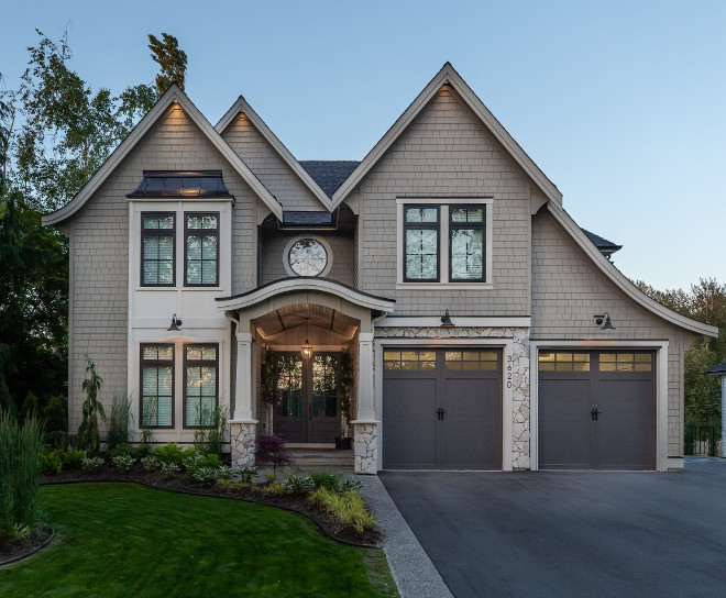
British Columbia has a special place in my heart, and Langley is also a very special city to me because it’s where my husband and I got married many years ago. To say that I am happy to be featuring a home from there and getting to know Cristy of @centrestagedesign is quite an understatement. Cristy, as you will soon see, is a very talented interior designer and she has opened the doors of her home to not only give a house tour but also share all details of her custom home.
Keep reading and make sure to follow her on Instagram!
“Hello readers! I am beyond excited to be sharing photos of my home with you. A month ago, I received a message from Luciane @homebunch asking me if she could feature our home on her blog series “Beautiful Homes of Instagram”. I felt a surge of excitement and disbelief! Me? Our home? I couldn’t believe it! I am constantly inspired by the homes Luciane features and hope that you can find some inspiration in reading about our home too.
My name is Christy and I live in Langley, British Columbia, Canada with my builder husband Erik and our four children. My husband grew up in the country and I was a city girl and right now we’re living the best of both worlds on our half acre property just on the outskirts of town. Erik works in construction and I am an interior designer and the owner of Centre Stage Design. Prior to becoming a designer, I spent six years in University to become a high school teacher then later completed my interior design program and opened my own design business.
The first house we ever owned was one we built before our first child was born. We scooped up a lot at a great price just after the recession in 2009 and started the build process with much less knowledge than we have today. Our first experience building was a learning curve but it taught us a lot about design and function. We’ve since done other new builds and a renovation and have gained much more experience. We completed our current build in the fall of 2017 and I can honestly say that I am still so happy with the elements of design in this house. I hope you enjoy it as much as we do and thanks so much for checking out our work!”

As much as I love the look of the ever-popular white house, I wanted to do something different so I opted for a grey-green exterior colour called Monterey Taupe. Our home was designed by the incredibly talented Andy Friesen from Su Casa Design. To save on cost, we used one of Su Casa’s stock plans and modified it to our liking. Andy is wonderfully intuitive and incorporated every element we asked for from the circle window to the arched entry and the curved gable roofline. We used a variety of textures on our exterior including shake, plank and natural stone!
Main colour – “James Hardie Monterey Taupe”
Architect – Su Casa Design
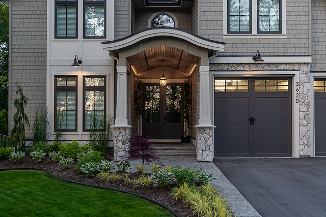
Sometimes it’s easy to forget that so much planning and design thought goes into creating a home! I love that this close-up shows off some of these details.
Trim colour – “Benjamin Moore Ashwood”
Stone – White Harbour
Lighting: here – similar
Doors – Masonite
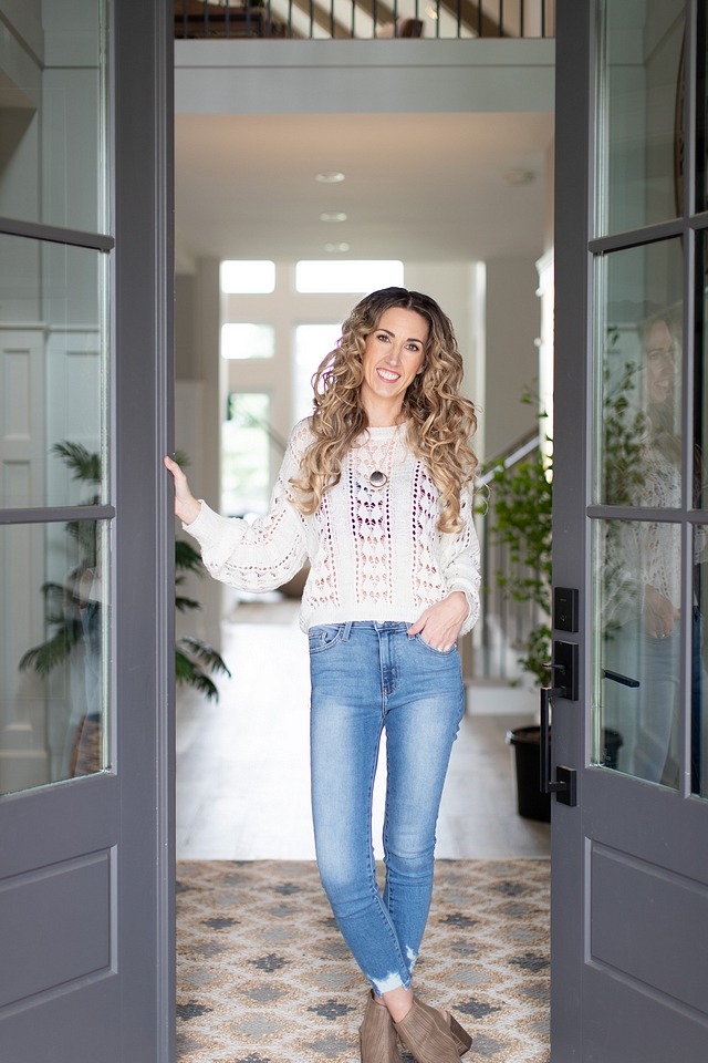
This is the beautiful and talented Christy of @centrestagedesign.
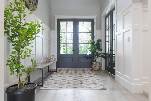
Our front entrance still gets me excited. I paired our double front doors with double French doors to the office for a dramatic flare. I am also a huge fan of bringing the outdoors in. We are blessed to have a family member who owns a plant nursery, so we were able to incorporate trees, like this Ginkgo, into our decor.
Door Colour – “Benjamin Moore Iron Mountain”
Wall Colour – “Sherwin Williams Repose Grey”
Wainscoting colour – “Sherwin Williams Pure White”
Bench – Valley Direct Furniture (Local store) – similar here.
Bench Decor – QLiving Furniture – (Local Store) – similar here.
Clock – Urban Barn – Others: here, here & here.
Beautiful Foyer Rugs: here, here, here, here, here & here.
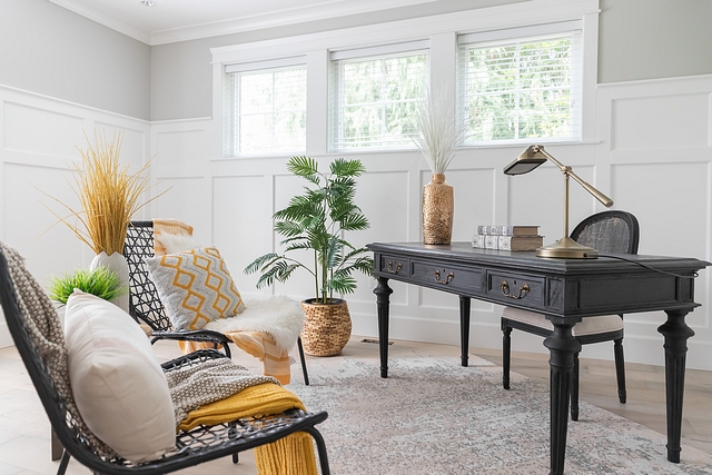
Our office is a beautiful mix of traditional and modern elements that blend perfectly. Our RH partner’s desk adds a sophisticated touch while our chairs add a whimsical and fun flare. These chairs are actually outdoor chairs that I’ve layered with pillows and throws to make them cozy indoor chairs.
Wall Colour – “Sherwin Williams Repose Grey”
Wainscoting Colour – “Sherwin Williams Pure White”
Desk – Restoration Hardware – Others: here, here, here (many colors) & here.
Desk Chair: here – similar
Chairs & Pillows – Homesense
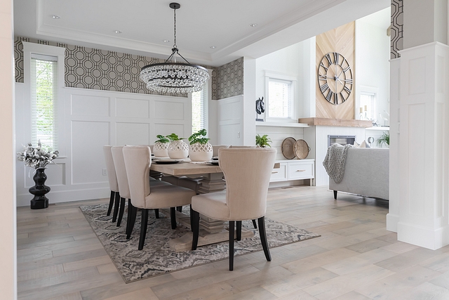
When I saw this Robert Abbey light fixture in a magazine, I knew I had to have it. Knock-offs just wouldn’t do so I splurged and got it! I think the wallpaper compliments the chandelier perfectly.
Chandelier: Robert Abbey
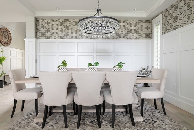
I’ll admit, we don’t use our dining room much and I would contemplate putting one in our next house but it’s a great space to use for entertaining during the holidays and special events. We both come from large families so when we do host, there’s always room!
Wallpaper: Wayfair.
Table – Valley Direct Furniture – similar here.
Dining Chairs: Local Store – similar here – Others: here, here, here, here & here.
Vases – Structube
Faux Leaves – Pier One
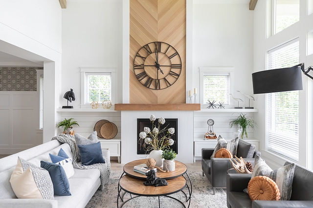
Since the fireplace design is the focal point of our Great Room, I wanted something different than the everyday stone wall, so we bought some 6” tongue and groove cedar and stained the rough-edge backside and installed it in a chevron pattern. The bottom of the fireplace is a textured tile that was originally grey to look like concrete, but it didn’t work well with our warm wood tones, so I painted it white!
Wall Clock – QLiving – similar here.
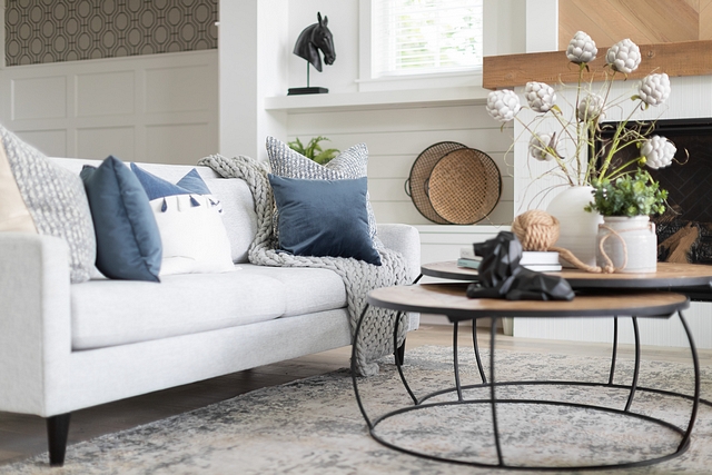
I love playing with textures and layers as you can see from my sofa styling. The oversized knitted blanket and large chopped pillows make this a spot to melt into.
Sofa & Pillows – Valley Direct Furniture – similar Sofa & Velvet Pillows.
Nesting Coffee Tables – here.
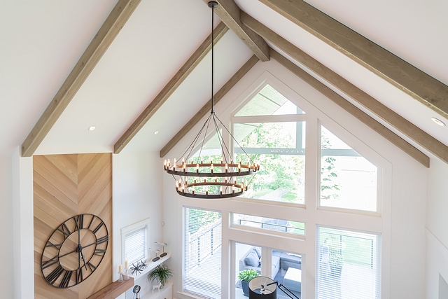
This 50” double tiered Restoration Hardware chandelier was worth every penny! I swapped out the candelabra bulbs for tube shaped bulbs for modernity.
Beautiful Chandeliers: here, here, here, here, here & here.
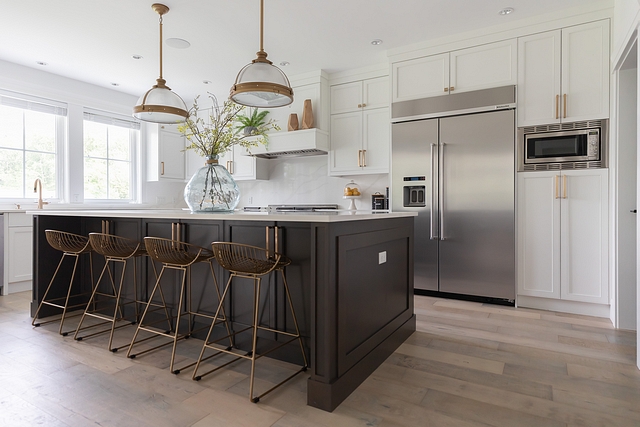
I LOVE our kitchen with our large 5’ x 10’ island, veined quartz countertop and gold accents. Our kids eat breakfast at this island each morning and I am so grateful for the size and prep space it provides! I went with a thinner shaker style on these maple doors and did a flat slab on all the upper drawers for visual interest. We have a good-sized butler’s pantry off to the right which allows me to keep my kitchen clutter-free!
Bar Stools – Wayfair
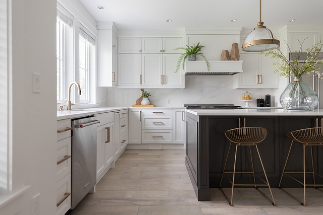
I love the shelf above the hood vent! We opted against open shelving so building our hood vent this way allowed me the option to still do some shelf styling.
Large Glass Vase – Homesense – similar here.
Stems in Vase – Pier One.
Dishwasher: KitchenAid
Faucet: Delta.
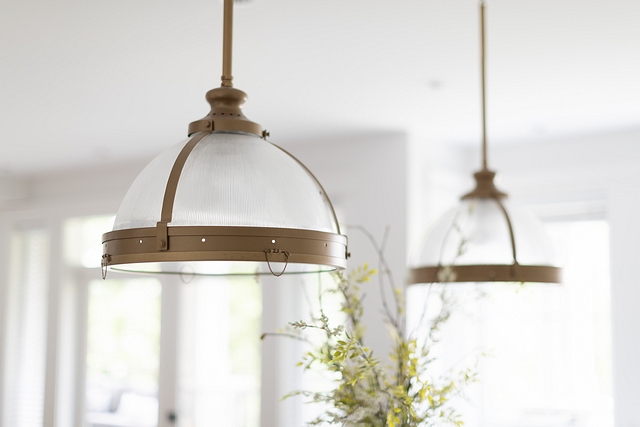
Our oversized 18” island pendant lights are perfect for our 10’ island. I had them custom powder coated to match the hardware.
Lighting – RH – Other Beautiful Lighting: here, here, here, here, here, here, here & here.
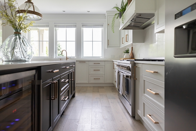
Island Colour – Custom Stain (close to Benjamin Moore Iron Mountain)
Cabinet Colour – Sherwin Williams Pure White
Wine Fridge – Having a wine fridge in the island was a must. Need I say more?
Wine Fridge – Vinopro
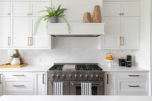
The hot topic here is our 48” dual fuel range! 6 burner gas cook top with a griddle and double electric ovens beneath. The best part is we found this range at Costco for a fraction of the price of a Wolf and have no complaints!
Range: Thor Kitchen Range
Hardware – Richelieu Transitional Metal Pull Champagne Bronze.
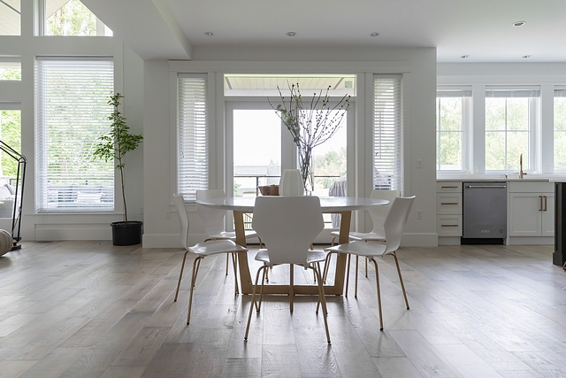
With having 4 kids I knew I wanted a round marble tabletop but couldn’t find one large enough within my budget. So, I found a 60” marble tabletop at a Restoration Hardware Outlet in Vancouver and had the metal base custom made then spray painted it gold! Voila, my design breathed into life and at a fraction of the cost.
Similar Dining Tables: here & here – rectangular
Chairs – Wayfair
Metal Base – Xtreme EffeX
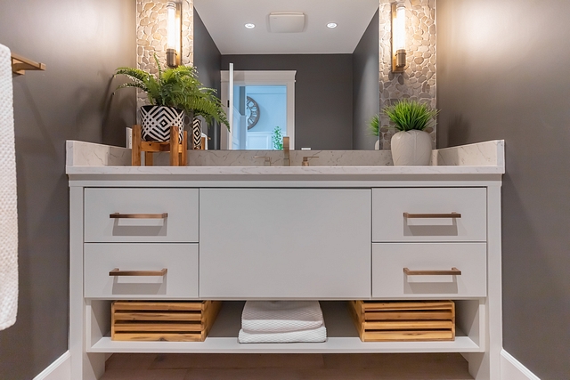
I kept most of our house light and bright but played with a moody tone in the powder room. Our gold “lightsaber-like” wall sconces are paired with our gold faucet. I even went as far as having our towel bar and TP holder powder coated in gold to match!
Vanity Colour – Benjamin Moore Silver Song
Wall Colour – Benjamin Moore Iron Mountain
Vanity – Custom – similar here.
Faucet – Delta
Sconces – Wayfair
Hardware – here – similar
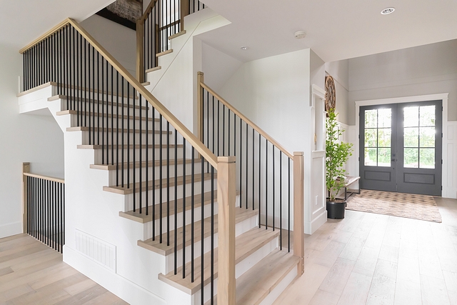
Instead of carpet I opted for hardwood stairs with white risers. I shifted away from the thick and heavy spindles and selected thin rails and posts. These white oak posts are only 4” wide.
Flooring (European White Oak) – Dansk Mount Shasta Collection “Frost” – similar here.
Handrail Stain – Sansin Silver Birch.
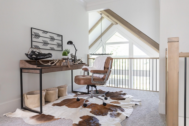
I love the rustic feel here with the beams and cowhide rug!
Rug, Desk & Chair – Valley Direct Furniture – similar: Rug, Desk & Chair.
Black Croc Head, Plant, and basket decor – QLiving.
Wall Art – Design Lighting – Other Beautiful Artwork: here & here.
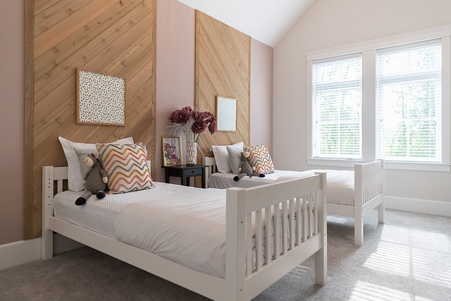
Our two girls share a room and they requested a pink wall! We added diagonal tongue and grove cedar feature panels above each bed to make the illusion of a larger headboard.
Wall Colour – “Benjamin Moore Driftscape Tan” (It’s pink)
Feature Wall Stain – Sansin Silver Birch
Artwork: here & here – similar
Beds: here – similar
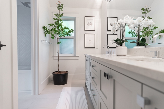
I put a lot of thought into designing our kids’ bathroom cabinet. The pull-out drawers on the bottom function as footstools for the kids!
Cabinet Colour – “Benjamin Moore Silver Song”
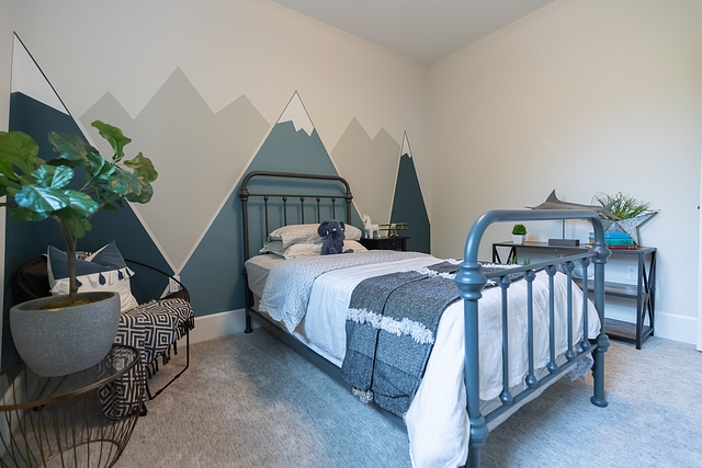
I created a mountain mural wall for our 3 year old son. It took me 20 mins to tape and prep this mural plus an hour and a half to paint!
Wall Colours – “Benjamin Moore Newburg Green”, “Benjamin Moore Classic Grey” and “Sherwin Williams Repose Grey”.
Bed – Wayfair
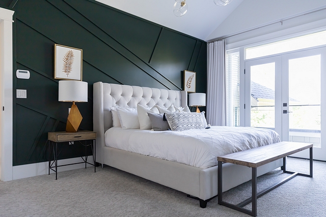
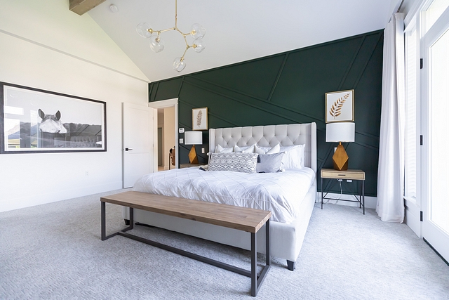
Our master bedroom feature wall, with its vertical slats and moody jewel toned colour, makes me smile every time I see it.
Dark Wall Colour – “Benjamin Moore Essex Green”
Light Wall Colour – “Sherwin Williams Pure White”
Bed: here – similar
Bedding: here – similar
Beuatiful Nighstands: here, here, here, here & here.
Bench: here – similar
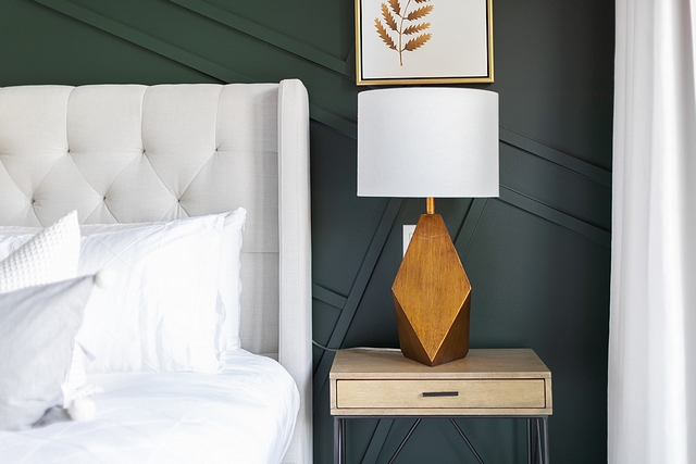
The gold lamps and art give contrast to our “Essex Green by Benjamin Moore” wall. Huge thank you to Langley Decorating Centre for supplying the Benjamin Moore paint for this fun project!
Lamps: here – similar
When we built our house the trend towards natural wood tones was just emerging but I thought I’d give it a try on our master vanity and I’m so happy I did. Our shower glass seamlessly leads into the frosted glass of the toilet room. We went open concept on this bathroom…no doors!
Chandelier: here.
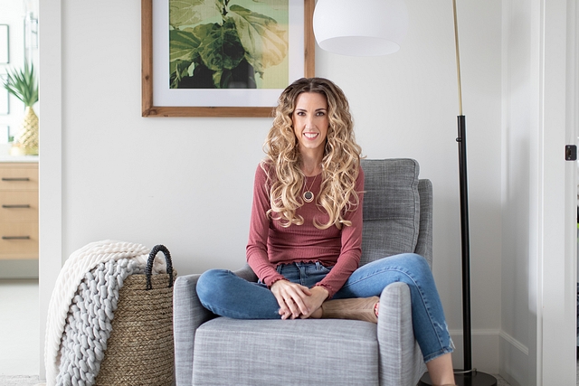
We have this little corner of the bedroom where I like to lounge and read. Kidding…I don’t have time with four kids!
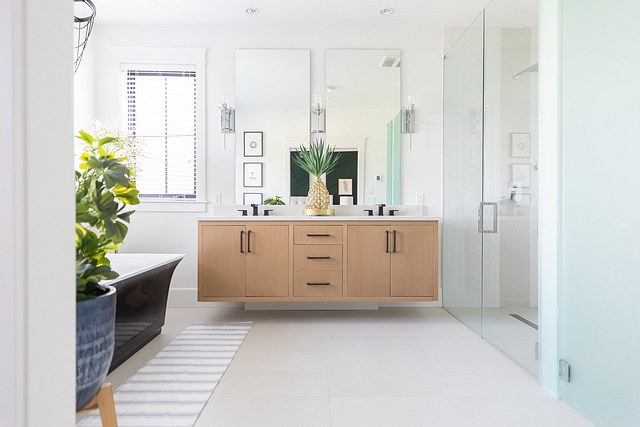
The custom floating vanity and the curb-less shower bring a sleek feel to this spa-like bathroom.
Beautiful Vanities: here, here, here & here.
Sconces: Wayfair.
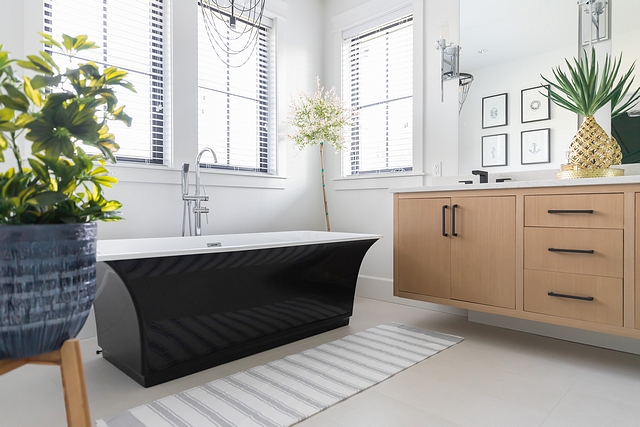
I kept our tile floors simple so that our black bathtub and vanity could be the focal points. While we don’t often use our tub, it’s a beautiful sight to look at!
Tub – Costco – similar here.
Bathmat – Homesense.
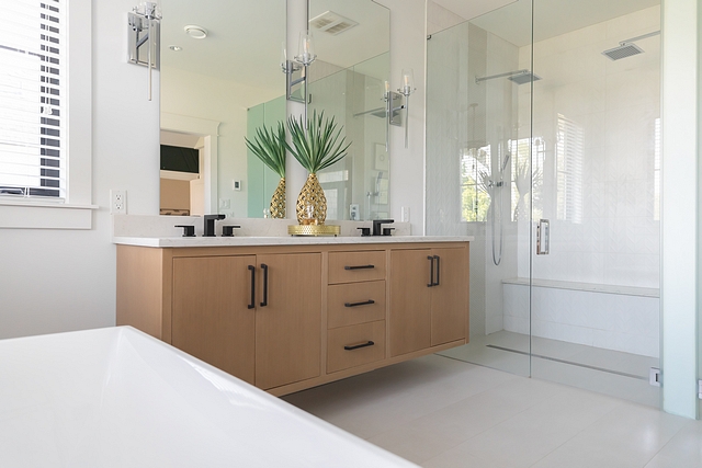
Take a closer look at our shower and you’ll see the simple yet gorgeously textured white chevron tiles paired with grey penny tiles. Double shower heads were a must.
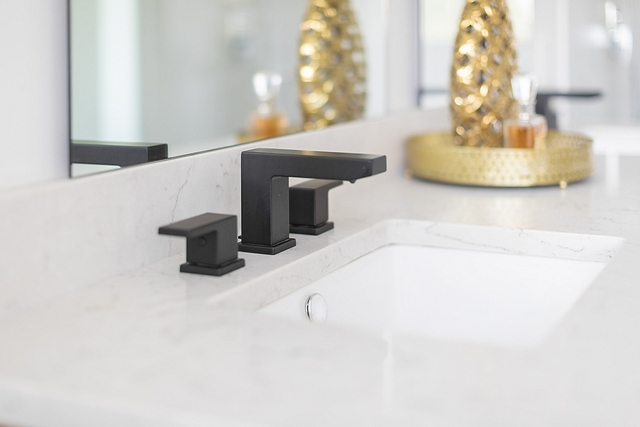
These bold black vanity faucets tie in nicely with the black hardware and tub!
Faucets – Wayfair
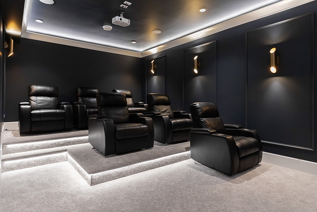
I have to admit; this is a pretty cool room with its 3-tiered seating and 120” screen! Our brass wall sconces compliment our navy blue walls and ceiling.
Wall Colour – “Benjamin Moore Hale Navy”
Power Recliners – Costco Abbie Black Top-grain Leather Media Power Recliner – similar here, here, here.
Sconces: here – similar.
Projector – Amazon
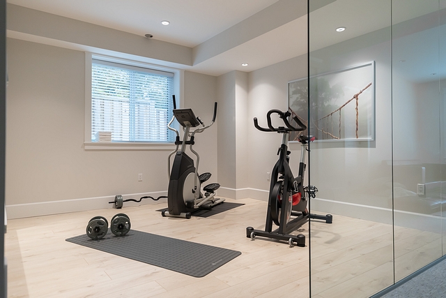
The first question people ask when they see this room is, “do you actually use your gym?” Why yes, yes we do! We added 3 large glass panels, so this room doesn’t feel closed off from the rest of the basement.
Artwork: Ikea, BJÖRKSTA Picture, Jungle Journey.
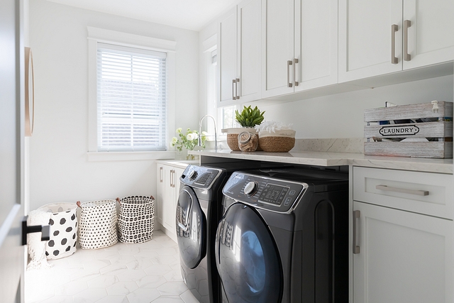
Marble hex flooring adds character to our laundry room.
Marble Hex Tile: Local store – similar here.
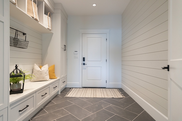
Dark large-scale herringbone floors with light grout distract from the dirt that is ever-present in our mud room. Believe it or not, the kids actually do use these shoe drawers so the mud room stays decently organized! Shiplap on both sides for fun!
Cabinet Colour – “Benjamin Moore Classic Gray”
Tile Flooring – 12” x 24” Black Slate
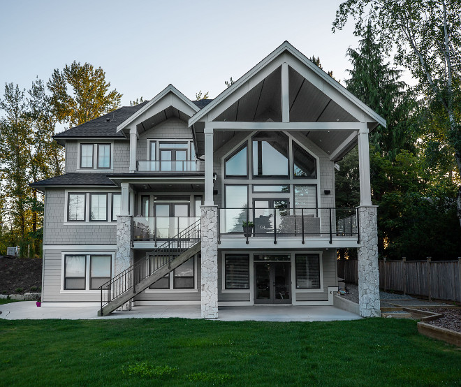
I don’t know what’s more impressive, the front or the back! We love the classy look of the black windows and the impressive size of our 17’ x 33’ deck. Our East facing lot also allows for some beautiful sunrises through our master deck in the mornings.
Windows – Morrison Windows Ltd.
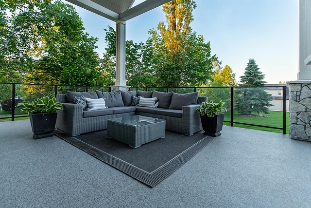
The beauty that surrounds us is all the decor I need in this space!
Outdoor Furniture: here – similar
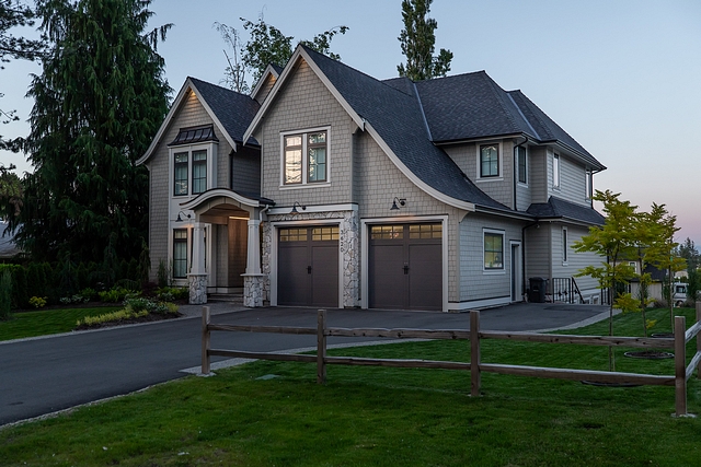
I just love the sloped roof!
Thank you for stopping by and checking out our home!
Photography – White Cloud Productions.
Architect – Su Casa Design.
Thank you for shopping through Home Bunch. I would be happy to assist you if you have any questions or are looking for something in particular. Feel free to contact me and always make sure to check dimensions before ordering. Happy shopping!
Wayfair: Up to 70% OFF – Clearance!!!
Serena & Lily: Up to 30% Off on Bedding & Beds!
Joss & Main: Warehouse Clearout – Up to 70% off!
Pottery Barn: Huge Sale! Save Up to 75% Off!
One Kings Lane: High Quality Design Decor for Less.
West Elm: Up to 70% off clearance!!!
Anthropologie: See the super-popular Joanna Gaines Exclusive line!
Urban Outfitters: Hip & Affordable Home Decor.
Horchow: High Quality Furniture and Decor. Up to 30% off the entire site!
Nordstrom: Up to 40% OFF. New Decor!
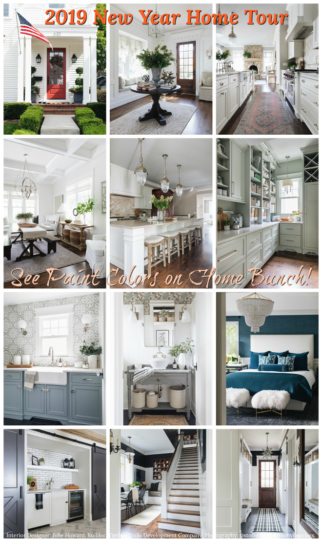 2019 New Year Home Tour.
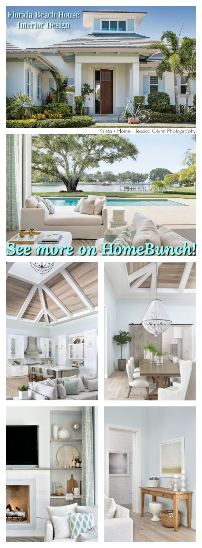 Florida Beach House Interior Design.
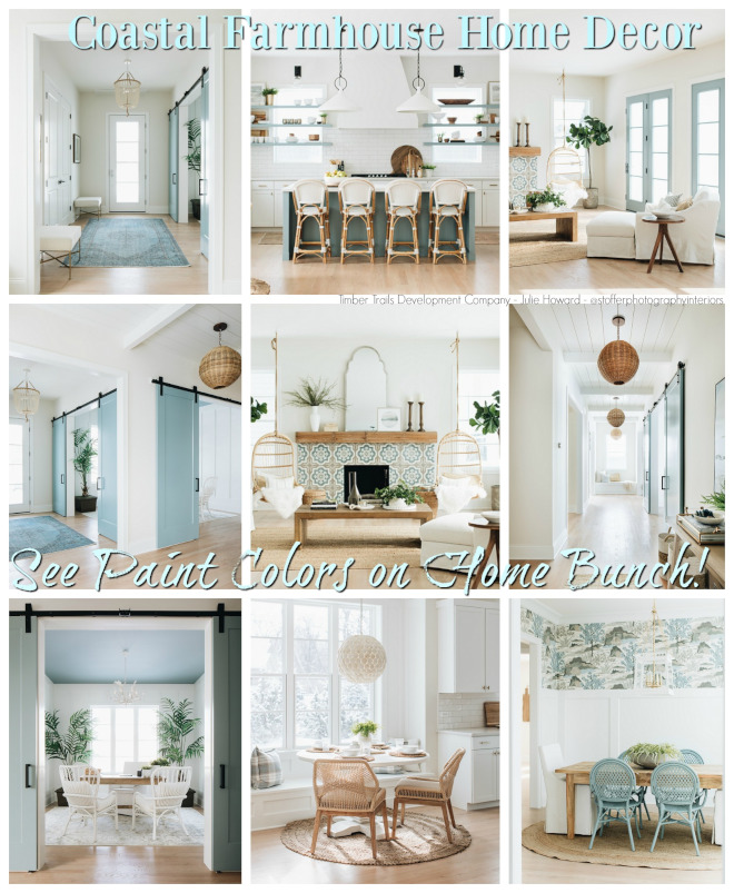 Coastal Farmhouse Home Decor.
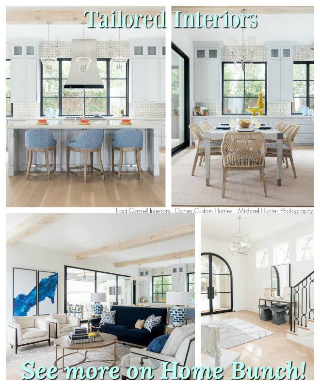 Tailored Interiors.
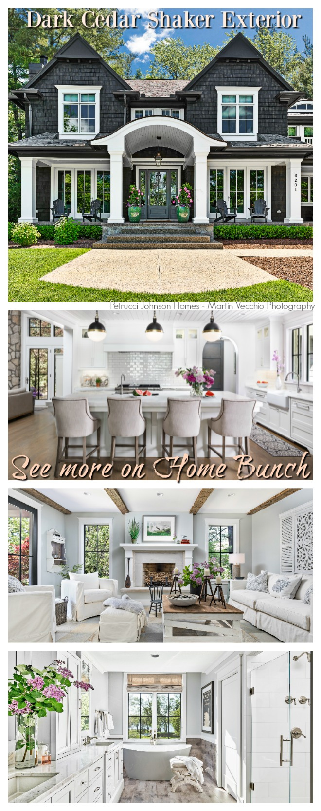 Dark Cedar Shaker Exterior.
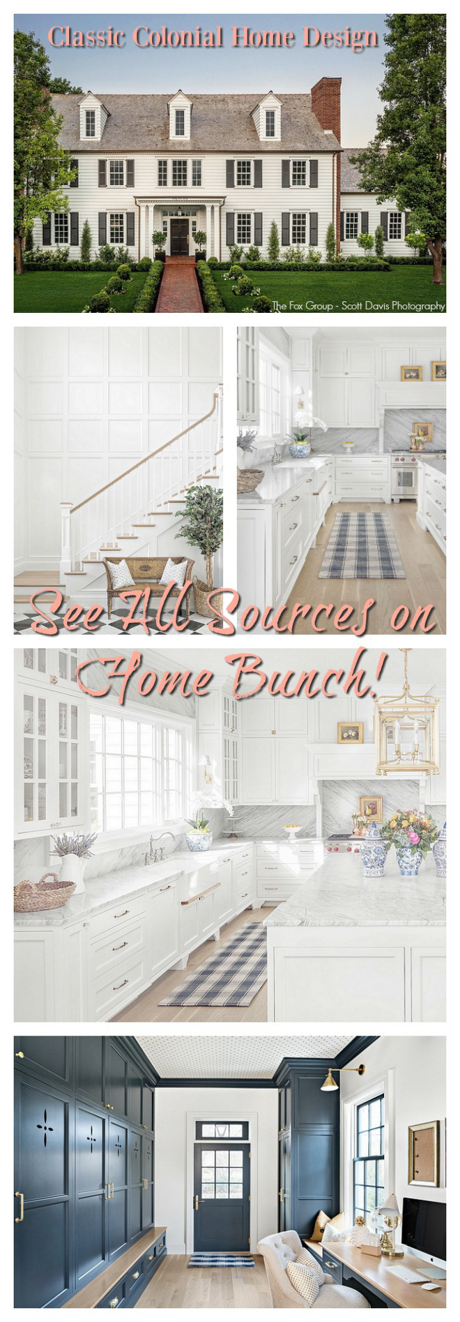 Classic Colonial Home Design.
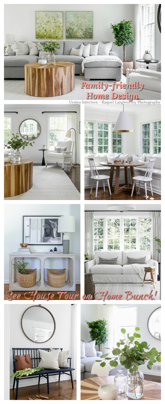 Family-friendly Home Design.
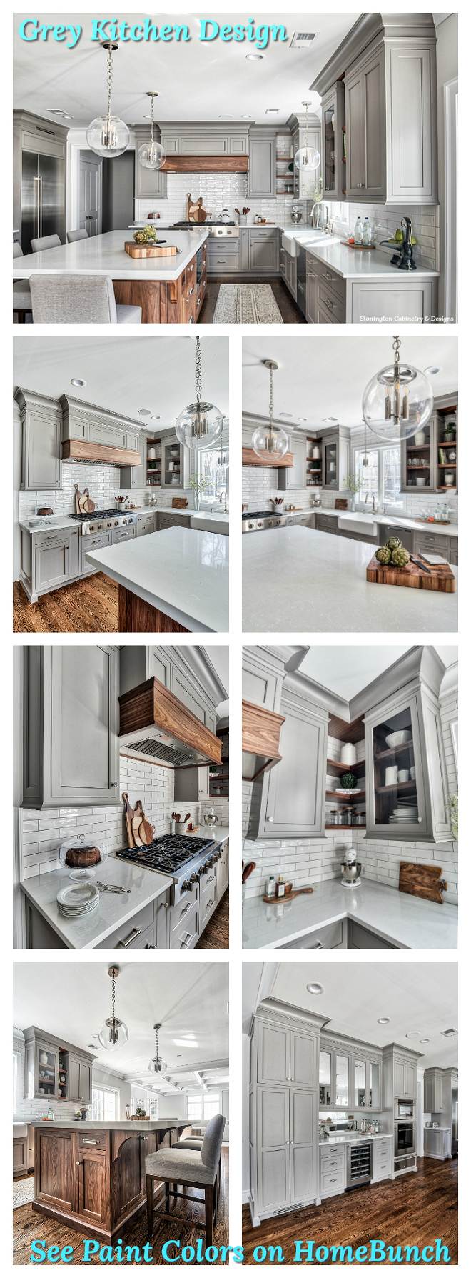 Grey Kitchen Paint Colors.
“Dear God,
If I am wrong, right me. If I am lost, guide me. If I start to give-up, keep me going.
Lead me in Light and Love”.
Have a wonderful day, my friends and we’ll talk again tomorrow.”
with Love,
Luciane from HomeBunch.com
Get Home Bunch Posts Via Email ![]()
“For your shopping convenience, this post might contain links to retailers where you can purchase the products (or similar) featured. I make a small commission if you use these links to make your purchase so thank you for your support!”
Subscribe to get Home Bunch Posts Via Email
Beautiful! Thanks so much for sharing.