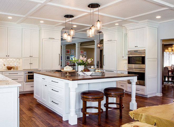
Creating a kitchen design is not as simple as many imagine. You need to take in consideration many aspects, including the overall space you have. Different spaces require different layouts. You can have a u-shaped, l-shaped, galley designs and you can’t forget the layout for the islands, peninsulas and, most importantly, the work triangles. A work triangle, as you probably know, is the range, sink and refrigerator and it should always feel connected for an easy flow in the kitchen.
This large kitchen, designed by Karr Bick Kitchen and Bath, shares great ideas for cabinet, island and appliance layout. Make sure to look carefully at where these elements were placed and take notes on the sources.
I hope you enjoy it!

This U-shape kitchen provides a massive expanse of counter and storage space as well as great flexibility.
In this kitchen, the cooktop was placed on the island.
Kitchen Lighting
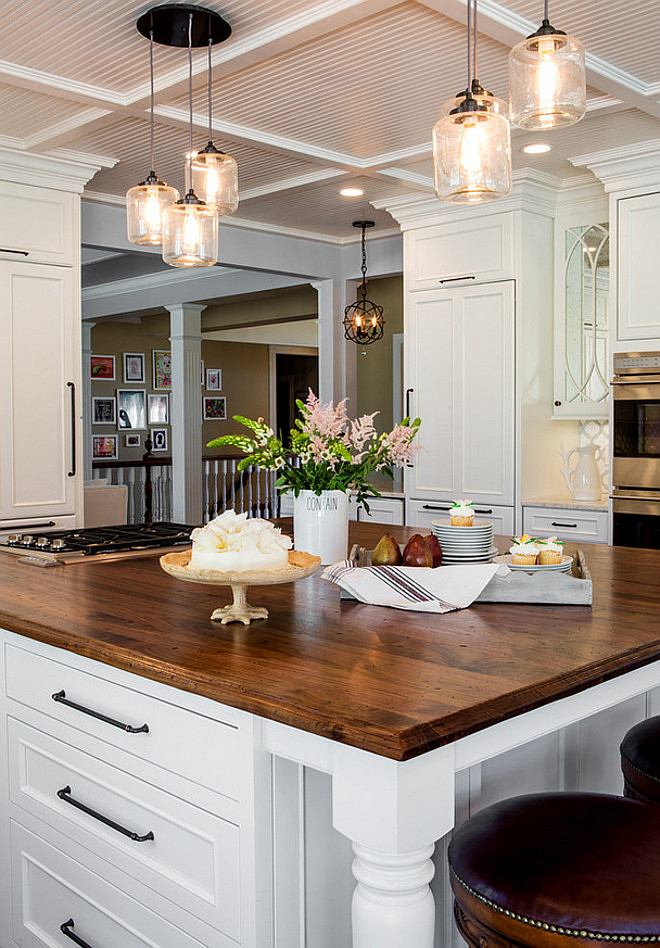
The glass jar filament pendants above the island are 3-Jar Glass Chandelier from West Elm – $249 each.
Fridge
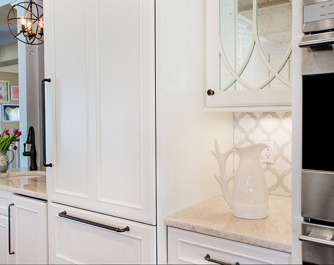
If you look at the first picture, you will notice that this kitchen has two fridges. One is located in front of the cooktop and the second one is the one we see above, flanked by the kitchen bar and the ovens.
Kitchen hardware are Top Knobs, Chareau Collection in an Umbrio finish.
Kitchen Bar
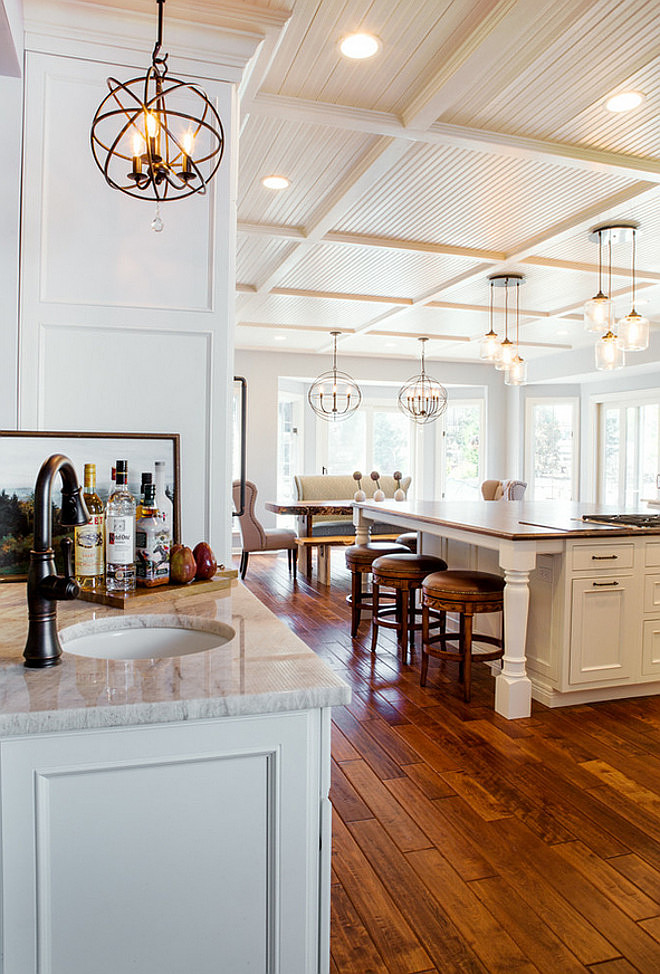
A kitchen bar was strategically placed on the corner of the kitchen, where can easily be accessed from the dining room. This space is perfect to prepare drinks or your daily coffee.
Notice in this picture, that the kitchen island offers seating space for three stools on this side and two more in front of the island. You can also see the dining area in this picture.
Island Countertop
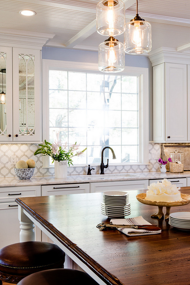
The butcher’s block island countertop is Wood Countertop Species by Craft Art.
Sink is placed under a large window flanked by lower and upper cabinets.
Backsplash
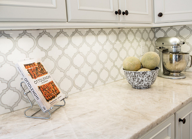
The kitchen backsplash tile is Artistic Tile Toledo Lucido Glass and Stone Water Jet Mosaic.
Perimeter Countertop
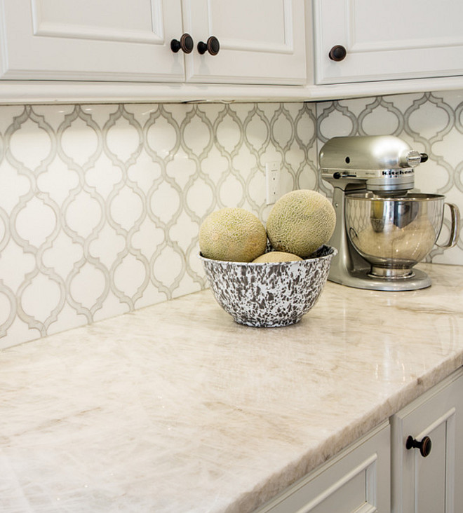
Countertop is Iceberg Quartzite – a strong and timeless white stone.
Kitchen Cabinet

These cabinets are from Mouser Custom Cabinetry and are an Andorra door style with Linen painted finish.
Dining Area
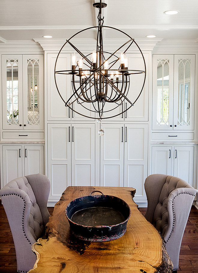
A large table in the dining area not only emphasizes space but also creates a delineation between the kitchen and dining spots.
Lighting is Foucaults Twin-Orb Iron Chandelier from Restoration Hardware.
Sources: Karr Bick Kitchen and Bath. Denash Photography.
Thank you for shopping through Home Bunch. For your shopping convenience, this post may contain AFFILIATE LINKS to retailers where you can purchase the products (or similar) featured. I make a small commission if you use these links to make your purchase, at no extra cost to you, so thank you for your support. I would be happy to assist you if you have any questions or are looking for something in particular. Feel free to contact me and always make sure to check dimensions before ordering. Happy shopping!
Wayfair: Up to 75% OFF on Furniture and Decor!!!
Serena & Lily: Enjoy 30 to 70% OFF on Sale Styles!
Joss & Main: End-of-Decade Dash Sale!
Pottery Barn: Buy More, Save More Sale + Free Shipping.
West Elm: End of Season Sale – Up to 75% Off.
Anthropologie: Extra 40% off Sale Items!
Nordstrom: Save Up to 50% Off!
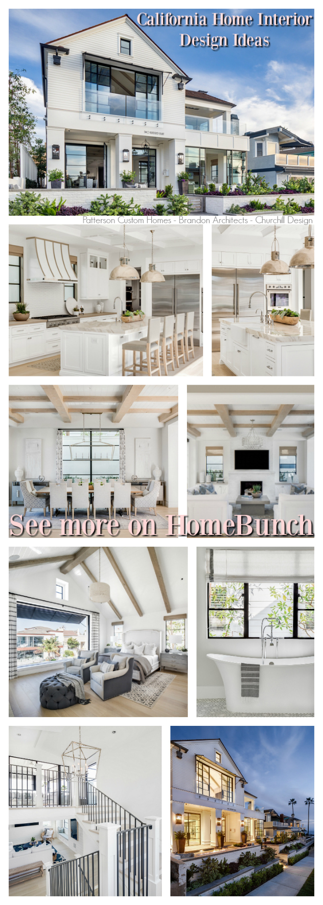 California Home Interior Design Ideas.

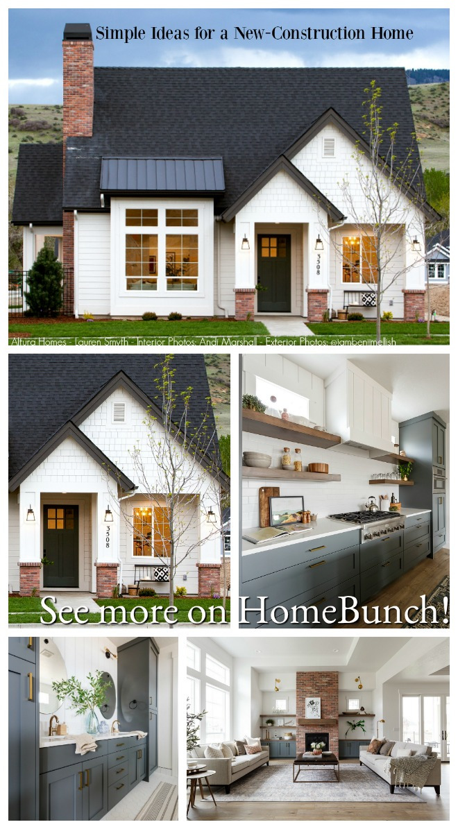 Simple Ideas for a New-Construction Home.
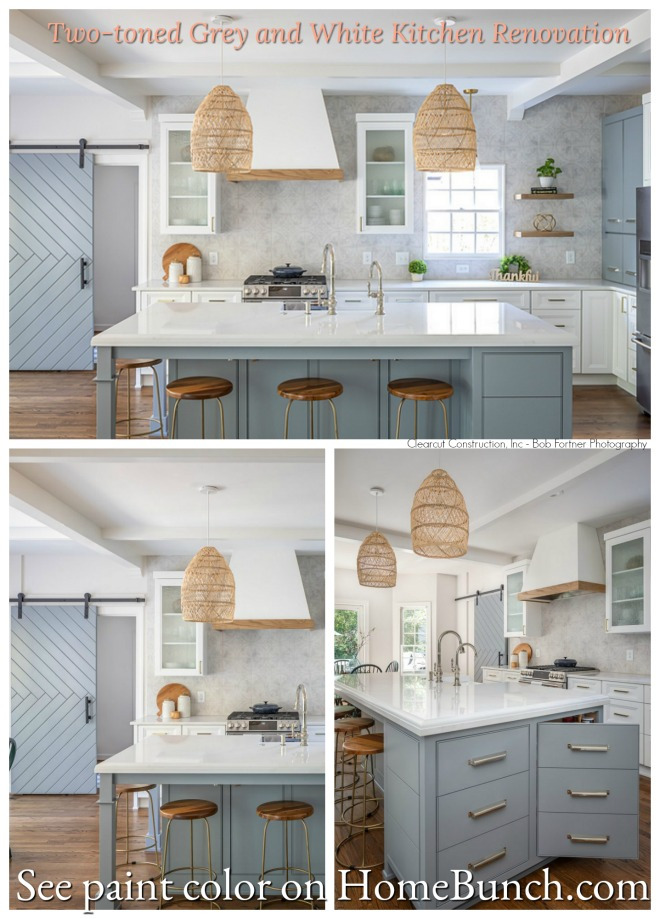
 Open and Airy Townhouse Design.
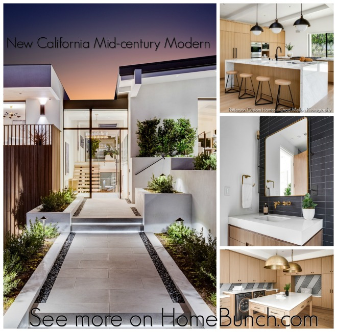
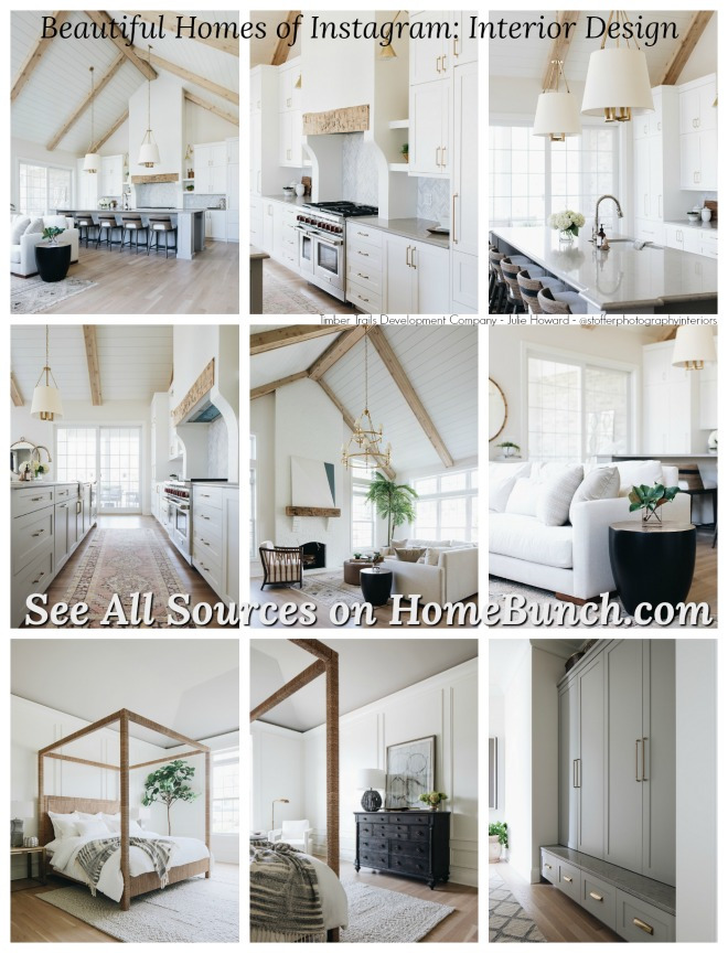
 Beautiful Homes of Instagram: Modern Farmhouse.
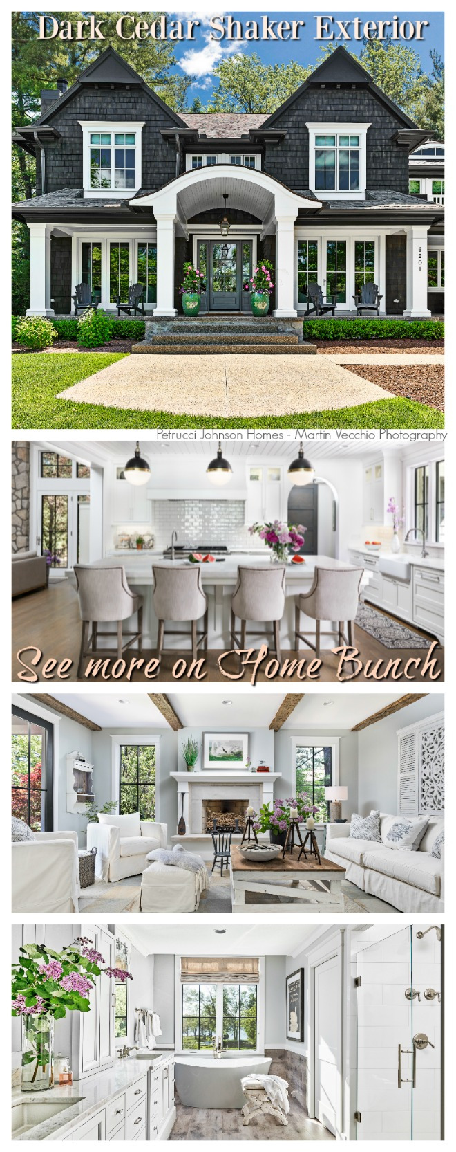 Dark Cedar Shaker Exterior.
“Dear God,
If I am wrong, right me. If I am lost, guide me. If I start to give-up, keep me going.
Lead me in Light and Love”.
Have a wonderful day, my friends and we’ll talk again tomorrow.”
with Love,
Luciane from HomeBunch.com
Subscribe to get Home Bunch Posts Via Email
This is a beautiful kitchen. I love the colors and the contrasts between the counters, cabinets, and the flooring. What type of floors are they? Do they have a specific color name?
Thank you for your time and sharing.
This kitchen is simply lovely, Luciane. Tons of inspiration. I especially like the look of the mirrored upper cabinetry. I already obsess about enough things when company is coming over. I’d rather not worry about whether my cabinets with glass doors are orderly and presentable enough for guests. The mirrors offer an interesting and beautiful alternative.
On the kitchen tile, Toledo Lucido, the pattern looks really plain compared to the sample picture which shows calacatta gold polished stone. Is this kitchen tile a simpler version of the Toledo Lucido?