Hello, my wonderful friends! How are you doing? I hope you and yours are feeling great, are healthy and have some beautiful plans for this week that is just starting.
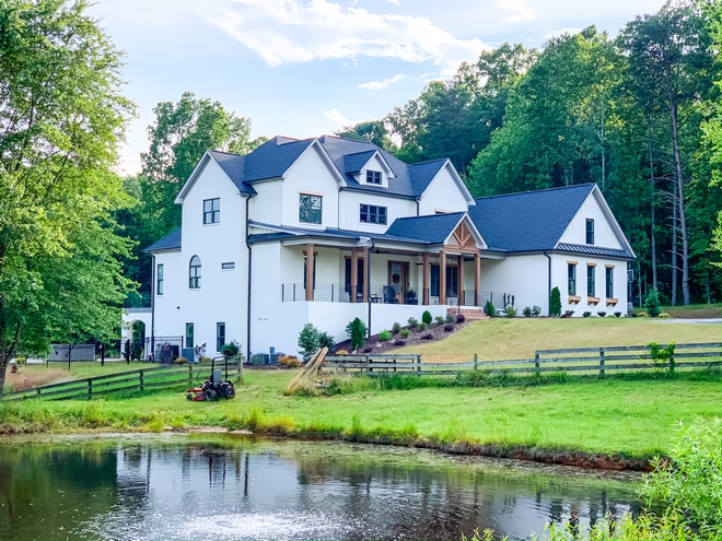
It’s really great to share Kristin’s home of @home_on_providence_hill on our “Beautiful Homes of Instagram” series. Her home is inspiring and it feels truly like a home – not a staged museum; something so common to find these days. The fun part of this series, I find, is to showcase how real homeowners design their own space. I think that allows us to feel more comfortable and less afraid to create a place where we feel really at home, that truly belongs to us.
Keep reading to know more about this inspiring homeowner. I am sure you will love to read all of the insights she’s sharing!
“Hi everyone! I’m Kristin from @home_on_providence_hill.
For as long as I can remember, I’ve always dreamed of designing my own home. I still have some sketches I saved in a folder from when I was about 10 years old! I dabbled with the idea of becoming an architect until I realized I really just wanted to design my own home, not everyone else’s!
Soon after my husband and I married, we purchased a spec house in a sweet, rural town just outside of Greensboro, NC that we grew to love. We settled in that house and our 3 babies were born while we lived there. As the kids grew we were constantly changing things, adding on small features and rearranging rooms to fit each stage in our family’s life. When our 3rd child arrived, we even moved out of our adorable, larger first-floor master bedroom and converted it into a playroom for a few years. We took a smaller bonus room (without an attached bath) upstairs and remained there until we moved several years later.
We lived in that home for 12 years and there were many things we loved about its layout, and a few other things we wished we could change… there was no basement and the kitchen felt cold, dark and stuffy. We paid for architectural plans to remodel so that we could evaluate whether to add-on or start over on a new-construction. We enjoyed living in our neighborhood and had amazing neighbors, but my husband started dreaming about land and wide open spaces, and praying I would come to have the same desires! At the same time I never stopped dreaming of my own home designs which I had been constantly sketching in my head. For years I filed away magazine pages of home features I loved and when the world became digital, I sprang into the Pinterest world and it became my new design idea filing system.
After years of dreaming, praying, and searching we found land we loved and purchased it. For the next couple years we planned and designed our home and developed the land just a bit. My childhood dream of building a home became a reality and in March of 2019 we broke ground! I thought it would be fun to document our building journey for our own memories so I started an Instagram Account @Home_On_Providence_Hill soon after we purchased our land and I came to love the IG home building & decor community! I learned from what others shared, borrowed great ideas, and made meaningful connections and friendships in the process. I treasured every moment of our building journey, and it was such a joy to share each step of the process and what I was learning along the way! We finished building in December of 2019 and moved in just before Christmas. And even with 2020 being a wild year to remember for all the wrong reasons, we have felt richly blessed to be settled-in, and making this new house our home.”
Pin your favorite home ideas!!!

Kristin’s home is a place where you can easily see a real family living in and enjoying life. The home itself is surrounded by nature and feels private and serene.
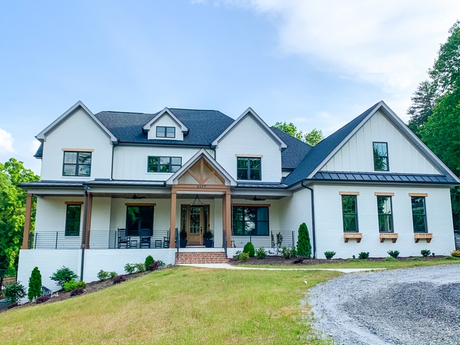
In North Carolina brick is super affordable so it was never an option of ours to consider any other exterior for our home. We loved the idea of having a white colored house, but light mortar is super expensive! We found it more affordable to go with a basic brick & mortar and paint it!
Windows: Ply Gem Bronze.
Gutters: Bronze.
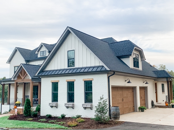
I added character with cedar planks above the windows and cute window boxes on the garage!
Cedar above windows- clear coat.
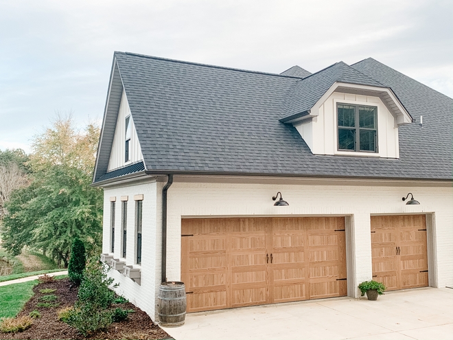
Shingles: Landmark Miore Black.
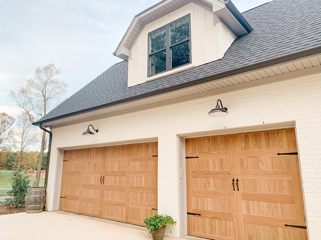
I really wanted the look of wood garage doors but didn’t want the maintenance (or cost!) I loved our C.H.I doors that are stamped to look like wood! We went with carriage house style in “Natural Oak”.
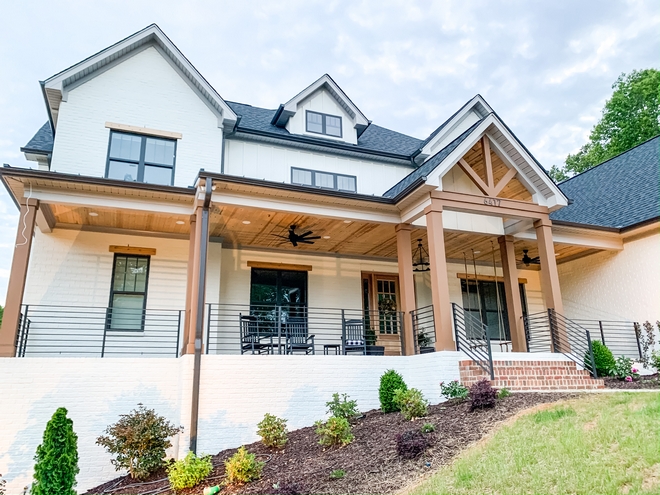
I compared several whites and fell in love with Sherwin Williams Dover White! We added a partial gray metal roof for character and chose Sherwin Williams SW4019 Flint Gray for our soffits and trim. I brought in bronze gutters to compliment the bronze windows.
Exterior: Brick, General Shale Wake Manor Painted Sherwin Williams Dover White.
Soffit/Trim: Sherwin Williams SW4019 Flint Gray.
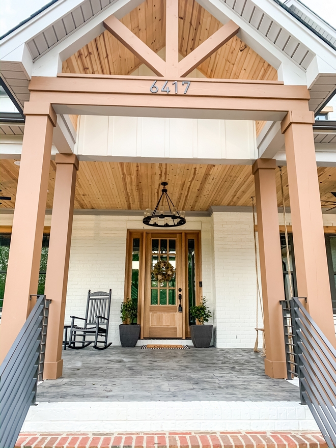
We used Pine beams for the front (which are more durable then cedar), but they don’t take a stain well unless it’s a paint stain so we chose one called Jute Brown.
Front Posts: Jute Brown SW 6096 by Sherwin-Williams in the Hellman’s clear semi-gloss.
Lighting: here & here – similar.
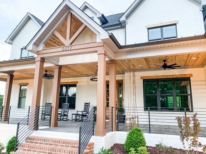
Front Porch: I wanted to be thoughtful in our porch design, adding plenty of space for outdoor living. We made the porch extra deep and wide.
Fan: Fanimation- Levon Custom all-black in 52” (black motor and blades).
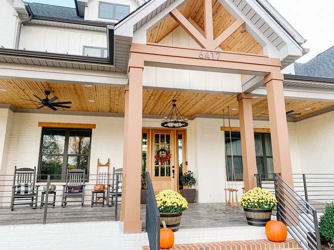
We went with stamped concrete for the front porch and left some brick unpainted for the steps.
Flooring: Stamped Concrete.
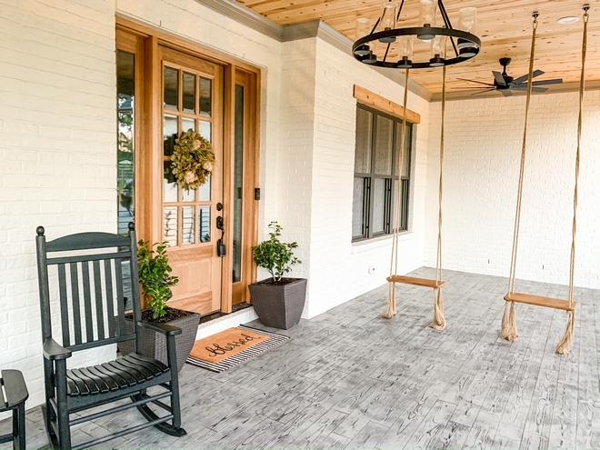
I did a lot of research on rockers and loved the ones I found from Polywood because they are maintenance free! The two porch swings have been a great feature! My kids (and me!) are constantly going out there throughout the day to swing!
Porch Swings: Etsy Store.
Furniture: Polywood Jefferson Rocker – similar here, here, here & here.
Doormats: Black & White & “Blessed” Doormat – similar.
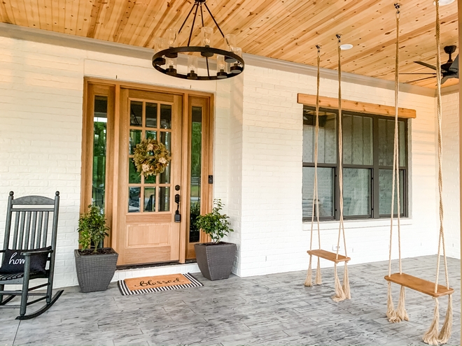
Front door is from Cardinal Millworks, Pine. Wood stain is Minwax 71009 1G Cherry 235 Stain 524 VOC.
Entry Door Set: Kwikset.
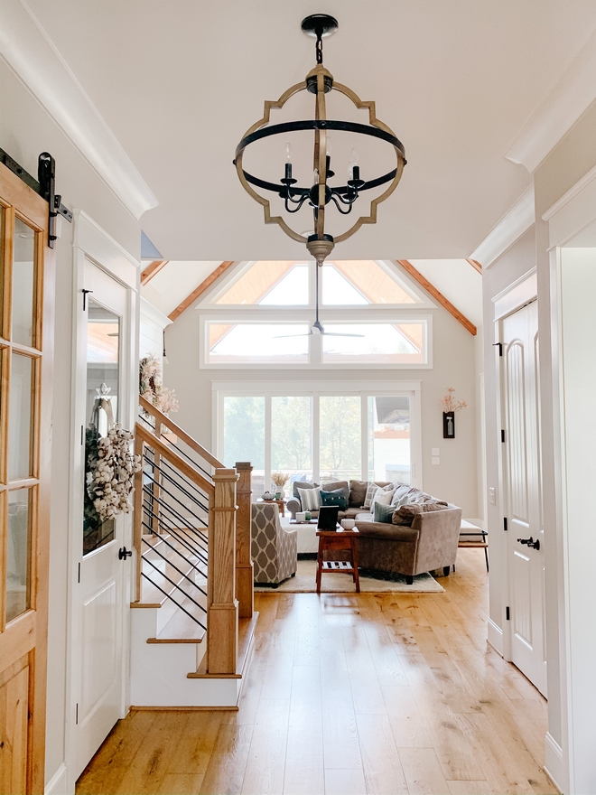
Front Door Entry: I really wanted to incorporate character in our home and a great way to do that is with unique doors! We have 3 doors in our front entry but they are all unique! The sliding barn door was a perfect fit for my office. (In our previous home we had French doors on my office). I like to keep that door open most of the time so it adds for a design feature, but it’s easy to close when I need to make it a quiet workspace. The white door with glass leads to our basement. Across from that door is our hall closet. I wanted glass on the basement door so it was easy for guests to know where the basement was without opening our closet doors.
Lighting: Wayfair.
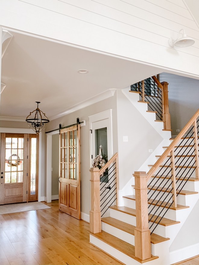
I wanted a great vaulted ceiling but I did not want it open to the upstairs. I didn’t want sound (and air) to travel upstairs. So to ease that we put a wall on the upstairs side. With such a big blank wall space in the family room I wanted to add some character. I love how the shiplap and lights transformed the space.
Hardwood Flooring: 7.5” White Oak, stain color: Minwax Weathered Oak 270.
Barn Door: Custom – Others: here, here, here & here.
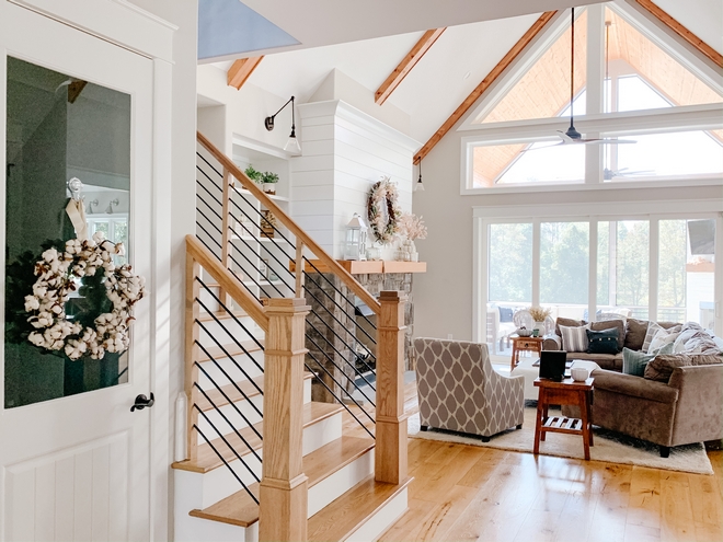
Family Room: My vision for our family room was a vaulted ceiling with lots of windows and a clear view of the backyard. In our previous home the fireplace blocked our view, so in this home I moved it to the side. Our screened-in porch follows the same vault line with high windows. Our doors slide open wide to make the outdoor space part of the inside and the room opens into our kitchen as well which makes it one great living space.
Cotton Wreath: here – similar.
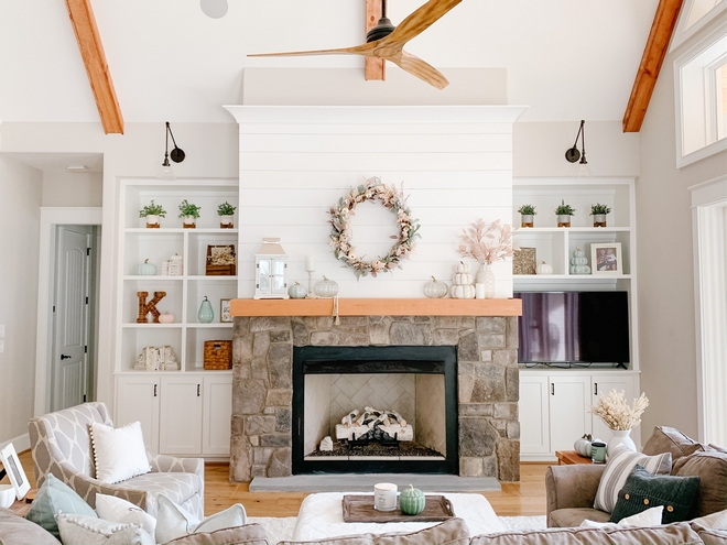
On the hubby’s wish list for this room was a huge fireplace. My request was for the TV off to the side. I wanted to have open shelves but also closed shelves below for storage.
Chair: West Elm.
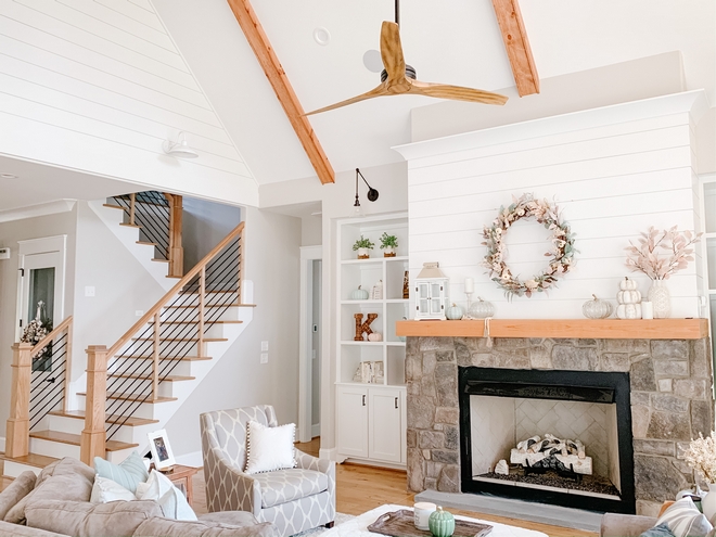
All interior trim is Sherwin Williams Extra White.
Lights in walkway: Quarom international white.
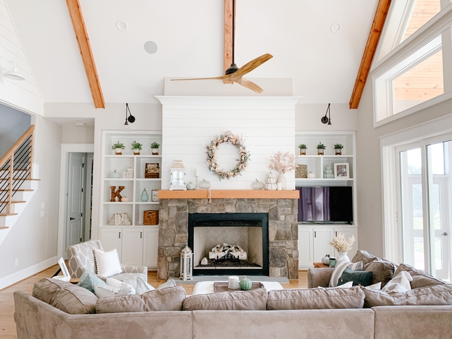
Sofa: Havertys – similar here – Other Best Sellers: here, here, here, here, here & here.
(Scroll to see more)
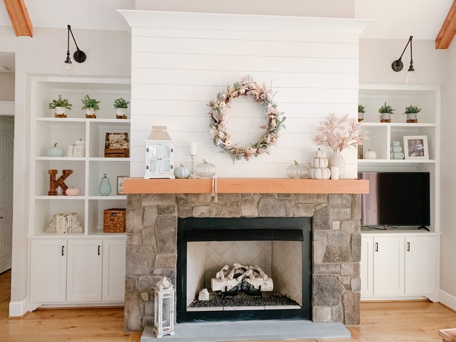
Fireplace: Sharp Stone: Cultured Stone, Refined to No End – Palisades – Ancient Villa Ledgestone Go with light gray mortar.
Wreath: DIY project – Other Beautiful Options: here, here, here, here & here.
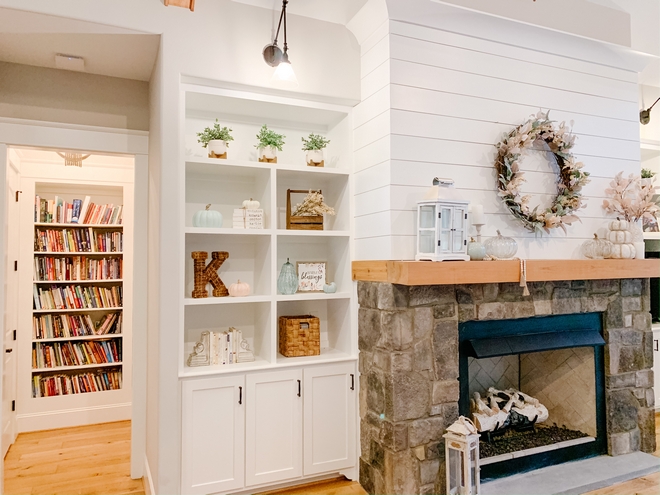
Sconces: here.
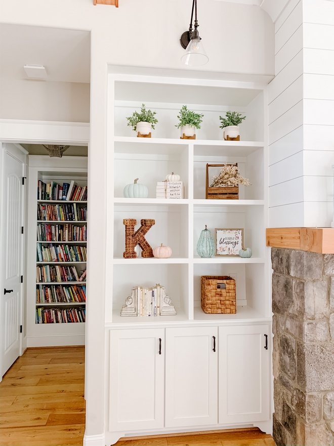
Cabinets flanking the stone fireplace are in Sherwin Williams Extra White.
Cabinet Hardware: here – similar.
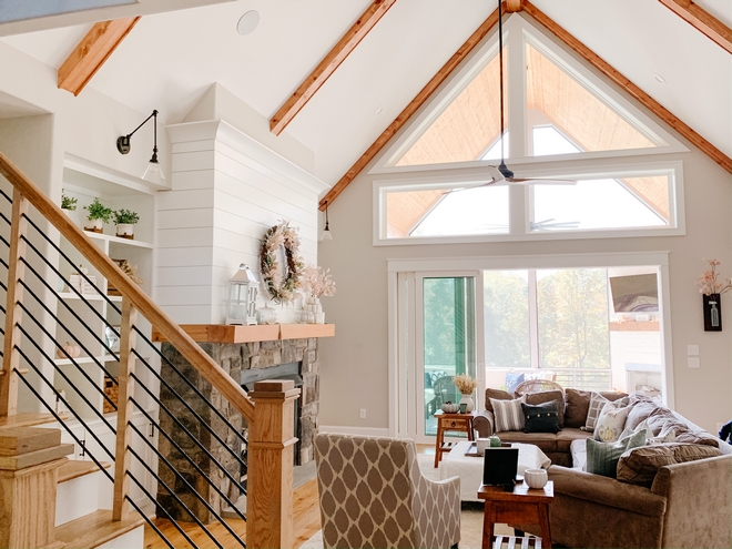
Walls are in Sherwin Williams Agreeable Gray.
Beams: Pine in Minwax Cherry 235.
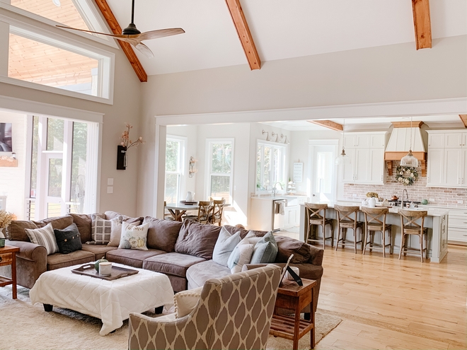
We love having an open floor plan. Our Family Room flows into our Kitchen. Behind my kitchen is our Laundry Room.
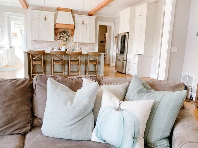
Pumpkin Pillow: here.
Pompom Pillows: here.
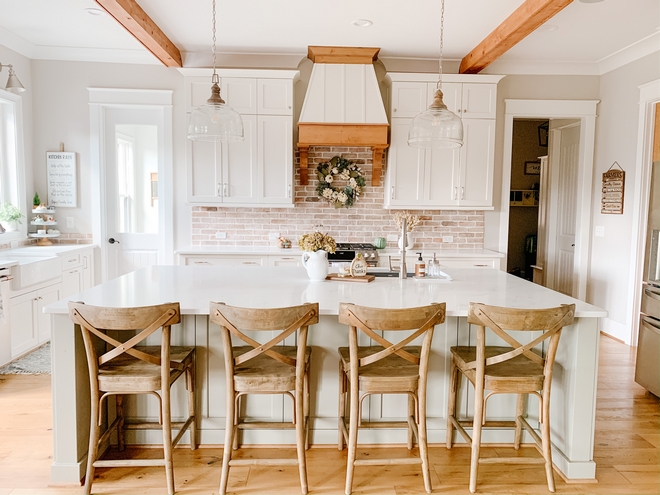
Kitchen: Many people kept telling me I would regret the placement and would want my sink and dishwasher in my island, but I was set on my vision. (I also didn’t like the idea of piled up dirty dishes on my island!) And when we have guests I wanted to be able to push the dirty dishes out of the way and enjoy my guests and do the dishes later! I don’t regret a thing! (We did put another sink in the island as well to be close to the stove and fridge.)
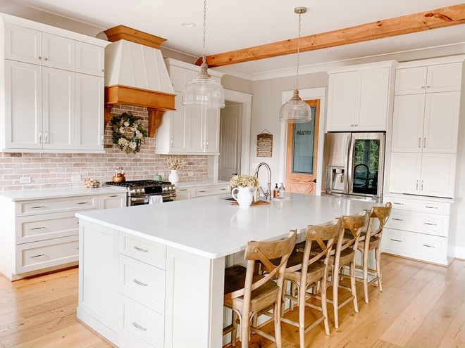
Island Pendants: Capital Lighting – similar here – Others: here, here, here, here, here, here & here.
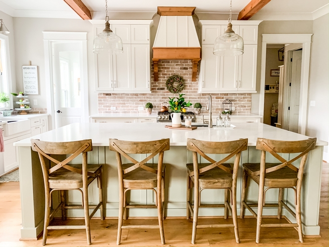
Wall Paint Color: Sherwin Williams Agreeable Gray.
Counterstools: World Market – Other Popular Choices: here, here, here, here, here, here, here, here, here, here & here.
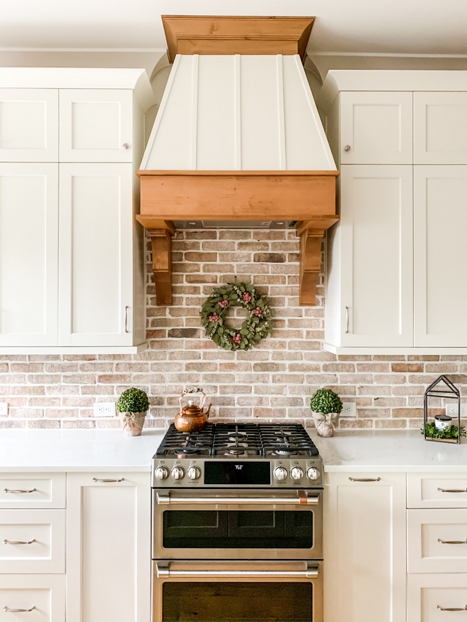
One of the first design elements I envisioned in my kitchen was a brick backsplash. I love how it ties in a different texture with woods and brings together wood and white. I found a thin brick called Hamilton from General Shale. You can use grout or mortar on an inside space. We went with grout with a “messy” style look. I couldn’t be happier with our selection.
Backsplash: General Shale Hamilton – similar here.
Range: GE Cafe.
Copper Tea Kettle: Old Dutch International.
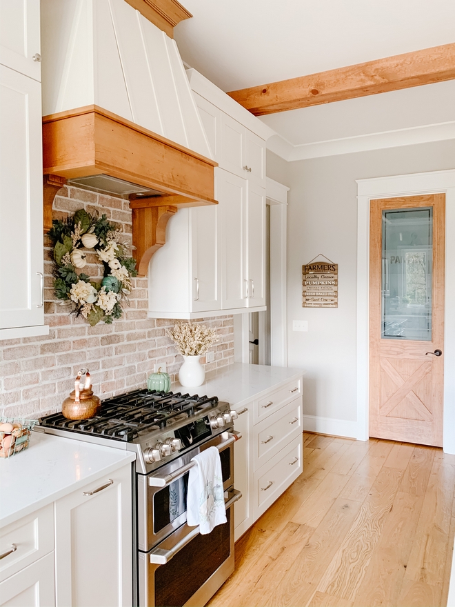
I wanted to incorporate wood accents all over our new home. When designing I struggled with knowing how to mix woods. The floors, the beams, the wood accents on the light fixtures, the chairs! I stressed about how they were all going to come together. I came to realize you can mix all different woods! The variety blends great and adds character.
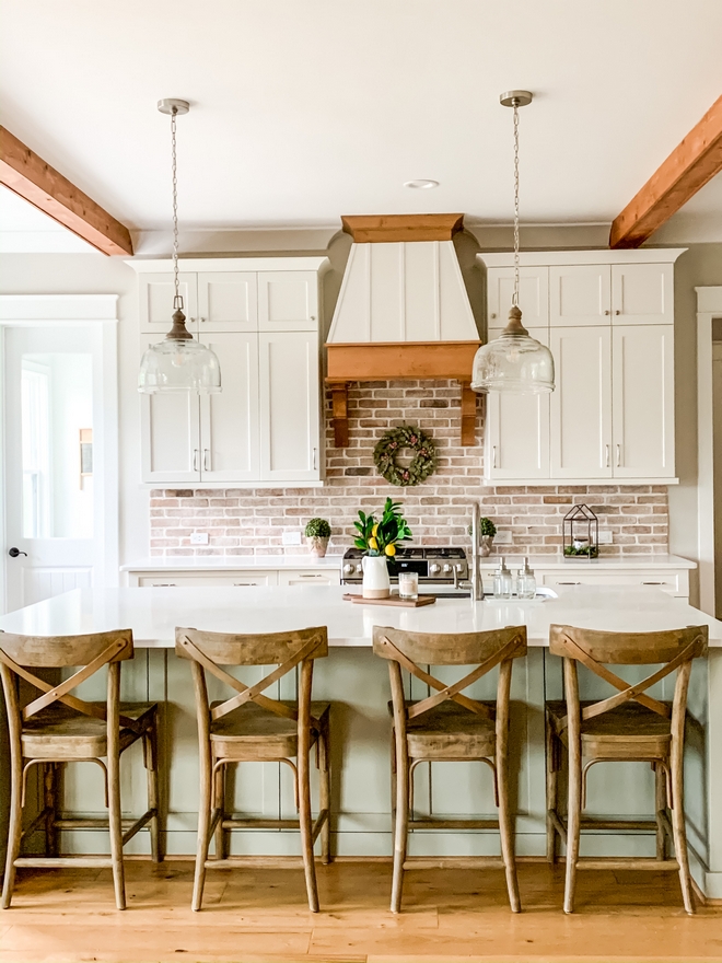
Kitchen cabinets are Maple Wood in Frosty White by Covenant Made Cabinetry.
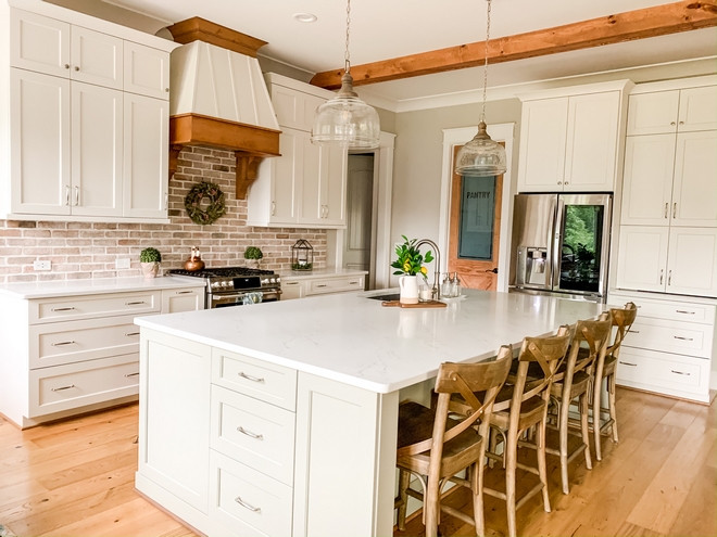
Our island color was actually a mistake at first! It was supposed to be SW Online which is a gray/blue color. We ended up with Sherwin Williams Chatroom and to this day no one knows how it happened. Our cabinet company was going to re-paint it for us but we ended up loving the mistake. Some things are just meant to be!
Island Dimensions: 8’x5’
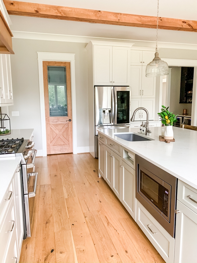
I love having a big island! Some of the features we added in the island was a pull out paper towel drawer, a low microwave, a pull out trash & recycle, drawers on the sides and big cabinet storage in the front under where the stools are!
Island Sink: Blanco in Metallic gray.
Faucet: Pfister Wheaton 1- Handle Pull Down Kitchen Faucet in Stainless Steel.
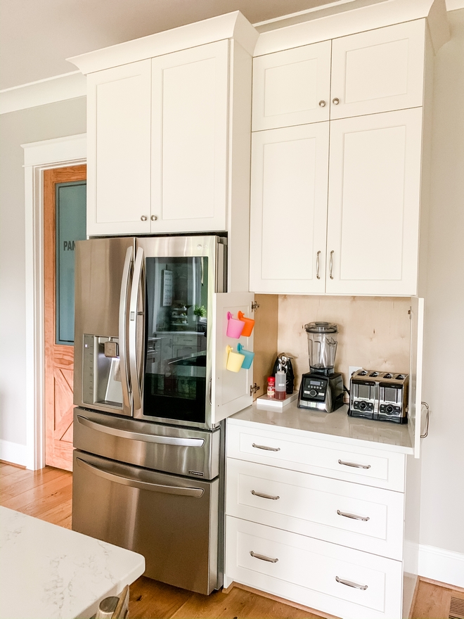
The Refrigerator’s cabinet features a hidden appliance garage.
Refrigerator: LG.
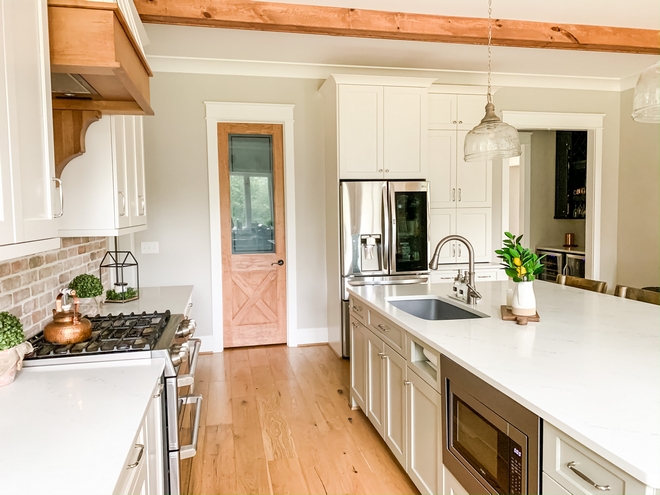
Countertop: Quartz Valencia from Francini Marble fabricated by Amanzi Granite.
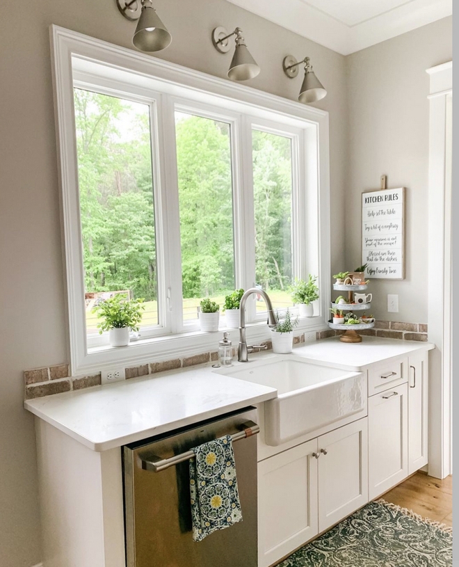
I dreamed of having a window behind my kitchen sink for as long as I can remember! Our kitchen in our previous home was very closed off and dark and when I was washing dishes (a gazillion times a day), I couldn’t see my kids playing in the backyard. This was my number one goal for our new kitchen.
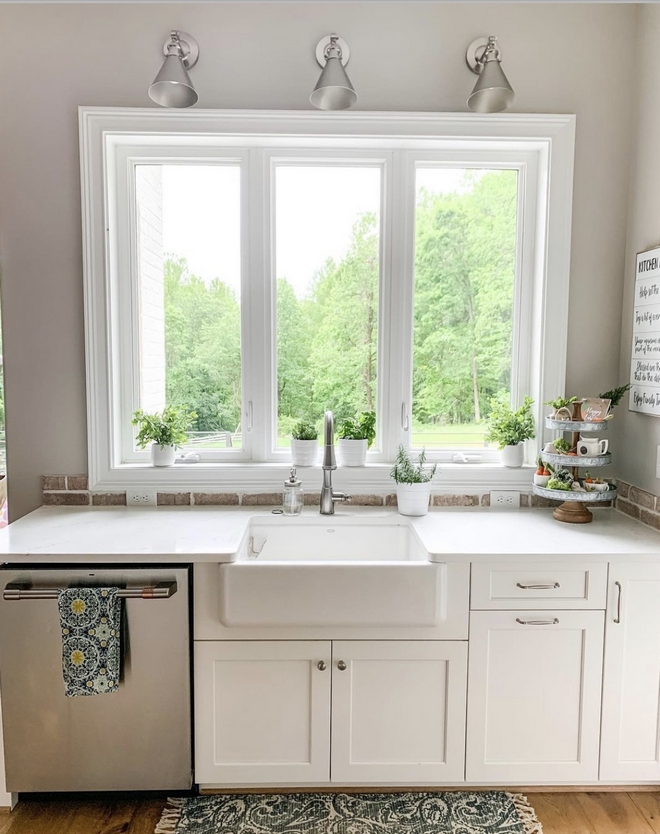
Faucets: Pfister Wheaton 1- Handle Pull Down Kitchen Faucet in Stainless Steel.
Main Sink- Kohler Whitehaven Enameled Cast Iron.
Lighting: Visual Comfort.
Dishwasher: GE Cafe.
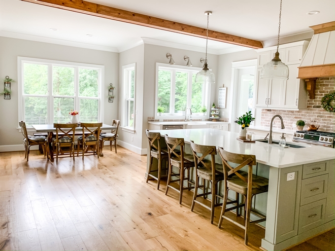
In addition to having my main sink overlook my backyard, I also wanted my eating nook overlooking the backyard with windows as well. Everyone kept telling me it was too hard to to get the layout I wanted and that I would have wasted space. I didn’t listen. Instead I measured and reworked it several times. I’m glad I pursued what I wanted. We were able to maximize the space in the family room. It feels so spacious and open, especially when we have a house full of guests.
When building your own design, press on for what you want. You know your home and your family and what works best for you.
Table: Target – Others: here, here, here, here, here, here & here.
Chairs: World Market.
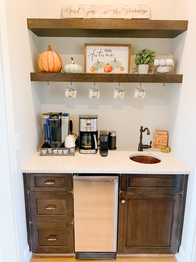
Coffee Station/Wet Bar: My hubby is a big coffee guy so a coffee station was a goal in our building design. I noticed in most home plans there might be a coffee bar OR a wet bar, but I always thought- why not put both and make them across from each other?! That’s exactly what we did. Our wetbar/coffee stations are between our kitchen and our dining room which is super convenient. We put an ice maker and sink on the coffee side.
I decided to change things up a bit from our lighter look and go with a darker stain in this area. Our kitchen has white and gray cabinets and our dining room furniture is a rustic dark wood. I was iffy about putting this dark wood color cabinet next to the light kitchen but it bridges the transition into our dining area great. Don’t be afraid to mix things up!
Coffee Bar/Wet Bar Cabinet- Alder Wood.
Hardware: Richelieu in Antique Copper.
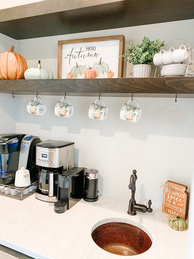
I knew I wanted a copper sink and old fashioned faucet! The cabinet drawers are super tall and perfect for all our travel mugs, teas, coffees, etc. I added the hanging hooks and they make it so easy to grab our daily mugs.
Sink & Faucet- Premiere Copper Products.
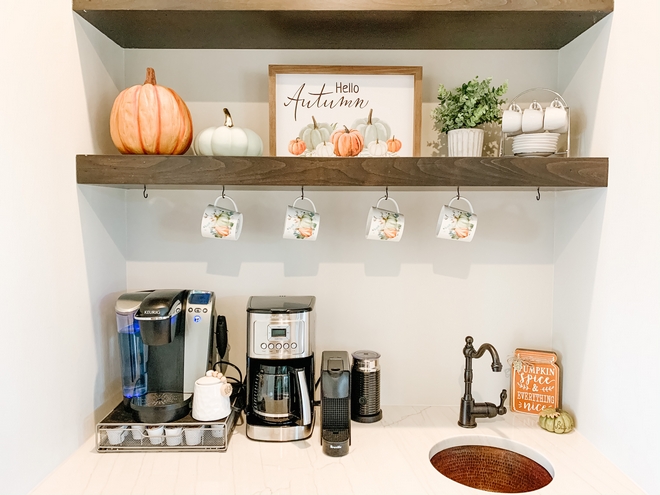
We found amazing quartz remnants that have strips of gold and bronze in them! You can save so much money on remnants for small spaces like this!
Countertop: White Macaubas True Quartzite.
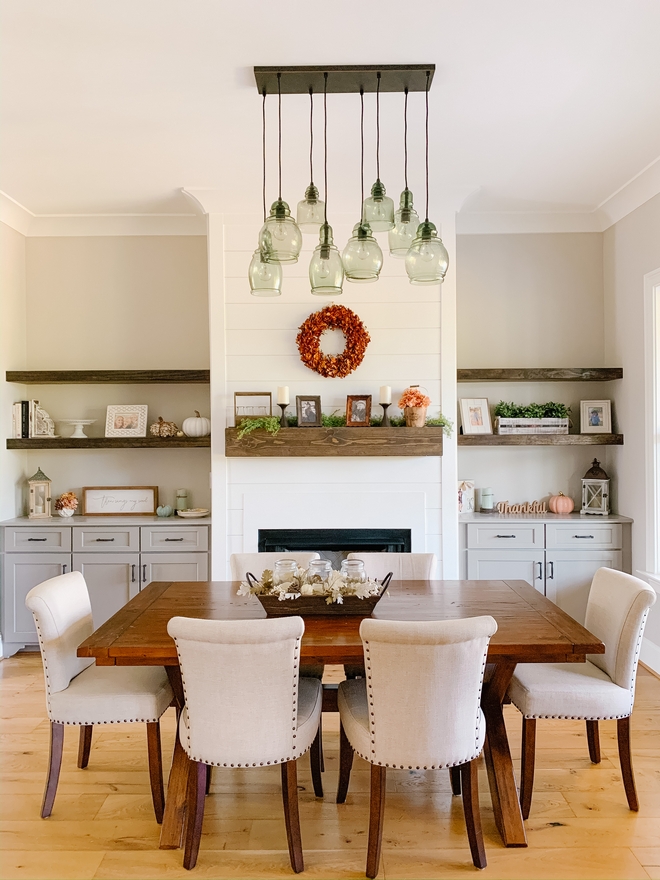
Dining Room: A lot of new homes are doing away with the traditional dining room but I just couldn’t. I wanted a place to gather for special meals and a place for all my china and special dishes. Instead of having a traditional buffet, we went with built-in cabinets. I wanted the room to be a multi-functional used space. We added a fireplace and we are going to put our family piano in here. We use this room for puzzles and games and a gathering spot! I love having the dining room at the front of our house when you walk in so it’s a lovely entry space (and one that is usually easy to kept clean!).
Chandelier: Pottery Barn.
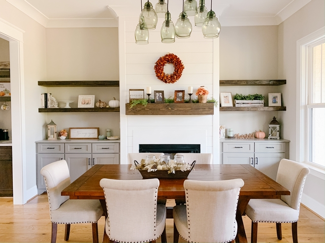
Walls are in Sherwin Williams Agreeable Gray.
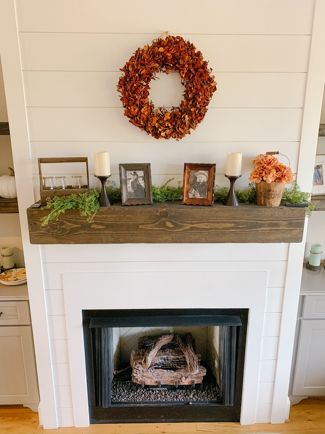
Fireplace Mantle: Made by Rocowood, stained in Minwax Jacobean.
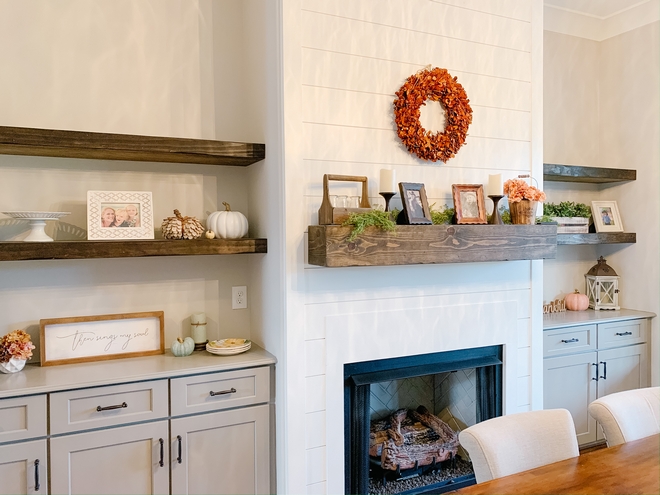
Dining Cabinet Paint Color: Sherwin Williams SW 9170 Acier.
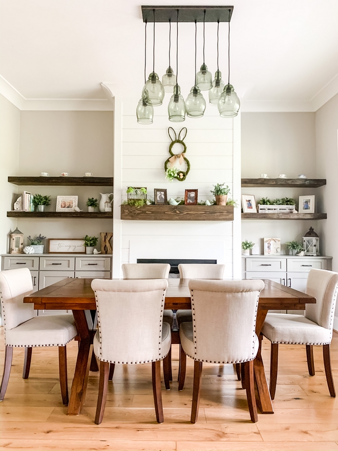
Dining Table: Pottery Barn Toscana Dining Table.
Dining Chairs: Pottery Barn – Others: here, here, here, here, here, here, here, here, here, here & here.
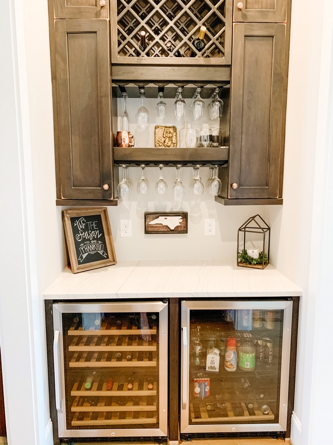
On the wine side we added a wine fridge and beverage cooler. I love the cabinets on the side to hold liquor & glasses and the hanging wine glass shelves are such a great use of space! Our cabinet company also designed the wine rack above. Seriously this space is sooo useful!
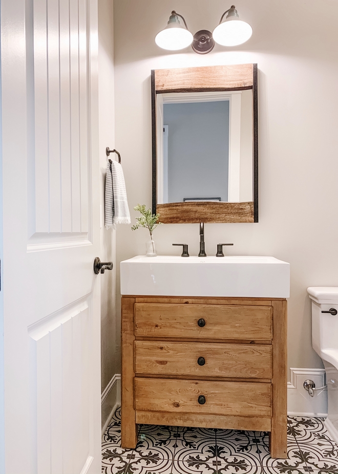
Half Bath: We decided to put our half bath in a location near our garage and side entrance (especially with children & guests coming in from outside). It’s also in a nice location just off the kitchen (but not seen from the kitchen).
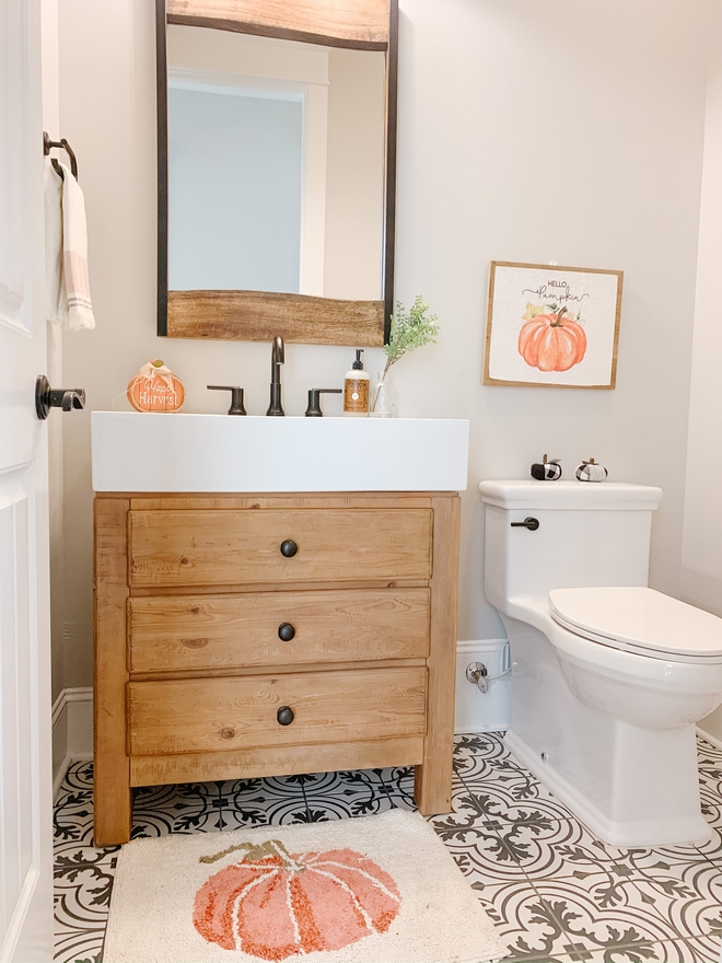
I came across this vanity for our half bath very early in our house planning and knew it was what I wanted and never looked back! I LOVE having drawers! My kids keep an extra toothbrush in here so they can always brush on their way out the door!
Vanity: Pottery Barn.
I immediately found this tile and fell in love. It’s not black but almost a dark gray with a navy tint. I was so pleased to find the mirror that I thought went along beautifully!
Paint Color: Agreeable Gray by Sherwin Williams.
Toilet – Mirabelle “Key West” 1pc toilet.
Tile: Merola Tile – similar here.
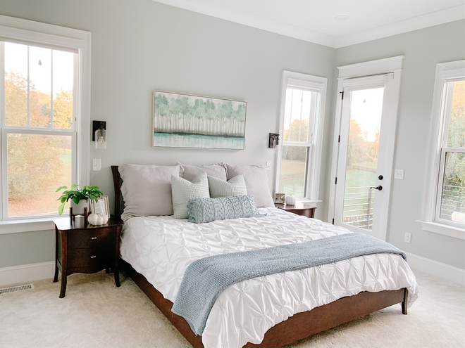
The goal for our bedroom was to be an oasis where we can relax. I chose Sherwin Williams Silver Strand for the walls because of the calming feel. We wanted our room to feel cozy so we added a gas fireplace! I also wanted a lot of windows to enjoy our views. I strategically measured our bed and nightstands to have the windows fit perfectly on either side.
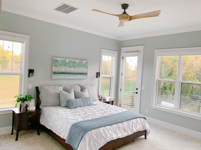
Instead of having table lamps we added sconces with separate switches.
Sconces: Capital Lighting.
Fan: Fanimation 56″.
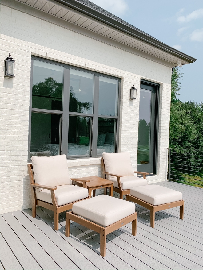
We have a door that walks out to the back deck with a sitting area for our Polywood loungers.
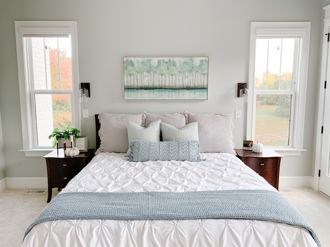
Paint Color: Sherwin Williams Silver Strand SW 7057.
Bed: Local store – Others: here, here, here, here, here, here & here.
Nightstands: Local store – Others: here, here, here, here, here, here, here & here.
Duvet Cover: West Elm.
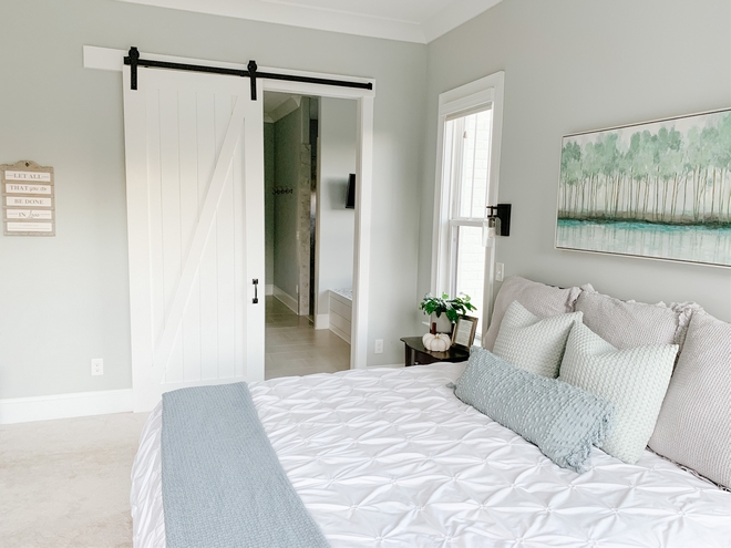
We went with a sliding barn door from our master bedroom to master bath. This is a door we usually leave open, however when we need privacy it’s easy to slide shut. I love how it adds character to the room!
Barn Door: here (painted in SW Extra White) – similar – Others: here, here, here, here, here & here.
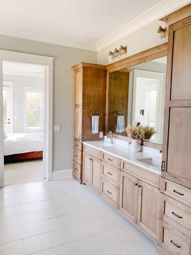
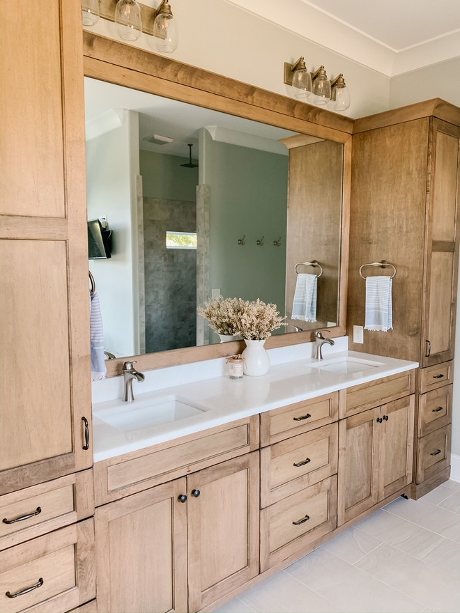
Master Bath: I originally planned to do our master cabinets in a classic gray color, but then I came across a rustic wood look I knew my husband would love over the gray. Our cabinet company made up a stain to match my vision! We love our double sinks and waterfall faucets! The cabinetry and drawers give us so much storage space. I had the bottom cabinet made into a pull out hamper!
Cabinets: Rustic Maple in Custom color by Covenant Made Cabinetry.
Towel Rings: Pfister Kelen.
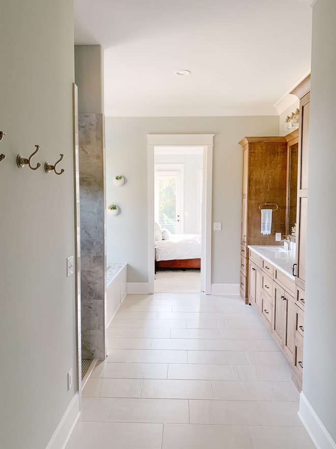
Paint Color: Sherwin Williams Silver Strand.
Floor: Mosaic Tile – similar here – Others: here, here, here, here, here & here.
Robe Hooks: 4x Pfister Tisbury.
We wanted a walk in shower without a glass door. I love the tile I found at Floor & Decor. It’s the little details that go into building a home that makes it truly custom.
Faucets: Pfister Jaida Single Faucet.
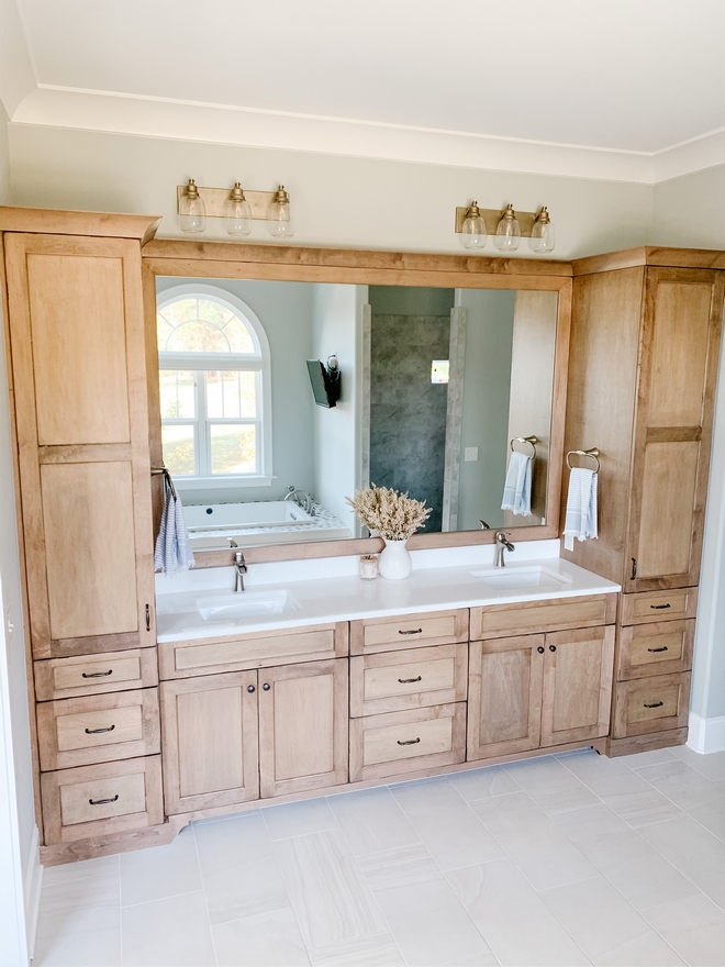
Countertop: Elegant White Brazilian Marble from Amanzi Granite.
Light: Savoy Light -3 light Bath Bar in industrial steel finish – Others: here, here & here.
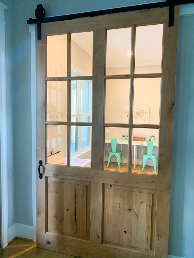
Home Office Barn Door: Custom.
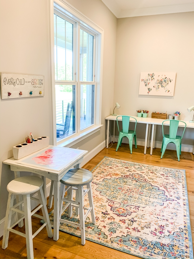
Office: I work from home so I designed my office to have a dual-purpose and serve as a work space as well as a craft room for the kids. I bought my L shape desk from Ballard Design years ago and turned it to face the window view. The kids have a workspace of their own with 2 IKEA desks. I also added a painting table we can work at together.
Paint Color: SW Agreeable Gray.
Chairs: here – similar.
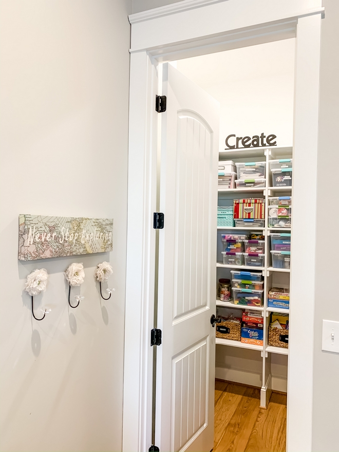
One of my favorite features I incorporated in this room was a walk-in closet with lots of shelves!
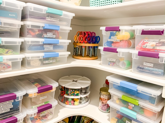
I love organization and this closet has a ton of it to keep my kids and myself in order. I separated items and craft activities in labeled boxes that we can easily grab off the shelf, take to our table to use and then put back.
Storage Ideas: here, here, here & here.
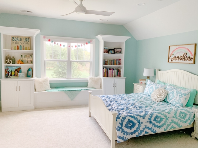
Daughter’s Room: My daughter wanted a turquoise blue surf themed room! It was fun to make this space something she loved. I always envisioned a reading bench in her room with bookshelves on either side. Our carpenter built it exactly as I planned! I designed a nook in her room for a future desk/work space for when she gets older.
Furniture: Pottery Barn Teen.
Accessories & Artwork: Hobby Lobby & Homegoods.
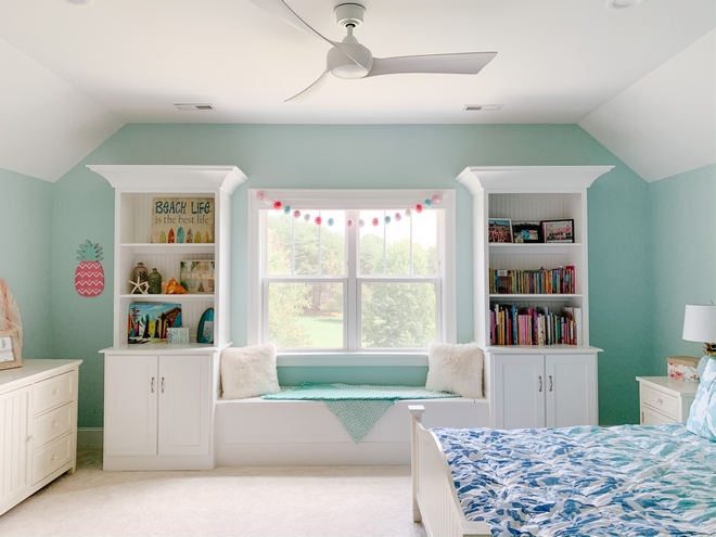
Paint Color: Sherwin Williams Tidewater.
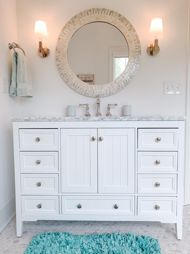
Daughter’s Bath: This room turned out to feel like a bathroom for a princess! I vaulted the ceiling and added a small chandelier. I chose a vanity from Wayfair. I wanted a round mirror and loved how this one complimented the pearl tile from the bath tub! I thought sconces would look pretty on either side rather then traditional lighting and I’m so happy with these milk glass ones I found!
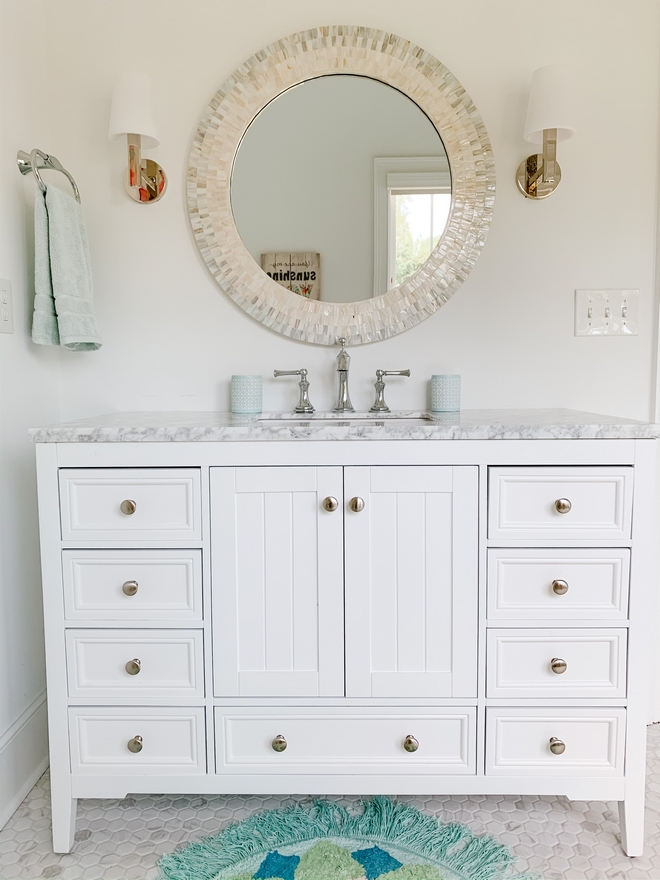
Vanity: Wayfair – Others: here, here, here, here & here.
Mirror: here, here & here – similar.
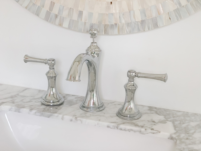
Faucet: Pfister Tisbury Widespread Bathroom Faucet.
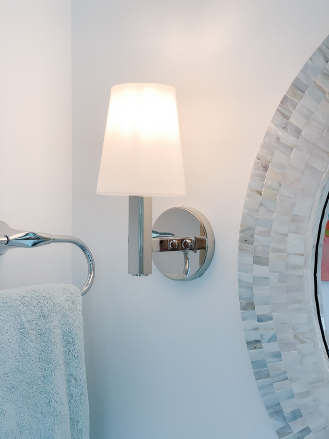
Lights: Generation Lighting 1 light sconce polished nickel with milk glass shade.
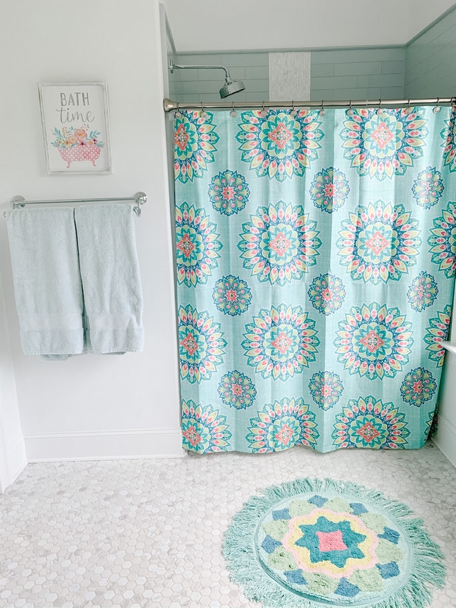
Bathroom Paint Color: Sherwin Williams SW 7006 Extra White.
Shower Curtain: Target.
Tile: Floor & Decor – similar here & here.
Faucet: Pfister.
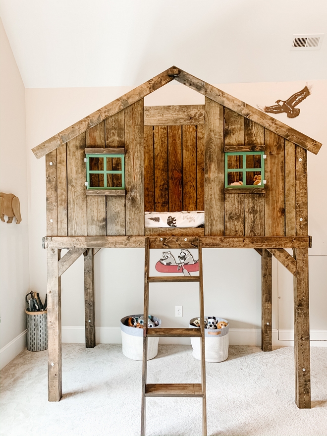
Youngest Son’s Room: I designed an outdoor adventure theme for my youngest’s room. For a year and a half while we were building, the 5 of us lived in a 2 bedroom townhouse and my littlest slept on a pull out toddler mattress. I knew by the time he had his own room I wanted to get him a very special bed of his own! We had a local company Southern Roots NC build him a treehouse bed! I chose to add a vaulted ceiling to his room and it really ended up being great with the bed!
Treehouse Bed: locally handmade – Others: here, here & here.
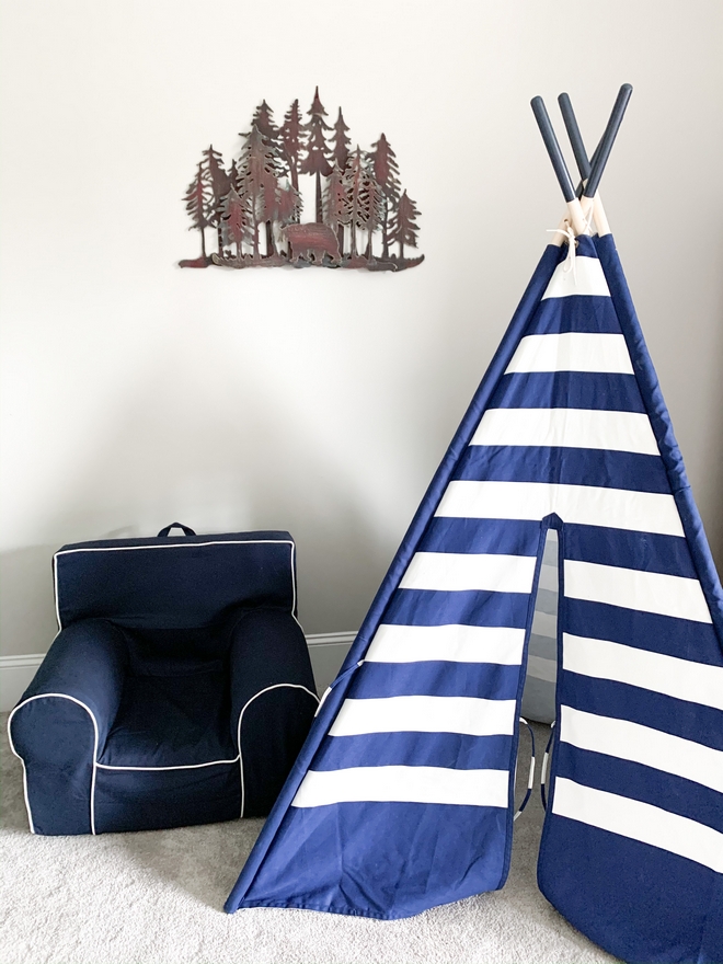
Walls: SW Agreeable Gray.
Teepee: Sam’s Club – similar here – Others: here & here.
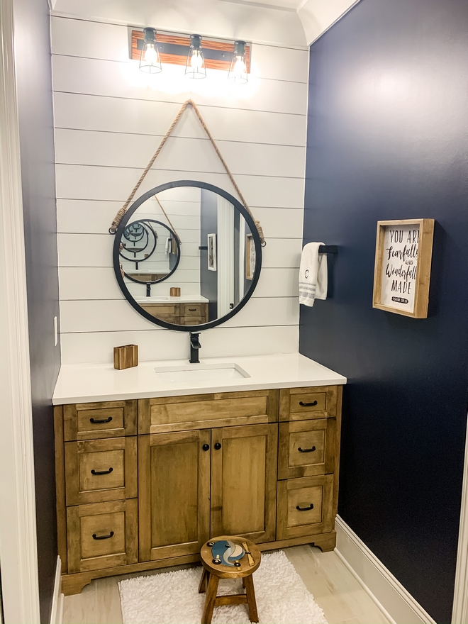
Boys Bath: My boys share their own bathroom so I wanted to be thoughtful in giving the space a manly feel. I knew I wanted navy and ship lap, but with no windows I was afraid it was going to be too dark. I love how it turned out leaving the shiplap white and painting the walls navy. The boys each have their own space and sinks that mirror each other. I incorporated a pocket door when you walk in from the hallway (it saves space and allows for an easy entry as we leave it open all the time). For the shower I used a mix of wood looking tile on the sides and then a cream washed tile in the back that is the same as the flooring. Adding a niche was a nice touch to hold their shampoo & soap. I had a lot of fun with designing this room. I think I love it more then my boys do- they really don’t care about design lol!
Counters: White Zen Quartz Amanzi granite.
Towel Bar Rings: Pfister Kenzo.
Mirror: Kirklands.
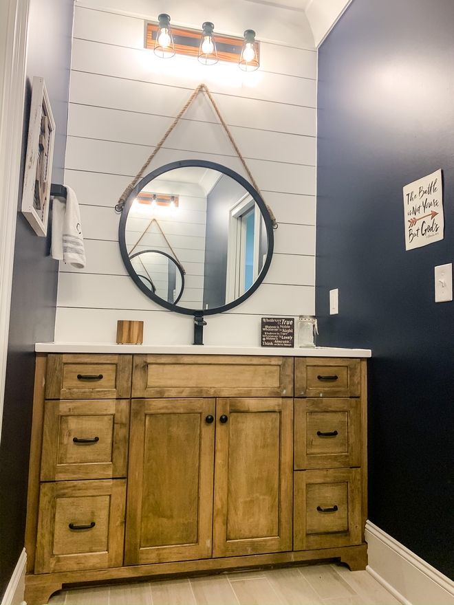
Cabinets: Maple cabinets in Nutmeg stain by Covenant Made.
Hardware: Richelieu in black.
Faucet: Pfister Kenzo Matte Black.
Light- Wayfair – Others: here, here, here & here.
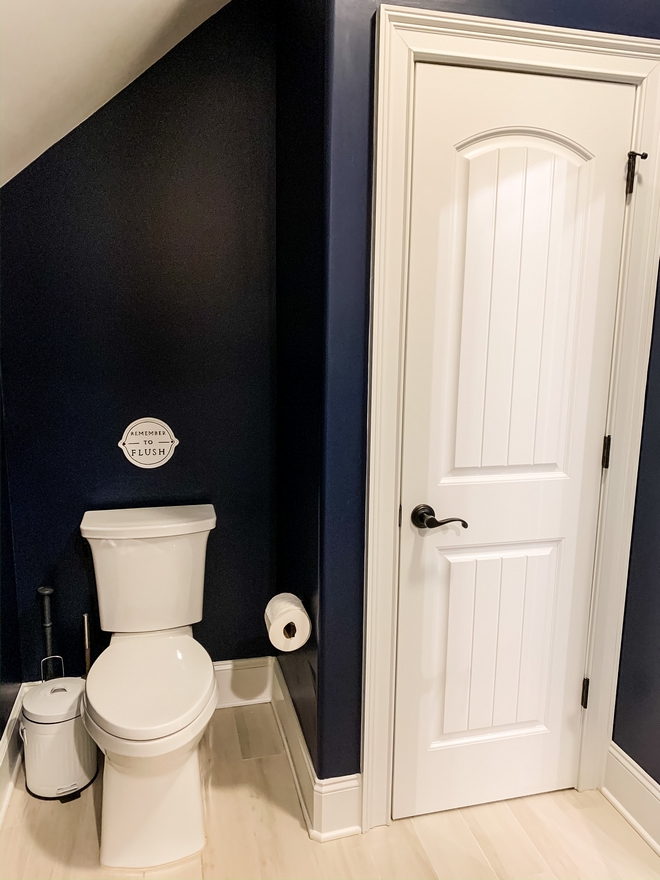
Paint color is Sherwin Williams Naval.
Wall Sign: Target.
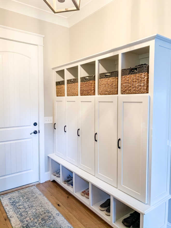
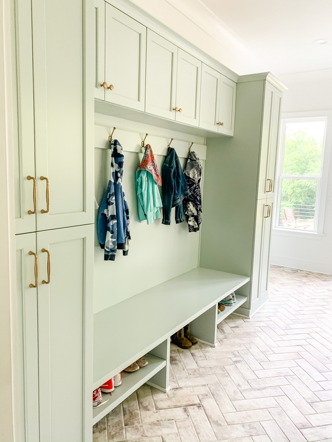
Mud Room: I knew in our home I wanted to have a side entry. (In our previous home we didn’t have one, we just came in through our garage door). I wanted a way for us to go in and out (let the dog out, watch for carpool), etc without having to always open the garage. I am so glad we added it! The side door brings you in to our mud room/aka “drop zone”. The sliding barn door then leads in to the laundry room. It’s often left open, but when it’s super messy or guests come I can easily shut the room off.
I designed the cabinets in this room so that we each have our own “locker”. I wanted doors to hide everything! Inside each one is hooks and a shelf and a usb outlet to store our devices. It would have been prettier to have closed in the bottom shoe space, but I know my family and if it takes work to open, it won’t happen! By leaving the space open, they are more likely to drop their shoes on the bottom shelf on the way in!
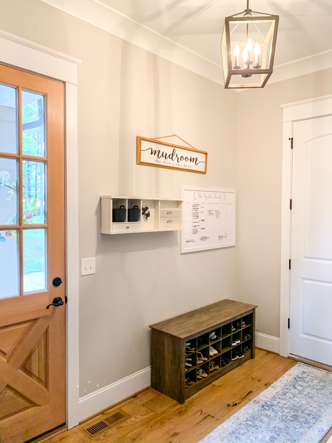
Walls are in Sherwin Williams Agreeable Gray.
Rug: HomeGoods – similar here, here & here.
Lighting: here.
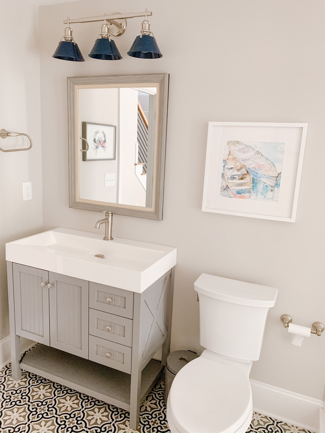
Basement Bath: I designed our basement bathroom to have a nautical feel.
Paint color is Sherwin Williams SW 7029 Agreeable Gray.
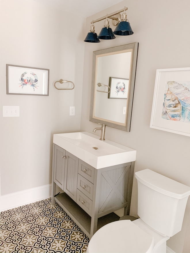
I found the vanity off Wayfair and loved the modern sink. The lighting adds a perfect nautical feel!
Vanity: Wayfair.
Faucet: here – similar.
Lighting: Golden Lighting.
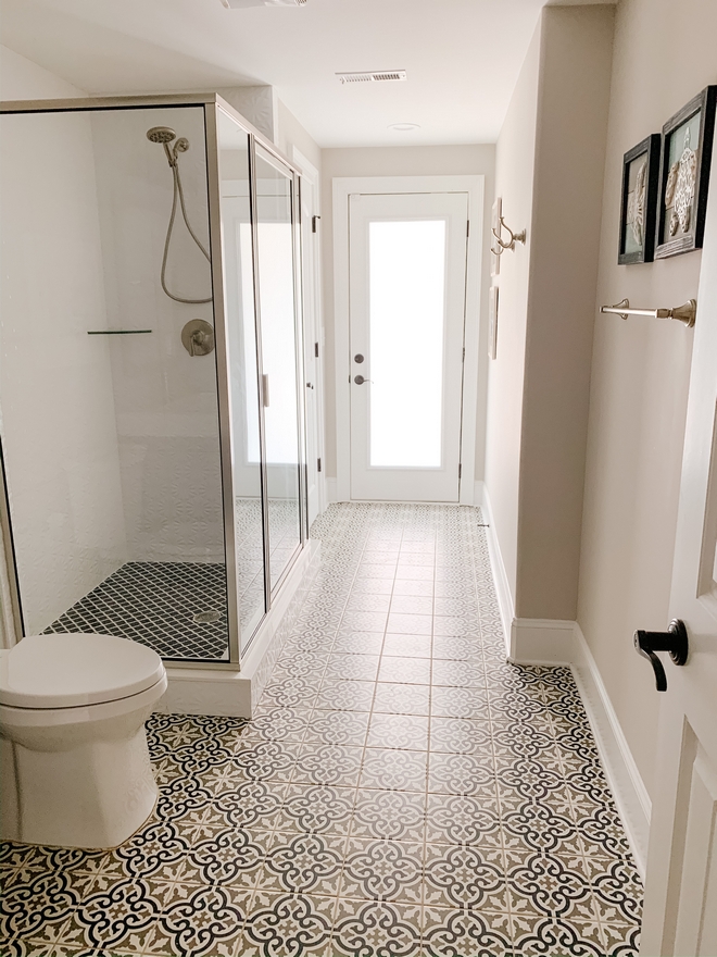
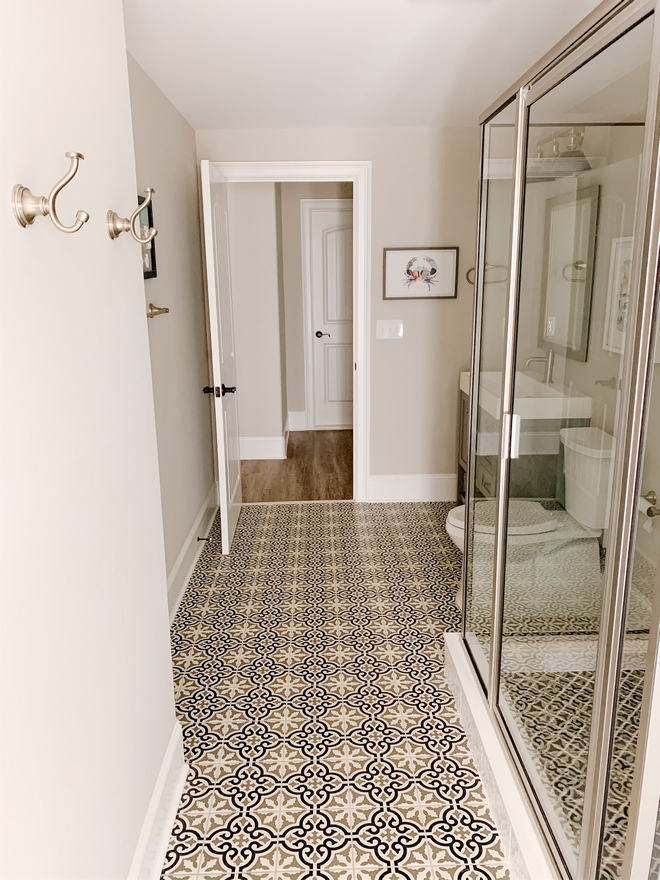
I designed the room to have an exterior door for pool access. I added frosted glass to that door to bring in light (as there are no windows in the room). I added a big linen closet to keep all our pool towels and sunscreen. I love the tile I found for this room. The floor tile has navy accents that tie in with the navy shower floor and the white shower tile has a fun wavy texture!
Tile: Local store – similar style: here, here, here, here, here & here.
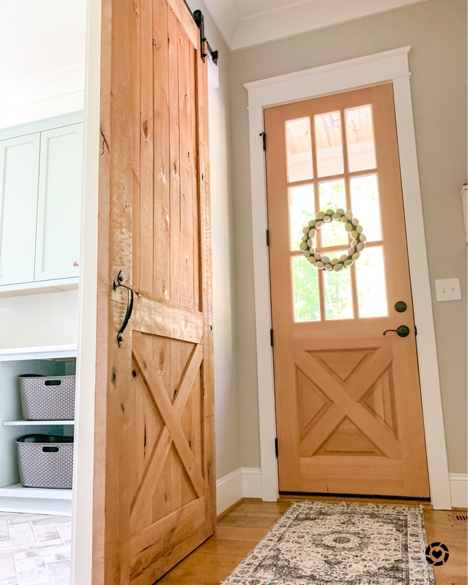
Sliding Barn Door: Cardinal Millworks – similar here.
Barn Door Hardware: National Hardware.
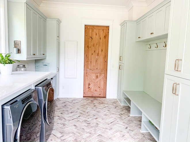
Laundry Room: I wanted to make our laundry room a happy place! I do not like laundry (who does?!), so therefore my goal in this room was to make it an environment that changed my attitude about it!
On the right you will find hanging hooks for clothes, shoe shelves, a bench and laundry shoot.
We have a laundry shoot that falls into one of the cabinets, and a pull down built in iron board. I added an outlet to the cleaning cabinet to keep our hand vac and tools charged.
Walls are in Sherwin Williams Extra White.
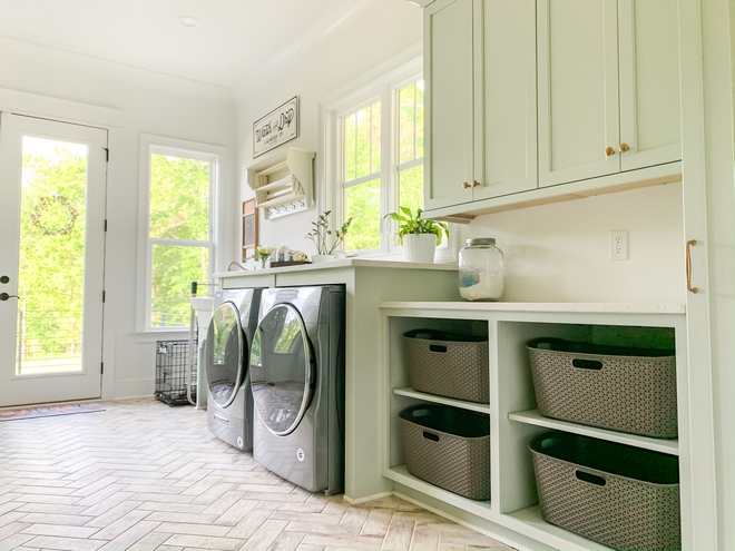
My vision was for a galley style room with lots of window light and an entrance from the mud room, the kitchen and a door to go to the backyard. I wanted to make good use of both sides of this room. On this side is our laundry tub, dog crate, drying rack, washer/dryer and shelves for laundry baskets.
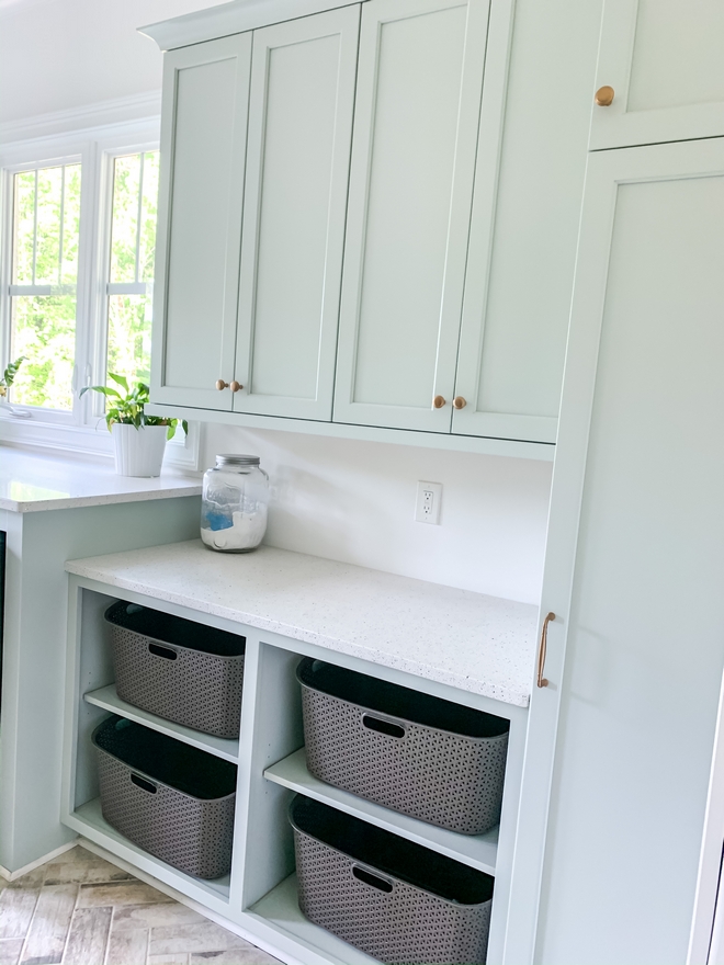
Cabinet Paint Color: Sherwin Williams Sea Salt.
Countertop: Quartz White Lace from Amanzi Granite.
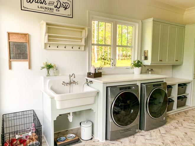
When designing the layout of our room I thought of all the things we owned (dog crate, drying rack, dog bowls, etc) and made sure I had a space for everything.
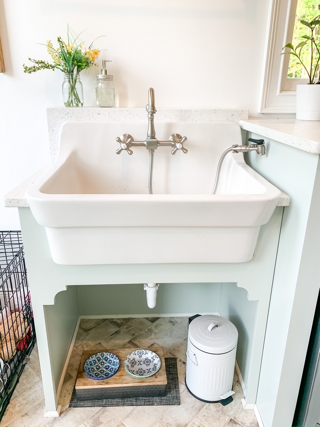
Sink: American Standard.
Faucet: Kingston Brass.
I wanted the room to have a soft calming feel so I went with Sherwin Williams Sea Salt cabinets and love how the champagne bronze hardware goes with it!
I LOVE how the floor brought everything together. I really like the look of brick floors but I couldn’t imagine the feel and cleanup of having a brick floor in my laundry room… so I got tile that looks like brick and laid it in Herringbone Pattern! I’m super happy with our choice!
Hardware: Champagne Bronze.
Floors: Cantina Bianco from Mosaic Tile – also available here.
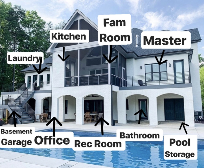
Isn’t Kirstin thoughtful? This picture gives us a really good idea of the spaces in her home.
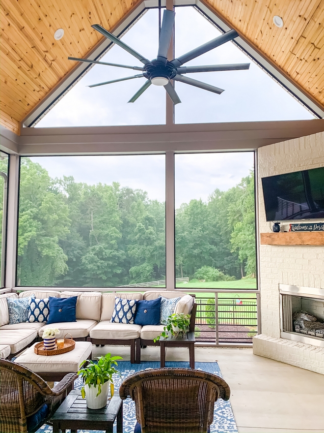
Screened Porch: We loved our screened porch we built in our previous home so we incorporated many of the same features in this one.
Fan: Fanimation- Slinger v2 – 72” black motor, black blades with 9″ rod.
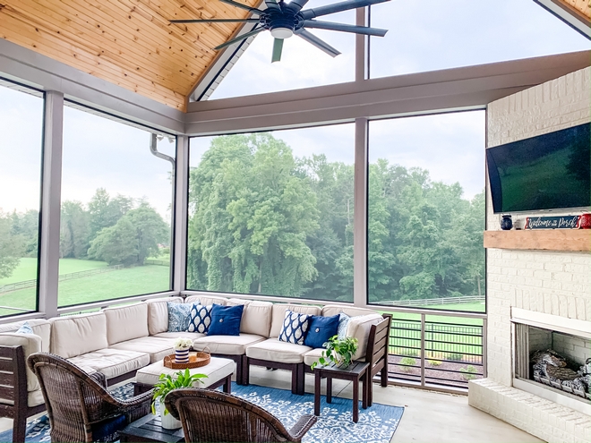
We designed our screens to be as wide as possible to maximize the clear views.
Outdoor Furniture: Pottery Barn.
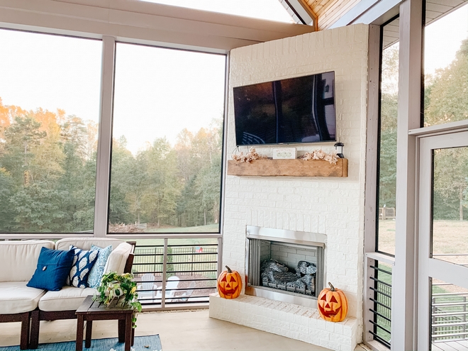
Our builder suggested the corner fireplace and we are so happy we added it! It’s our favorite room to watch tv in as well.
Mantel: Made by Rocowood.
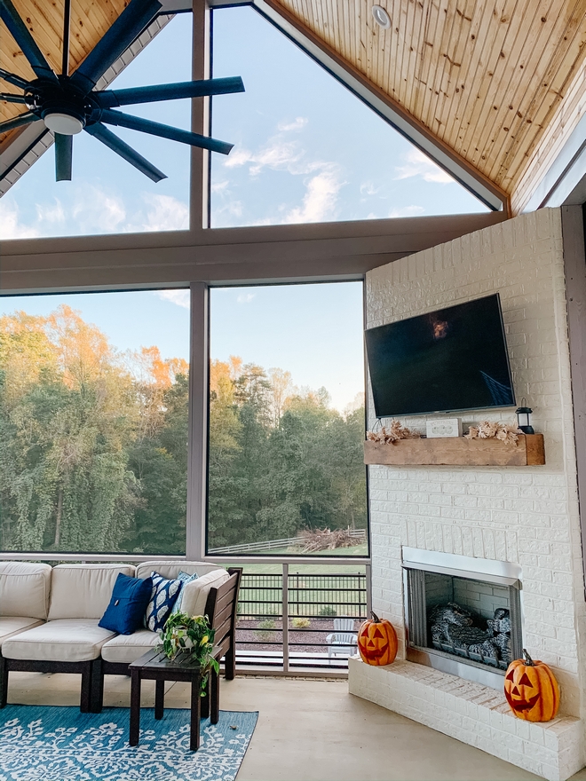
We vaulted the ceiling and made an opening at the top as a window. Both of these features gives the space a very open and airy feel. It also allows for more light to come into the house.
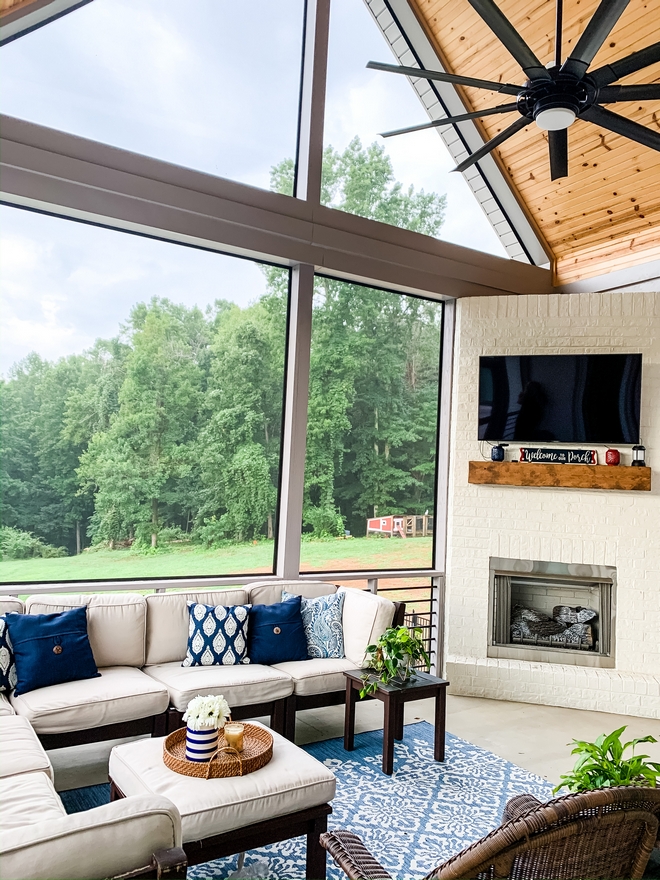
Ceiling: Vaulted ceiling clad in Pine Tongue and Groove.
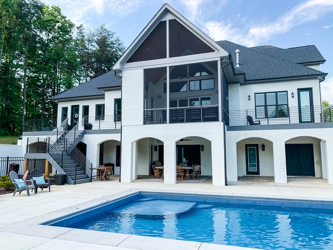
Pool/Back of House: Some people dream of having vacation homes… We dreamed of making our home feel like we were on vacation.
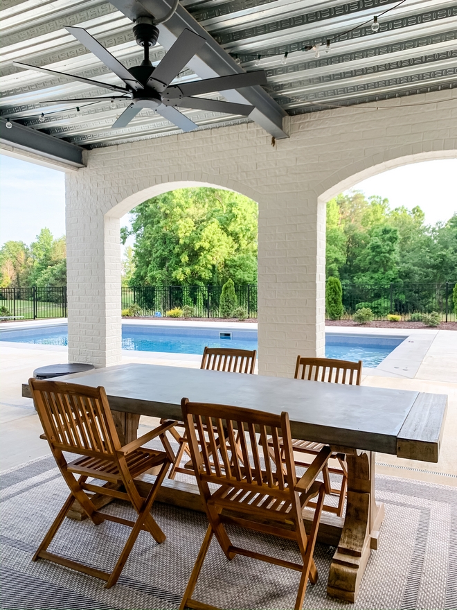
We wanted to do waterproofing under our deck to keep it dry for sitting/eating underneath. However it is a huge cost to do so! Instead we poured concrete flooring on our screened-in porch (instead of Trex like the rest of the deck). We then lined it underneath with metal. We love the look, it keeps us nice and dry underneath and it didn’t cost us any extra money!
Dining Table: The table was a piece we bought at a warehouse sale after Furniture Market – Other Concrete & Wood Tables: here, here, here & here.
Dining Chairs: Tommy Bahama.
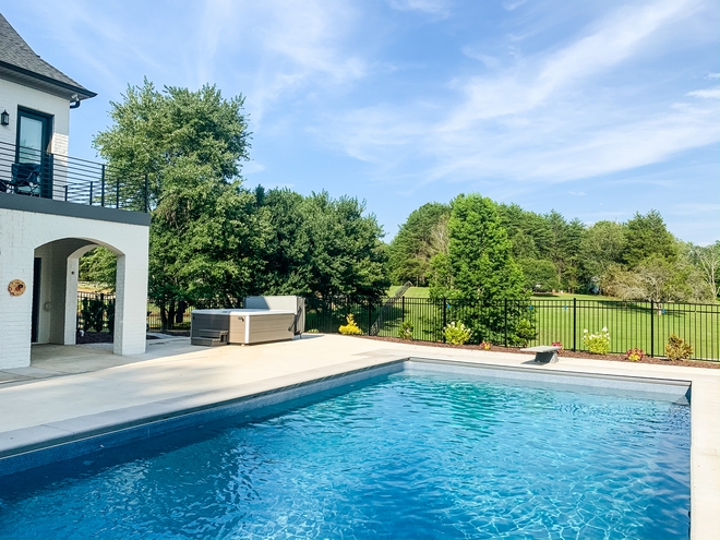
We love to travel and try new places (I’m a travel agent!). So instead of investing in a lake house or beach house, we invested in making our home a place we can’t wait to relax in after work.
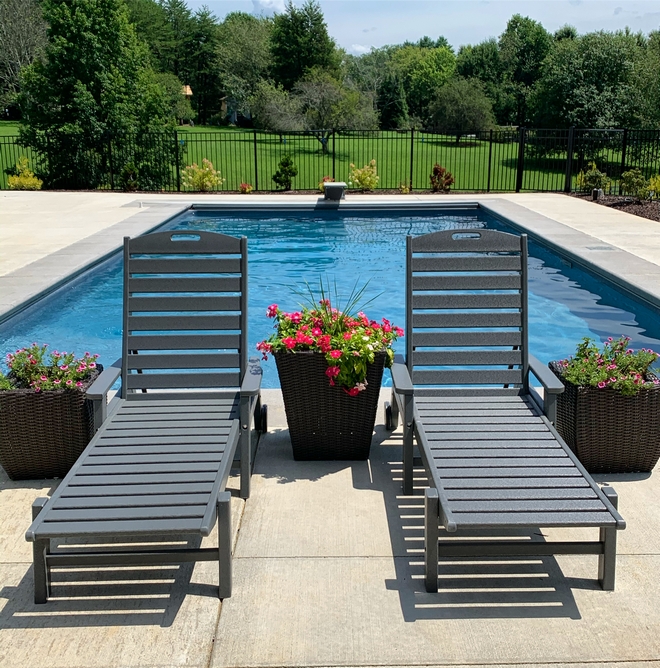
We constantly keep saying to each other, “I feel like we’re on vacation out here in the country.”
Pool Loungers: Polywood Nautical.
Builder: Brian Disney Homes.
Click on items to shop:
Thank you for shopping through Home Bunch. For your shopping convenience, this post may contain AFFILIATE LINKS to retailers where you can purchase the products (or similar) featured. I make a small commission if you use these links to make your purchase, at no extra cost to you, so thank you for your support. I would be happy to assist you if you have any questions or are looking for something in particular. Feel free to contact me and always make sure to check dimensions before ordering. Happy shopping!
Wayfair: Holiday and Furniture Sale.
Serena & Lily: 20% Off everything with code: LOVEHOME.
Joss & Main: Large Rugs for under $200.
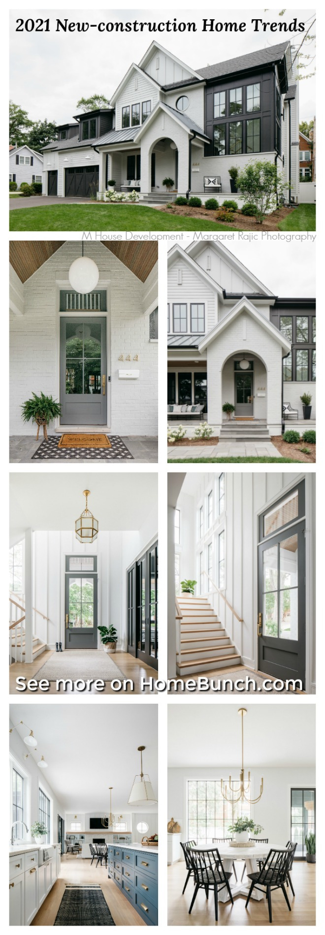 2021 New-construction Home Trends.
 New-construction Modern Farmhouse.
 New-construction Modern Farmhouse.
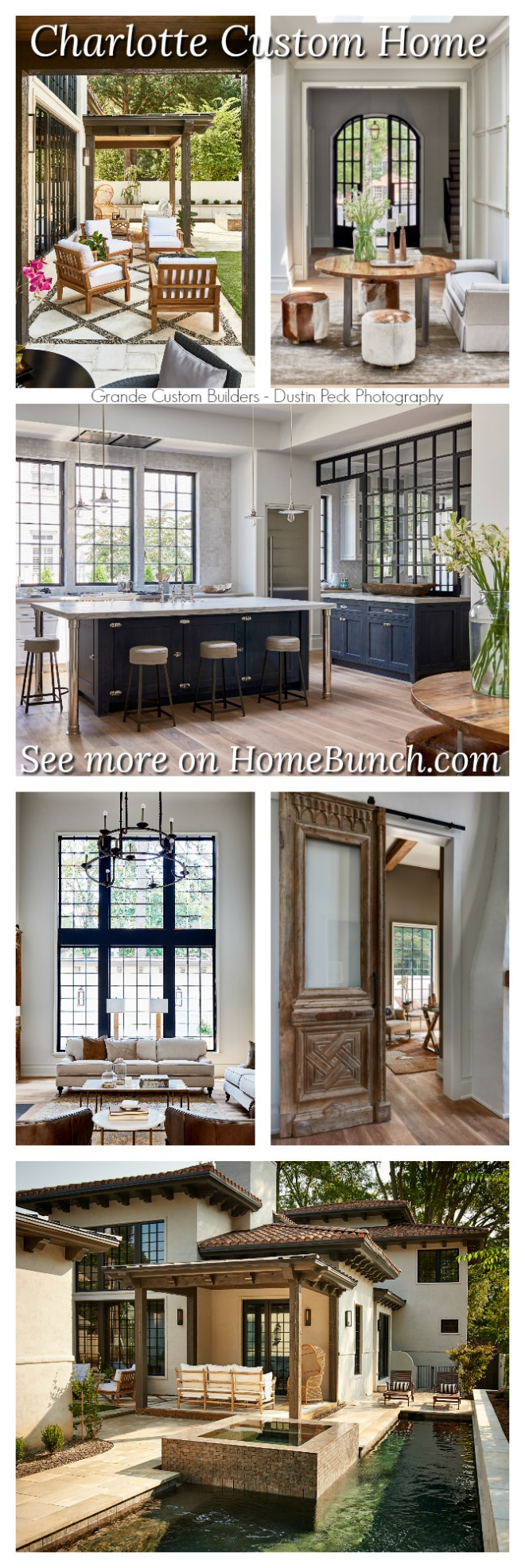 Charlotte Custom Home.
 2021 Dream Home.
 Two-toned Modern Farmhouse.
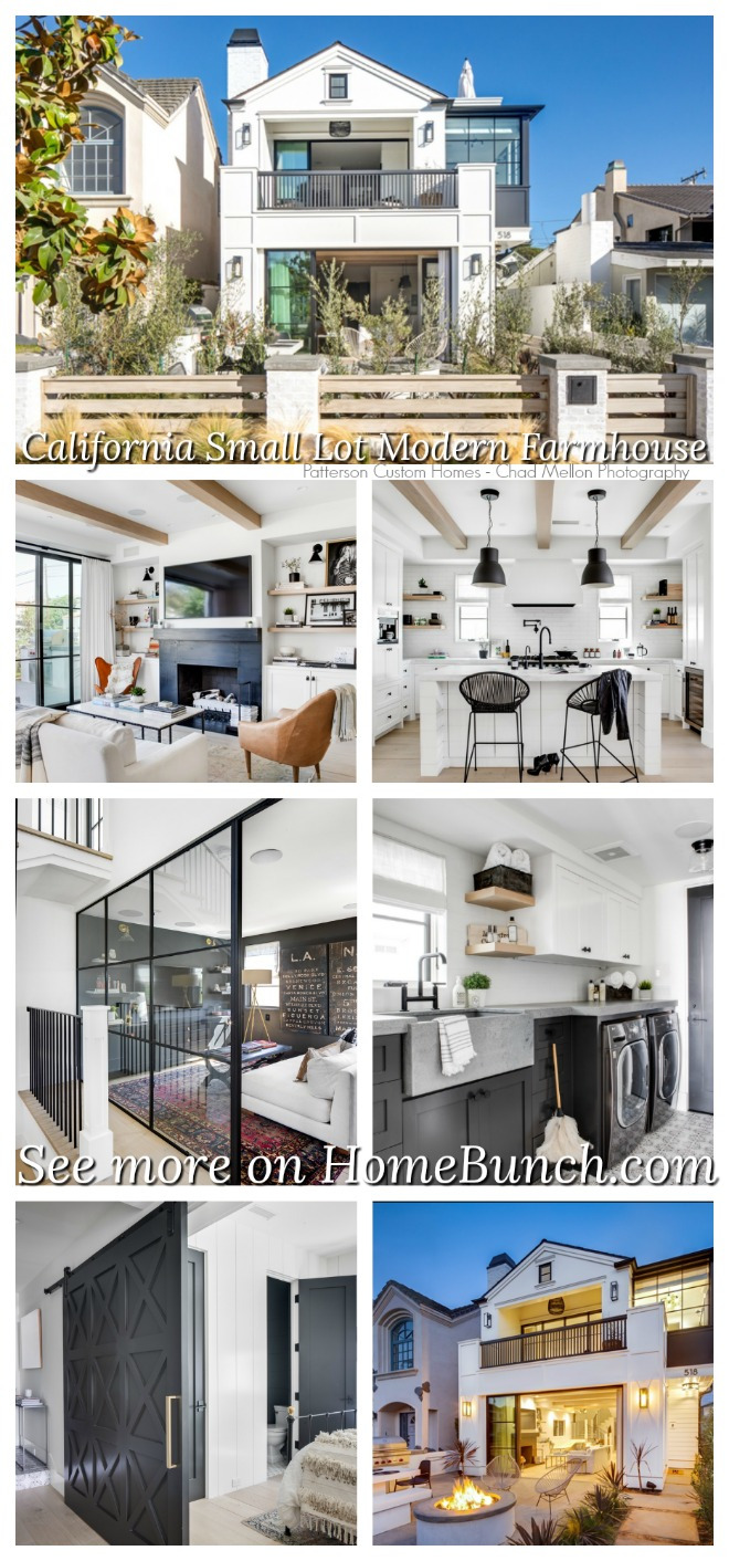 California Small Lot Modern Farmhouse.
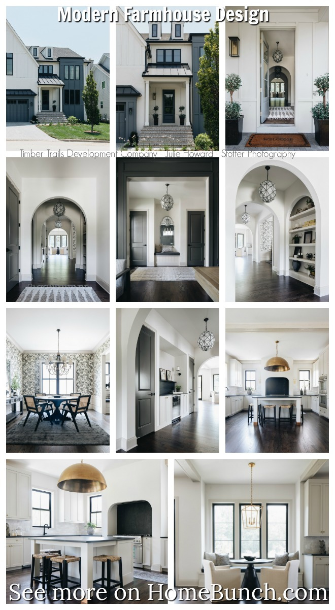 Modern Farmhouse Design.
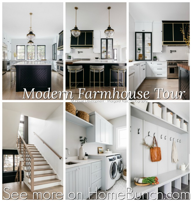 Modern Farmhouse Tour.
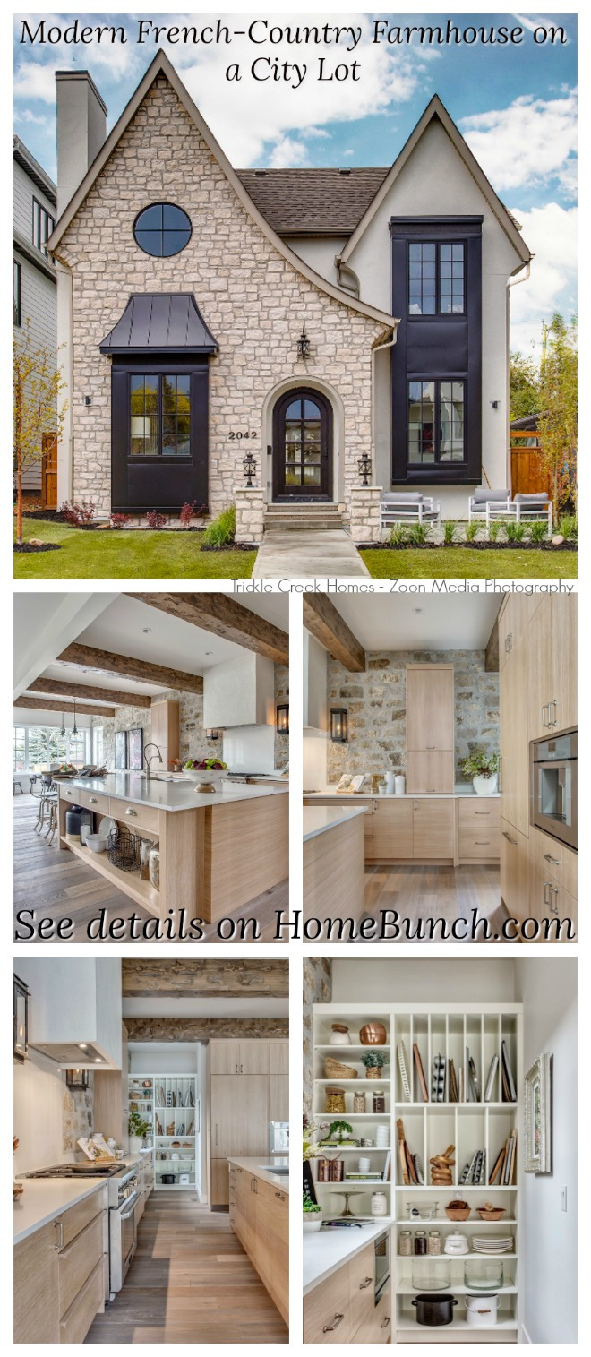 Modern French-Country Farmhouse on a City Lot.
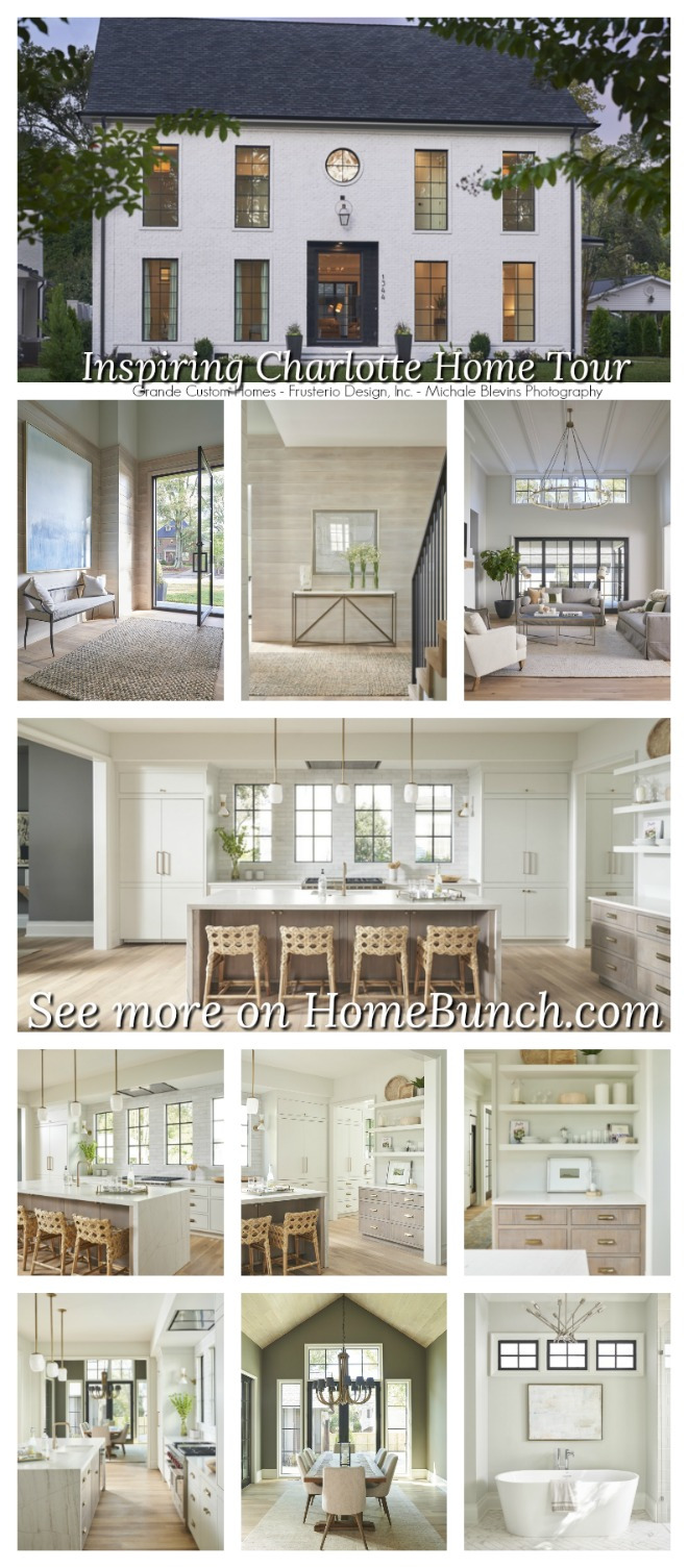 Inspiring Charlotte Home Tour.
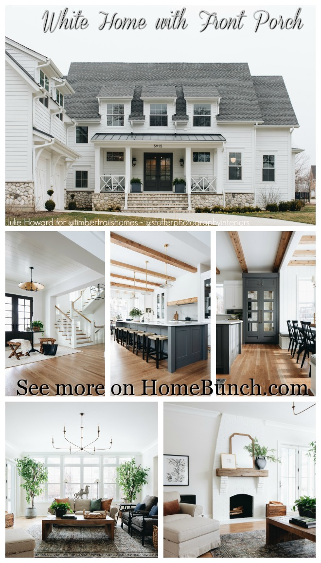 White Home with Front Porch.
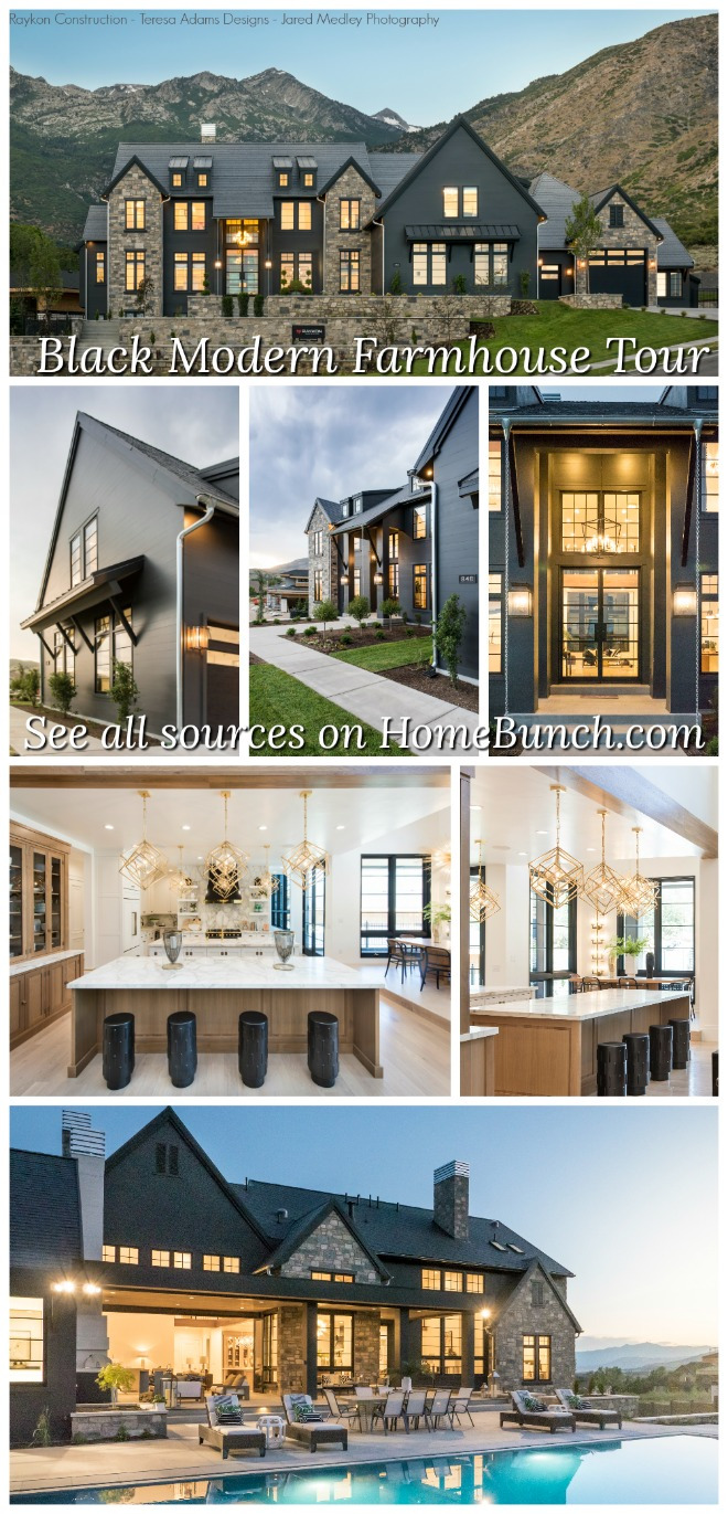 Black Modern Farmhouse Tour.
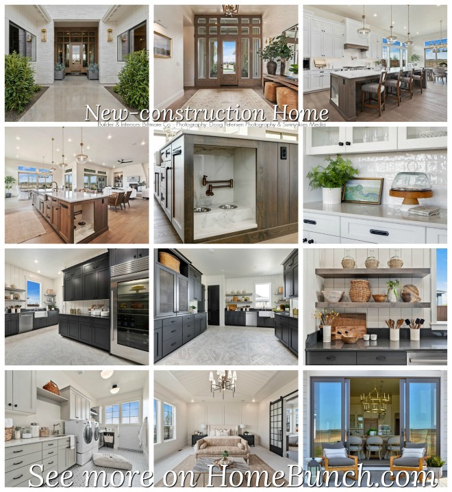 Beautiful Homes of Instagram: New-construction Home.
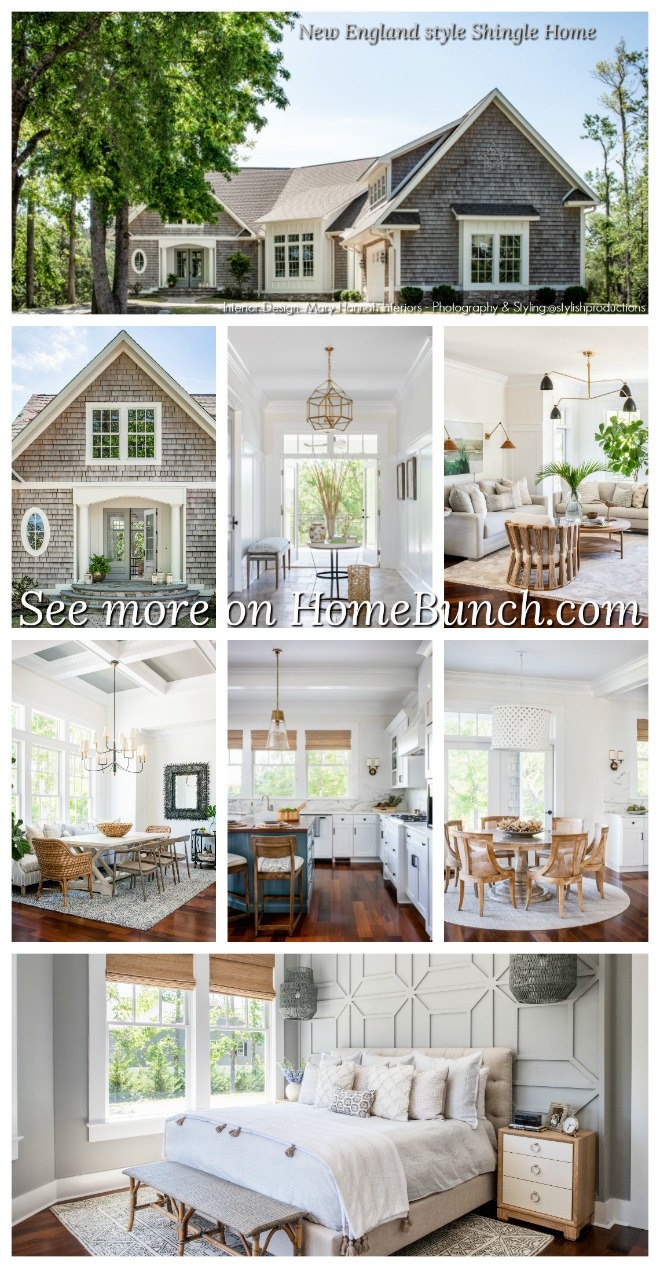 New England style Shingle Home.
“Dear God,
If I am wrong, right me. If I am lost, guide me. If I start to give-up, keep me going.
Lead me in Light and Love”.
Have a wonderful day, my friends and we’ll talk again tomorrow.”
with Love,
Luciane from HomeBunch.com