The Holidays are approaching and Wayfair is back with its Way Day sales, where you can enjoy discounts of up to 80% OFF, and EVERYTHING SHIPS FREE, making it easier to get your home ready for all of the gatherings that are about to start. These are the hot Way Day deals to shop today before they are sold out!
But before I share the best “Hot Way Day Deals to Shop Today” (which you can find just below the house tours), I’d like to highlight some bestsellers that you all enjoyed from the recent house tours I shared. Many of these items are currently on sale, making it the perfect time to grab them if you believe they will be a good fit for your home.
I always do my research before sharing any links to make sure I give you the best deal options so you can save money and time, and I really hope you find something that brings you joy!
Please note that this post contains affiliate links, which means that I make a small commission if you use these links to make your purchase at no extra expense to you and this is not a sponsored post. No one paid me to share these items with you. These are products that I truly believe are beautiful and at a competitive price, and like in every post I share here I hope that my suggestions can make things easier for you if you’re planning on adding something new to your home. 💗🙏
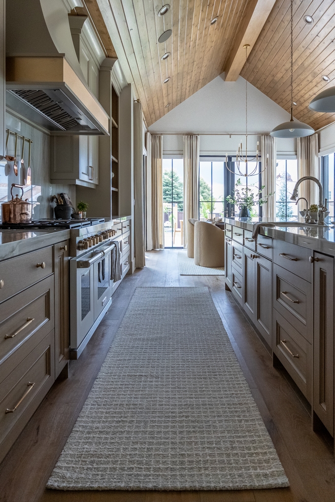
Best Seller Runner: Vivir x Livabliss Andreas Area Rug 3×10. This runner is currently 52% OFF!!!
Why I love it: Besides being a neutral option that truly works with any style and space, the product itself is top notch. This is a warm rug, perfect for the cold months ahead, and the quality will exceed your expectations!
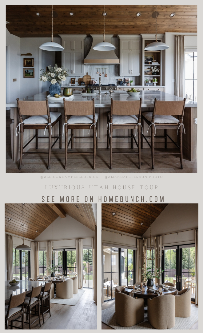
Interior Design: @allisoncampbelldesign – Photography: @amandapeterson.photo.
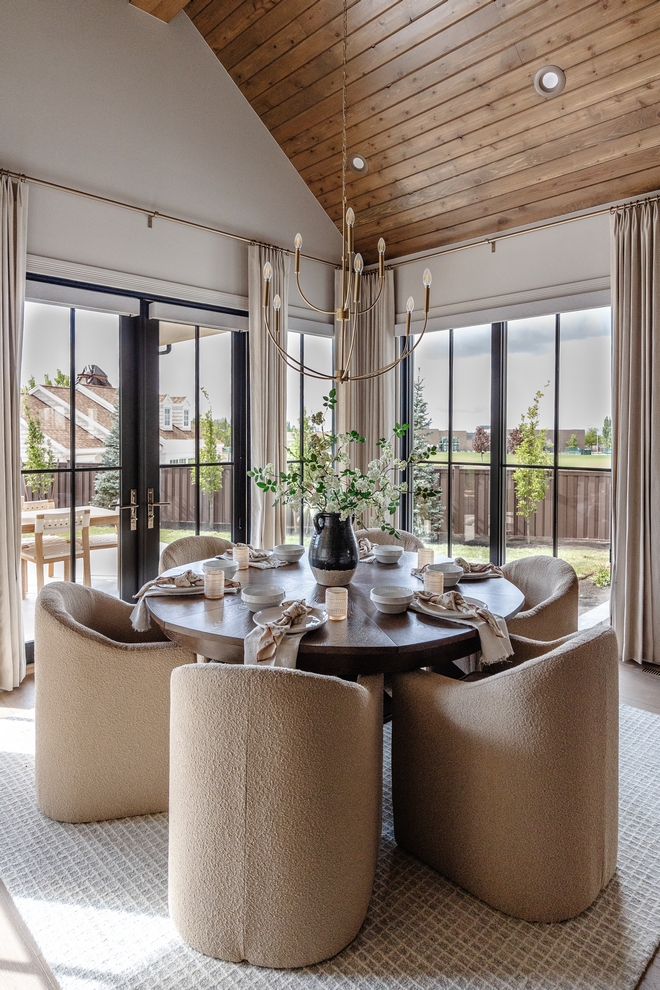
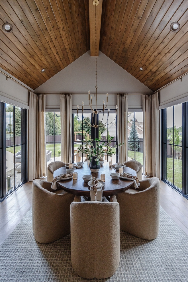
Dining Room Rug: Vivir x Livabliss Andreas Area Rug.
Chandelier: Nine Light Chandelier.
Interior Design: @allisoncampbelldesign – Photography: @amandapeterson.photo.
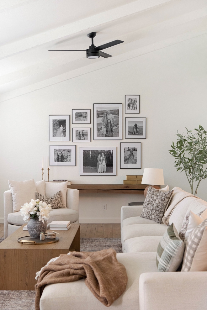
Best Seller Console Table: Solid Wood Console Table.
Why I love it: This Solid Wood Console Table is often featured in the homes I share here on Home Bunch, and coming in three different sizes and six different colors to choose from, this console table gives you plenty of options to finally decorate that space you have been wanting to. It has solid construction and is easy to assemble.
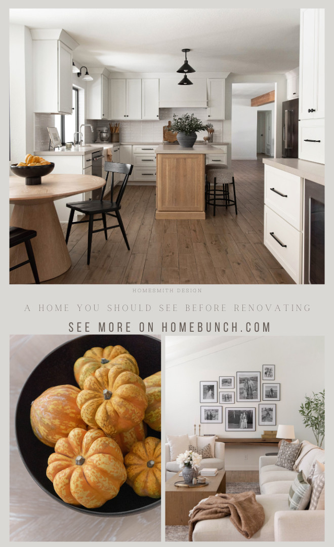
Interior Design: @homesmithdesign.
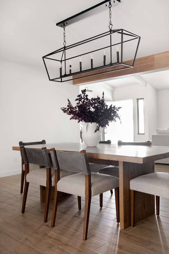
Best Seller Dining Table: Oak Dining Table.
Shop the Look: Dining Chairs.
Why I love it: Interior designers absolutely love this brand because of its reliability for quality. Now, when it comes to this particular dining table, the quality of the wood is phenomenal. This dining table is sturdy, heavy, and it’s made to last.
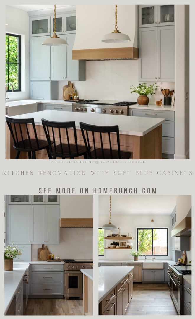
Interior Design: @homesmithdesign.
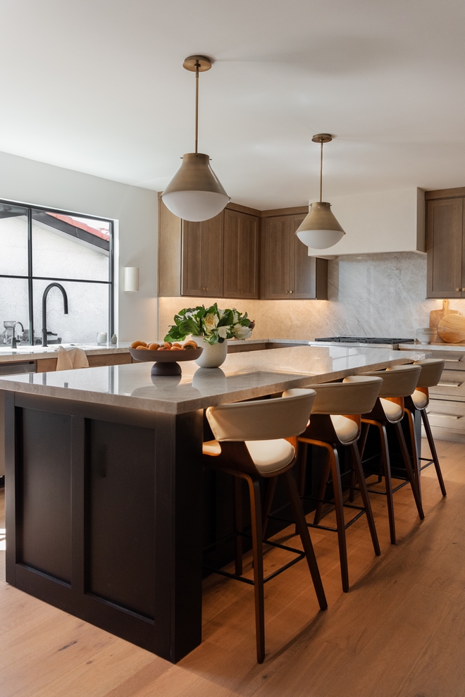
Best Seller Counterstools: Counter Height Bar Stool with Open Back and Footrest in Wood, Faux Leather.
Why I love it: With a nod to mid-century modern design, I see these counter stools as statement pieces that don’t break the bank. Their contoured back, along with the footrest, creates a very comfortable seat. I also love the neutral faux leather upholstery. It’s easy to keep clean, and it will last a long time. Overall, just a really great find!
Interior Design: @homesmithdesign.
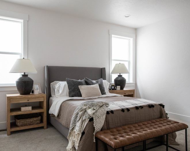
Best Seller Bed: Tilly Upholstered Bed – Featured in “Classic Grey Linen“.
Why I love it: Year after year, the Tilly Bed continues to be one of Wayfair’s best sellers. This timeless bed comes in 44 fabric choices, making it easy to find one that works perfectly in your space. My favorite options are the neutral “Zuma White Textured Linen,” the “Zuma Pumice Textured Linen,” and the “Textured Amber Linen” for a current, warm-hued bed. There’s a gap in the back, so I recommend using it with a minimum of a 12” mattress and a 9” box spring.
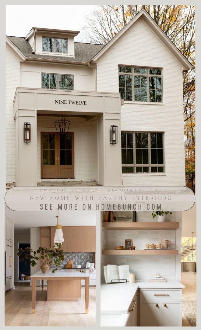
Builder:@alturashomes.
Click on items to shop or read more about them below the image:
Note: Prices are subject to change due their “Flash Deal” sales.

1: I shared this Console Table recently on my Home Bunch Favorites: Holiday Decor (definitely take a look if you’re in search of inspiring holiday decor!). I felt compelled to share it with you again because this stylish and functional console table is an incredible bargain. It offers a high-end look at an affordable price. UNDER $180!
2: This Wood Accent Wall Decorative Mirror offers beautiful design, is high quality and comes in many colors and sizes to choose from! HUGE SALE!
3, 4 & 5: I know it’s hard to believe, but Christmas is closer than we think, and this Real Touch Christmas Garland and this 76” in. Faux Garland (44% Off right now!!!) always sell out. If they sell out before you have the chance to scoop them, this 9′ Christmas Greenery PE Dripping Garland is another one I think you’ll love!
6: Are you feeling a little embarrassed about the state of your current sofa or are you simply tired of it? If so, I have the pleasure of sharing with you THREE GORGEOUS sofa options, all under $560! Option #1: 80.5″ Farmhouse Upholstered Slipcovered Sofa – The deep seat has that perfect sink-in factor, perfect for long movie nights. Option #2: 85” Square Arm Upholstered Sofa (seen in the picture above) – Featuring 8″ wide square arms and linen-blend upholstery, this sofa has a modern feel that is perfect if you are going for a neutral and practical look. So beautiful and so affordable! Only $580! Option #3: This Wayfair Verified 80.31” Upholstered Sofa comes in several colors to choose from. The cushions are on the firm side, but they are still very comfortable. This sofa is a best seller; it doesn’t look cheap at all and it’s currently only $379! Such an amazing buy!
7: Now, here’s a huge deal for you! This Ottoman Coffee Table is often recommended by designers, but right now, you don’t need to pay the big price tag because it’s 41% off!
8: Currently at 46% off, this designer-look and comfortable Velvet Accent Chair is under $180 right now. You can’t go wrong with such a stylish accent chair for this price! It comes in other colors that you can choose from!
9: This Full Assembled Upholstered Accent Chair is super stylish, and the price is just right! These chairs are great; they come assembled, so you just have to take them out of the box. Only $284!
10: This Flocked/Frosted Realistic Spruce Christmas Tree with LED Lights is on a huge sale and it’s absolutely beautiful! The branches are sturdy for heavier ornaments, and it has a beautiful appearance and realistic look. Under $160 for the 7.5 ft.
11: Certain things never go out of style, and this 22” H Upholstered Side Chair (Set of 2) is one of them! Several colors to choose from, but the Light Beige Fabric/Light Ash Frame (as seen) always sells out fast.
12: This 63-Inch Long Dining Table for 4-6 People is perfect for that chunky look that is trendy right now. Only $173!
13: Being a bestseller at Wayfair, this Linen Upholstered Solid Wood Dining Chair (Set of 2) is such a classic option! Also available as armchairs. Both are on sale! They’re my favorites!
14: If you’re going for a designer-look vibe but you’re on a budget, this Framed Artwork is perfect for hanging something small over the bed. I love the warm hues and the simple golden frame.
15: You already know it, the Tilly Bed truly is my favorite! Its classic wingback headboard means it’ll always be in style. This bed feels solid the second you touch it—no wiggle or wobble in the frame, and with its classic look, it will work with any bedding style you want to dress it with. The options are endless with this bed!
16: Pillows can completely change the feel of any space, and this 100% Cotton Reversible Throw Pillow is getting all of my attention.
17: This Nightstand with 3 Drawers is such a great find! They need some assembly, but they are not too complicated, and it’s worth the price you are paying. I love their classic, upscale look and how spacious they are. Only $410 for 2 nightstands!
18: This cute Turned Wood Spindle Nightstand with Drawer is over 40% off right now! Only $120. Rush before it’s gone!
19: We all love things that make our lives a little easier, right? This Solid Wood Nightstand with Built-in Power Outlet and USB Port is a super solid wood nightstand, and I love that it comes with the USB plug-in on the top. The drawers open and close very smoothly.
20: I love this Channel Ottoman! It’s the perfect size and great quality. The color is perfect for the earthy neutral vibe of the bedroom or living room.
21: If you are tired of the cheap looking, super thin rugs that we often find out there, this Ivory / Taupe Area Rug is thick and soft. The true tones are ivory and taupe. High-quality and 51% off right now!
“As always, thank you for your presence here, my friends. You all mean so much to me. I hope you enjoyed my suggestions and that they helped you find something beautiful for your home.” With Love & Light, Luciane @HomeBunch
Interior Design: @allisoncampbelldesign – Photography: @amandapeterson.photo.

Thank you for shopping through Home Bunch. For your shopping convenience, this post may contain AFFILIATE LINKS to retailers where you can purchase the products (or similar) featured. I make a small commission if you use these links to make your purchase, at no extra cost to you. Shopping through these links is an easy way to support my blog and I appreciate and I am super grateful for your support! I would be happy to assist you if you have any questions or are looking for something in particular. Feel free to contact me and always make sure to check dimensions before ordering. Happy shopping!







“Dear God,
If I am wrong, right me. If I am lost, guide me. If I start to give-up, keep me going.
Lead me in Light and Love”.
Have a wonderful day, my friends and we’ll talk again tomorrow.”
with Love,
Luciane from HomeBunch.com