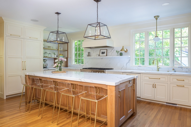
Kitchen trends come and go but if you hire good professionals, chances are that your kitchen will be done right and continue to look good for many years after we say adieu to 2020.
Here, the builder and designer for Clearcut Construction, Inc., shares more insights about this recent kitchen renovation:
“On our first site visit, I realized there was a traditional theme throughout the home, and a kitchen too small to fill the requests for appliances, storage, and just overall functionality the clients were really hoping for. They also had a major layout issue. The powder room actually separated the kitchen and the main dining room walkway. It was quite a maze. In order to solve this problem I moved the powder room to an existing breakfast area that was too tight to be of any use to the kitchen. The dining room table was also blocking the main path to the living room. So to fix this issue I turned it into more of a corridor accessing the back deck by adding french doors and creating a new entry for the main living area. Now, here came the hard part. I had to convince the homeowners to do away with their large walk-in pantry in order to expand the kitchen. You can imagine what was going on in their brains when I first introduced this idea. And that is how the pantry unit developed. I knew it had to not only be functional, but to also look nice since this storage area couldn’t be hidden away. Thankfully, they gave me free reign on design, so I got the opportunity to create what was truly a statement piece. We chose to go with a dark color for high contrast since the color scheme in the kitchen was neutral. It also helped to tie in the wood island and existing trim color together. Since this new layout was one of a kind, I knew the design had to be too! We paid close attention to detail with the island’s legs, pantry, custom wood shelving unit, and court shelf that continued across the window. I personally think we achieved the uniqueness we were going for while still staying in our traditional style. Another thing that we really wanted to stand out was the hood. We do similar hoods in most of our projects, but I wanted something totally different. So I bounced around different shapes until we came up with the one you see in the pictures.
At the end of the day the goal was achieved: create a unique design that was not only beautiful, but functional to our clients’ needs.” – Richard Ryder Designer/ Builder for Clearcut Construction, Inc.
Make sure to see these amazing renovation projects by Clearcut Construction, Inc.:
– Black & White Modern Farmhouse Bathroom.
– New Mid-Century Modern Kitchen Design.
– Two-toned Grey and White Kitchen Renovation.

As is a common theme in our area, our clients adored their neighborhood but their kitchen was not exactly what they were hoping for. It was such a joy working with them to create a space that was both functional for their busy family and also representative of their personal style. This is our take on an updated traditional with touches of farmhouse to add warmth and depth. There are many specialty features and elements in this kitchen so if you scroll through them too quickly you’re sure to miss something! 🙂
Counterstools: Wayfair – similar here & here – Other Popular Choices: here, here, here, here, here, here, here & here.
Kitchen Windows: JeldWen.
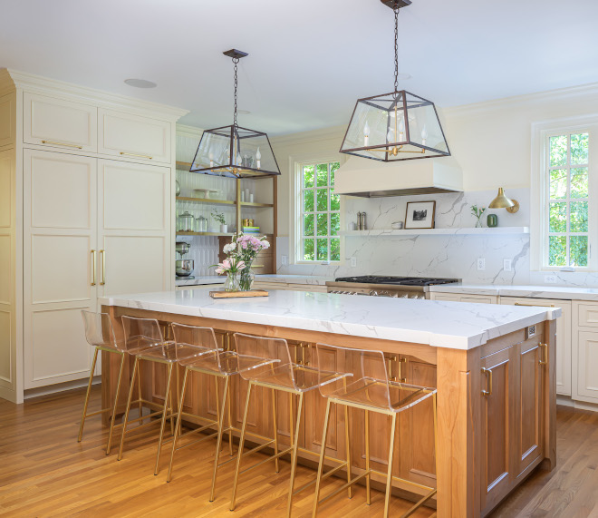
Kitchen Pendants: Lantern and Scroll – similar here – Others: here, here, here, here, here, here & here.
Paneled Refrigerator: Thermador.
(Scroll to see more)
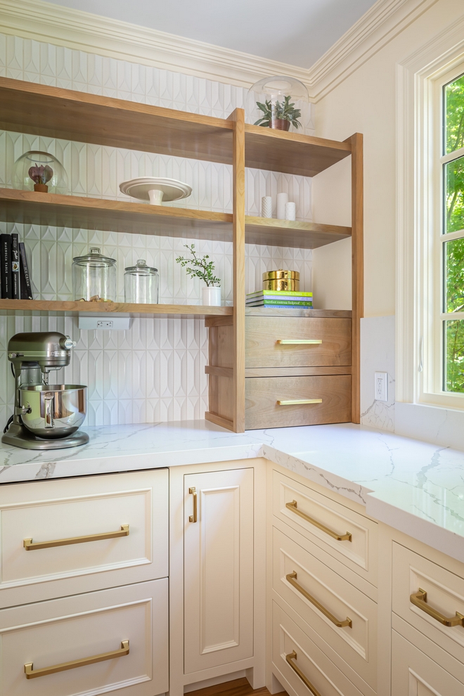
“When we first started brainstorming design ideas our main goal was to keep with the home’s original traditional style, but update it with modern touches to give it an upgraded feel. Take a look at this portion of the space. There are many traditional elements here: the cabinet design, color palette, and crown molding. By adding the modern elements, we really made this design unique. Note the large brass hardware that is super sleek, the clean lines from the shelves, and the white quartz countertops.”
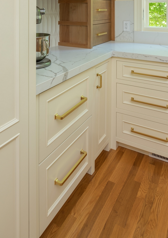
Appliance Pulls: Rejuvenation.
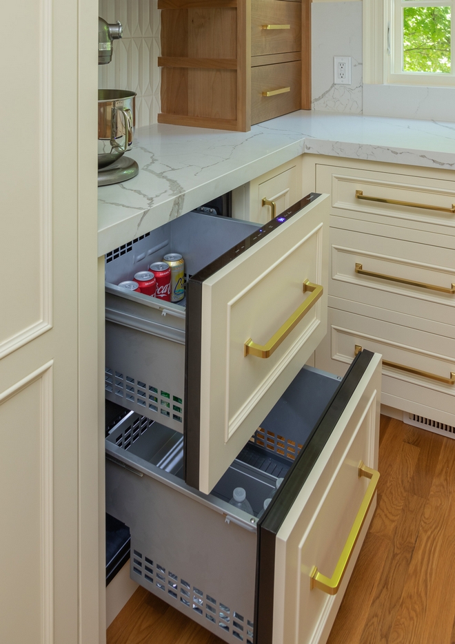
Refrigerator drawers are really practical and these panel-ready by Thermador create a seamless look.
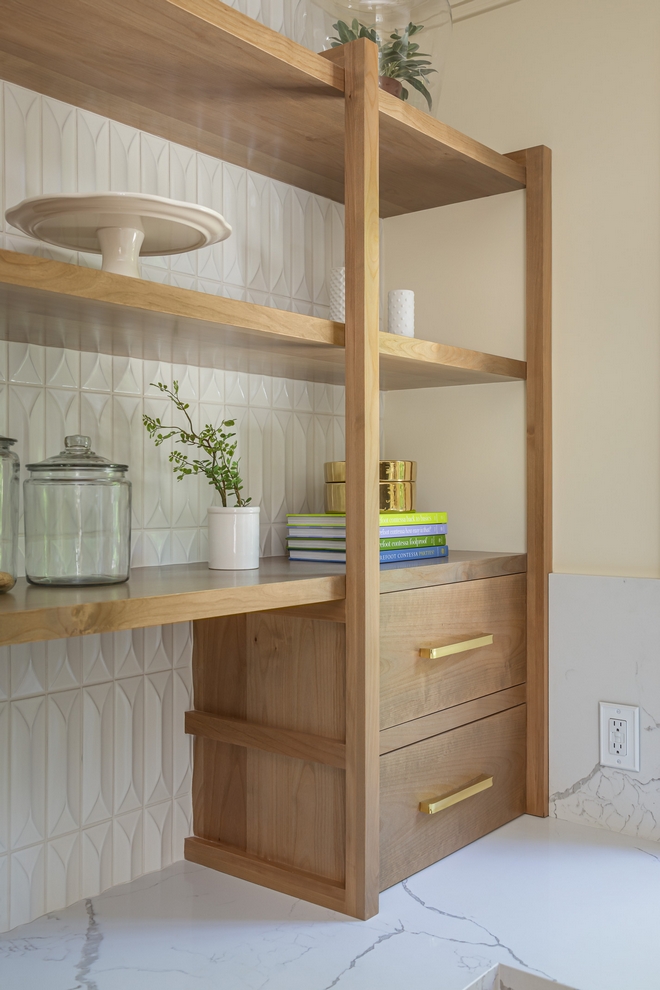
Backsplash Behind Open Shelving: 3D Ceramic Tile White Subway – Other Beautiful Tiles: here, here, here, here, here, here, here, here & here.
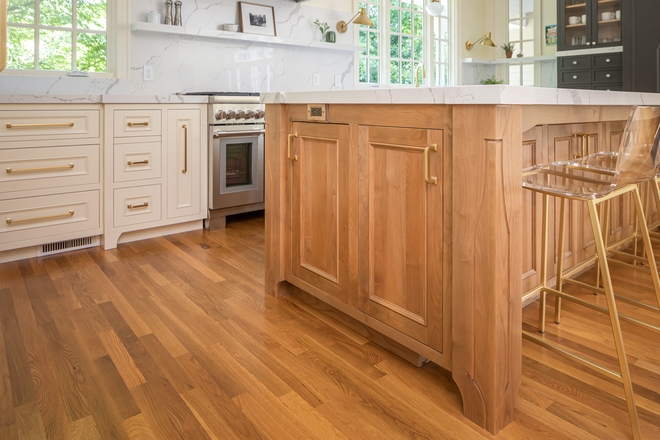
Kitchen Cabinet: The kitchen island and the perimeter cabinets are custom. Notice the beautiful design on the kitchen island posts.
Island Hardware: Arched Mission Hardware Line in Aged Brass from Rejuvenation.
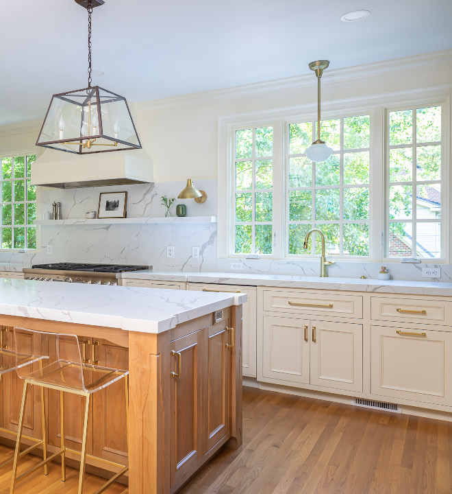
Faucet: Brizo Rook Smart Touch in Luxe Gold.
Sink Pendant Light: Rejuvenation (The designer customized this pendant, so it has the 10” Opal Classic Schoolhouse Shade and the rod finish is Aged Brass).
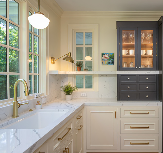
Sink: Riverby from Kohler.
Crystal Pulls: Schaub City Lights Knob.
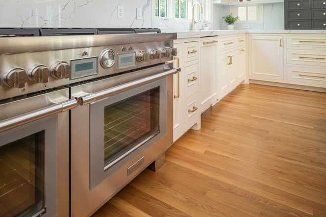
Range: Thermador 48-Inch Pro Grand Commercial Depth Dual Fuel Range.
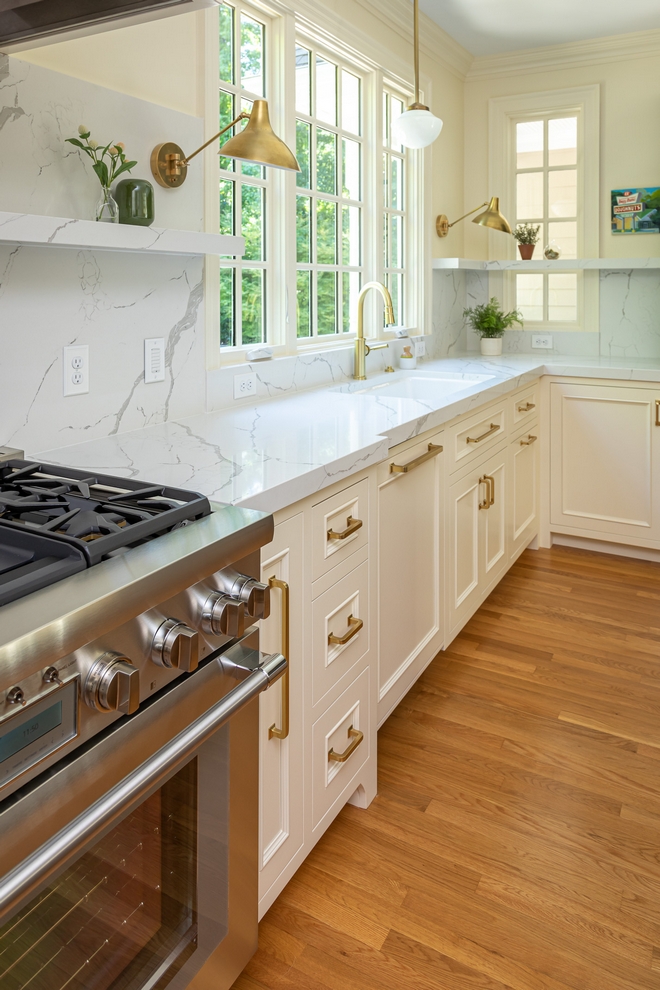
Countertop and shelves are MSI Calacatta Laza Quartz.
Hardware: Mission Hardware Line in Aged Brass from Rejuvenation. We chose different sizes for different cabinet faces.
Dishwasher: Thermador.
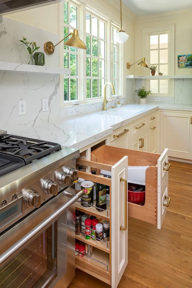
The kitchen cabinets feature many custom pull-out drawers for spices, utensil, pots & pans to maximize storage space.
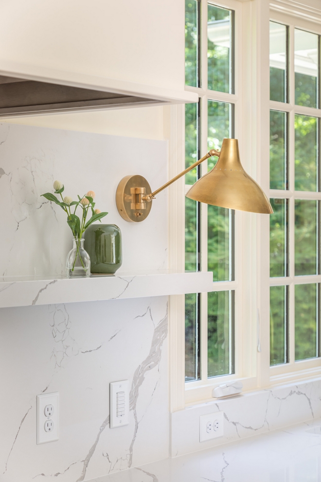
Backsplash is also in MSI Calacatta Laza Quartz.
Sconce: Visual Comfort.
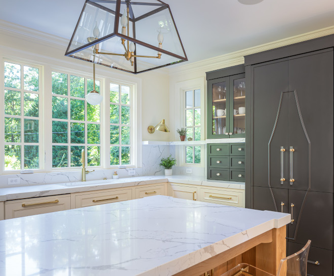
Countertop: MSI Calacatta Laza Quartz.
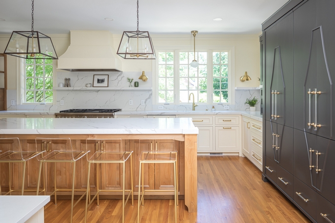
The custom Pantry is truly a statement piece. The charcoal cabinetry contrasts with the neutral color scheme found in this kitchen.
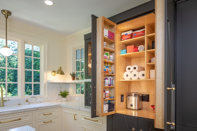
Besides being really beautiful, this custom pantry is really functional and very spacious!
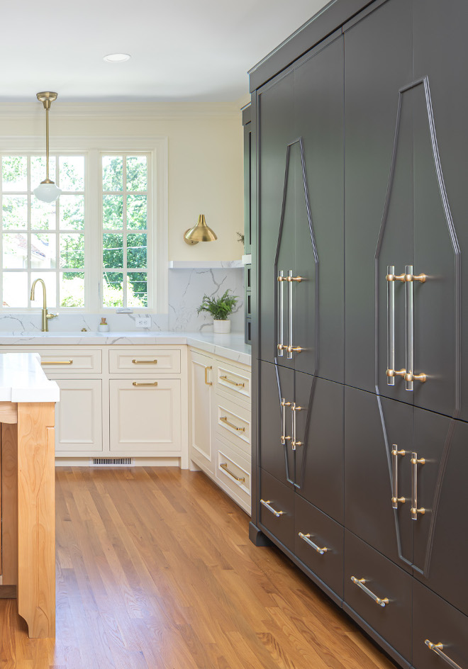
Pantry Paint Color: Urban Bronze by Sherwin Williams.
Hardware: Schaub Lumiere.
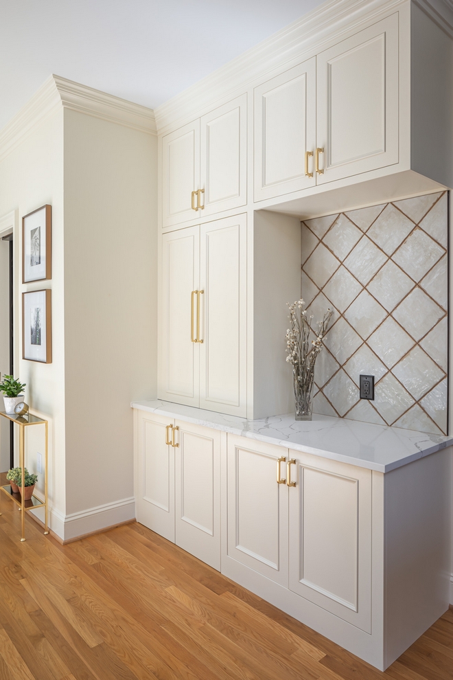
Extra storage is added with a custom cabinet between the Kitchen and the Family Room.
Tile: 8×8 Ceramic Tile.
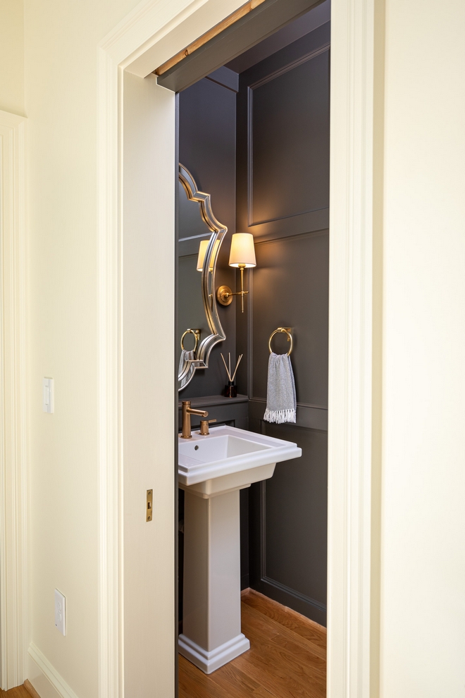
The Powder Room features wall paneling and a classic pedestal sink.
Pedestal Sink: Kohler Treshman 24” Pedestal Sink Bathroom Sink.
Mirror: Uttermost – Others: here, here, here, here, here, here, here, here & here.
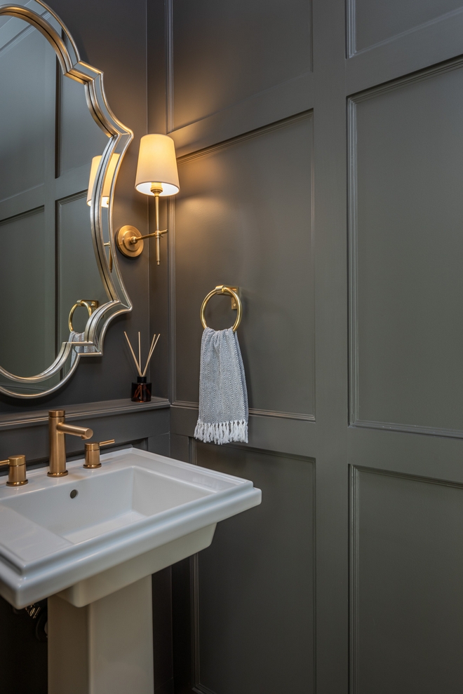
Paint Color: Urban Bronze by Sherwin Williams.
Faucet: Moen Align Brushed Gold Two-Handle Bathroom Faucet.
Beautiful & Affordable Sconces: here, here, here, here, here, here & here.
Photography: Bob Fortner.
Click on items to shop!
Thank you for shopping through Home Bunch. For your shopping convenience, this post may contain AFFILIATE LINKS to retailers where you can purchase the products (or similar) featured. I make a small commission if you use these links to make your purchase, at no extra cost to you, so thank you for your support. I would be happy to assist you if you have any questions or are looking for something in particular. Feel free to contact me and always make sure to check dimensions before ordering. Happy shopping!
Wayfair: 4th of July Sale! Up to 70% off on Living Room Furniture and Decor.
Serena & Lily: Huge Outdoor Furniture and Decor Sale.
Pottery Barn: Flash Sale Up to 70% off!
Joss & Main: 4th of July Sale.
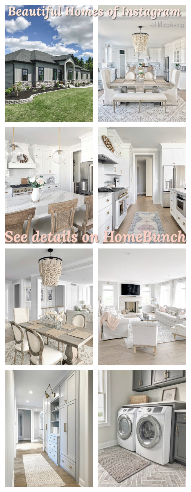 Beautiful Homes of Instagram.
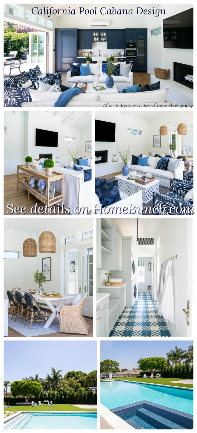 California Pool Cabana Design.
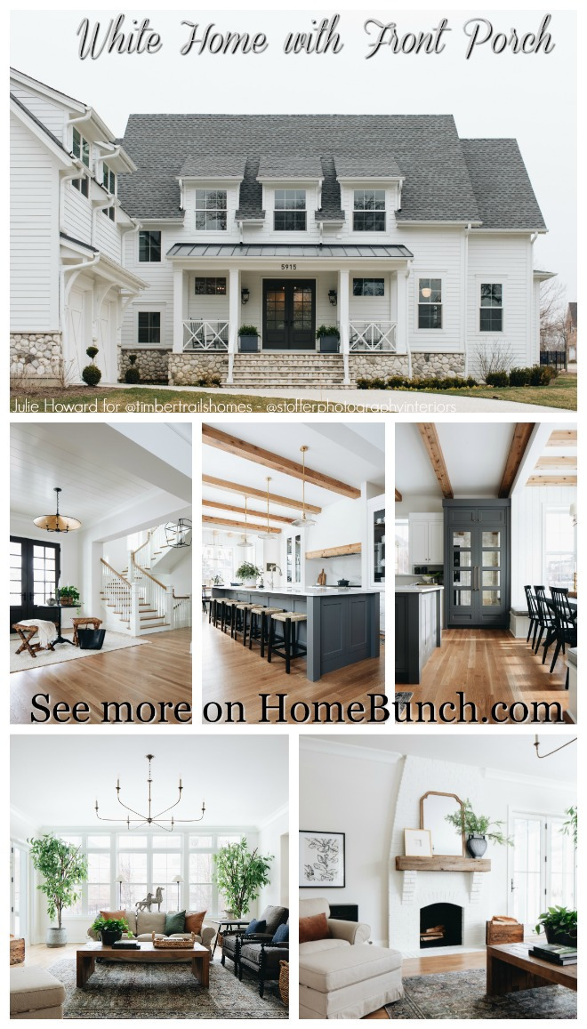 White Home with Front Porch.
 Dream Family Home Tour.
 Inspiring Charlotte Home Tour.
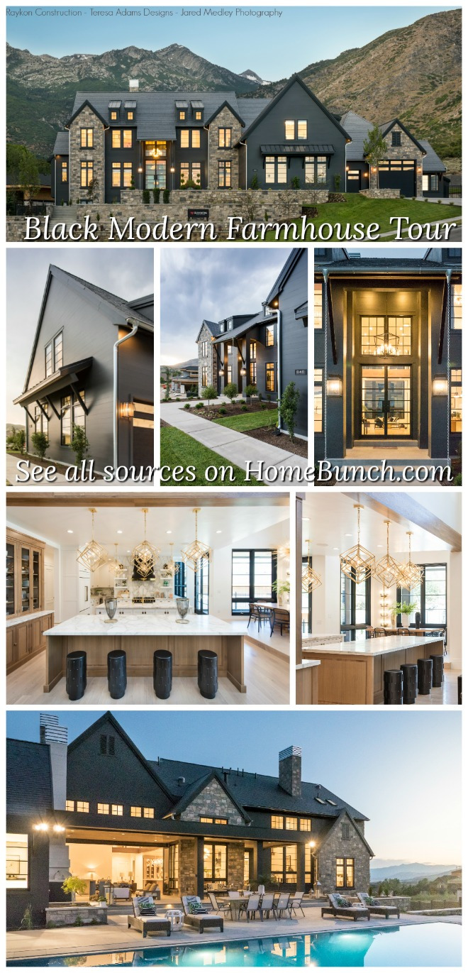 Black Modern Farmhouse Tour.
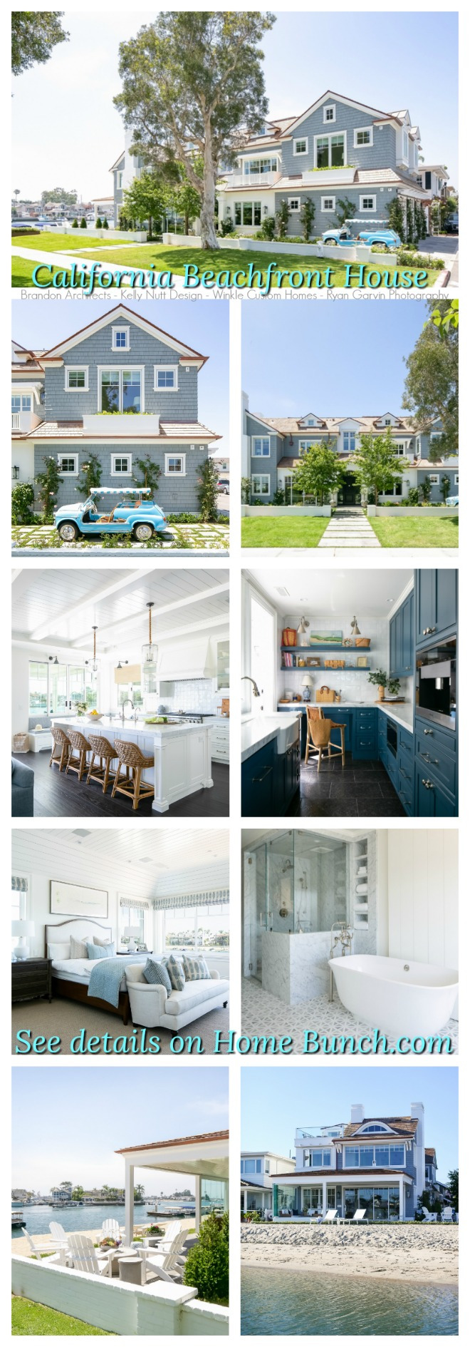 California Beachfront House.
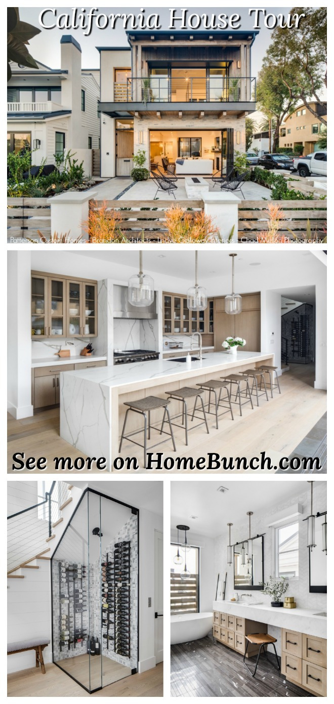 California House Tour.
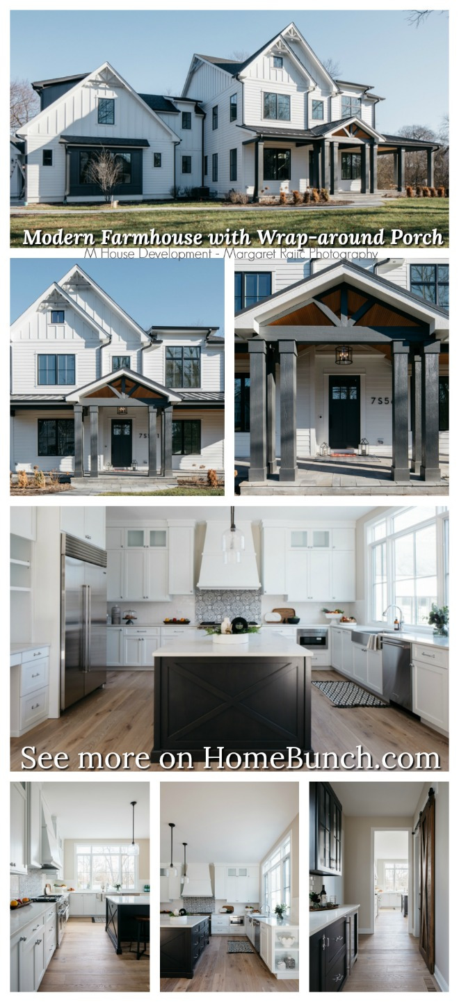 Modern Farmhouse with Wrap-around Porch.
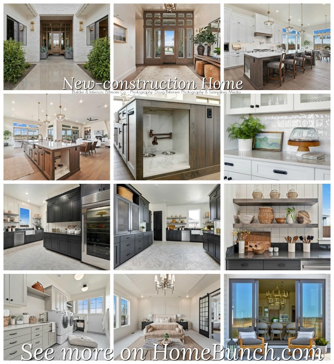 Beautiful Homes of Instagram: New-construction Home.
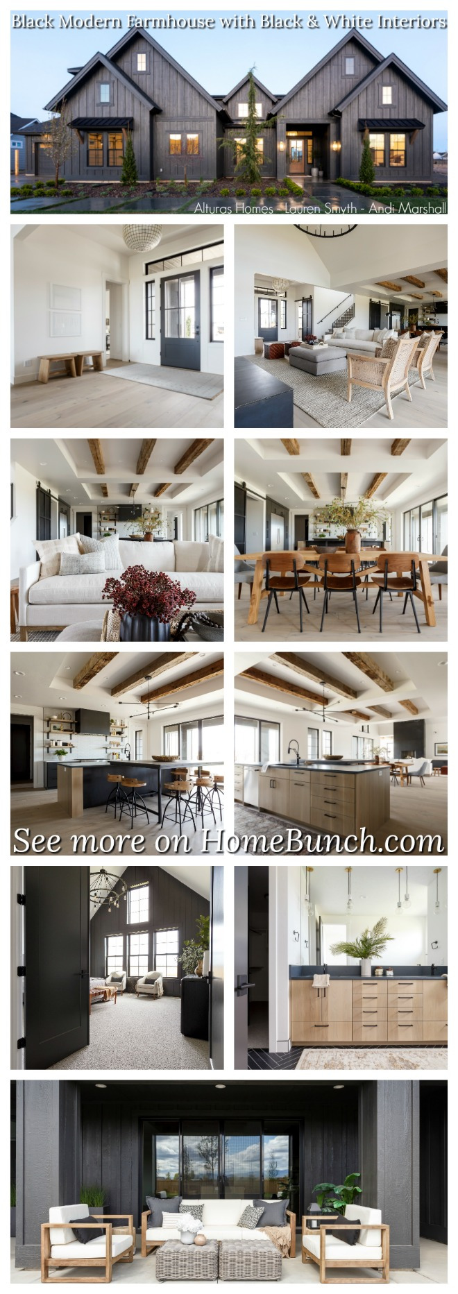 Black Modern Farmhouse with Black and White Interiors.
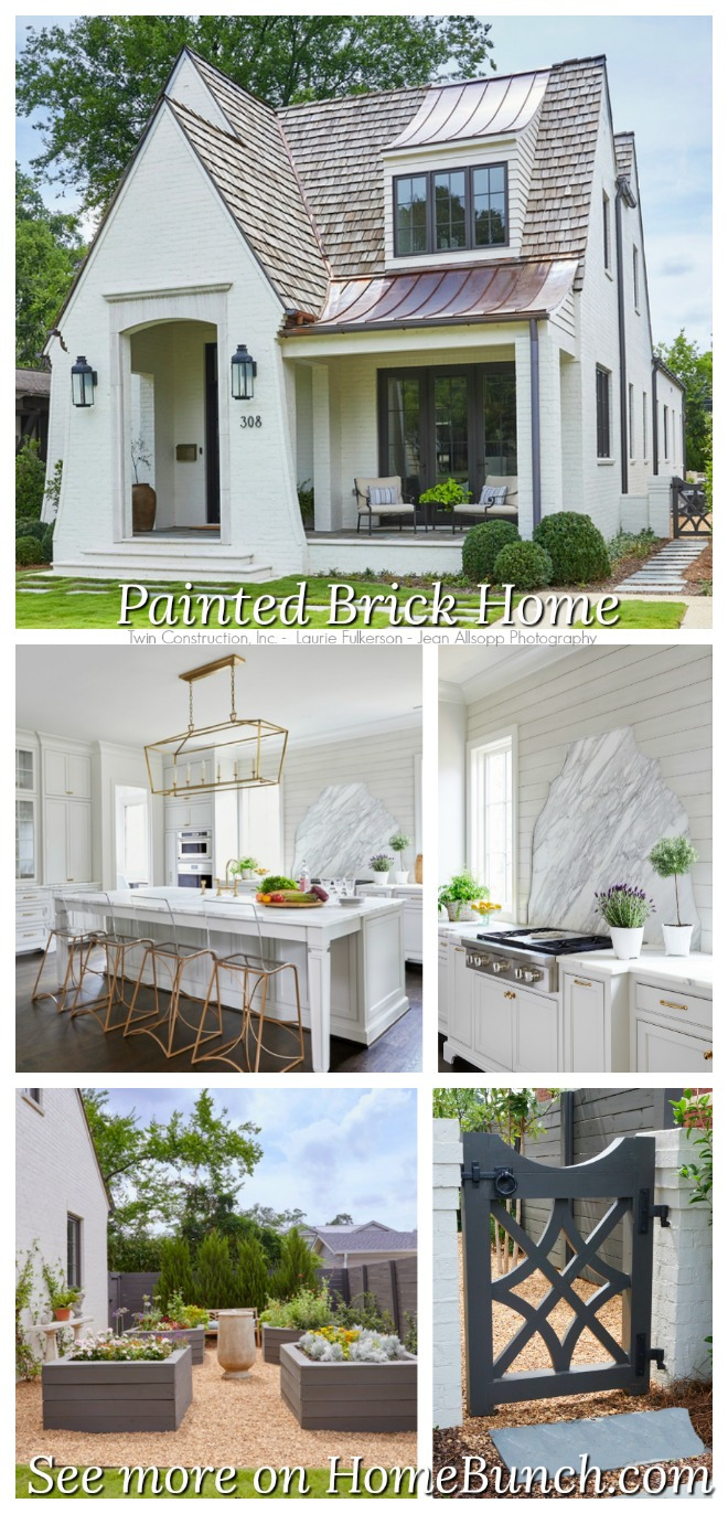 Painted Brick Home.

 New-construction Florida Home.
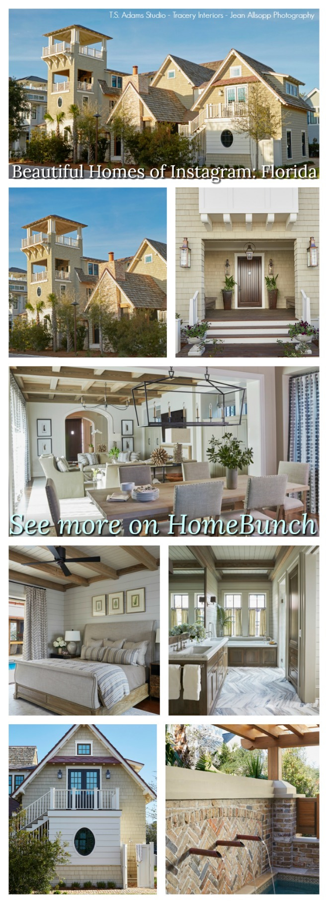 Beautiful Homes of Instagram: Florida.
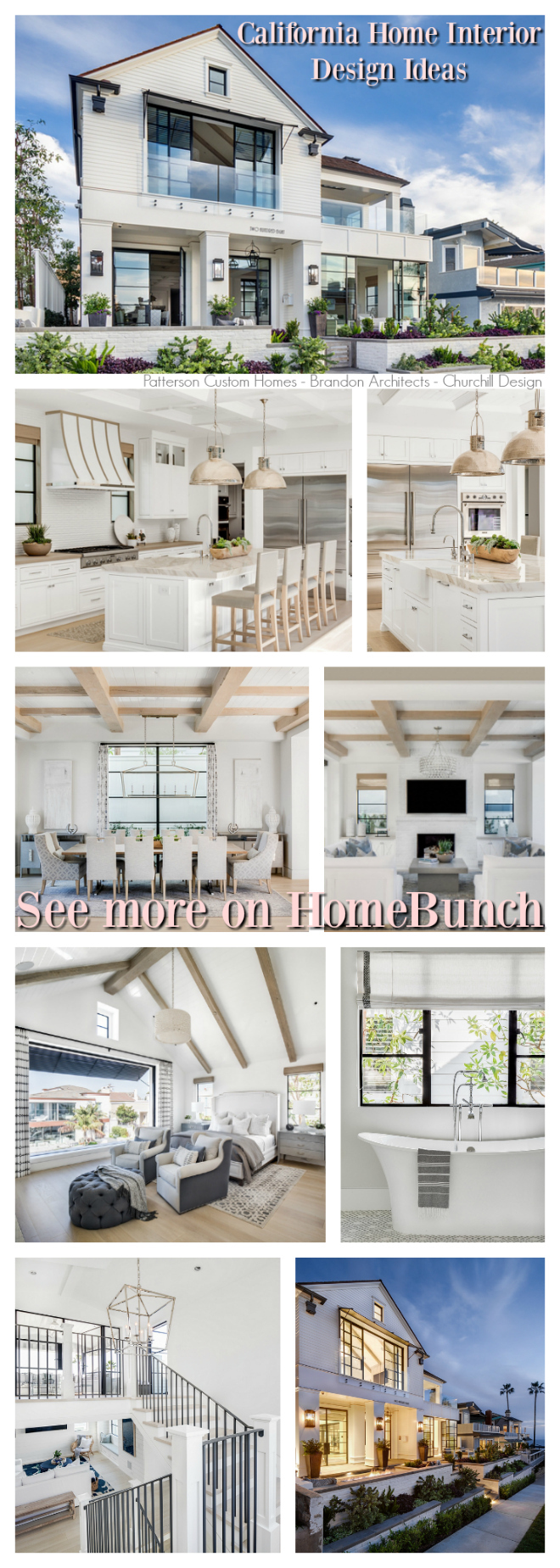 California Home Interior Design Ideas.
 Beautiful Homes of Instagram: Modern Farmhouse.
“Dear God,
If I am wrong, right me. If I am lost, guide me. If I start to give-up, keep me going.
Lead me in Light and Love”.
Have a wonderful day, my friends and we’ll talk again tomorrow.”
with Love,
Luciane from HomeBunch.com
No Comments! Be The First!