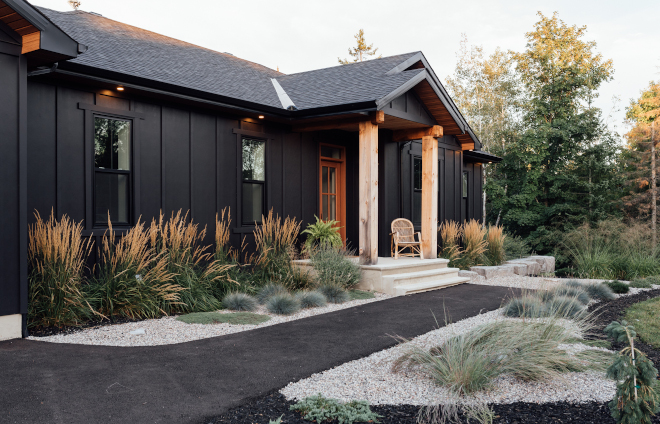
I absolutely love featuring talented homeowners and that is why I have started the “Beautiful Homes of Instagram” series many years ago. Today, we will be seeing Elyse McCurdy Home Designs of @elyse.mccurdy_homedesigns‘ home and getting to know more about this amazing person. She’s someone I wouldn’t hesitate to hire to design my own home if I lived in Ontario and I am sure we would end up being close friends.
Elyse, along with her husband, not only built an inspiring home but are also building together, along with their two young sons, a life that is sure to inspire and encourage us to follow our dreams. Life is too short to postpone that.
Please make sure to continue reading to know all of the details about Elyse’s home:
“Hello! My name is Elyse of Elyse McCurdy Home Designs (@elyse.mccurdy_homedesigns) and I am so excited to be a part of Home Bunch’s Beautiful Homes of Instagram feature. This is truly a “pinch me” moment -that our home and labour of love was seen and appreciated by Luciane is an incredible feeling. I am so happy to share our home with you today as I hope our home and journey is one that inspires you! Professionally, I am an architectural designer designing custom homes and major renovations for my clients. Personally, I am a mother of two small boys and, together with my carpenter husband, we live inside our own moody creation.
I think it makes sense to give you a little back story on us as a couple and a family because it is the stories of our previous homes that have shaped the one we live in today. In 2012, we got married and built our first home together with a local tract home builder. It was a beautiful large two storey home where we were very fortunate to be able to have as a young newlywed couple. Coincidentally, we both ended up working for the same Ottawa home builder. I was fresh out of university and it was my first corporate design job; whereas, my husband quickly climbed the corporate ladder, which meant more stress and more responsibility in a construction management position. It was not until we welcomed our first son in 2015 that my husband realized how miserable he was at his job. It was not fulfilling and unfortunately, it was not until he had a workplace injury that he came to this conclusion that he had to choose happiness -if not for him, for his new son. We made the tough decision to sell our home and intentionally downsize to lead a more simple life.
My husband went back to his roots and began working once again with his hands as a carpenter. Building a custom home always felt like a far off dream for us and it was not until we were driving around in the countryside outside of Ottawa one afternoon, while our infant son slept in the backseat, that we found a beautiful wooded lot in a quiet estate subdivision outside of the city. We were fortunate enough to figure out the finances and make it work. With the encouragement and help of our family and friends, we built our second home in 2017. Keeping our newfound philosophy of choosing happiness and simplicity, we decided to build a small bungalow with a simple floor plan with a walk-out basement to maximize the overall footprint of the home.
During that time, we became pregnant with our second son, who was born shortly after we moved into our new custom home. We thought this would be our ‘forever home’. We enjoyed the building process so much that we quickly decided to do it all over again! Many thought that we were overly ambitious to do it again with two small children, but being in the industry with the skills we both have as a designer and a carpenter, we saw the opportunity to sell this home, make a profit and propel us further as a young family. I was still working my corporate job and had dreams of working for myself. Selling our second home and building again was certainly not an easy decision but it was a significant moment for us as a family -it meant that we could once again make life choices to lead a simple life and put happiness first. My husband previously had that foresight when he chose to leave his high stress corporate job for something more fulfilling. The same was true for me and it was now my time to step out and make that change. If there is anything I can show my sons, beyond love -it’s to lead life with passion and do what you love every day. I knew I had this passion inside of me, one that was not realized with my corporate job. Selling our home once again put us in a financial position which allowed for me to embark on the roller coaster ride of being an entrepreneur.
Being in the field we both are in, my husband and I see a lot of homes, but when it came to designing our own again, it actually was very straightforward for us. We had learned that we thrived living with the small bungalow floor plan and again decided we wanted ‘simplicity’. A simple floor plan checking all our must-haves, like an open concept kitchen and main floor living space with views of the trees outside. We wanted to again maximize the footprint of our floor plan with a walk-out basement that would give us access into our wooded backyard. Where we envisioned lots of time spent outdoors, bonfires and playing with the boys in the yard. The floor plan was the easy part, as it was a natural evolution of our previous bungalow design
This home embodies and symbolizes to us so much more than four walls. It’s the home that has allowed us to be free and really lead our lives with passion. Thank you for taking the time to read our home’s story and I hope it has inspired you in some way!” – Elyse of Elyse McCurdy Home Designs.

“My favourite aspect to every home I design is the exterior. It’s the moment you can play with texture, colour and contrast. For the exterior of our home, again we led with the notion of simplicity. Down to the pitch of the roof, the materials and colours used on our home.” – Elyse of Elyse McCurdy Home Designs.

“Having a moody exterior has been an amazing canvas against our ever changing Canadian landscape. The four seasons are the perfect backdrop to our home and there have been absolutely zero regrets with our exterior colour choice. Moving inside, it felt natural to extend the idea of repeating the colours and wood tones we love with contrasting black and white accents. Our home feels warm and cozy and is the perfect design for us as a family of four.” – Elyse of Elyse McCurdy Home Designs.
Landscape design: Gardening by Design Inc.
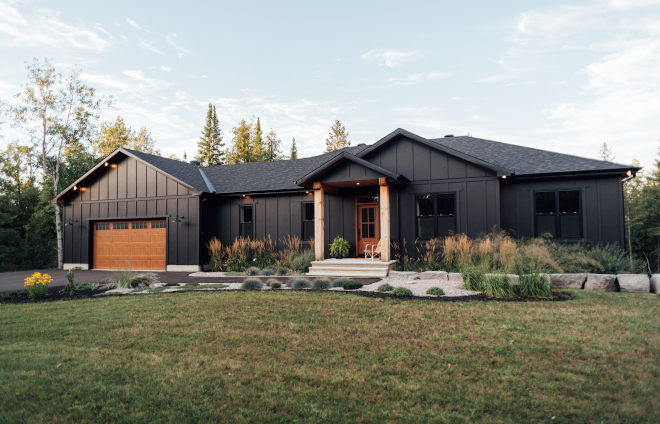
“Once we had nailed down a colour for the siding, we decided to pair the moody colour with black windows with a simple vertical grill down the centre on a single hung window giving it a modern farmhouse feel. To give the front of the home a bit of character and interest, we chose to have large 10” pine timbers flanking our medium oak fibreglass front door and a Clopay steel garage door from their Gallery Collection with a wood grain finish in Medium Oak to balance it off yet add a bit of contrast against the dark siding colour. The home’s exterior is simple but timeless.” – Elyse of Elyse McCurdy Home Designs.
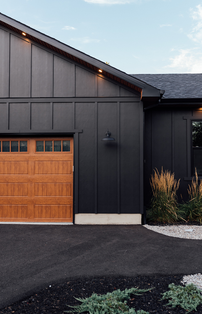
“We both are big fans of the James Hardie fiber cement product and knew we would be using that for our homes’ exterior since it is a product that can give you a ‘wood grain’ look without maintenance of it and still remain a classic choice overtime.” – Elyse of Elyse McCurdy Home Designs.
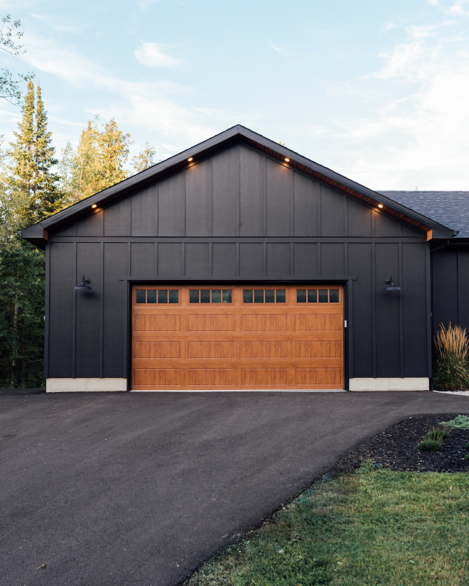
Garage door: Clopay, Gallery Collection in Medium Oak.
Barn Lights: here – similar.
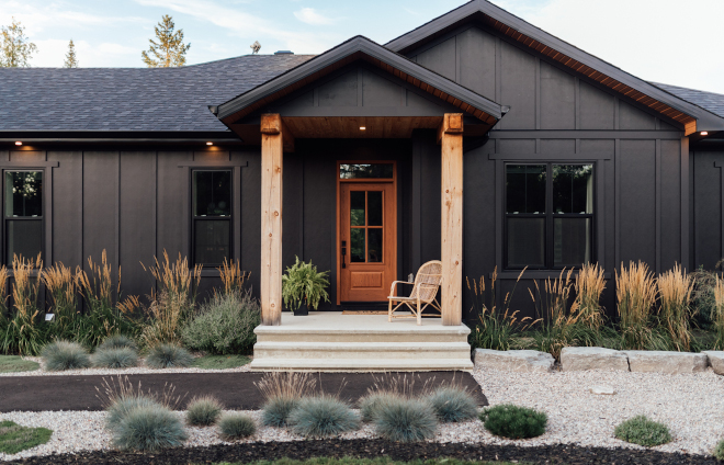
Exterior siding: James Hardie, colour: Midnight Black (formerly Black Water).
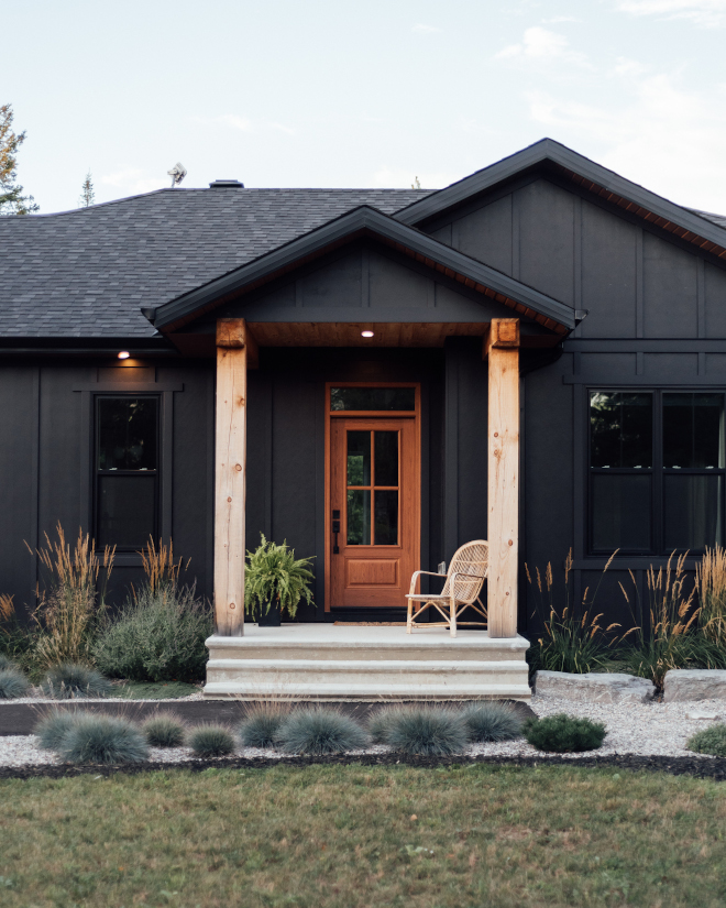
“These are the top 3 questions we get about our moody home:
1. What color is it? – James Hardie Midnight Black (formerly Black Water), Dream Collection. It’s such a great color with no weird undertones.
2. Batten spacing? – 24″. Each James Hardie Siding Board used is 4×10. Every other trim, aka “Batten” covers up a seam. Historically board & batten served a purpose. Now it’s more of an architectural detail in which you can modify the spacing based on the aesthetic you’re seeking.
3. Worried about Fading? Big concern for many who are nervous about making the plunge into the dark side: – James Hardie ColorPlus Technology helps to resist fading.” – Elyse of Elyse McCurdy Home Designs.
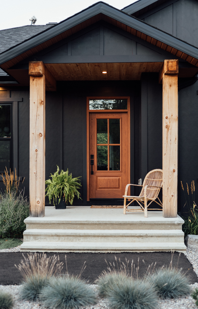
Windows & front door: Gentek Canada.
Timbers: 10” pine timbers locally sourced.
Soffit: Royal Building Solutions, colour: cedar bark.
Wicker chair: thrifted – similar: here.
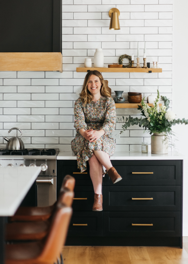
What an honor it is to have Elyse on our “Beautiful Homes of Instagram” series! She’s beautiful, talented and she worked really hard on this feature. I hope you are all enjoying it! Make sure to give her some love on her Instagram feed as well! ❤️
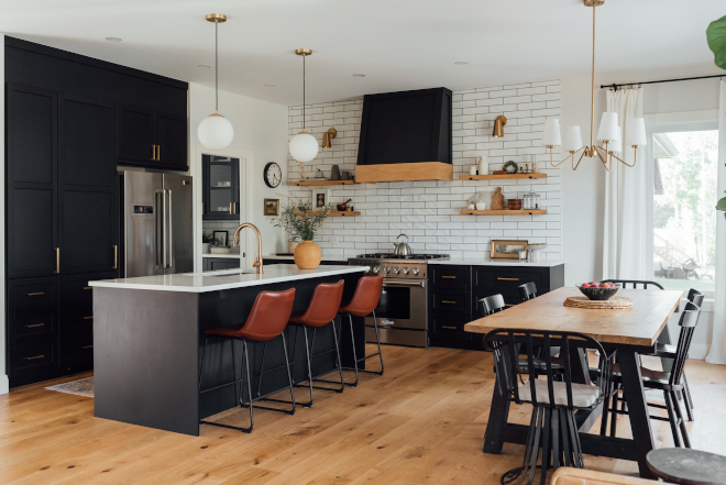
“We opted to have 7” wide engineered white oak floors throughout since it’s a small layout and visually having the same flooring throughout gives the illusion of a larger space without cluttering the eye with different floor cutlines. We went bold in our kitchen with black cabinets but felt balanced with the floors and the wall colour. It’s the perfect anchor to our open concept living space. The custom hood fan and fireplace wall are opposite one another but tie in really well and contrasting against the white walls. Overall for this open concept Kitchen and Living space, we wanted it to feel cohesive yet cozy for our family since we spend the majority of our time here.”- Elyse of Elyse McCurdy Home Designs.
Hardwood: 7” Engineered brushed white oak, Lauzon Flooring – similar here.
Wall colour: Benjamin Moore, White Wisp.
Trim colour: Benjamin Moore, White Dove.
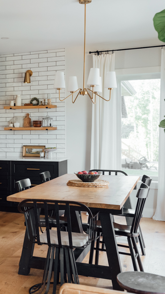
A dining table with metal base and black dining chairs add an Industrial Farmhouse vibe to this kitchen.
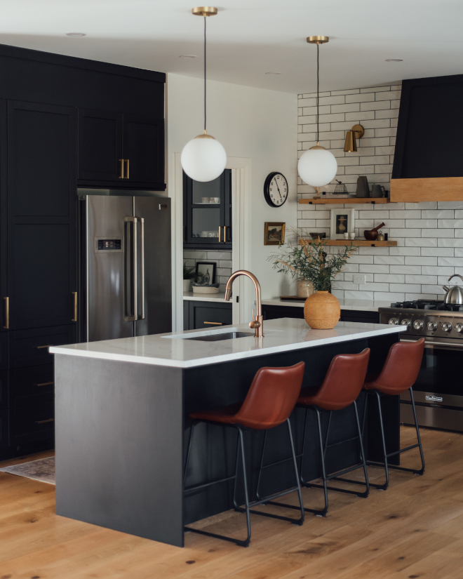
Kitchen Cabinets: Ikea Canada, Lerhyttan cabinets.
Barstools: Structube Canada, Hayden in brown – similar here, here & here.
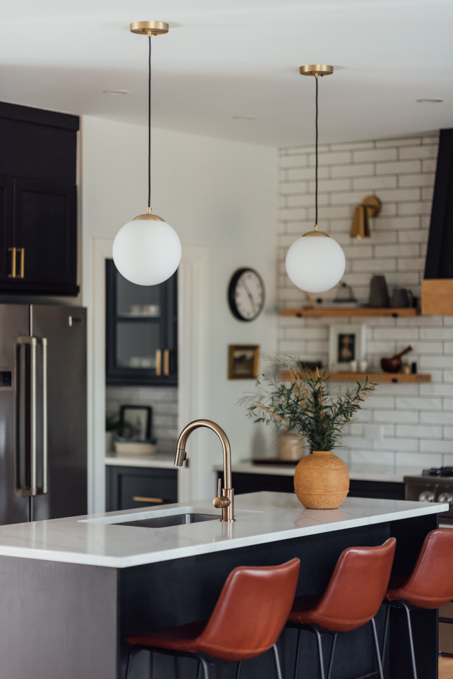
Pendants: Brushed brass with milk glass pendant.
Faucet: Delta.
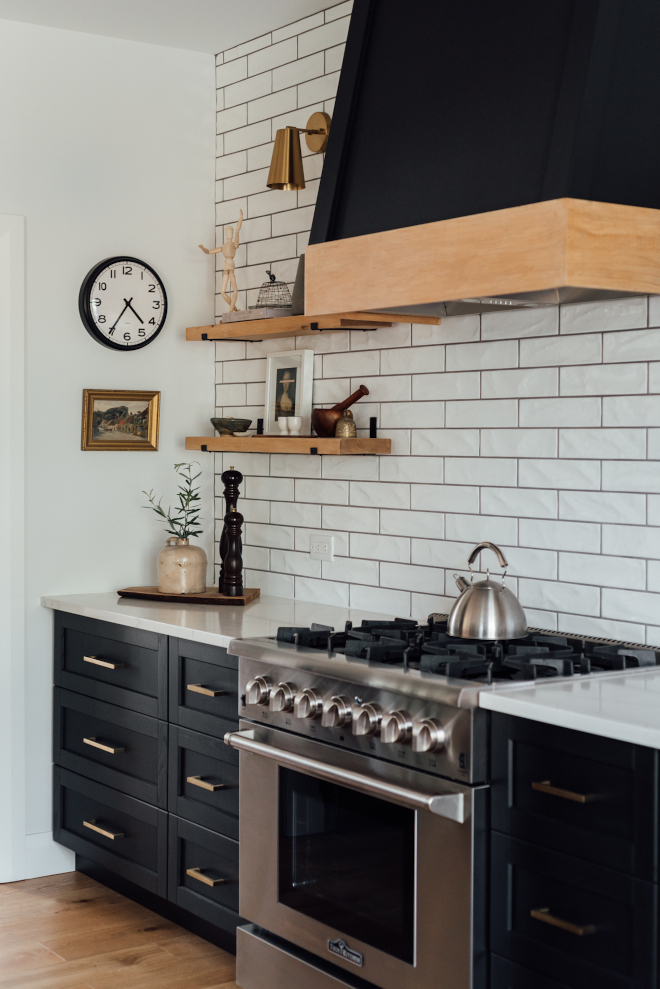
Hood fan colour: Benjamin Moore, Onyx.
Backsplash: White subway tile, matte – similar here.
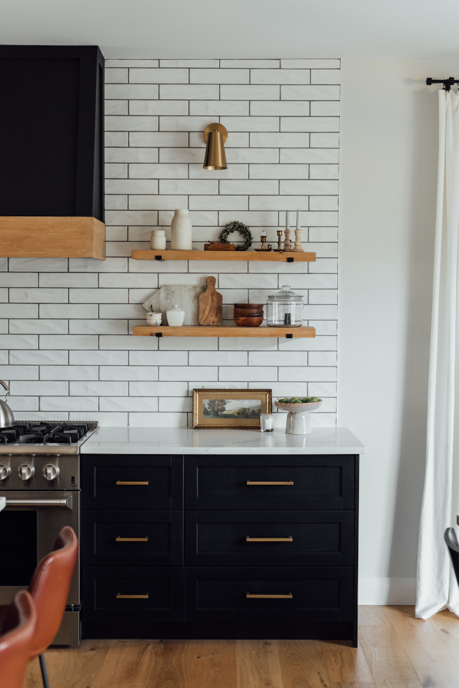
Kitchen cabinetry hardware: 7 ½” and 5” Amazon Canada – similar here.
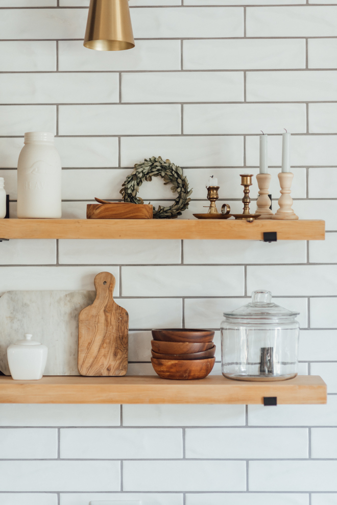
I love the simplicity of the wooden shelves against the matte subway tiles. Clean and zen without feeling cold.
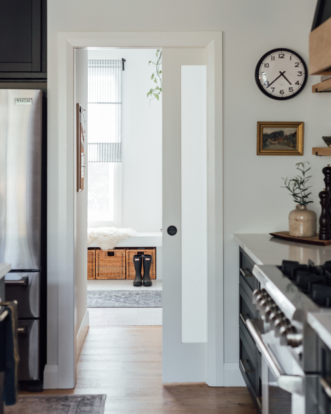
The Mudroom is conveniently located just off the Kitchen, which makes things much easier when you arrive with groceries! 🙂
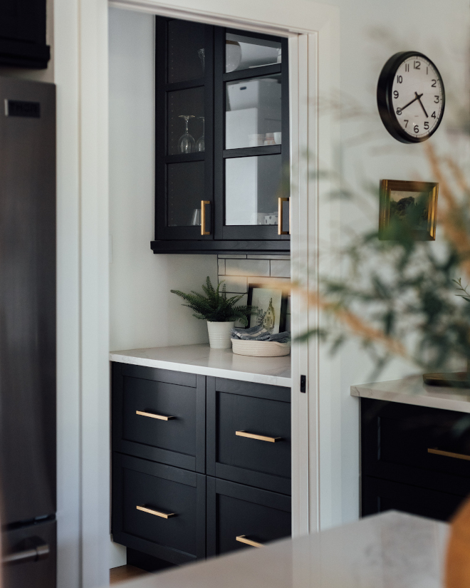
The Butler’s Pantry is located just before the Mudroom and a glass pocket door separates this space from the Kitchen.
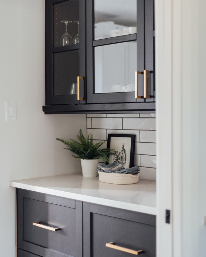
Counter: Quartz counter, Zenith Quartz Canada, colour: Calcutta Leyla.
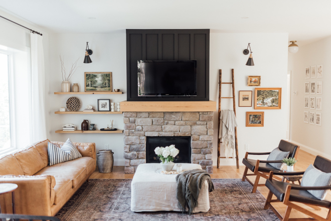
“Having a mix of old and new pieces and playing with different types of materials, like wood side tables, the leather couch and linen covered ottoman, look really lovely but also are really functional for a family with young kids! Surfaces that can be wiped down after a spill or thrown into the washer, to rugs with low piles have been really helpful in creating a comfortable yet relaxing space for our family.” – Elyse of Elyse McCurdy Home Designs.
Fireplace Board & batten: Benjamin Moore, Onyx.
Rug: Loloi, Layla in colour: Olive & Charcoal.
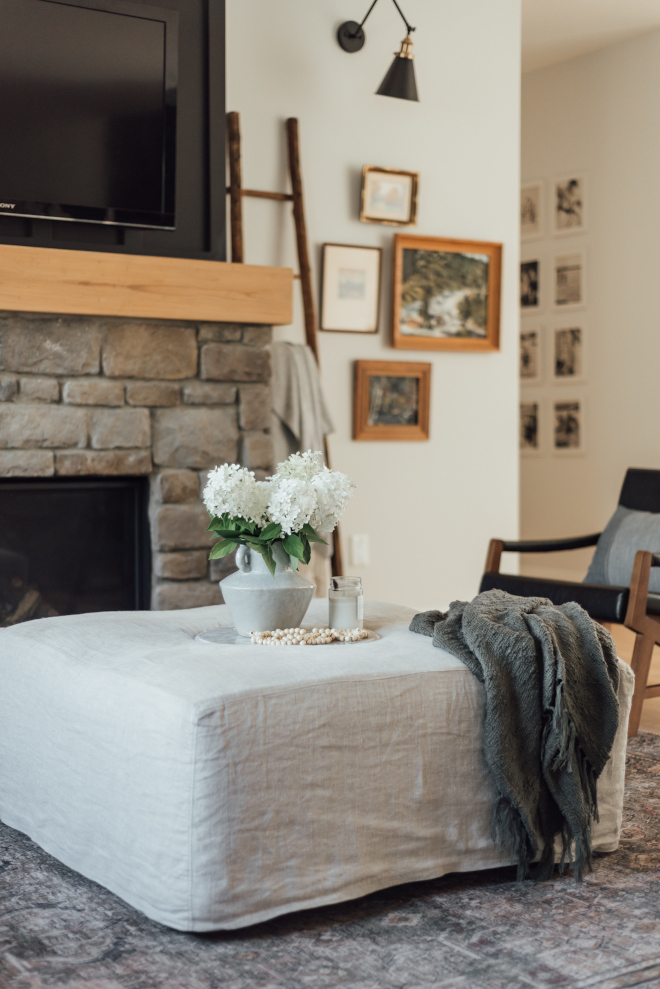
Ottoman slipcover: Etsy, BeAPillowholi.
Vase: stoneware vase with handle: Alima Deneke Interior Design – Also available here.
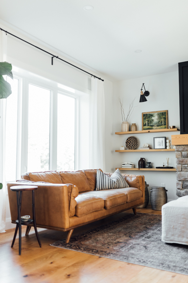
Couch, Timber leather sofa, Article – Also available here.
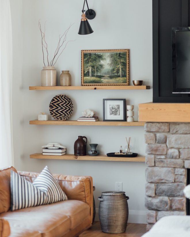
“I love collecting art, from antique or thrift shops to family heirloom art pieces. Taking those collected items with new pieces makes for a really unique and special space.”
Baskets: Maison Blonde.
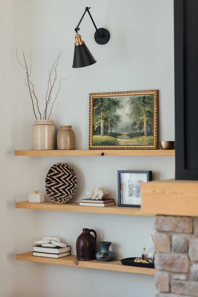
Shelves: Custom made via Shop to Shelf (@shoptoshelf via Instagram).
Shelf accessories: KKI Design Co.
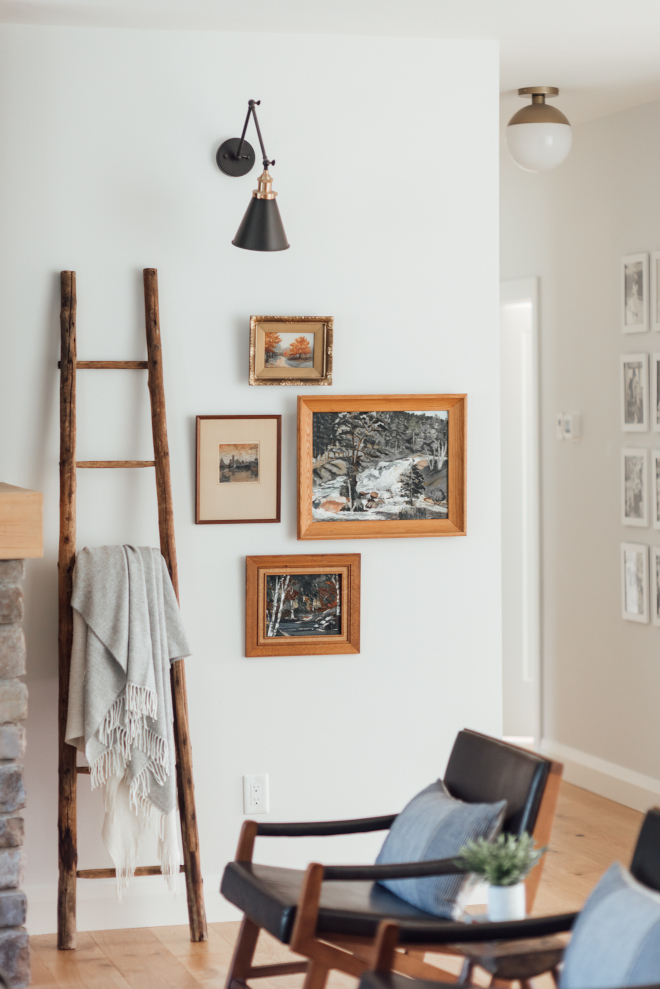
Wall colour: Benjamin Moore White Wisp.
Sconces: here – similar.
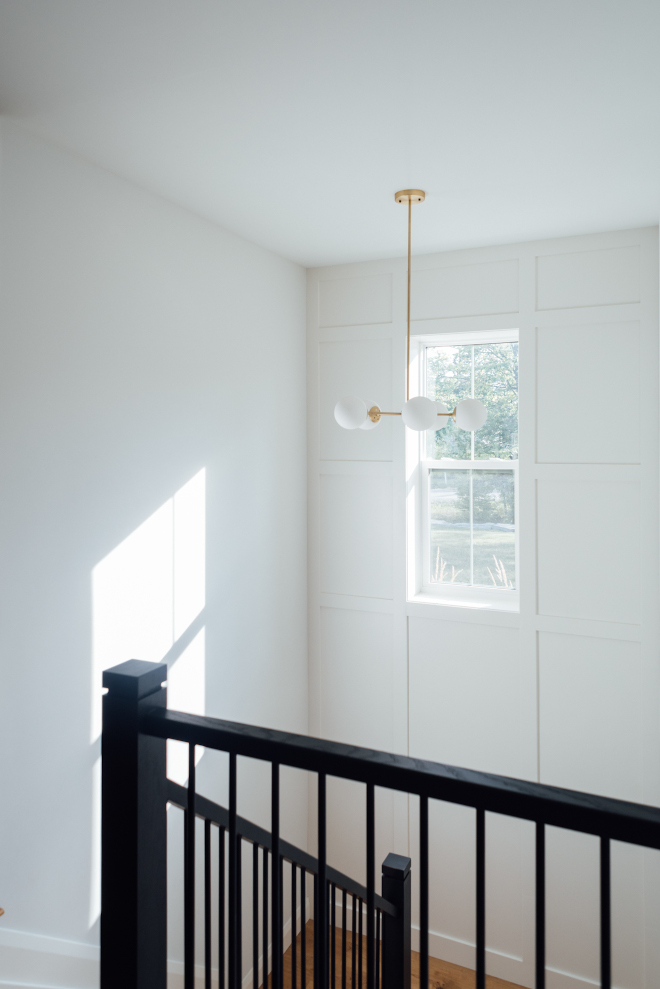
“The stairs are a focal point in our open concept living space. Having a window in the staircase lets in a ton of natural light both into the main floor but also into the basement.”- Elyse of Elyse McCurdy Home Designs.
Wall colour: Benjamin Moore, White Wisp.
Brushed Brass Chandelier pendant: Wayfair.
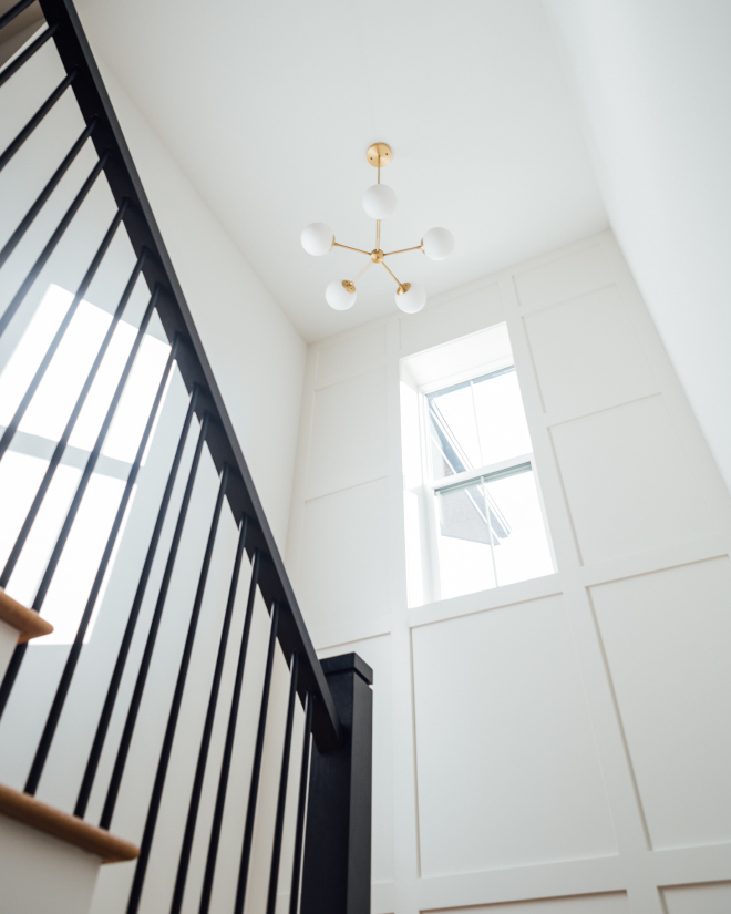
“The stairs descending into the basement left a spot for a feature wall, where we did a painted MDF box trim detail from landing to ceiling with a medium sized chandelier that ties in with the other surrounding light fixtures.”- Elyse of Elyse McCurdy Home Designs.
Trim colour: Benjamin Moore, White Dove.
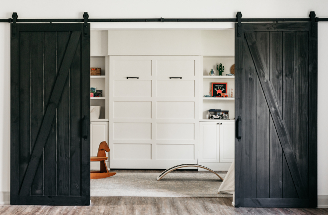
“Our previous home had a dedicated Guest Room with beautiful built-in bunk beds, but most of the time that room went unused and was only used a couple times a year. It felt wasteful to have something so lovely but not used. When it came time to create this home’s basement design, we decided to create a dedicated Playroom for the boys that could also act as a Guest Room.” – Elyse of Elyse McCurdy Home Designs.
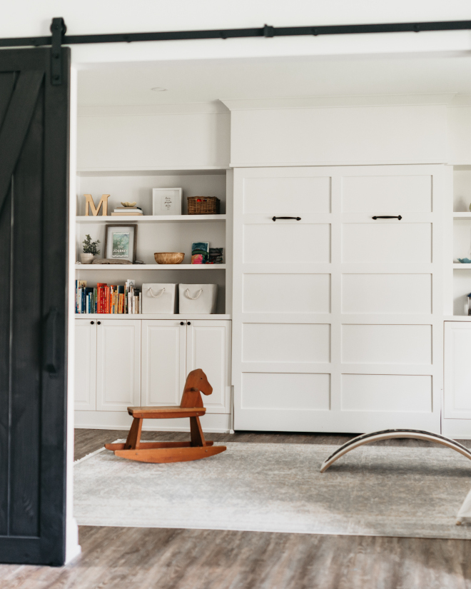
Cabinet colour, trim & wall colour: Benjamin Moore, Snow on the Mountain
Area Rug: Wayfair.
Murphy bed handles: Red Brick Emporium.
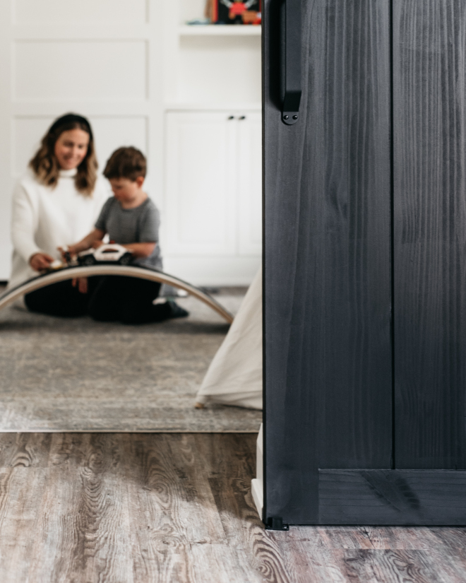
Black Barn Doors: Local store – similar here, here & here.
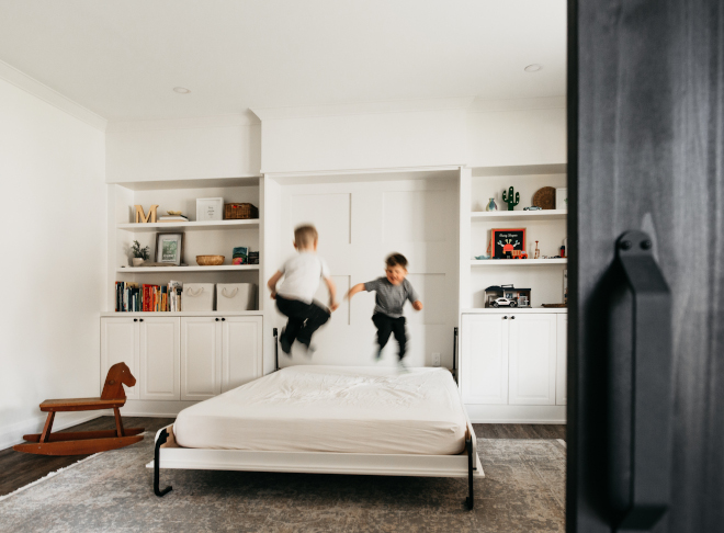
“The Murphy bed is in the middle of the room with plenty of open and closed storage for my children’s toys. The room has barn doors to close off for overnight guests or when the mess of the boy’s toys becomes too much!” – Elyse of Elyse McCurdy Home Designs.
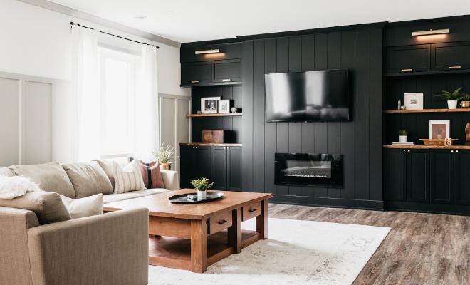
“Our basement has a large Family Room space with a big couch and large TV for cozying up and watching movies together. The space is open and in a large room.” – Elyse of Elyse McCurdy Home Designs.
Wall colour: Benjamin Moore, Simply White.
Trim & crown colour: Benjamin Moore, Hazy Skies.
Couch: DecoRest Canada – Others: here, here, here, here & here.
Coffee Table: Local store – similar here & here – Others: here, here, here, here & here.
Rug: here – similar.
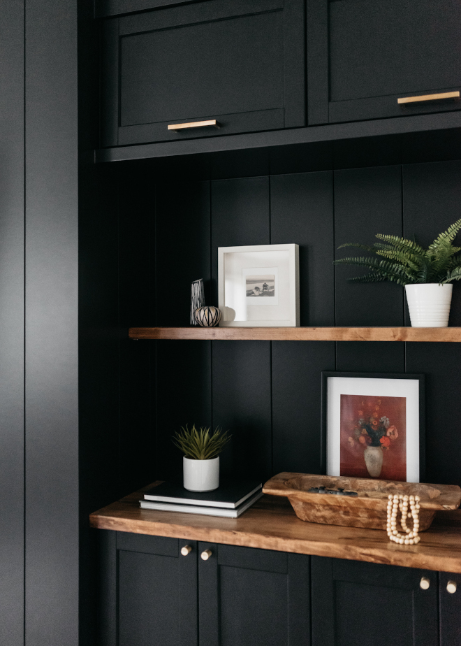
Black Built-in Paint Color: Benjamin Moore, custom colour to match cabinetry.
Cabinets: Ikea Canada, Lerhyttan.
Cabinet Pulls: 7 ½” and 5” Amazon Canada – similar here.
Cabinet Knobs: Brass knobs, Amazon basics.
Wooden Bowl: here – similar.
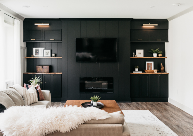
“We did built-ins for storage for movies and board games but also to hide the TV, so it remains the focal point of the room but visually it does not stand out.” – Elyse of Elyse McCurdy Home Designs.
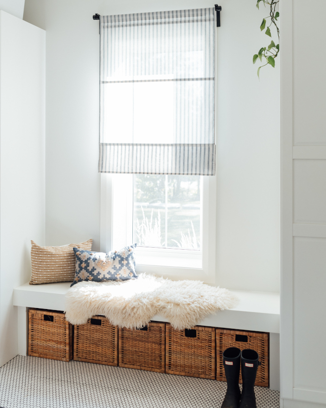
“Living in Canada with four seasons, having a drop zone and Mudroom was also another essential ‘must have’ for our layout. Having a window in the Mudroom is also a great trick to make a small space feel larger. The window is flanked with two built-in closets with a bench and baskets -which offers tons of storage space for our family.”- Elyse of Elyse McCurdy Home Designs.
Rattan storage basket, BRANÄS Ikea Canada – similar here & here – Others: here & here.
Wall colour: Benjamin Moore, White Wisp.
Trim colour: Benjamin Moore, White Dove.
Roman shade, Ringblomma kea Canada.
Pillows: Etsy shop, Pineandelk.
Photography: Randi Saunders, My Roots and Hearts.
Click on items to shop:
Thank you for shopping through Home Bunch. For your shopping convenience, this post may contain AFFILIATE LINKS to retailers where you can purchase the products (or similar) featured. I make a small commission if you use these links to make your purchase, at no extra cost to you, so thank you for your support. I would be happy to assist you if you have any questions or are looking for something in particular. Feel free to contact me and always make sure to check dimensions before ordering. Happy shopping!
Joss & Main: New Fall 2021 Catalog.
Pottery Barn: Up to 70% on Bedding – Free Shipping with Code: FREESHIP
Burke Decor: 20% Off Site Wide with Code: Lagoon
Lulu & Georgia: New Fall Arrivals
 Beautiful Homes of Instagram.
 Classic Shingle Waterfront Home.
 Florida Home Tour.
 Family Home with Classic Interiors.
 Illinois New-construction Modern Farmhouse.
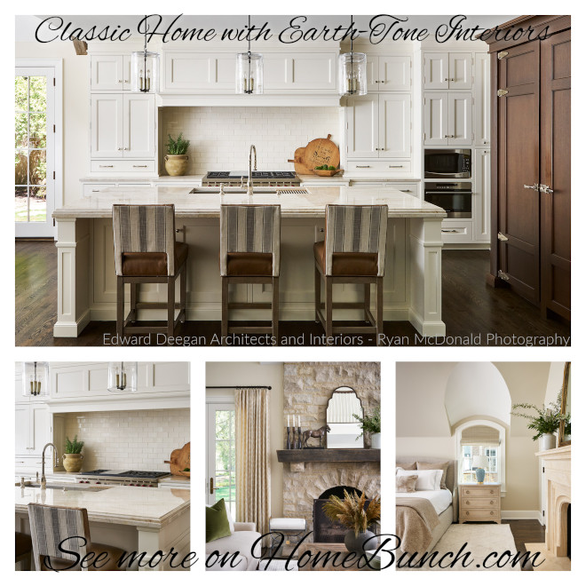 Classic Home with Earth-Tone Interiors.
 Tour this California Coastal Farmhouse.
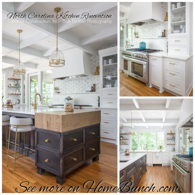 North Carolina Kitchen Renovation.
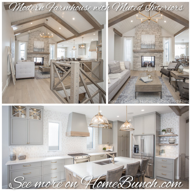 Modern Farmhouse with Muted Interiors.
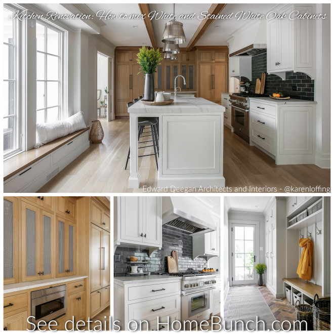 Kitchen Renovation.
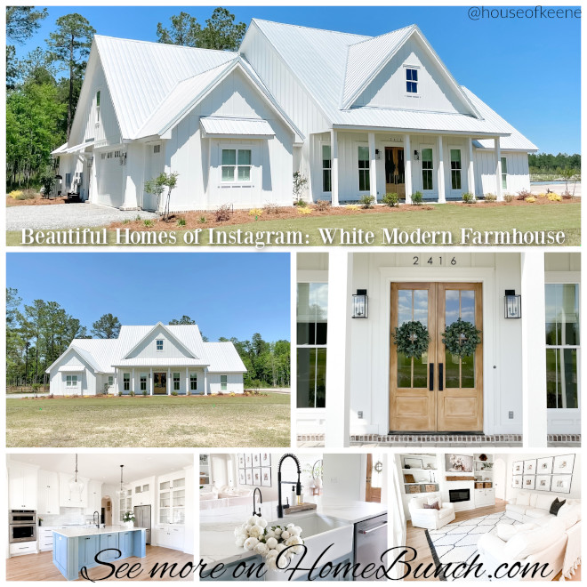 Beautiful Homes of Instagram.
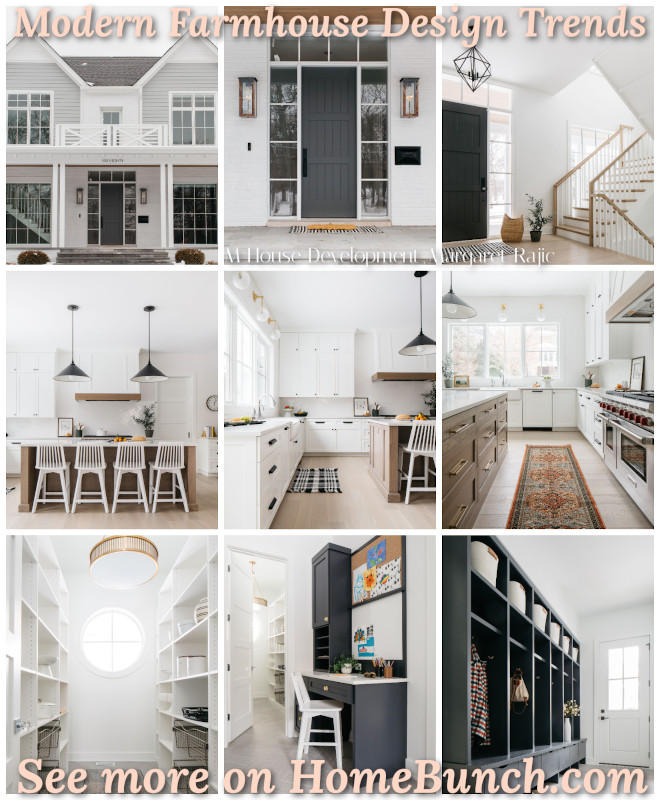 Modern Farmhouse Design Trends.
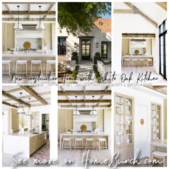 New-construction Home with White Oak Kitchen.
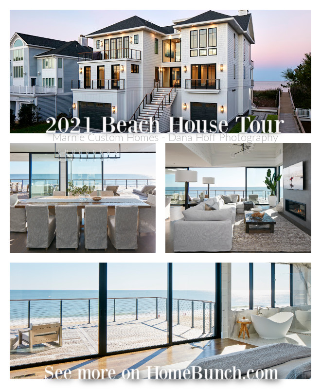 2021 Beach House Tour.
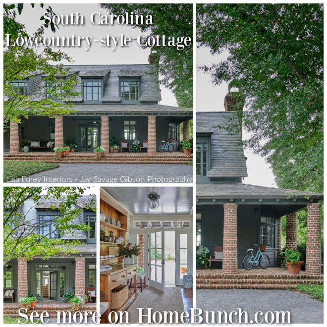 South Carolina Lowcountry-style Cottage.
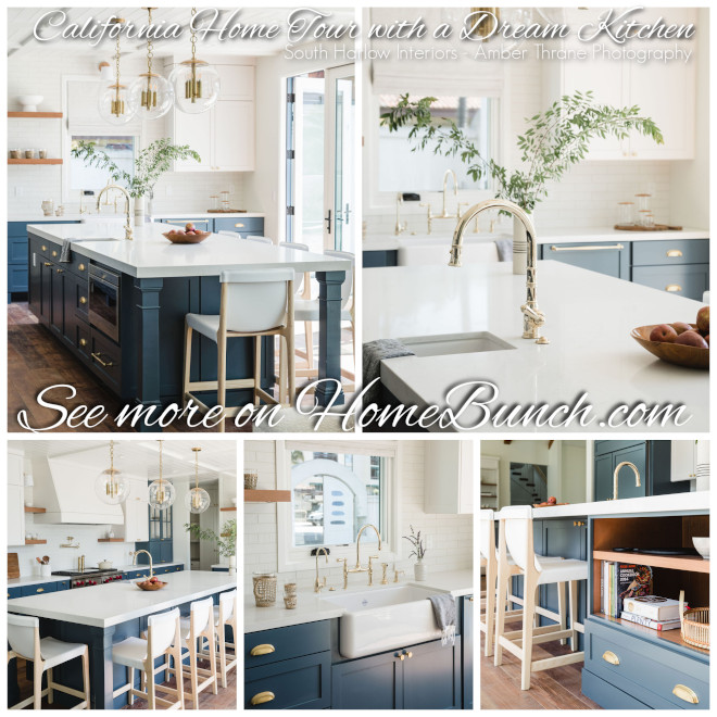 California Home Tour with a Dream Kitchen.
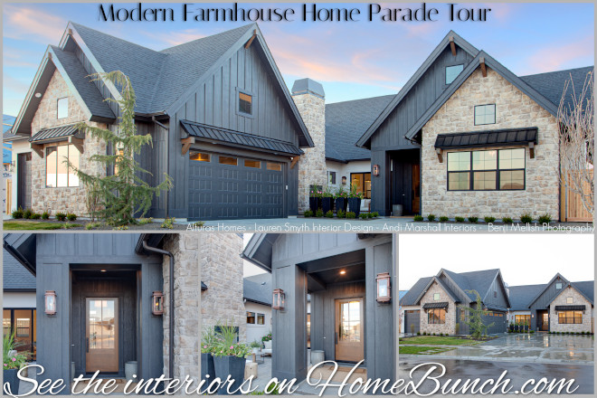 Modern Farmhouse Home Parade Tour.
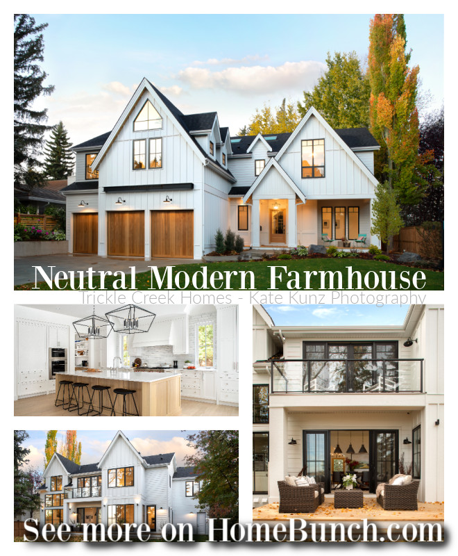 Neutral Modern Farmhouse.
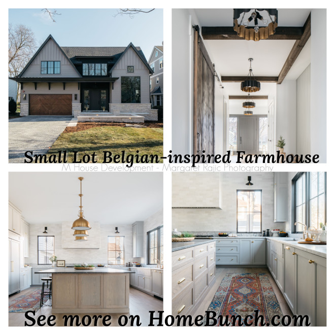 Small Lot Belgian-inspired Farmhouse.
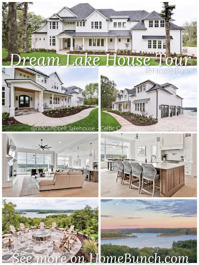 Dream Lake House Tour.
 California New-construction Home.
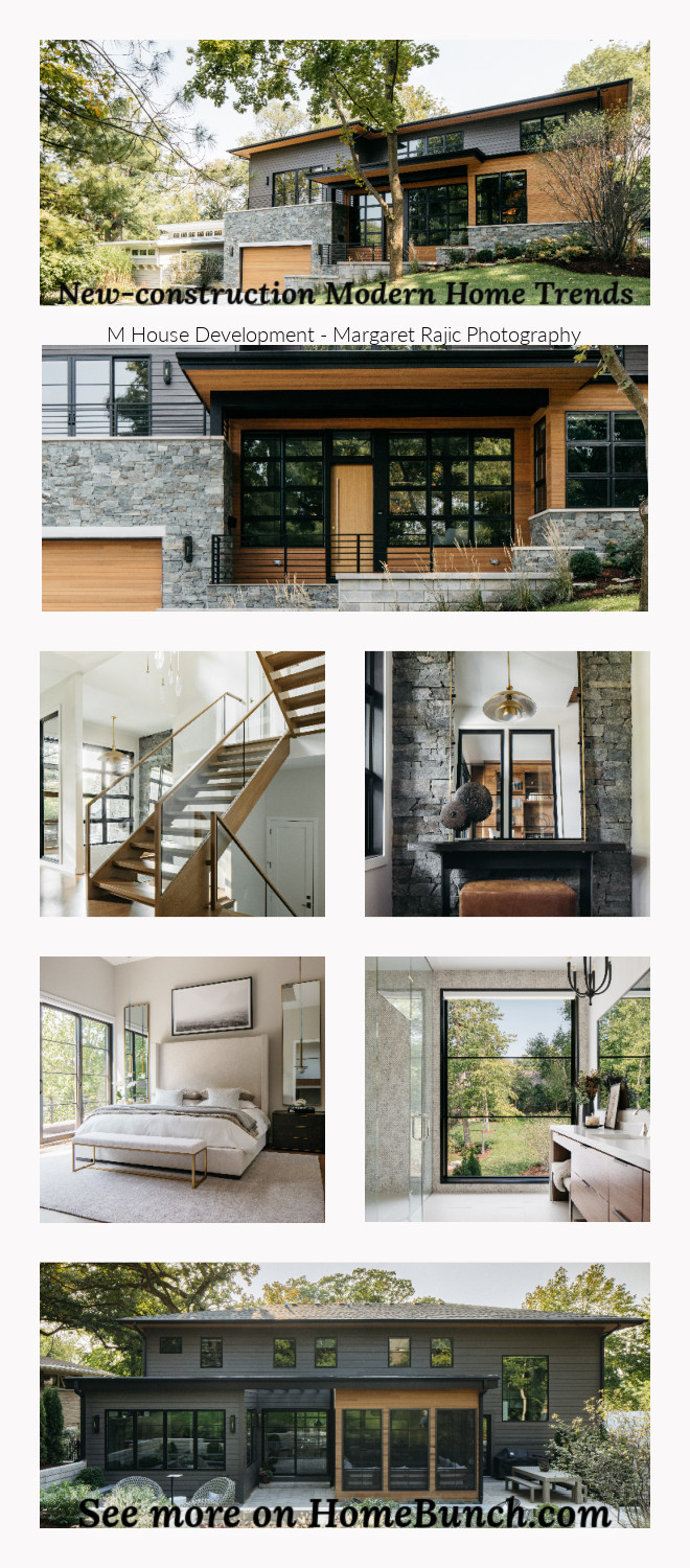 New-construction Modern Home Trends.
 “Dear God,
If I am wrong, right me. If I am lost, guide me. If I start to give-up, keep me going.
Lead me in Light and Love”.
Have a wonderful day, my friends and we’ll talk again tomorrow.”
with Love,
Luciane from HomeBunch.com