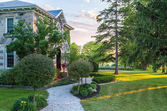
Knowing Canada from coast to coast, I have to say that this is one of the most magical countries you could ever know and I am extremely happy to have this Canadian interior decorator, Cynthia from Cynthia Weber Design, sharing her stunning historic stone farmhouse with us.
Her home has been published many times in magazines and here you will see not only how she lives but also get all of the insights of the renovation of her charming home. Be aware though, her home and its surroundings are so enchanting that it might make you want to leave the city and move to the country!
I have always loved historic homes… there is a romance to them that inspires me to dream.
My name is Cynthia and my husband Kent and I run our custom interiors business, Cynthia Weber Design from BannockBurn 1878. Our home is located on 7 acres in the rolling countryside of Huron County in Ontario, Canada.
The story of how we came to be here is rather serendipitous. In the fall of 2014 we sold a home we had designed and built in nearby Bayfield, Ontario. We had contemplated building again or possibly renovating an old church or converting a barn but nothing had felt quite right. One day we drove down a country road and saw BannockBurn 1878 and fell completely and madly in love with it. After stopping the car in the road we saw the owner tending the garden out front. We drove in and gave her our card asking if she would let us know if she ever decided to sell. She looked at us for a minute and said “ Actually, I am thinking it might be time to sell”. We went back for a tour the next week and shook hands. Within six weeks we were here.
Living in a historic home brings unique joys and challenges. Kent and I are aware that this house has stood for many generations and nurtured many families. We are the current stewards of it but it will go on long after we are gone. We are completely committed to doing our best to make it all it can be while it is under our care.
I want to thank Luciane for the opportunity to share snippets of our life here with you. If you enjoy what I have shared I hope you follow along with me on Instagram – @Cynthia_Weber_Design.
1st Image: Robin Stubbert for Style at Home.
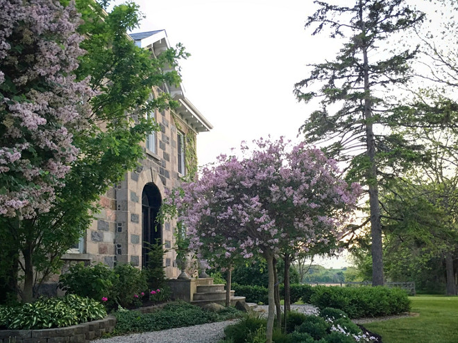
The house took two years to build. Stone was hauled from the river and brought to the site by horsepower. The stone masons lived here while they built it.
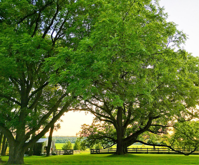
So much has changed since the original owners built this house but, the sprawling views down over the pasture, the truly amazing sunsets and the “sense of place” I imagine are the same.
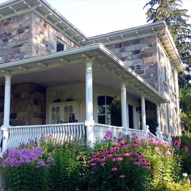
Exterior of house is stone, built over a two year period from 1876-1878.
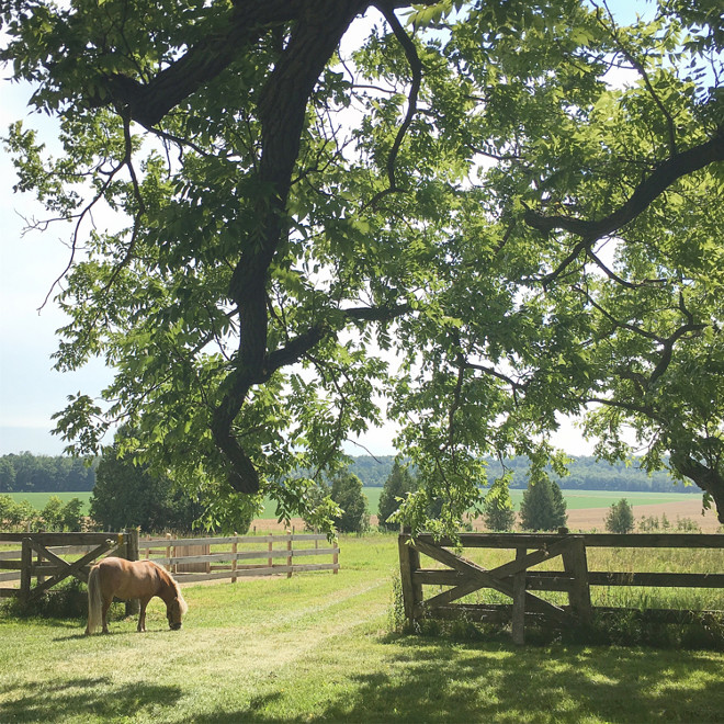
Our life here is filled with many activities. We have two mini horses, five chickens, a rooster and two dogs.
No matter how busy the day has been we try to make time to relax and regroup by taking a walk down through the pasture trails with the dogs and horses in the evenings.
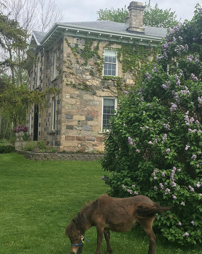
Our little guy Mac enjoying a snack. 🙂
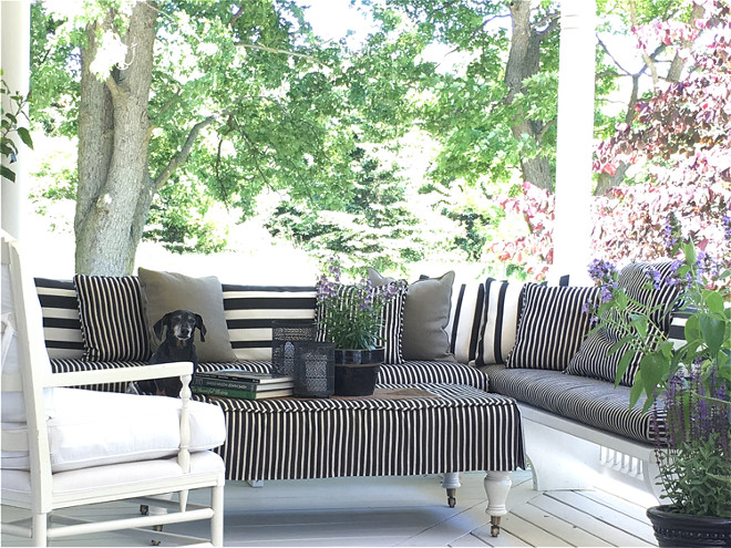
The porch wraps around the house. It is a lovely place to sit and take in the views down through the pasture. The corner bench and seating area becomes our summer living room. Emmitt, our miniature Dachshund, loves to nap here.
Outdoor Furniture/Decor: Striped fabric is a Sunbrella fabric called Creek, available to the trade through JF Fabrics. Corner bench was salvaged and rebuilt for the porch. Ottoman is Gresham House Furniture slipcovered in the same striped outdoor fabric. White chair is Gresham House Furniture.
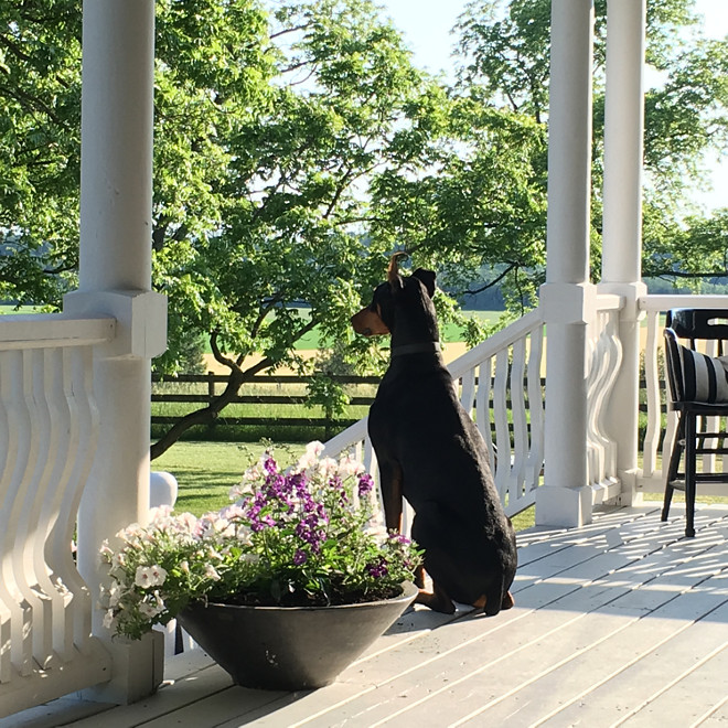
Everyone in the family seems to enjoy living here. 🙂
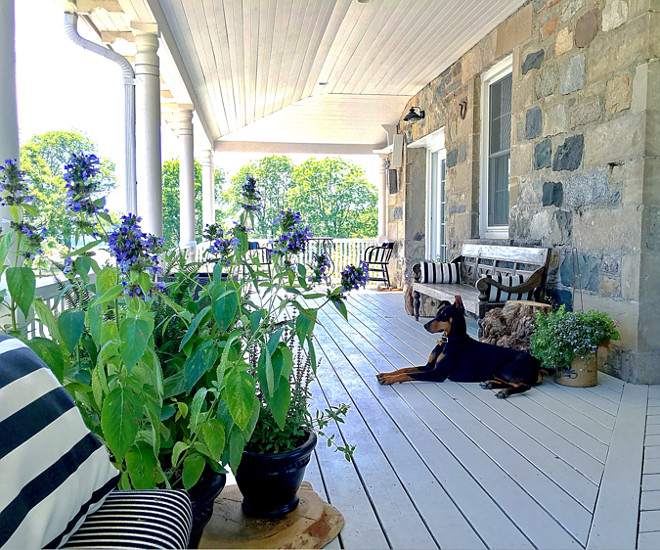
Porch floor is Benjamin Moore HC-170 Stonington Gray.
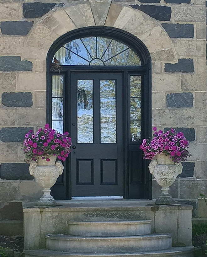
Last year I painted the front door black and I love the balance it has created. Front door is Black Cat from Beauti-Tone Home Hardware.
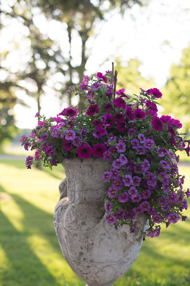
Deciding what to plant in the urns makes me happy. I have a confession to make… I change them out a few times a season. I just can’t help myself!
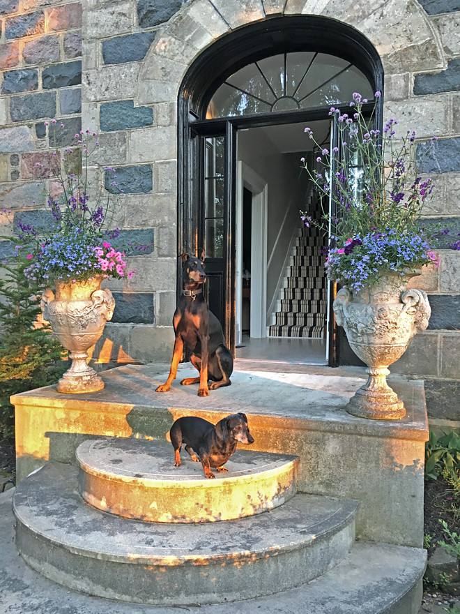
Our dogs love to sit here. The squirrels taunt them from the trees.
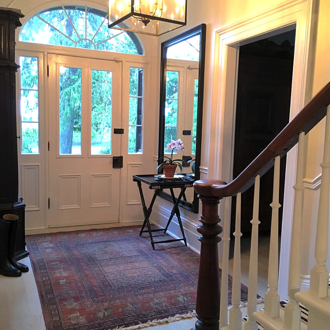
My philosophy on interior spaces revolves around the elegance of simplicity and living with the things we love. Our homes are not static, they evolve as we change and experience new places and perspectives. I tell my clients to surround themselves with things that speak to them and Kent and I certainly do that here at BannockBurn 1878.
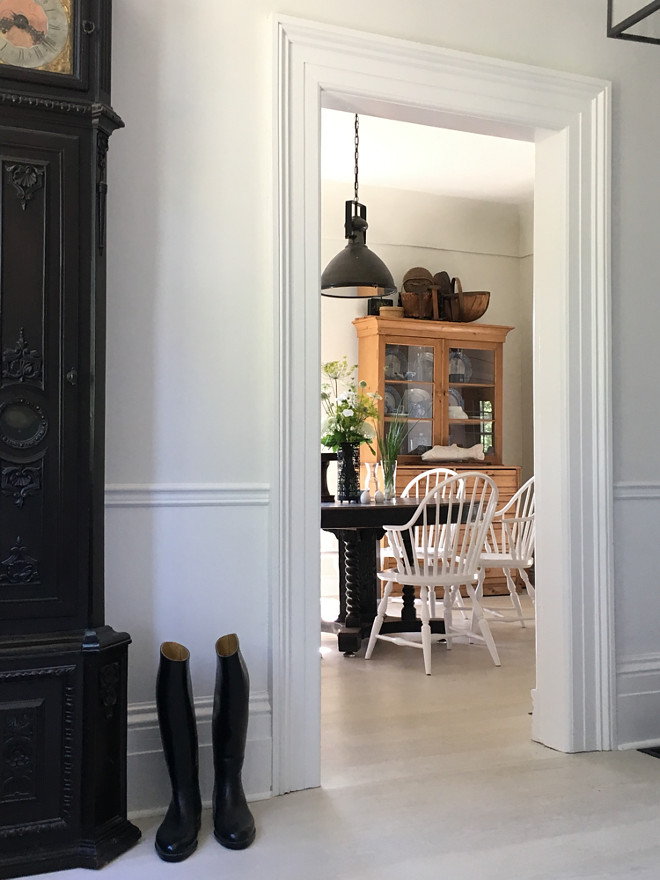
I change the decor in the foyer frequently but one thing seems to stay the same… the riding boots sitting beside the grandfather clock were worn by Kent on our wedding day. I like seeing them in passing, it is a gently reminder of all the steps we have taken together through the years. In fact , we wrote our own vows and my favourite line was…
“Take my hand and walk with me through all that life may bring”.
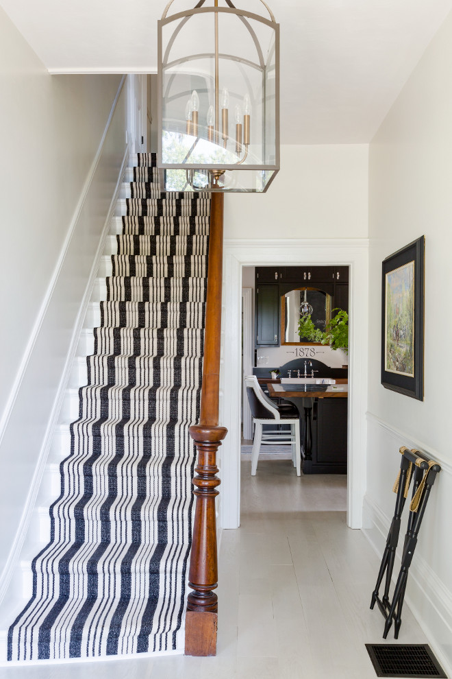
In the foyer a fun striped Dash and Albert runner was added to the staircase. The pattern is called Birmingham Black.
Photo by Robin Stubbert for Style at Home.
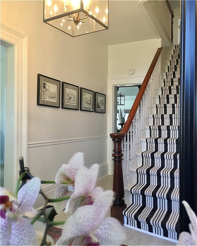
Wall colour is Snow Angels by Beauti-tone through Home Hardware.
Lighting is Hinkley Lighting.
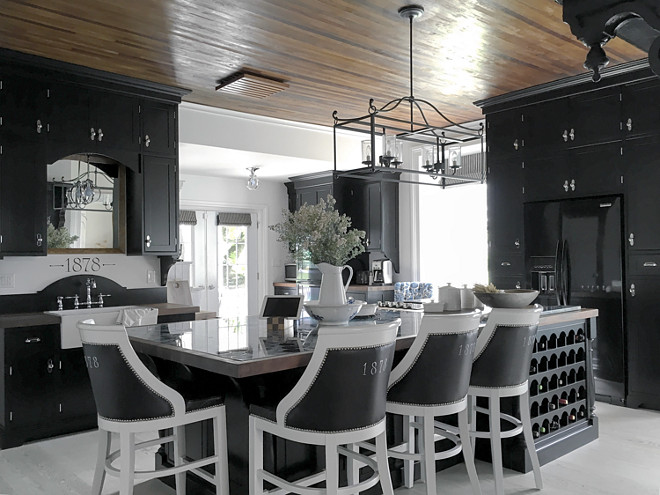
The kitchen before renovating was… a bit scary. Peach floor tile, a floral wallpaper boarder circa 1980, a counter that ran right in front of the two windows obstructing the beautiful views and walls the colour of orange sorbet. The one highlight was the wood ceiling. It is the only thing we didn’t change.
The ceiling is strips of various woods and although not original to the house, we believe it dates back to the 1920’s.
I designed the cabinetry to give a sense of history while also bringing a bit of drama. Curved elements inspired by the hoop top front door are repeated throughout this space. Some examples of this are curvy corbels, backplates for knobs, globe-like pendants and a half moon arch over the sink.
Island: The island is 5’ x 10’. Black Walnut butcher block surrounds the stovetop and also bands the Concetto Blue Agate slab. A ribbon of ebony runs between the agate and walnut providing a pin stripe effect. Hoop top cubbies for wine storage echo the curved theme.
DIY Barstools: The barstools were a yellow leather which although truly beautiful just wasn’t fitting with my plan so I dyed them black and painted 1878 on the backs.
Barstools: To the trade through Gresham House Furniture.
Island light is Feiss.
Faucets: Riobel.
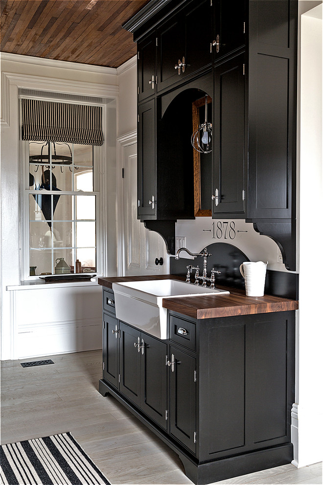
The cabinets are maple finished in Black inside and out. All the details such as corbels, crown, hardware etc. were designed to reflect historic elements while still providing modern functionality and maximizing space by extending right up to the ten foot ceilings.
Cabinet Paint Color: Cabinets are a custom colour I call “Buggy Black”.
Cabinet Hardware: Chrome backplates, exposed hinges, cup pulls and knobs available through Bellacor.
Backsplash: Rather than a traditional backsplash in the kitchen I designed a curved backplate for the sink cabinet then painted 1878 the date of the house above it on the wall as a feature. Counters are Black Walnut in homage to the giant Black Walnut trees here on the property.
A birdseye maple mirror purchased at auction many years ago reflects light and adds interest.
To take advantage of the ten foot ceilings we went right up with the cabinets. I have oodles of storage up there which is so handy.
Pendant light is Hinkley Lighting.
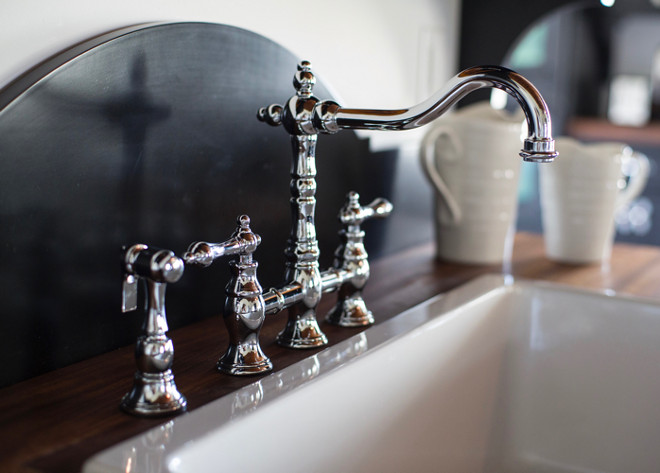
Faucet is by Riobel.
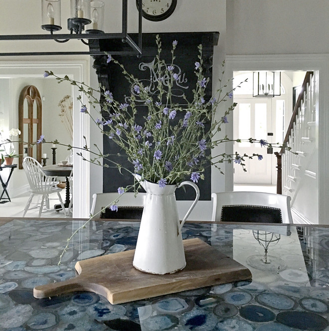
The top is Concetto Blue Agate by Caesarstone surrounded by Black Walnut. An ebony banding has been added as a pinstripe detail between the walnut and the agate.
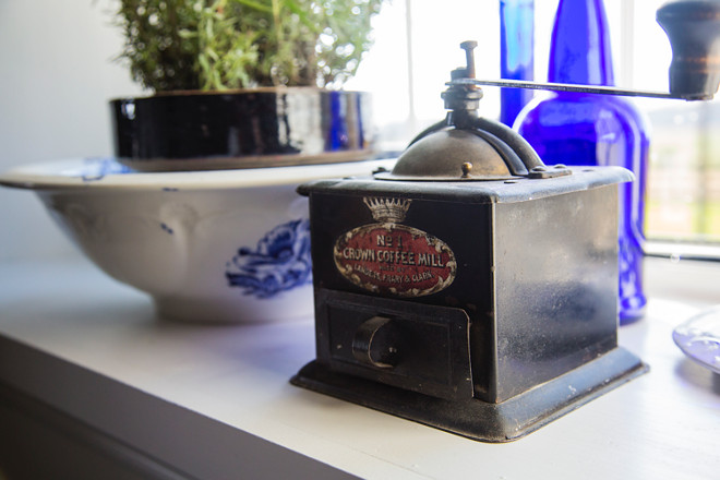
An antique coffee grinder brings charm to this farmhouse kitchen.
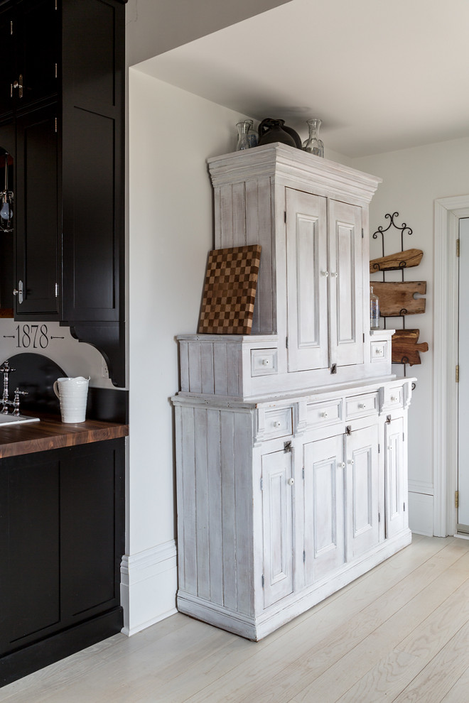
Flooring on main level of the house is custom milled wide width White Oak that has been stained with a white semi transparent exterior stain.
On the main floor we ripped out all the flooring. There were five different kinds none of which were original and there were several elevation and style changes. To unify things we laid white oak throughout and stained it with a white semi- transparent exterior stain. This brought back such a feeling of openness and continuity. I absolutely love it.
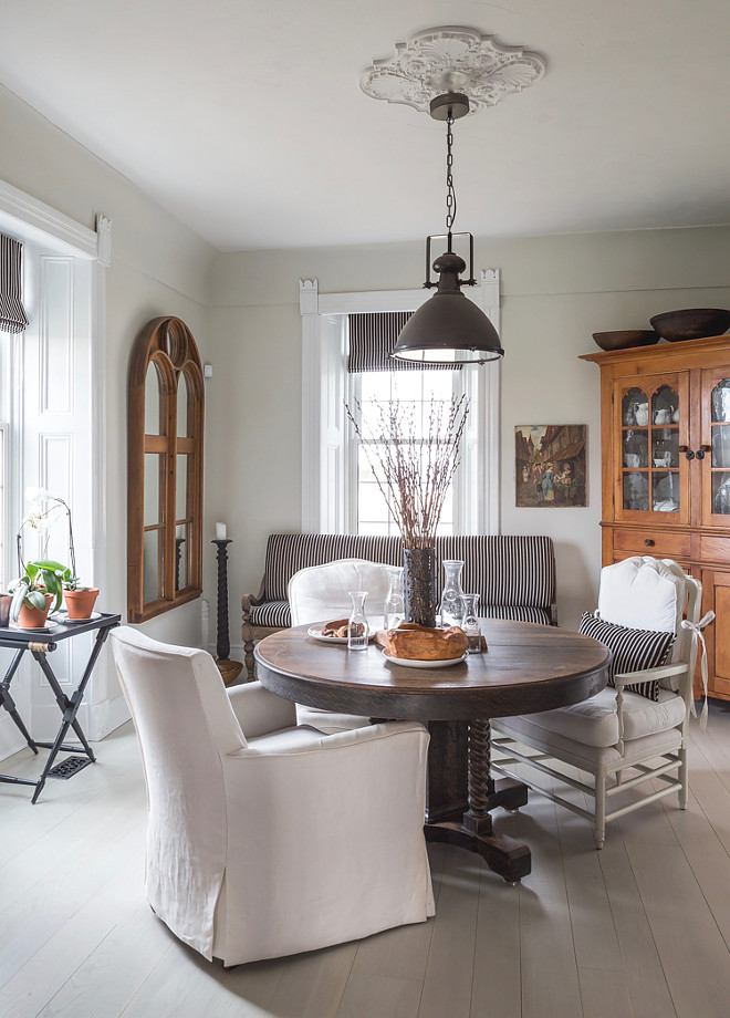
As you may gather from the various changes in room decor seen throughout these photos… I don’t leave things the same for long. A chair may be in the dining room one day and the next day has a new home in another location… The bench shown in the dining room photo is the same one seen in another photo out on the porch. The cushions shown in the dining room photo are the same ones used outside for the summer on the corner bench.
Chairs surrounding dining table are to the trade through Gresham House Furniture Table. Corner cupboard, mirror, bowls and bench are all antiques we gathered up over the years. Collapsible table with tray in window is custom through Cynthia Weber Design.
Photo by Robin Stubbert for Style at Home.
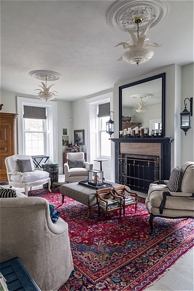
Our living room is filled with antiques and art. I kept the backdrop clean throughout the house with light walls and flooring so the pieces could speak. The Fireplace has been decommissioned unfortunately so until we can re-establish it properly I have dressed it up a bit. A huge mirror reflects light and the pair of hanging lanterns bring balance and scale. I salvaged a footboard from an antique bed and used it as a fender.
Child sized chairs extend the size of the ottoman in an unexpected way. They make a perfect perch for books.
I did simple but highly functional Roman blinds in a black and oatmeal stripe throughout the main floor windows. They let the millwork take centre stage while still adding design detail and a finishing touch.
Carpet in living room is vintage purchased through E-Carpet Gallery.
Window Treatment Roman Blinds throughout main level are custom through Cynthia Weber Design. Fabric is Pattern Creek col: 98J6581 available to the trade through JF Fabrics.
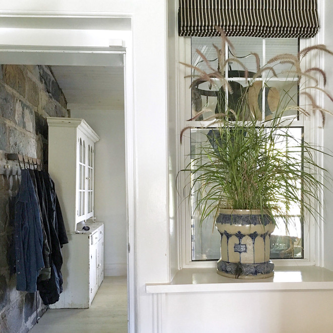
The mud room is a hub of coming and going. When we purchased the house it needed significant work. Various renovations throughout the decades had left it feeling slightly disjointed and in conflict with original architecture.
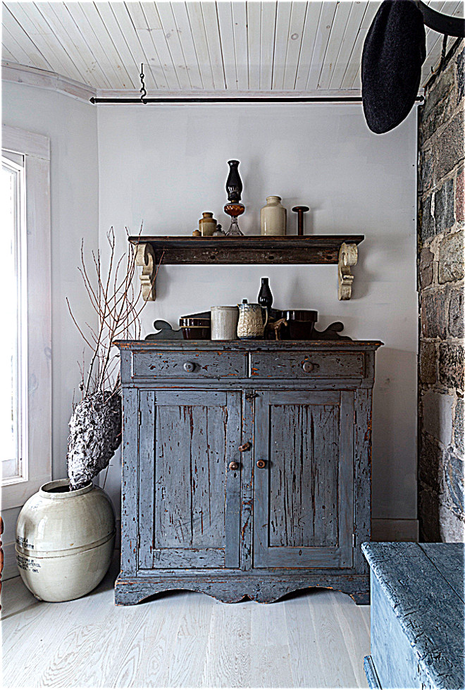
We found this beautiful blue cupboard at a favourite antique dealers shop and it fits right in here storing dog food and birdseed.
Photo by Robin Stubbert for Style at Home.
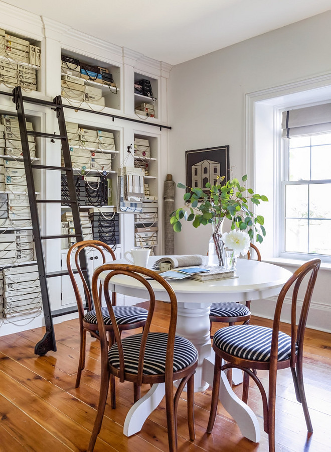
My design studio is on the second floor of the house. I designed a wall of cabinetry to store all my samples and resource materials. The library ladder allowed me to maximize the 10 ft. ceilings by going up up up!
Photo by Robin Stubbert for Style at Home.
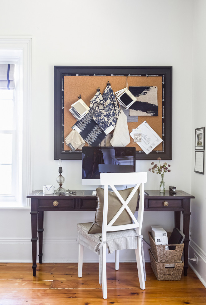
Cork boards prove a valuable way to keep organized. Whether putting together an inspiration board for a client project or just pinning up notes to myself… they are always in use.
Photo by Robin Stubbert for Style at Home.
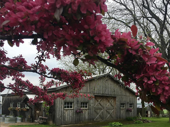
If you look to the left you will see our water trough herb garden. Things are starting to flourish and I can’t wait to start harvesting fresh herbs again!
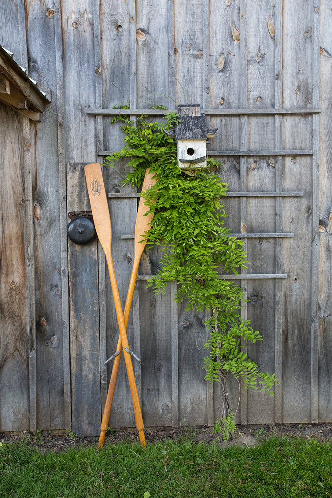
I am in love with Cynthia’s property. There’s something beautiful everywhere you look!
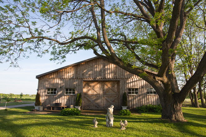
Re-establishing the orchard is also something we are undertaking. I love seeing the buds form in early Spring knowing what is to come!
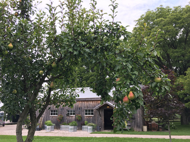
We wanted to do something unique for the herb garden. Seven water troughs of various sizes placed along the side of the barn set the stage perfectly. A few hanging baskets, an antique ladder and a horse shaped weathervane finished things off with a touch of whimsy.
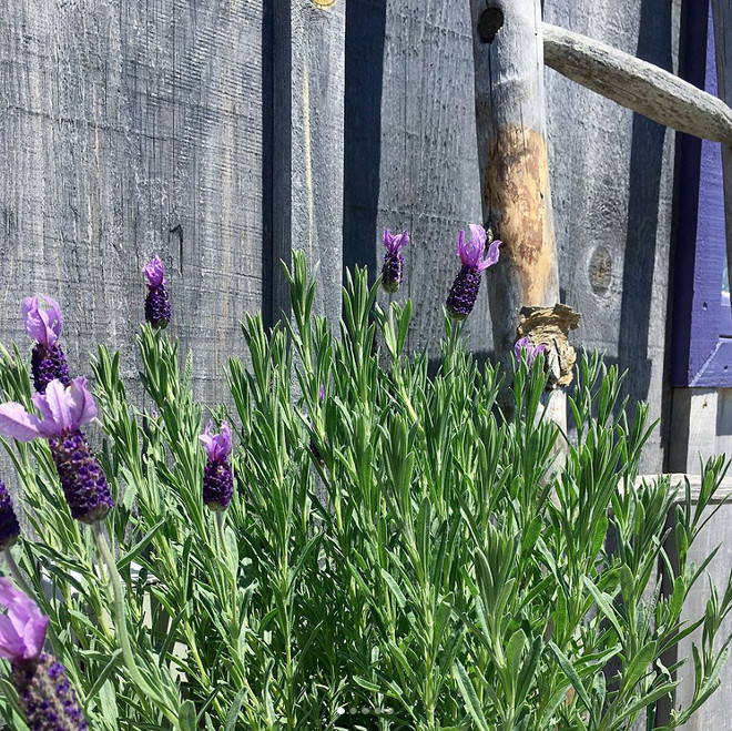
Lavender against the barnwood… inspirational!
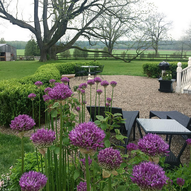
Gardening plays a big role, with extensive perennial gardens, an herb garden and huge vegetable gardens we are constantly tending… and don’t forget cutting the lawn! It is a labour of love and many of our friends and family enjoy coming to relax on the porch while we cook up a meal featuring whatever is in season.
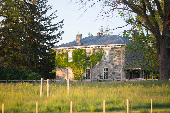
Now you see why Cynthia and her husband couldn’t resist falling in love with BannockBurn 1878.
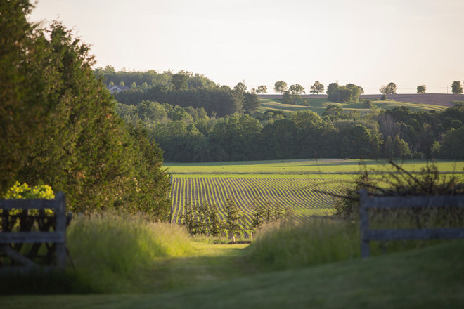
Take a deep breath and feel the fresh air…
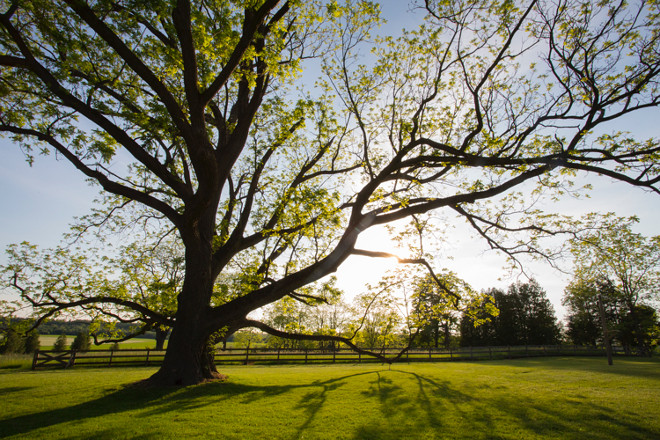
This Black Walnut tree guards over BannockBurn 1878. It has a trunk over 20 feet in circumference and sweeping limbs that seem to reach out and beg you to come sit and dream. I wonder how many have loved him… I know I certainly do!
Thank you for shopping through Home Bunch. I would be happy to assist you if you have any questions or are looking for something in particular. Feel free to contact me and always make sure to check dimensions before ordering. Happy shopping!
Serena & Lily: Enjoy 60% Off hundreds of sale styles!
Wayfair: Up to 70% OFF – Home Remodel Sale!!!
Joss & Main: Warehouse Clearout – Up to 70% off!
Pottery Barn: 40% OFF EVERYTHING + Free Shipping – Use code: FREESHIP
One Kings Lane: High Quality Design Decor for Less.
West Elm: Best time to shop. Up to 40% off Everything!!!
Anthropologie: See the super-popular Joanna Gaines Exclusive line!
Urban Outfitters: Hip & Affordable Home Decor.
Horchow: High Quality Furniture and Decor. Up to 30% off the entire site!
Nordstrom: Up to 40% OFF. New Easter Decor!
Arhaus: Dining Sale. Up to f0% OFF!
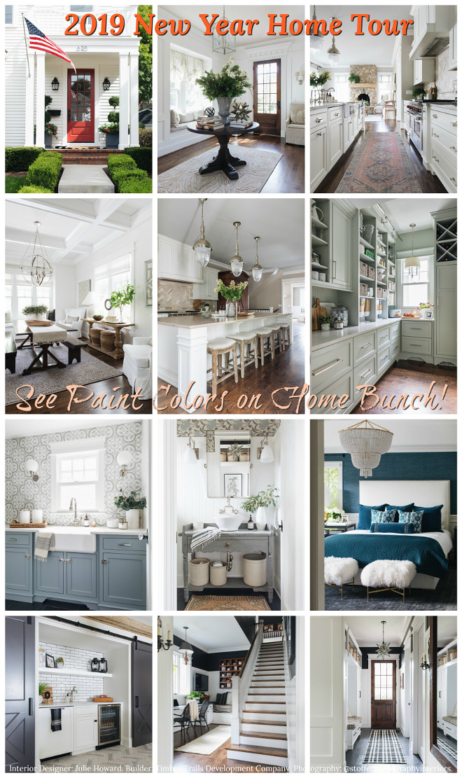 2019 New Year Home Tour.
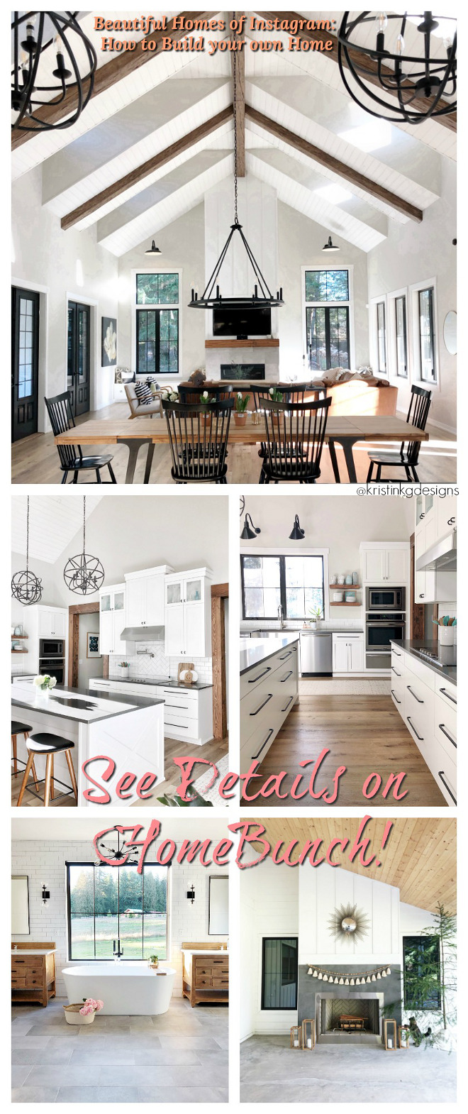 Beautiful Homes of Instagram: How to Build your own Home.
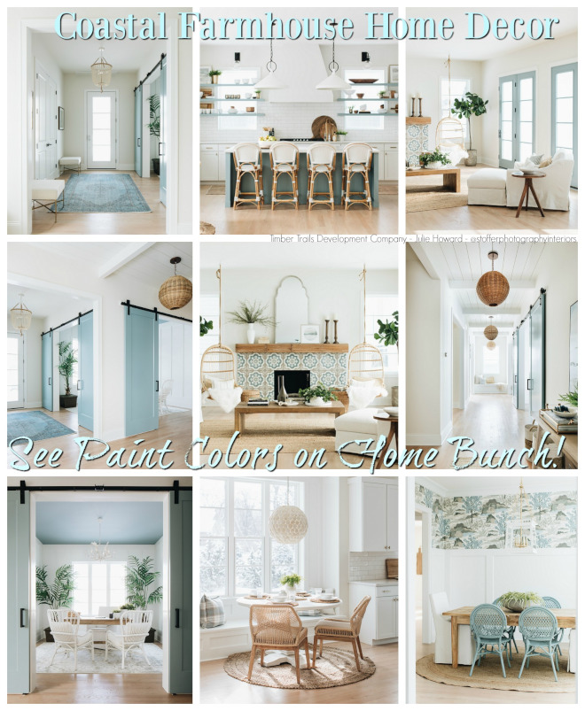 Coastal Farmhouse Home Decor.
 Modern Farmhouse with Front Porch.
 Modern Coastal Shingle Home.
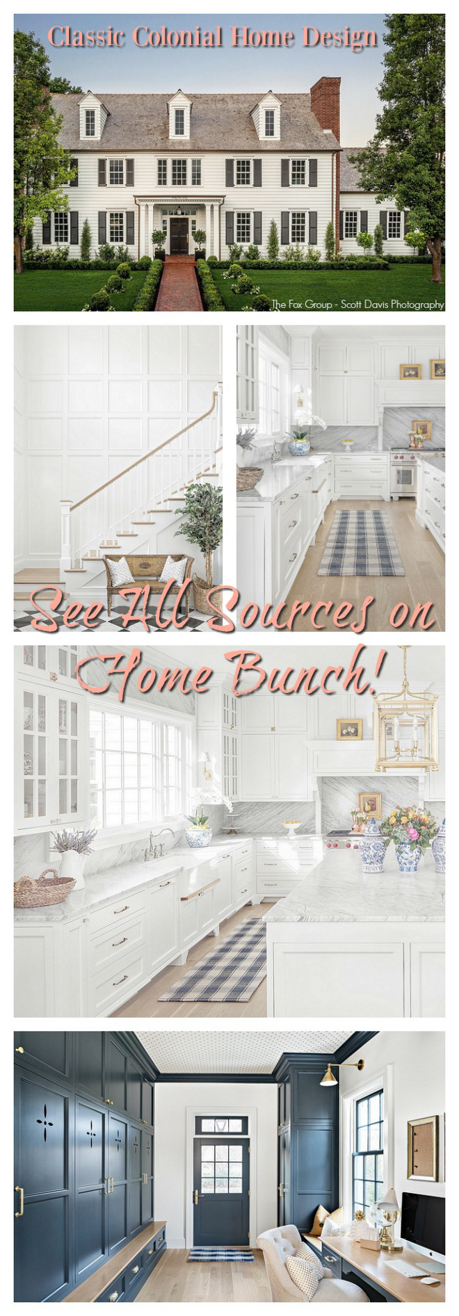 Classic Colonial Home Design.
 New England Home.
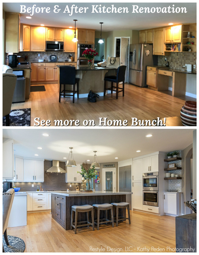 Kitchen Renovation with Before & After Pictures.
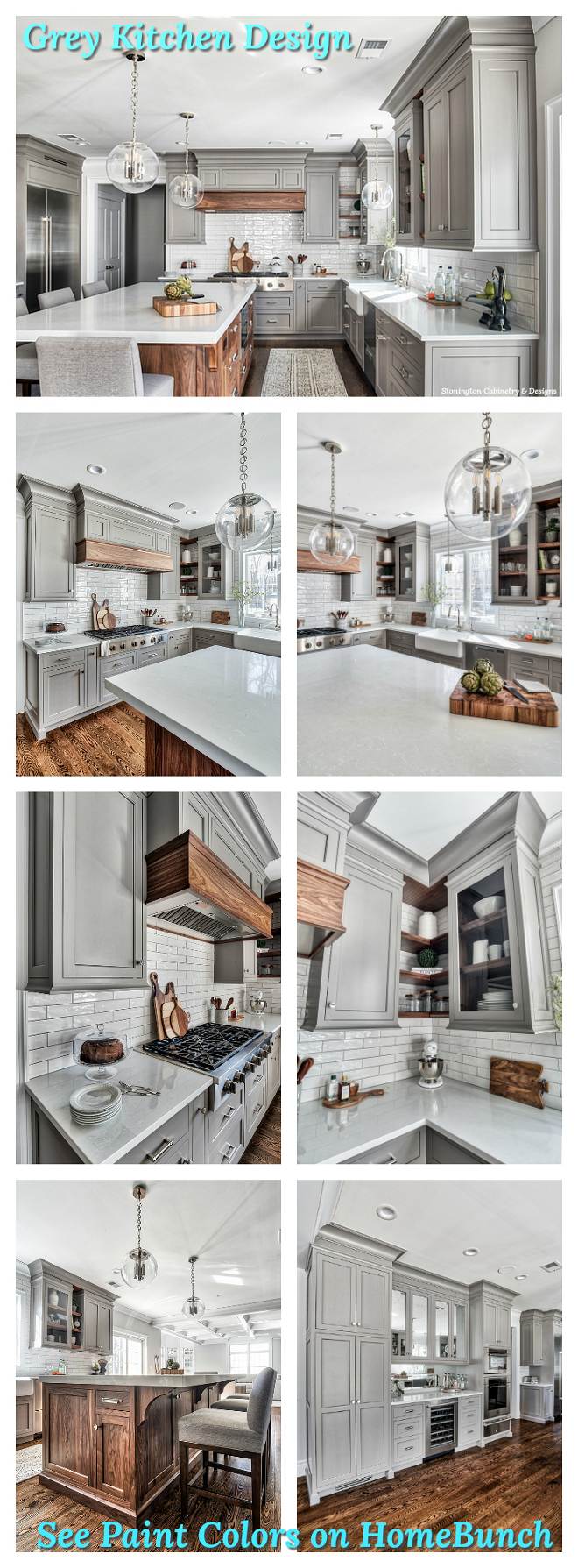 Grey Kitchen Paint Colors.
“Dear God,
If I am wrong, right me. If I am lost, guide me. If I start to give-up, keep me going.
Lead me in Light and Love”.
Have a wonderful day, my friends and we’ll talk again tomorrow.”
with Love,
Luciane from HomeBunch.com
Get Home Bunch Posts Via Email ![]()
“For your shopping convenience, this post might contain links to retailers where you can purchase the products (or similar) featured. I make a small commission if you use these links to make your purchase so thank you for your support!”
Subscribe to get Home Bunch Posts Via Email
I would never leave this house if I lived there! Can you imagine growing up there?
Truly a beautiful home, a tribute to the past and present. I love the fact that you have maintained the charm and stateliness of this home while transforming it with current design trends.