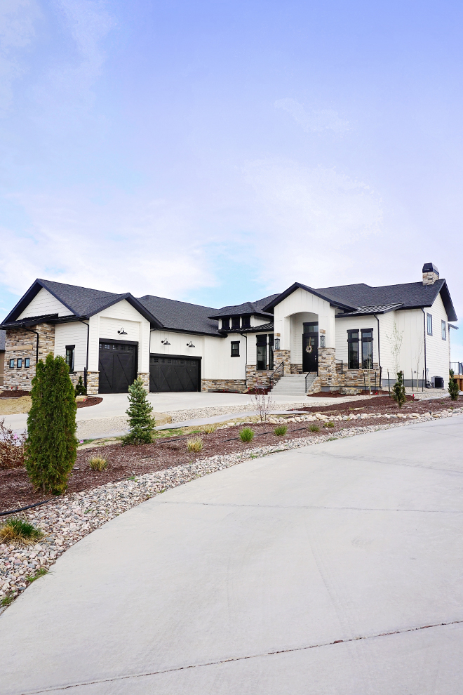
Beautiful Homes of Instagram is truly one of my favorite posts to prepare and share with you. I think it’s amazing to see how these homeowners are designing and decorating their home and making the best of the space they have. I love getting to know a little about their story and about how their homes have inspired so many readers (nothing makes me happier to know that you’re learning something new here).
Today, you will enter Heather and Joe’s newly built modern farmhouse. They moved to this house not long ago and they’ve been working hard to make of it their dream home. This couple is very handy and Heather is a super mom. I simply adore her!
Get to know the homeowners and their story:
Joe and I are the owners of @household no.6, we have 4 kiddos (hence the name household no.6!) We have been designing, renovating and flipping for over 10 years now off and on. We did it as a side venture but have recently jumped in and are now full force with renovations and designs! When we were designing our home from scratch, we knew we wanted a modern rustic feel and something very open and functional. Since we have a large family, being able to keep an eye on the kids all of the time was important to us. Our floorplan is VERY open, bright and functional. We love natural light and also live on a lake. So views and lots of windows were important to us! We love combining old with new elements and love the look of modern rustic. We wanted our exterior to be a classic black and white with pops of stone. Our home has a walk out basement so from the front it looks like a 1 story but inside it actually has a full open basement! I am in LOVE with wall treatments and feel they add such dimension and character to a room. So I have them ALL over my house!
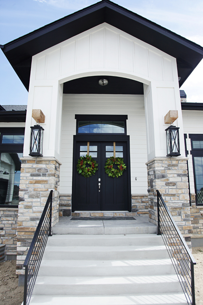
Exterior: We always knew we wanted a white modern farmhouse style home. I love the look of a large one story home and since our lot is a walkout, this is what worked for our home! We custom designed our entire house.. it took us over a year!! Once we got the inside flow, functionality and spacial planning figured out, we were able to move onto the outside.
The colors we used are Navy Bean by Sherwin Williams for the white color and Sherwin Williams Tricorn Black for the trim and fascia.
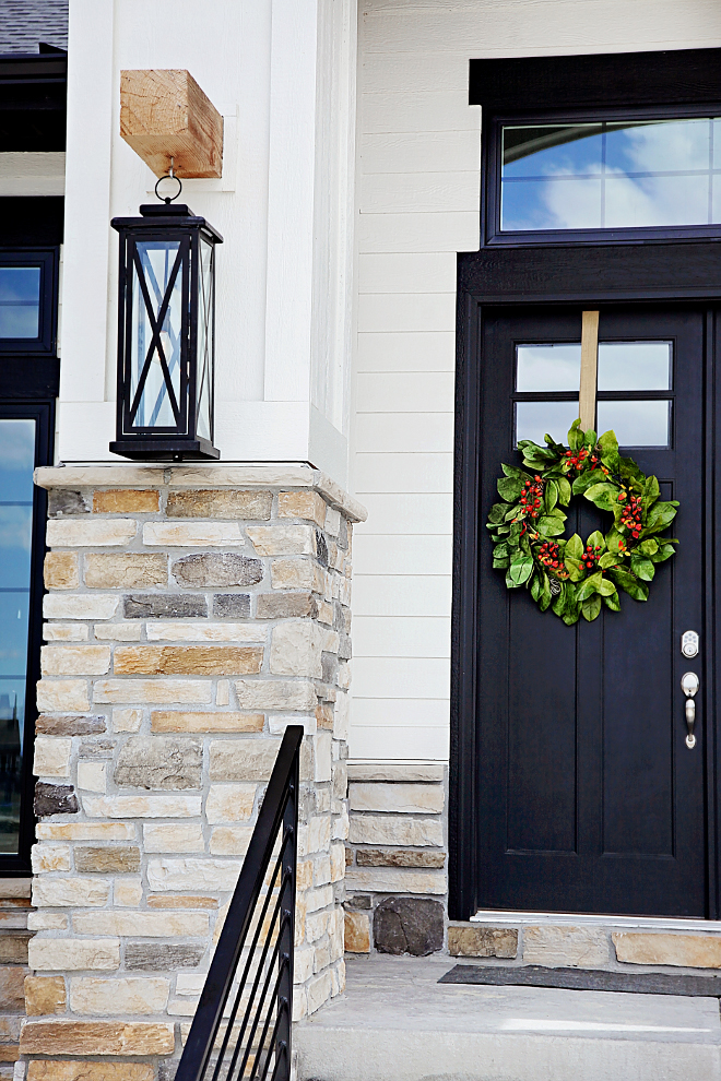
We also knew we wanted our front entrance to be beautiful and grand. We custom designed it to have lanterns hanging for extra interest!
Lights are from Home Depot – customized.
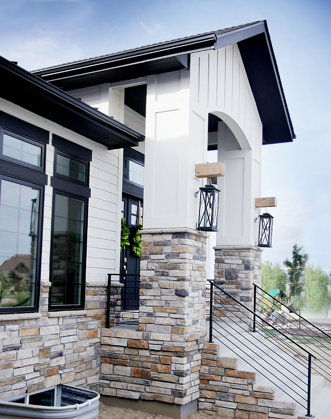
We just LOVE the contrast of our exterior, the roof lines, the metal roof, and the grandness of it all! Our stone is Aspen country Ledgestone by Boral.
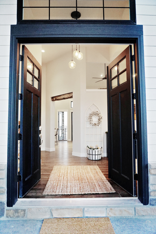
Black Door Paint Color: Sherwin Williams SW 6258 Tricorn Black.
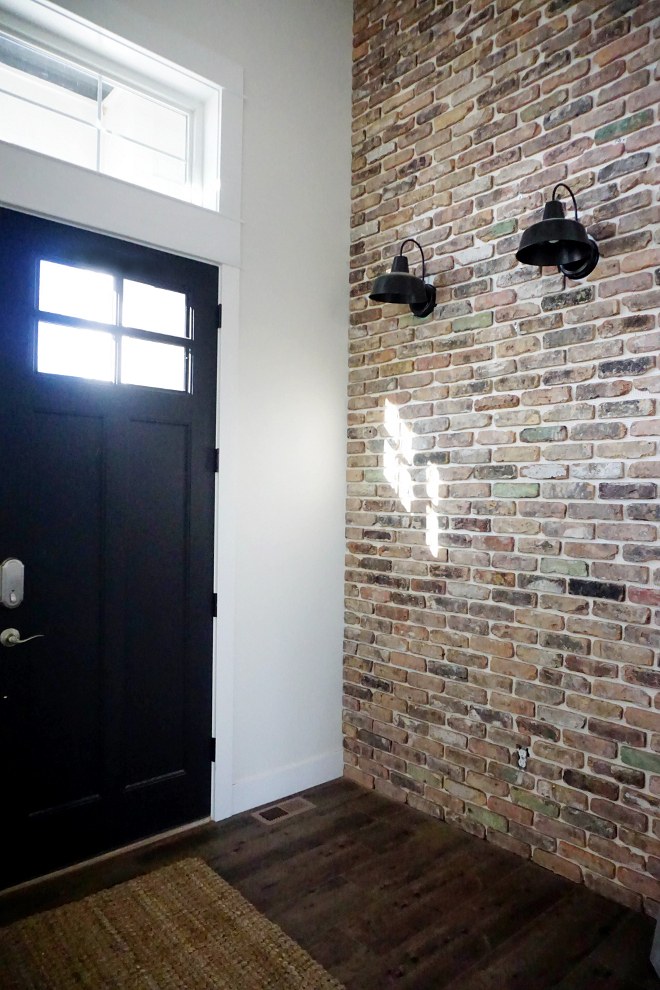
I can’t stop staring at our front entry wall you guys! It still needs grout and decor but it’s up!! I can’t wait to get my hands on this baby!! 🙂
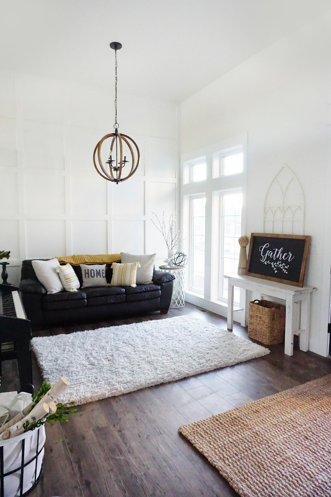
Our living room is bright open and cozy. I wanted a space where the kids could practice piano and also a space that separated the rest of our house from the front door.
The wood orb chandelier is from Amazon.
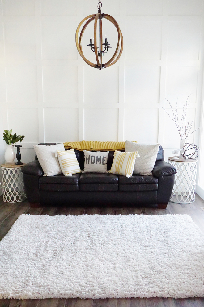
We decided on a beautiful and simple white square board and batten for this room because I just felt it was a little more formal but also very simple and clean.
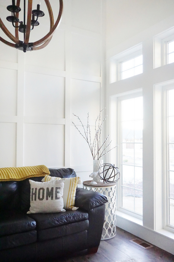
Most of my walls (the cream) are Polar Bear by Behr.
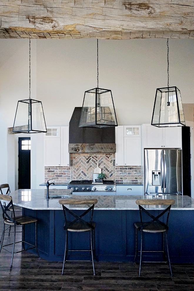
The kitchen is the hub of our home and also in the center of it all! I wanted to be able to see into most of the rooms from the kitchen, so sight lines were really important to us! Our kitchen only has one wall so we had to get creative on where to place appliances! Our oven is actually in our island as well as a prep sink. I wanted the main sink to be tucked away since we entertain a lot so it off to the side and nice and deep! We went with a very large single basin farm sink for our large family! We have a huge walk in pantry, as well as a custom hood vent and large 48″ gas range with a griddle,and grill on it!
Faucet is by Kohler.
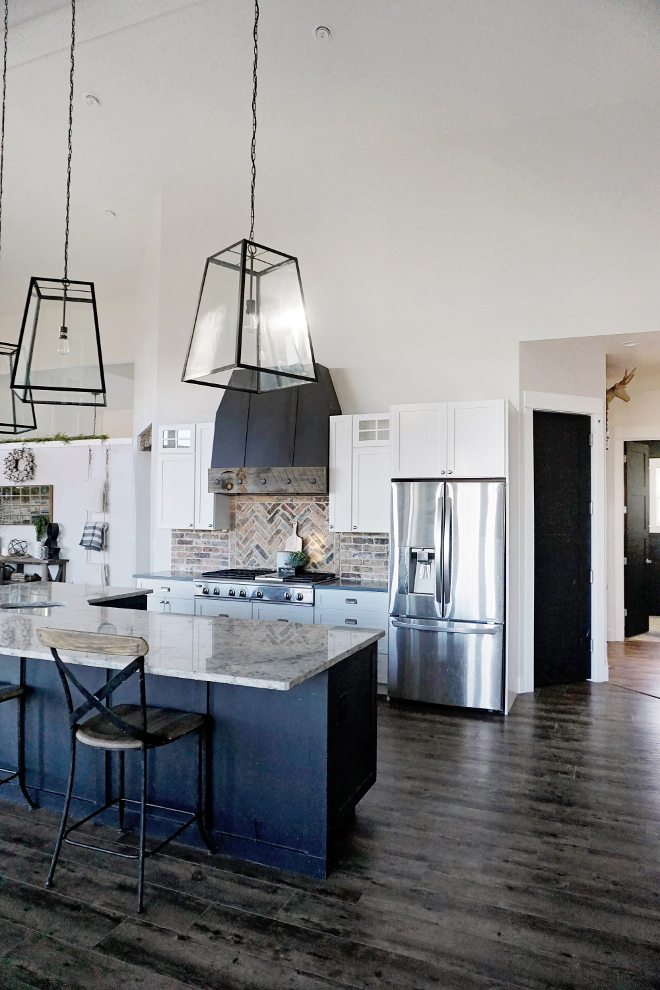
Our pendants are large, bold and modern. I wanted them to make a statement and we just LOVE them! They are from Ballard Designs.
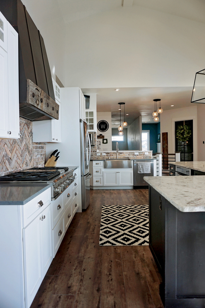
The countertops are granite. Runner is from Rugs USA.
Hardware are from Lowe’s.
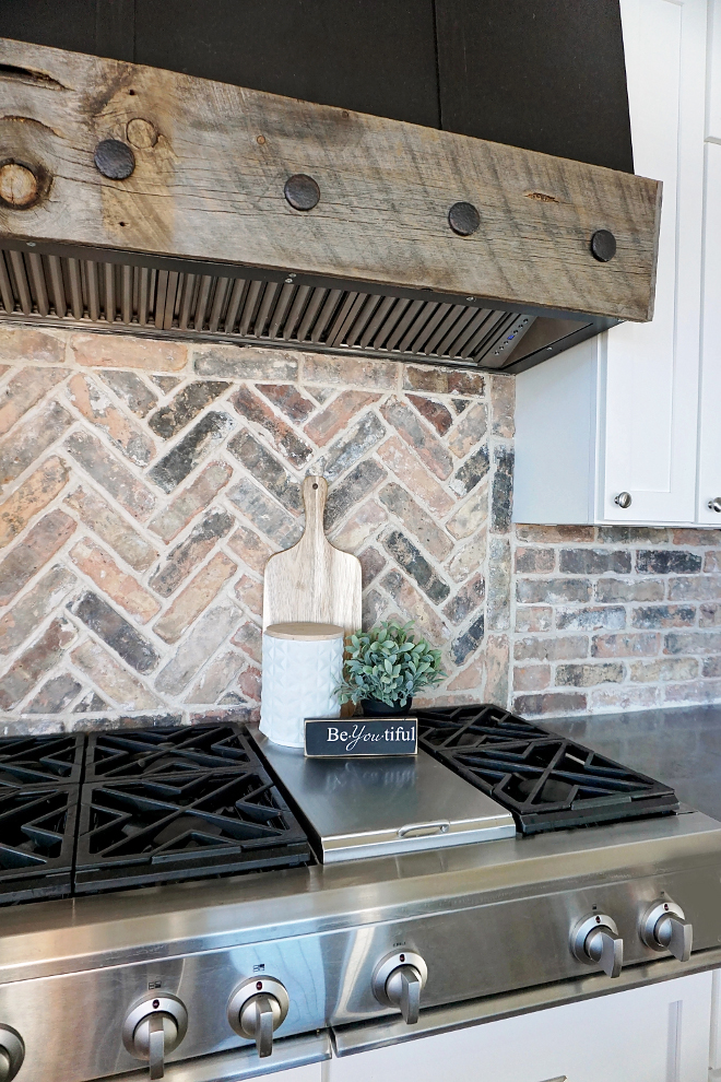
We knew we wanted a timeless backsplash and fell in love in with this old Chicago exposed brick! We used a herringbone pattern behind the range to add dimension and finished with a brick pattern in the rest of the kitchen.
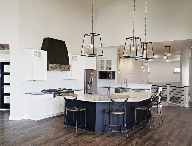
The kitchen cabinets are are Elkay Cabinets – semi-custom from Lowe’s.
Kitchen Island Dimension: 13X5
Countertstools are from Star Furniture.
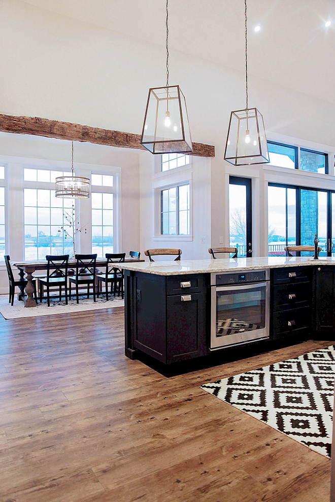
Flooring throughout all first floor is Boerne Luxury Vinyl.
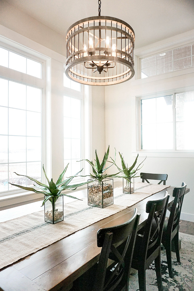
I am loving Heather’s dining room! It’s comfortable, neutral and full of great ideas!
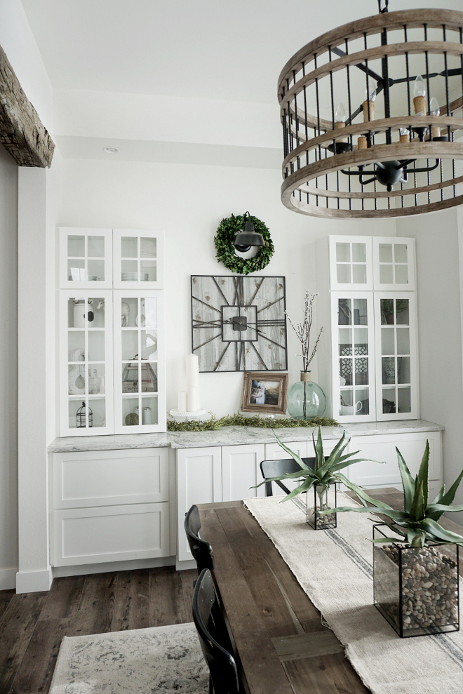
Paint Color: Polar Bear by Behr.
The cabinets are from Lowe’s and the wall clock is from Hobby Lobby.
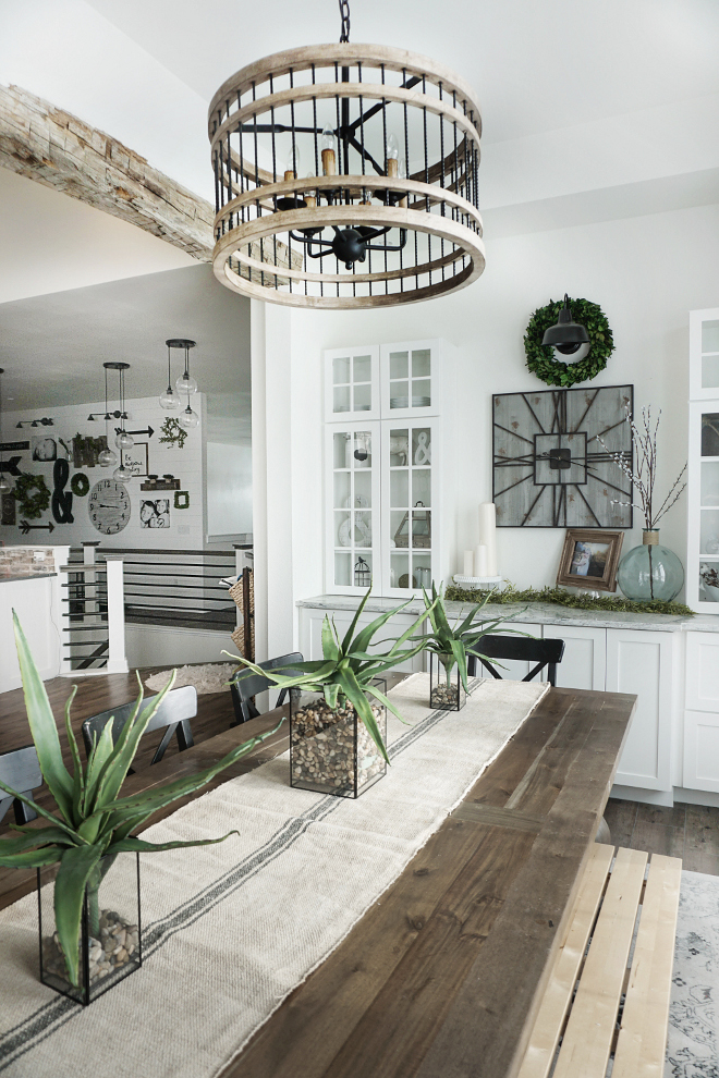
Lighting is from The Light Center and vases are from Target.
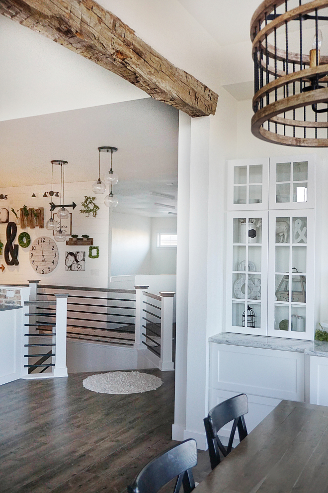
The dining area features a stunning reclaimed ceiling beam.
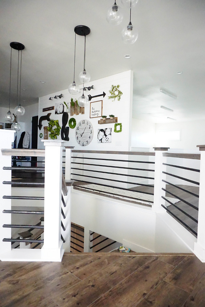
This modern custom staircase is outstanding and works perfectly with the modern farmhouse-style feel of this home.
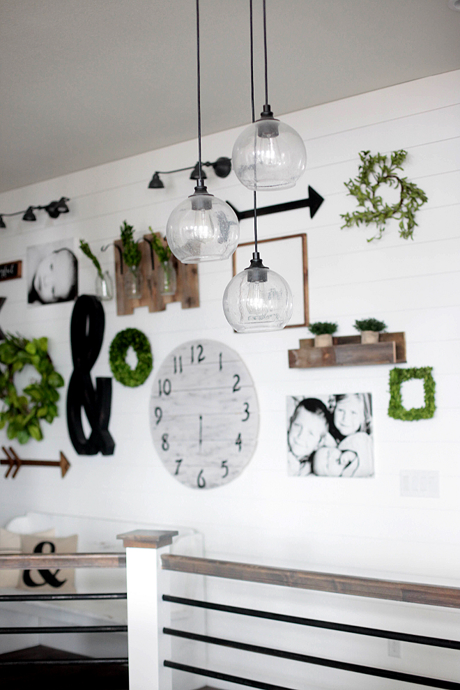
A house only becomes a home when we share it with the people we love.
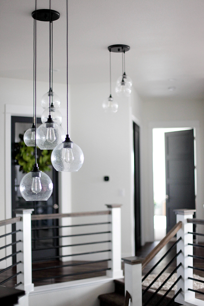
Lighting is from cb2 – firefly pendant light.
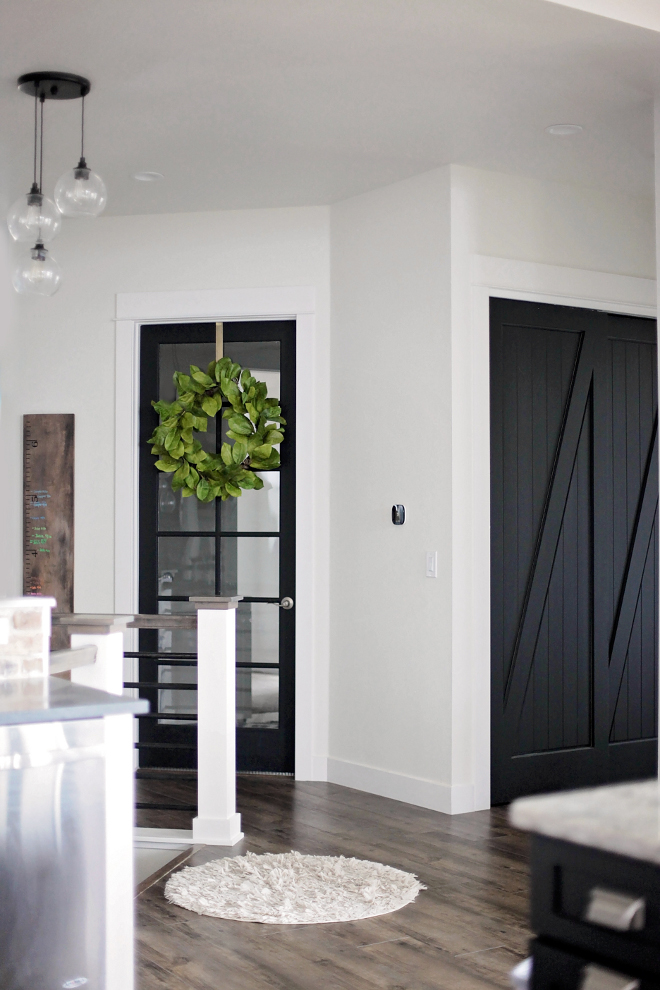
Interior Black Door Paint Color: Sherwin Williams Tricorn Black.
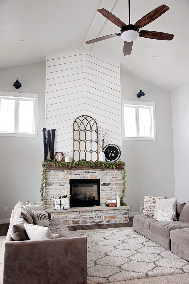
The family room is large, open and inviting.
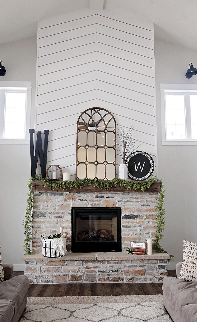
The fireplace is definitely the focal point of our family room! I knew I wanted to create something unique and bold with the fireplace so we decided to go with a bold and modern herringbone type pattern wood treatment on the fireplace. We then paired it with a very rustic exposed wood beam and finished it off with some aged stone. We LOVE how it turned out and just adore the modern rustic feel of the room!
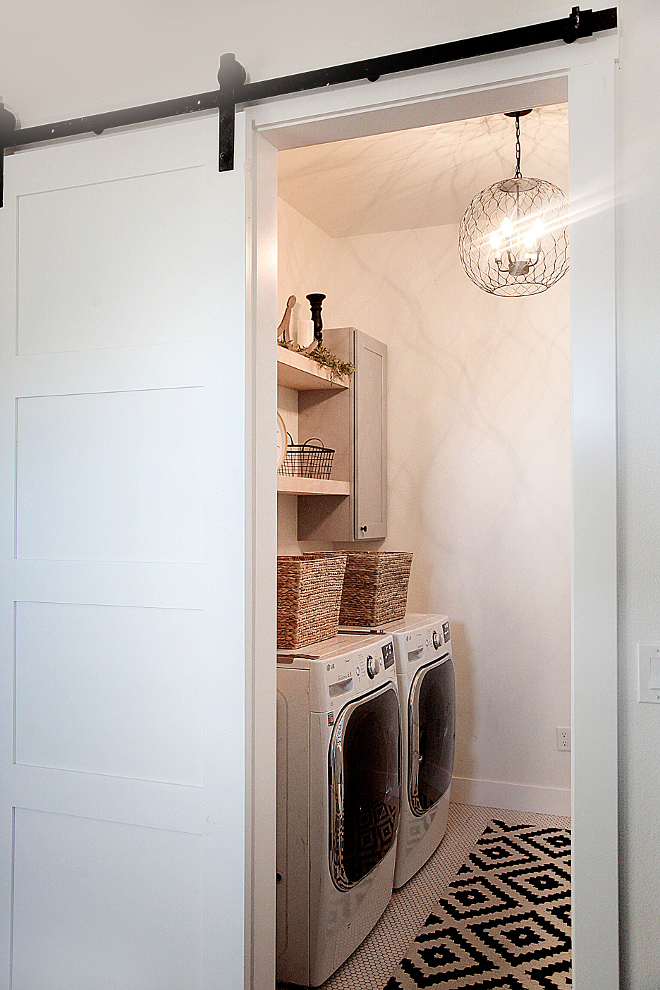
I wanted to be able to throw my dirty dish towels into the laundry room from our kitchen so a laundry room close to the kitchen was important to us!
Runner is from Rugs USA.
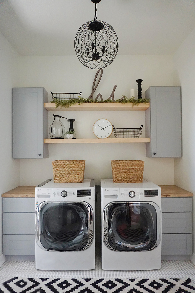
Since you can see into our laundry room, I wanted it to flow with the style of the rest of our house. So we kept it, clean, modern and a little rustic! We LOVE the open shelving and functionality of the space and the light, rug and decor give it a pop of style!
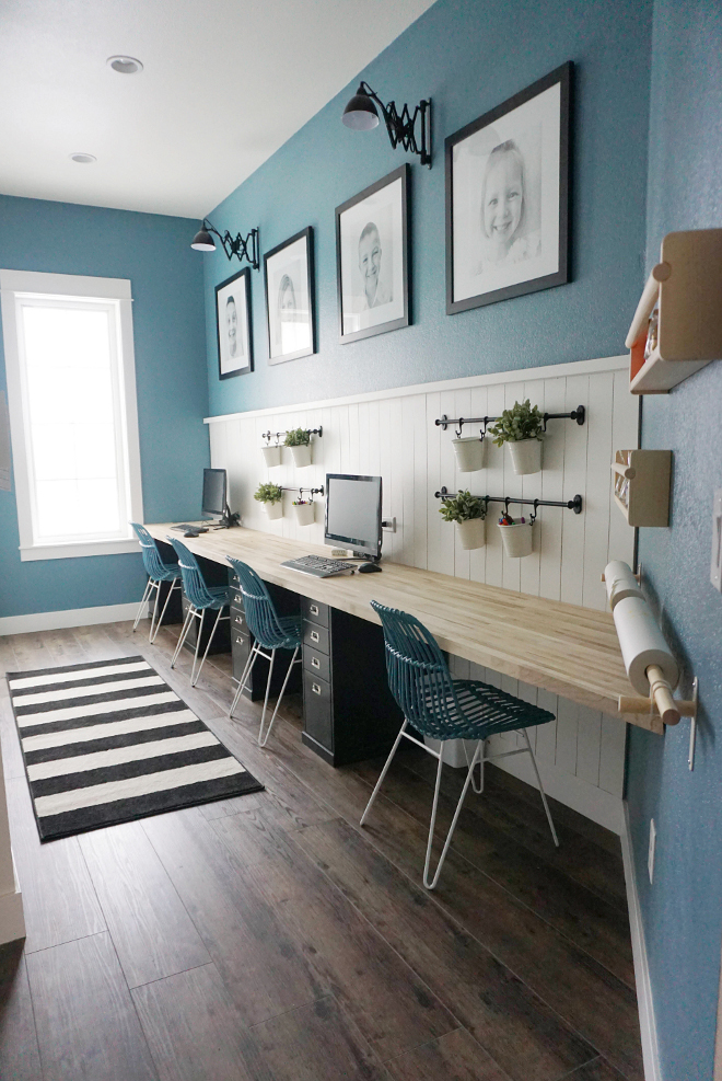
Since this room is also open to the rest of our home, it was very important to keep the style cohesive yet make it very kid friendly.
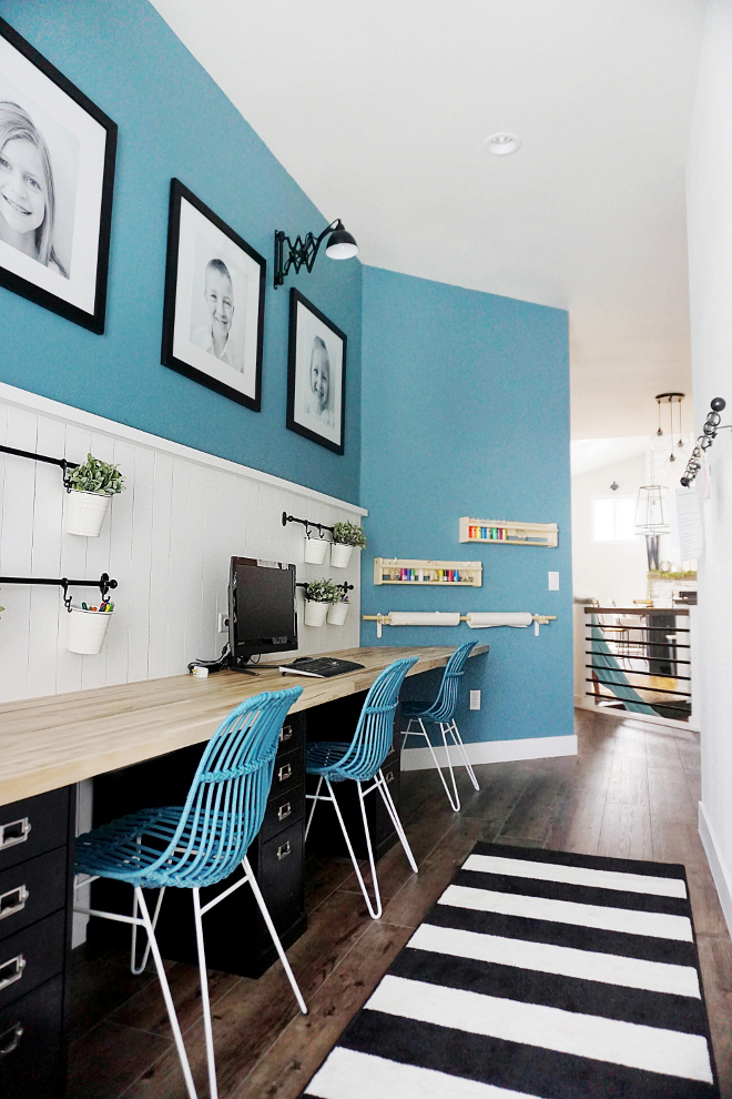
We decided to add a pop of color – a custom blue/green slate color. We knew we also wanted to add a wall treatment to break up the wall since the wall is so long and tall! We decided on a thin vertical shiplap with a ledge on top.
We also knew we wanted to add large pictures of our children to the space so these 24″x24″ picture frames were perfect!
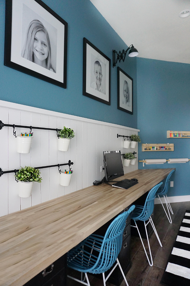
We added black Ikea storage cabinets and a 16 ft Lumber Liquidator butcher block countertop.
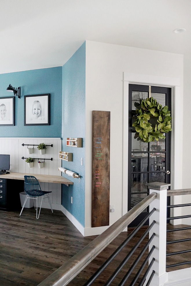
We wanted the space to be a multi purpose art/homework space. So we decided to do every other “station” a computer/homework station and then the others an open art area complete with lots of art supplies! We LOVE how the space turned out!!
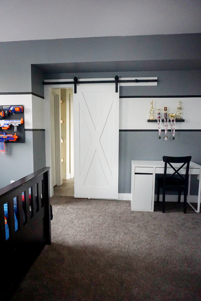
Kids rooms.. each of my kids room reflect their personality and I wanted them all to be bold, colorful and creative.
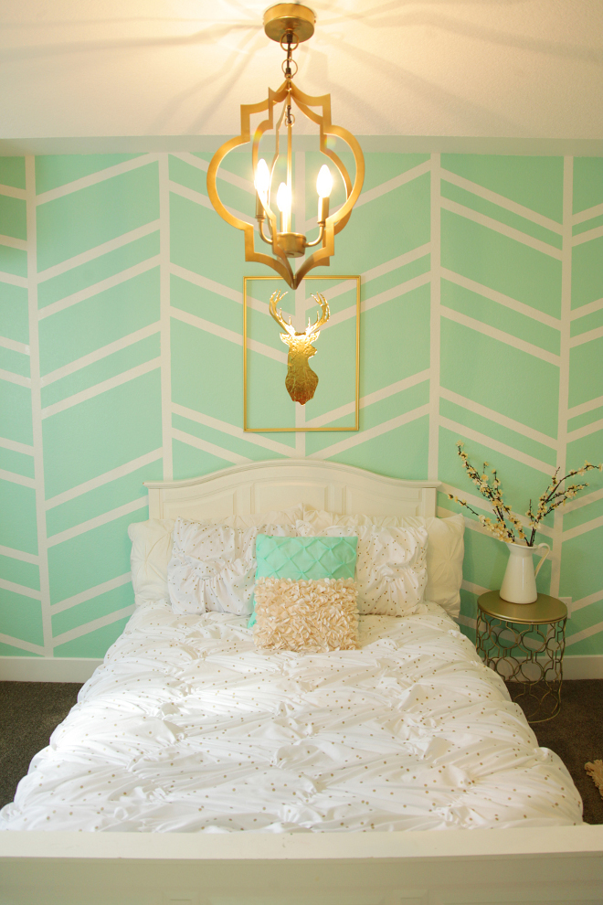
This mint and gold guest bedroom features a custom paint color. The unique herringbone wall treatment adds dimension and break up the large walls.
Lighting is from World Market and bedding is from Target.
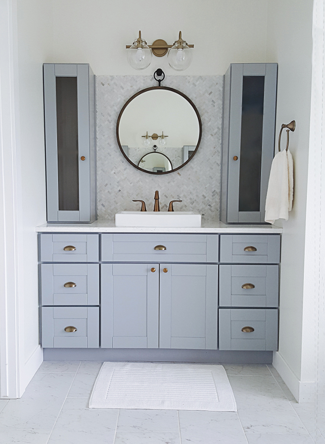
Joe and I really wanted a master bathroom retreat, somewhere where we could really relax, that was comfortable AND stylish. I really LOVE the grey and natural tones and wanted to incorporate them into this space. I wanted the space to feel fresh, clean and modern while also being comfortable. AND I didn’t want to spend a lot. I really wanted to achieve a designer look on a budget. We were able to get the look we wanted on our budget this in several different ways. First, I went with RTA cabinets (ready to assemble) this saved us A LOT of money. RTA cabinets are usually about half the cost of custom cabinets and you can get several different finishes, styles and options to go with your design and budget. In our master I knew I wanted grey shaker and I was only able to find them at the Cabinet Spot. I worked with Vic who helped me design them and sent me 3D images of all my spaces… SUPER awesome!! I am really happy with the color and quality of these cabinets. They have soft close drawers, high quality material and lots of customizable options!
We chose to add towers to our vanity tops for more storage and opted for the frosted glass for a more luxurious look. We were also able to save on our countertops by going to a granite yard and choosing from remnants. The sinks were purchased off the shelf from Lowes. I’m really loving gold fixtures right now so I found a gorgeous clean and modern set that I thought fit the look of my bathroom perfectly. The round mirrors were purchased off the shelf from World Market. The round light fixtures found (here) were the only round fixtures I could find and they were in chrome. So I just found a gold spray paint that matches my other finishes and closely as possible and spray painted them! The gold pulls were also purchased right off the shelf at Lowes! I knew I wanted to splurge a little on the back splash and take it all the way up the wall for a more dramatic look. The herringbone backsplash is from “Floor & Decor”. Lowes also carries a VERY similar style but the tiles are a little larger.
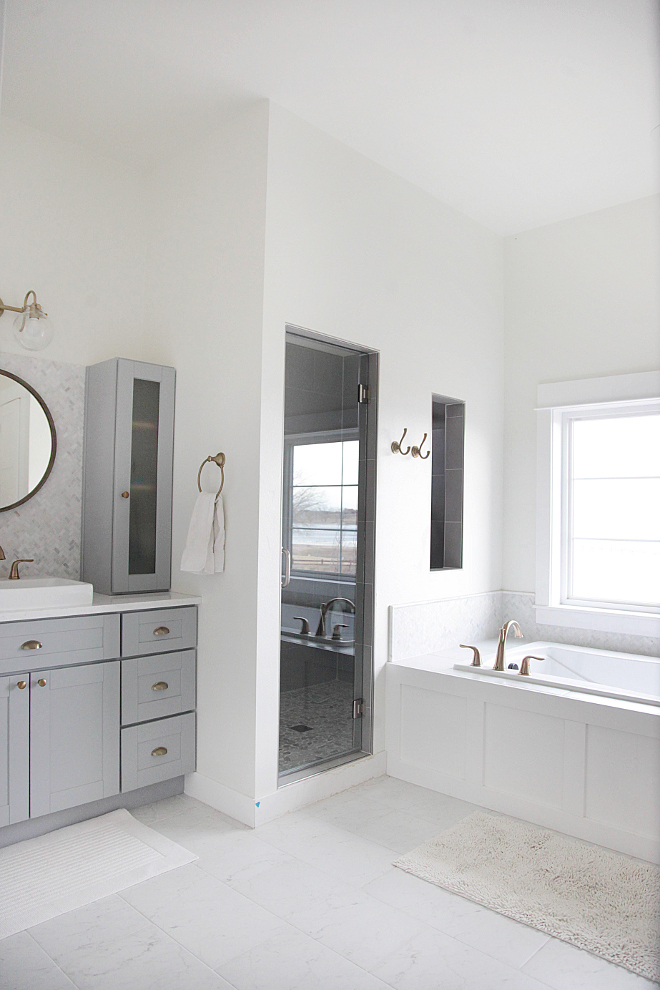
In our shower we really loved the idea of pebble flooring for a spa feel. I wanted to keep the shower really simple so we decided to go with a large grey matte tile and the pebbles – we took the tiles all the way up the sides for a more modern look. We used a cohesive snow white grout color throughout the entire space to tie everything together.
I added white board and batten to the front of my bathtub to add some character and texture. My flooring is off the shelf from Lowes. It is a marble-look-a-like. To save even more money we worked with our tile guy to get the project supply list and went and picked EVERYTHING up ourselves. I did not want to pay my tile guy to go back and forth to the store so he had my number on speed dial and I was his runner. This was a pain… not going to lie)BUT we paid ONLY for production labor that was all done at my house and there were no hidden fees or extra costs. All in all, we were able to achieve a gorgeous modern spa like feel in our master bathroom on a budget.
Wall paint color is Polar Bear by Behr.

Our lot is a reverse pie shape lot since we are on a cul-de-sac. The front part of our lot was a little narrow, so we were forced to put our garages interior facing with a side load.
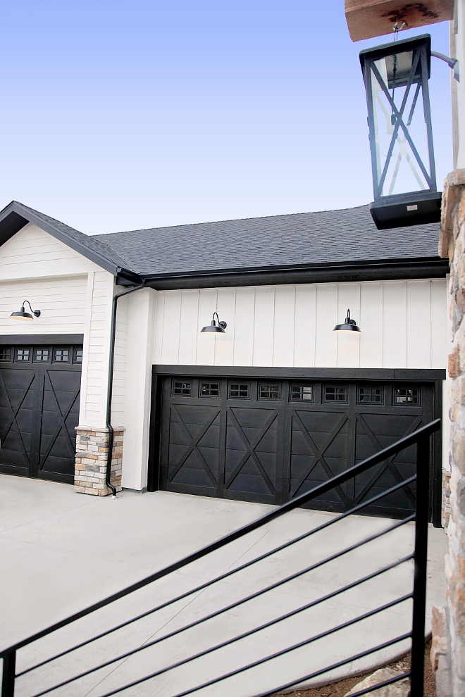
The lights over the garage doors are from Barn Lights.
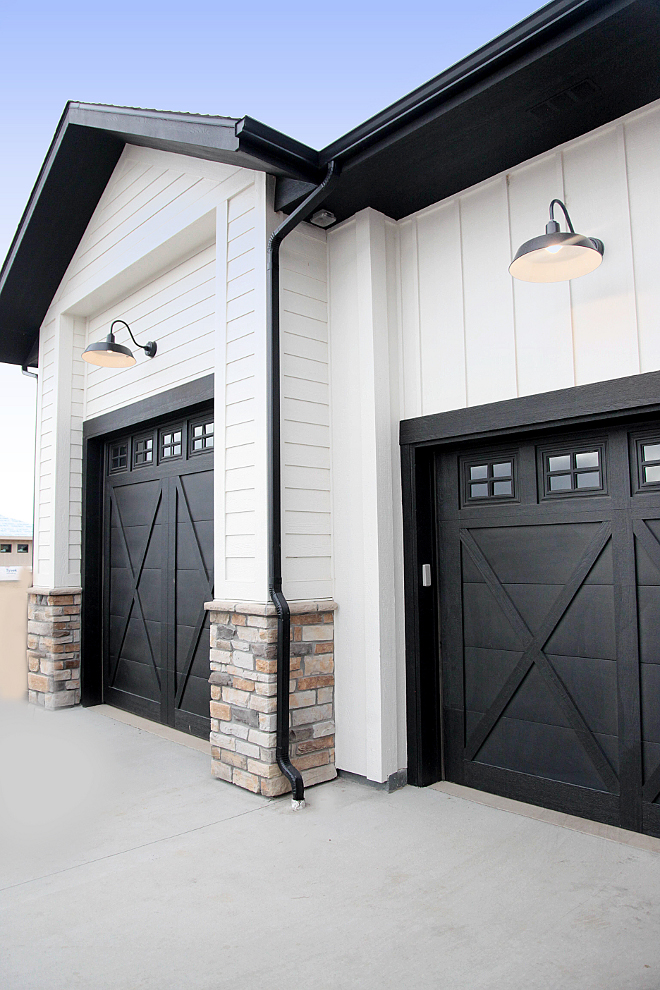
Black Garage Door Paint Color: Sherwin Williams Tricorn Black.
Click on items to shop!
Thank you for shopping through Home Bunch. I would be happy to assist you if you have any questions or are looking for something in particular. Feel free to contact me and always make sure to check dimensions before ordering. Happy shopping!
Serena & Lily: Pillow & Throw Sale!
Wayfair: Up to 75% OFF on Furniture and Decor!!!
Joss & Main: Up to 70% off Sale!
Pottery Barn: Bedroom Event Slale plus free shipping. Use code: FREESHIP.
One Kings Lane: Buy More Save More Sale.
West Elm: 20% Off your entire purchase + free shipping. Use code: FRIENDS
Anthropologie: 20% off on Everything + Free Shipping!
Nordstrom: Sale – Incredible Prices!!!

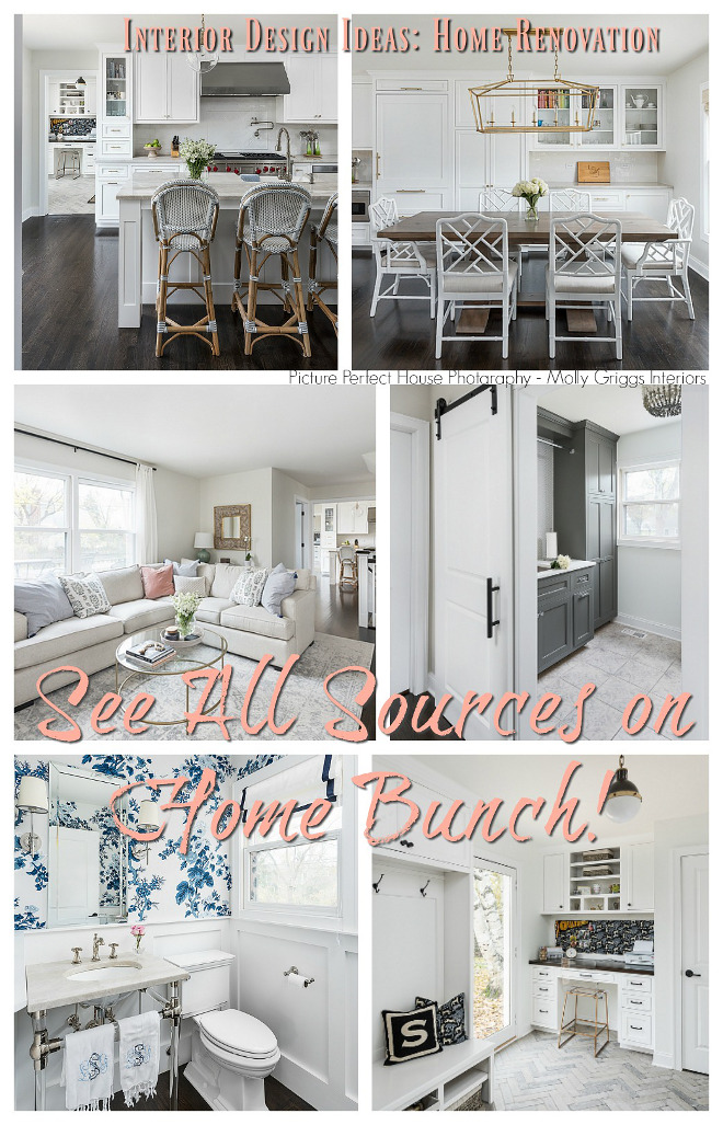
 Beautiful Homes of Instagram: Modern Farmhouse.
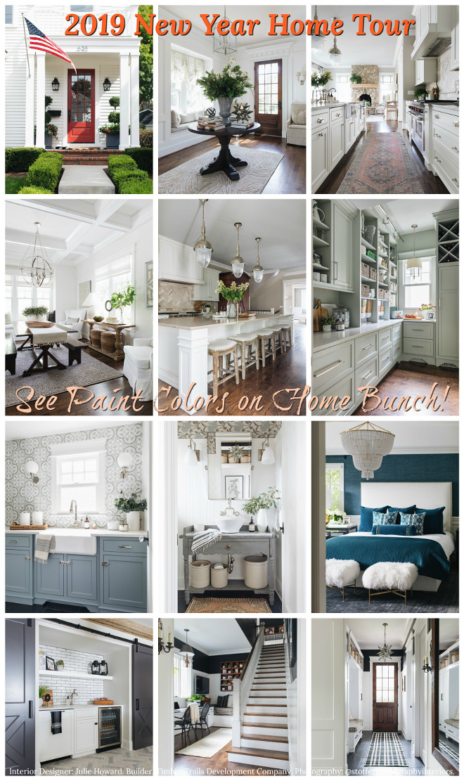 2019 New Year Home Tour.
 New-Construction Home Ideas.
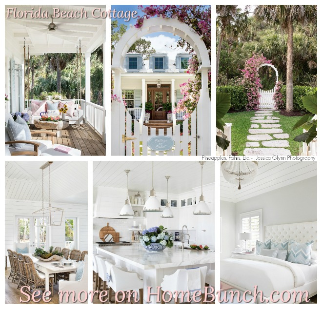 Florida Beach Cottage.
 Tom Brady and Gisele Bundchen’s Home – Full House Tour.
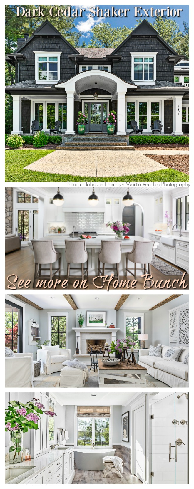 Dark Cedar Shaker Exterior.
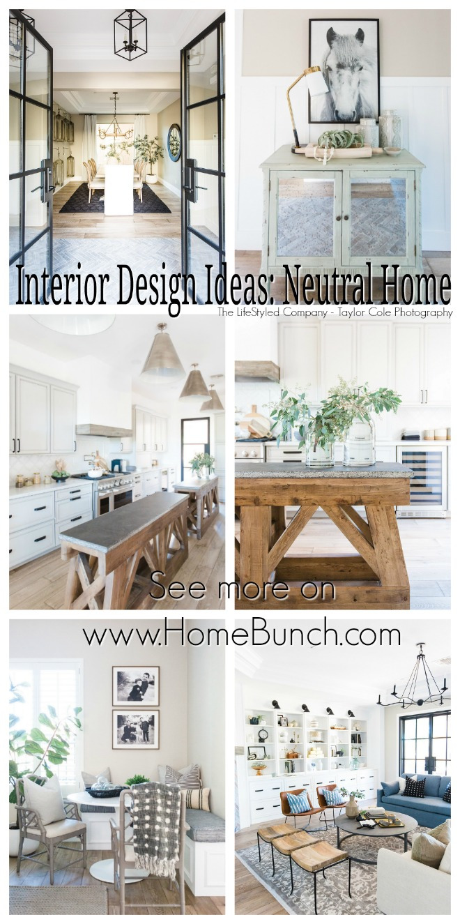 Neutral Home.
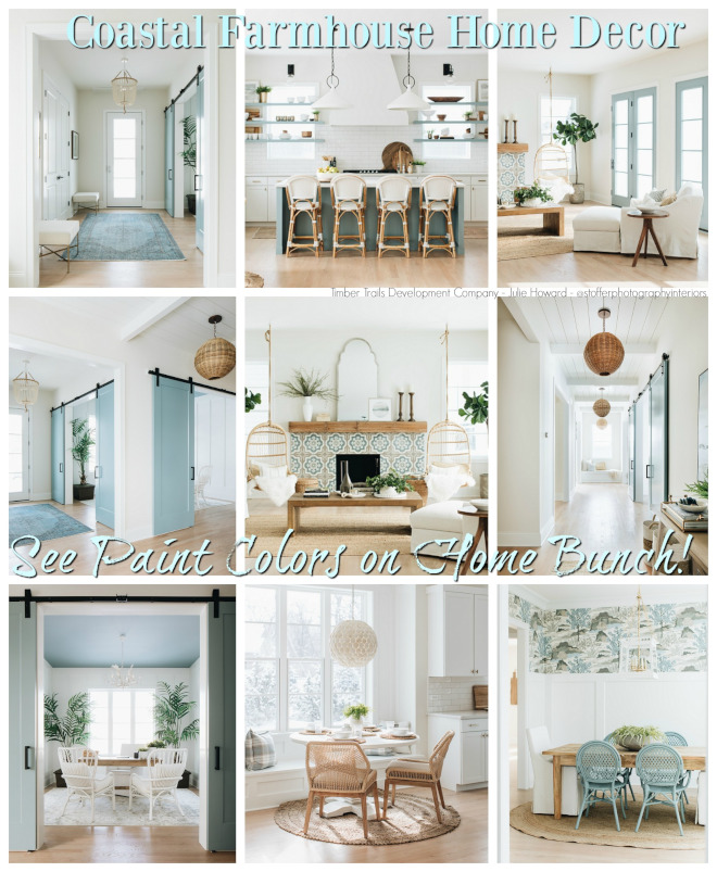 Coastal Farmhouse Home Decor.
 Modern Farmhouse with Front Porch.
 Lake House Interior Design Ideas.
 New England Home.
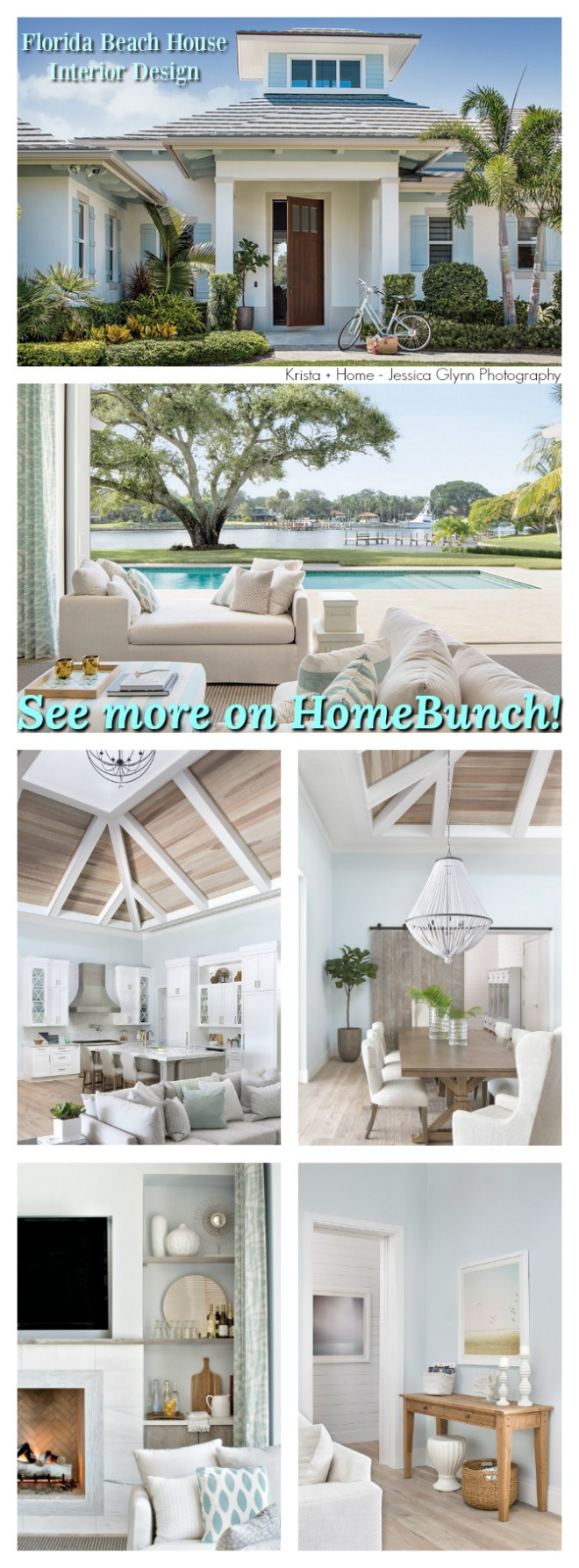 Florida Beach House Interior Design.
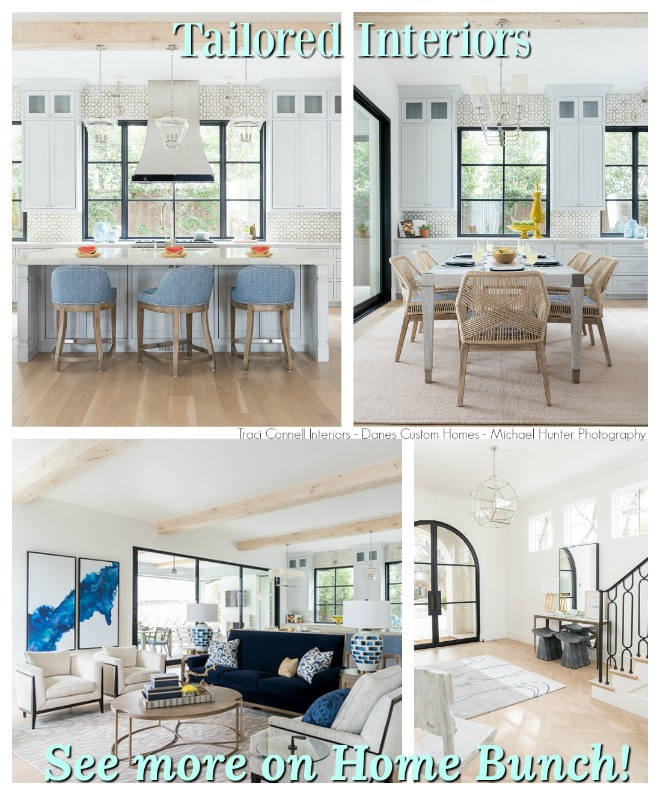 Tailored Interiors.
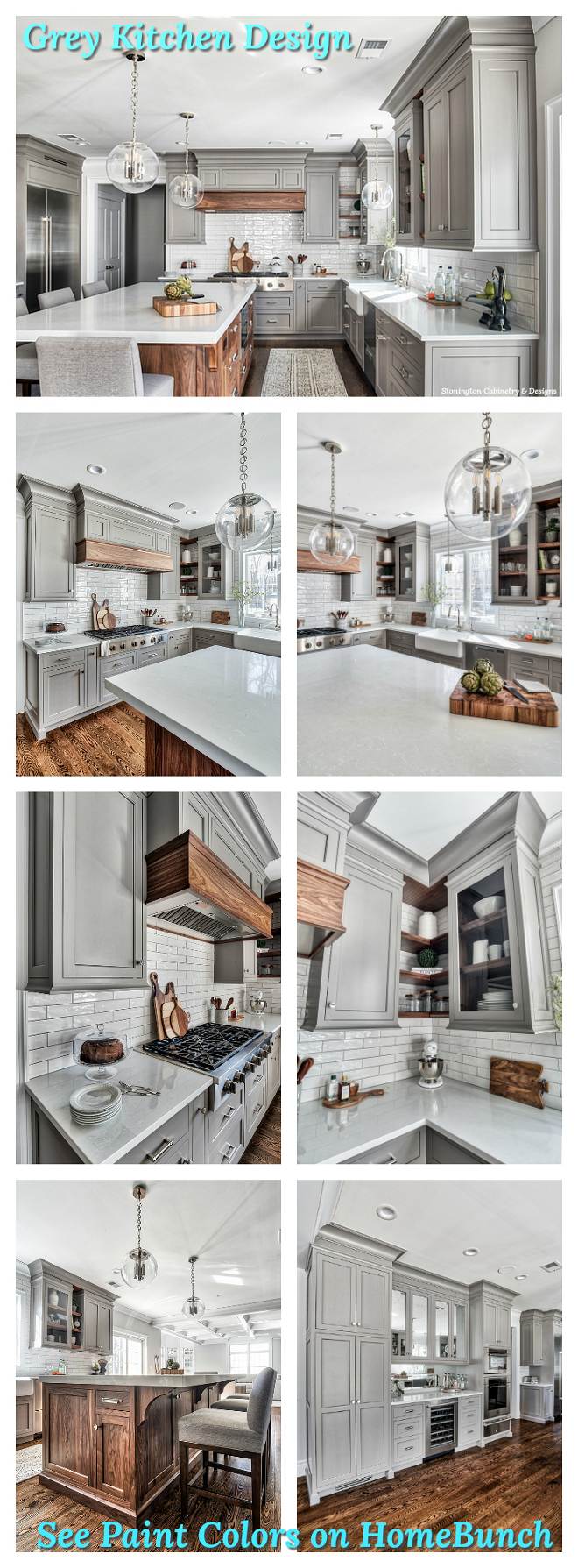 Grey Kitchen Paint Colors.
“Dear God,
If I am wrong, right me. If I am lost, guide me. If I start to give-up, keep me going.
Lead me in Light and Love”.
Have a wonderful day, my friends and we’ll talk again tomorrow.”
with Love,
Luciane from HomeBunch.com
Get Home Bunch Posts Via Email ![]()
“For your shopping convenience, this post might contain links to retailers where you can purchase the products (or similar) featured. I make a small commission if you use these links to make your purchase so thank you for your support!”
Subscribe to get Home Bunch Posts Via Email
I love your home! The style is a perfect, and I love the brick wall in the entryway!
I’d love to know more about the old Chicago brick used in the backsplash. This is perfect for my kitchen renovation. How can I get this?
I would love to know where got your brick tile for your kitchen!! I have been searching for a long time and this tile is perfect for my house!
Hi! I love the backsplash done in “Old Chicago brick” and was wondering where you sourced that material from? I haven’t been able to find an exact match. Please let me know at your earliest convenience. Best, Tonya (773.575.9962)
Hi Tonya,
Feel free to contact the homeowner via Instagram. She should be able to share more details with you.
Thank you,
Luciane
I love the exterior paint colors! Is “Navy Bean” from a different vendor? I’m unable to find it at Sherwin Williams.