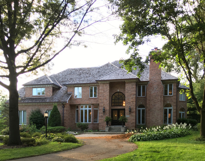
I have said before that our new series “Beautiful Homes of Instagram” would be featured bi-weekly, but since what we truly have in life is “now”, I couldn’t wait any longer to share this extraordinary home.
I discovered Summer from Sumhouse_Sumwear, after she tagged me in one of her pictures shared on Instagram. I immediately started to follow her and soon invited her to share her home on the blog.
Here, Summer shares the trajectory of transforming a 1980s fixer-upper into a modern dream home:
“With a self-taught interior designer for a mother, and a very handy father, I grew up living through numerous home renovations. I loved our beautiful homes that my parents created, but fashion was more my thing than interior design. Little did I know that one day, that would change!
While in college I met my husband, Dan. We got married in 2003, had 2 daughters, and moved twice. Fast forward to spring of 2013 and we were ready to move again. We were hoping to find a completed home that was fairly new. We saw many homes that were spacious and nice, but nothing seemed like “us.”
After a few months of searching, we followed some open house signs about a mile and a half away from our current home. Those signs led us to an area that we didn’t even know existed! At the end of a street, alone on a cul-de-sac, sat a stately custom built Georgian house. We pulled up and got out of the car and I actually said, “I think we may have found the house of our dreams!”
We walked in and my heart immediately sank…the house was in need of a total gut job. After talking to the realtor, we found out that the house was for sale for 6 YEARS! The house was a 5,000 sq ft fixer upper with a 2,500 sq ft unfinished basement, that no one wanted.
The homeowners custom built the house in 1988 and it looked as if it were a time capsule of that year. The whole house had orange stained oak woodwork and floors, some tile floors, ivory carpeting, a red brick fireplace in the family room, some stained glass windows, many oak built-ins, a large kitchen with oak cabinetry and 1980s appliances, bathrooms with huge tub decks, hair dryers in bathrooms that were attached to the walls, and even a bidet.
Even though this house wasn’t “us” in its current state, I saw spaces that could be transformed. The footprint of the house was exactly what I was looking for. We left the house that day talking about how we didn’t want to renovate our next home, but I couldn’t stop designing this house in my head and picturing my family living in it! With our 2 daughters being 5 and 6 at the time and me being a stay at home mom, something excited me about this project. After a lot of convincing, my sweet husband agreed and we began our 3 year journey to turn our house into what it is today.
Since we’ve moved in, we have gutted and completed 3 of the 6 bathrooms, a whole new kitchen, changed flooring, gutted and repainted much of our main floor and some of our second floor, and finished the whole basement. Although we still have to gut 3 more baths, create my home office, and re-do our exterior, I am constantly trying to perfect what we’ve already done. My love for interior design has grown so much that I have turned it into a part time career, helping other people turn their houses into their dream homes!”
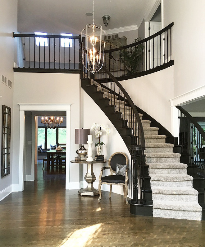
Style Inspiration: I chose neutrals like gray and shades of white for a chic and calming effect and pops of bold black for some elegant drama. We have over 100 windows in our home and I wanted the “color” in my home to come from what shows through them. Because we live in the Midwest, we get to experience all 4 seasons. The windows act as artwork, providing different pops of color all year long. I love a little bit of Parisian influenced glamour with some vintage and some rustic touches. My goal is to create a home that is just as comfortable and livable is it is beautiful to look at.
Black Staircase Paint: Black Beauty by Benjamin Moore with a high gloss varnish.
Wall Paint: Metro Gray By Benjamin Moore.
All Trim: Benjamin Moore White in Satin Finish.
Stairway Spindles: The iron spindles are from Cheapstairparts.com and are from the Tuscan round hammered collection. They are alternating Tuscan Round Hammered plain bar, and the double sphere bar.
Decor: The foyer table is from Z Gallerie, the chair, pillow, table decor, and lamp all from HomeGoods. Hanging wall mirror from HomeGoods.
Before & After
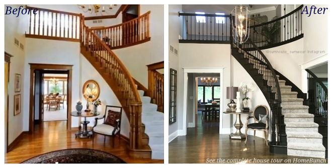
This is a “Before & After” photo of Summer’s foyer. The “before” photo was taken before they purchased the home. Such a difference, huh?!!
Front Door
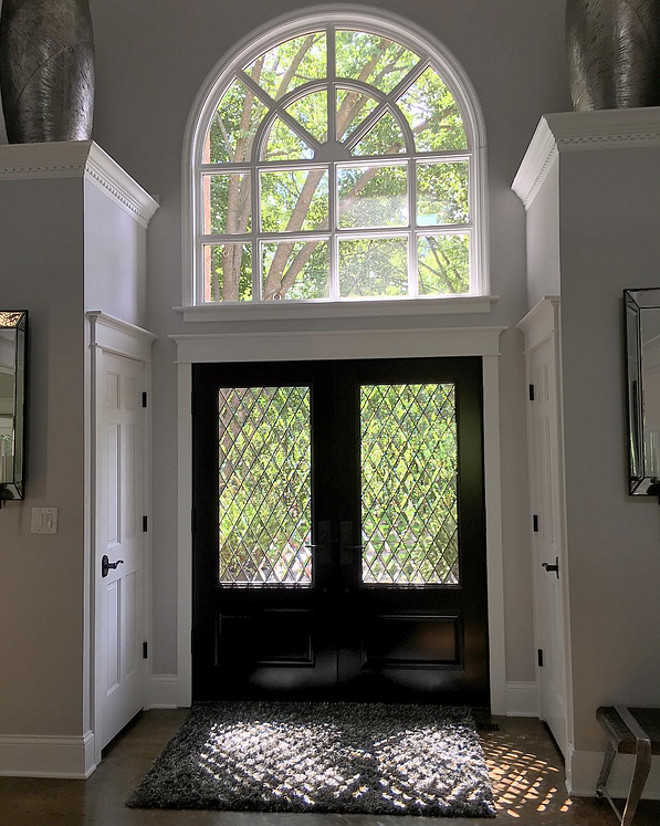
Summer have replaced the old front door and side lights, with brand new custom mahogany double doors with diamond beveled glass.
Custom Front Doors: Mahogany with custom stain, Glass is diamond and beveled glass Doors by Creative Millwork in St. Charles, IL.
Living Room
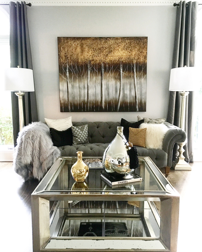
Living Room Design: I went with metallics and and used the colors in the artwork that I found from Pier 1 for my design inspiration. I chose this piece not only for it’s visual appeal, but it went with the theme of nature being my artwork. I dressed up my vintage looking tufted sofa with collected looking mix of ornate pillows and a luxurious throw.
Wall Paint: Benjamin Moore Metro Gray.
Trim Paint: White with Satin Finish by Benjamin Moore.
Sofa, Pillows and Throw: Homegoods.
Coffee Table & Floor Lamps: Z gallerie.
Window Panels: Z Gallerie.
Panel Rods: Homegoods.
Wall Art: Pier 1.
Casual Elegance
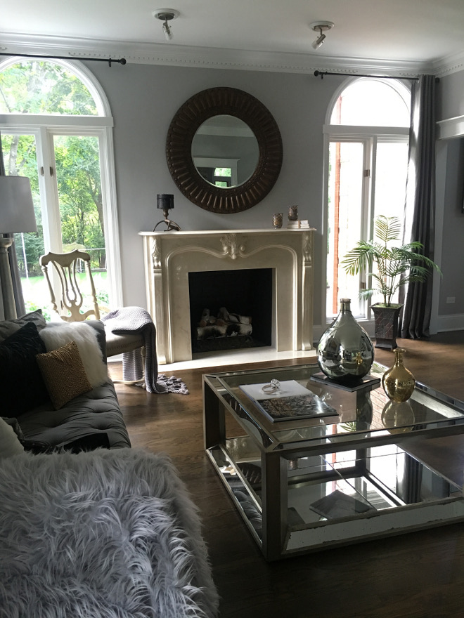
The homeowner describes this space as “something formal, yet not too buttoned up”.
Mirror above Fireplace: Homegoods.
Chairs: Homegoods.
Fireplace
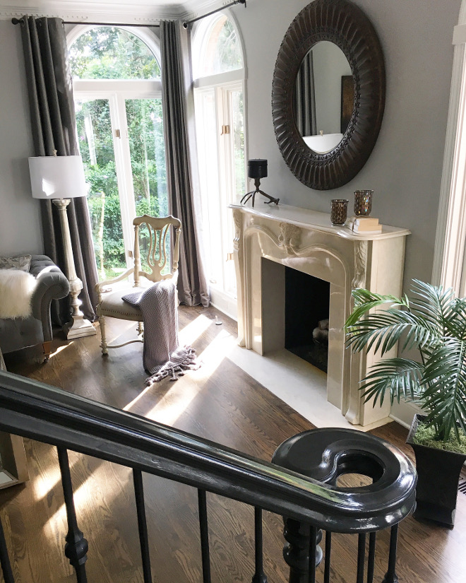
The fireplace in this room is the only thing in the house that we kept and didn’t change in any way. It’s classic, timeless, elegant appeal ties in with the vibe of a glam formal living space.
Dining Room
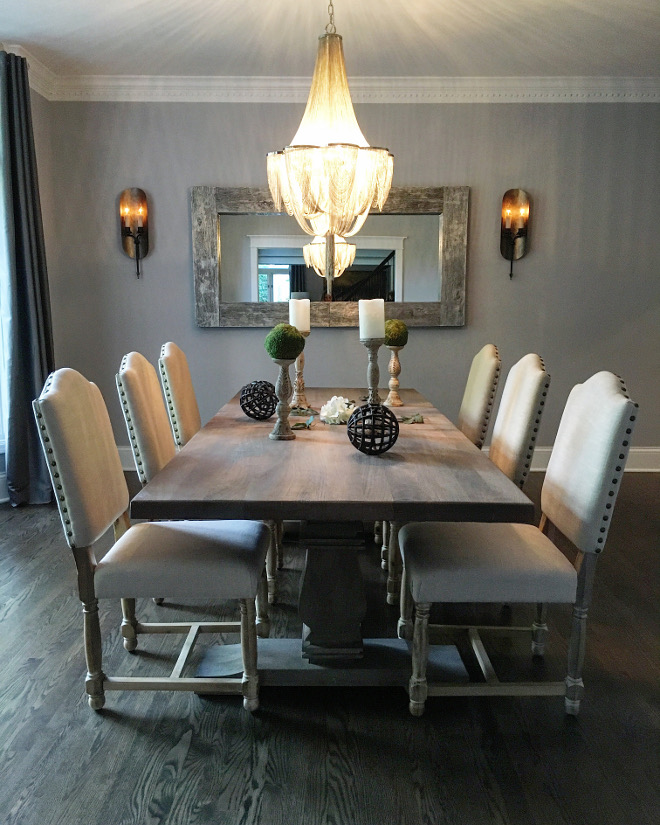
Dining Room Design: I love lighting and this room is all about the polished chrome draping chains Chandelier. Paint Color is Metro Gray by Benjamin Moore.
Trim Paint: White by Benjamin Moore in Satin Finish.
Chandelier: Maxim Chantilly collection 10- light chandelier.
Dining Room Sconces: Amenia 2 light wall sconce by Savoy House.
Window Panels: Z Gallerie.
Rods: Homegoods.
Table: Home Decorator’s Collection.
Chairs: World Market.
Mirror: Z Gallerie.
Kitchen
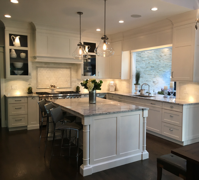
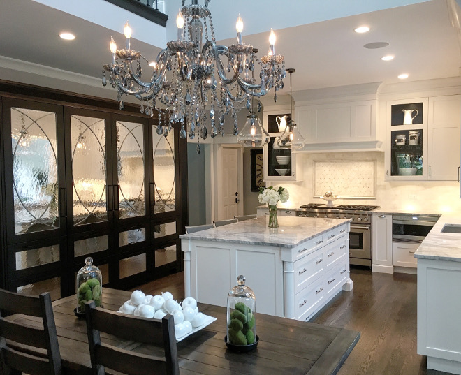
Kitchen Design: This is where we started our renovations and ideas for our home, because not only do I believe that the kitchen is the heart of the home, ours is literally in the center of the house. This is a perfect example of my taste. I love the clean lines and edges on the countertop and simple shaker style cabinets with a slight beveled edge. Some more interesting aspects of the cabinetry come from the detailed island legs and the hardware. I mixed in fancier handles with a more contemporary version classic cup pulls for a balance of vintage glam. For the back splash I wanted classic marble subway tiles to blend and not distract with other kitchen details, like the visually stimulating mosaic pattern above the range. This honed mosaic pattern has circle mirror inserts to tie in nicely but not compete with our leaded antique mirrors on the refrigerator and pantry armoire.
Wall Paint: Benjamin Moore Metro Gray.
Trim: White by Benjamin Moore with Satin Finish.
Countertop
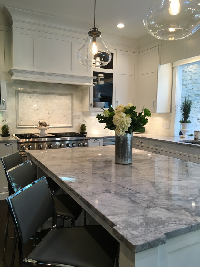
The countertops are probably my favorite aspect of the kitchen. I love that Super White Quartzite looks like marble, but is stronger than marble and granite. These particular slabs are loaded with beautiful veining and gorgeous color.
Countertop: SuperWhite Quartzite from Global Granite and Marble.
Pendants
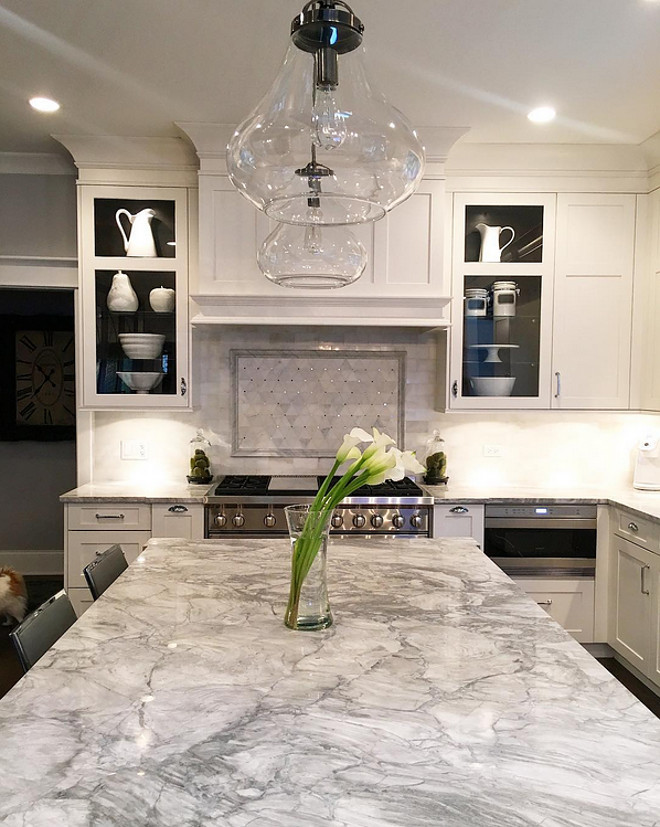
I wanted to create juxtaposition with all my glam going on with industrial pendant lights. I loved that they are big and see through so that they don’t take up any visual space and almost disappear.
Pendant Lighting: Flux Retro Inspired Pendants.
Appliances
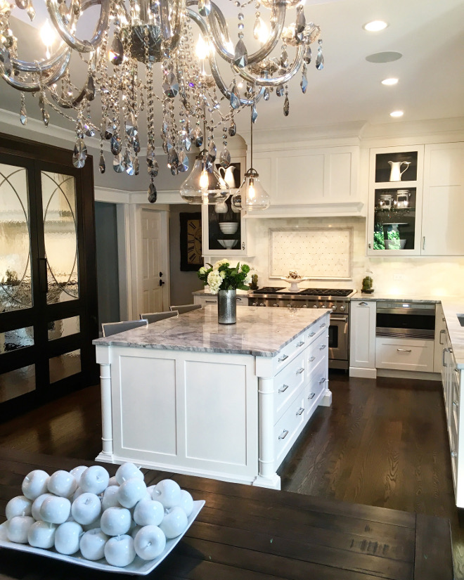
Range: 48” gas range with 6 burners and griddle by Wolf.
Microwave Drawer: Wolf.
Paneled Dishwasher: Bosch.
Exhaust Hood: Best.
Kitchen Hardware
Hardware: Top Knobs Chateau Collection Emerald Pulls in Polished Chrome and Top Knobs Somerset Cup Pulls in Polished Chrome.
Kitchen Cabinet
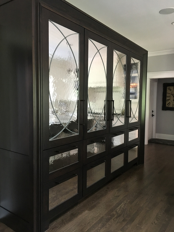
This kitchen armoire has 2 refrigerators in the center with 2 freezer drawers below each refrigerator. On either side of the refrigerators are pantry cabinets with pullout drawers and pantry drawers below. I chose hardware for the armoire to be sleek and oil rubbed bronze to blend in with the wood, so that it wouldn’t be busy with the mirrors.
Cabinetry: Brookhaven by Wood-Mode.
Wood: Maple.
Color: Java.
Leaded Antique Mirror Inserts: By Glass Works in Schaumburg, IL.
Double Hardware on Refrigerator/Pantry Armoire: Oil Rubbed Bronze Meadows Edge.
Refrigerators and 4 Freezer drawers: Sub-Zero Appliances.
Kitchen Cabinet
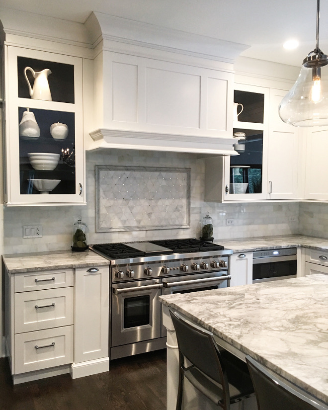
Cabinets are Brookhaven Edgemont Recessed by Wood-Mode.
Wood: Maple.
Color: Nordic White.
Glass Cabinet Wood Backing: Maple in Java.
Backsplash Border
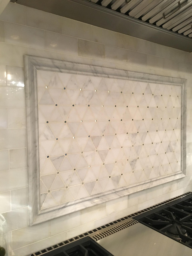
The backsplash is framed with Honed Carrara Marble Border.
Range Backsplash
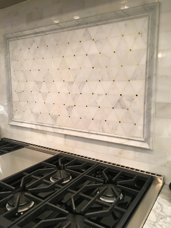
Hood Mosaic Marble Detail: Honed Carrara And Mirror inserts by Porcelanosa.
Mirror Insets
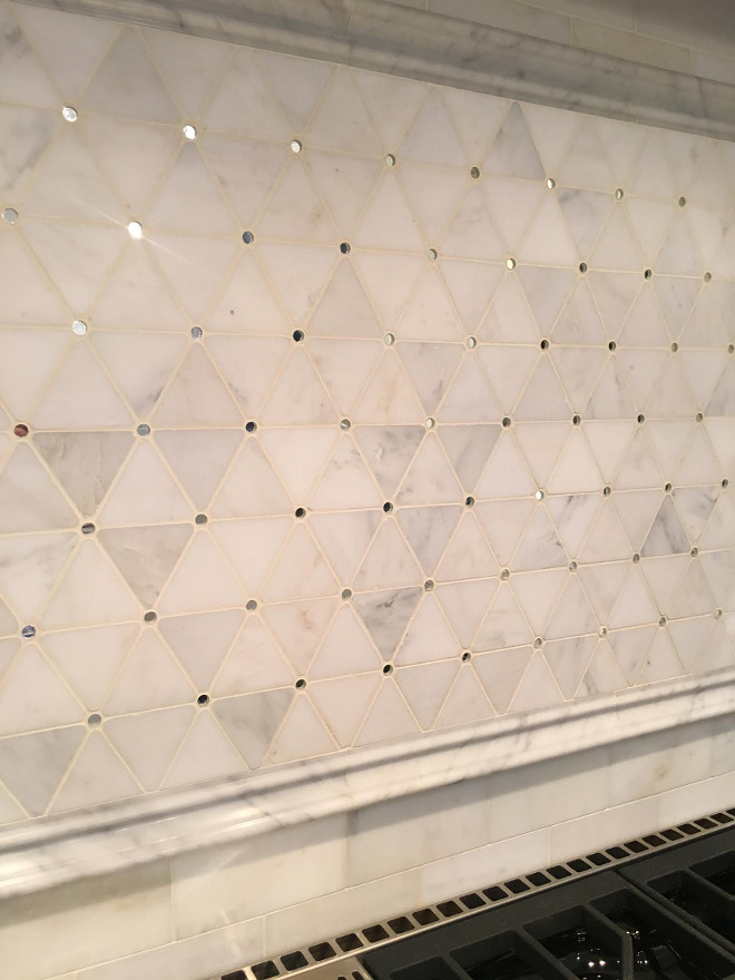
The backsplash above the range has circle mirror inserts. I love this!!!
Bar Stools
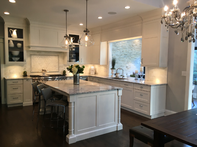
I chose sleek bar stools with a back fro comfort, but made sure that they pushed all the way under my kitchen island so that they would also be almost invisible up against the refrigerator/pantry armoire.
Kitchen Island Barstools: Homegoods.
Backsplash
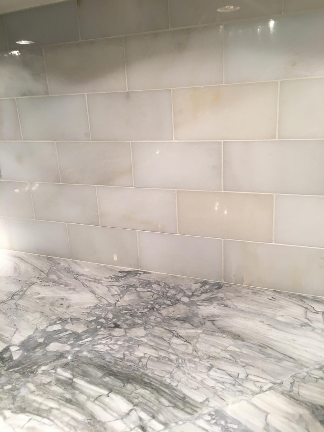
Marble Backsplash: Polished Carrara Subway Tiles from MS International.
Flooring
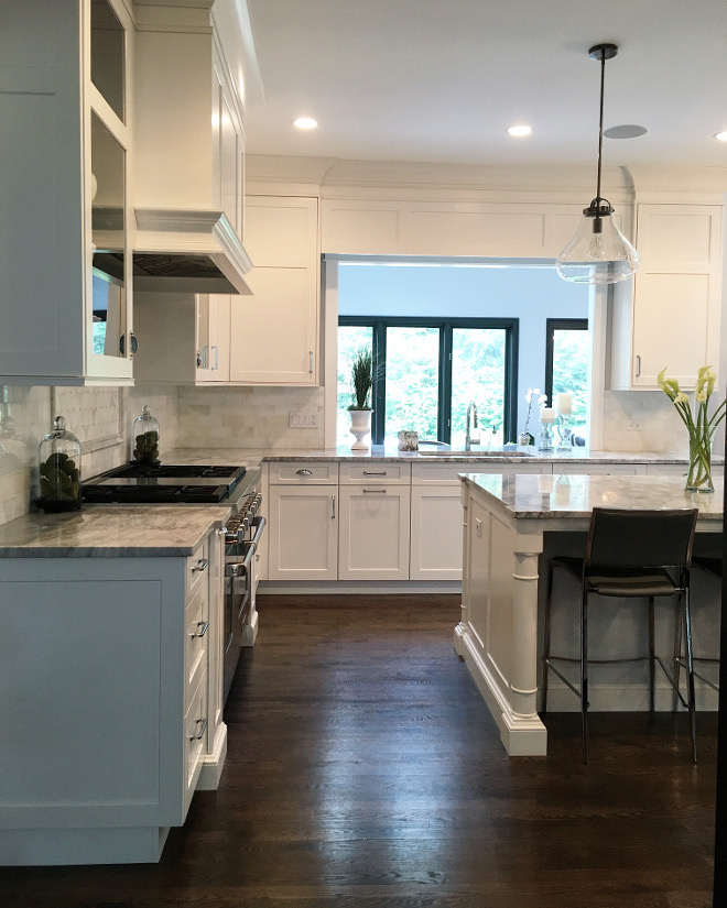
Wood flooring in House: Wood floor is red oak with Jacobean stain and satin finish by Minwax.
Faucet
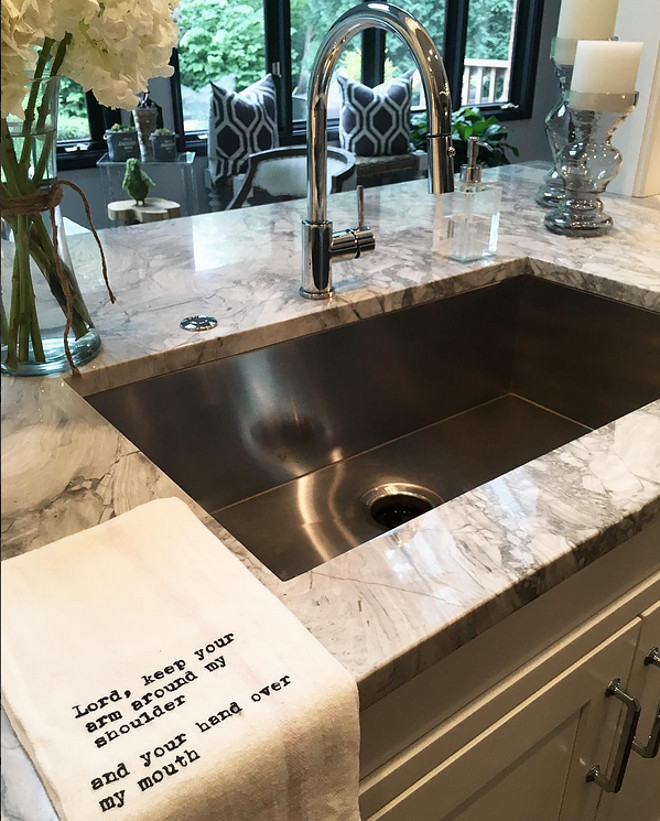
Faucet is by Hydrology.
Passthrough
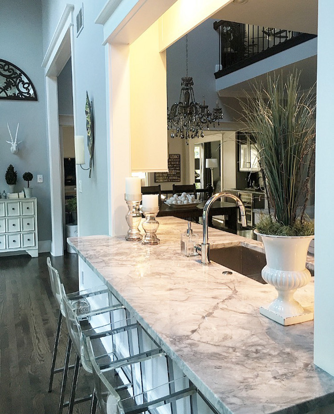
Clear barstools were added at the passthrough window in the kitchen to not only be functional, but take up less visual space in the long and narrow sunroom.
Barstools: CB2 Vapor Stools Clear.
Sunroom
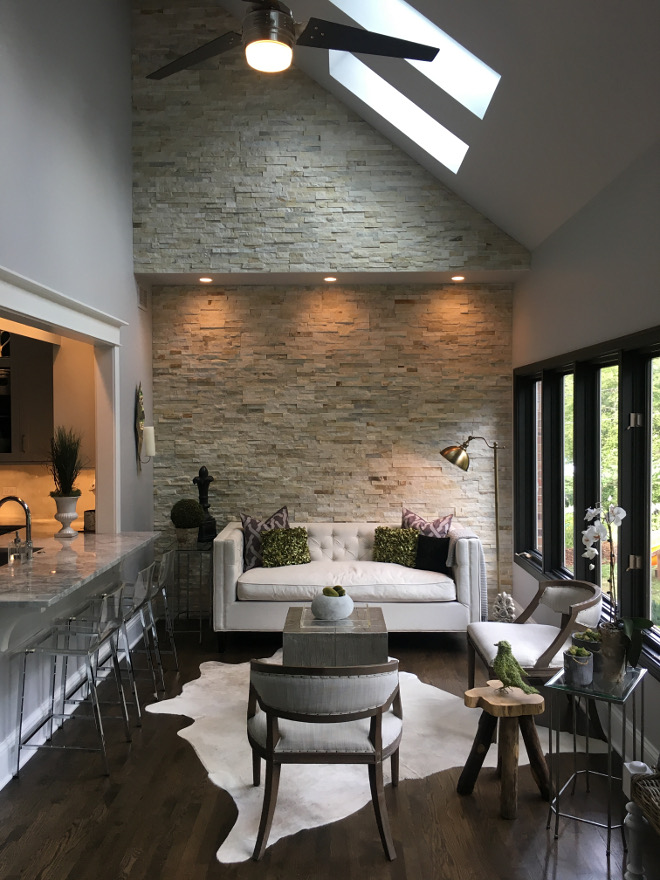
Sunroom: The feels in this room are all about nature with it’s tall stone wall and black framed windows. This room is long and narrow, so I wanted to give this tall wall a purpose and make it the focal point. We decided on adding stone to play up and coincide with what we did in the family room to the fireplace. I love the texture it added and the natural aspect of it. For more texture I added a neutral cowhide, which I believe is every designer’s best friends. It adds luxury to any space and looks stunning no matter where you put it. The black framed windows and door were meant to exaggerate the windows and act as picture frames to the outdoor scenery.
Stone Wall: RealStone Systems Shadowstone Panels in Alabaster.
Sofa, Throw Pillows and Blanket: Homegoods.
Green Leaf Pillow: Pier 1.
Side table used as coffee table: Z Gallerie.
Chairs: World Market.
Metal and Glass Nesting Tables: Homegoods.
Floor Lamp: Homegoods.
Paint Color
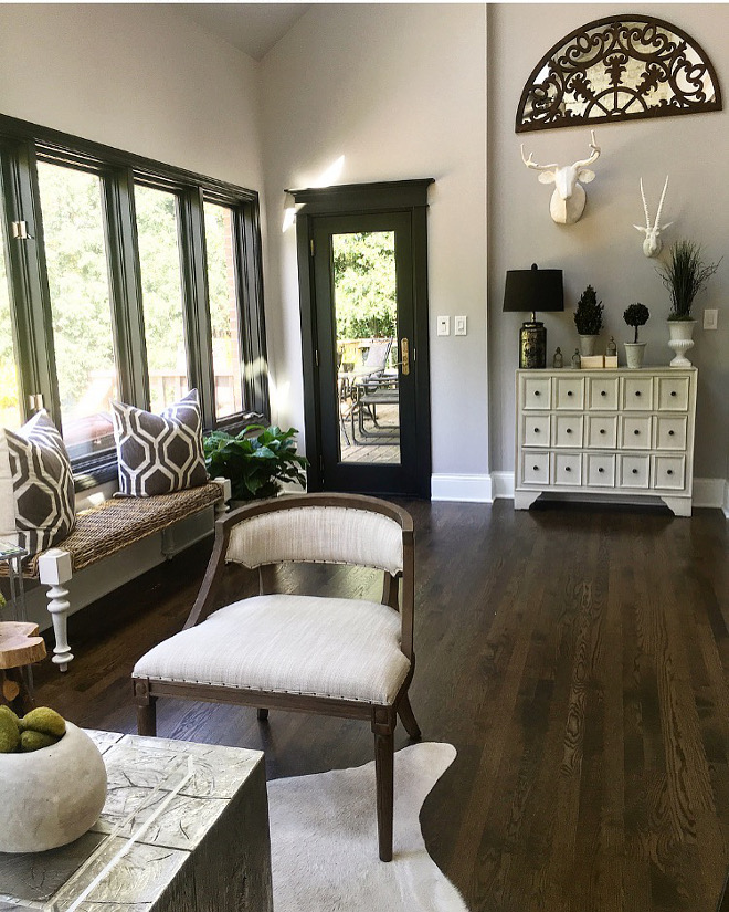
Wall paint: Benjamin Moore Metro Gray.
Window and Door Trim: Black Beauty by Benjamin Moore.
Wicker Bench: Homegoods.
Pillows on Bench: Z Gallerie.
Stag Head Wall: Stags: Homegoods.
Mirror: Homegoods.
Chest: Homegoods.
Lamp: Hobby Lobby.
Chandelier
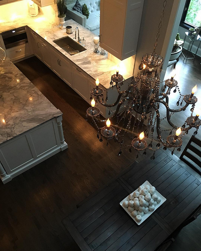
Eating Area Chandelier: The Omni Chandelier in Smoke By Z Gallerie.
White Apples and Tray: Homegoods.
Dining Area
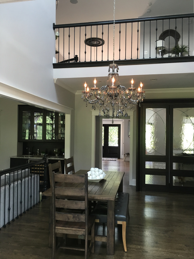
I balanced out my smoky crystal chandelier with fluted glass arms, with the rustic touch of my farmhouse kitchen table. I wanted to make it look less like a dining set , so I changed up the look by adding a bench.
Kitchen Table and Chairs: World Market.
Bench: Homegoods.
Wet Bar
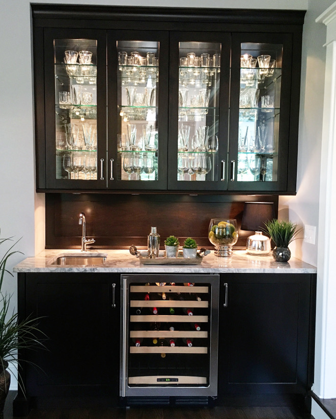
The wet bar is in dark wood with a wood backsplash because I wanted this to be a more masculine feature in the home. I like a balance of femininity and masculinity throughout my home.
Wet Bar Cabinetry: Brookhaven by Wood-Mode.
Wood: Maple.
Color: Java.
Countertop: SuperWhite Quartzite from Global Granite and Marble.
Wine Refrigerator: U-Line.
Faucet: Hydrology.
Hardware: Top Knobs Chareau Collection Emerald Pulls in polished chrome.
Family Room
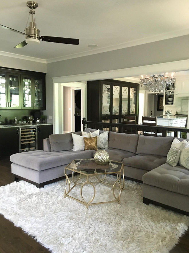
Family Room Design: This room was completely transformed when we took out a stained glass window and refaced our red brick fireplace with stacked stone. I chose not to do a mantle for a sleeker and cleaner look. I wanted a sleek and sectional with clean lines, that was also comfortable. I love that it has some tufting to dress it up a little bit. I added throw pillows with different textures to add interest, as well. The gold table with glass top adds a little bit of the glam to tie in with our open floor plan and the glam in the kitchen.
Family Room Details
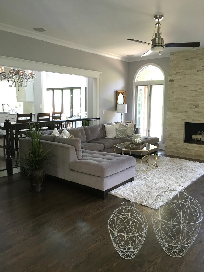
Wall Paint: Benjamin Moore Metro Gray.
Family Room: Fan Fixture is by Emerson Fans CF205BS.
Sofa: Arhaus Furniture Garner Sectional.
Throw Pillows: Homegoods.
Rug: Homegoods.
Coffee table: Homegoods.
Wire Baskets: Homegoods.
Fireplace
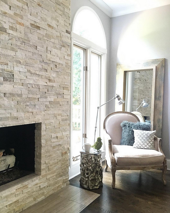
The stone on fireplace is RealStone Systems Shadowstone Panel in Alabaster.
Wine Room
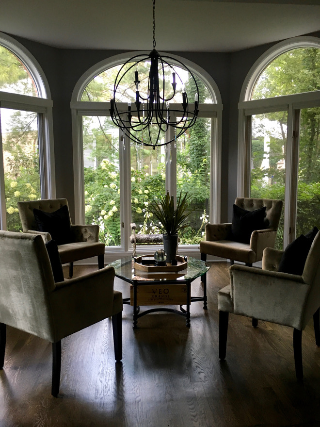
Wine Room Design: This room right off of our family room is completely surrounded by windows and a glass door. It didn’t have an obvious purpose, so we named it “the wine room” and sometimes we use it for just that in the evening. It is a great place to watch wildlife, as well. Just recently we saw wild turkeys, large rabbits, and coyotes all in one sitting. Thinking about changing it’s name to “The Observatory.” 🙂
Wall Color: Sterling Silver by Benjamin Moore.
Light Fixture: Z Gallerie (discontinued).
Antique Table, Antique Tray and Decor: Homegoods.
Chairs: Z Gallerie.
Pillows: Pier 1.
Powder Room
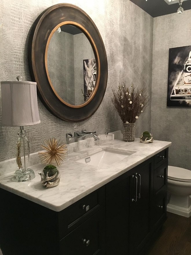
Powder Room Design: I wanted this room to be memorable. Guests are in this space for a short period of time and it can go unnoticed or make a huge statement. I chose to do metallic crocodile embossed wallpaper to add interest and texture to the walls, without doing a busy pattern. We did a trayed ceiling with rope lighting in the crown moulding to highlight the dark gray dramatic ceiling. I did a chandelier instead of sconces to make the room elegant. I was less concerned with adequate lighting since it is just a powder room and more interested in creating a mood, so the chandelier is on a dimmer. Another unique feature is the wall mounted faucet and undermount sink.
Toilet: Hydrology.
Wallpaper
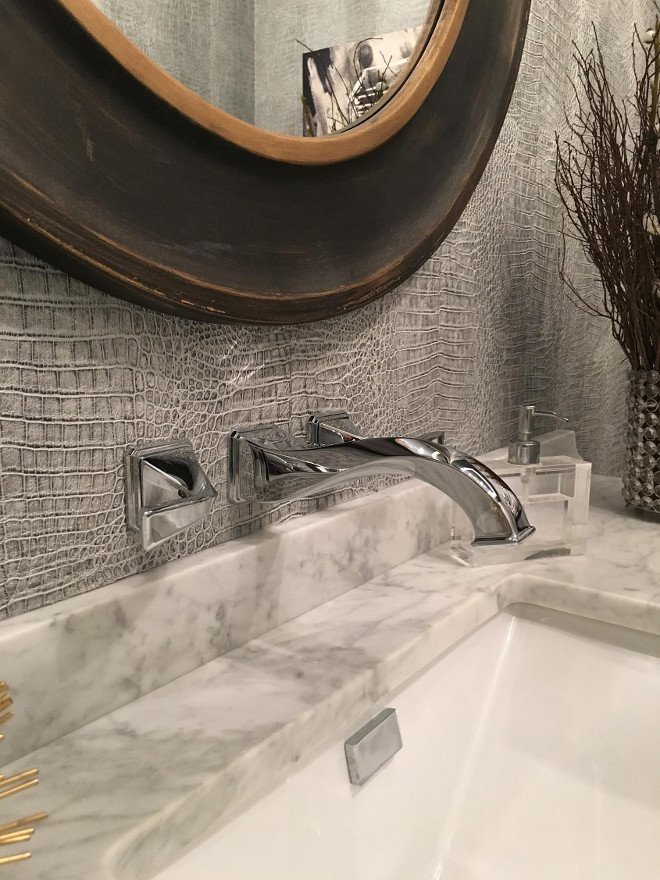
Wallpaper: Metallic Crocodile Wall Paper, Domus Parati Milano from Italy.
Faucet
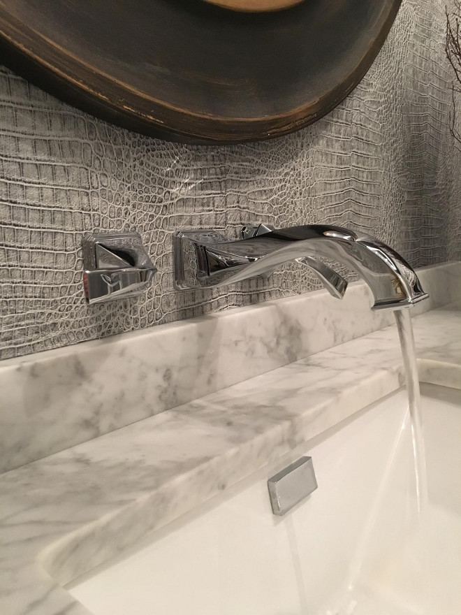
Wall mounted faucet is Brizo Faucets in Polished Chrome.
Countertop
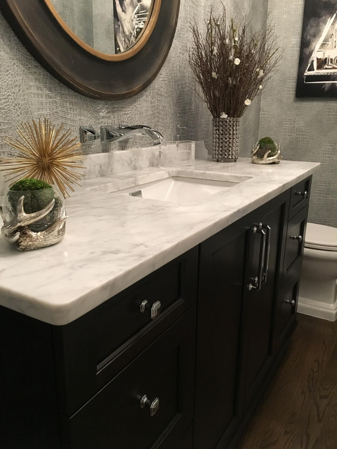
Countertop is Honed Carrara Marble from MS International, Inc. Sink is Toto.
Hardware & Cabinetry
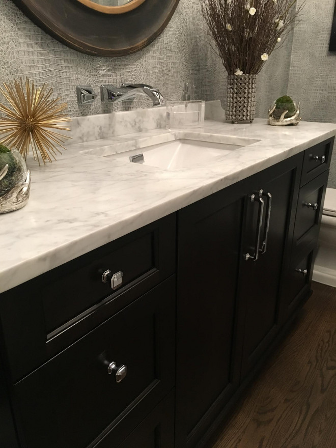
Vanity: Brookhaven Edgemont Recessed by Wood-Mode in Java.
Hardware: Tob Knobs Emerald Knob pulls in Polished Chrome. Pulls: Chareau Collection Emerald Pull in Polished Chrome.
Home Office
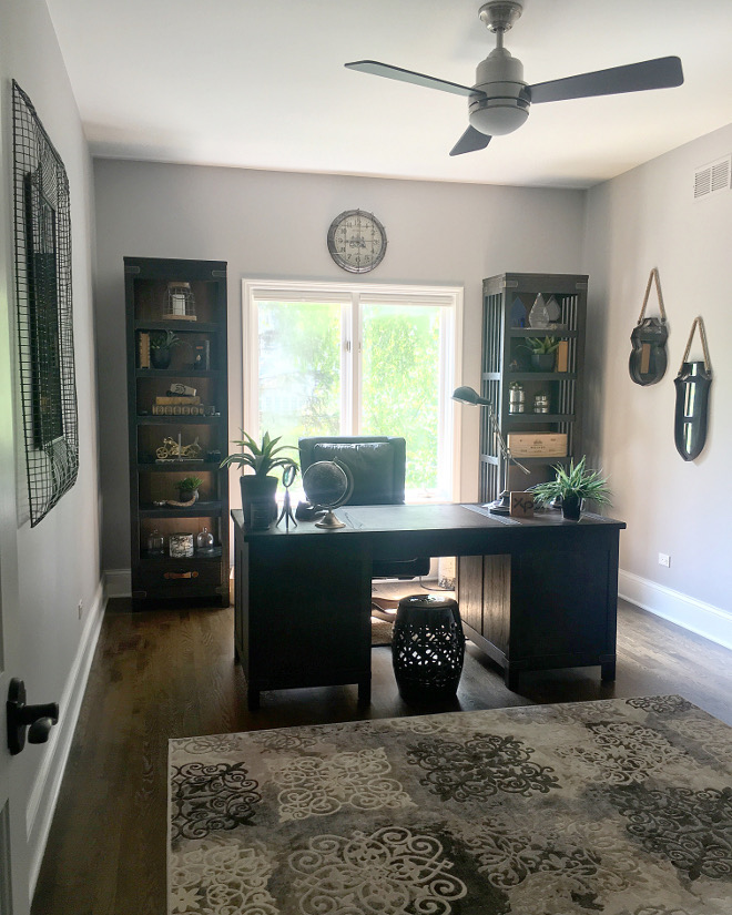
Office Design: The theme of this space was to be vintage and masculine. My challenge was bringing in light, because my husband wanted dark furniture. I used a light colored rug with dark accents and mirrors to help brighten the room.
Wall Paint: Benjamin Moore Metro Gray.
All Furniture: Arhaus Furniture.
Rug: Homegoods.
Stairway
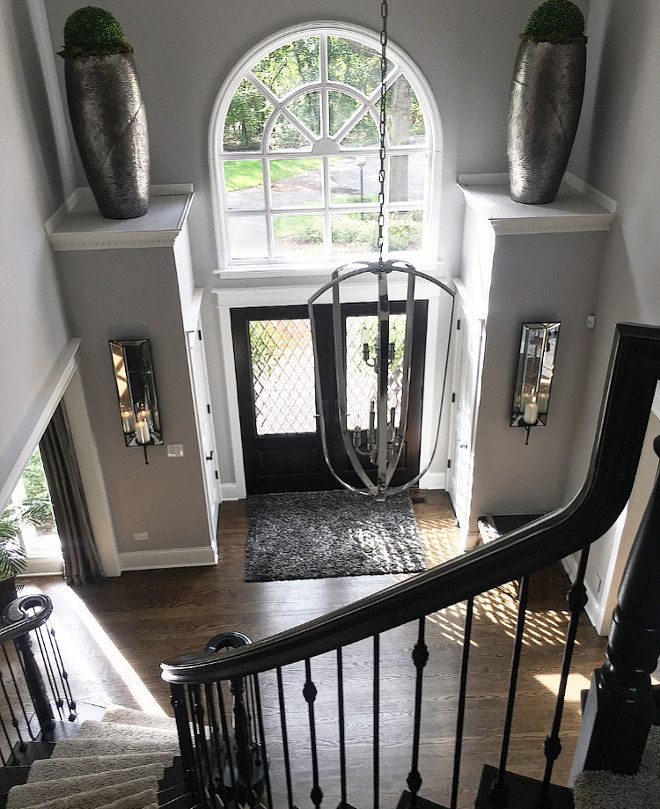
Foyer Design: I wanted a couple big and bold pieces for my large 2 story foyer. My philosophy to make a statement here was less is more, and bigger is better. I didn’t want to clutter up this space with too many things. I wanted the focus to be on the grand dark staircase highlighted by all of the natural light coming through the doors, skylights, and Palladian Window. I chose a simple and sleek pendant chandelier for this tall and narrow space so that it wouldn’t compete with my large crystal kitchen chandelier that is in direct sightline from the foyer.
Foyer Lighting: DVI Lighting as part of the Castille Collection.
Foyer Rug: Home Dynamix the Style is Paris, color charcoal.
The mirrored candle sconces are from Z Gallerie. The planters on top of platforms are from Homegoods.
Carpeting
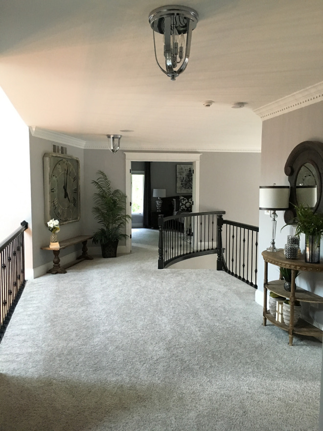
Carpet on stairs (and throughout upstairs): Karastan Smartstrand and is part of the Woodland Pass collection, color is Stepping Stone.
Ceiling Fixtures: DVI Lighting Flush Mount Castille Collection.
Wall Clock: Homegoods (similar at RH).
Bench: Homegoods
Mirror: RH.
Table: Homegoods.
Master Bedroom
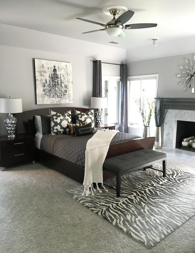
Master Bedroom Design: I wanted this room to be a calming space with bold accents. I chose bold Euro Shammed pillows from Z gallerie to add some punch to our bed. I loved the idea of this chandelier wall art because typically I would want to have a chandelier hanging over my bed, but living in the Midwest calls for the functionality of a ceiling fan when comfort is a priority.
Window Panels: Z Gallerie.
Bedding: Calvin Klein.
Pillows: Z Gallerie.
Throw: West Elm.
Metal Vases: Target.
Furniture: Dania Furniture.
Rug, Bench, Chair & Metal Side table: Homegoods.
Bedroom Fireplace
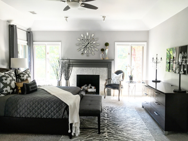
Fireplace Paint Color: Benjamin Moore Kendall Charcoal in High Gloss Finish and Carrara Marble.
Paint Color
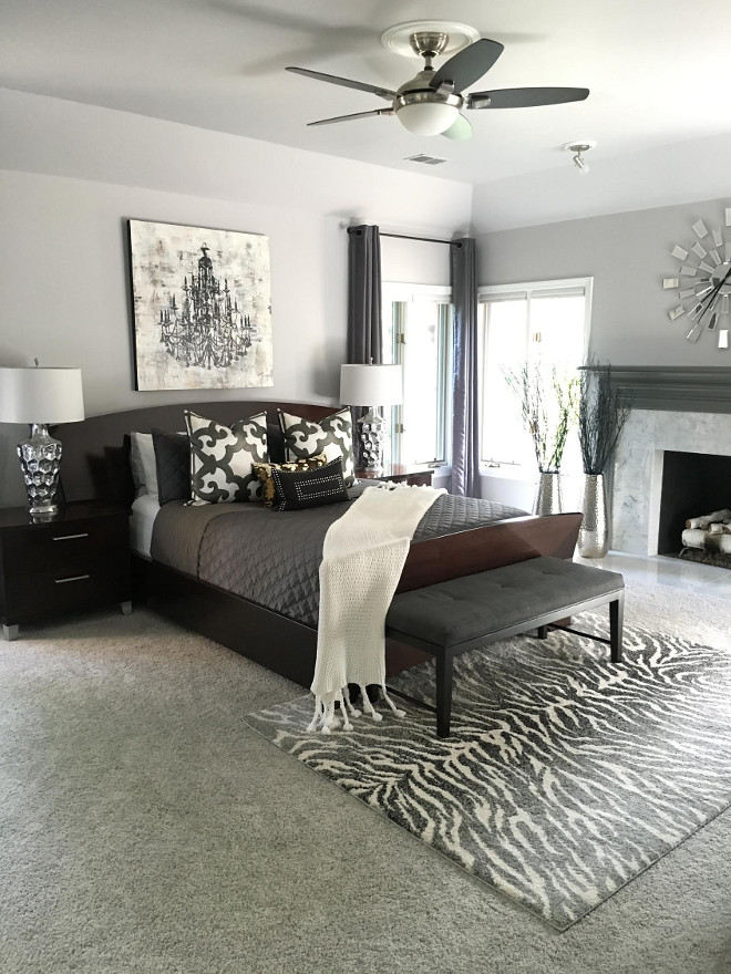
Benjamin Moore Metro Gray.
Master Bathroom
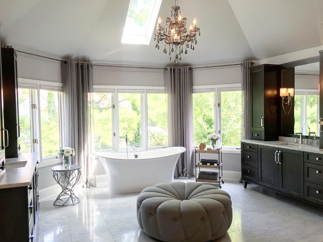
Master Bath Design: I fell in love with the ceiling in this room. I did another smoky crystal chandelier to give me the bling and thought that the darker crystals made it less feminine. Below the chandelier, sits the favorite seat in the house. Our gray comfy ottoman is fave spot to hang for everyone in our family. We added a flatscreen tv on a swivel arm so that we can adjust it to see it from wherever we are in the room, and the kids will often lay on the ottoman and watch it. We did more masculine looking dark vanities on legs to look more like furniture. I love the classic pulls that look like trunk handles. I feel that they add a nice vintage touch to the clean more contemporary lines of the vanities. For a more glam touch, we chose to do chrome caps on the legs of my makeup vanity. I also wanted this piece to stand out and be special. I also chose special chrome and crystal sconces that differed from what I chose on the sink vanities. The heated floors are on all year long and are the perfect solution to a cold marble floor. It is always cozy in there!
Ottoman: Arhaus Furniture.
Bath Tub
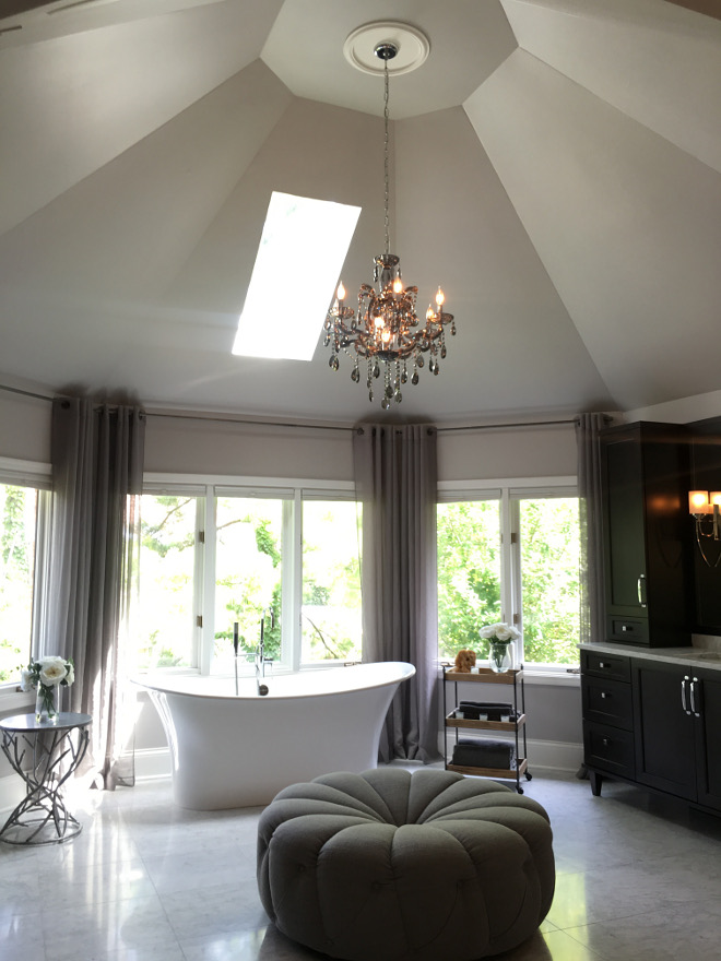
The bath tub combined both the sleek look I like, with the added touch of a subtle curve.
Bath tub: Toulouse tub by Victoria + Albert Baths.
Window Panels and Rods: Homegoods.
Bath Cart and Side Table: Homegoods.
Vanity Sconces
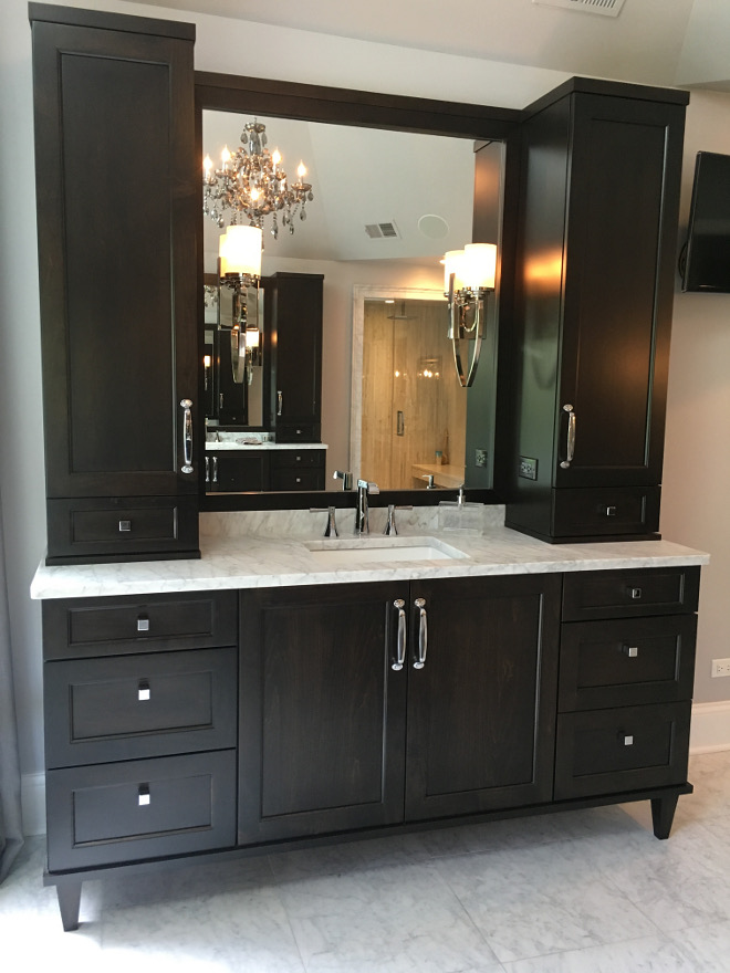
Vanity Sconces are by Feiss WB1561 in Polished Nickel.
Bath Faucets: Hydrology.
Cabinetry: Brookhaven Edgemont Recessed by Wood-Mode in Maple. Color Java.
Hardware: Pulls by Top Knobs style is Trunk in Polished Chrome. Knobs are by Top knobs, Tapered Square Knob 1 in. in polished Chrome.
Sinks: Toto.
Flooring
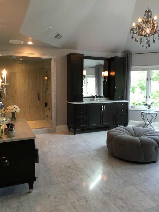
Flooring: Marble Floor Tiles: Honed Carrara Marble 18” sq tiles from MS International Tile.
Heating is by Nu Heat.
Lighting
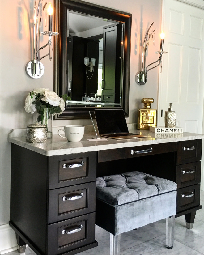
Makeup vanity Sconces are by Kichler #42929 in polished chrome.
Vanity Countertops: Honed Carrara Marble.
Water Closet
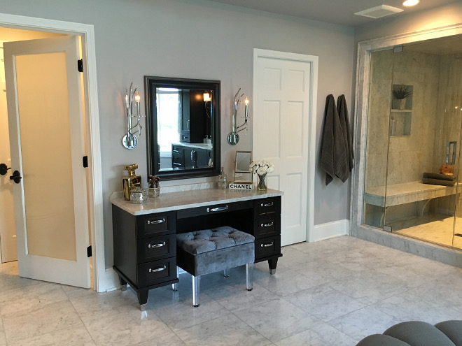
We did a water closet with a frosted glass door that does the job of maintaining privacy, yet differentiates this space from a typical closet.
Chandelier
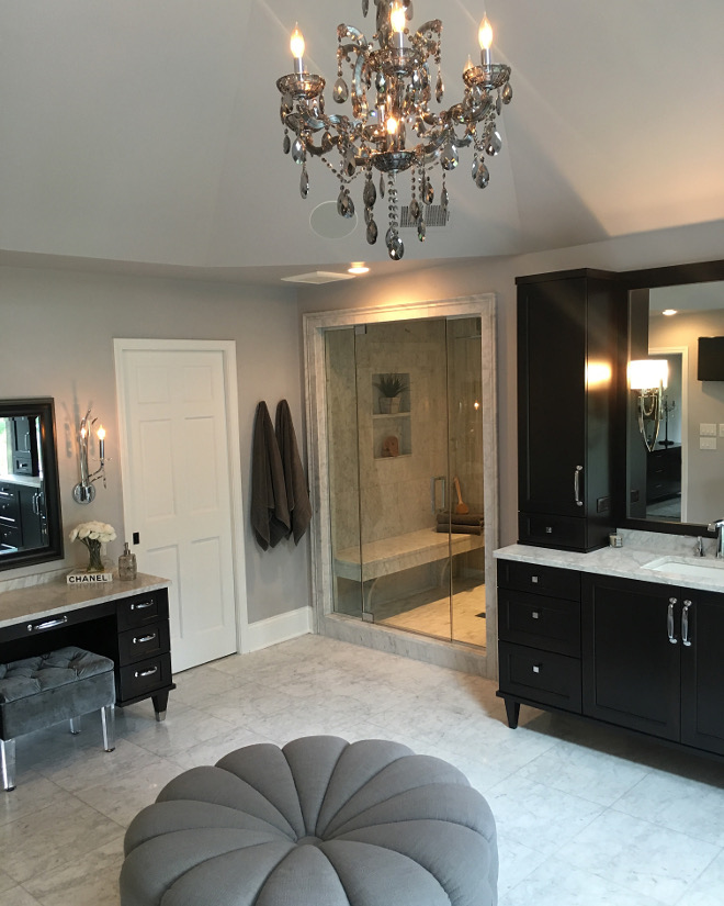
Wall Color: Benjamin Moore Metro Gray.
Chandelier: Mercer Chandelier by Z Gallerie.
Shower
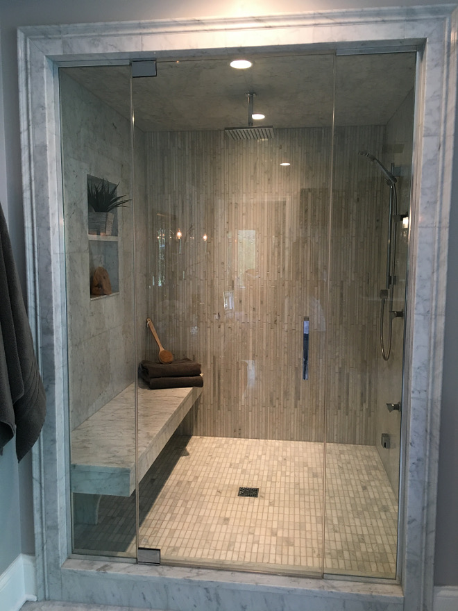
The shower is approximately 5 ft wide and 6 ft deep. It is a steam shower with a rain shower head, body sprays, and a hand held shower. Using it is like heaven. I liked the idea of making the back wall with no fixtures or niche on it, the only wall with mosaic on it. I wanted it to look like art and decided on long, thin, vertical staggered polished carrara marble rectangles. I thought that the shape and texture mimicked the look of rain and the water coming from the rain shower head.
Rainshower Head: Hydrology.
Handheld Shower: Hansgrohe.
Steamshower: Hydrology.
Body Sprays: Hydrology.
Shower Floor Tile
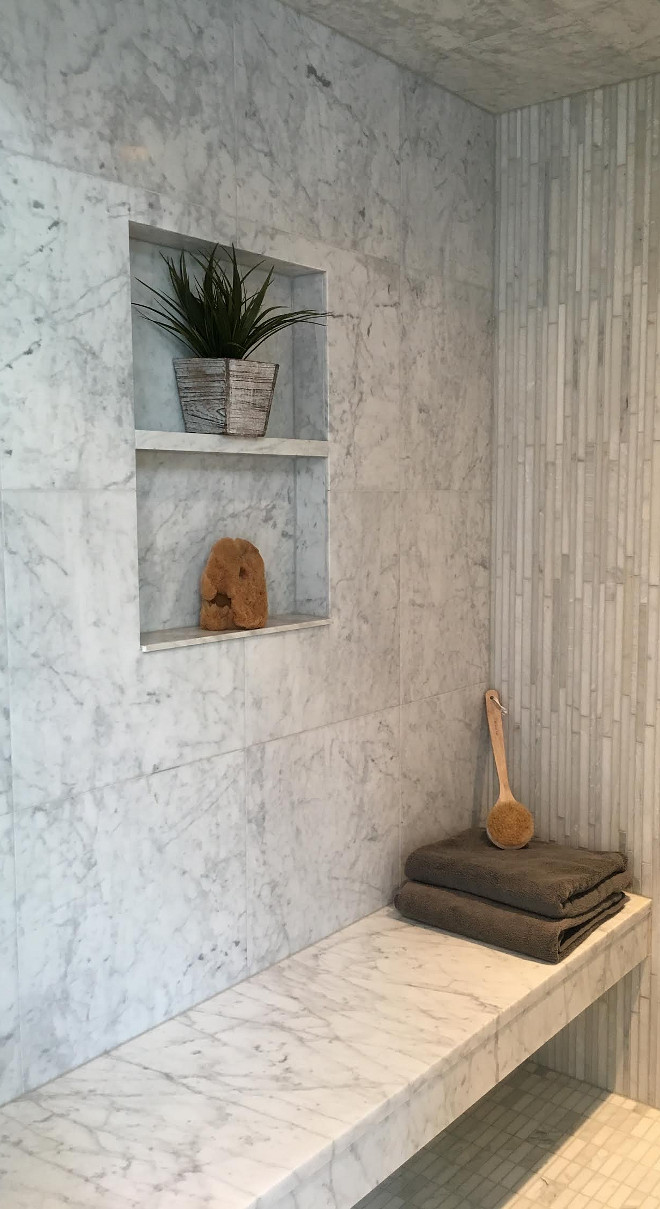
Shower floor tile and wall tile are Honed Carrara from MS International, Inc.
Shower Accent Wall
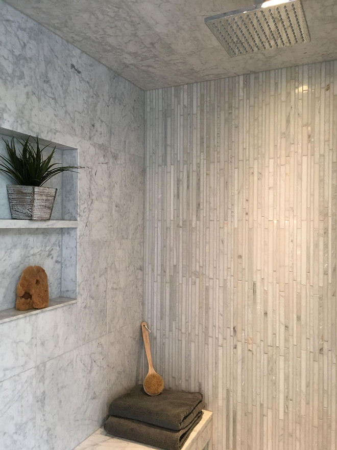
Shower feature wall tile is Polished Carrara from The Tile Shop.
Shower Bench
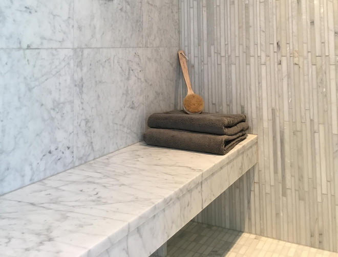
Shower Bench Seat: Honed Carrara Marble.
Dream Closet
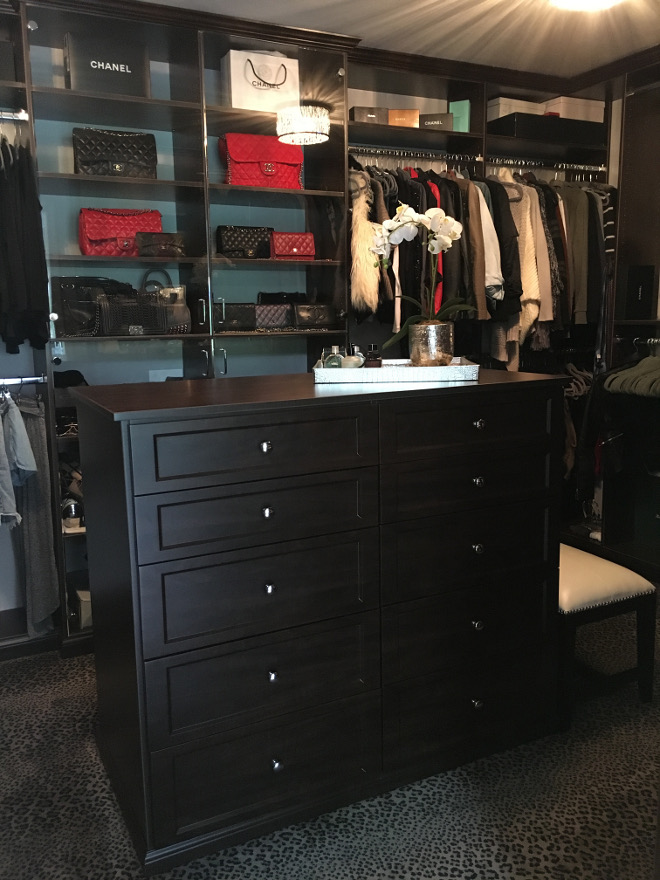
This is Summer’s dream walk-in closet. I love the dark cabinetry and her Chanel bag collection!
Shoes
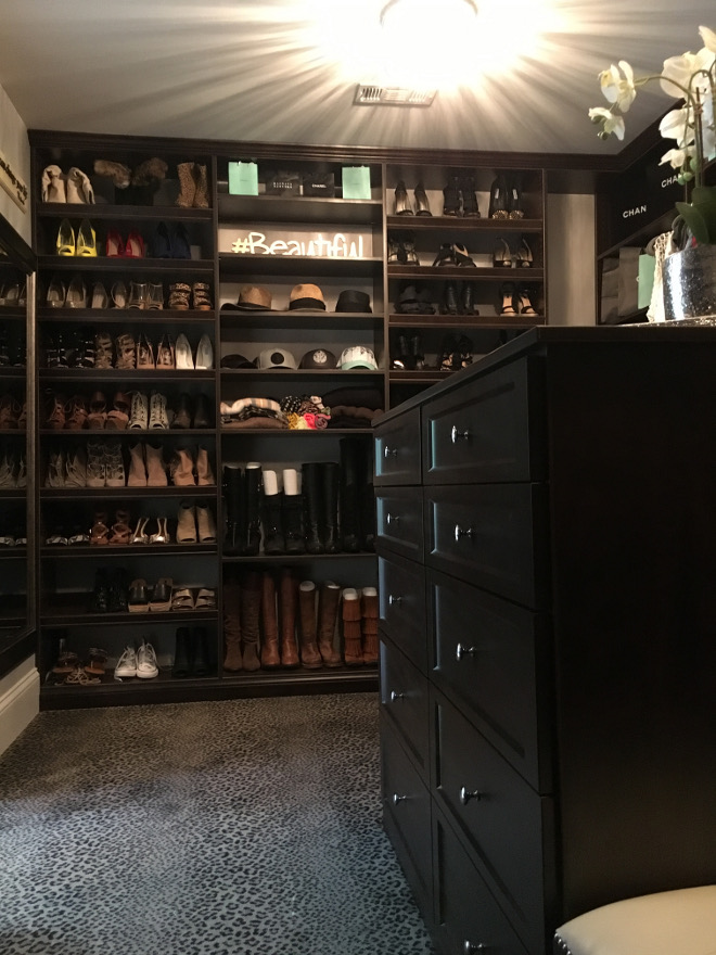
I love the design here, but I those shoes really steel my attention!!!
Stairs
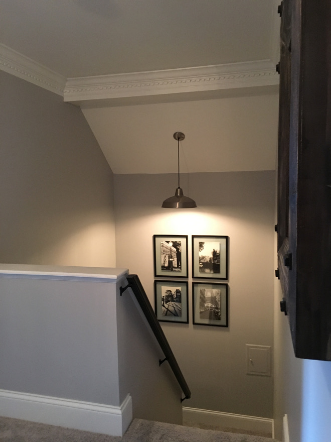
The grey wall paint color is Metro Gray by Benjamin Moore.
Basement
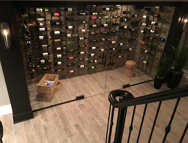
Design Philosophy: The Basement was totally unfinished, however, we had a plan for what we wanted to do with it from the very beginning. The layout seemed to call for each living space to be made into what it became. We replaced the carpenter’s staircase with wood steps and a custom wood railing with wrought iron balustrades. We chose the space for the wine cellar to be like art as you entered the basement from the stairway. Although not a large space, it makes quite a statement!
Wine Cellar Details
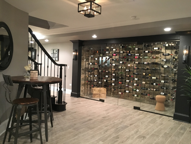
Wine Cellar: Temperature Controlling Unit and thermostat By Whisperkool.
Wine racks are by Vintage View.
Wine Cellar Pillar Sconces: Ethan Light Collection by Feiss.
Bistro Table and Chairs: World Market.
Ceiling Light: Hampton Bay 4 light oxide brass semi flush mount from Home Depot.
Wine Cellar
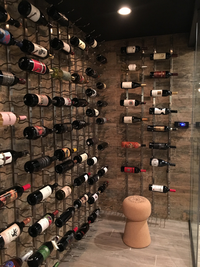
I chose the vintage view wire racks to showcase the bottles of wine and make them easier to see. Although it isn’t completely filled right now, each rack holds back to back bottles of wine making the maximum capacity that it can hold just over 600 bottles. We went with the WhisperKool ceiling mounted unit so we could camouflage it in the ceiling, making the wine cellar a temperature controlled room.
The faux wood porcelain tiles were the perfect vintage touch to the wall of wine.
Fun Time
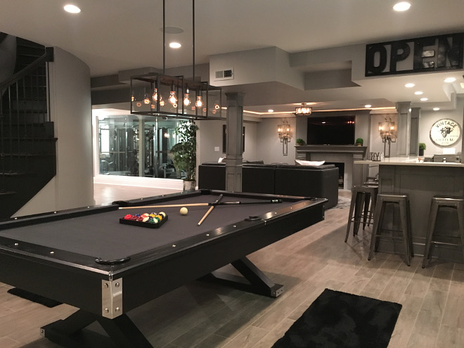
Pool Table/Ping Pong Conversion table and Dart Board: Jaxxon Game Table by American Heritage.
Pool table light fixture is by Trans Globe.
Wall Paint Color
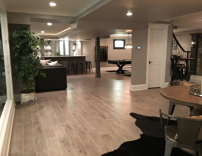
San Antonio Gray by Benjamin Moore.
Flooring
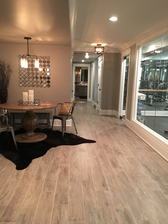
I really like the idea of a faux wood tile for flooring because it is a basement and we wanted it to be more durable and a place where we could entertain. It definitely makes for easier clean up and is easy to maintain.
Flooring: Thomas Tile Faux Wood Grey Washed Porcelain Tiles.
Table and Chairs: World Market.
Lighting: Braelyn Collection by Kichler.
Home Gym
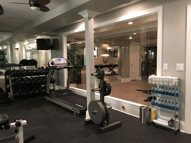
We chose to do a glass window wall for the weight room because we didn’t want to feel like we were closed in a space in the basement. We wanted to open up the space and enjoy the view of our lower level while using the room. And we also think it’s pretty cool to look at when we are hanging out in other areas of the lower level. The other 3 walls in this space are all mirrors.
Work It
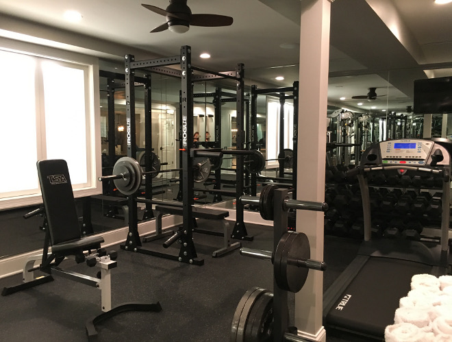
Workout Equipment: Fitness Factory.
Basement Bathroom
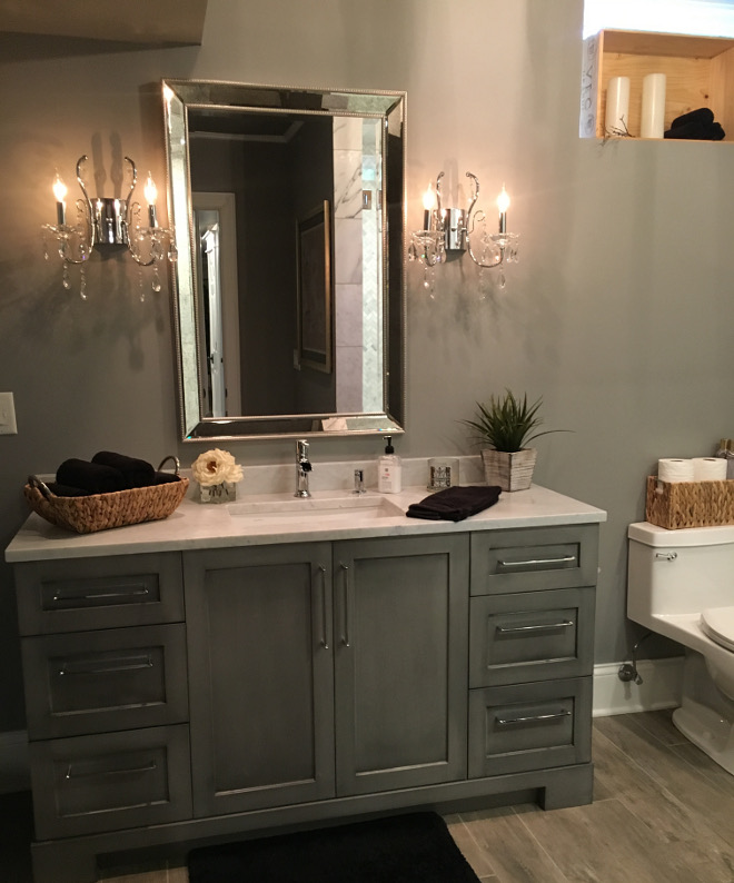
Custom cabinets are from A.W.E (Artistic Wood Expressions) Color: Custom paint and glaze.
Countertop: Honed Carrara Marble.
Hardware: Meadows Edge Circle Pulls in Polished Chrome by Top knobs.
All Plumbing Fixtures: Hansgrohe.
Sink: Laufen.
Sconces: Kichler Lighting.
Paint Color
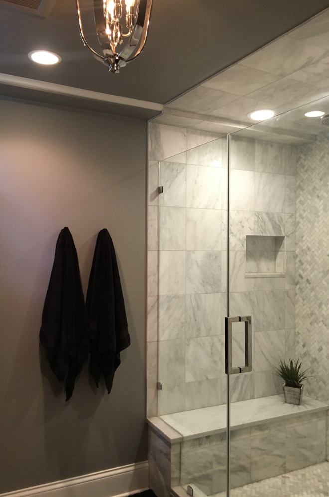
Wall Color: Benjamin Moore Storm.
Ceiling light: DVI Lighting Castille collection semi-flush mount.
Tiling
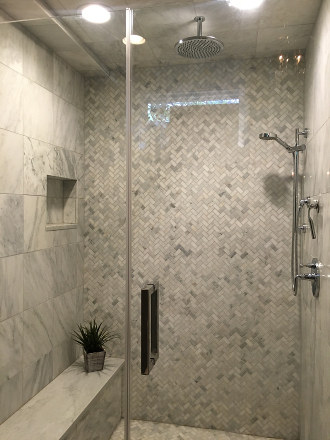
Shower Tiles: Honed Carrara Marble 12” X 12” and Mosaic is 1” x 2” honed Arabescato herringbone.
Movie Time
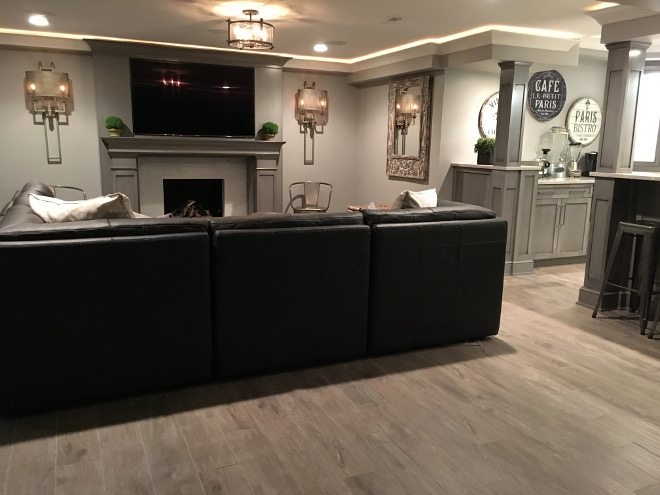
Dark Gray Leather Sectional: The Cloud by Z Gallerie.
Creative
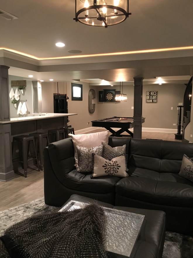
Because the basement was unfinished and wasn’t planned for that way, we dealt with some ceiling issues. There are different levels of ceiling heights in the basement due to duct work, but most are around 8 and 9 feet. We didn’t want the lower level to feel like a basement, so we chose to do make the ceilings a little interesting by dropping the crown in the media room and bar area and added rope lighting.
Bar Stools: Target.
Rug: Joss and Main.
Fireplace Surround & Lighting
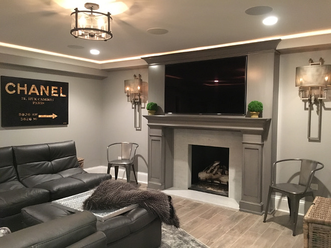
Fireplace: Honed Carrara Marble.
Fireplace Wall Sconces: Savoy House.
Fireplace/Media area Semi-Flush Ceiling Fixture: Ethan Collection by Feiss.
Kitchenette Cabinetry
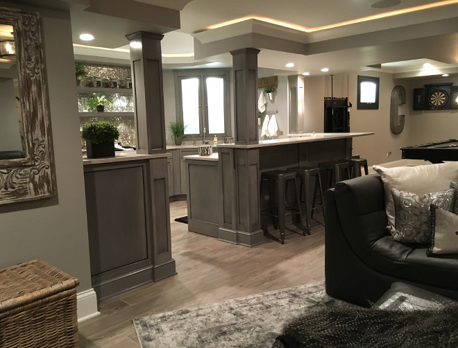
Kitchenette Cabinet Color: Custom Color and Glaze.
Cabinetry: Custom made by A.W.E (Artistic Wood Expressions).
Smart Thinking
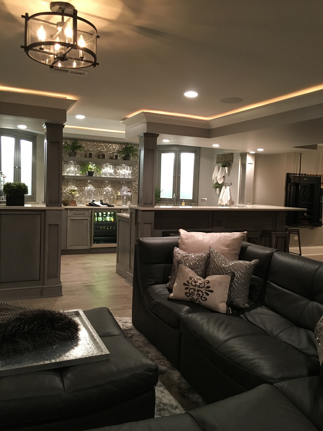
The theme of this whole lower level is mainly to be an extension of our home and for it to not feel as if you are going into a dark basement below ground. One of the ways we counteracted the feeling of being below ground level, was by adding cabinet doors with frosted glass over our window well windows. A fluorescent light is behind each one, so that when they or on, there is light coming through day or night. It’s a really cool effect and it you never know what time it is. It is easy to lose track of time when we are on our lower level. We use it often to play games, watch movies, enjoy family time, and entertain.
Hardware
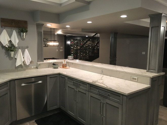
All Cabinetry Hardware: Meadows Edge Circle Pull by Top Knobs in Polished Chrome.
Appliances
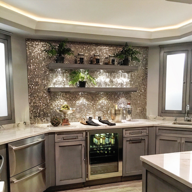
The Kitchenette and Bar area has a beverage refrigerator for adults and a beverage refrigerator drawer for the kids. The bottom drawer is a freezer and ice maker. It also has a dishwasher and microwave drawer.
Beverage Refrigerator is by U-Line. Refrigerator/Freezer Drawers are by Jenn-Air.
Dishwasher is by Bosch. Microwave Drawer is Sharp.
Backsplash
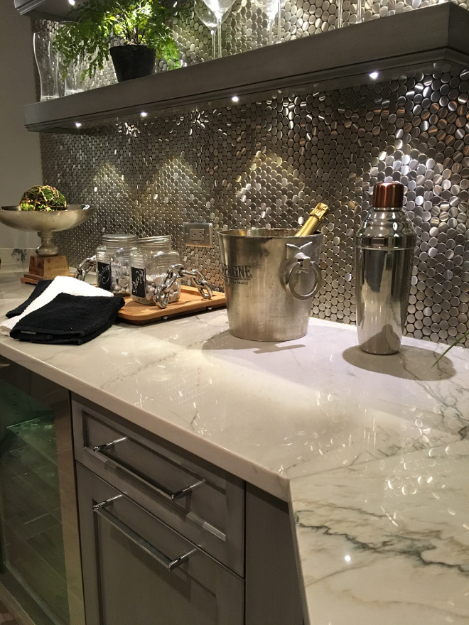
The backsplash was a fun way to bling up the space and tie in the stainless steel appliances. I wanted it on just the center wall so that it would be a focal point. I didn’t put it everywhere in the bar because I thought it would lose it’s effect.
Kitchenette Backsplash: Brushed Chromium Penny Tile with a porcelain backing by SomerTile.
Countertop
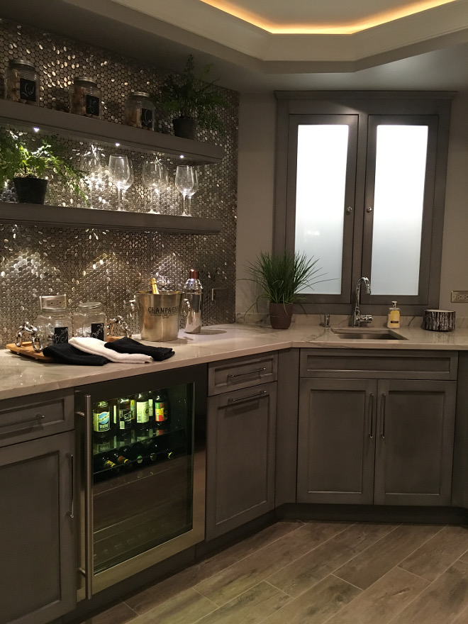
Countertop is White Macaubas Quartzite.
Transforming Beauty

“Now that we’ve gotten the bulk of the interior done, we are starting to update the exterior. We have replaced the old front door and side lights, with brand new custom mahogany double doors with diamond beveled glass. We also put on a brand new cedar roof and traded out our old white gutters for over-sized copper gutters. We are now in the process of doing a landscape and hardscape transformation. The circle driveway in the front of the house is getting ripped out, along with the whole front yard, back deck and patio, and we are expanding the back yard. The front of the house will soon have a new blue stone walk ways from the cul-de-sac and the side driveway, a bigger lawn with the circle drive being gone, new front steps, and a courtyard with clay brick pavers. The new back yard will have a multi-level stone patio with an outdoor kitchen, hot tub, pergola, and fireplace.
I wanted to mention the big pile of saw dust in front of the house in the exterior picture of my house. We just cut down a huge tree. This photo was taken just as we started to rip apart the yard to re-do the hardscape and landscape”.
Aren’t you curious to see how the exterior will look? Summer have mentioned that she will share the exterior photos with us when everything is complete. Stay tuned to see more of Summer’s beautiful home in the near future.
Quiet Time
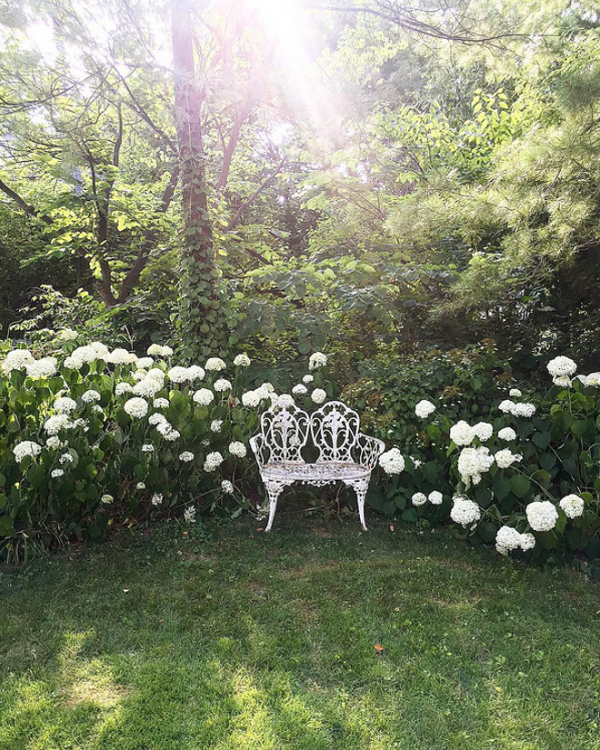
This is a quiet spot at Summer’s home…. I love this vintage bench and the mature landscaping.
Thank you for shopping through Home Bunch. For your shopping convenience, this post may contain AFFILIATE LINKS to retailers where you can purchase the products (or similar) featured. I make a small commission if you use these links to make your purchase, at no extra cost to you, so thank you for your support. I would be happy to assist you if you have any questions or are looking for something in particular. Feel free to contact me and always make sure to check dimensions before ordering. Happy shopping!
Wayfair: Up to 75% OFF on Furniture and Decor!!!
Serena & Lily: Enjoy 30 to 70% OFF on Sale Styles!
Joss & Main: End-of-Decade Dash Sale!
Pottery Barn: Buy More, Save More Sale + Free Shipping.
West Elm: End of Season Sale – Up to 75% Off.
Anthropologie: Extra 40% off Sale Items!
Nordstrom: Save Up to 50% Off!

 Cape Cod Lake House Interior Design Ideas.

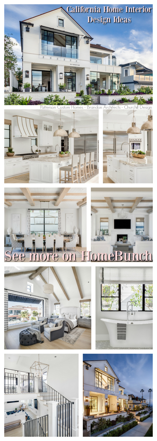 California Home Interior Design Ideas.
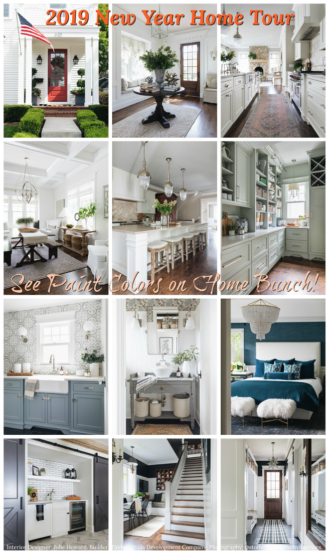 2019 New Year Home Tour.
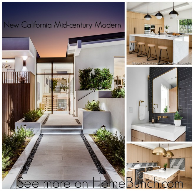
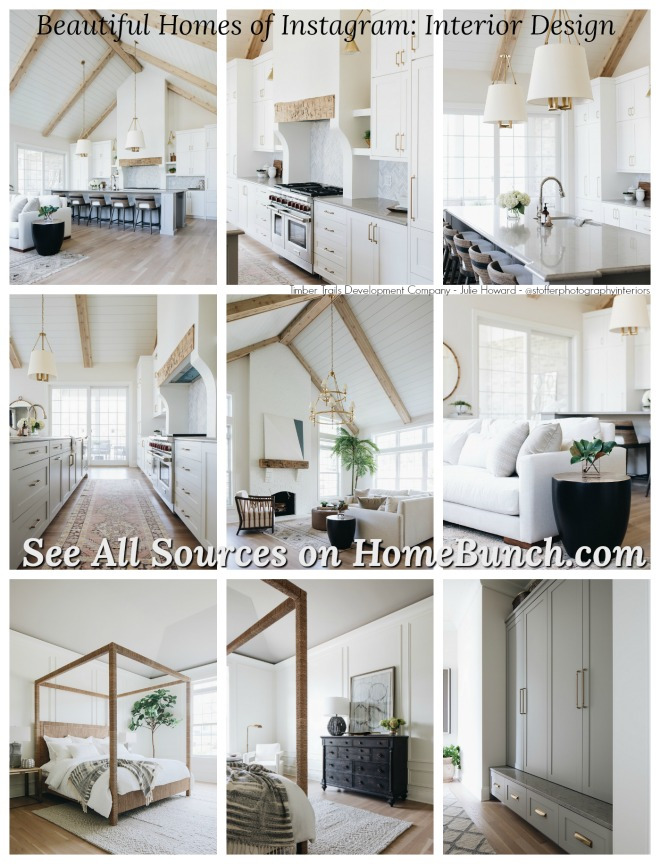
 Beautiful Homes of Instagram: Modern Farmhouse.
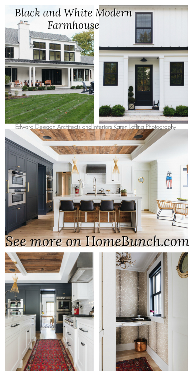 Black & White Modern Farmhouse.
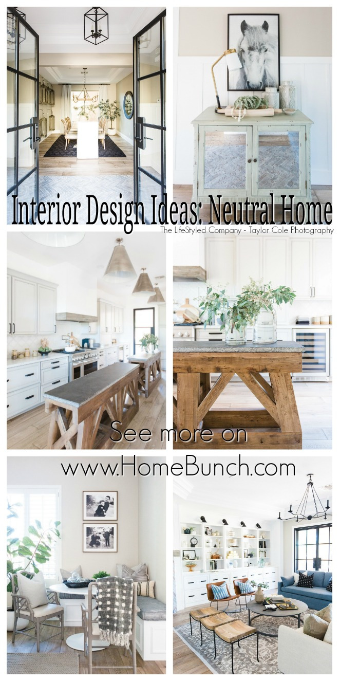 Neutral Home.
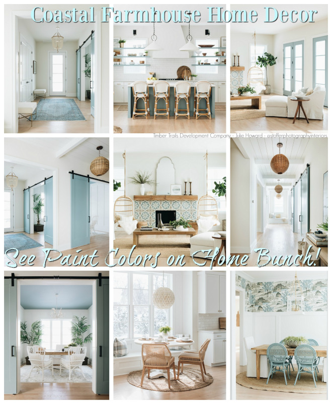 Coastal Farmhouse Home Decor.
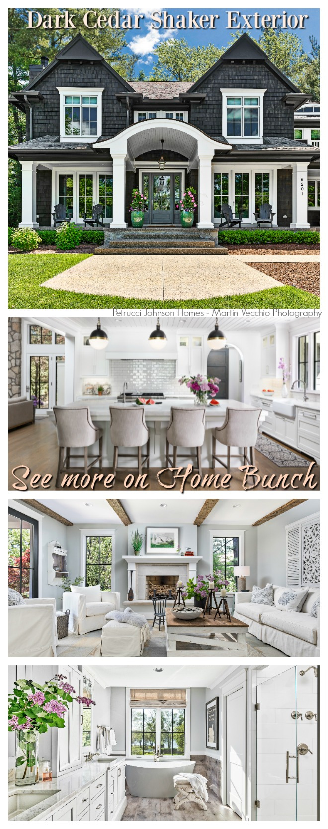 Dark Cedar Shaker Exterior.
“Dear God,
If I am wrong, right me. If I am lost, guide me. If I start to give-up, keep me going.
Lead me in Light and Love”.
Have a wonderful day, my friends and we’ll talk again tomorrow.”
with Love,
Luciane from HomeBunch.com
Subscribe to get Home Bunch Posts Via Email
Hi, where in Illinois is this house? It’s so gorgeous! I love your blog Luciane! I look forward to getting your emails everyday!
So beautiful! Where did the vanity bench come from? It’s a must have for me!
Hi! I absolutely love the design! I have saved the basement portion as inspiration. Could you tell me what wall colour you used? Thank you
Stunning!