Choosing the right people to be featured on the Beautiful Homes of Instagram is not always an easy task. I often keep an eye on what I see on IG, when people tag me and when they use the hashtag #BeautifulHomesofInstagram. These are a few ways that help me find talented people like Jackie of @finding__lovely.
I fell in love with Jackie’s home as soon I stopped by her page. She has a very strong sense for design and her genuine personality makes you feel as if you’ve known her for years! I truly feel honored to have her on the blog. She took the time to share every detail and explain everything about every room. Not everyone is this kind! Thank you, Jackie for being so helpful and opening more than just your door to us… thank you for being willing to share your wisdom. This truly reflects your inner beauty, my friend!
Get to know your newest “Beautiful Homes of Instagram” inspo! 🙂
Hello, I’m Jackie of @finding__lovely and am so honored to be featured here on the Home Bunch. Luciane does such a fantastic job providing the details behind the spaces we all love and use to style our home. What a resource! Pinterest and I had a love affair with the HomeBunch long before I even knew Luciane and her kind heart! And to be featured along side the most lovely homes on Instagram, I’m truly honored.
I love homes and all things design and when you boil it down, I just really enjoy making things beautiful for my family and others. To me home is a place of peace, filled with favorite colors and textures—where messes happen, memories are made and DIYs unfold. There is nothing off limits or untouchable in this home and I love that. I find myself inspired by the coast, sea colors, transitional design with a dab of bohemian and every now and then, a modern touch.
We moved to Boston from southern California in 2008, newly married and right out of college, so I could get a masters degree in clinical nutrition from Boston University and complete my medical internship to become a registered dietitian. It was rigorous and trying all happening in the financial woes of 2008 and our first year of marriage. I look back and think, “good gracious what were we thinking.” We never saw each other as I was trying to keep my head above the books and my poor husband was delivering hot wings with a paper map to put food on the table. By 2012 we were able to buy our first house in the suburbs of Boston and in 2015, with a one year old (and unknown to us at the time, newly pregnant with number two) we put an offer in on a dilapidated historical “project” in a favorite Boston suburb. Wellesley is a stones throw from downtown Boston with just about one of the cutest town centers you’ve ever seen and lots of character homes. Coming from California where everything is in a shopping mall format and 1970s ranches, I was quickly enamored by New England architecture and elegant town centers.
Built in 1879, our new house had good bones, a nice flow to the rooms, ~3000 square feet, tall ceilings at almost 10 feet but needed some serious love. It smelled like a cat and every room was painted a different color, cracking plaster and a moldy main bathroom. But houses, like people, sometimes just need a little attention and love. I could see the beauty there under the surface, my husband was a bit skeptical and more concerned about the financial implications but we signed on the dotted line and it was ours.
I’ve been documenting the design process on my blog and instagram account, finding__lovely which was started as a creative outlet and honestly as a sanity break during the LONG months my second son had colic. I found that by being intention about finding little bits of lovely each day—in my home and in other’s, I was able to rise above the mental exhaustion of incessant baby screams. I literally did not leave home for 7 months unless it was grocery shopping at 9 o’clock at night. The colic was just so long and hard. It made me realize that home is more than the walls around us and we are each, in essence, the designers of that space. Our surroundings really do make a difference in every day life. @finding__lovely gave me motivation to find the blessings when all I really wanted to do was scream right along with him.
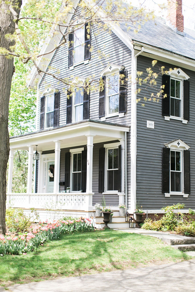
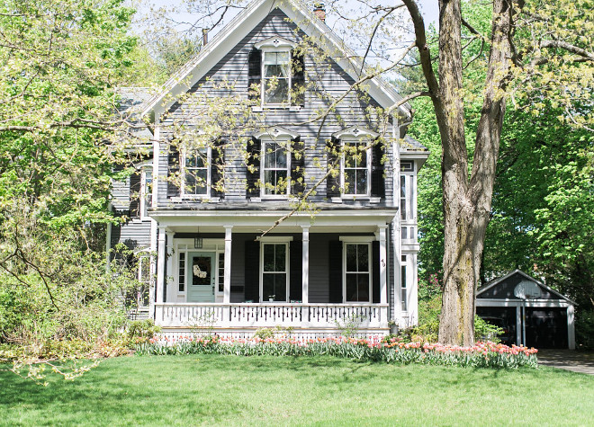
Built in 1879, our home has a tinge of farmhouse and a tinge of Victorian.
I wish I knew the color of the exterior. The previous owners left us no paint cans. I plan on taking the peeling paint chips to the store to find a match. We’ve actually had people stop and ask the color and when I apologetically told them I did not know the color they asked if they could take a paint chip. It is quite in need of some exterior love. Soon house soon!
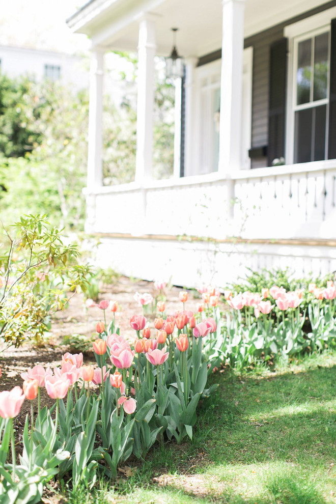
We’re on a quiet side street yet accessible to all the major routes.
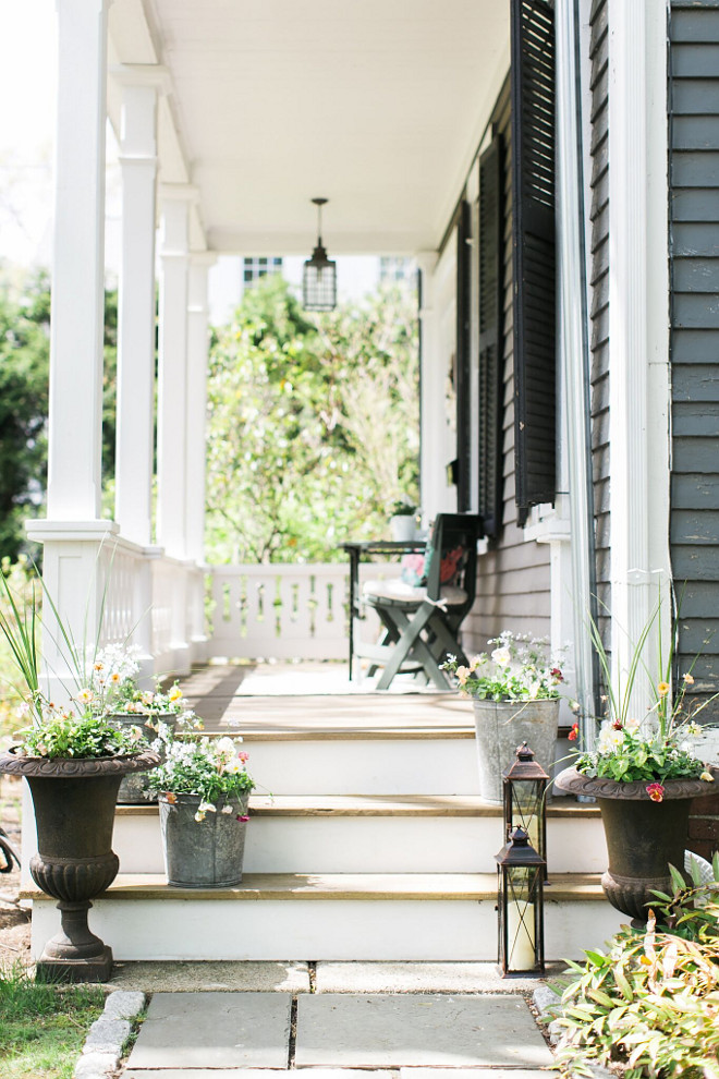
The porch was my favorite thing about the house for a long time. Isn’t there something just romantic about sitting under the eaves and watching life move slowly by?
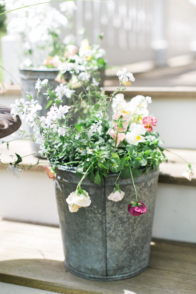
Galvanized metal planters add a farmhouse touch to the front porch.
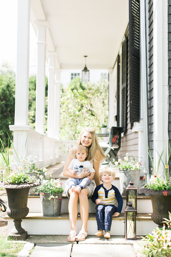
This is Jackie and her a-d-o-r-a-b-l-e sons! Aren’t they all beautiful? This home is just this special because of this Blessed and inspiring family. 🙂
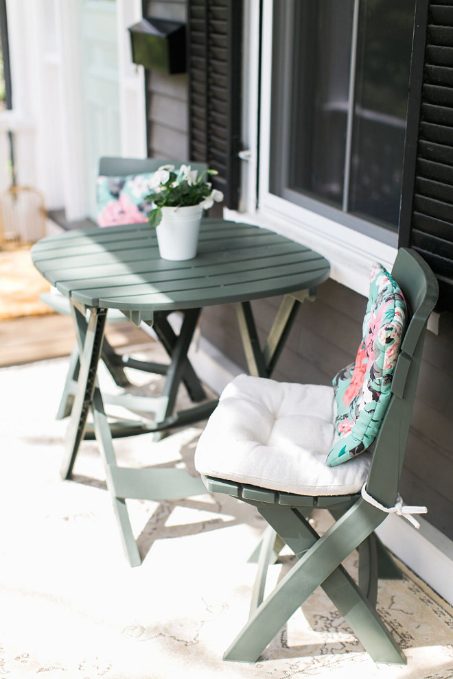
The table and chairs are from Wayfair.
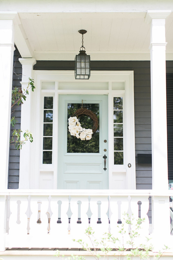
I painted our front door Benjamin Moore Catalina Blue in high gloss.
The lantern light is original to the house.
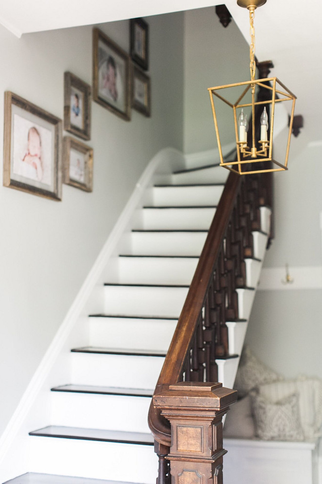
As you enter the home you’re greeted by a lovely old wood staircase. We had pictures taken of our boys at 5 day old, 6 months and one year, framed in barn wood frames and they are our artwork up the stairs.
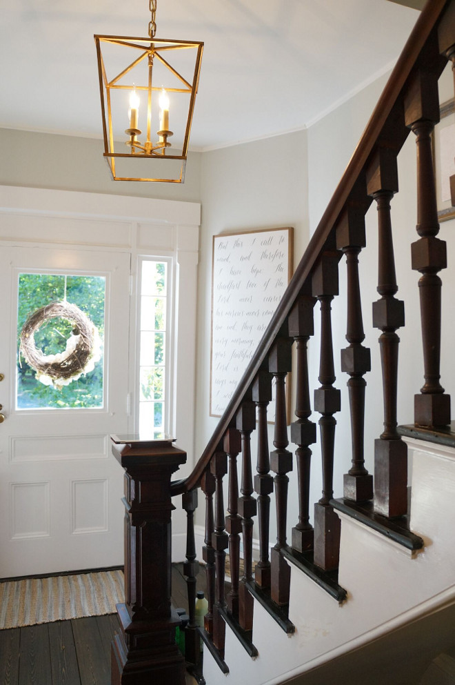
We also had our family’s Bible verse custom made by House of Belonging. The wall color is Benjamin Moore Grey Owl.
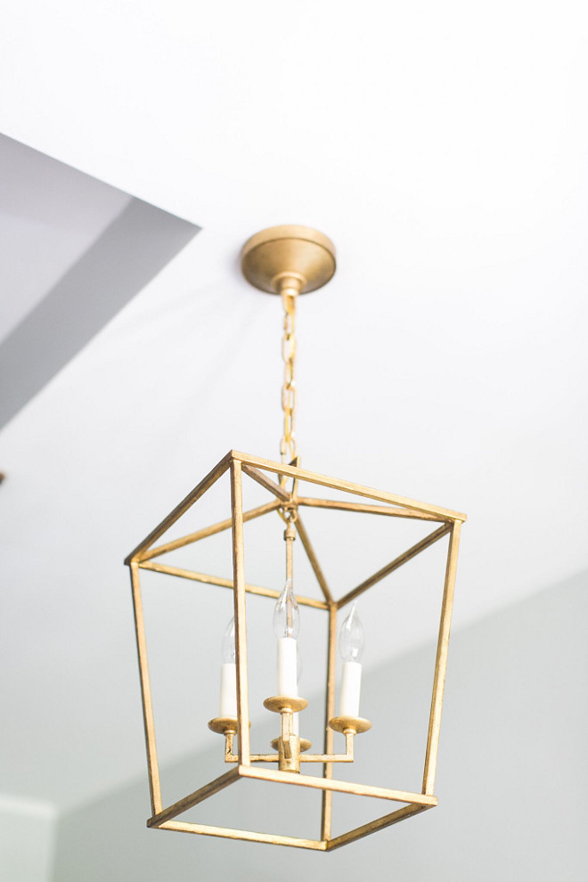
The entry light is the Darlana Lantern by Visual Comfort (17”w by 24” h).
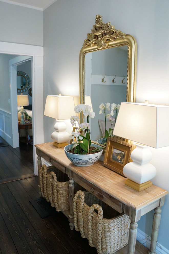
The entry is a relatively tight squeeze but I really wanted an entry table. This one from World Market is thin and long. A perfect addition to the space. I jazzed it up with ring pulls and matching large seagrass baskets. It’s topped with matching Visual Comfort lamps and a Restoration Hardware mirror.
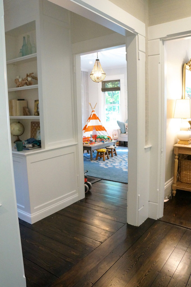
The first project in our home was to refinish the hardwood floors given our little one was crawling around on splintering floors. It was here in the entry that we realized under the unsalvageable wood flooring was original pine floors. They were sanded down and stained with two coats of a 50/50 mixture of Minwax Ebony and Jacobean, finished with a satin clear coat.
The entry way spills into the dining room and family room and the front playroom via a side door right when you enter. We leave that door closed to contain the children. 🙂
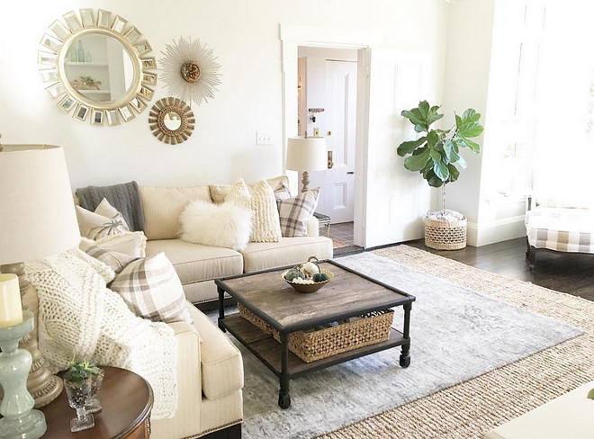
The family room along with the front room, which is our boys’ playroom, was taken down to the studs shortly after we had baby number two, to eliminate the old horsehair plaster and lead paint. The wall color is Benjamin Moore Winter White and the sectional and chairs are from Ethan Allen.
Seagrass Rug: Joss and Main, 9×12
Vintage-inspired Rug: 8×10 originally purchased from One Kings Lane, now found at Mcgeeandco.
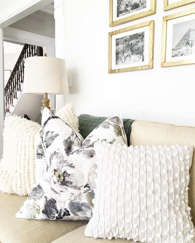
Floral Pillows: Designers Guild Shanghai Garden in Ecru from Burke Decor.
Knit Off-white Pillows: Pottery Barn.
Table Lamps: Home Goods.
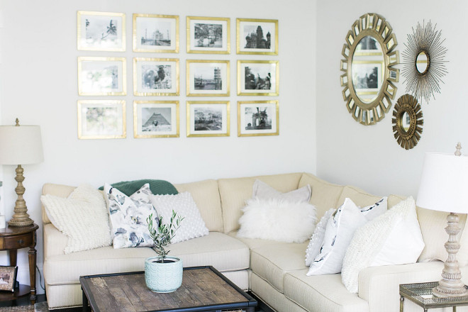
Before we had babies my husband and I loved to travel. The gallery wall are black and white photos from our travels framed in Anthropologie’s Minimalist Gallery Frame.
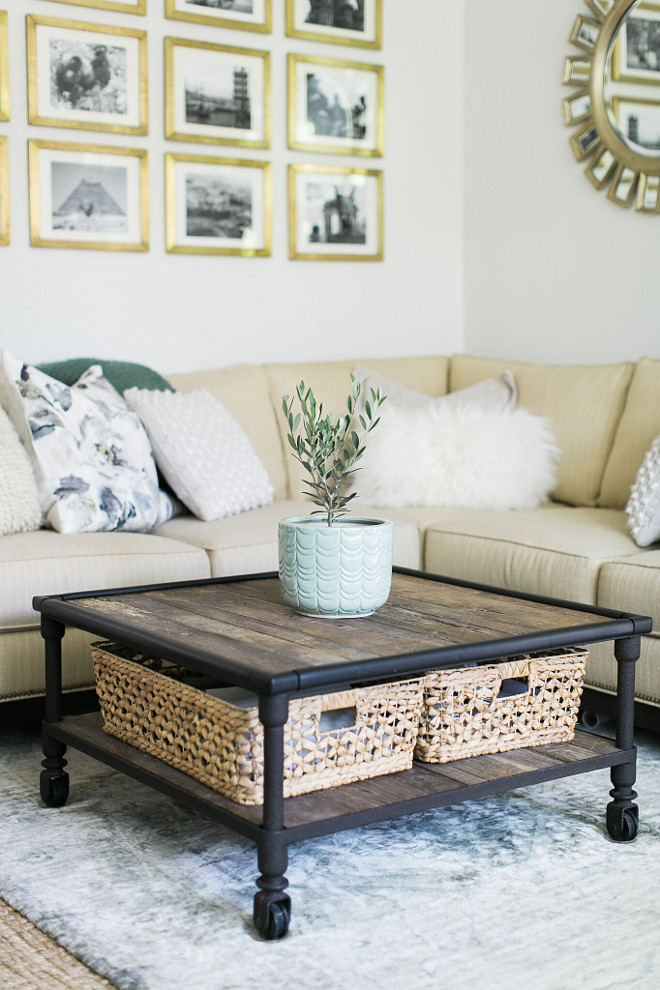
Coffee table from Restoration Hardware, baskets from Homegoods. The baskets are a lifesaver, hiding all the clutter of daily life—magazines, ipads, laptops.
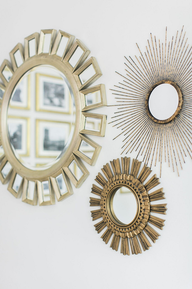
The adjacent wall has a trio of starburst mirrors, the biggest from Z Gallerie, the medium by Ballard Designs and the smallest from Target which I gold leafed.
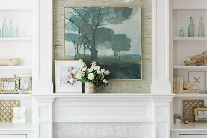
We had built-ins made by the talented team at Needham Woodworking. They are true artisans and worked with me to design cabinets that highlighted my love of symmetry and functionality—even creating a lift system for our tv so it rises up out of the bottom left cabinet.
Art: Karen Smidth for Serena and Lily.
Grasscloth: Kravet.
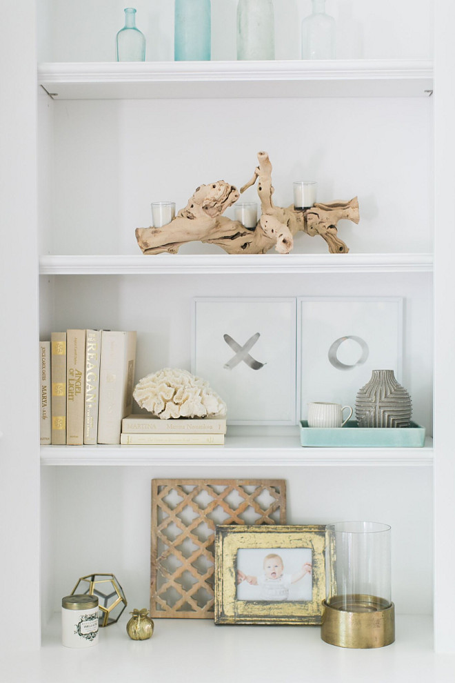
All trim in the house is Benjamin Moore Decorator’s White.
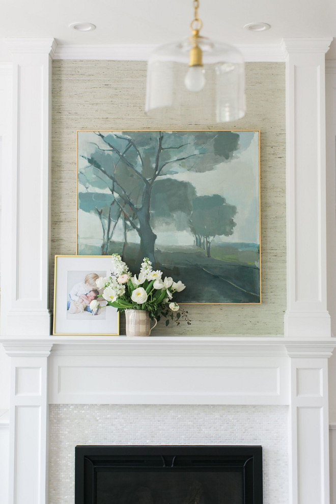
The gas burning fireplace is by Heat n Glow, it is their Escape I35 FireBrick insert in the iron age front. We had a metal worker cut the black insert surround down to the actual insert cover so that we could have as much tile around the fireplace as possible.
The tile is from the TileBar in mini brick oyster white pearl. It is gorgeous and we have had no issues with the heat damage.
Tile: TileBar Mini Brick Oyster White Pearl tile.
Clear Glass Handing Pendant: One Kings Lane.
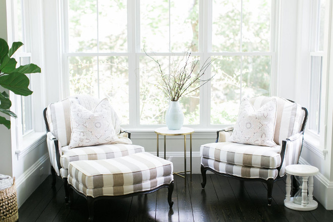
Side Chairs and Ottoman: Ethan Allen Versailles Chair.
Side Table: Target.
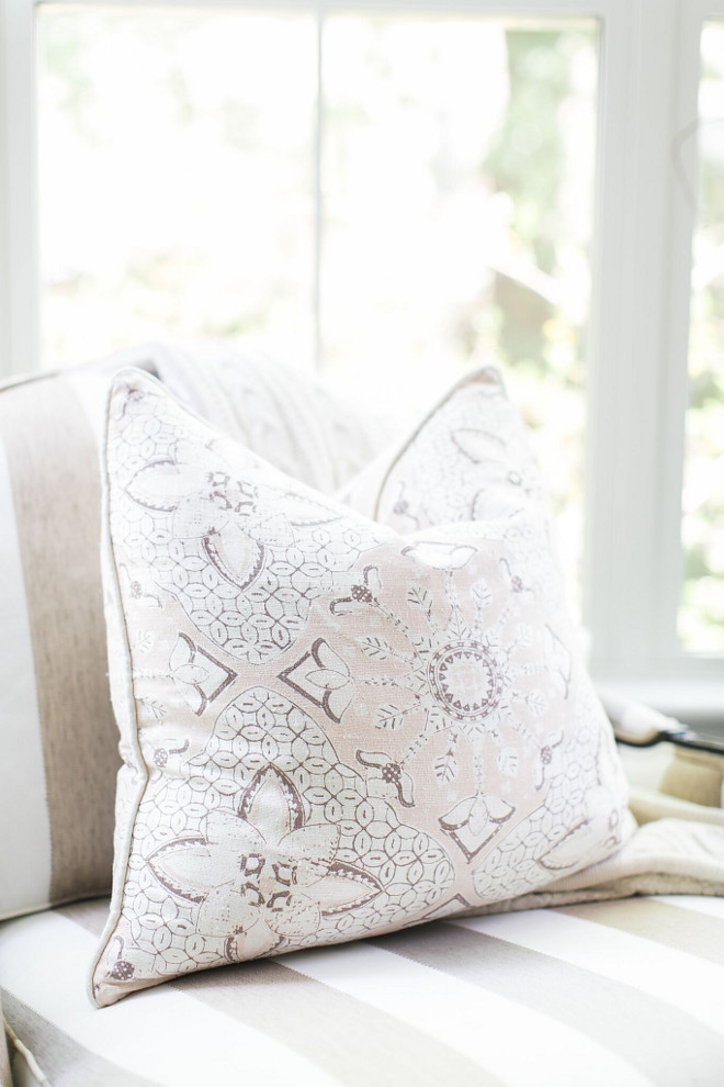
The neutral pillows are from One Kings Lane.
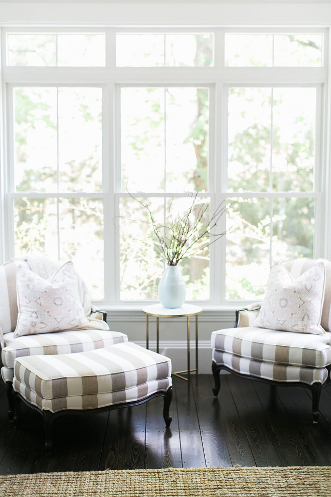
New windows were installed in the rooms. They are by Harvey windows, with the windows in the nook each 82” high and 30“ wide including the transom windows above. Being from California, I wanted as much natural light as possible while living in New England. The windows in the house were already quite big but I insisted on adding the transoms for both the architectural interest and natural light.
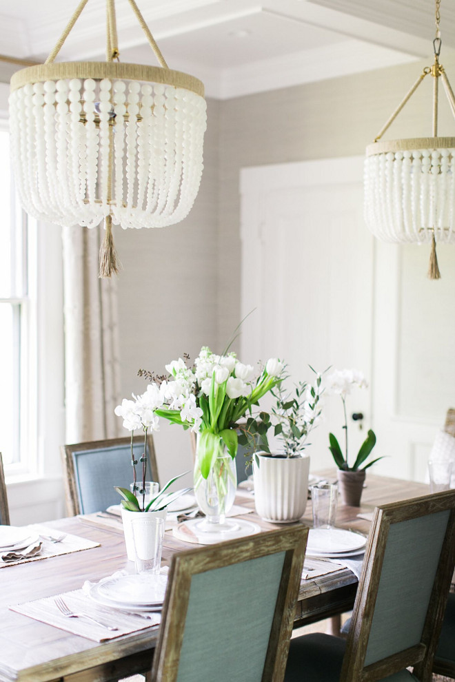
Shortly after our mini renovation of the family room and playroom, we tackled the pink plaster dining room. Yep! It was a pink plaster!
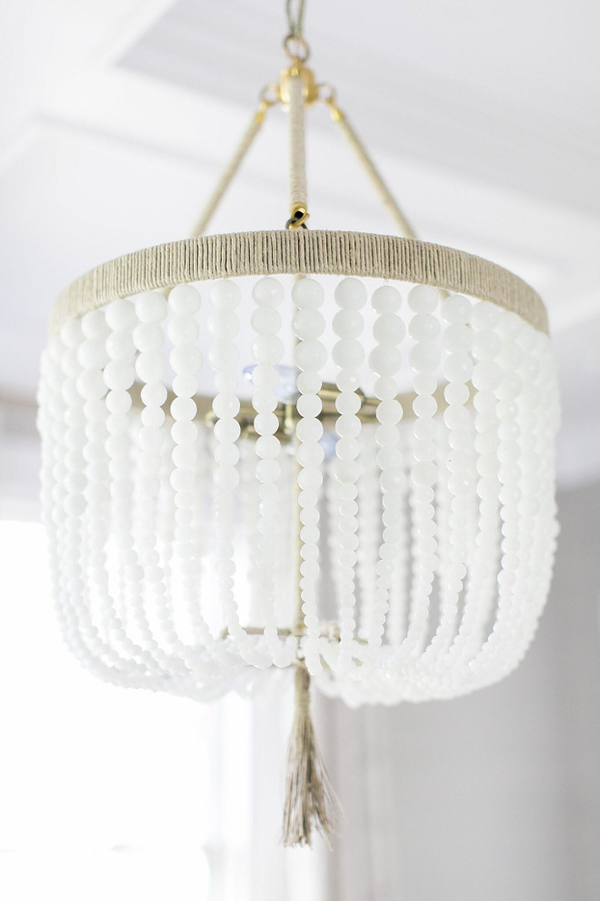
Chandeliers are 18” Malibu chandelier in milk glass bead and natural raffia from Ro Sham Beaux.
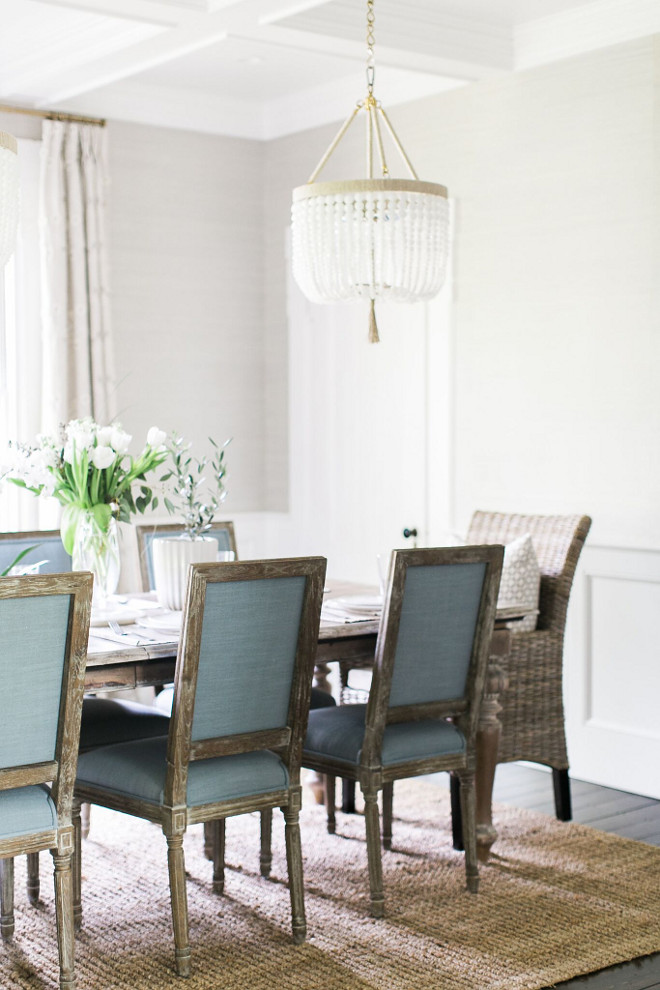
I had never purchased a dining room table before and was very excited to find this Avignon table from Frontgate. The side chairs are from World Market and the wicker end chairs are from Pier 1.
End Chairs: Kubu Wicker end chair, Pier 1.
Rug: Joss and Main 9×12
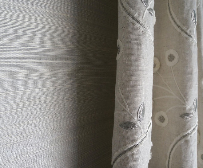
In this space my inspiration piece was the beautiful fabric by Anna French. I matched the grasscloth to it and the chair pillows fabric by Schumacher.
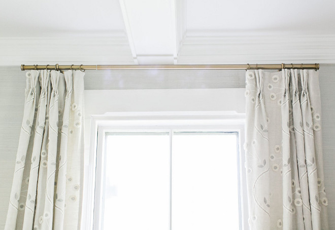
Curtains: Custom coverings by Anna French in Olympus from Lynn Chalk, Etsy.

I love how this beautiful neutral grey grasscloth sets the soothing tone of this room. Wallpaper is Schumacher Kisho Sisal Silver.
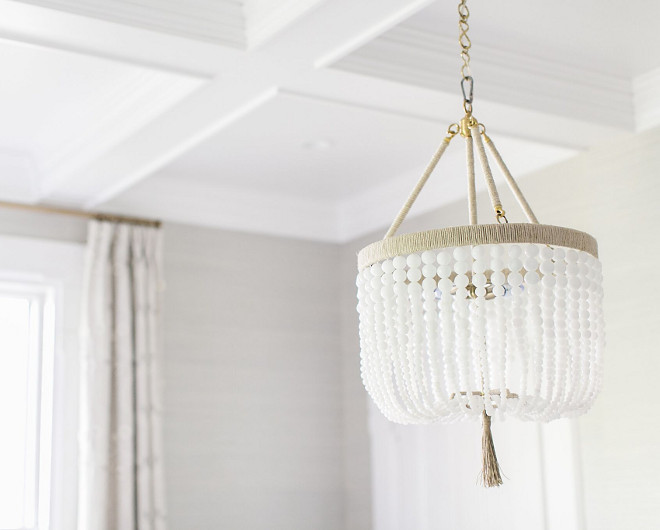
We had the same carpenter add wainscoting and a coffered ceiling.
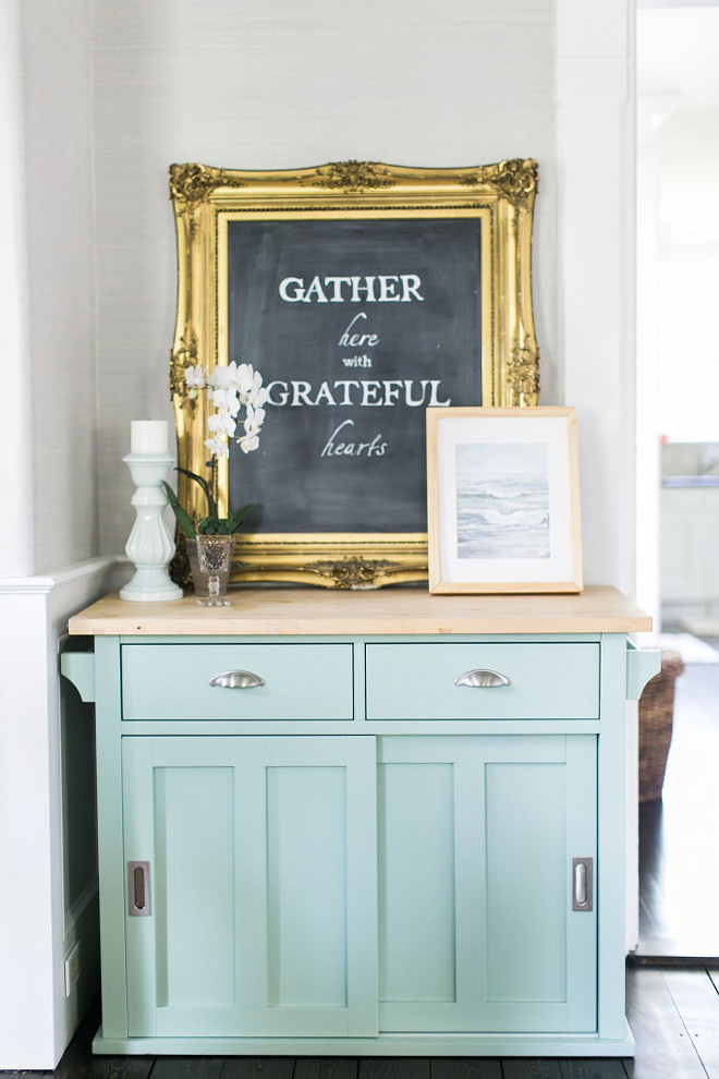
Hutch: An antique Thomasville from Craigslist.
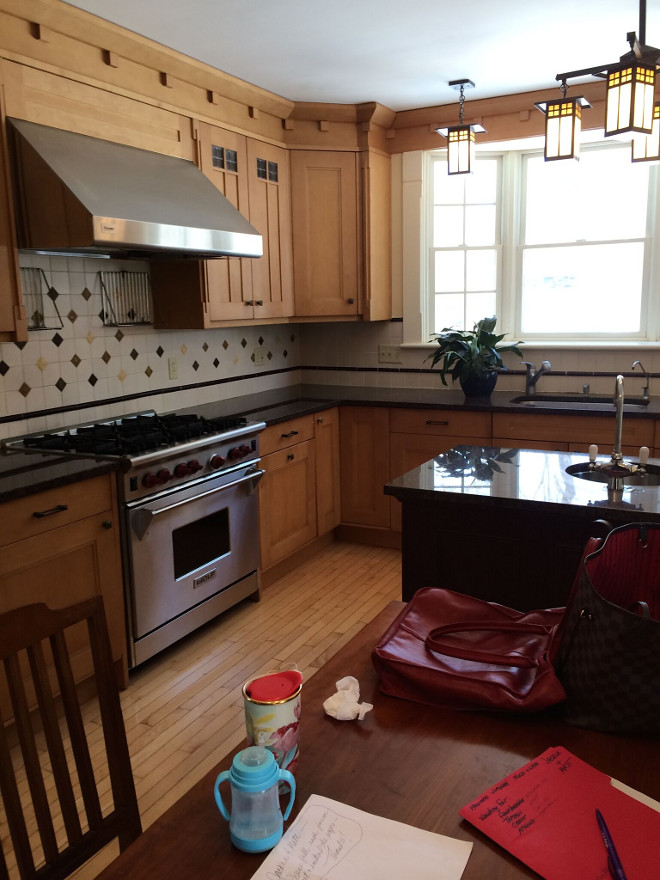
The kitchen when we moved in was a chaotic mess of wood colors – 4 different wood tones to be exact and it drove me nuts. I was 7 months pregnant when I just couldn’t take it any longer. My husband took every cabinet door and drawer front off. We washed everything thoroughly, sanded and I painted the cabinetry during nap time every day. It took 2.5 weeks of nap times.
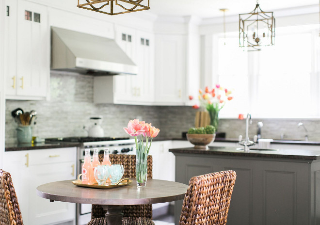
The white color (Benjamin Moore Chantilly Lace) made the kitchen so much lighter while the grey island (Benjamin Moore Chelsea Gray) provided depth and interest.
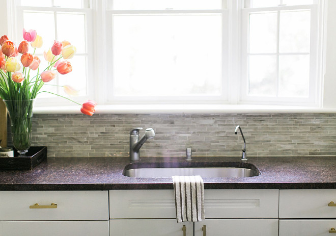
We (and by we I mean my hubby) ripped out the backsplash which was a dated ivory 4×4 tile interspersed with weird decorative tiles. We replaced it with a beautiful creamy grey/taupe glass tile mosaic from South Cypress.
Backsplash Tile: South Cypress, Java random strip-latte glass mosaic.
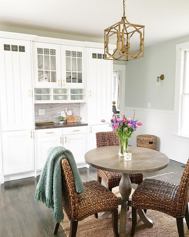
I painted all the baseboard and trim in BM Chantilly Lace.
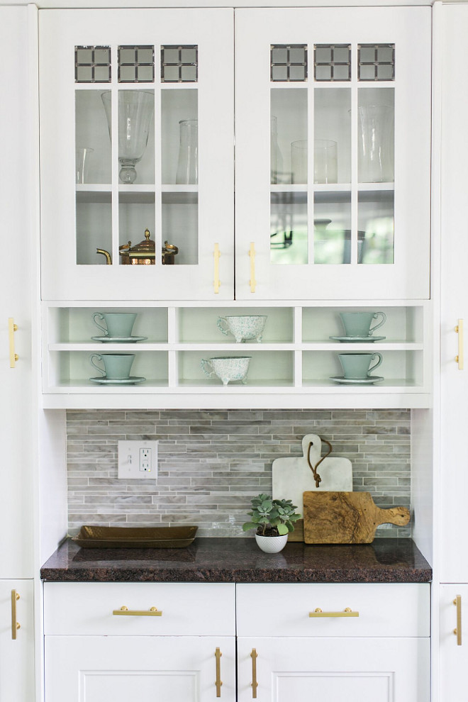
Kitchen Cabinet Paint Color: Benjamin Moore OC-65 Chantilly Lace.
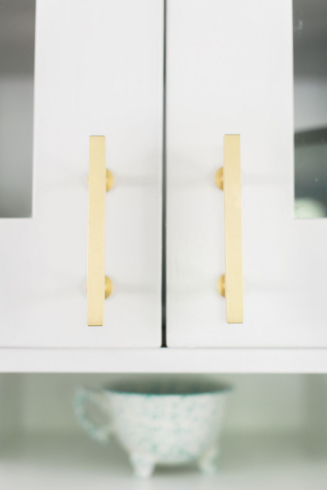
Drawer Pulls: Lewis 3” bar pull from Myknobs.com
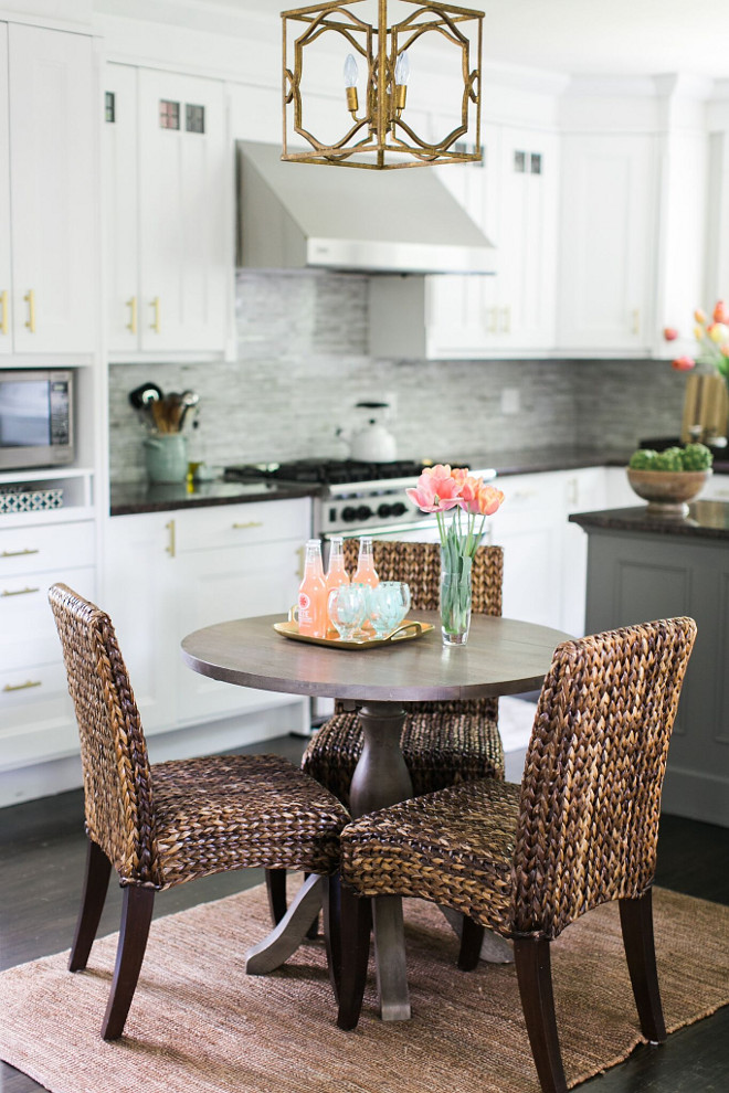
Greywash Table: World Market.
Woven Wicker Chairs: Pottery Barn.
Rugs: Ballard Designs.
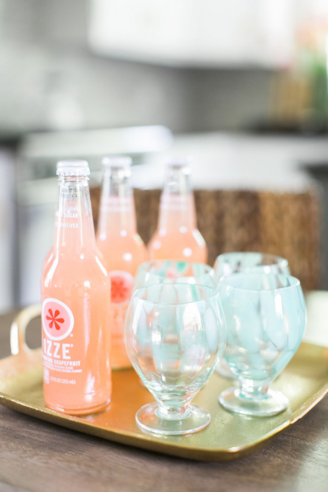
Fresh colors bring some extra happiness to this beautiful kitchen. 🙂
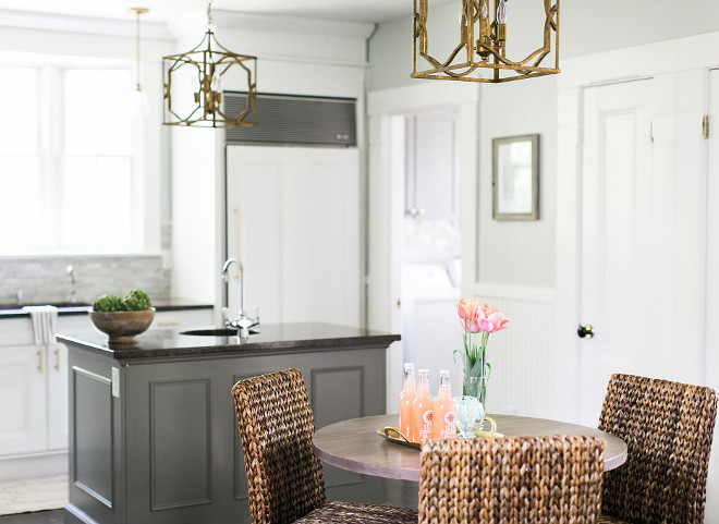
The lighting made a huge difference. We added two new pendant lights, mini pendants over the sink and sconces all in antique brass tones. The modern brass drawer pulls brought the whole space up to date. The island paint color is Benjamin Moore Chelsea Gray.
Lantern Pendant Lights: Small modern fretwork frame lantern in aged gold, Shades of Light.
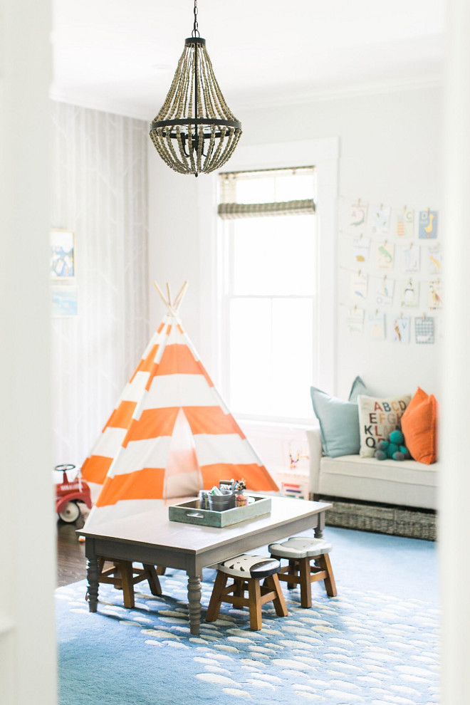
We were initially drawn to this house for the character and charm but we loved the layout with this room being right off the family room and the perfect size for a playroom. We don’t have anything off limits in our house—the kiddos play everywhere but we spend most of our days in this playroom, we all want to be in here. Wall paint color is Benjamin Moore Paper White.
Chandelier: Small Wood Bead Chandelier, World Market.
TeePee: Land of Nod.
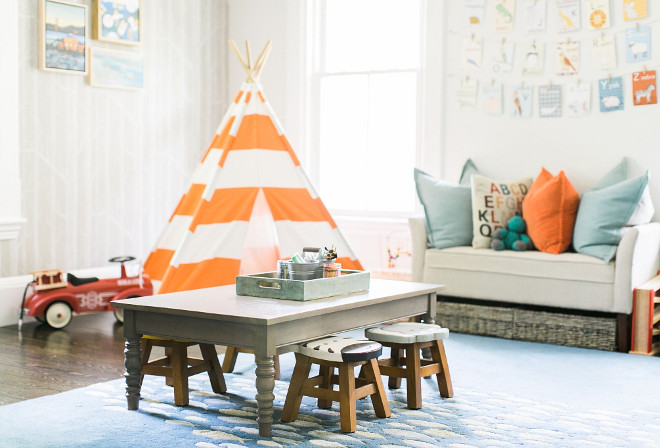
I wanted a fun and whimsical space for little boys to learn and play but like the rest of the home, I wanted it to be lovely and inspiring, in a palate of grey, taupe, light blue, navy and aqua and in this case, punches of fun orange which screams “little boys”.
The rug adds whimsy while grounding the color palate.
Rug: Jaipur Rug called Schooled in Aegean Blue, Rugs Direct.
Pictures: Serena and Lily Art.
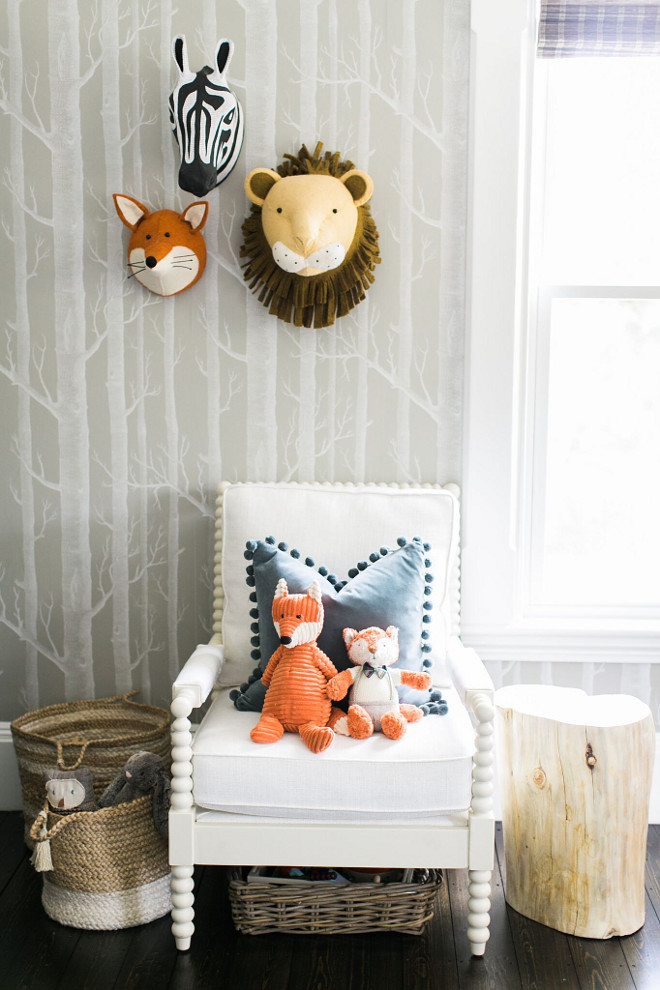
I really believe it is the details that make a space lovely and my favorite detail in this room is the Cole and Son Wallpaper wall. I loved the statement it made but being in the taupe color way, it was soothing as well. My husband, turns out, is an amazing wallpaper hanger.
The side chair is from Wayfair in Talc basketweave and the gorgeous side table is from the talented Etsy shop, woodZwayz. The stump table is so heavy that my boys can’t tip it over. A perfect addition to a playroom.
Wallpaper: Cole and Son Woods in Taupe.
Zebra Wall Head: Anthropologie.
Lion and Fox Faux Head: Fiona Walker.
Baskets on Floor: Homegoods.
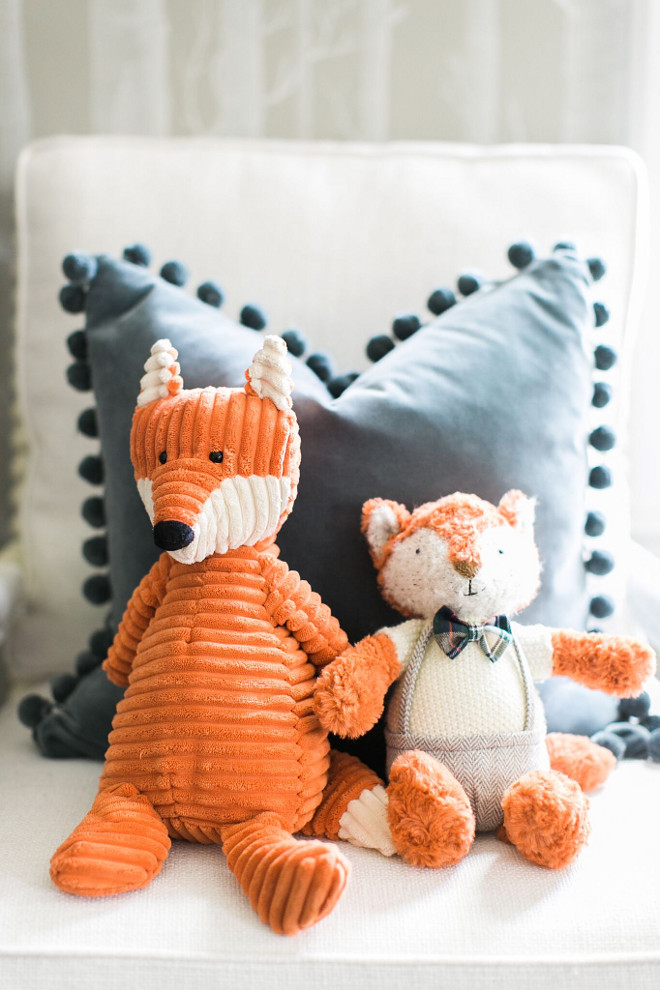
Side Chair: Henderson side chair in ivory, Birchlane.
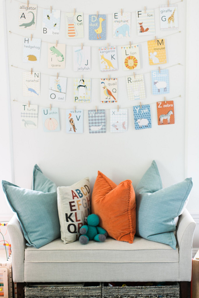
The ABC cards are from Kate Durkin on ETSY. I hung them with tacks, bakers twine and tiny clothes pins.
Animal Alphabet Cards: Katedurkin, ETSY shop.
Settee: Target.
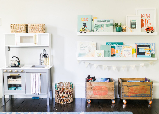
Book Ledges: Holman Ledge 4 ft in modern white, Pottery Barn.
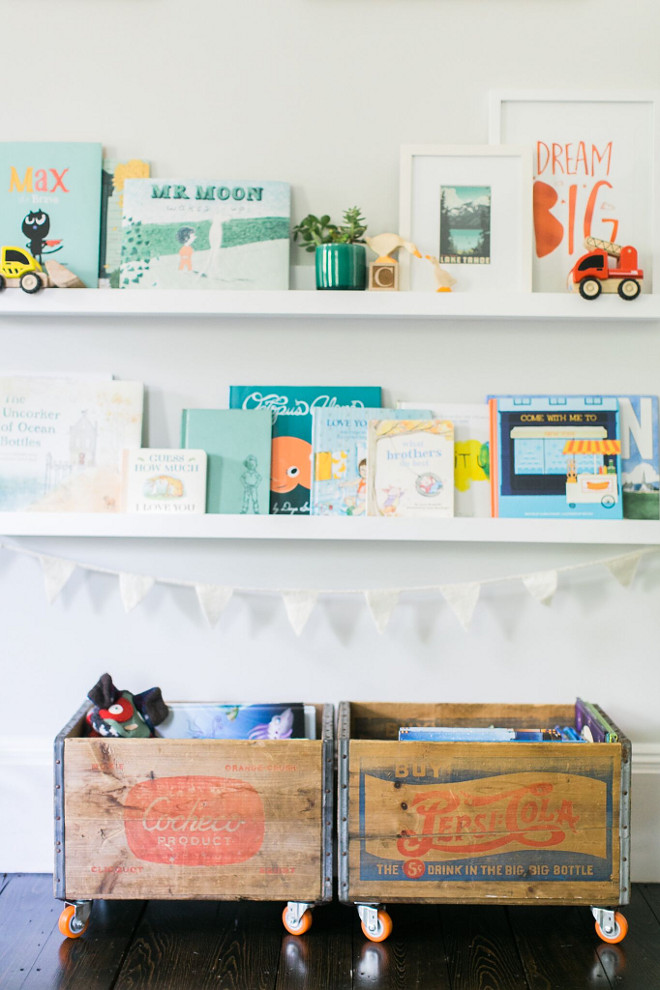
We created a reading nook on one wall out of Pottery Barn ledges and old crates we added wheels to.
Crates: Flea Market find, orange wheels from Amazon.
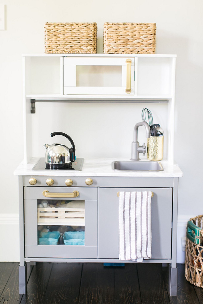
The ikea kitchen got a facelift to resemble momma’s real kitchen. I used marble contact paper for the surface and BM Chelsea Grey I had leftover from the kitchen island.
Play Kitchen: Ikea
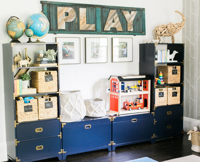
Having just finished the dining room and adjacent family room, custom built-ins were not in the budget for the playroom. I waited until Land of Nod had a sale and bought two bookcases and two toy boxes. Perseverance pays off—they look like a solid unit and add interest to the space.
Bookcases: Campaign Bookcase in midnight blue, Land of Nod.
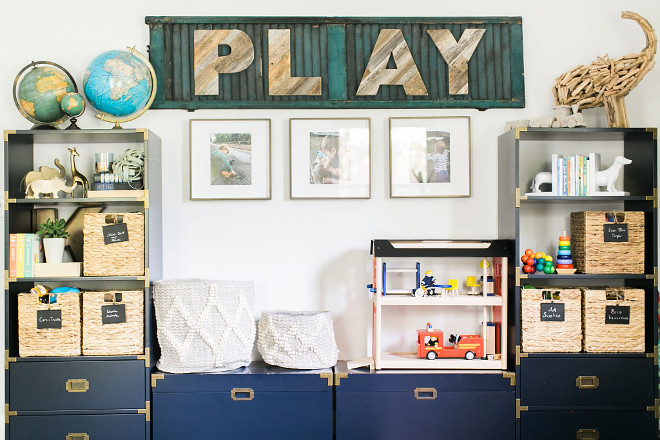
This room has many DIYs but my favorite is the P-L-A-Y sign. The barnwood letters are from Etsy and were initially hung on our wall but they just didn’t look grounded. It need to be more substantial. We found some old teal shutters in the garage that are original to the house. We did not paint them, just cleaned them well and attached the letters with wood glue. Voila.
Baskets on Toy Boxes: Metallic Woven Wool Storage, Pottery Barn Kids.
Play Barnwood Letters: FracturedWood, ETSY shop.
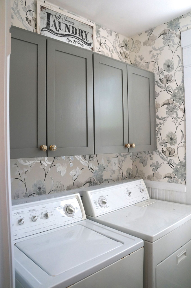
Our main downstairs laundry/powder room is the only bathroom on the first floor and it is right of the kitchen, not ideal and soon to be remedied in an upcoming remodel/addition. But I do enjoy being able to quickly clean up kitchen messes with the handy laundry. We updated this space by painting the cabinets, Benjamin Moore HC-168 Chelsea Gray to flow with the island since they are so close in proximity. Sometimes carrying a color repeatedly through spaces helps create a cohesive look in your home.
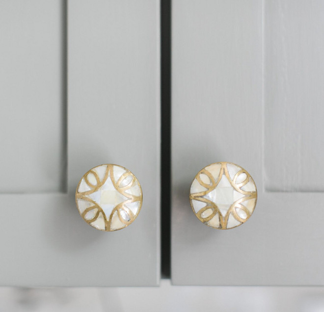
I replaced the knobs with these pretty ones from Anthropologie.
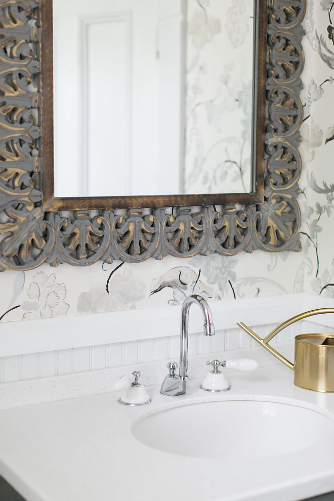
My husband once again flexed those epic wallpaper muscles of his and put up this beautiful Designer’s Guild wallpaper, Whitewell Noir. It is my favorite wallpaper in the whole house.
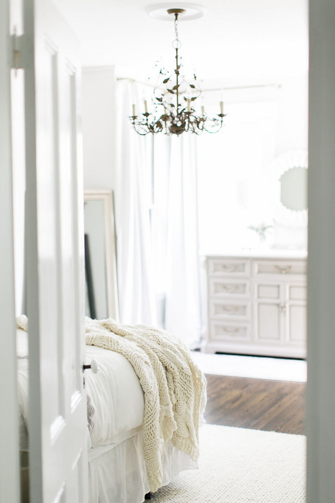
We just completed our master bedroom about a month ago. And it feels great.
We’ve been living in a half finished space for far too long with most of our attention going to the boys and other house projects.
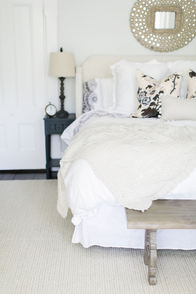
I wanted soothing and neutral. The rug is a braided wool rug from Rugs USA, 9×12. It fits nicely in the space and is very soft underfoot. The bench at the end of the bed was a steal at HomeGoods.
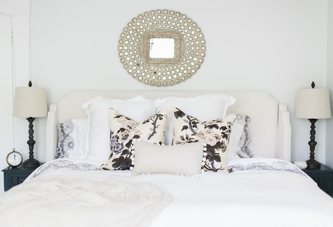
The bedding is white with a pop of pattern in the Schumacher floral pillows.
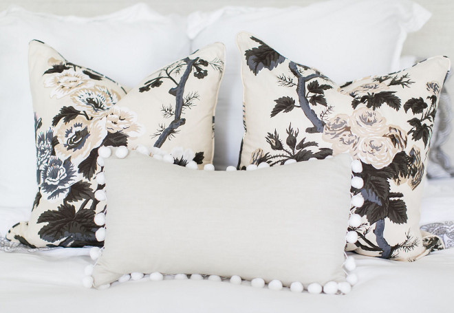
The pom pom pillow is by Laurel and Blush.
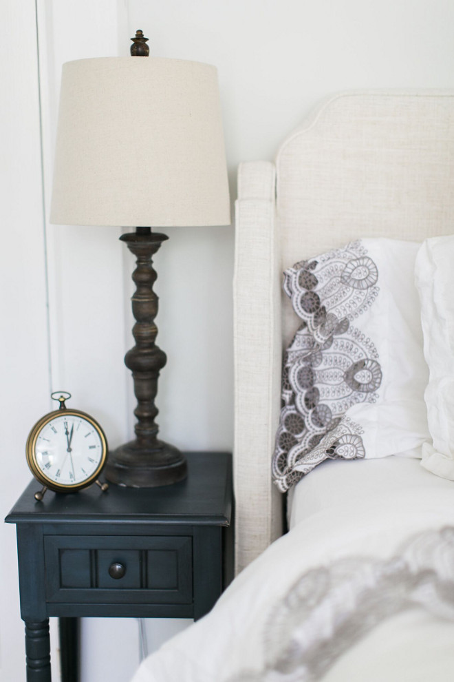
We have a king size bed and not a lot of space for nightstands. These nightstands are barely 12” wide and are from Wayfair. Lamps are from HomeGoods.
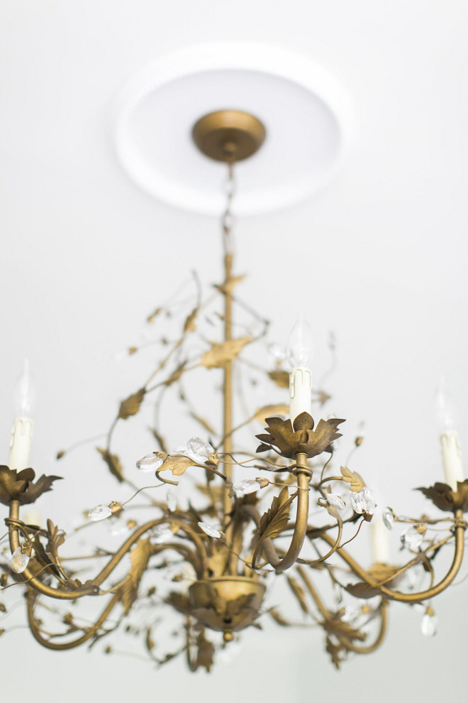
The chandelier is from Ballard Designs.
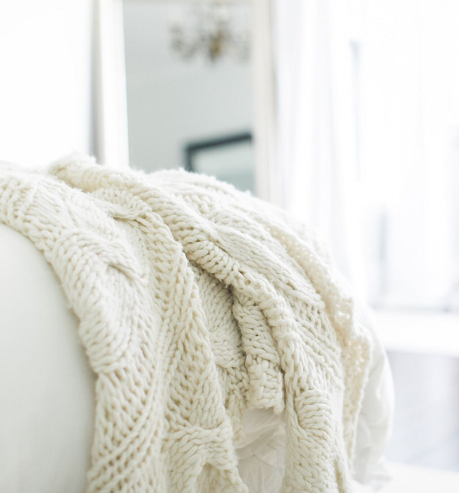
A knit throw brings texture and a soft feel to this bedroom. Throw is from Ethan Allen.
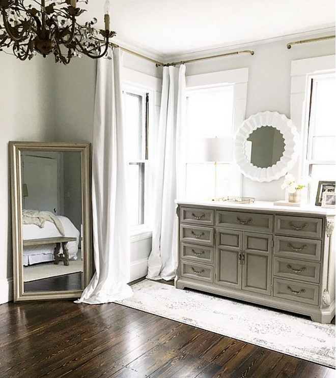
Believe it or not, the white velvet drapes are from Amazon by Half Price Drapes and I could not be more impressed. They are fully lined blackout drapes with weights in the bottom corners, 50×108″ and they were only $65 per panel. I know I know. I’ll give you a minute to pick your chin up off the floor. They are AMAZING. Luxurious, well-made wonders of engineering. Although white, they soften the room and block the light.
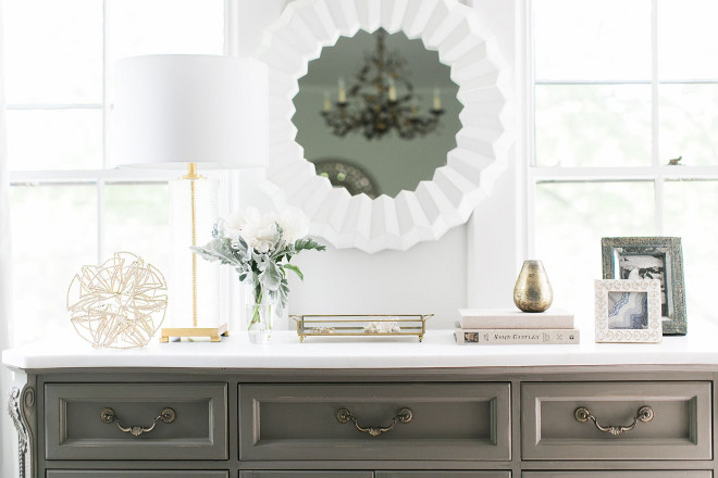
The dresser was my mother’s. I painted it a grey chalk paint and went to the remnant yard to find a piece of rhino quartz for the top. It has a beautiful creamy look to it and was a very inexpensive upgrade. It is topped with a Serena and Lily mirror and lamp from Wayfair.
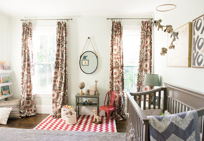
As always I had a jumping off point. A source of inspiration that ignited the treasure hunt that is, decorating a room. It was an odd transition moving his nursery from one house to another. Especially because our previous house was a 1950’s cape with 7 foot low ceilings! My poor momma had to sew extra fabric on the bottom of his drapes so they’d actually be usable in this new space. To be honest, I’ve kind of stopped finagling things because he is 3 yrs old and headed to the land of little boy and that will probably mean a new space eventually.
Little things bug me a bit (like crooked lamp shades but he’s knocked them over so many times I can’t keep them straight). So the wall groupings that fit well in the old room seem a bit small on these great big new walls. Still lovely. Still a perfect spot for my sweet boy.
The grey rug is from HomeGoods. The red zigzag rug was purchased in Camden Maine by Joellen Designs.
The crib is from Target by Million Dollar Baby.
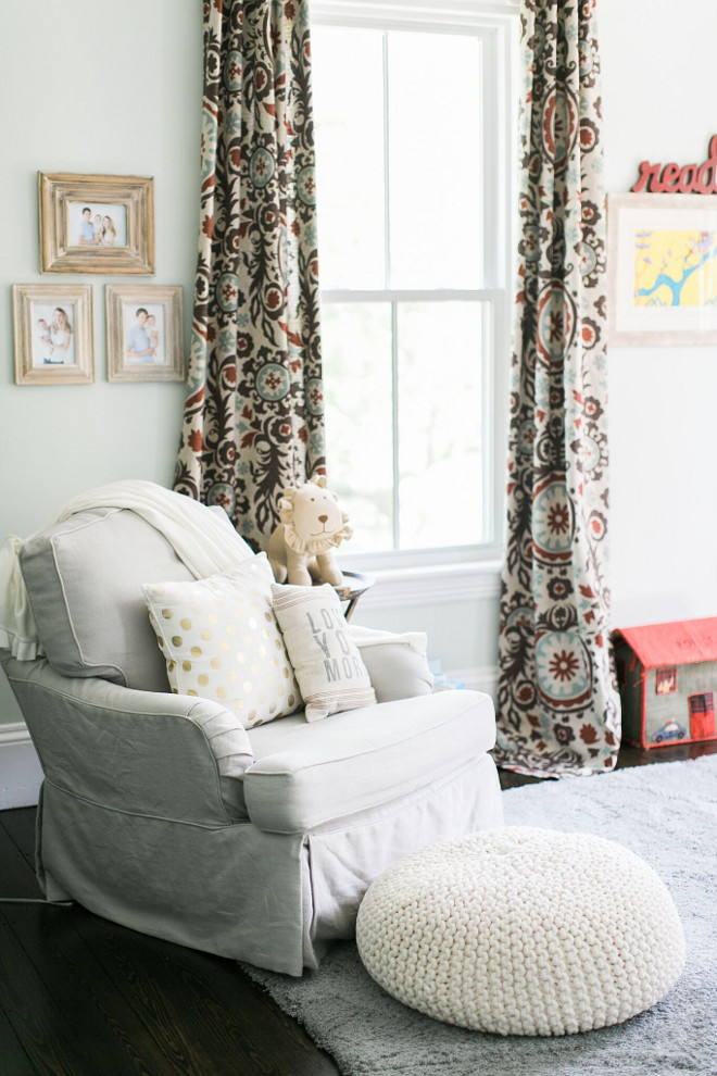
His curtains were the main point of inspiration, along with a vintage radio flyer wagon. Fabric is from onlinefabricstore and is the Suzani Nile/Denton.
The glider is from Restoration Hardware.
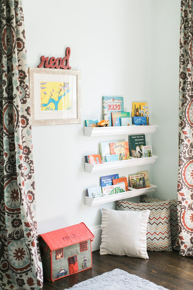
We love to promote reading with our boys and they both love books. My husband installed the rain gutter book shelves. A DIY inspired from Pinterest.
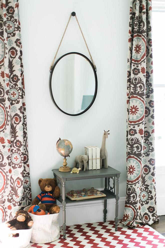
The paint color is Behr Mystic Sea.
The mirror is from World Market. The grey table was a Craigslist find.
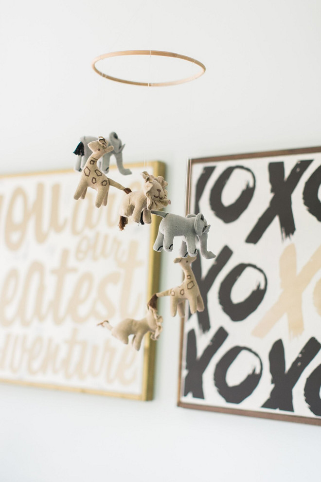
Mobile from Restoration Hardware.
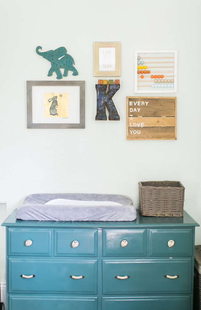
The dresser was a Craigslist find that I painted a deep teal and added Anthropologie hardware.
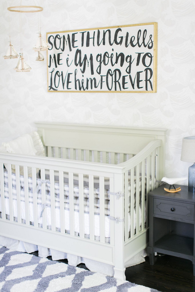
The nursery was inspired by ocean calm. Little did we know we’d have a tsunami of a baby. Having a soothing space with this kiddo was much needed. Like all of the inspiration in my home, it usually comes from a key piece. Whether it be fabric or wallpaper, rugs or a color, something needs to ground your design and inspire the compilation of the space. For Kai’s sweet room it was the wallpaper. Everything hangs on it’s color scheme and pattern. We found the wall color by matching samples to the wallpaper—Benjamin Moore Classic Grey. Once you have your foundation, everything else falls into place.
The crib itself is from Target. The side table next to the crib is from One Kings Lane. I loved that it pulled in the dusty blue color of the rug.
The sign above the crib is from House of Belonging.

The mobile is a DIY project as is the ABC artwork I made using a pin board from Target, scrapes of fabric and iron on hem.
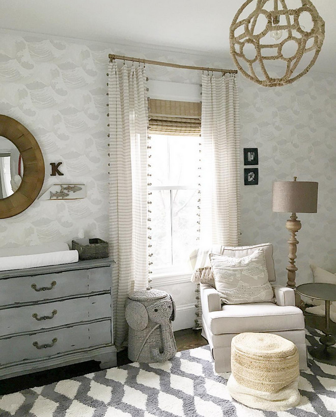
The sweet grey elephant hamper along with the rocker are from The Home Decorators Collection.
The pendant is from Restoration Hardware Baby and Child as well as the crib bedding and bumper.
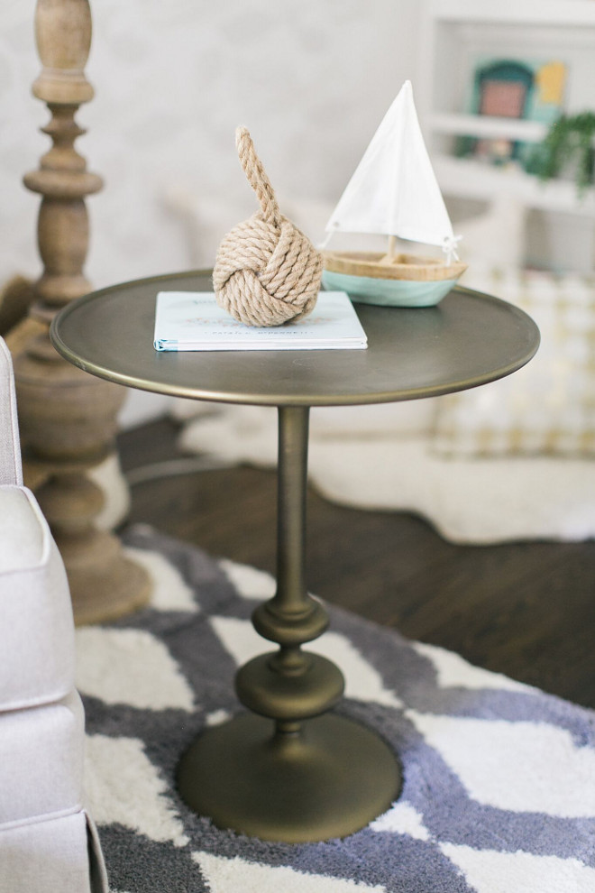
The side table is from Anthropologie.
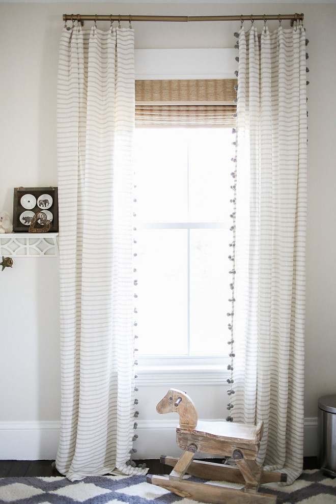
The beautiful curtains are also from Anthropologie.
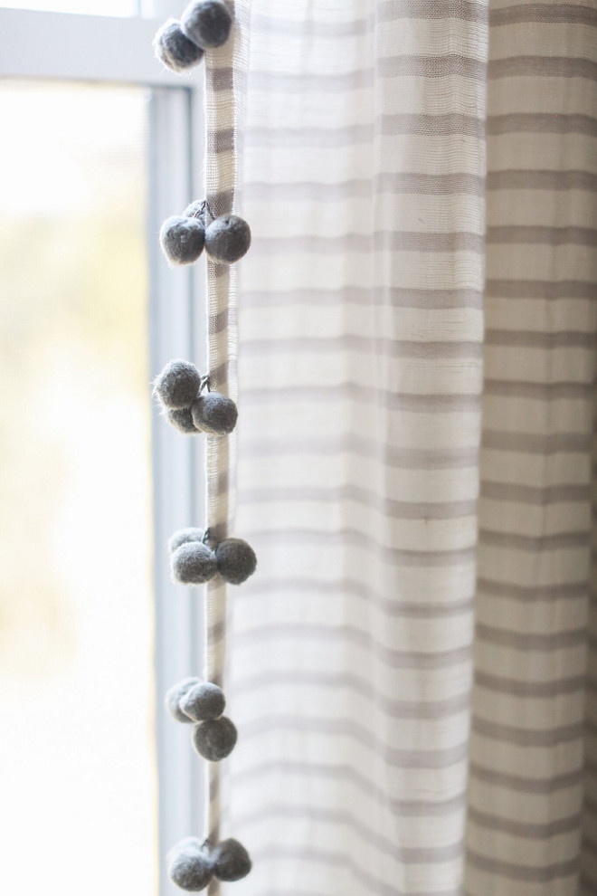
Aren’t these pom pom curtains adorable?
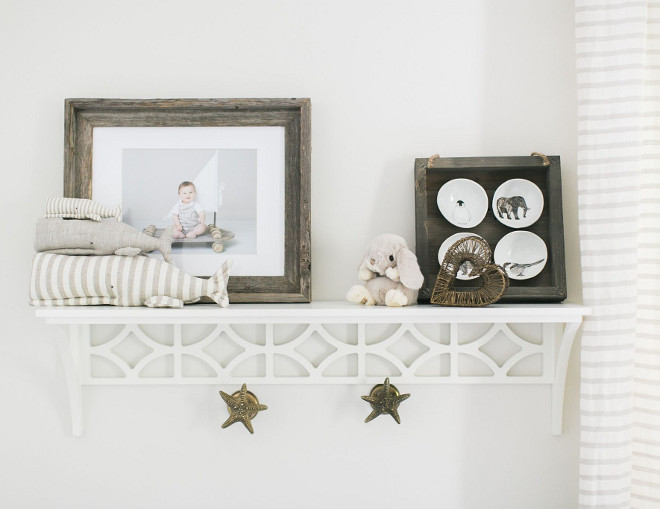
The bookshelf in the reading nook as well as the wall shelf are from Pottery Barn Kids.
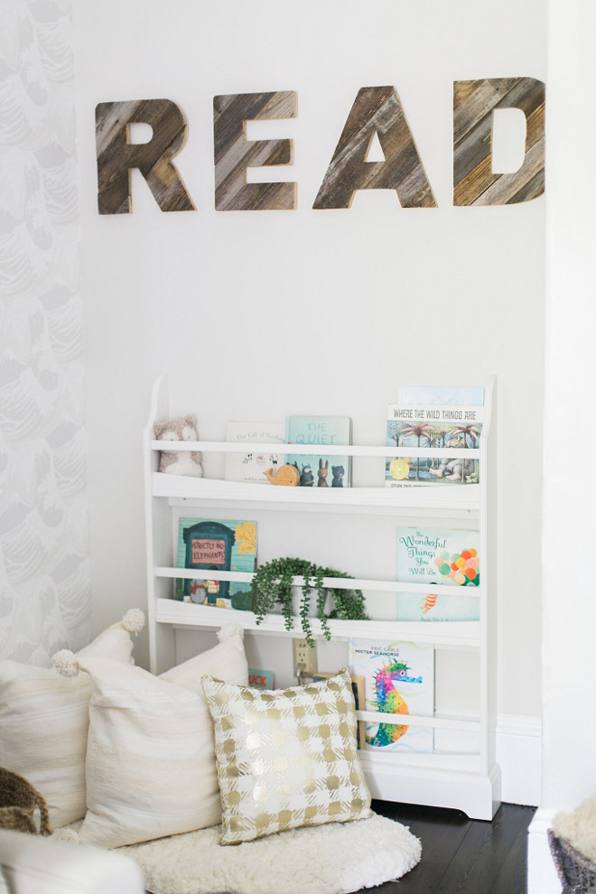
The reclaimed wood letters bring a farmhouse feel to this nursery.
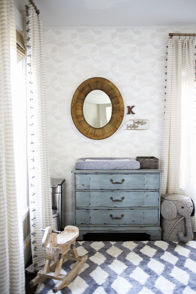
The dresser and rug are from HomeGoods. The mirror is from Antique Farmhouse.
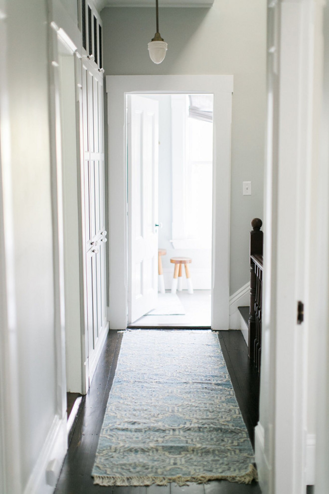
As you walk up the main stairs we have 3 bedrooms and a bathroom and another flight of stairs up to the third floor (were there are 2 more large bedrooms). On the other side of the upstairs hallway is a small step down to a small bathroom and bedroom. Our realtor called it “the maid’s quarter”. It is here we are hoping to remodel into a master suite in a few short months.
The nice thing about pushing into the adjacent bedroom is it allowed us room to put in floor to ceiling cabinets for hall storage. These large built ins house all the towels and sheets and make the home so much more livable.
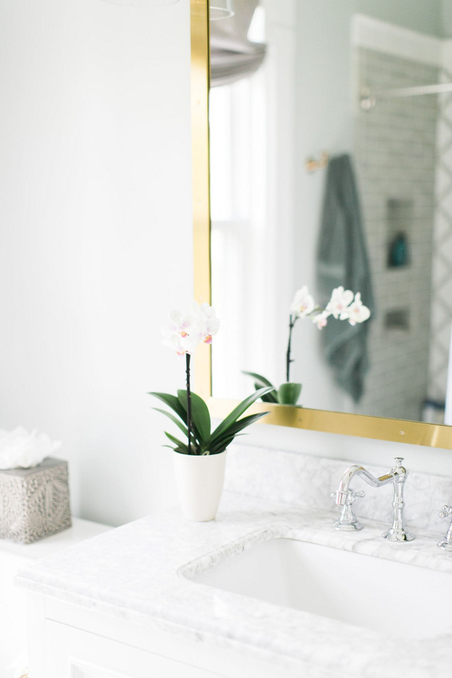
The upstairs bathroom is our main bathroom for both us and the kiddos right now. When we moved in it was a horrible mess of moldy fish print tiles. And it was small. The adjacent bedroom which is now our son, Cade’s room was so big that it was an easy decision to borrow some space from that room. Sometimes you don’t need a bigger house, just to allocate space differently.
The mirror is from Restoration Hardware. The white vanity is 36” from Wayfair.
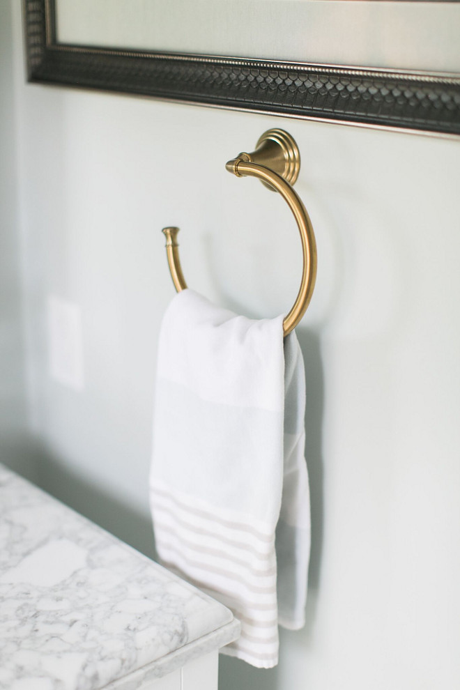
The hardware is from Kohler.
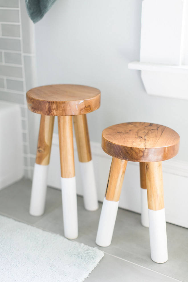
The shower curtain, wood stools and linens are from Serena and Lily.
One thing that we tried to do in this space was capture the unused nooks and crannies. We had tiny shelves built in next to the shower behind the door that are perfect for wash clothes and small toilettries. If you are designing a space, think about trying to utilize what looks like unused space seizing it for its potential. Storage, especially in bathrooms, is always a good idea.
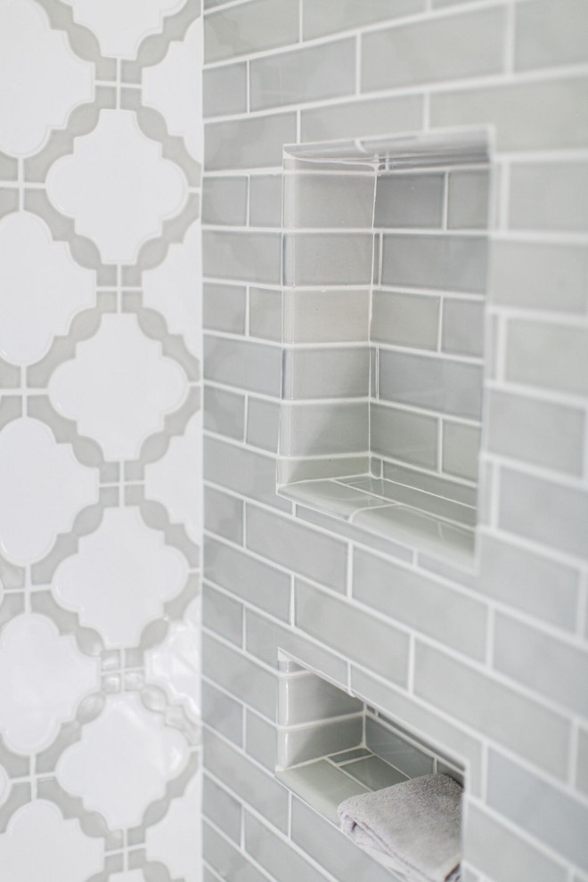
I used two different tiles for the shower, a grey subway tile and a lattice pattern for the back wall. Both are from The Tile Shop.
I hope you enjoyed our home tour. We have lots of fun changes coming soon to this old house as we add a mudroom/garage addition and open the wall between the kitchen and family room. 🙂
Click on items to shop!
Thank you for shopping through Home Bunch. I would be happy to assist you if you have any questions or are looking for something in particular. Feel free to contact me and always make sure to check dimensions before ordering. Happy shopping!
Serena & Lily: Pillow & Throw Sale!
Wayfair: Up to 75% OFF on Furniture and Decor!!!
Joss & Main: Up to 70% off Sale!
Pottery Barn: Bedroom Event Slale plus free shipping. Use code: FREESHIP.
One Kings Lane: Buy More Save More Sale.
West Elm: 20% Off your entire purchase + free shipping. Use code: FRIENDS
Anthropologie: 20% off on Everything + Free Shipping!
Nordstrom: Sale – Incredible Prices!!!


 Beautiful Homes of Instagram: Modern Farmhouse.
 2019 New Year Home Tour.
 New-Construction Home Ideas.
 Florida Beach Cottage.
 Tom Brady and Gisele Bundchen’s Home – Full House Tour.
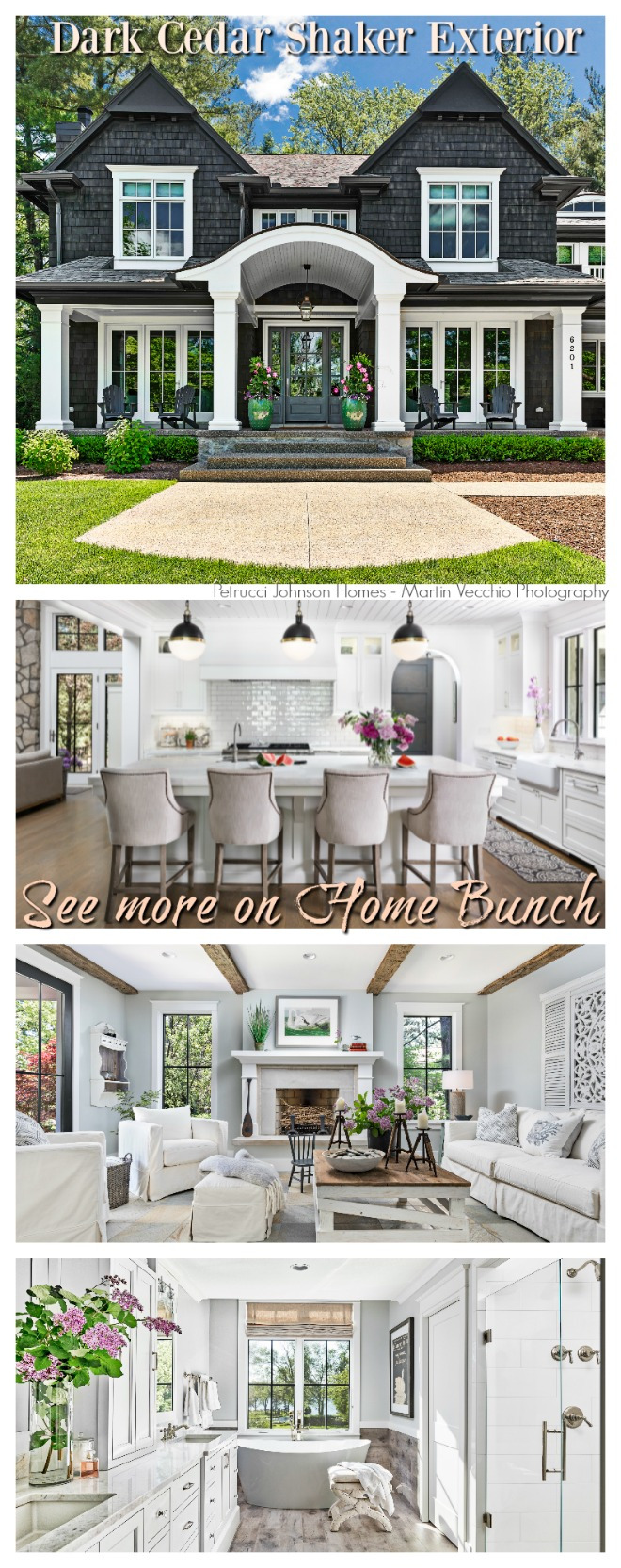 Dark Cedar Shaker Exterior.
 Neutral Home.
 Coastal Farmhouse Home Decor.
 Modern Farmhouse with Front Porch.
 Lake House Interior Design Ideas.
 New England Home.
 Florida Beach House Interior Design.
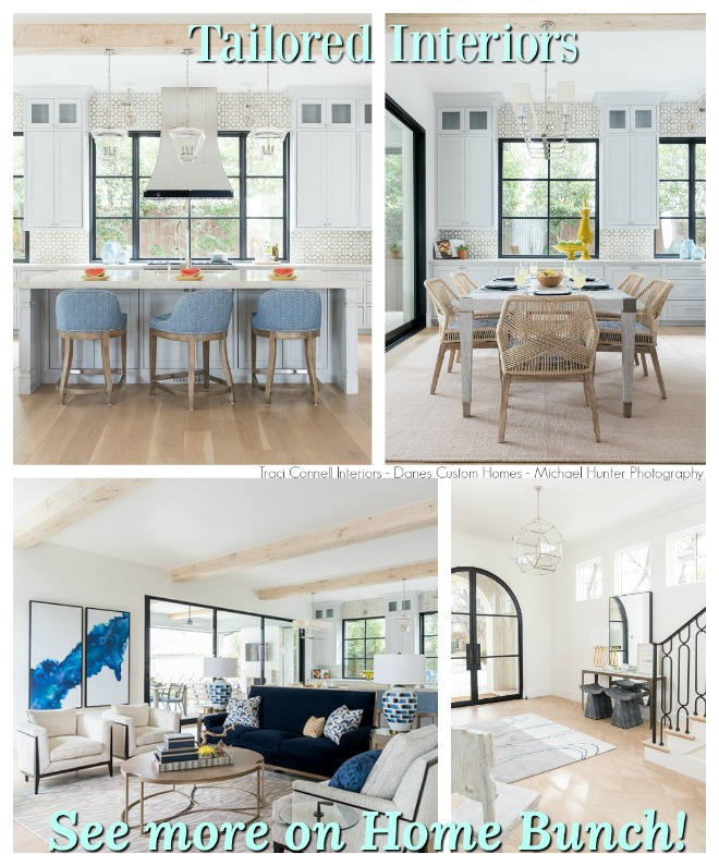 Tailored Interiors.
 Grey Kitchen Paint Colors.
“Dear God,
If I am wrong, right me. If I am lost, guide me. If I start to give-up, keep me going.
Lead me in Light and Love”.
Have a wonderful day, my friends and we’ll talk again tomorrow.”
with Love,
Luciane from HomeBunch.com
Get Home Bunch Posts Via Email ![]()
“For your shopping convenience, this post might contain links to retailers where you can purchase the products (or similar) featured. I make a small commission if you use these links to make your purchase so thank you for your support!”
Subscribe to get Home Bunch Posts Via Email
Where is the rug in nursery from?
Hello,
I don’t have the source for the rug but these are similar: https://rstyle.me/n/dai32mccxp7
https://rstyle.me/n/dai5jbccxp7
https://rstyle.me/n/dai5jzccxp7
Other great nursery rugs: https://rstyle.me/n/dai5nqccxp7
I hope this helps. 🙂
Luciane