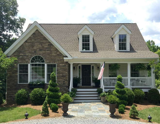
Happiness has arrived! I honestly feel extra happy when I share a new “Beautiful Homes of Instagram” post with you. I find these posts are so helpful if you’re looking for inspiration because these talented homeowners are always full of incredible ideas and many DIY projects. Today, I am honored to feature Selena from @middlesisterdesign. She and her husband are a DIYers and I am sure your jaw will drop as much as mine did when you see all of the projects done in this house.
I hope you guys have a great time and get some inspiration here to apply to your home! I am definitely sharing this post with my husband! 😉
“I am so honored to have our home featured on Home Bunch! When Luciane contacted to ask if she could feature it, I was quite shocked and beyond excited! To have our humble little home that we’ve poured our hearts and souls into displayed next to some of the most beautiful homes on Instagram is just such an incredibly exciting gesture. Thank you Luciane. And thank you all for visiting! Welcome to our home!
A little intro to myself. I’ve had a passion for Interior Design and Décor for as long as I can remember. It was merely a “hobby” of mine for many years. Until 2 years ago I worked part time as a bank teller. One day my husband suggested that I pursue my dreams of having my own Interior Styling business. After a lot of deliberation, I decided to go for it and Middle Sister Design was born. I specialize, and take pride in being a more budget friendly, less complicated, savvy stylist for the homeowner who desires a well-dressed home without the large price tag. Simple, Smart and Savvy; that’s my motto! I began a Blog, have had much success with local clients and have loved every minute of it. (And have not once missed wearing heels to work, counting dirty money or trying to upsell. There’s still so much for me to learn and I have big plans for the future of my Blog and Business.
When my husband and I decided to build our home nearly 10 years ago we had just been married less than a year. We had viewed many homes in the area’s “cookie-cutter” neighborhoods and while we were uncertain of exactly what we wanted, we knew these were not it. We decided to scour the internet for land as well as for house plans. My husband found a 2 ½ acre piece of land that was only 5 minutes from my childhood home and I found the house plans (we disagreed on LOTS of them before finding the “perfect” one.).
We both liked the bones of the house plan I’d found, however there were many things we didn’t love and so we sought help from a local Architect and custom home building company. With their assistance, we made changes to much of the main floor plan.
I would describe my design style as somewhat eclectic. Growing up in the South and in a more traditional style home, you will find a bit of it throughout my own. However, being a lover of trends, I do enjoy bringing pieces of trendy items into the mix. Neutral, natural, earth inspired elements are my favorite. My Grandparents lived on a farm and from my memories of spending the summers there stem an adoration for that lovely, cozy farmhouse feel. My take on modern farmhouse industrial and boho chic also play a part in this eclectic style of mine. I truly do have an appreciation for all the styles.”
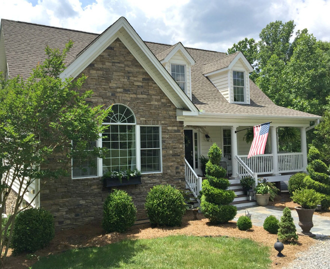
We kept to the original plans for the exterior of the home aside from choosing much larger windows shown above as well as the Stacked Stone veneers from Eldorado Stone in the color Alderwood. We loved that stone so munch in fact that we decided to carry it over to the entire foundation all around the entire house. The siding is Vinyl in the color ivory and all gutter work and trim are vinyl as well in white. We have designed and installed all of the landscaping ourselves and while that is a job in itself, the toughest part is keeping the multitude of deer from eating all of our hard work.
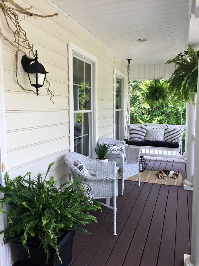
Front Porch stain is James T Davis solid stain in the color Tree Bark. The swing is from Hayneedle and the wicker conversation chairs are from Pier 1. Rugs are from Target.
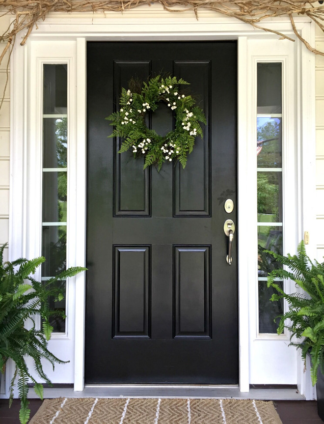
Front door color is basic black exterior paint.
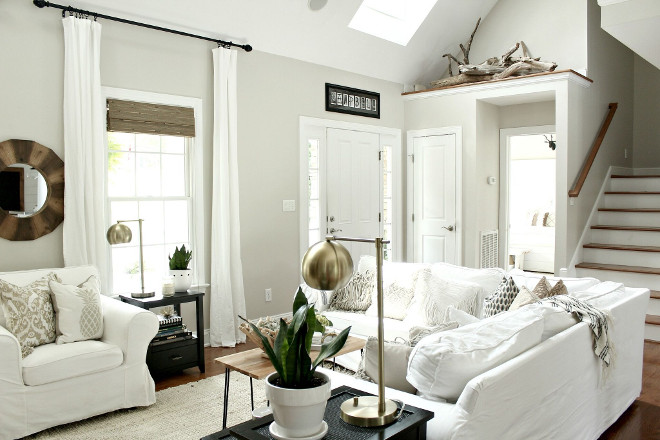
The front door opens to the Great Room which was actually 3 rooms on the original floor plan; Living Room, Kitchen and Dining Room. This, even on blue prints, looked incredibly cramped and we all agreed that an open concept would be a more unique and inviting look for this space.
Another favorite unique feature of mine is the little “shelf” above the foyer’s close/master bedroom door. I chose to display the driftwood pieces my sister has collected from a nearby river for me over the years, knowing my love for it.
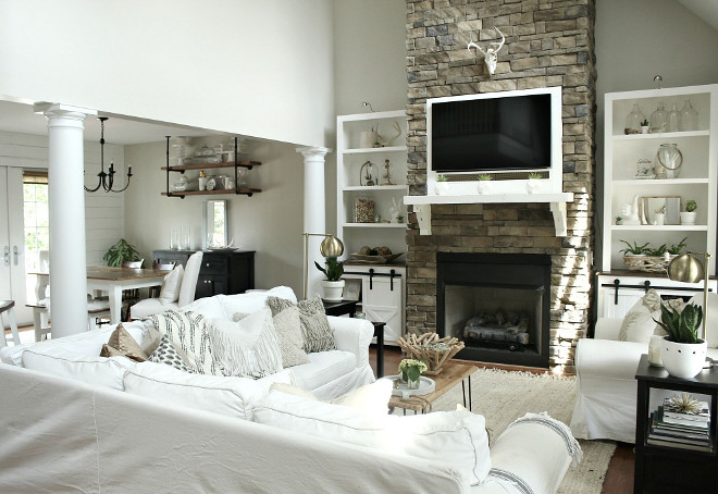
Sofa and chair in this space are the Ikea Ektorp Slipcover Series, both in Bleking White.
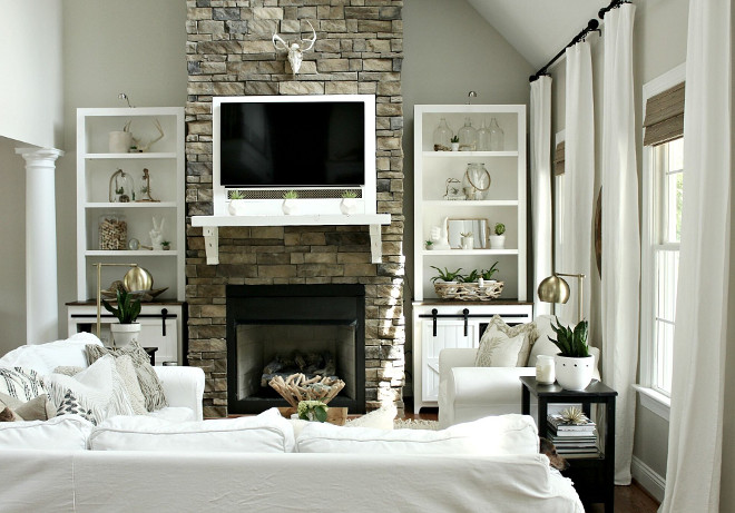
DIY Inspo: Bookshelves, side tables and coffee table were all built by my husband.
Rug is Bleached Jute from Overstock.
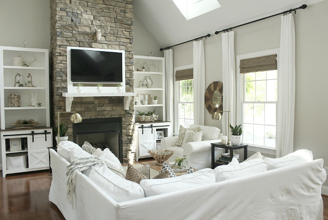
We decided to take the fireplace all the way to the top of the high ceilings using the same stone used on the exterior – Stacked Stone veneers from Eldorado Stone in the color Alderwood.
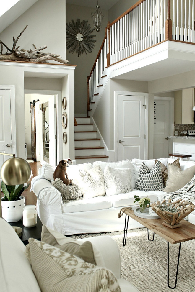
Paint color for the entire main floor is Benjamin Moore HC-173 Edgecomb Gray.
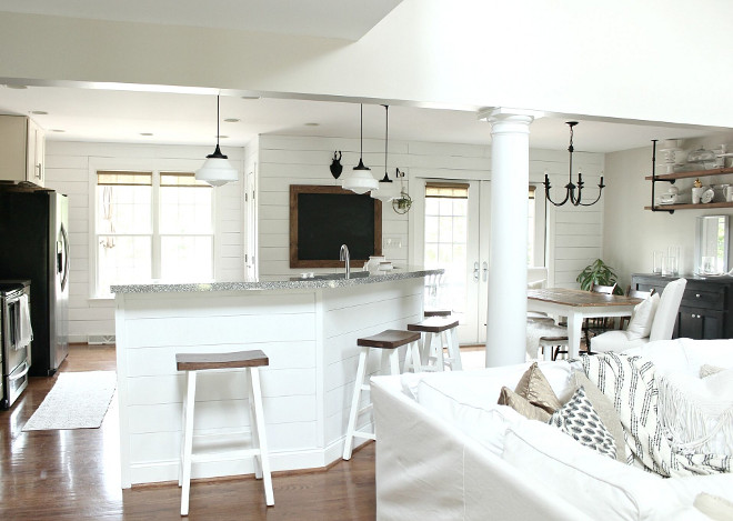
The shiplap wall was added by us last year. We used 4×8 wood floor underlayment from Home Depot, cut into 6” strips and installed using liquid nails and a small brad nail gun, using nickels as spacers. It was such an easy project that creates such dramatic results. And best of all, incredibly inexpensive. Paint color is White.
This open concept would require reconfiguring the entire kitchen layout which was tricky but in the end, we chose a unique island style and designed using Kraftmaid cabinets all the way to the ceiling to utilize every inch of this small space for storage as possible. Cabinets are solid maple in the color Biscotti.
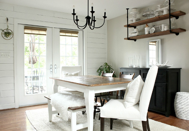
The table is a found item made from 100 year old barnwood. It was in bad shape when I found it but I put a little love into it and she’s as good as new. The bench at table, sideboard and industrial shelves were built by my husband. The two captain’s chairs are from Ikea. Rug is the bleached jute from World Market. Grasscloth shades are from JC-Penney.
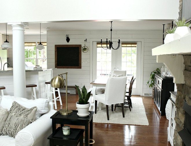
The French Doors in the Dining Room were not a part of the original plan. In fact, there was only one small window here as well as in the kitchen area. The French Doors open to a large deck, also not part of the original plans.
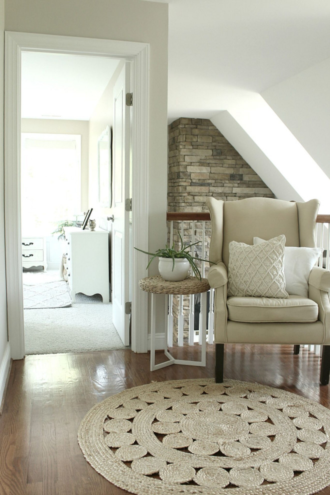
Upstairs are two bedrooms and a full bath. The landing at the top of the stairs houses a chair that is a family heirloom. Another favorite space of mine.
All flooring throughout the home is oak with the exception of two upstairs bedrooms.
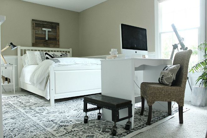
Our daughter is grown and no longer lives with us. When converting her bedroom into an office for myself, I wanted to keep a bit of “youth” to this room but also wanted it to be a place for guests of all ages to feel comfortable. I chose fun, on trend patterns and lots of textures for this space. The chair rail was installed when the home was built. Last year I installed the faux board and batten using 1 ½ inch lattice strips. Paint color on walls is Khaki by Valspar. Board and batten and all trim and doors are basic white paint. Simple. Bedding is from Pottery Barn and all furniture is the Ikea Hemnes series.
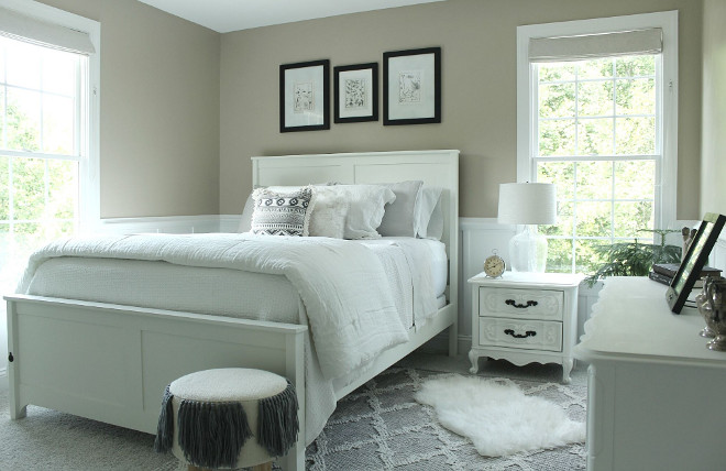
The second bedroom has always been a guest bedroom but it too got the board and batten treatment last year. Wall paint color is also Khaki by Valspar.
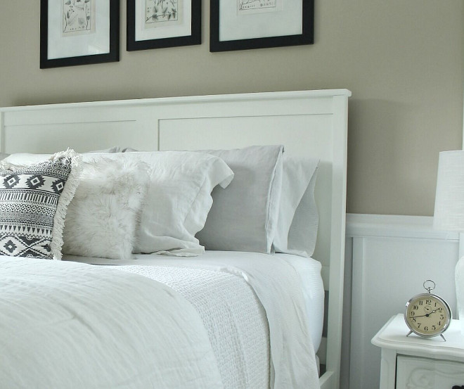
The bed is an antique, Amish made, chalk painted with Valspar chalk paint in the color Kid Gloves. French Provincial nightstand and dresser were mine as a child, painted the same as bed. Bedding is from various stores. I like to pay extra attention to detail as well as cost into the bedding of the guest beds. Linen, high quality cotton and extra down comforters are a great way to give that 4 & 5 star hotel feel.
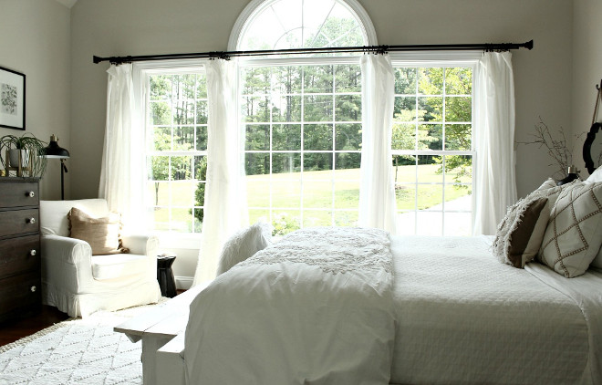
The Master Bedroom layout is original to the plans. Of course, as mentioned before, with the exception of making those windows much larger. This is one of my personal favorite changes that we made.
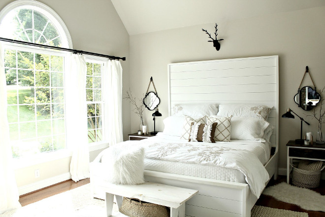
Wall paint color is Benjamin Moore Edgecomb Gray HC-173.
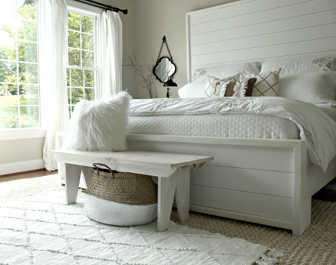
The shiplap bed, nightstands, bench and large mirror were built by my husband.
The jute rug is from World Market.
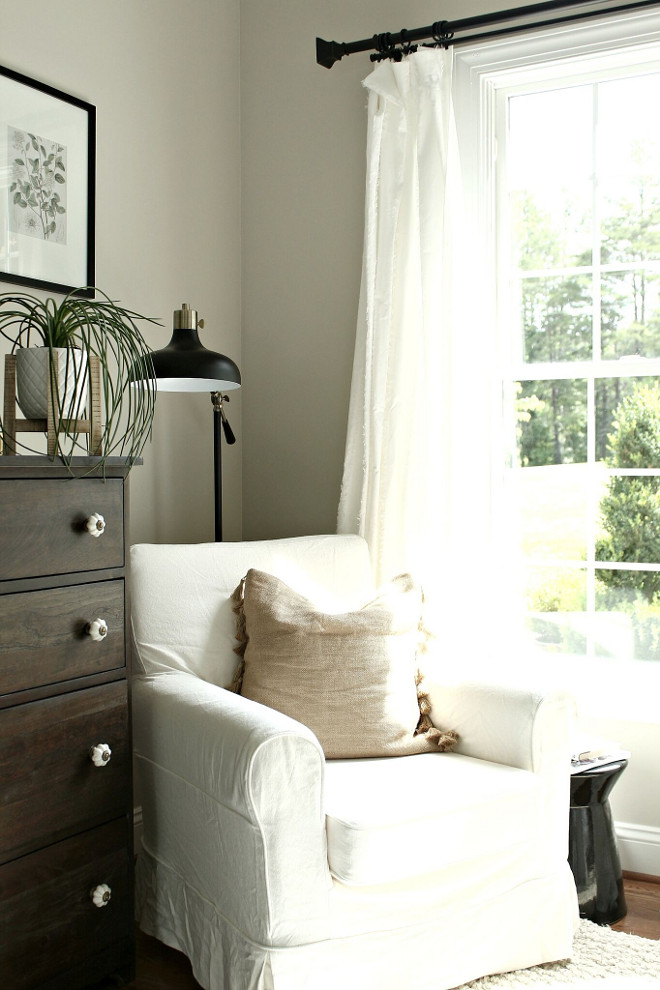
This slipcovered chair brings a relaxed feel to this farmhouse bedroom.
Lamps are from Target.
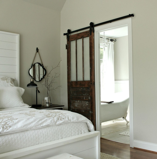
Hung with barn door hardware, this salvage door adds so much character to the master bedroom.
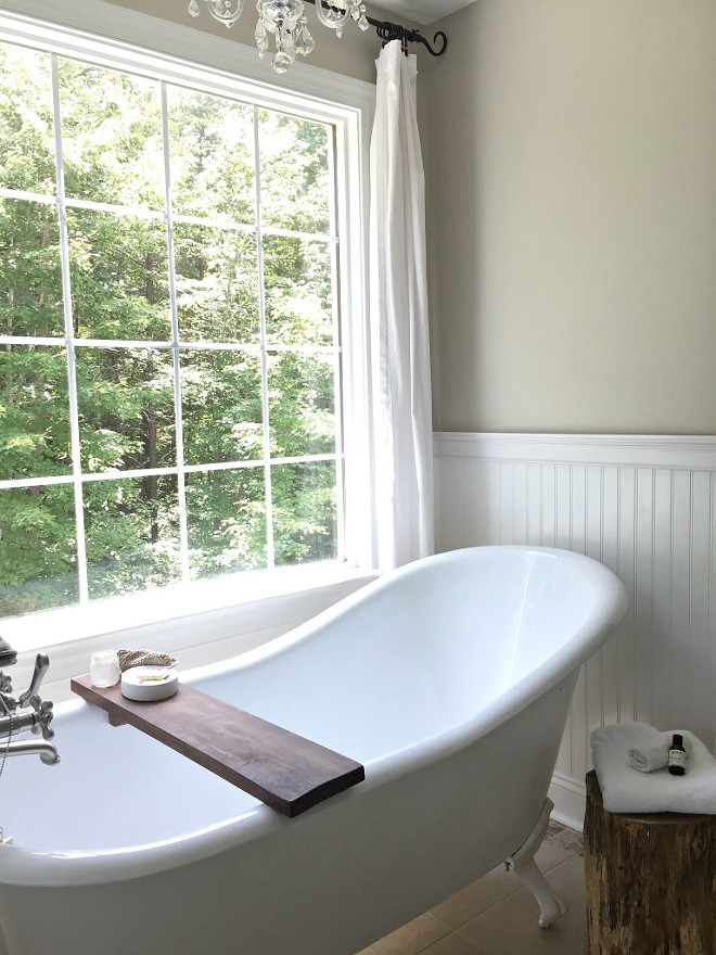
When built our home we’d installed a jetted garden tub. Four years ago though, we decided to rip it out and replace with this Clawfoot Slipper Tub from Vintagetub.com. This is the Randolph Morris 67 Inch Cast Iron Slipper Tub. I cannot express how much I adore this tub. Also in this space, we designed a much larger window here than the original floor plans. One of my favorite pastimes during the snowy season is soaking here while watching the snow fall.
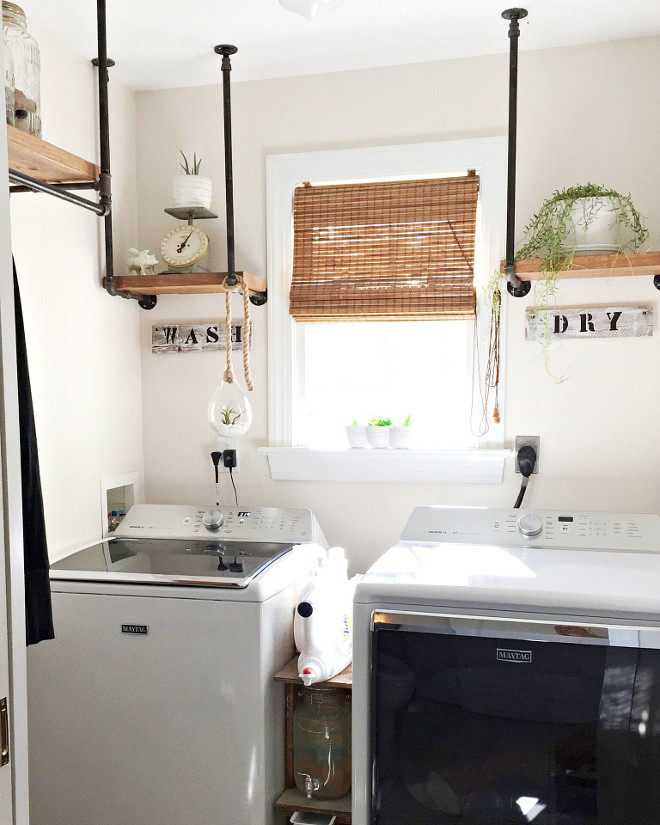
We reconfigured what was intended to be a mud room/powder room off of the kitchen area into a small powder room and laundry room. There were two reasons for this. One, taking square feet from this space allowed us to add them to the Master Bedroom’s Closet opposite the wall of this space. Two, making this space smaller meant there would be no place for an exterior entry door to enter the mudroom which worked well by adding a larger deck and doors in a different area, which I will describe below. We had decided earlier in the planning that a mud room was not necessary for us. The home has a full basement with garage. This is perfect for bringing in messes from long days of gardening or yard work.
The industrial shelving were built by my husband.
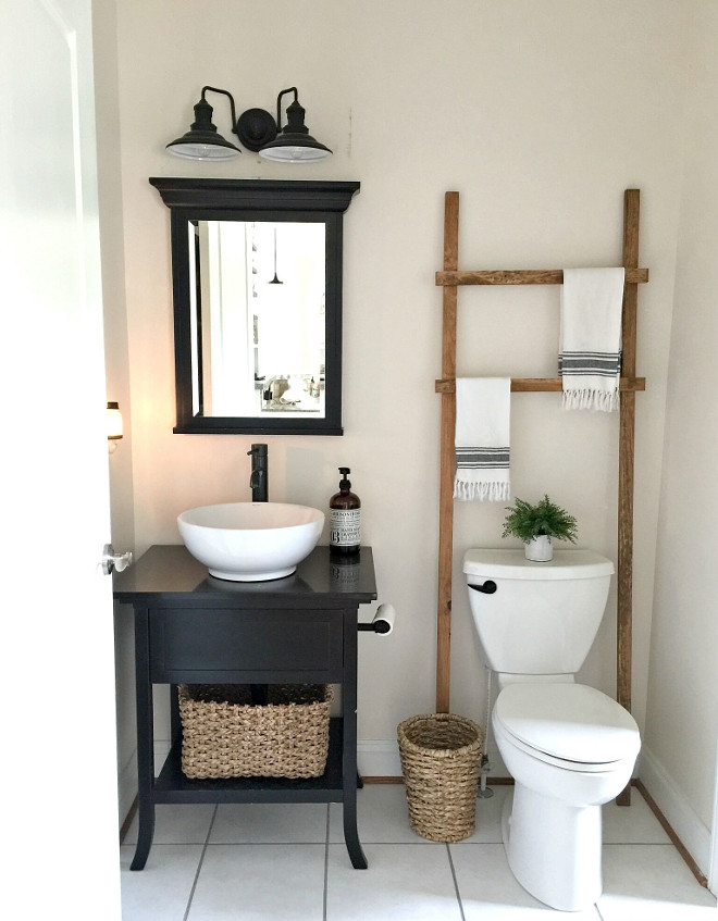
Here is the powder room. I decided to separate the powder room and laundry room with a pocket door which easily hides any laundry messes from potential unexpected guests- or when I simply want to “hide” it from myself! :).
Towel ladder was built by my husband.
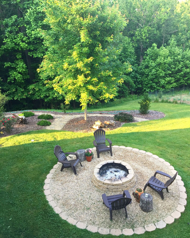
Our backyard is currently getting a small makeover but I thought I’d share a photo of our firepit from last summer. 🙂
Thank you for shopping through Home Bunch. For your shopping convenience, this post may contain AFFILIATE LINKS to retailers where you can purchase the products (or similar) featured. I make a small commission if you use these links to make your purchase, at no extra cost to you, so thank you for your support. I would be happy to assist you if you have any questions or are looking for something in particular. Feel free to contact me and always make sure to check dimensions before ordering. Happy shopping!
Wayfair: Up to 75% OFF on Furniture and Decor!!!
Serena & Lily: Enjoy 20% OFF Everything with Code: GUESTPREP
Joss & Main: Up to 75% off Sale!
Pottery Barn: Bedroom Event Slale plus free shipping. Use code: FREESHIP.
One Kings Lane: Buy More Save More Sale.
West Elm: 20% Off your entire purchase + free shipping. Use code: FRIENDS
Anthropologie: 20% off on Everything + Free Shipping!
Nordstrom: Sale – Incredible Prices!!!
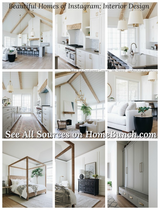
 Tom Brady and Gisele Bundchen’s Home – Full House Tour.
 Beautiful Homes of Instagram: Modern Farmhouse.
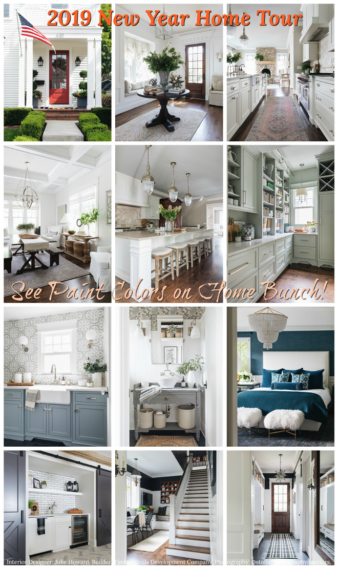 2019 New Year Home Tour.
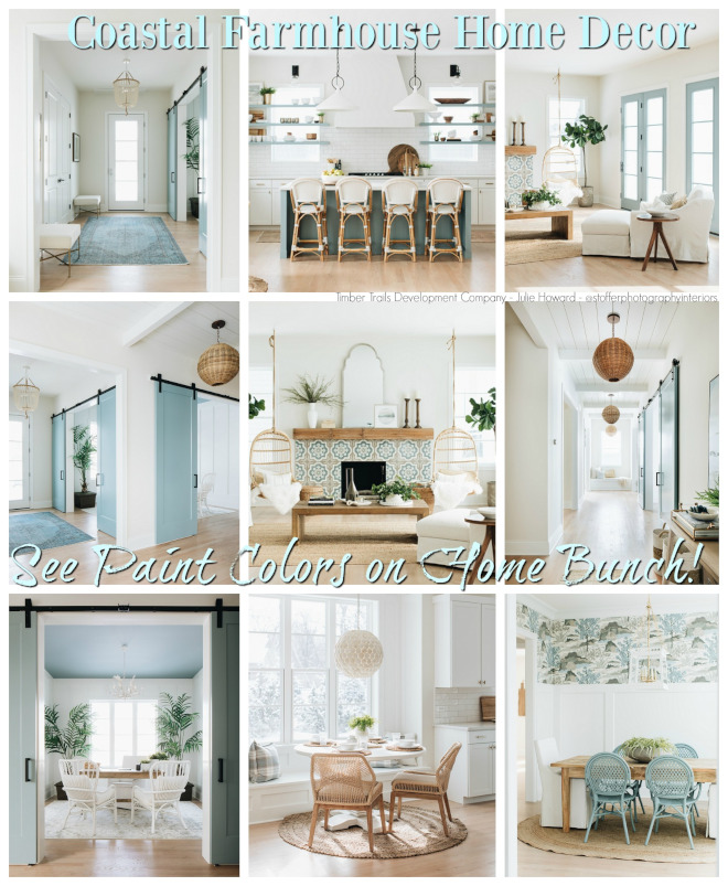 Coastal Farmhouse Home Decor.
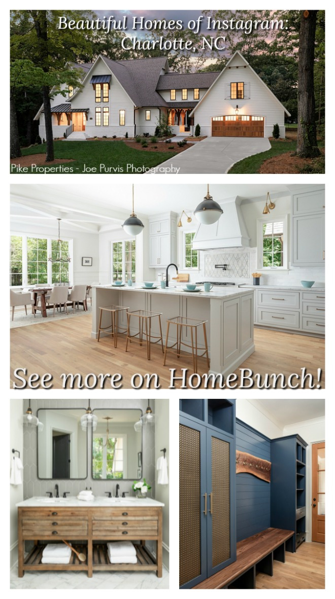 Beautiful Homes of Instagram: Charlotte, NC.

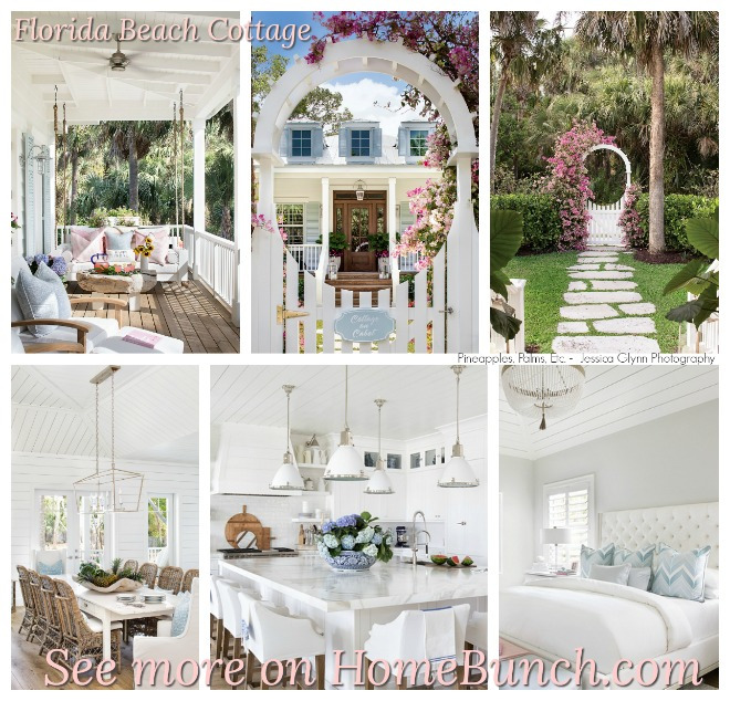 Florida Beach Cottage.
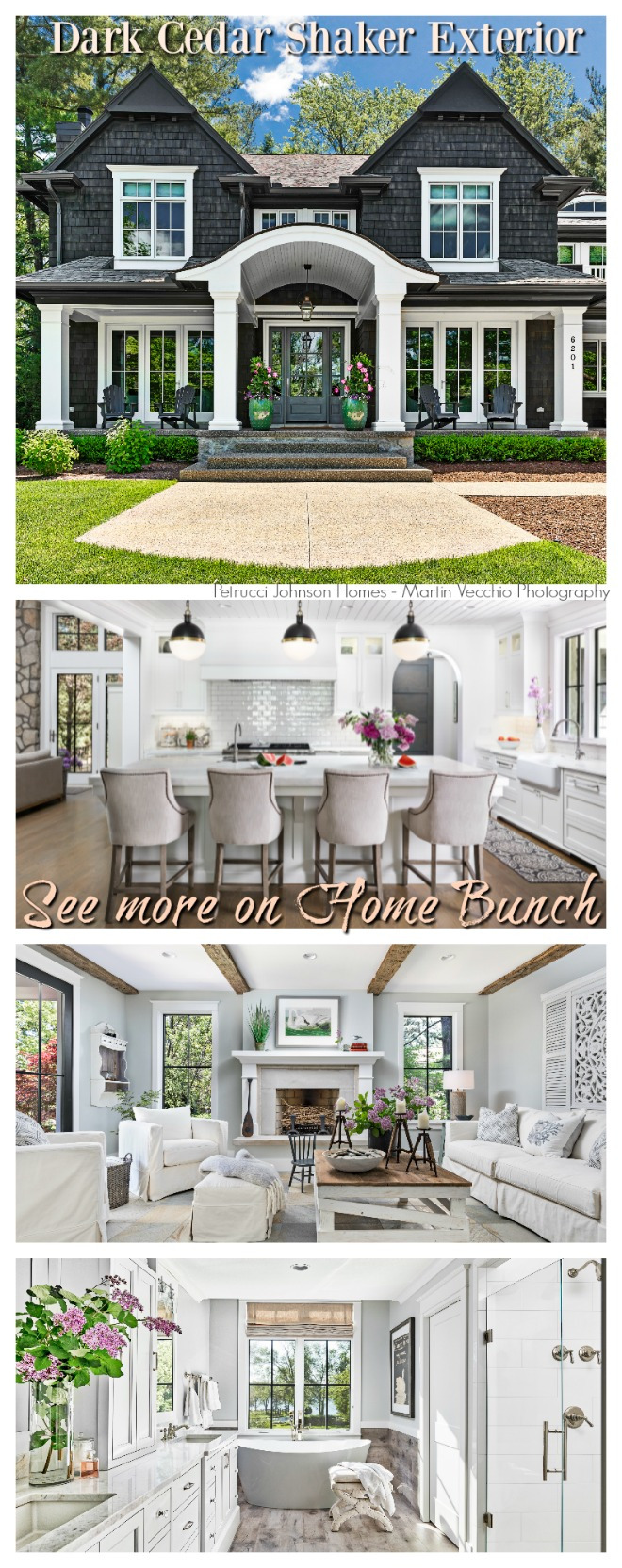 Dark Cedar Shaker Exterior.
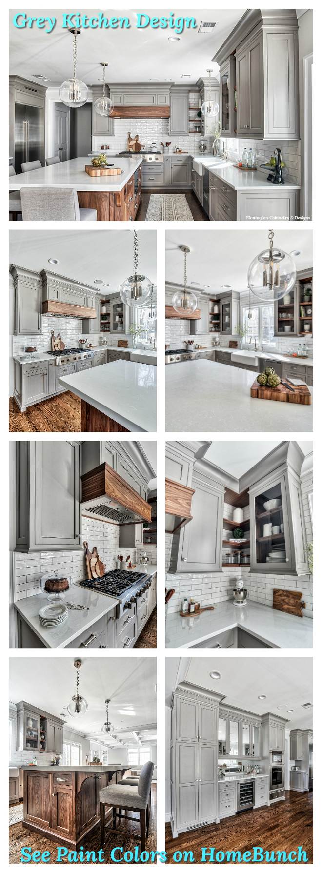 Grey Kitchen Paint Colors.
“Dear God,
If I am wrong, right me. If I am lost, guide me. If I start to give-up, keep me going.
Lead me in Light and Love”.
Have a wonderful day, my friends and we’ll talk again tomorrow.”
with Love,
Luciane from HomeBunch.com
Subscribe to get Home Bunch Posts Via Email
Gorgeous home! Simply beautiful. Thx for sharing.
I love Selena’s home and am so glad you included her in The Beautiful Home series! It’s amazing that she and her husband can make so many beautiful things. I’m heading over to follow her on IG.