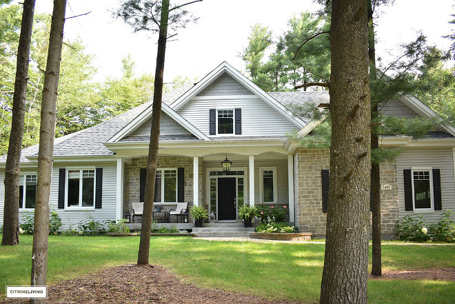
I first asked to feature Tamara Anka’s home (from @citrineliving) because I always loved the classic and custom feel it has. Little did I know that she was budget conscious and very smart when it comes to making a home look a million dollars without having to break the bank. I honestly can’t tell how much she inspired me. She even has woken me up about where to shop in Canada! I don’t say this often but I feel that it can be very frustrating to shop for your home when you live in Canada. I find that furniture and home décor in general is much more expensive here than in the States and it’s harder to get the right look for less. Tamara’s home is proof that it’s possible to create a home that is classy using many Canadian companies and shopping online – which I also find to be much harder to do than in America. I am so proud, happy and inspired by today’s Beautiful Homes of Instagram and I think you will love to see this home, regardless where you live!
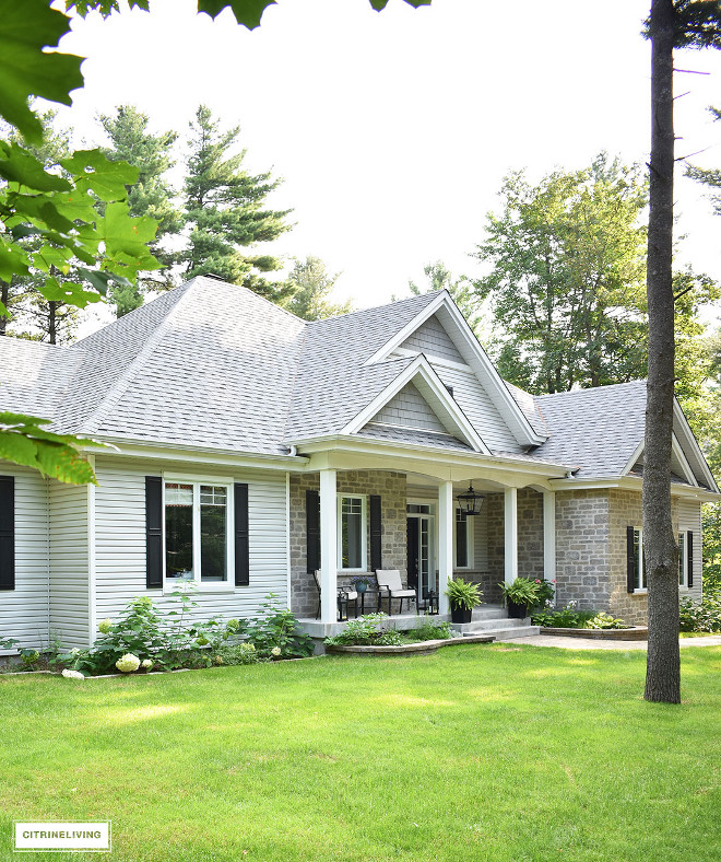
We’re two Designers/DIYers who built our home seven years ago, with the intention of flipping it within a year or two. It was built for a buyer in mind, so at the time, we wanted to keep the cost as low as possible by making budget conscious decisions, and create a home that would be enticing for the market. We love our private, wooded lot so much that we ended up staying and still call this spot our home today. We finished the majority of the interior ourselves – laying hardwood floors, installing all the trim, woodwork and moldings, and painted every inch! Our home is constantly evolving as we add new DIY projects to the list and one day we dream of building another home, or renovating this one to suit our needs.
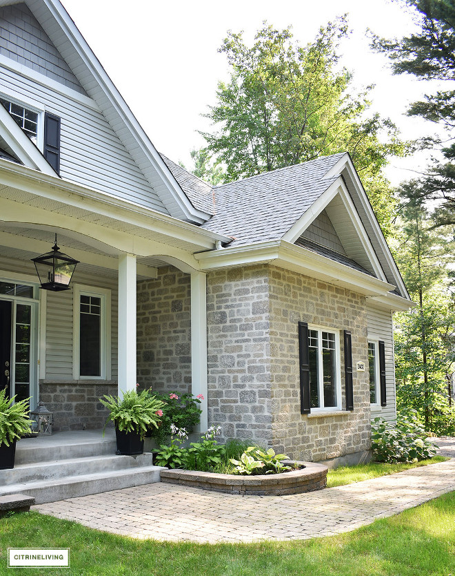
Our home has a small footprint, 1700 sq ft – and it was crucial to us to create a feeling of openness and give the impression that it is larger than it is. Keeping an open floor plan and raising the ceilings to 11 feet in the living/family room and main hallway/transition space, was an integral part of creating this feeling in our home.
Stone and window shutters adds to the curb-appeal of this custom home.
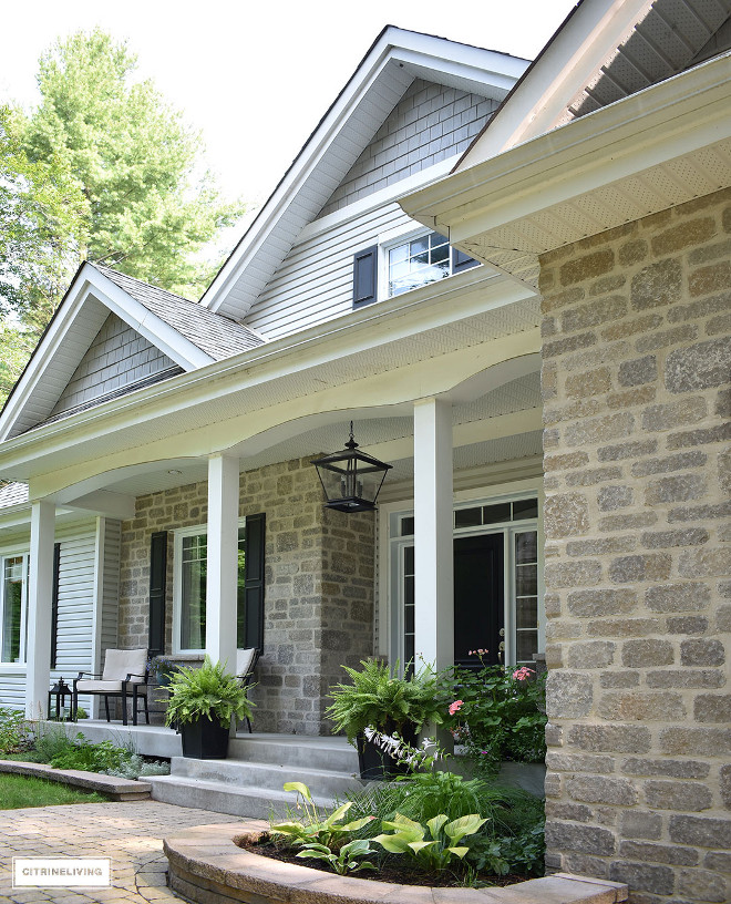
The exterior pendant is Crestwood Pendant by Progress Lighting.
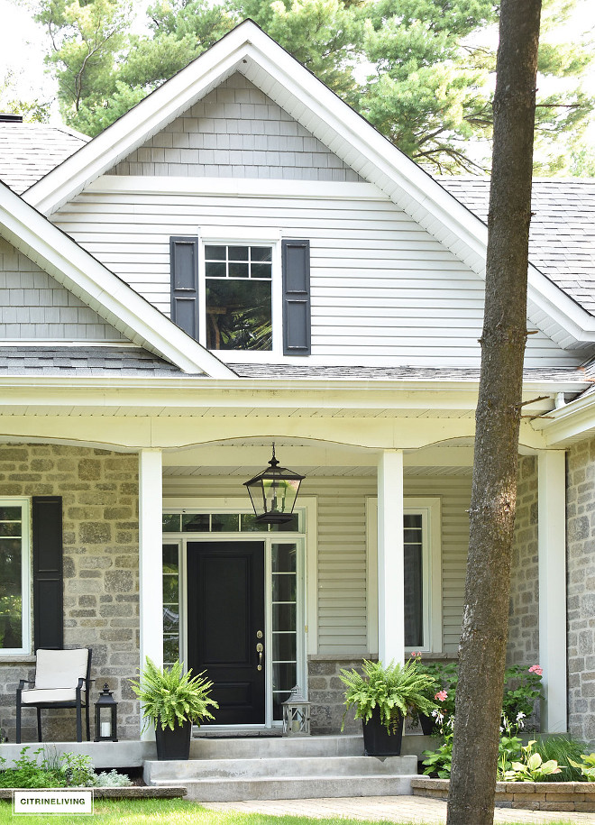
The black front door paint color is Canadian Tire Premier Exterior Paint – Midnight, Semi-gloss. What a timeless paint color!
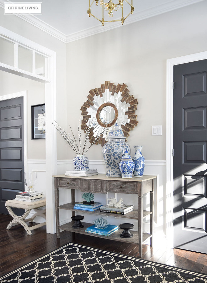
Get ready to fall in love with this beautifully appointed home! Paint color is “Collingwood OC-28 Benjamin Moore”.
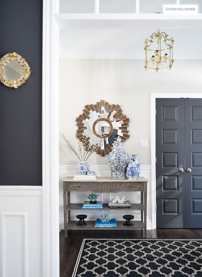
Dark Grey Interior Door Paint Color: Behr Cracked Pepper.
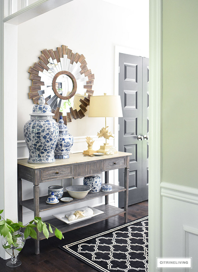
The entryway mirror and decor are all from HomeSense. Rug is Home Depot.
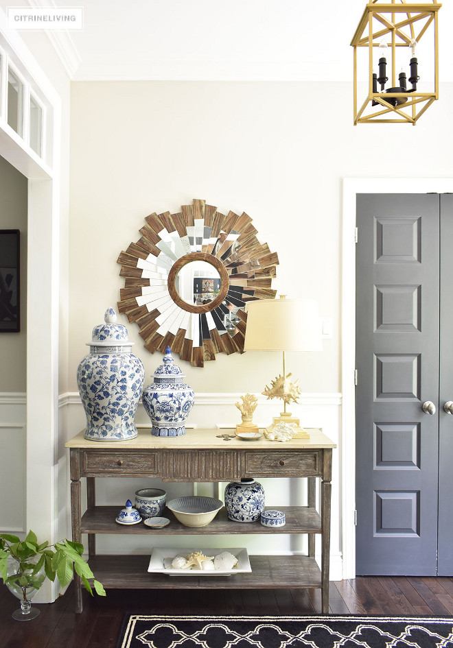
Console table is from HomeSense.
Entryway Lighting: Progress Lighting – Peidmont – hand-painted by the homeowner for a two tone look.
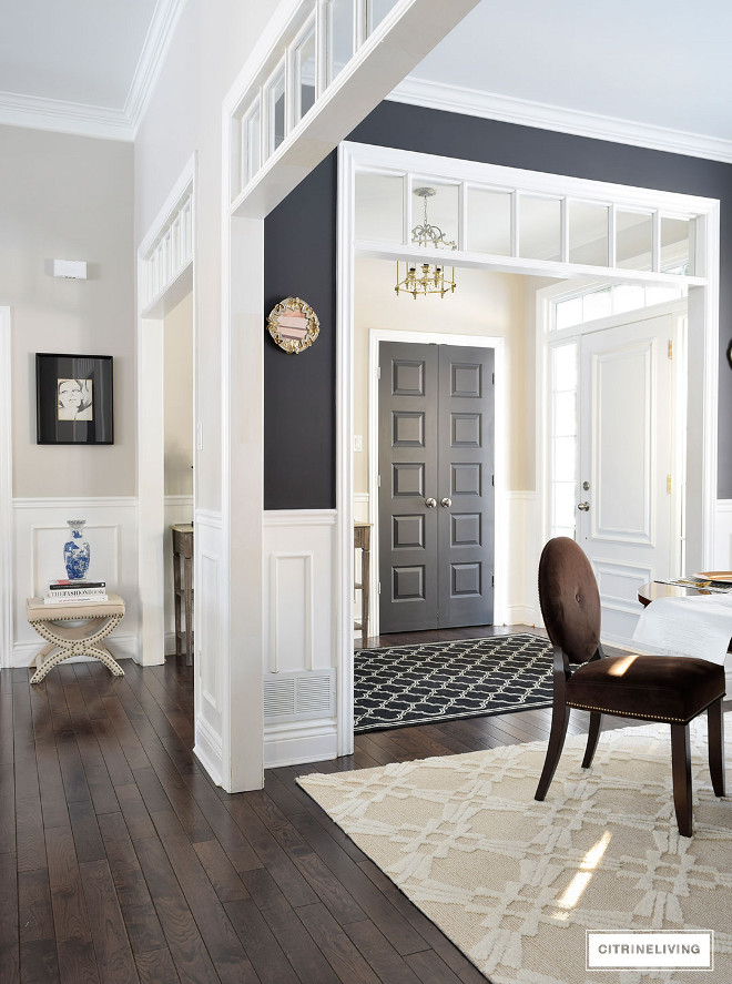
Adding woodwork and details with a ‘custom’ feel was an important part for the homeowner – the wainscotting is applied molding and chair rail, all painted a bright, crisp white. All Trim/Wainscotting Paint Color: Ultra Pure White by Behr.
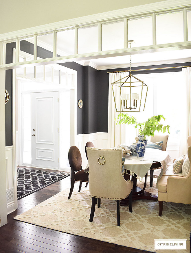
The dining room with it’s black walls is always a conversation piece in our home! It’s small but enveloping, and guests always love to linger on the settee after a meal with good conversation! I wanted the feeling of this room to be warm, welcoming and transportive – to give you the feeling that you were elsewhere other than your everyday world! The plan is to one day add built-in shelving flanking the settee as well.
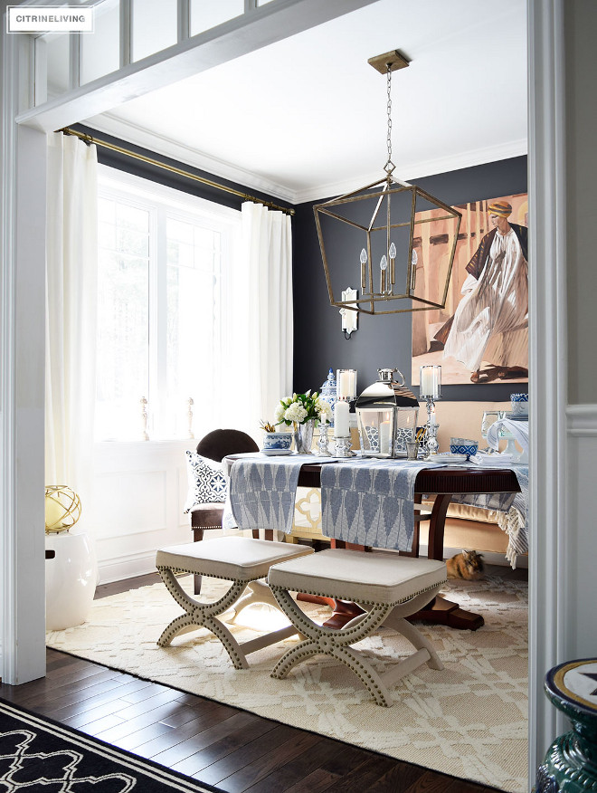
Blue and white is a passion of mine, having grown up around it and having a mother who collected it as well, it’s become a key part of the decor in our home.
Dining room Decor: All pieces are from HomeSense.
Upholstered Stools – Bouclair.
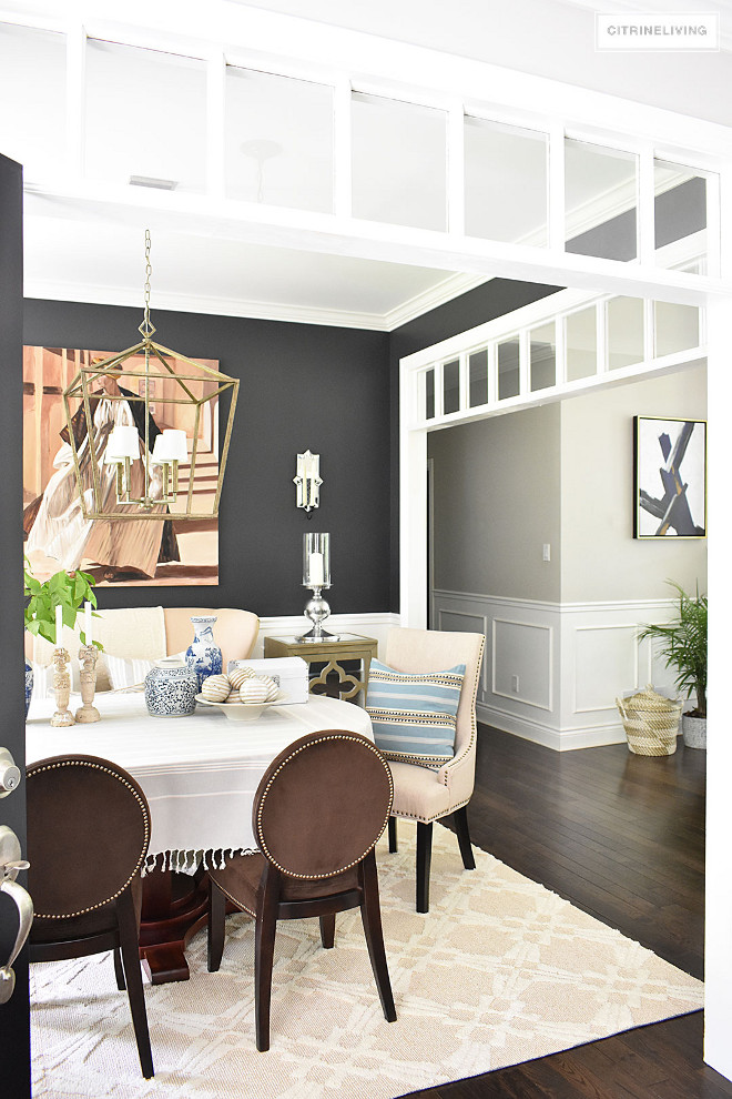
I am loving the contrast the dark paint color in the dining room creates against the neutral color on the remaining walls.
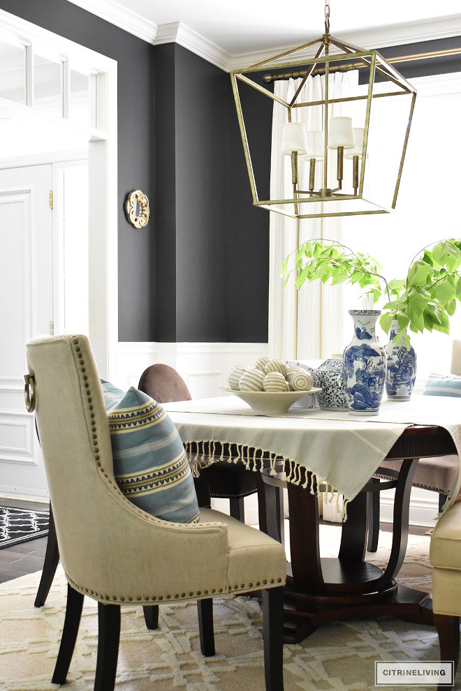
Lighting is from Wayfair – Lighting is Varnum 4-Light Foyer Pendant by Three Posts in Vintage Gold – with shades added from Amazon.
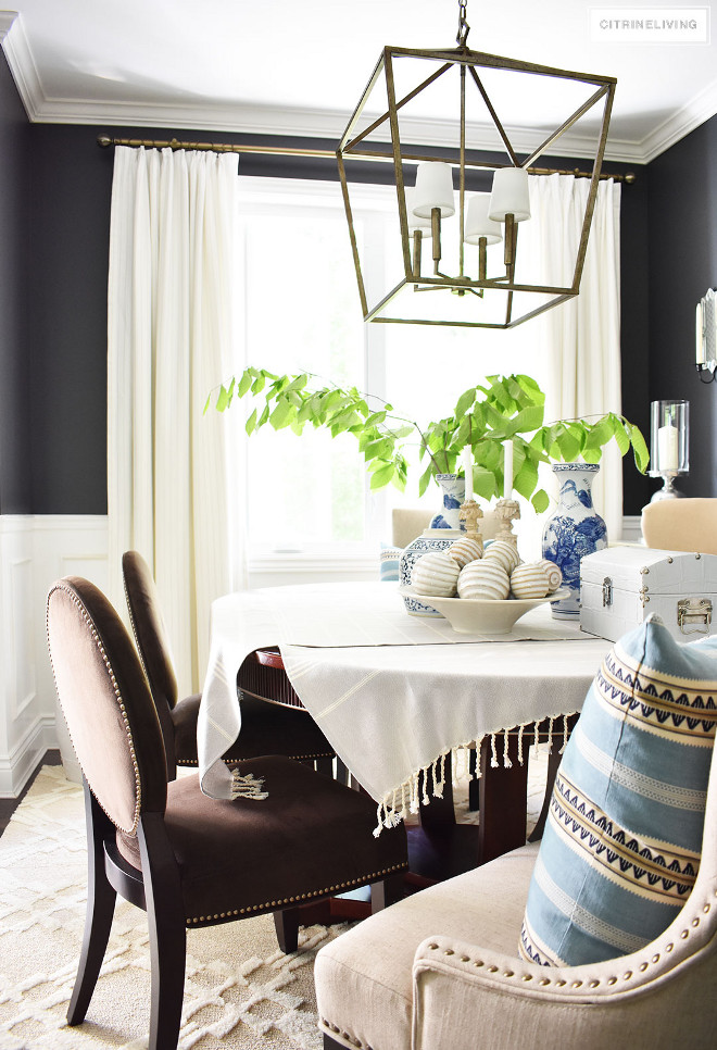
Paint color is Cracked Pepper PPU18-1 by Behr.
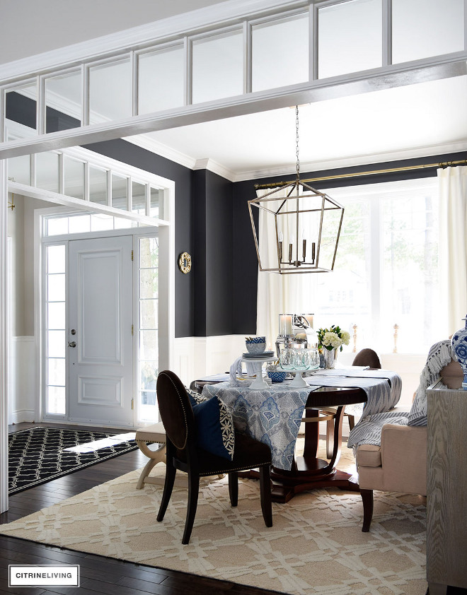
Rug is from Wayfair.
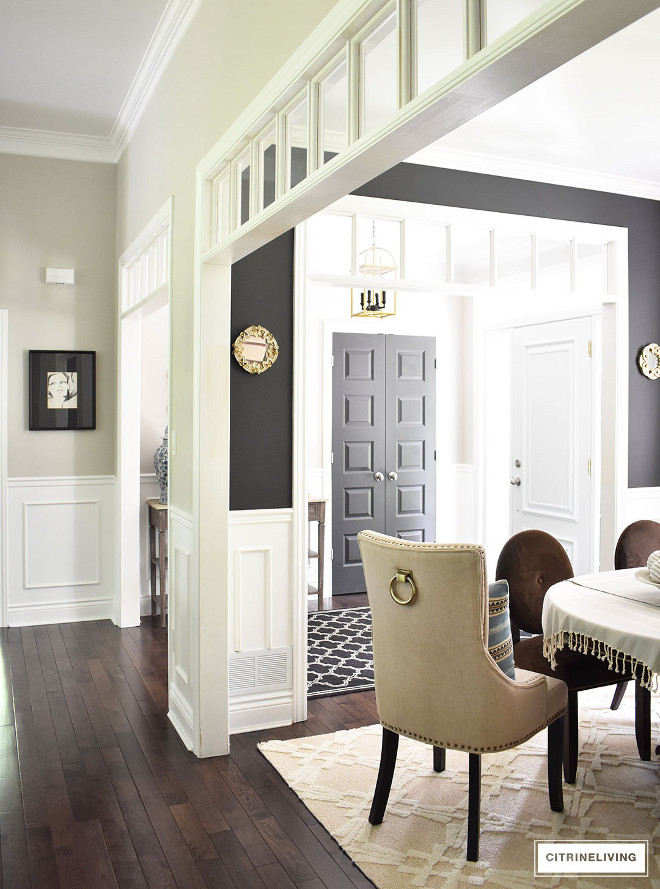
Dark hardwood flooring is Mixed grade oak with a walnut stain.
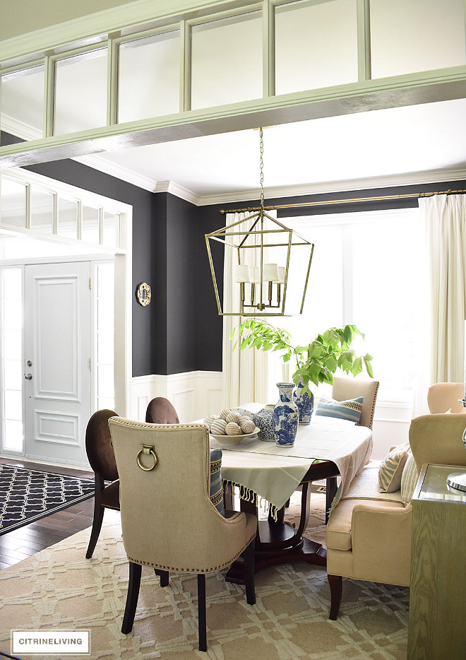
The dining room features custom drapes from Tonic Living.
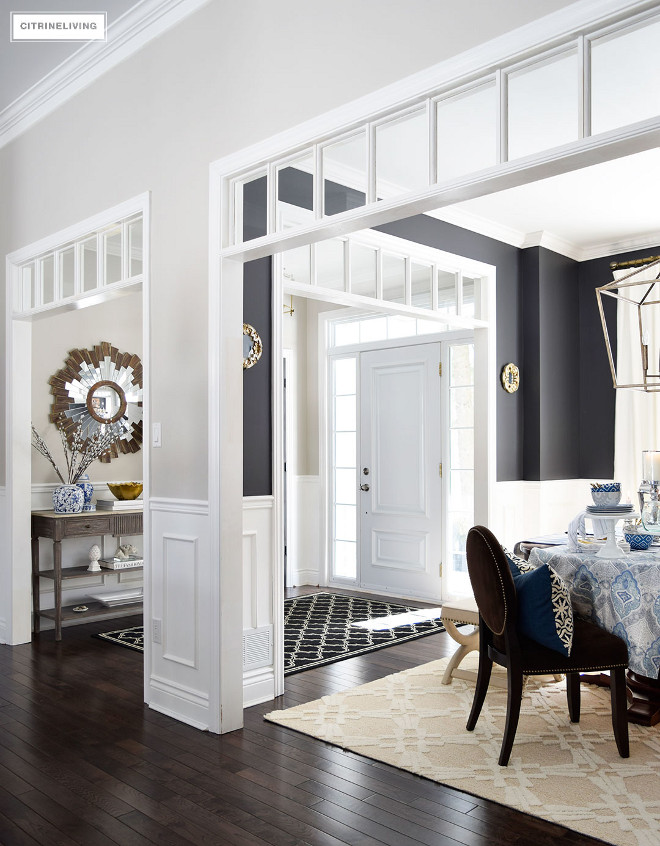
Large openings with architectural details such as transoms, between the entryway, dining room and main hallway creates visual interest.
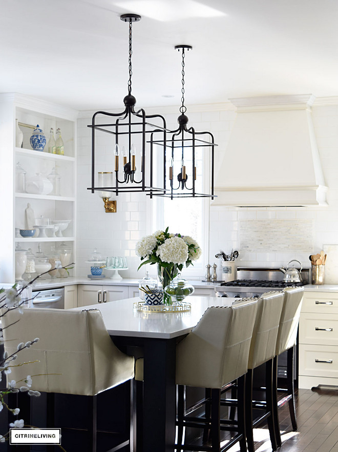
The kitchen was designed around an ‘old-world-traditional-meets-modern’ look. The back wall, as the focal point, has no upper cabinets and it features counter to ceiling white subway tile. The barstools were the driving force behind the kitchen and the jumping off point for the design of this space!
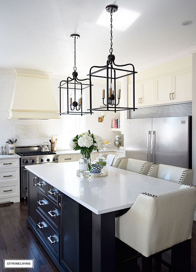
Kitchen island features Shaker style cabinet with added trim – MDF, Black.
Kitchen Island Dimension : 7’2″ x 3’7″
Kitchen Barstools: HomeSense.
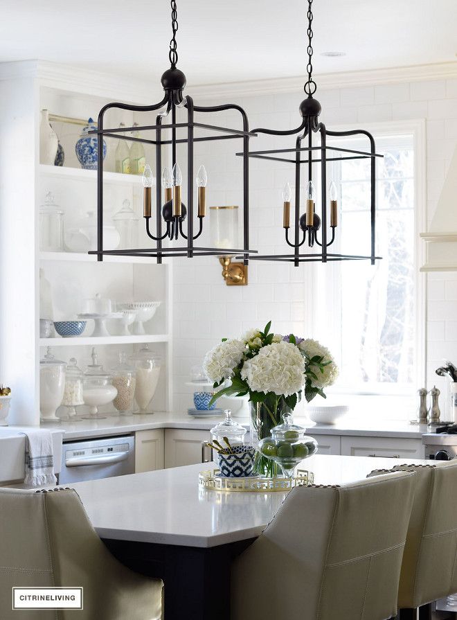
Kitchen Lighting: Progress Lighting – Assembly Hall Pendants.
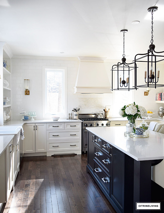
Kitchen Cabinet Hardware: Chrome Pulls are Hickory Hardware Studio Collection Bright Nickel Pull.
Ceilings are 9’.
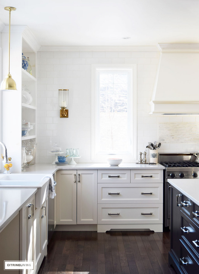
Perimeter cabinets are Shaker style with added trim – Polyester, Ivory.
Farmhouse Sink: Ikea.
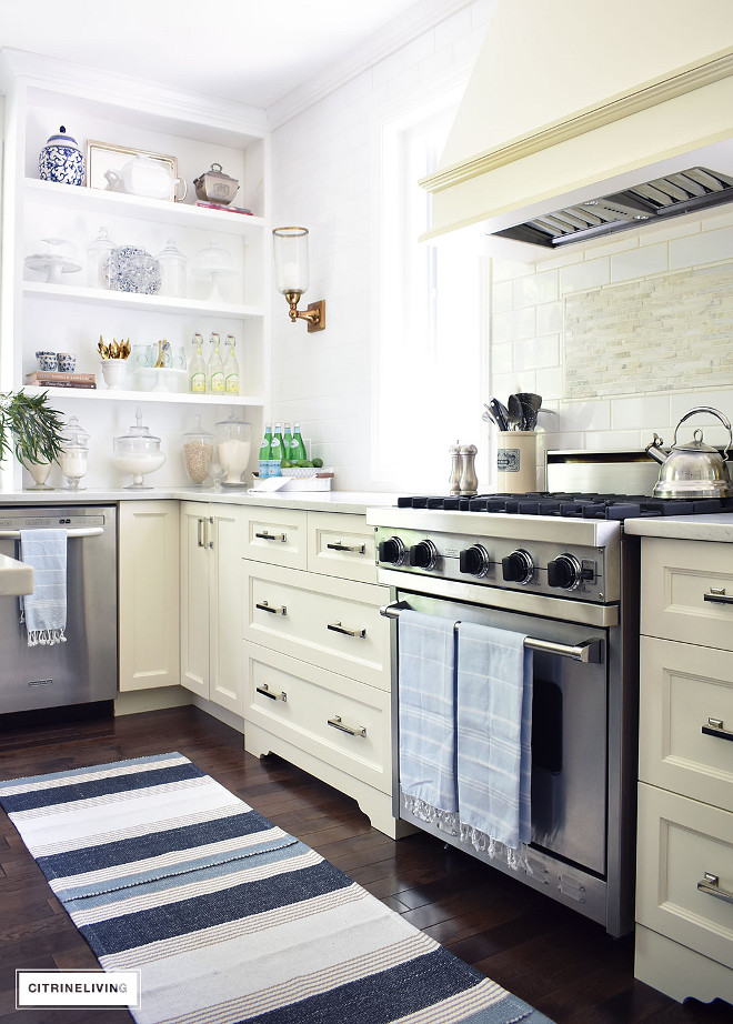
The homeowner added a blue and white striped runner and some turkish towels to bring a coastal vibe to her ivory kitchen.
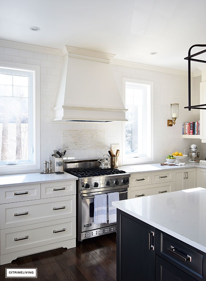
The backsplash is white ceramic subway tile with marble inset above stove.
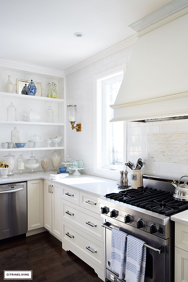
Countertop is Quartz in Misty Carrera.
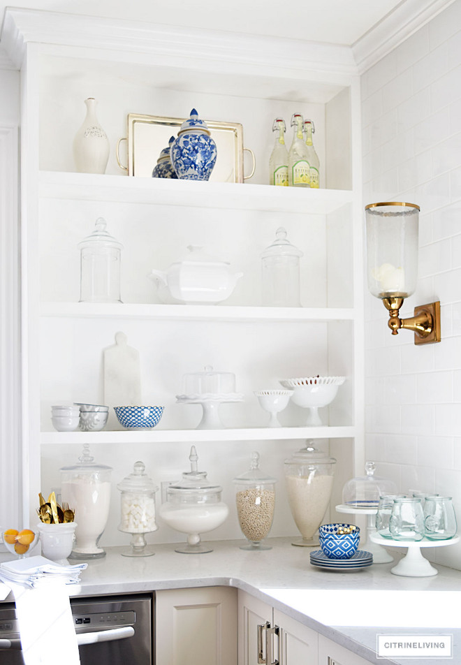
Having an open shelf cabinet is a practical, economical and beautiful addition to any kitchen.
Kitchen Candle Sconces – The Bombay Company.
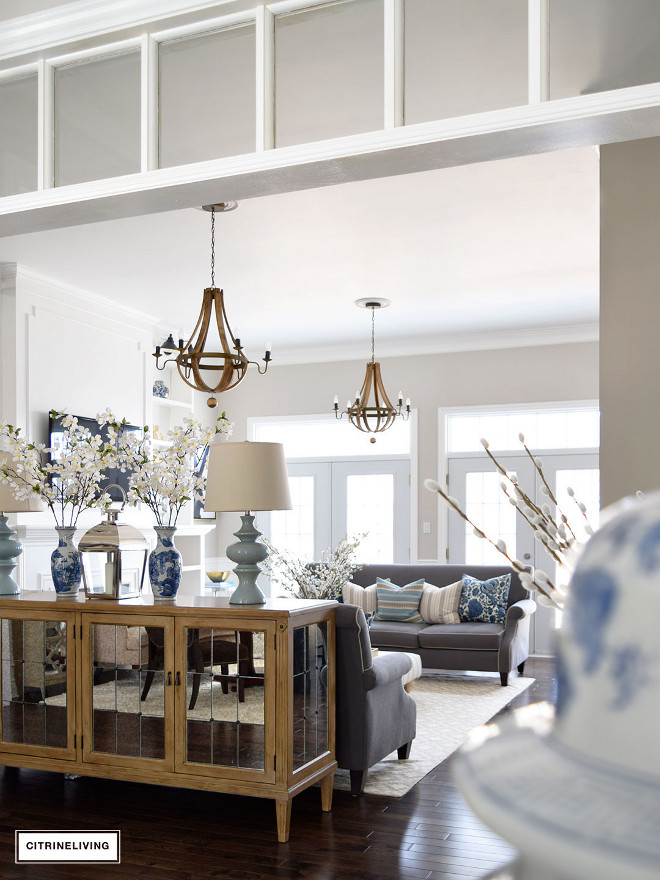
Our home has an east coast traditional look and feel, and my style is collected and curated. No matching sets of furniture in here!
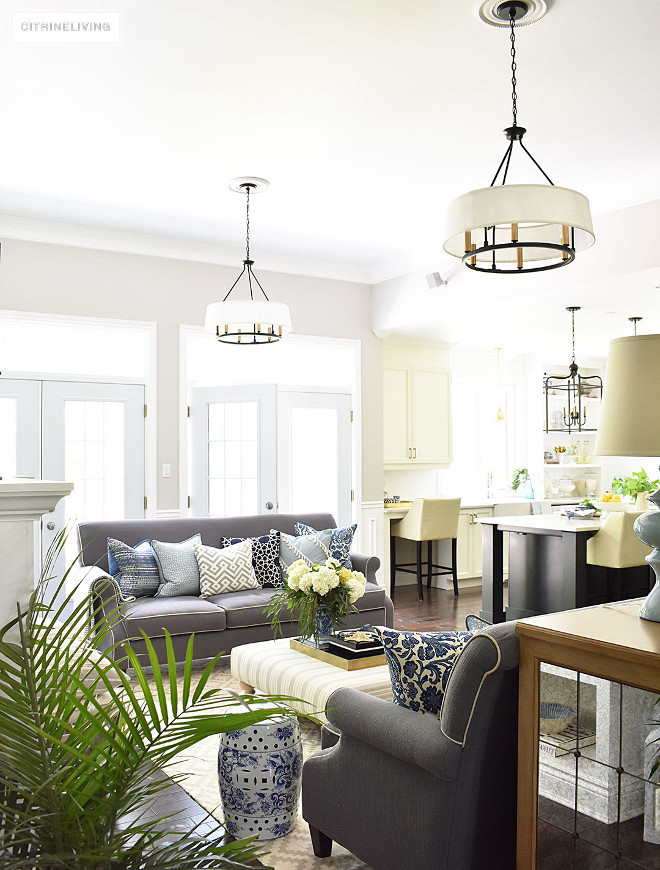
The kitchen opens directly to the family room.
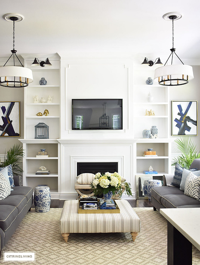
Tamara added molding and trim above the fireplace to give it a custom look. Doesn’t it look great?
Lighting is Progress Lighting – P4618 – Cherish – Six Light Circle Chandelier.
Rug is from HomeSense.
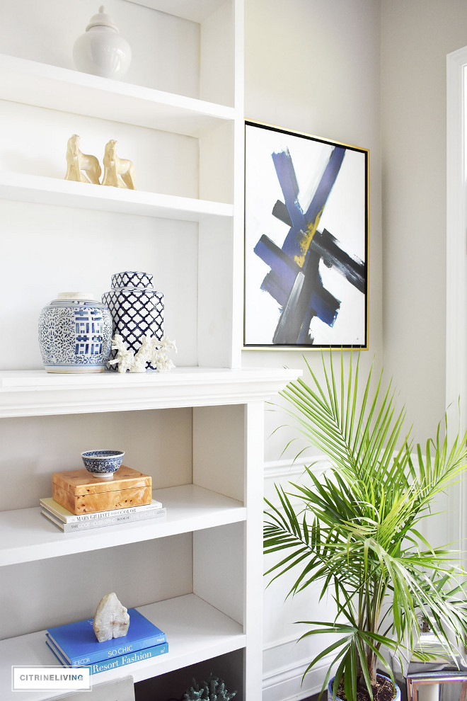
Tamara also built the bookshelves with her husband to add more storage and interest to their living room. I really like how clean and simple she kept them.
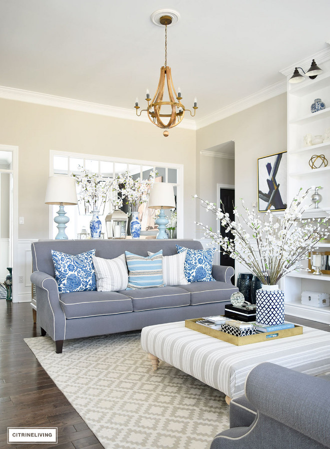
Living Room Ottoman: The Bay (it’s very old!), new feet and recovered many times!
Lamps are HomeSense.
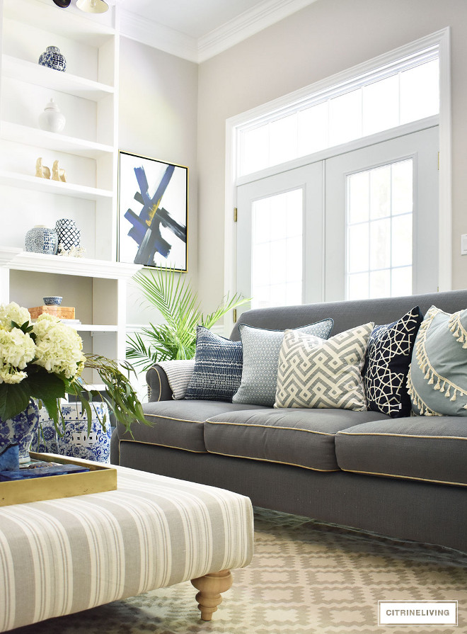
The homeowner used the same mix of pillows on both sofas, with one different pattern on each.
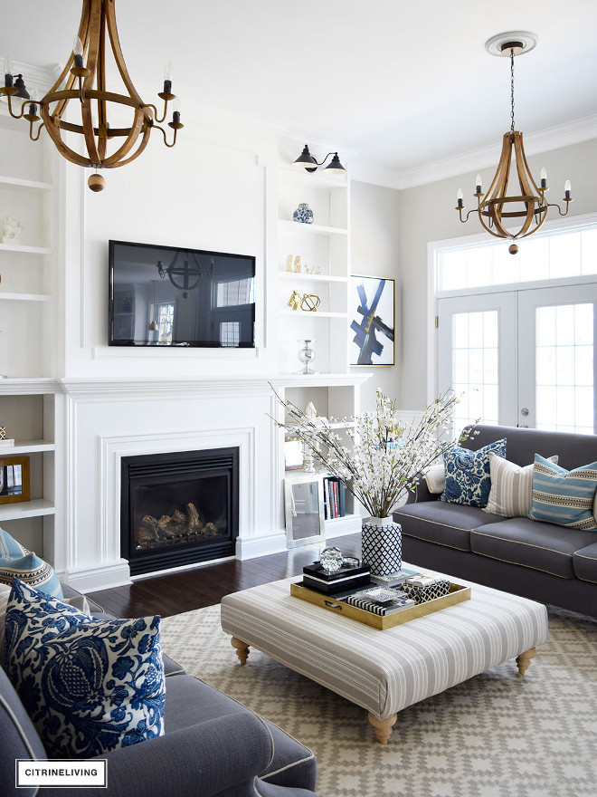
Tamara is always changing the lighting in her home to change the mood of the spaces. These wine barrel chandeliers add a more rustic/farmhouse feel to the living room.
Shelf lighting is from Wayfair.
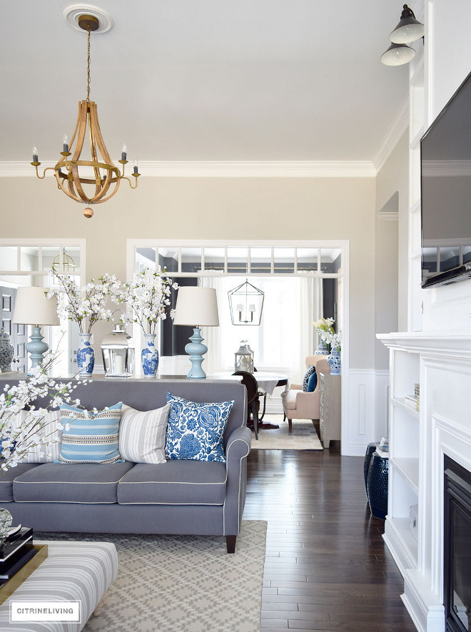
Family room and hallway ceilings are 11′.
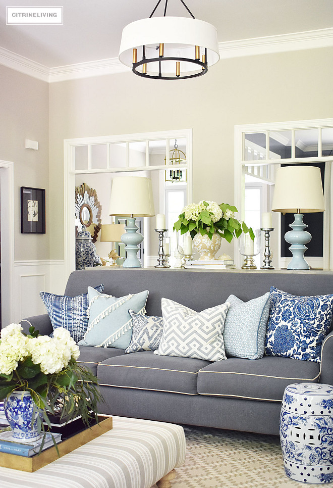
Pillows are from Tonic Living and HomeSense. Aren’t they stunning?!
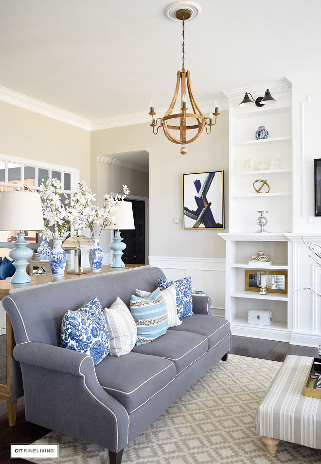
The grey sofas are Decor-rest by Steven and Chris.
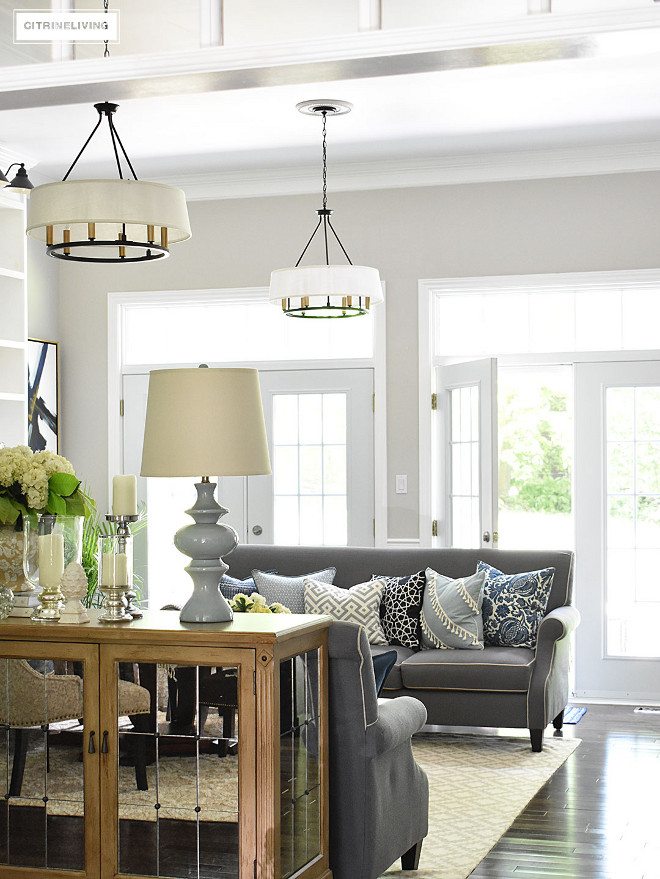
Main Wall Color Throughout (entryway, hallway, living/family room): “Benjamin Moore Collingwood“.
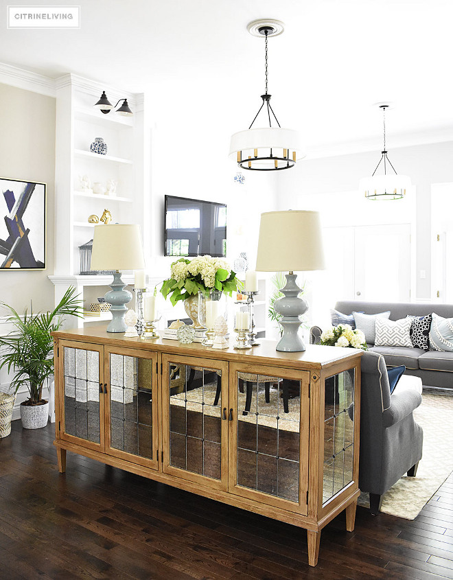
The mirrored buffet is from Structube.
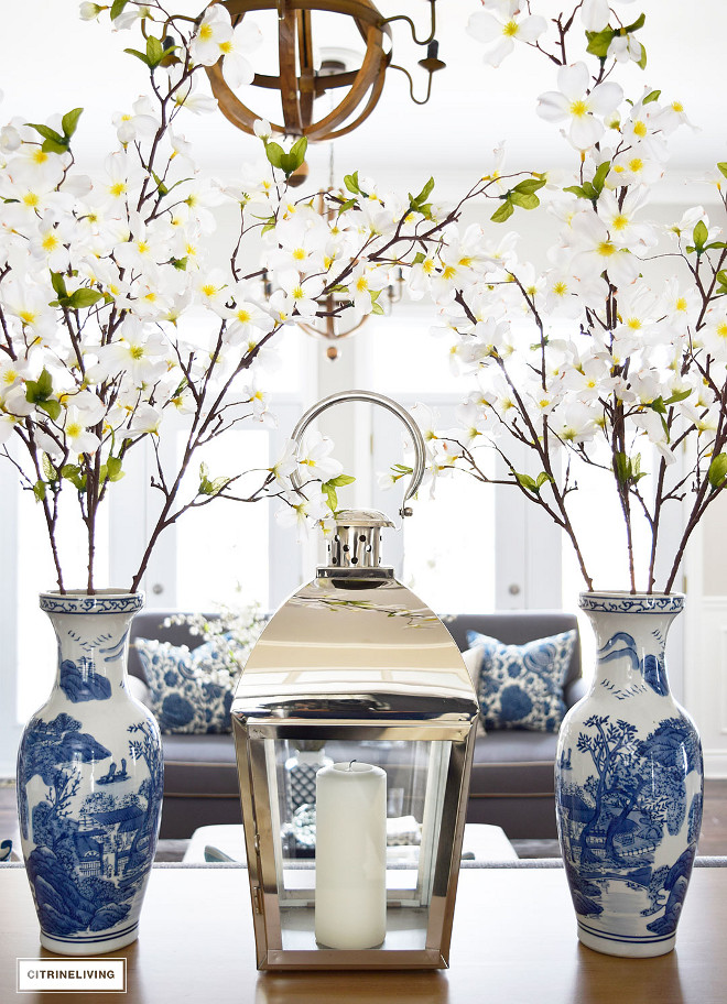
Decor is from HomeSense.
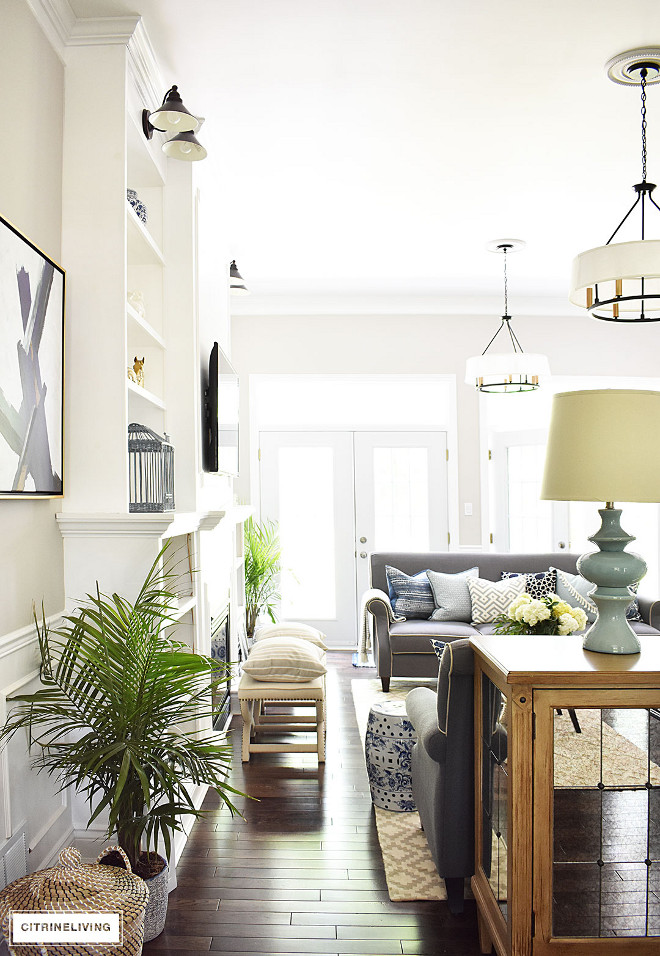
The beautiful dark hardwood flooring brings warmth to this living room. Flooring is Mixed grade oak with a walnut stain.
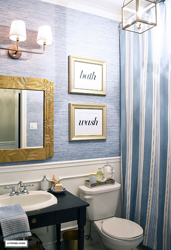
Tamara just gave this bathroom a makeover and it looks amazing! The faux grasscloth vinyl wallpaper looks the same as real grasscloth but it’s ideal for wet spaces such as bathrooms. Wallpaper is Norwall Wallcoverings Inc. from Wayfair.
Lighting is Darby Home Co.
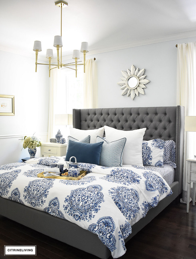
The master bedroom paint color is discontinued but closest match is Lily White by Benjamin Moore.
Lighting is Canadian Tire with shades added from Amazon (Furnishland Set of 5 Off White Chandelier shade, 4-inch Bottom Diameter, 4-inch Height, Cotton).
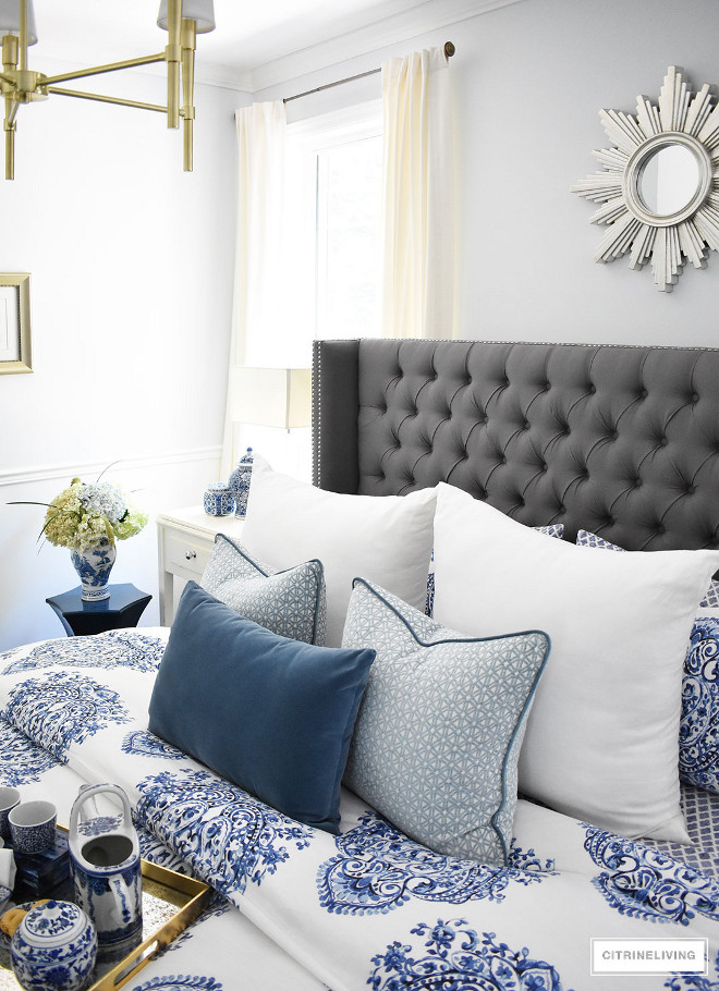
I love how crisp and timeless blue and white bedding looks. The pillow combination complements the classic look.
Bedding and pillows are from HomeSense.
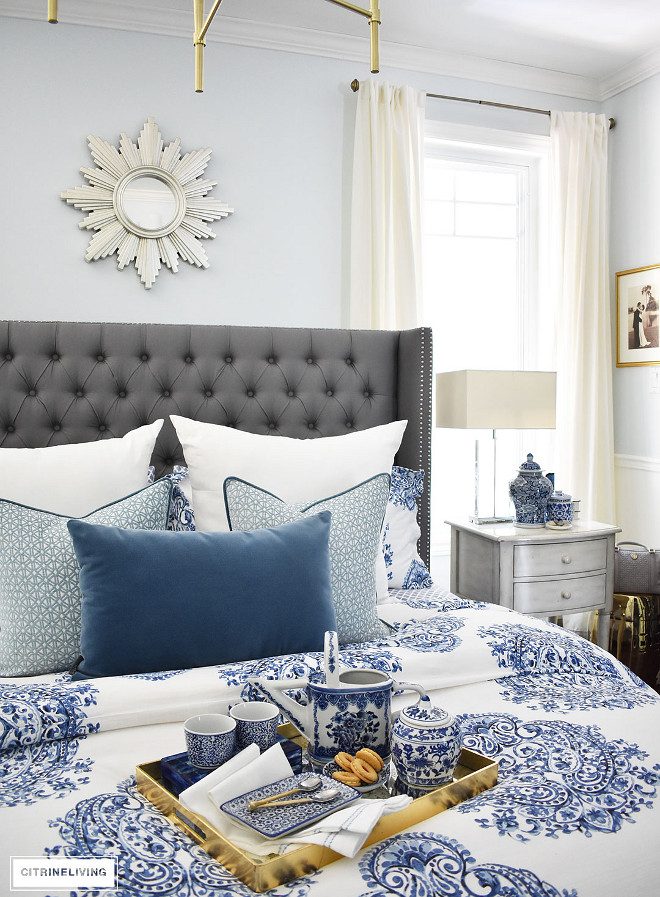
The accessories are also from HomeSense.
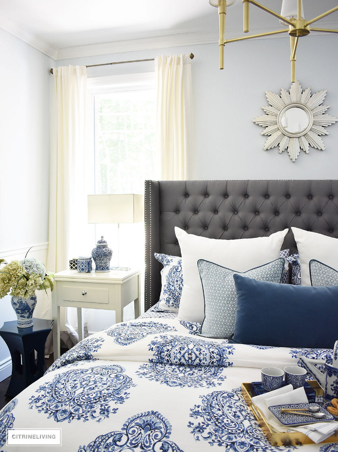
Nightstand: Vintage
Accent Table: HomeSense
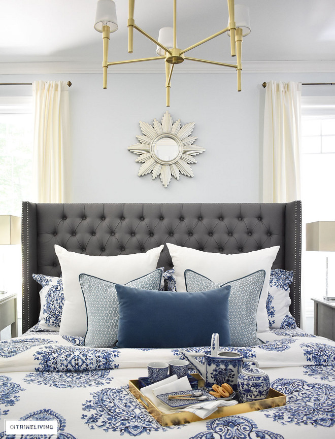
Bed is Versailles – King Size Bed by Structube in Charcoal – $879
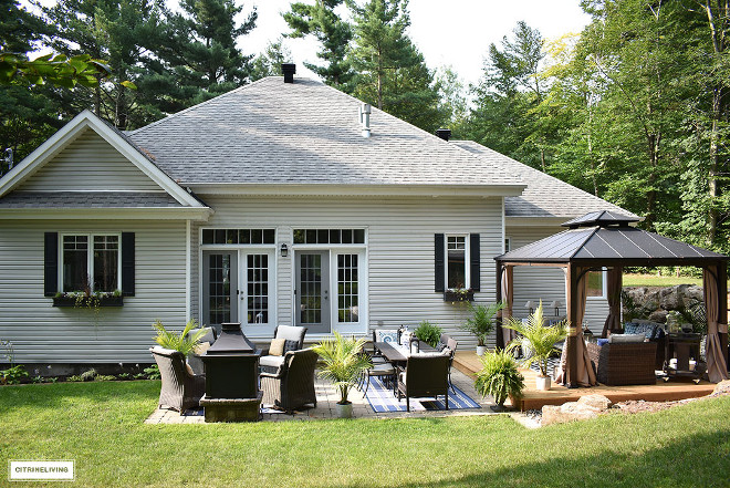
The backyard/patio was designed with three zones in mind – lounge, dining, fireplace/conversation.
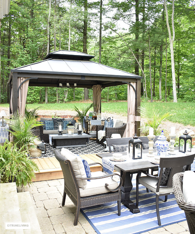
It was crucial to create an extension of the interior of our home and feel as though it was another room that welcomes guests to linger, relax and unwind.
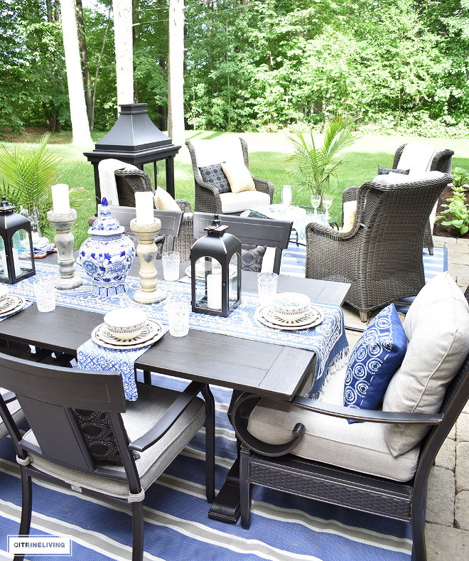
Table and chairs are from Canadian Tire.
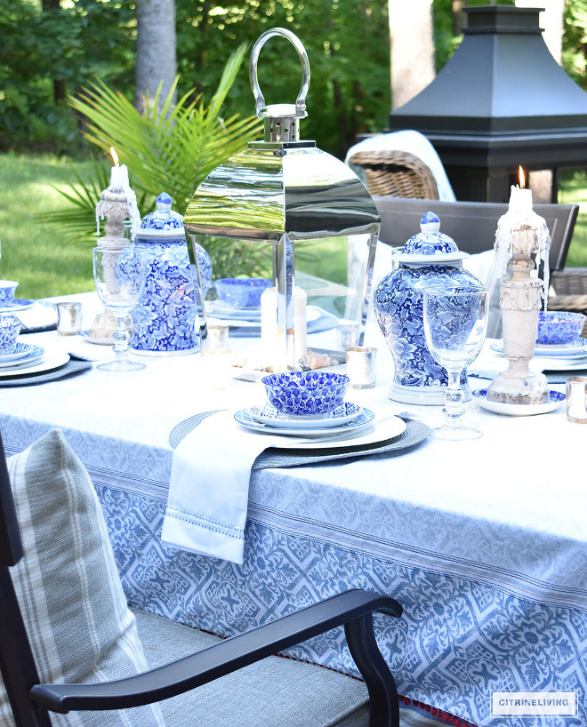
Decor is from Home Sense.
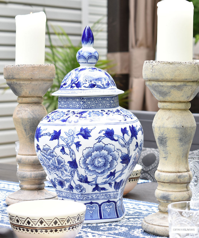
Blue and white decor adds a classic feel to this patio.
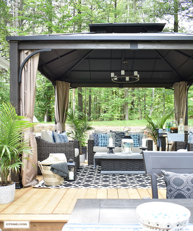
Outdoor Furniture/Decor: All items are from the Canadian Tire Canvas Line and some other pieces the homeowner had for many years.
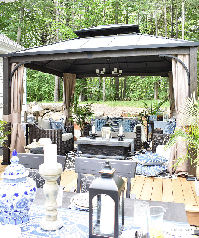
Accessories & Pillows: Canadian Tire & HomeSense.
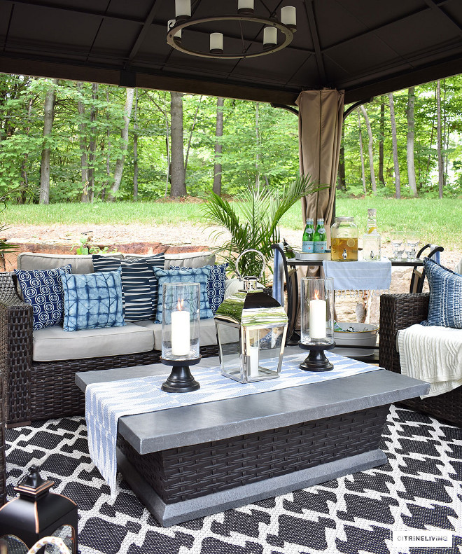
Isn’t this a great place to have some friend over?
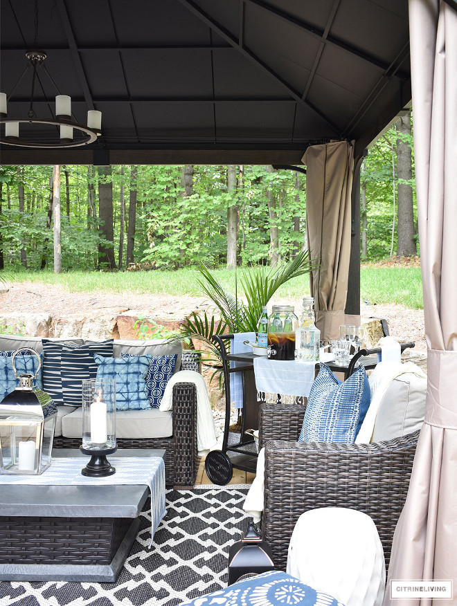
I like the idea of having a bar cart outdoors so you don’t have to keep going inside of the house to grab a drink or snacks.
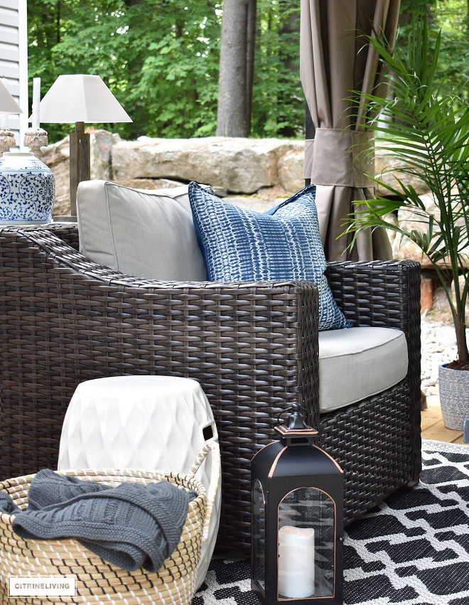
Outdoor chair is from Canadian Tire.
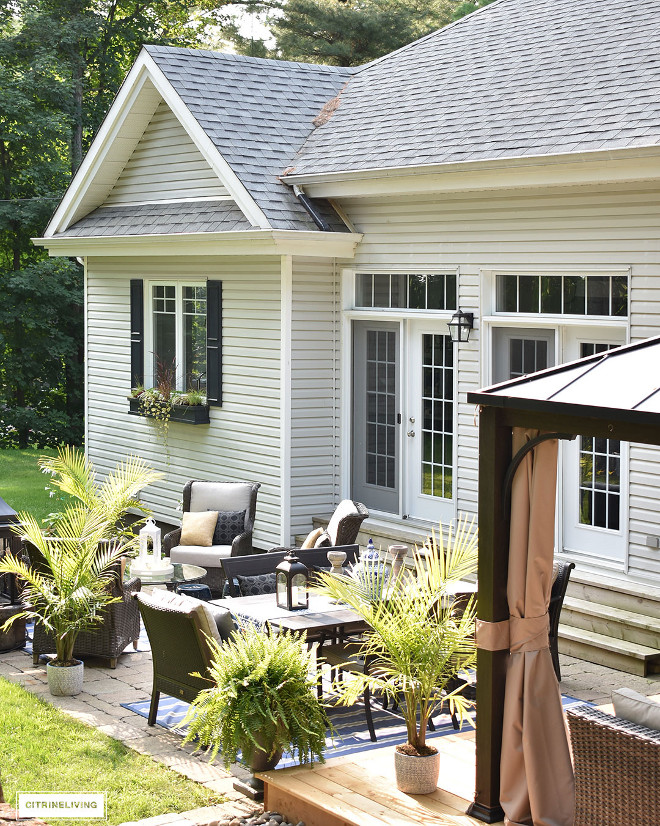
French doors open to a backyard that was truly designed for entertainment.
Exterior lighting is by Progress Lighting.
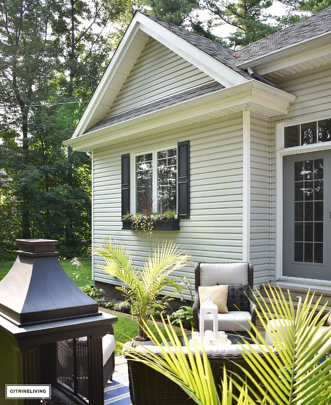
The black shutters and window boxes are painted in Canadian Tire Premier Exterior Paint – Midnight, Semi-gloss.
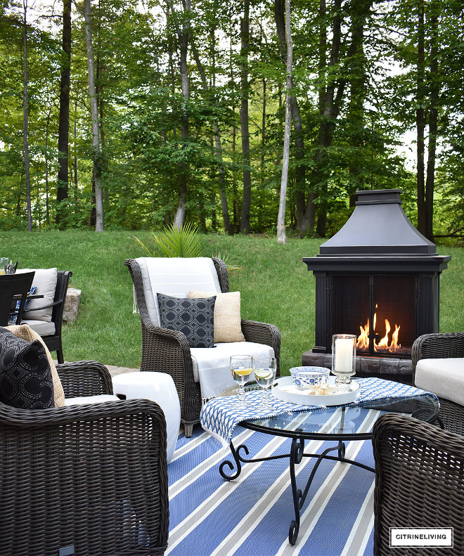
This area features an outdoor fireplace and comfy chairs.
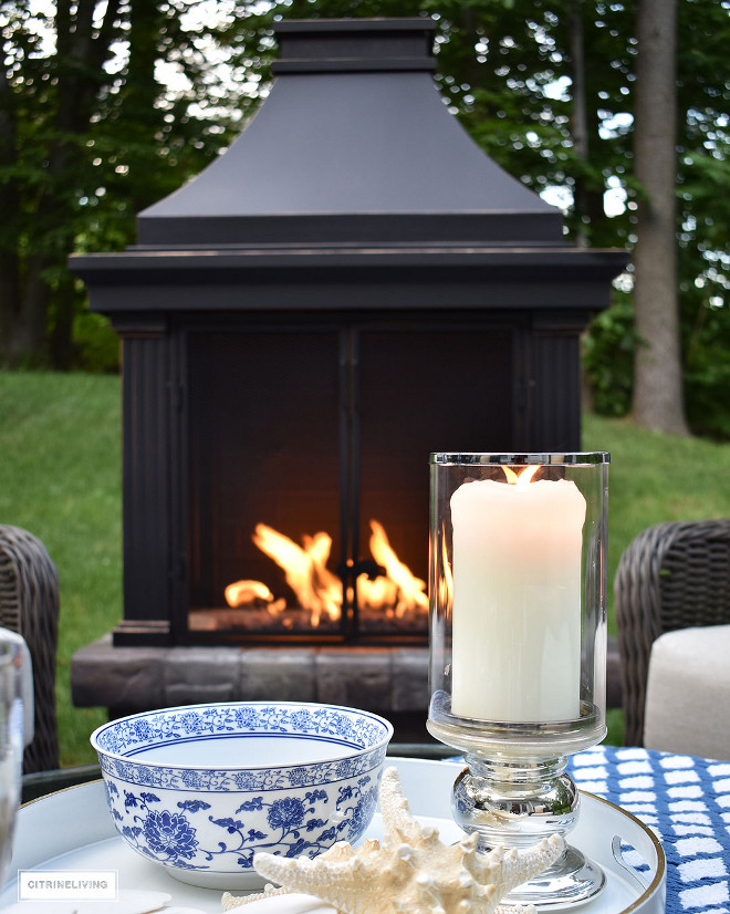
By bringing with the same blue and white color scheme we see indoors to the outdoors keep this entire home feeling connected.
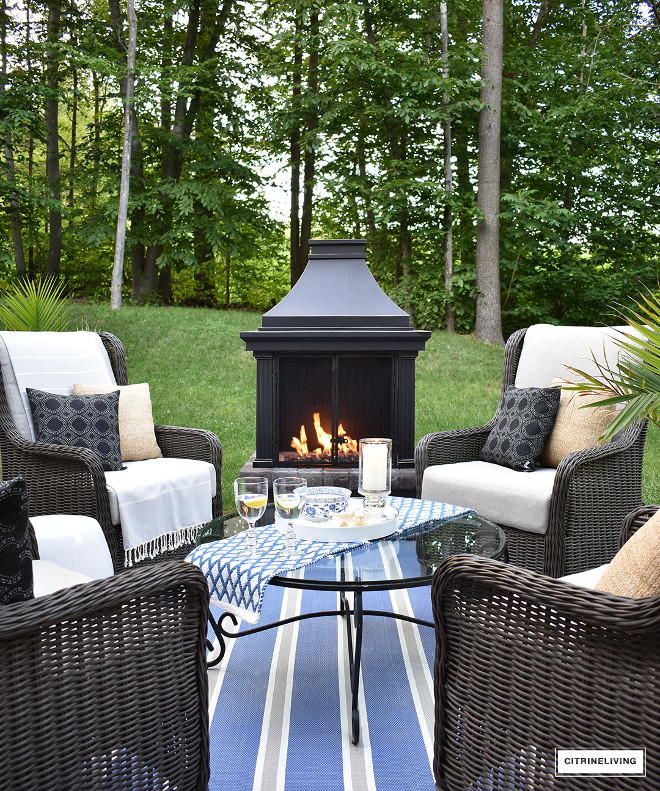
Can you picture yourself here by the fire with a glass of wine in hand? Life is good! 🙂
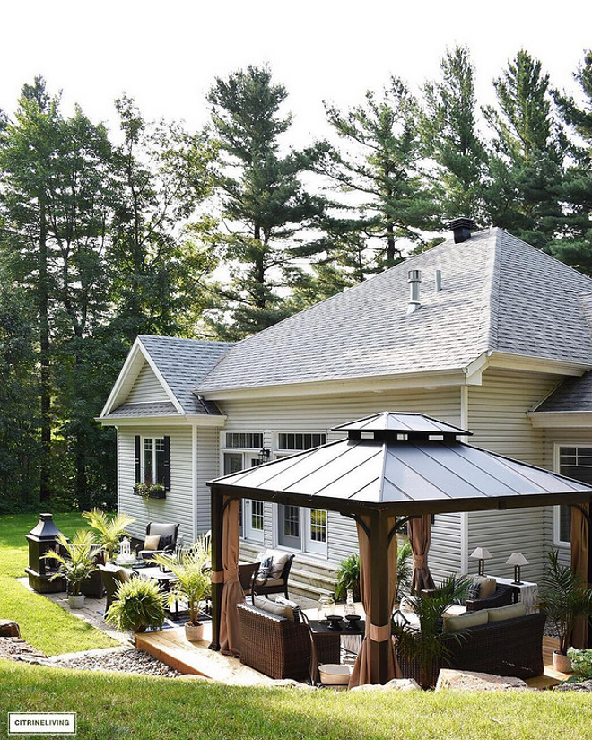
Create a home that makes not only yourself feel at home but also your family and friends when they come to visit.
Thank you for shopping through Home Bunch. For your shopping convenience, this post may contain AFFILIATE LINKS to retailers where you can purchase the products (or similar) featured. I make a small commission if you use these links to make your purchase, at no extra cost to you, so thank you for your support. I would be happy to assist you if you have any questions or are looking for something in particular. Feel free to contact me and always make sure to check dimensions before ordering. Happy shopping!
Wayfair: Up to 75% OFF on Furniture and Decor!!!
Serena & Lily: Enjoy 20% OFF Everything with Code: GUESTPREP
Joss & Main: Up to 75% off Sale!
Pottery Barn: Bedroom Event Slale plus free shipping. Use code: FREESHIP.
One Kings Lane: Buy More Save More Sale.
West Elm: 20% Off your entire purchase + free shipping. Use code: FRIENDS
Anthropologie: 20% off on Everything + Free Shipping!
Nordstrom: Sale – Incredible Prices!!!
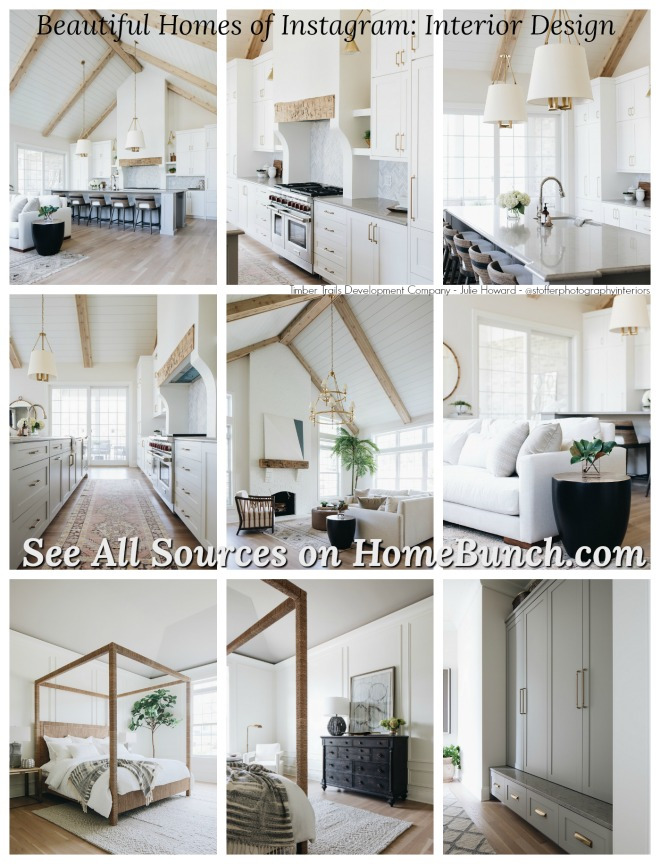
 Tom Brady and Gisele Bundchen’s Home – Full House Tour.
 Beautiful Homes of Instagram: Modern Farmhouse.
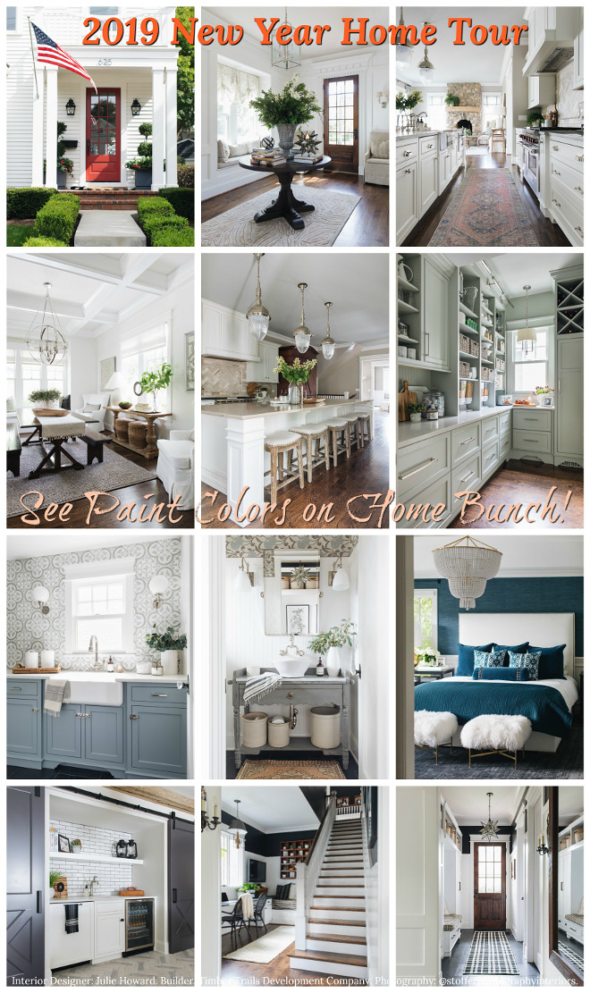 2019 New Year Home Tour.
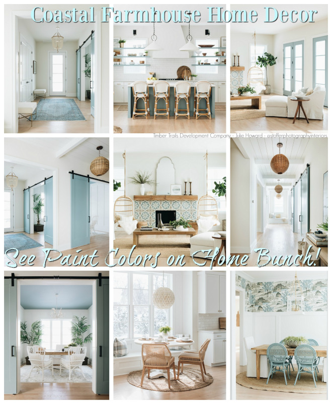 Coastal Farmhouse Home Decor.
 Beautiful Homes of Instagram: Charlotte, NC.

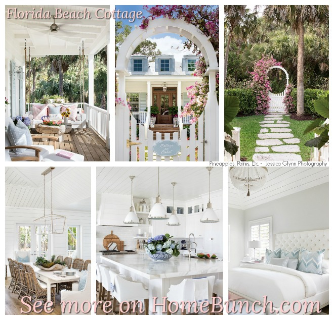 Florida Beach Cottage.
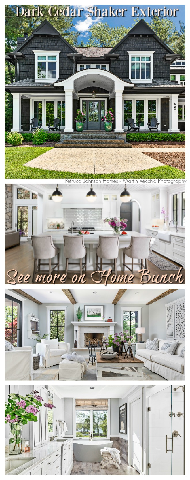 Dark Cedar Shaker Exterior.
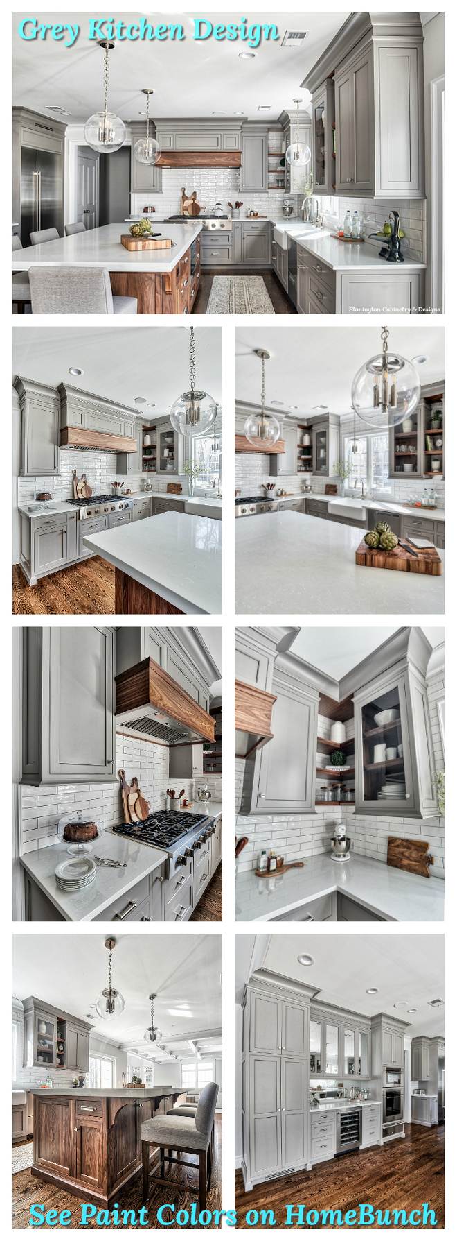 Grey Kitchen Paint Colors.
“Dear God,
If I am wrong, right me. If I am lost, guide me. If I start to give-up, keep me going.
Lead me in Light and Love”.
Have a wonderful day, my friends and we’ll talk again tomorrow.”
with Love,
Luciane from HomeBunch.com
Subscribe to get Home Bunch Posts Via Email
This is one of my favourite posts thus far! I am a lover of smaller, well appointed spaces, as opposed to huge ostentatious homes….this place was built for us! Beautiful!