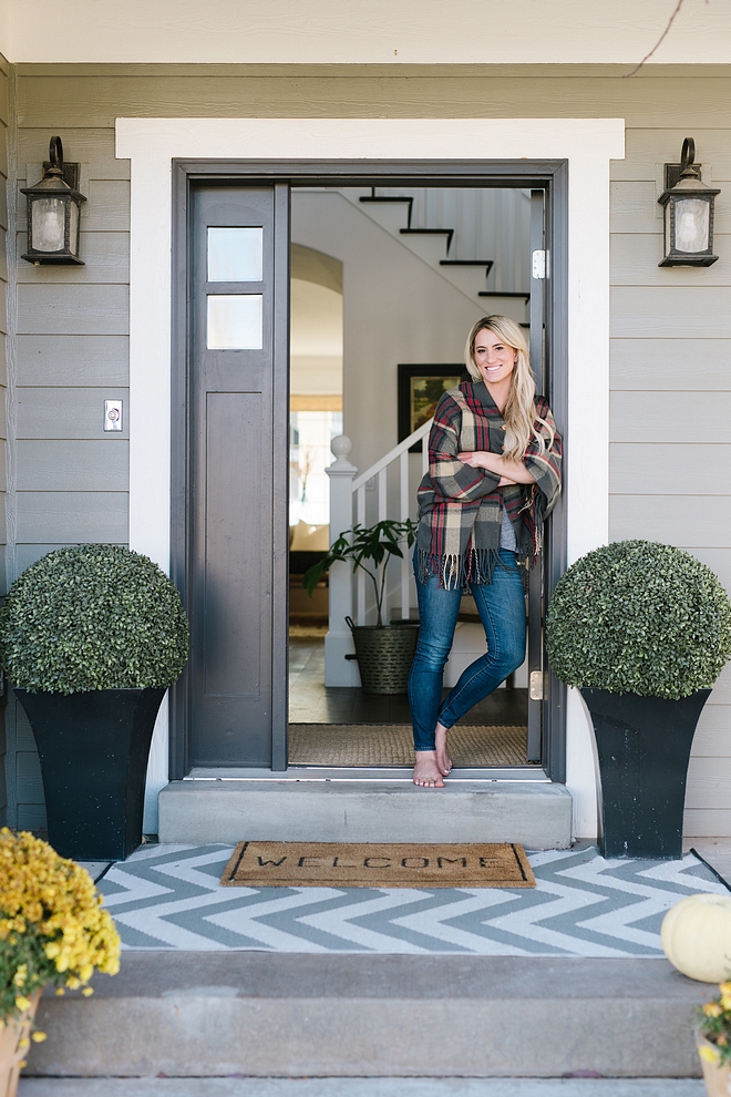
Hello, everyone! Before anything, I would like to wish you all a Happy & Blessed Mother’s Day! I sure wish I was with mine but I am very grateful for spending this special day with my kids. I hope you make beautiful memories today.
Cami Tiffin Clark at @camitiffin and I have so much in common that while reading her intro I kept telling her the things that have also happened in my life. But, coincidences apart, she is someone that is about to inspire you in many ways. She is smart and knows how to renovate and decorate a home like very few people. Her home feels heavenly. One can say it is because of its white interiors but I would have to disagree with that… the feeling of her home comes from this family’s inner Light.
Hey there! I’m Cami, and I couldn’t be happier to welcome you into our home. I would like to start by saying I have spent more time than I probably should admit on the Home Bunch feed and blog scouring for ideas and sources as we have remodeled this home. I started my Instagram account this past year and never would have dreamed I would be treated with the chance to appear on a site that I have frequented as just a regular gal obsessed with home design. When Luciane asked if I’d like to participate in her “Beautiful Homes of Instagram” series, I MAY have screamed and done a herkie right there alone in my kitchen! I’m honored to share our hearth and so happy to contribute to a community built on sharing and inspiring one another. It is my privilege to pay back for all the ideas I have gleaned from bloggers and designers I so admire. Thank you Luciane for this opportunity!

My husband and I met at a movie theatre in Lone Tree, Colorado. I had recently met his high school buddy while away for school at the end of a spring semester. We were both from Colorado. After being home for the summer a couple of weeks, he invited me to go with a group of his friends to an X-Men movie premier. He asked his friend Tyler to deliver my ticket to the lobby while he arranged seats. Tyler gave me the ticket. Our eyes met. And the rest, as they say, is history. This was May 2003. Tyler and I were married in August 2003. Yeah, you read that right. A cheesy “loved at first sight” story/a parent’s worst nightmare, right?! We will celebrate our 15th anniversary this year. We have three children, ages 12, 9, and 5 who keep us growing and learning all the time. We also have two teacup Yorkies that we adore who seem to make it into many of my photos.
My husband is a natural handyman. Although he works in the tech industry, he has done most of the work in our three homes we have remodeled. We also flip houses occasionally, and he has done most of the work in those projects as well. Buying undervalued homes has allowed us to become homeowners as well as learn some valuable skills. Remodeling has given us another opportunity to work as a team, and I believe it has also been a value to our marriage. We have both found a passion for the renovation and design process. We have put blood, sweat and tears into our homes and they are a source of pride for us. Although we are Colorado natives and lived there for the first ten years of our marriage, we moved to the small town of Midway, Utah just four years ago. It is very close to Park City, but most people haven’t heard of it. It’s small, quaint and friendly. We just got a stoplight! My parents bought a home here and we were lucky enough to visit a couple of summers. Midway is an easy place to fall in love with. We found our home online and I flew out to see it in person. Even though at the time, it had a much different style than it does now, it had such a great feeling and flow to it. A good vibe house to be certain.
We sold our home in Parker, Colorado and moved to Midway shortly after walking through the house. We began remodeling our home the moment we crossed the threshold and haven’t stopped since.
After years of gray walls, I decided on a whim to repaint the majority of the interior white. Finding the right white paint color is about as hard as finding your perfect partner. I actually decided on my husband quicker than a white paint. Go figure! I spent hours researching paint on Pinterest and designer websites (you know that rabbit hole). I’ve always preferred a crisp, clean white. The new wall color has been a welcome change. They are bright, happy and simple. I often get asked how I live real life in a house with so much white. For me, it’s very easy to spot the areas that need wiping and address them quickly. It keeps me on my cleaning game and honestly, even with the little smudges and fingerprints, a white home still appears very clean. It’s a magic trick!
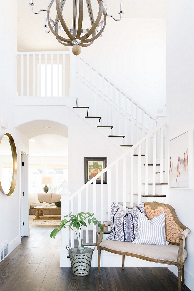
Wall Color: Snowfall by Behr.
Olive Bucket: World Market.
Pillows: McGee & Co.
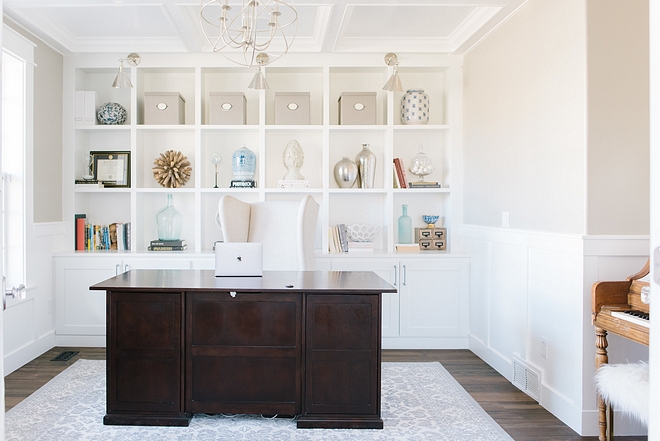
Our first project was the front room off the entryway. We needed to create some kind of office space, so we sacrificed a living or dining room. Two rooms that seem to be very underused in most homes, so it wasn’t too difficult to decide. I think this space had previously been used as a dining room. The French doors were installed to create separation. The pass through that connected to the kitchen we closed in, which gave us the space for functional office storage. One of the main priories in our remodel has been to create storage. This home, for its size, had very little. We still do not have a coat closet but we were able to make a small mudroom off the kitchen.
Chandelier: Ballard Designs
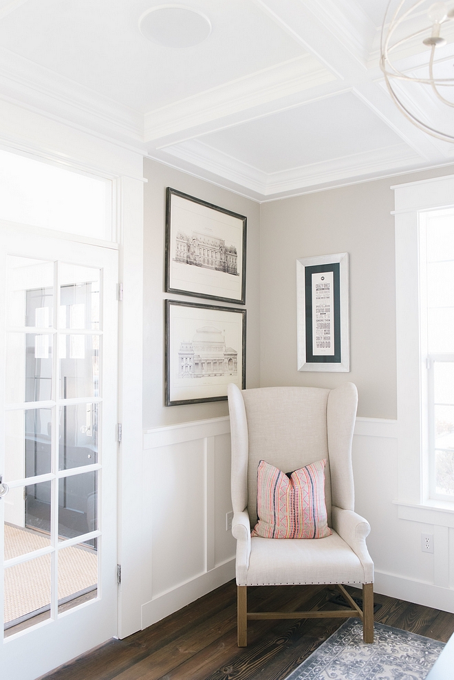
This office has our original gray paint and it’s still one of my favorite go-to colors for our investment properties – Rockport Gray at 50 % by Benjamin Moore.
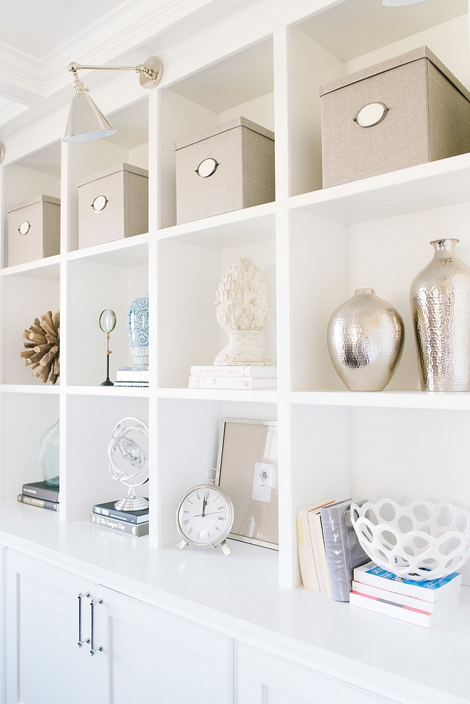
Sconces: Visual Comfort
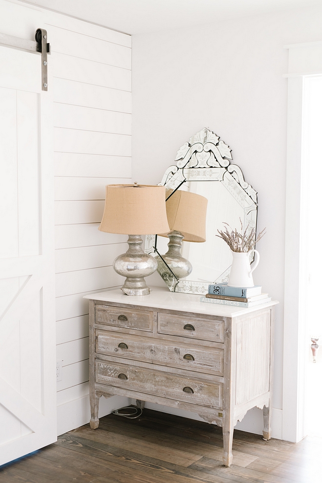
Our flooring was a drastic change to the house. Price has driven many of our design decisions. We want to allocate funds wisely to get the maximum profit for resale. I would have preferred lighter floors but the company we went with only had about five stains at the time, and the lighter one was too orange for me. We wanted rustic farmhouse style floors and the price was too good to pass. I love that the darker stain brings warmth to our home.
Vintage Pine Flooring: Tavern select stain.
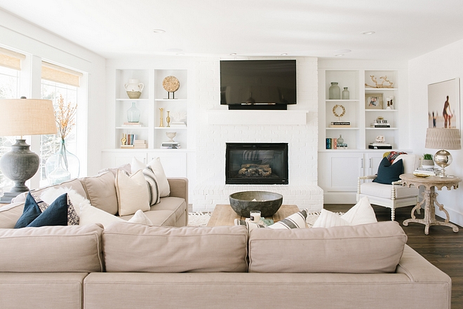
Our family room had a beautiful mantle, but there was no storage at all in this room. Reluctantly, we ended up tearing it out. We worked with our contractor to create this wall-to-wall builtin. We pulled the existing fireplace insert forward to create depth. We bought the brick at a salvage yard for practically pennies and cut the pieces in half, creating a brick facing. We actually left the red brick for a few months before painting it white. I found the varying color of the individual bricks too busy alongside the storage cubbies. Painting the brick really brought the cubbies to life and simplified the room.
Sectional is Norwalk.
Large Lamp: Details Comforts of Home.
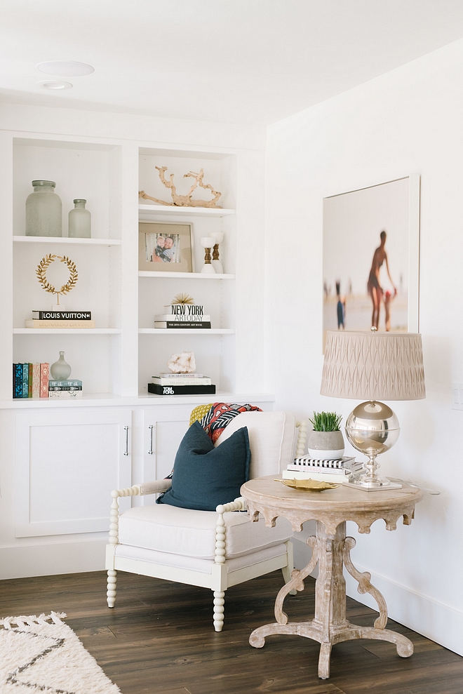
I am big on simple visual space. I feel like it helps me function better in life. Designing my life, the same way I approach designing a room is also a great passion of mine. I try to be intentional with how I fill my mind and my physical space.
Decor: One Kings Lane.
Lamp: Arteriors.
Spindle Chair: Z Gallerie.
Accent Table: Layla & Grace.
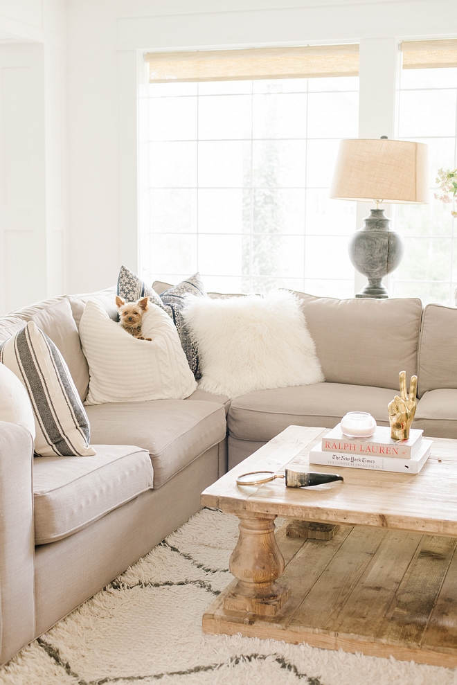
This is Cami’s sweet puppy. 🙂 How adorable!!!
Pillows: Pottery Barn.
Rug: West Elm.
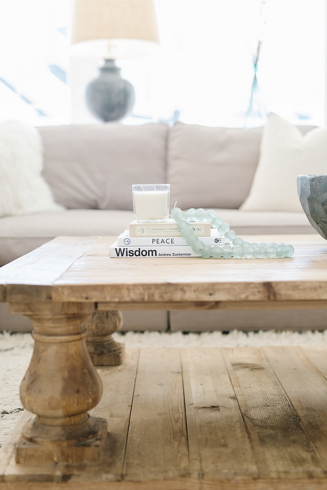
Similar glass beads can be found here.
Similar White Oak Balustrade Coffee Table: RH – Similar: Here, Here & Here.
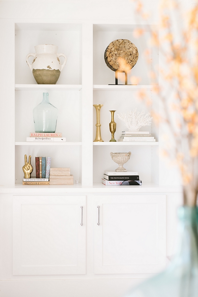
Bookcase Color: Decorator’s white by Benjamin Moore.
Decor: One Kings Lane & Horchow.
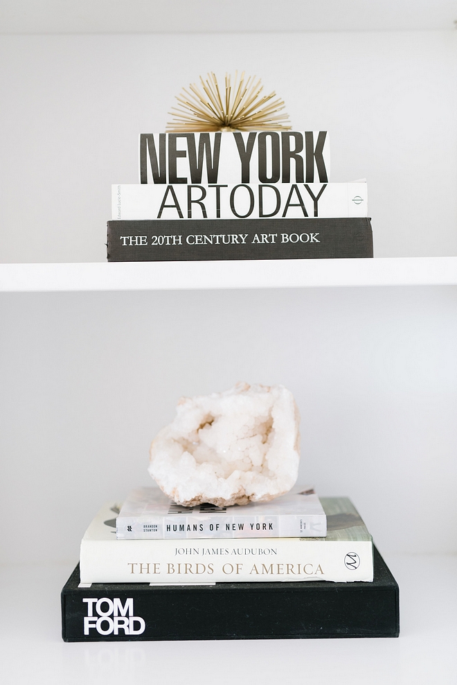
I love how Cami decorates her built-ins. It’s uncomplicated and chic.
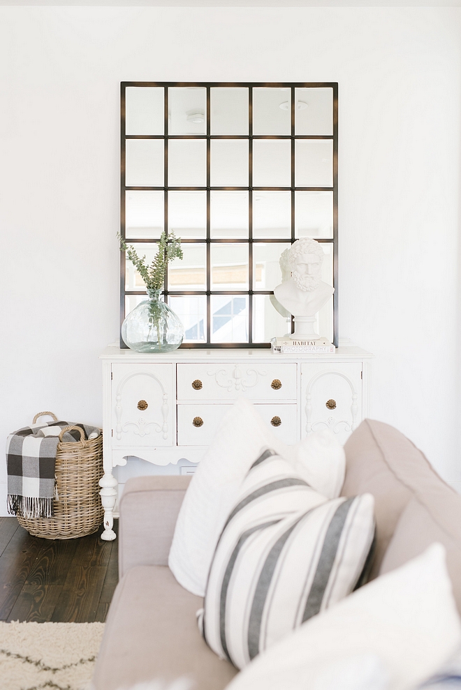
Rooms have an energy, and they affect how we function. I think looking within and knowing yourself and your needs is a vital component of creating a space you will love and in which you will thrive. No matter the size or style, everyone needs space that refills their tank and supports the pursuit of building a life we love. I know it’s cheesy, but I’m all kinds of cheesy.
Mirror: Pottery Barn.
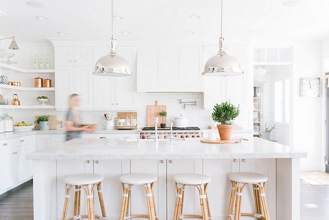
The most painful yet rewarding project thus far has been our kitchen remodel. Living in a remodel is…interesting. We didn’t have running water in our kitchen for about a month while we waited for our new cabinets and plumbing to be installed. It was challenging, but we created some fun memories. We were able to sell the cabinets, counters, and appliances to a young couple just remodeling their first home. We were happy to see everything go to use and even happier to put that money toward our new, much more functional kitchen.
Pendants: Restoration Hardware – similar here, here & here.
Barstools: Serena and Lily.
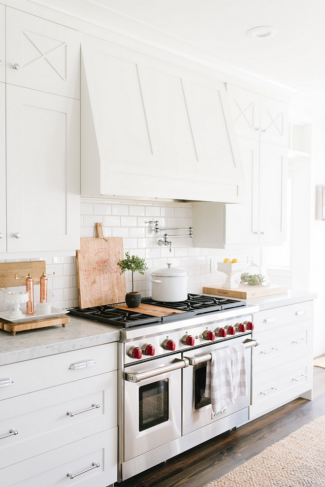
Cabinet Color: Decorator’s White by Benjamin Moore.
Range: Wolf.
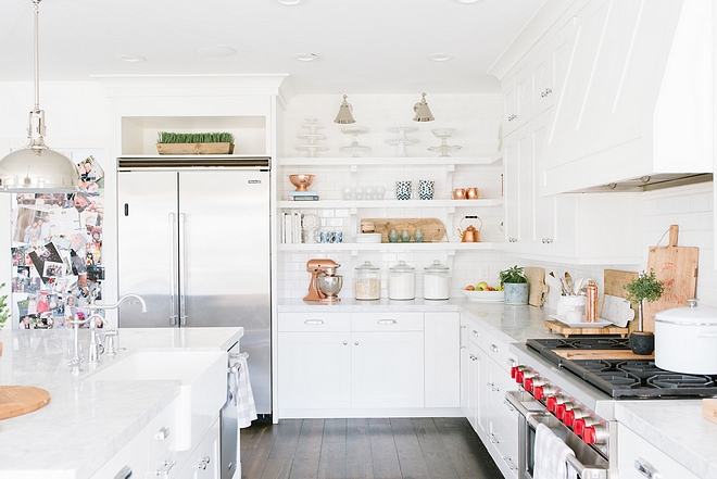
I get asked a lot about our marble counters. I did a few years of research on marble, and as we all know, everyone will have a different opinion on this topic. I happen to have thing for marble. It’s timeless and decadent yet rustic. A winning combination in my book! And after walking hundreds of steps on marble in Paris, I decided if it’s good enough for trampling on over decades and decades, it can hold up in my kitchen! Marble just speaks to my soul. Carrera is less expensive than many kinds of granite, so it’s not always a splurge. In fact, in comparison to the other options we were entertaining, we saved money! The rustic element of marble brings some old world charm and that was just what I was wanting in the heart of our home. This is our gathering place. We do cooking, homework, art projects, pumpkin carving and blogging on this stone. The stories it could tell! Clearly, I’m not too uptight about my counters. They get scratched and etched, but we will rehone them every couple years and they are good as new! (Be sure to check out my Instagram stories where you will see this counter covered in proof that we actually live here. And in my opinion, that is when these counters are at their most beautiful.)
Faucet: Danze.
Similar Sink: Farmhouse Sink.
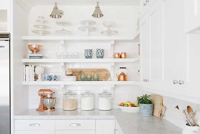
In our last home, we had Super White granite. That is a great stone option for anyone wanting a marble look without the worry over etching and staining.
Sconces: RH. Similar: Visual Comfort
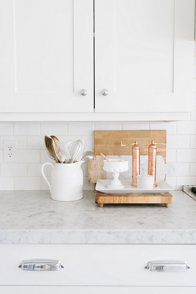
Cabinet Hardware: Restoration Hardware.
Similar Backsplash: Classic White Subway Tile.
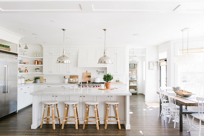
We created the kitchen window seat by moving our backdoor out of the bay window. The open doorway now leads to a pantry that was formerly a tandem garage.
Refrigerator: Viking
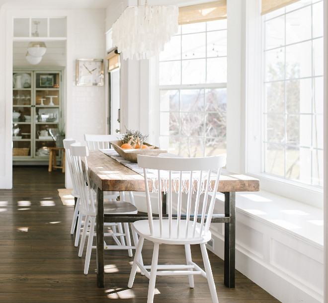
We were able to put in the three windows, gaining new and very welcome natural light.
Dining Chairs: Overstock.
Similar Dining Table: Here.
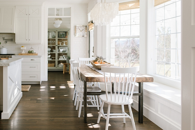
All the windows in our home used to have plantation shutters, but we found that they restricted too much of our views and light. Taking off the plantations made the home feel much more bright and open. We have beautiful views and hated to have them impeded.
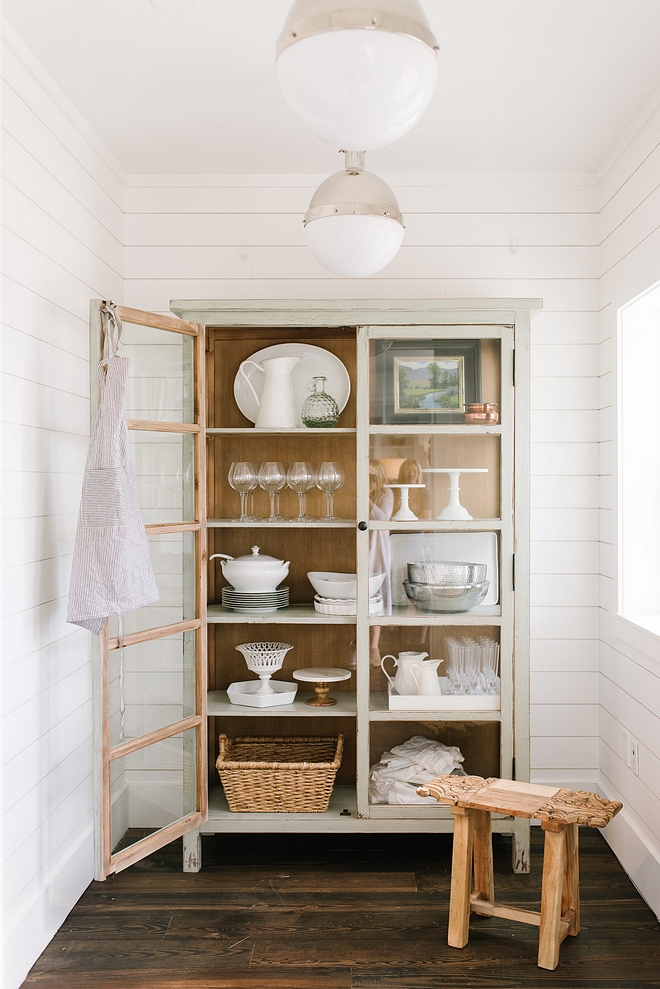
The hutch is from Sun River Gardens.
Lighting: Visual Comfort.
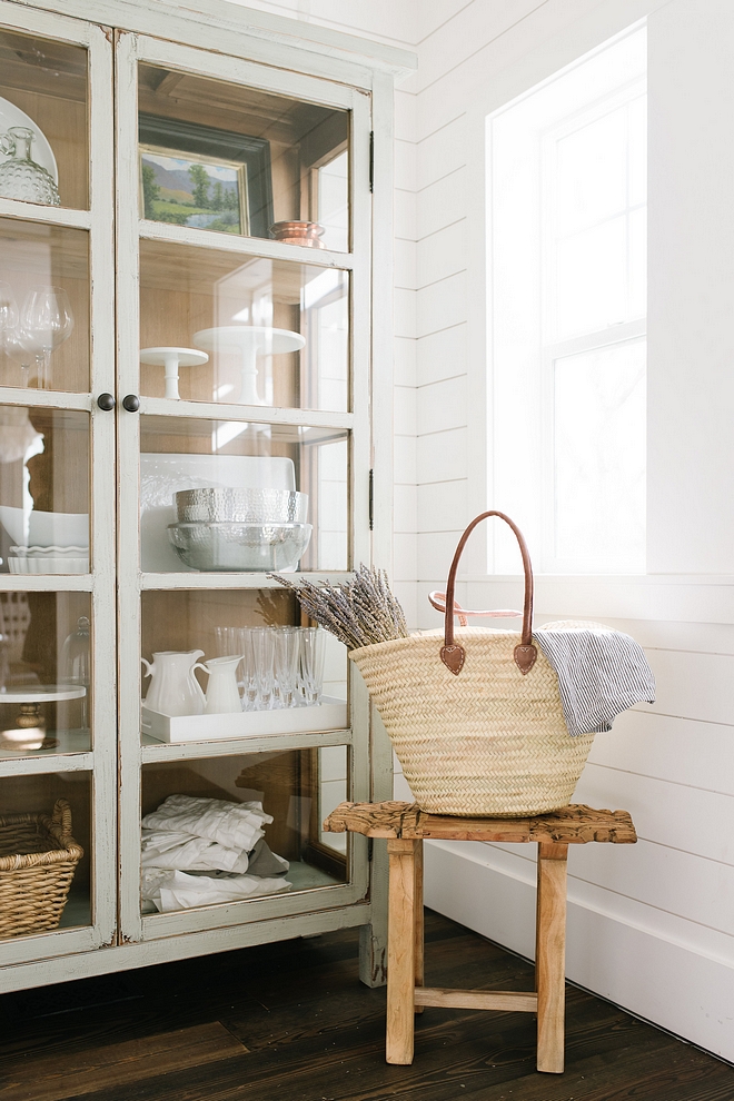
This stunning space features shiplap on walls and dark hardwood flooring.
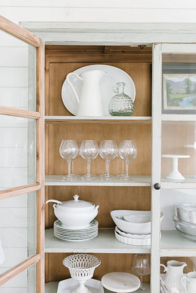
Beautifully arranged!
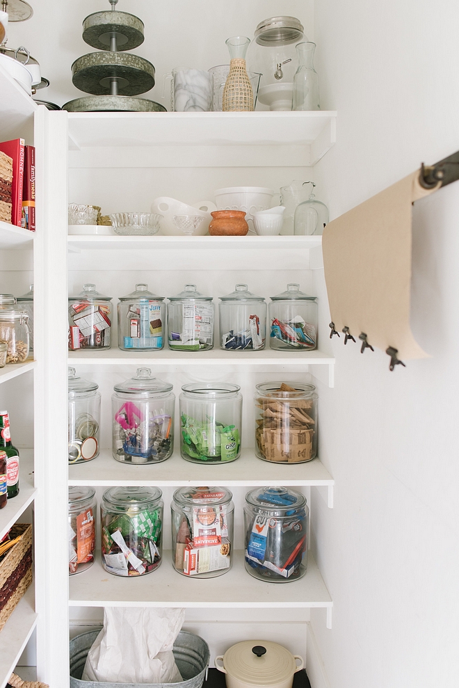
Our pantry is one of my favorite new additions to our home. I am so grateful for this spot in our home.
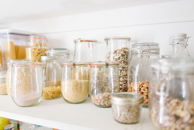
The original kitchen did not even have a pantry cabinet so having ample space to organize is never lost on me.
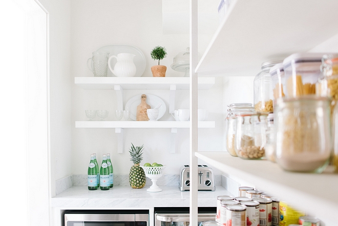
Every morning I come in for my coffee and feel grateful to have this nook and the new light streaming in through the windows.
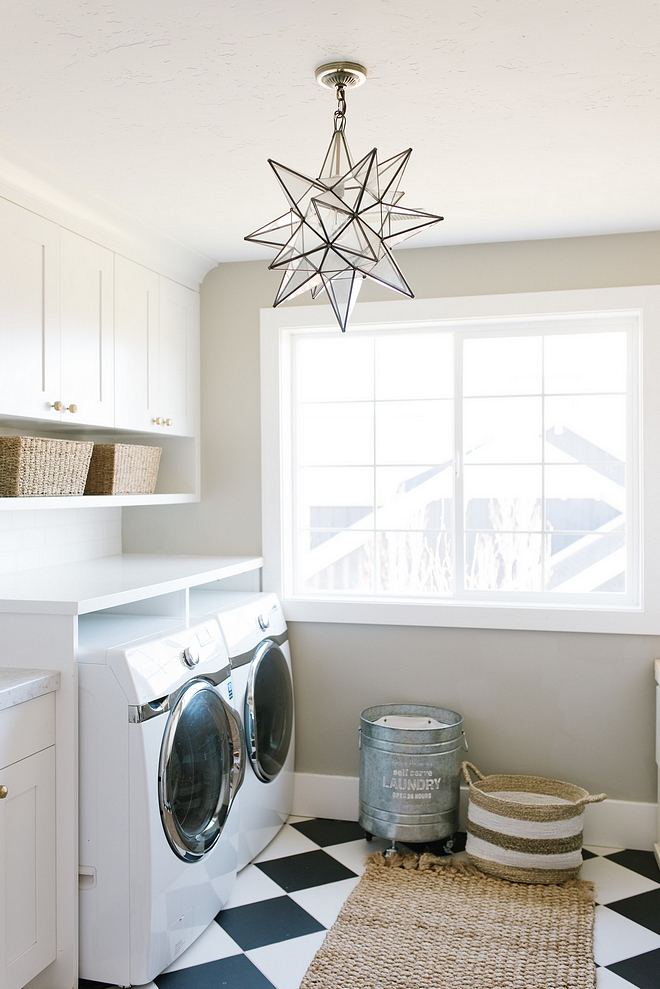
Paint Color: Rockport Gray HC-105 Benjamin Moore.
Our laundry room has been worth every dime! This entire room used to be a sitting area in our master bedroom. Across the hall used to be a tiny laundry closet. The door couldn’t open all the way, and the layout just didn’t make sense. The old laundry room, fortunately, backs to our master closet, so we were easily able to incorporate the extra square footage. A larger master closet was a bonus and also great for resell, if we should ever choose to. We still have to finish the other side of the laundry room. I am playing with how I want to use that space best. Stay tuned…
Tile: Contempo Tile.
Star Light: Lampsplus.
Metal Laundry Hamper: World Market.
Rug: World Market.
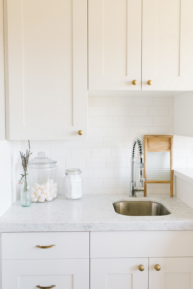
Cabinet Paint Color: Decorator’s White Benjamin Moore.
We changed all of the lighting and hardware throughout the house. They really are the jewelry of any home and just updating them can give an entirely new style.
Hardware: Anthropologie
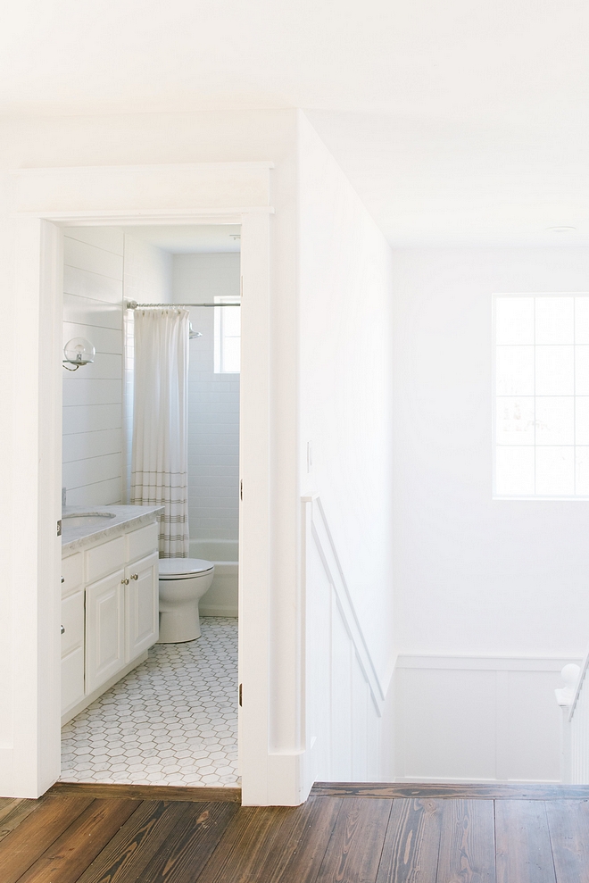
My oldest daughter was the first to get her bathroom updated and improved. We found the hexagon marble tiles online. If you are in the market for marble tile, the Builder Depot prices are fantastic! We purchased a paint sprayer and refinished the existing cabinets to save money. We had a new marble counter installed, which really makes the room feel brand new.
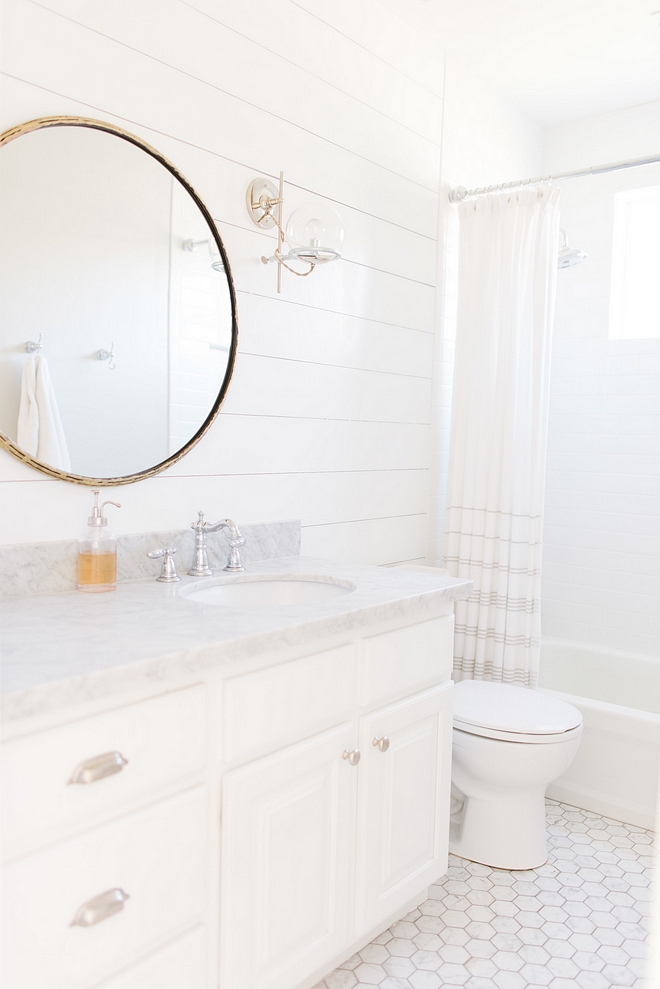
Bathroom Cabinet Paint Color: Decorator’s White by Benjamin Moore.
Mirror: CB2
Faucet: Delta
Tile: Builder Depot – similar here, here & here.
Sconces: Schoolhouse Electric.
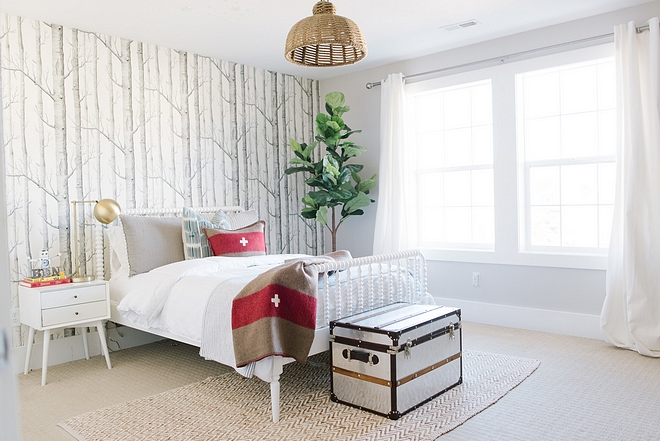
My son’s room makes me happy every time I walk by it. I’ve had such a fun time putting it together over the past few years. It is still a work in progress, but I love how it is now. We have plans for a window seat and bookcases for storing Legos and toys. That is one of the projects we will return to later if our budget allows.
Seagrass Pendant- Pottery Barn Kids.
Trunk: Home Goods.
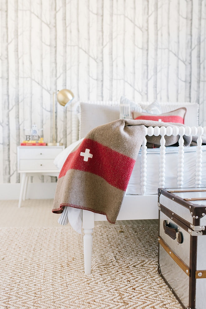
Nightstand: West Elm.
Rug-West Elm.
Bed: Land of Nod.
Pillow Shams: Ballard Design.
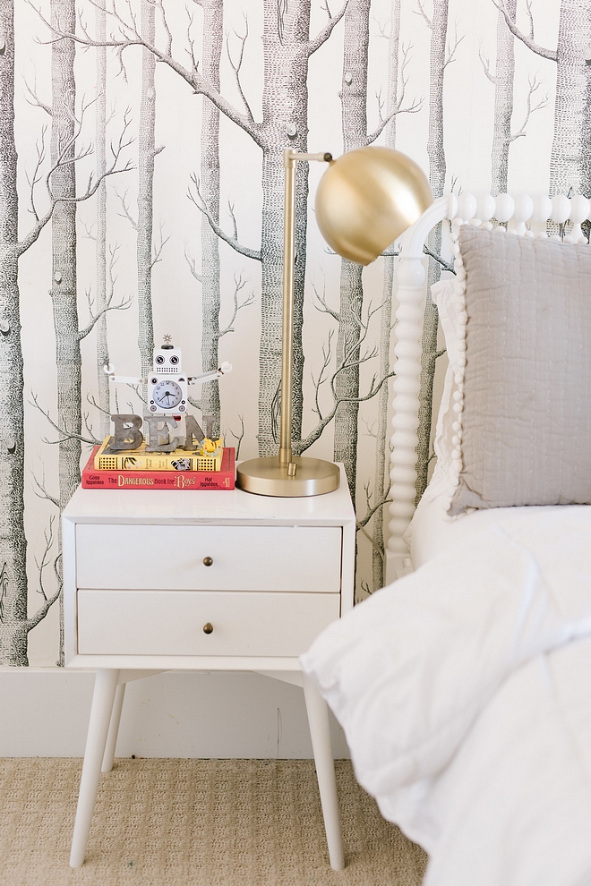
I love this wallpaper. It looks great in every space that I see it. Even in a girl’s room, I think it would be adorable.
Wallpaper is Cole & Sons – can be purchased via Anthropologie.
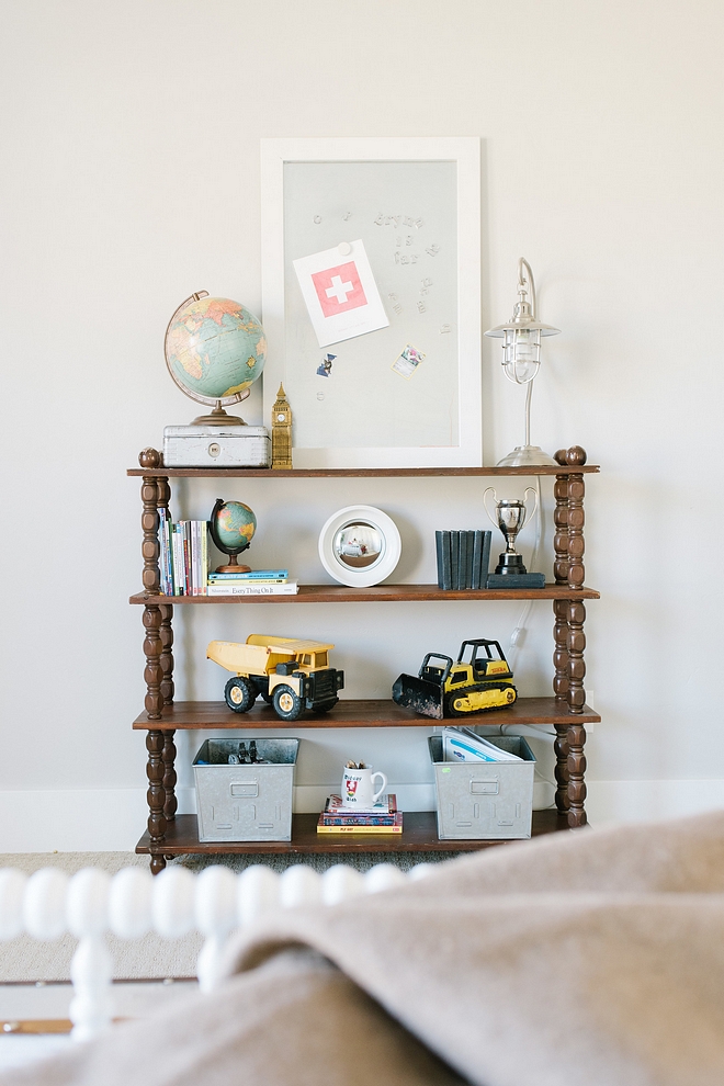
Paint color is Cafe Latte by Benjamin Moore.
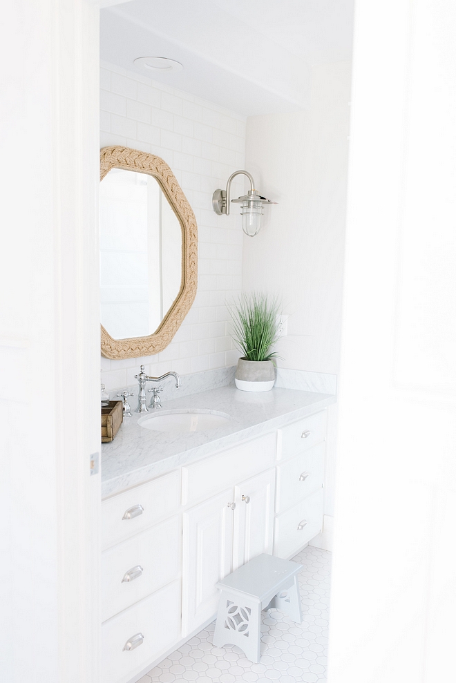
This middle bathroom got a little facelift this past summer. New tile and new paint on the cabinets. I found a marble remnant from a local stone yard, and it was enough for this bathroom and our pantry counter. Score!
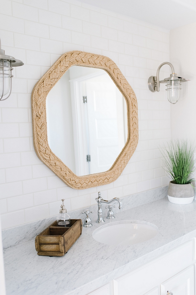
Mirror: Home Goods – Similar here, here & here.
Light: Lamps Plus – similar here.
Faucet: Delta.
Cabinet Paint Color: Decorator’s white by Benjamin Moore.
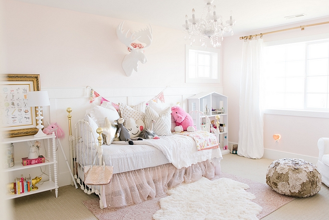
Little girl rooms are so fun to design. Every color is welcome and every animal. What a joy to make a space for play and imagination! And this room captures the spirit of our youngest little firecracker so well. She specifically requested pink. A surprising color for a little girl room, right?! Just kidding. It’s totally predictable, but it suits our little one so well. She spends hours playing her little heart out in her pink room. I promise you, it rarely looks like this, but that is just what we hoped for.
Chandelier: Overstock
Curtains and Rod: West Elm
Moose Bust: ZGallerie
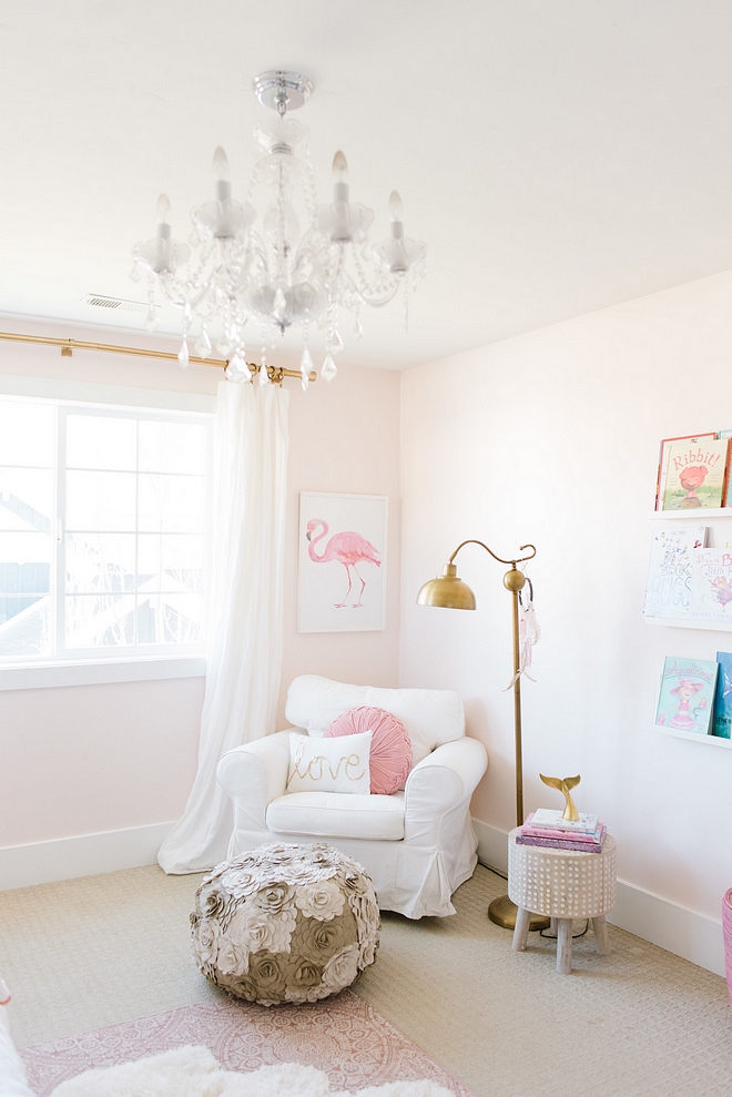
Paint color is Intimate White SW 6322 Sherwin Williams.
Floral Pouf: Arteriors
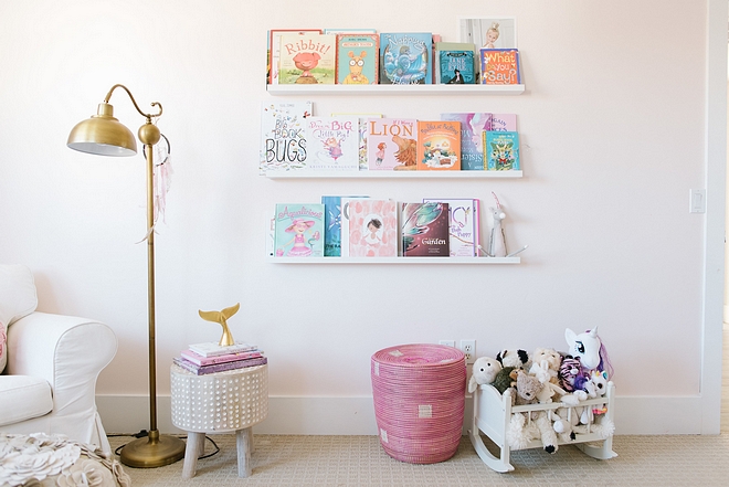
Bookshelves: IKEA photo ledges.
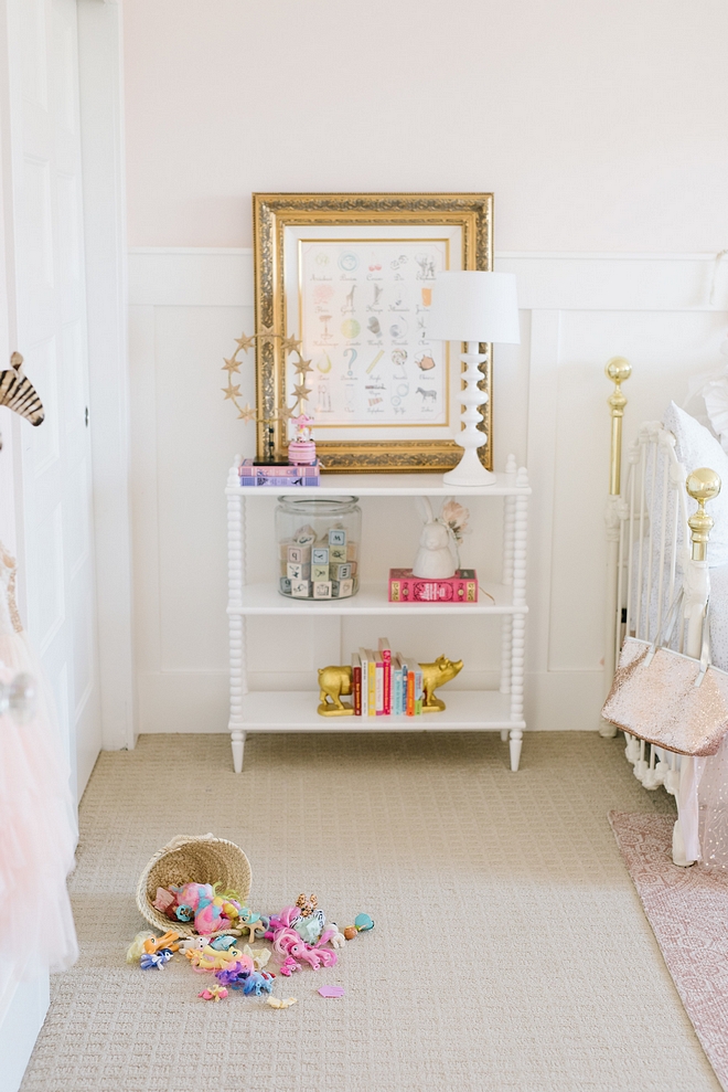
Spindle Bookcase: Target online.
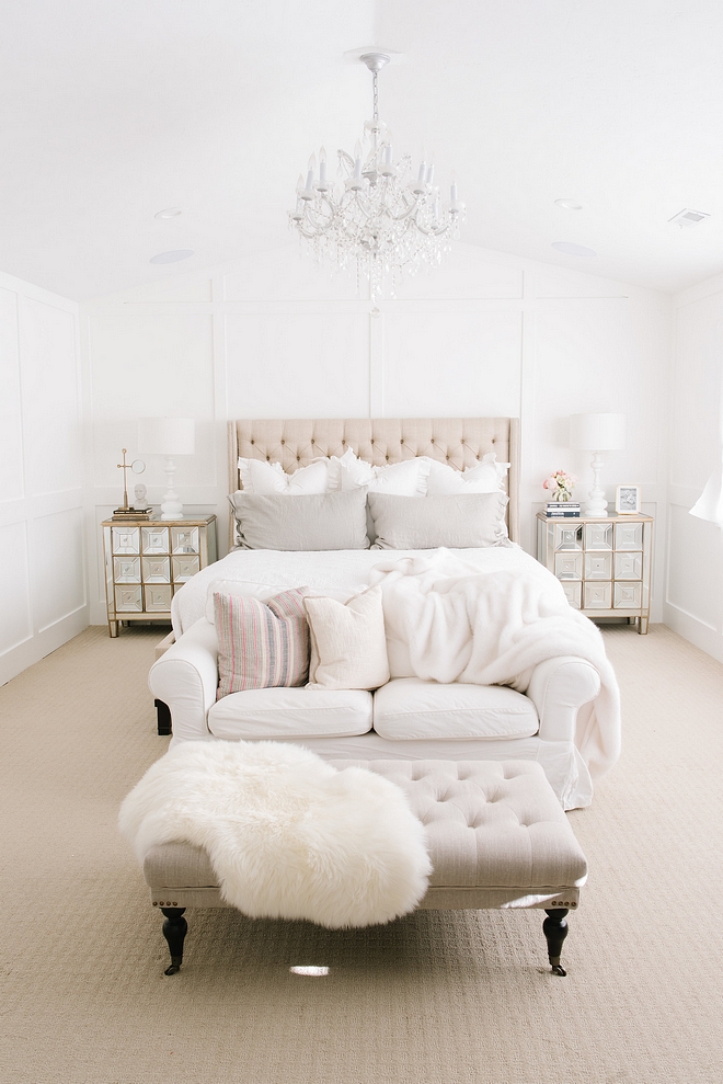
We have some big exciting projects yet in this home. A master bathroom remodels, our landscaping, and our basement. We look forward to the designing, the challenges, the victories and the growth. I document our projects and everyday life on my Instagram and I’d love to have you check it out. I believe good design is a FEELING created in our homes. I also believe home design is so much more than pretty things. It’s our refuge from the world. No matter the size or style. How we live within the walls, how we treat ourselves and those we share a life with will determine how beautiful our home feels. At least that is what I have found. Our house is my canvas and my safe haven. It’s part of my evolution as a person. I think we can design our home the same way we design our life. Some parts may need editing and reworking as time goes by. If we are intentional about what and how we choose to fill our home, we can truly design a space that warms the heart of any who enter.
Chandelier: eBay.
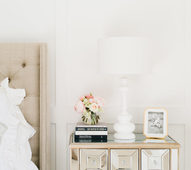
Nightstands: American Furniture Warehouse.
Lamps: Z Gallerie
Flowers: Horchow
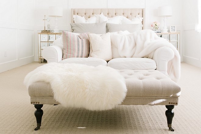
Ottoman: HomeGoods
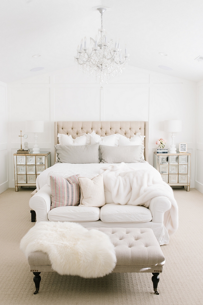
Trim & Moldings Throughout House: Ambassador by Sherwin-Williams in untinted white.
Bed: Vanguard Furniture.
Pillows and Quilt: Restoration Hardware.
I hope to see you soon. And again, thank you so very much Luciane for including me in this incredible resource for design and inspiration.
Make sure to follow Cami from @camitiffin on Instagram and visit her website to see more photos of her beautiful home!
Photography: Jessica Kettle
Pottery Barn: Flash Sale – Up to 70% Off! 1000s of New Arrivals!!!
Serena & Lily: New Summer Collection!
West Elm: Mega Spring Sale Up to 40% OFF!
Horchow: Flash Sale: Up to 55% Off!!!
One Kings Lane: Save Up to 70% OFF! Warehouse Sale + Outdoor Sale!
Williams & Sonoma: 20% off your order.
Nordstrom: New Spring Arrivals!
JCPenny: Clearance 80% OFF
Neiman Marcus: Up to $100 OFF on Women’s Shoes & Handbags!
Pier 1: Extra 10% Off + Free Shipping!
Joss & Main: Outdoor Entertaining Sale – Up to 65% Off!
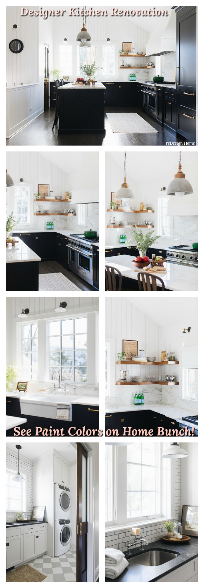
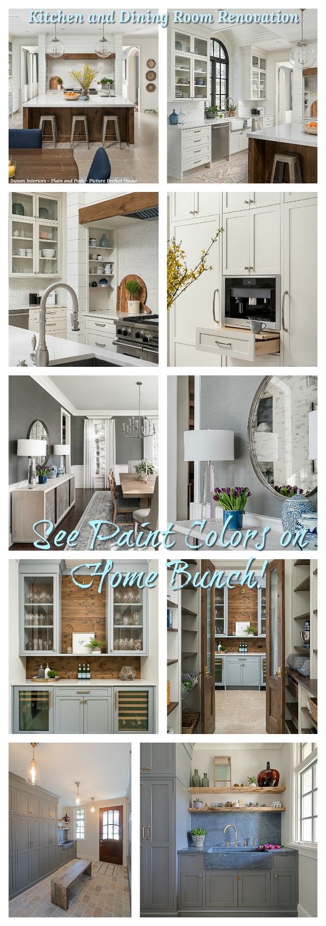 Kitchen and Dining Room Renovation.
 Texas Farmhouse-style Interiors.
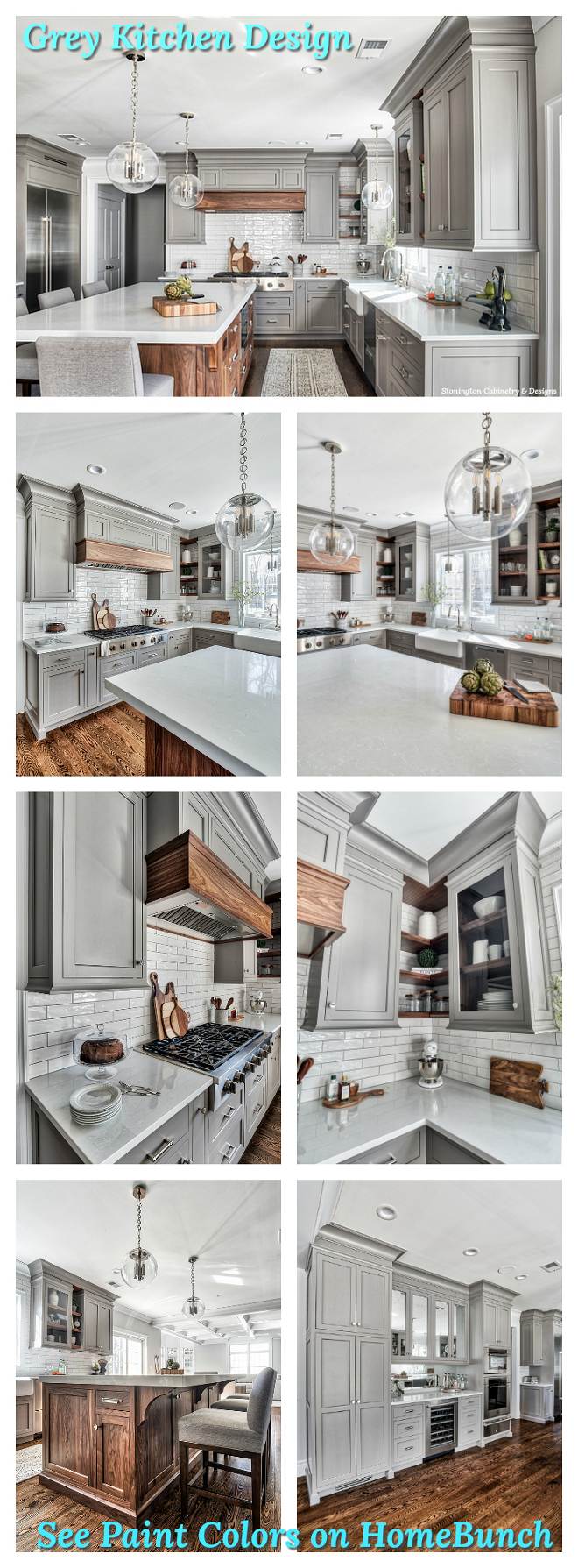 Grey Kitchen Paint Colors.
 Interior Design Ideas.
 Interior Design Ideas: Modern Farmhouse Interiors.
 New Interior Design Ideas.
“Dear God,
If I am wrong, right me. If I am lost, guide me. If I start to give-up, keep me going.
Lead me in Light and Love”.
Have a wonderful day, my friends and we’ll talk again tomorrow.”
with Love,
Luciane from HomeBunch.com
Interior Design Services within Your Budget ![]()
Get Home Bunch Posts Via Email ![]()
“For your shopping convenience, this post might contain links to retailers where you can purchase the products (or similar) featured. I make a small commission if you use these links to make your purchase so thank you for your support!”
No Comments! Be The First!