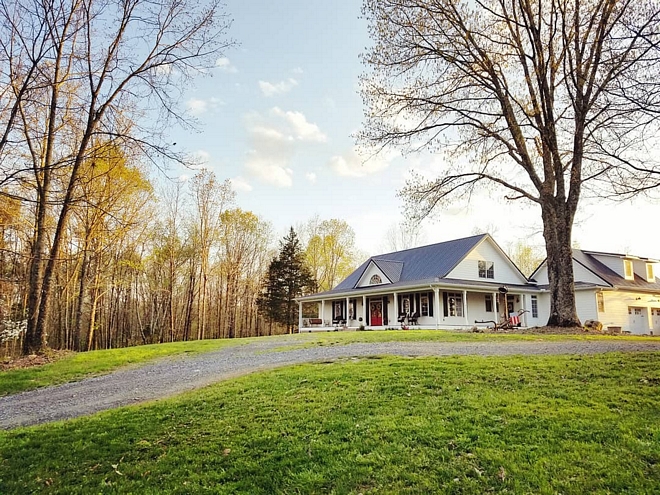
It’s great to start a brand new week with all of you here and I am very happy to be sharing Chasitiy of @lovehurtts on our “Beautiful Homes of Instagram” series. She is just a person that lightens up your day and I am sure you will feel this as you tour her beautiful country home.
“Hello everyone! I am Chasitiy Hurtt of @lovehurtts. My day/week/year was made when Luciane asked me if I would like to be featured in the series “Beautiful Homes of Instagram.” Some of my very favorite homes/inspirations that I have followed for years have received this honor in the past – and for our home to be even slightly considered to represent this series is such a privilege. Getting a deeper look into some of these great accounts, which are mainly driven by such incredible women, has given me a better understanding of this lovely community that Luciane has gracefully helped foster.
When discussing home decor/design, I always try to be transparent in that I do not have a formal design background, however, home decor has become an outlet for me over the years, and now can be defined more as a passion. I am always eager to create the next welcoming space…Whatever that may be.
Located in Northwest Georgia – in a town I actually grew up in – our home is built on the highest point of our community. Villanow is a town that can only be classified as extremely quaint, living “out in the country,” and everyone will ask what your last name is to trace back how they may know you or your relatives. It’s also not uncommon for anyone who ever talks about my beloved Villanow to describe it as “God’s Country” – It’s breathtakingly scenic, and utterly timeless!
I guess you could say my passion for design all started when Richard (my husband) and I purchased 55 acres in 2014, and decided to start designing/laying out our forever home roughly four years ago. I was researching, pinning, comparing, and analyzing every single detail of what I envisioned this home to be. When combing through thousands of house plans, we just couldn’t find THE one, and I just wasn’t willing to settle. After becoming somewhat discouraged we later discovered this dead-end was in fact as blessing. It was at that point that we were determined that if we couldn’t find the perfect home, then it could be created…from scratch. We started off by taking elements from all of the house plans that we loved, and create the home we wanted to fit our needs. Richard, being an engineer, was able to take all of my thoughts, crazy ideas, and changes and transfer them into a buildable blueprint. Thankfully we both thrive off of symmetry, so he was able to incorporate detailed design components for balance – which is a common thread throughout our entire home.
Since we were starting with a fresh slate – and by fresh… it was all wood, and had only been used as a deer-camp for hunters for the past 25 years, so it was completely overgrown. Starting with bulldozing a new 2,000 driveway, we set the tone for how our future guests would arrive to “Hurtt Holler.” We had actually visited the Biltmore in NC around that time, and thought it would be really neat to model a winding driveway (obviously a very scaled down version) after their entrance. We have plans to incorporate mini-vignettes over the years to try to recreate the Biltmore’s welcoming feel as you drive up.
The next element of design was based on another factor – I love to entertain, and as many have stated in the past, an open floor plan and large porches would allow us to host large sized gatherings and parties. We also achieved maximum privacy being on a hill, completely surrounded by woods, and the closest neighbor cannot be seen standing from any point inside or outside of our home. Wild muscadine vines, large oaks as far as the eye can see, and watching unparalleled sunsets with a ridge outline are just naming a few of my favorite features of our woodland retreat.
In building any home yourself, we still have a decent list of home projects that still remain, with landscaping being our main objective this year. With that said, I truly like to look back through pictures to see how much we have actually accomplished in the past two and a half years.
As you will notice within this article, my design style has a heavy french-country influence, with an accent of vintage flair, and a splash of craftsman to accomplish clean lines. I am inspired by layered textures, contrasts in colors, while always trying to remain classic.
Thank you so much for visiting our home!”
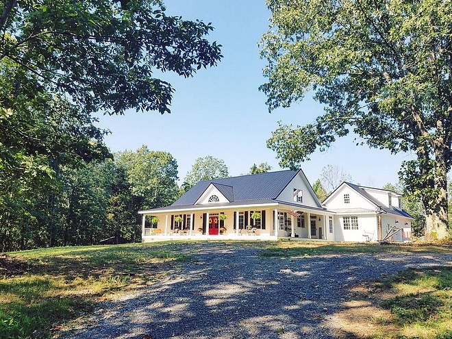
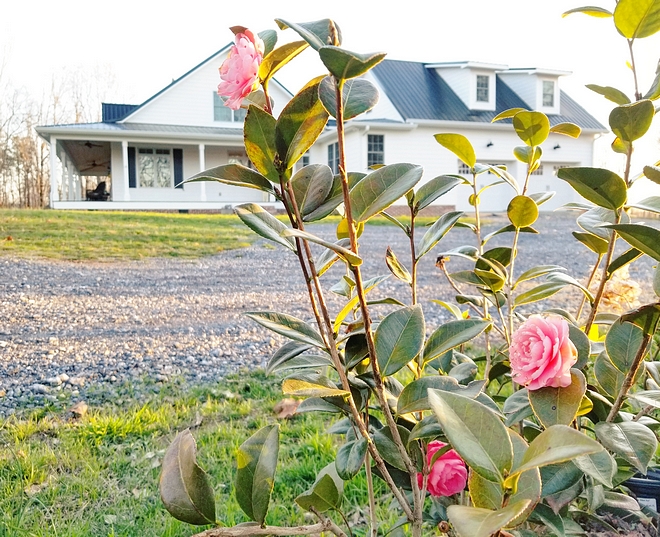
When designing our home, I appreciated the fact that the exterior of the home is the first thing our guests would see. So, I wanted it to make a classic yet Southern impression.
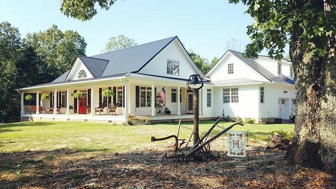
We positioned the home right next to one of the largest Oak trees on the property – Which is named the “General” for obvious reasons.
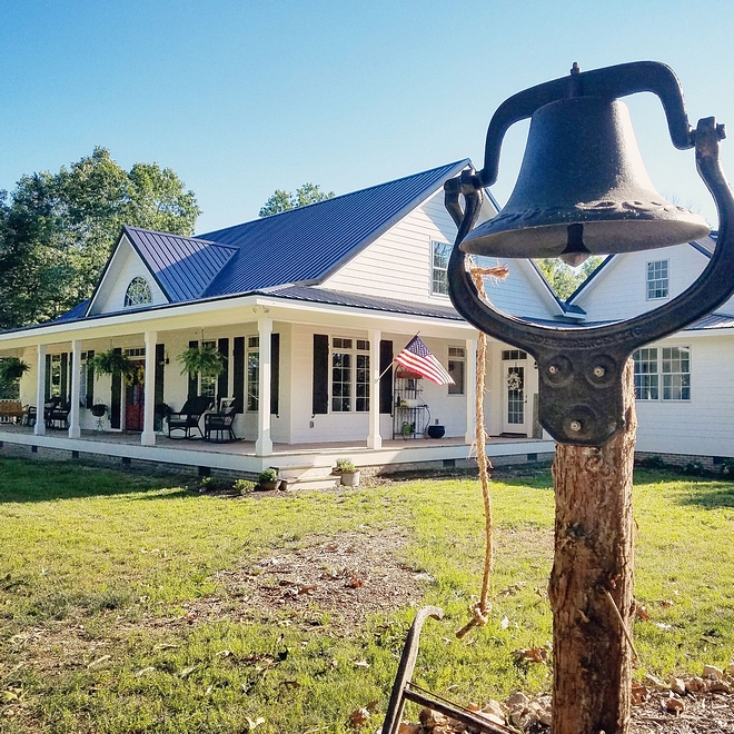
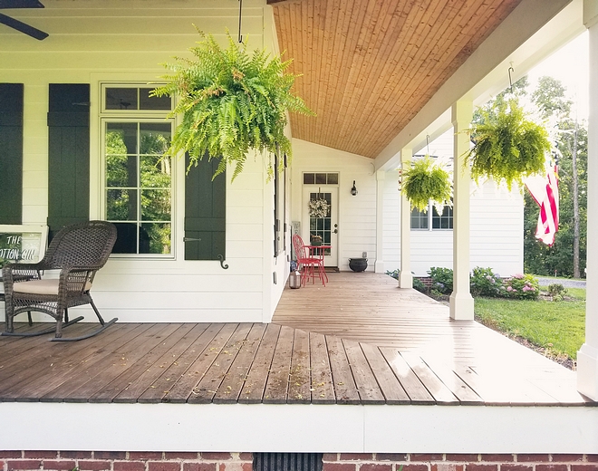
We handmade our own shutters out of 1 x 6 pine and are painted Tricorn Black SW 6258 – extra satin.
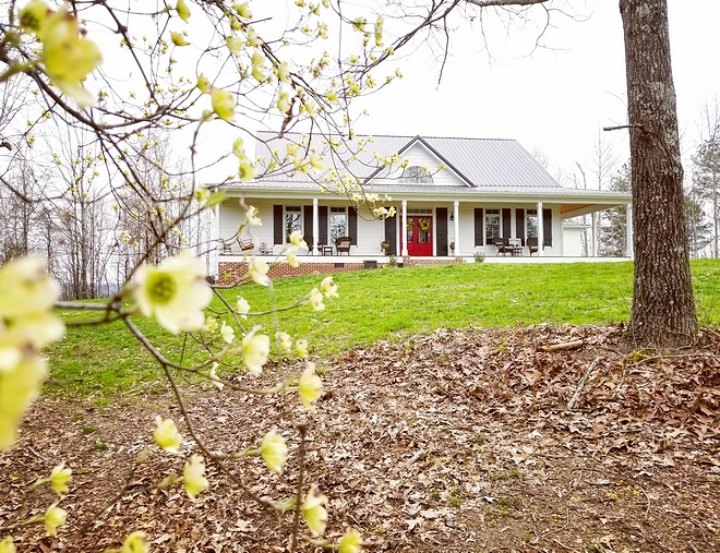
The front of the house is “Select Cedar Mill” Hardie. Siding painted with Sherwin Williams Extra White SW 7006 paint.
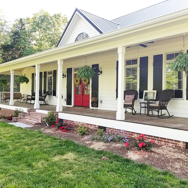
The front porch is made of 5/4 x 6 pressure treated pine stained with Super Deck SW 3542 Charwood. The beadboard ceiling is currently a natural finish, with plans to stain to allow the dark/golden undertones to bleed through.
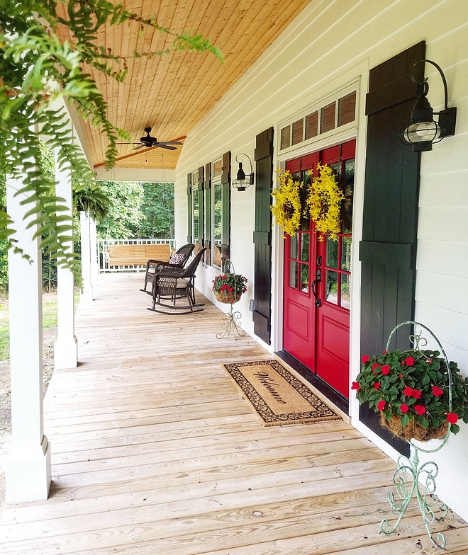
The double front door is from Pella, and came factory painted with Sherwin Williams Pure Red SW 6868.
Similar Red Front Door: Here.
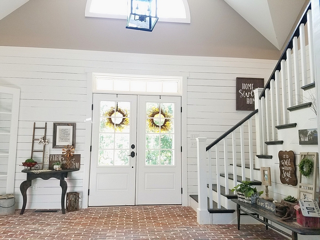
Having lived in Louisiana for a few years, I loved the classic, nostalgic feel of a brick floor and wanted to bring it home. It’s the very first thing people see when entering, and it’s always a wow reaction. Brick is so classic, and adds so much more than texture to any space.
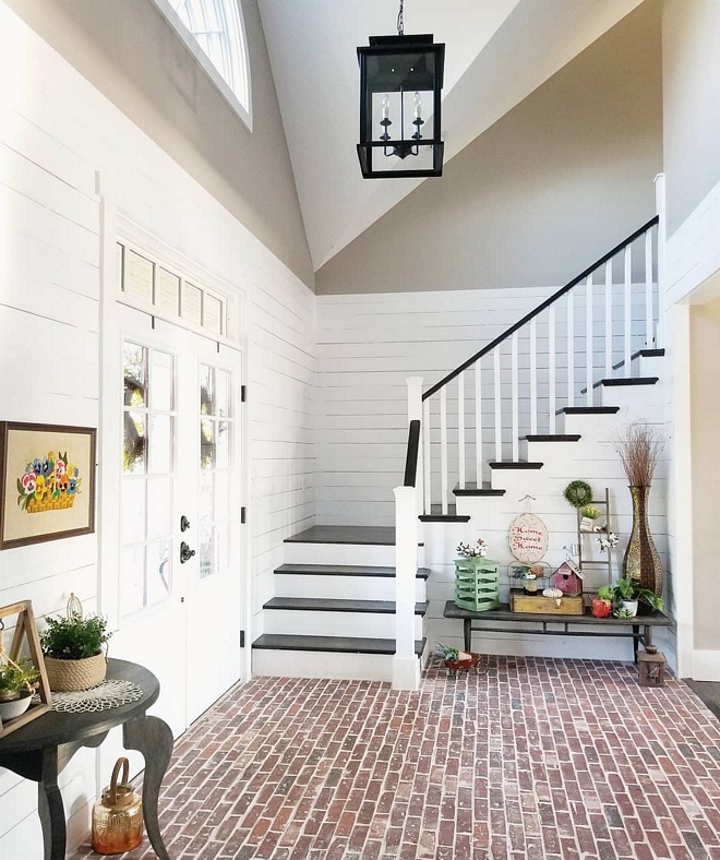
We added real shiplap and painted it in Sherwin Williams Extra White in the two story foyer as well to give the brick a softer contrast. I used a craftsman design for the staircase and interior door underneath. Again, this is to achieve the straight/clean lines in a sea of textures.
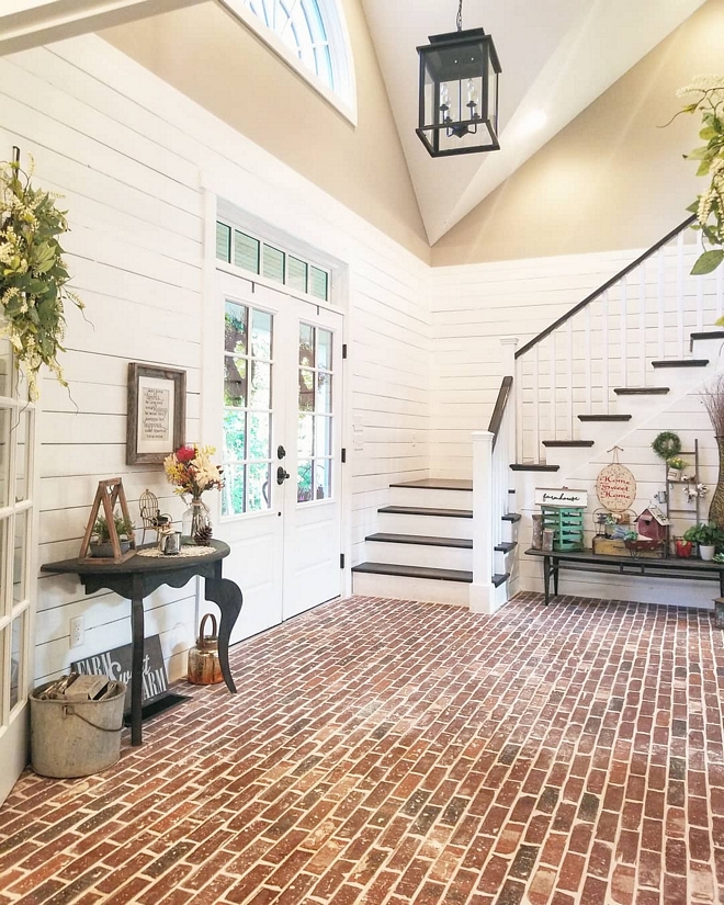
I decided to use the same “Old Louisville Tudor” brick by General Shale but in a thin brick to make it cohesive to the exterior design.
Affordable Foyer Lighting: Here, Here, Here, Here, Here, Here, Here & Here.
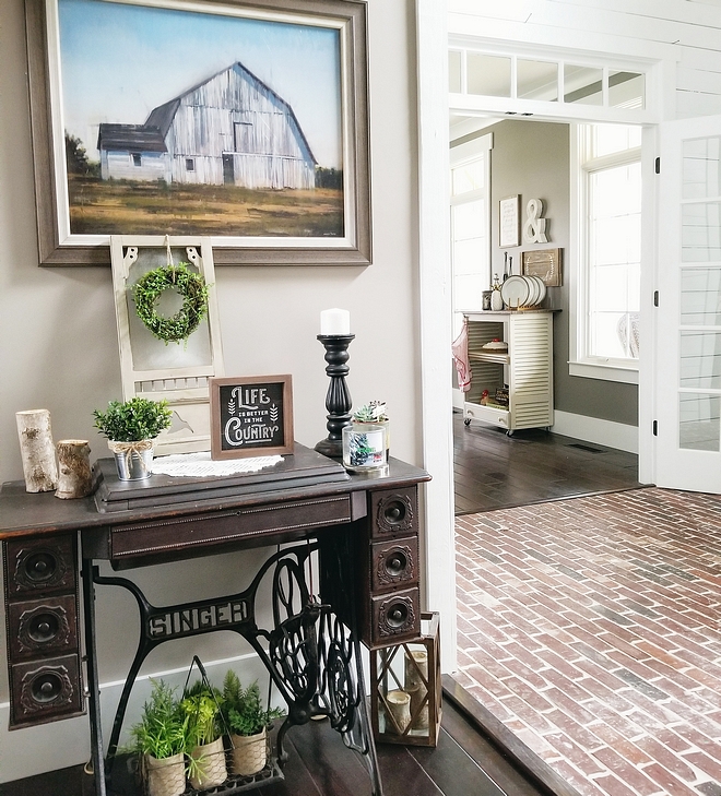
The wall color is Perfect Greige SW 6073 by Sherwin Williams.
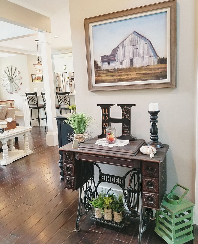
A vintage sewing machine adds some extra charm to this foyer.
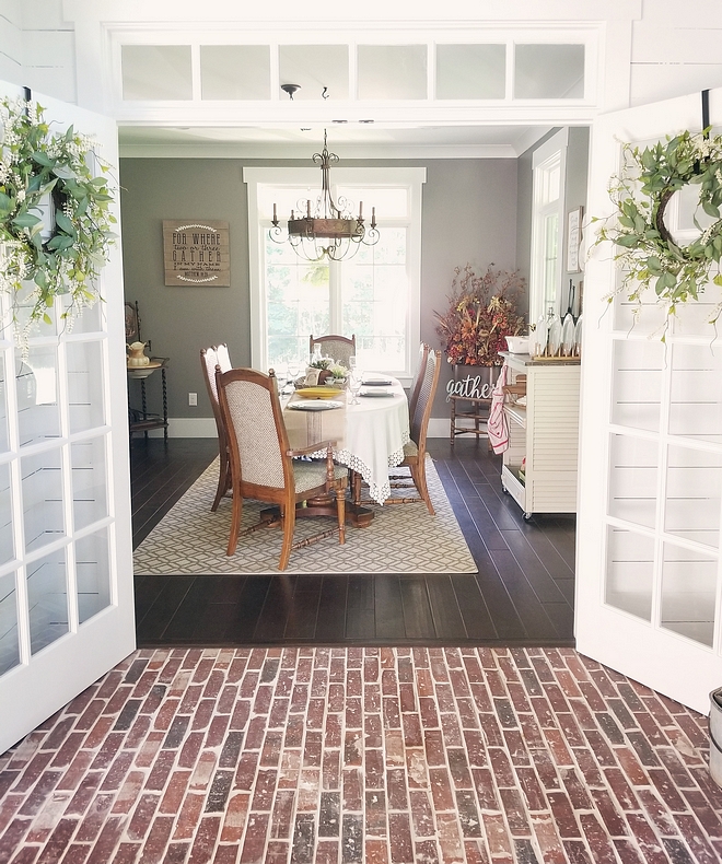
The dining room is just to the right after entering the home. I incorporated glass double doors with transom for this space as well to have a “draw in affect”. The hardwood floors are by Anderson Hardwood – Style Casitablanca/ color Monterrey Grey – similar here, here & here.
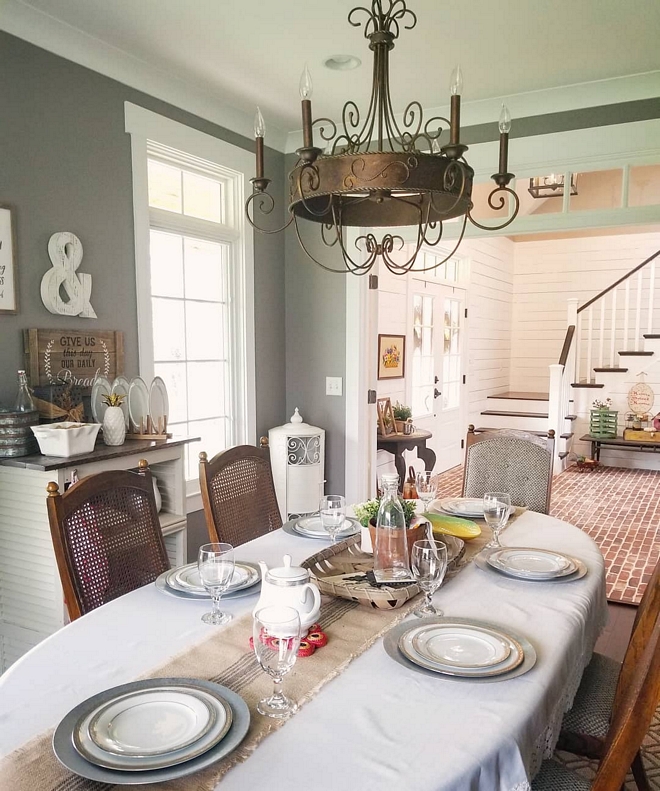
The walls are Sherwin Williams SW 7018 Dovetail with SW 7006 Extra White Trim by Sherwin Williams. The whimsical chandelier is the crown jewel in the center of this space. It is 30” Wide Rust Candelabra Chandelier by Franklin Iron Works. The windows are Pella Aluminum clad casement windows with transoms. This room in surrounded by the porch, so you virtually feel as if your outside sitting with hanging ferns in view.
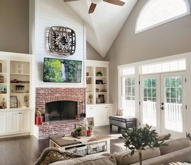
Connected to the Kitchen & Breakfast Nook, this two-story room was designed to draw your eyes up.
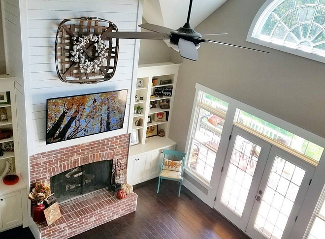
From the dimensional angles, to the arched brick/shiplap fireplace, we wanted this room to feel grand – Not due to it’s size, but for it’s depth & textures. We also chose to include an exposed beam in this room by increasing the height of the ceiling. The builder had every intention of covering it up based on it looking “unfinished,” however, I LOVED the character and the rustic feel it added to the room, so I fought for him to leave it as is.
Tobacco Basket (Wall Decor Above Fireplace): Here.
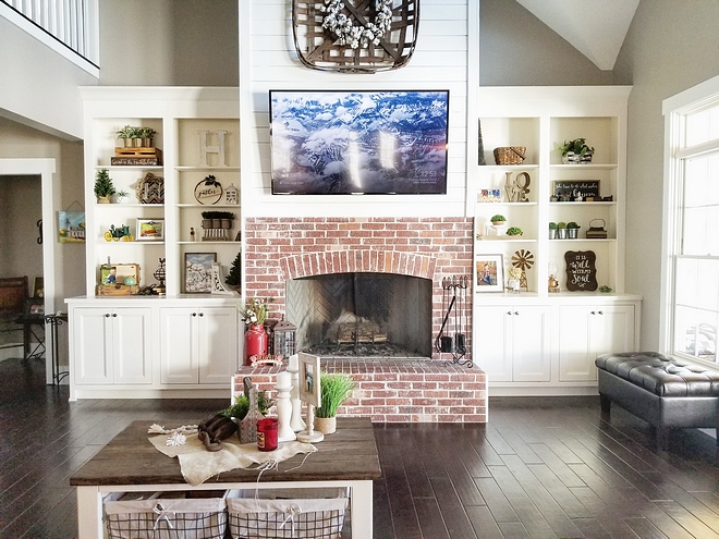
Also the original layout of this room had the fireplace off center before engineering changes, which we later corrected to create a symmetrical view from the kitchen. A fun fact about this room…The arched brick fireplace using the same General Shale Old Louisville Tudor thin brick & the half-moon window by Pella Windows are 2 out of only 3 arches used throughout the entire home. The other arch is located in the two-story foyer.
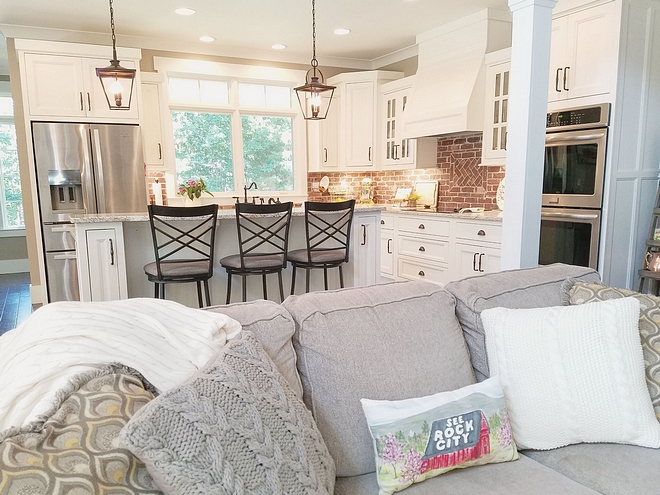
With incorporating these soft features within this space, I chose the blunt craftsman design for the columns for balance.
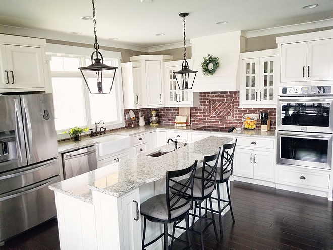
When designing the kitchen, I never in a million years thought I would ever want a white kitchen…Clearly, that changed. After creating a physical design board to compare while pulling everything together, I quickly decided that it was a MUST. The shaker style cabinets are recessed, painted Sherwin Williams SW 7008 Alabaster with dark bronze hardware.
The pendant lights above the island are the Arena Cove 10” Cottage Single Cage Pendant by Kichler – Again, darker metal was used to center the view, and compliment the hardware. The hardwood floors are by Anderson Hardwood – Style Casitablanca/ color Monterey Grey – Which gives it the perfect contrast from the cabinets, metals, and textures.
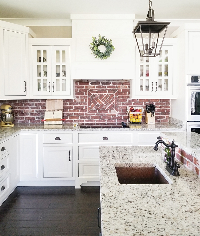
The backsplash continues the theme by using General Shale Old Louisville Tudor thin brick, which is the same as the foyer floor.
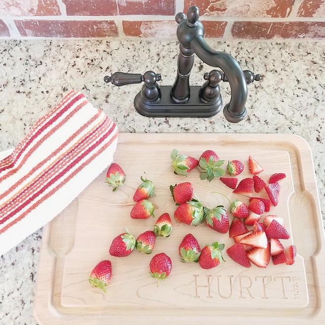
Ultimately, I decided on a copper bar sink in the island to be a statement which has a matching Oil Rubbed Bronze Kingston Brass KS117 faucet.
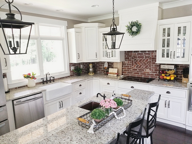
To complete the cabinets, we chose granite in color Ornamental Cream – with the perfect shades of color to bridge the harshness of the brick backsplash to the softness of the white surface.
The farmhouse sink is nestled under double casement windows with transoms. This feature was a must – Which ultimately changed the entire layout of the original kitchen. The faucet is a Kingston Brass KS127.ALBS in Oil Rubbed Bronze to coordinate with the cabinet hardware.
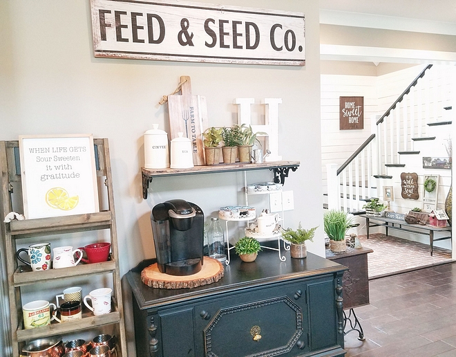
The wall color is Perfect Greige SW 6073 by Sherwin Williams.
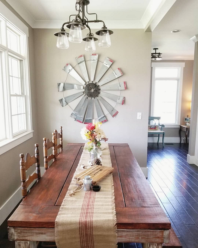
The breakfast area consists of a handmade farmhouse 7 ½” table with a large picture window to feature the views of the ridge & valley in Villanow. The oil rubbed bronze light right above the table is is the Bristow 4-Light Mission Bronze chandelier by Allen+Roth (similar here). I found the perfect old, beaten up windmill, at a local market. As soon as I saw it, I knew it belonged in this very place.
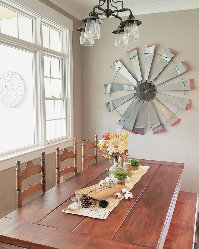
The wall color is, once again, Sherwin Williams Perfect Greige.
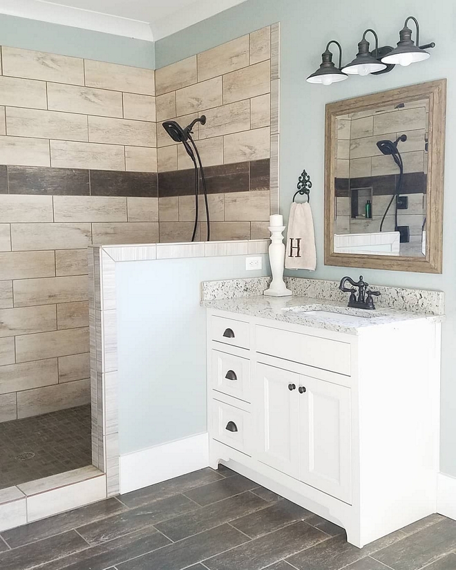
The vanities are the same specs as the kitchen cabinets – painted SW 7008 Alabaster with the same ornamental cream granite countertops. The light fixtures are 3 Hainsbrook 3-light vanity lights by allen+roth above the vanities.
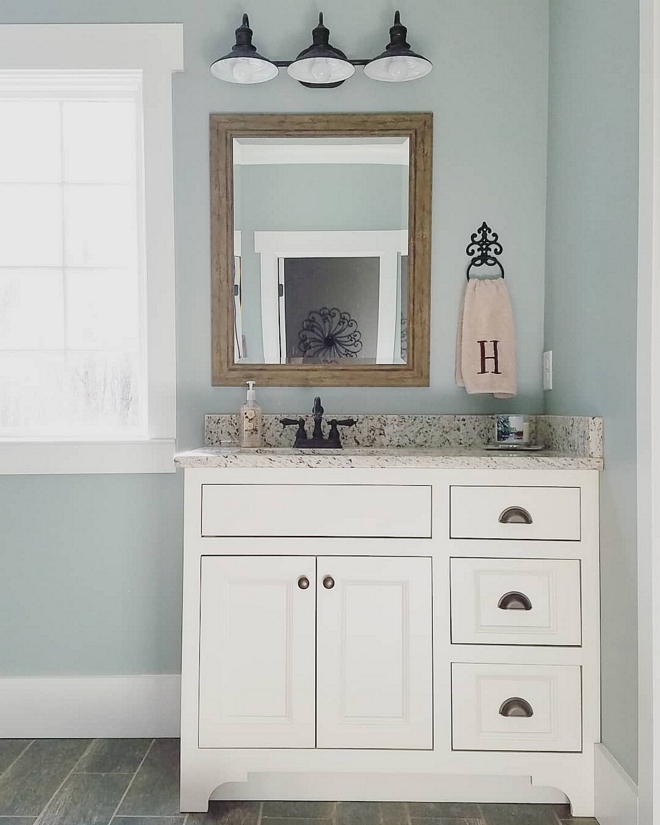
The master bathroom is painted a calming color – Sherwin Williams Silvermist SW7621 with extra White trim by Sherwin Williams.
The oil rubbed bronze faucets are by Kingston Brass KB1605AL Heritage 4-Inch Centerset Lavatory Faucet.
Similar Mirror: Here.
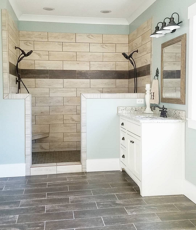
The flooring is ceramic tile style Channel Plank/ color Stone Gate (00510) by Shaw Floors (similar here) with cream grout color. The shower uses the same ceramic tile style Channel Plank but in color Flax (00100) – similar here – with a Stone Gate accent strip with matching mosaic shower floor. The dual shower heads are made by Delta Ashlyn Monitor 17 Series.
A large walk in closet with cabinet island is located just off of the master bathroom.
A side door leads to the porch.
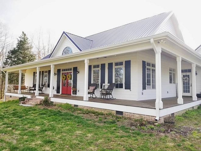
Roof is metal.
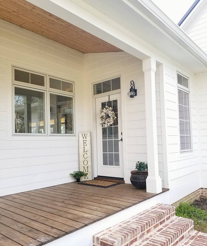
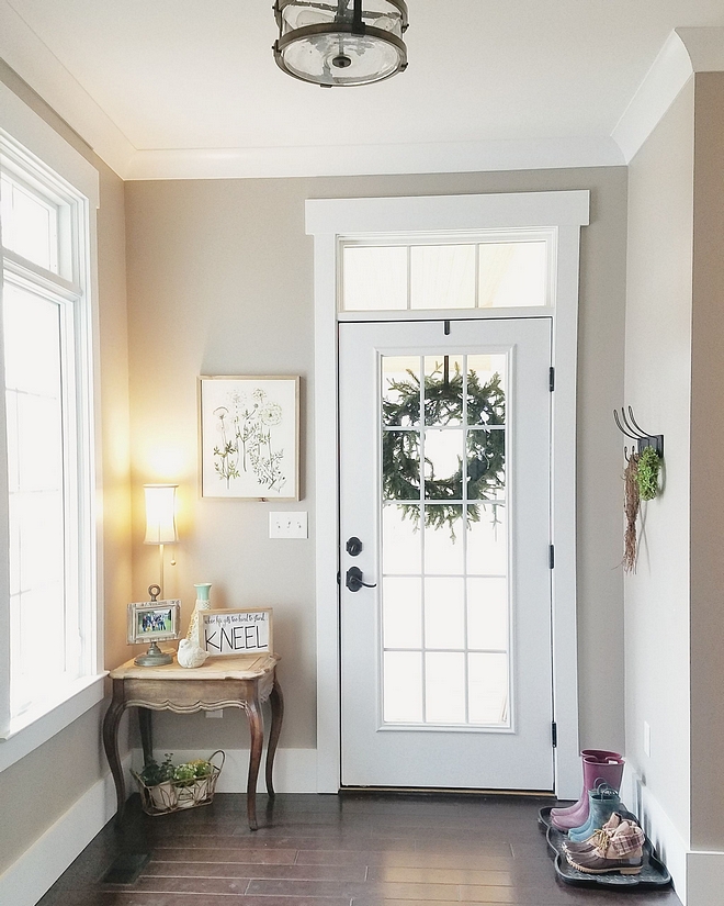
All doors and windows feature transoms.
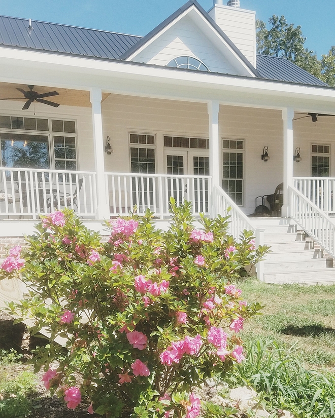
@lovehurtts
@lovehurtts
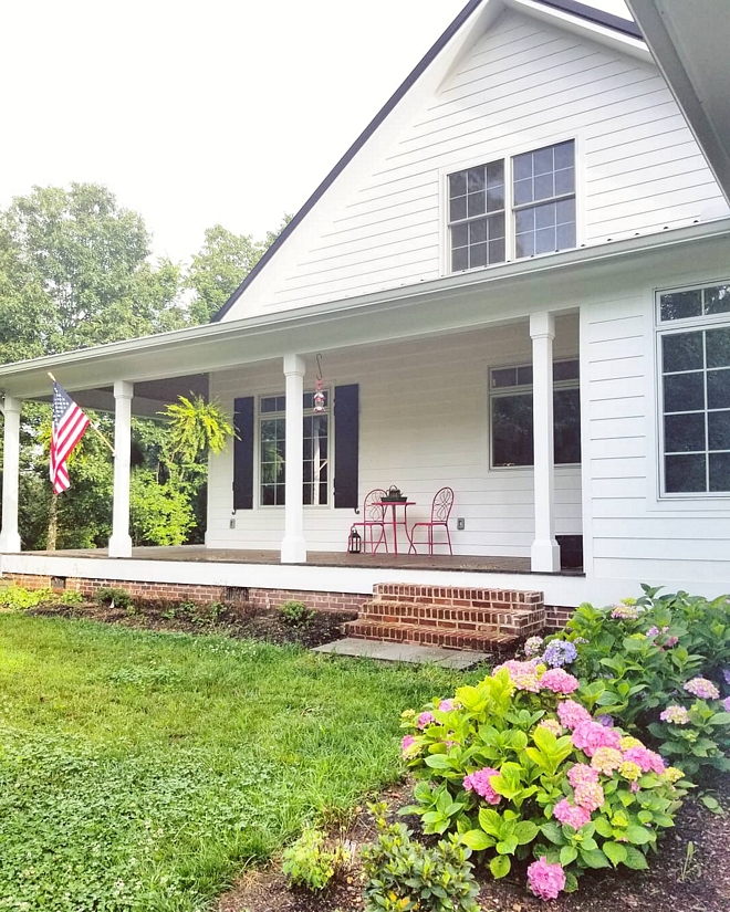
I wanted an “established” look when it came to the foundation, so we skirted the entire home with General Shale’s “Old Louisville Tudor” brick – The brick imperfections and contrast in color, make it appear as if it were an old home place.
@lovehurtts
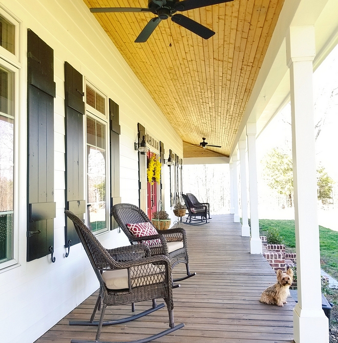
Awww.. how adorable is Chasitiy’s dog?! Those ears! 🙂
Similar Porch Rocking Chairs: Here.
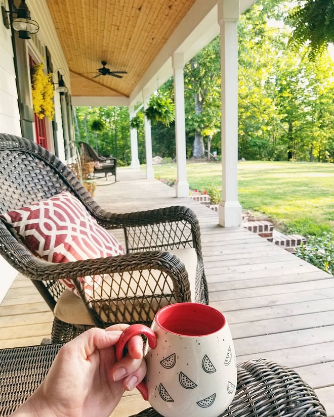
Chasitiy enjoying her beautiful porch.
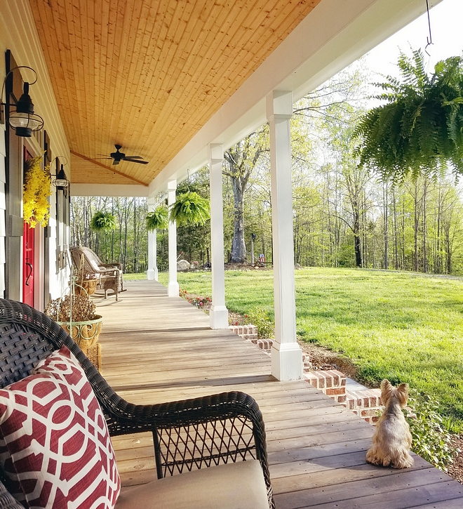
Can you picture yourself here, hearing the birds and breathing the fresh air?
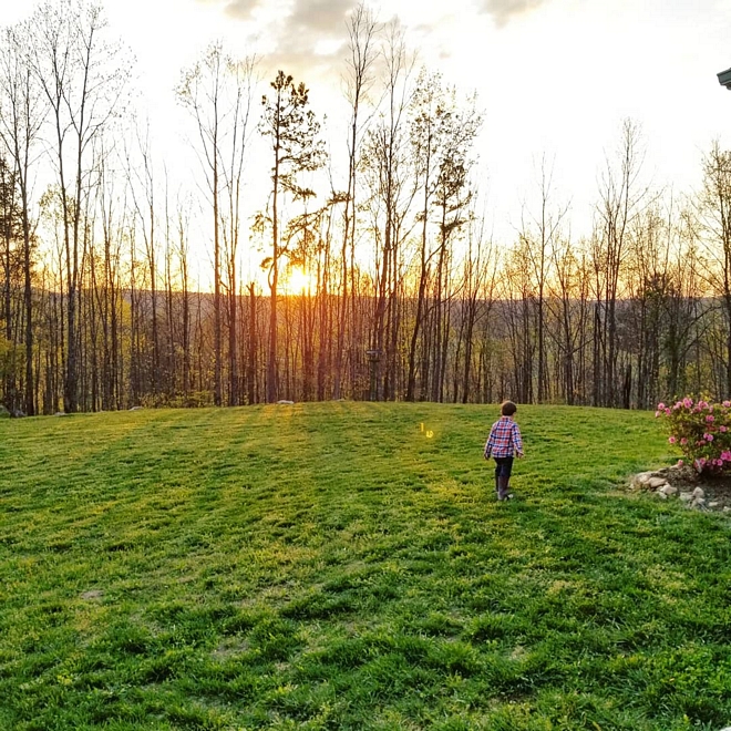
Country home… Where love grows and memories are made. ❤️
Thank you for shopping through Home Bunch. For your shopping convenience, this post may contain AFFILIATE LINKS to retailers where you can purchase the products (or similar) featured. I make a small commission if you use these links to make your purchase, at no extra cost to you, so thank you for your support. I would be happy to assist you if you have any questions or are looking for something in particular. Feel free to contact me and always make sure to check dimensions before ordering. Happy shopping!
Wayfair: Up to 75% OFF on Furniture and Decor!!!
Serena & Lily: Enjoy 20% OFF Everything with Code: GUESTPREP
Joss & Main: Up to 75% off Sale!
Pottery Barn: Bedroom Event Slale plus free shipping. Use code: FREESHIP.
One Kings Lane: Buy More Save More Sale.
West Elm: 20% Off your entire purchase + free shipping. Use code: FRIENDS
Anthropologie: 20% off on Everything + Free Shipping!
Nordstrom: Sale – Incredible Prices!!!
 New-Construction Home for First-time Home Buyer.
 Beautiful Homes of Instagram.
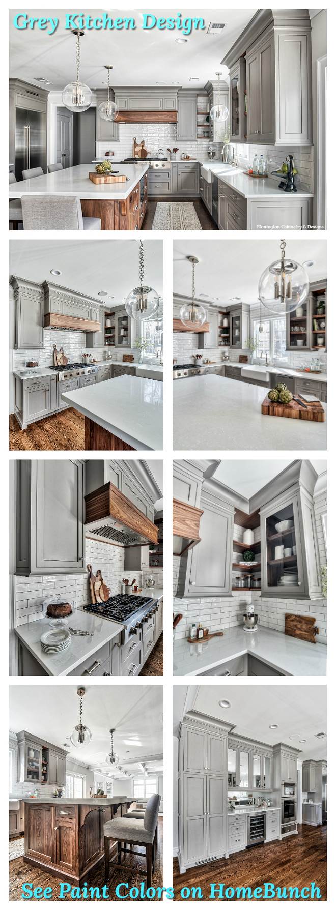 Grey Kitchen Paint Colors.
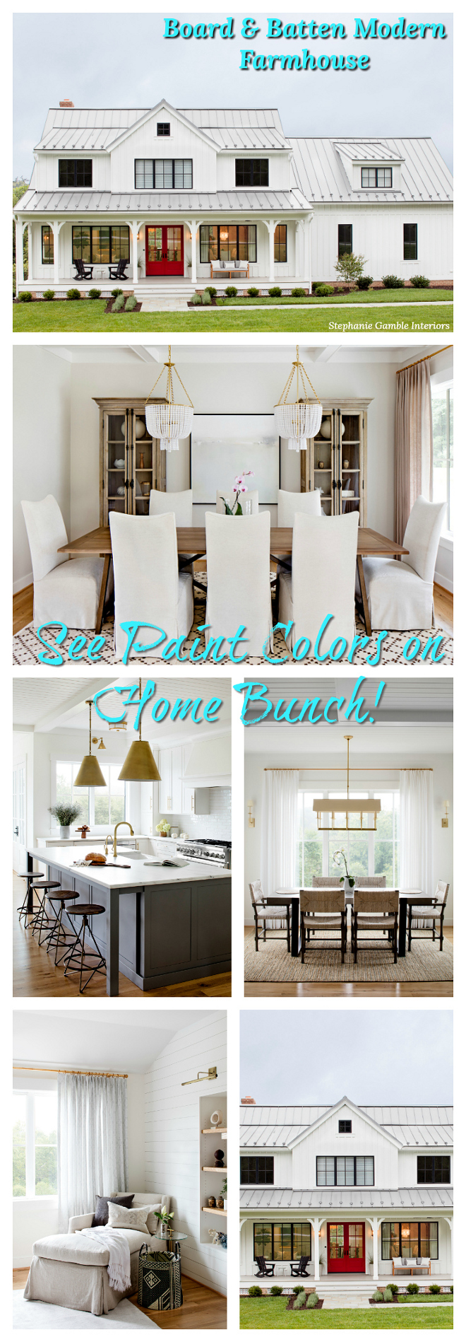 Board & Batten Modern Farmhouse.
 Interior Design Ideas: Transitional Home.
 Georgian-Style Manor with Traditional Interiors.
 Beautiful Homes of Instagram.
 New-Construction Family Home Design.
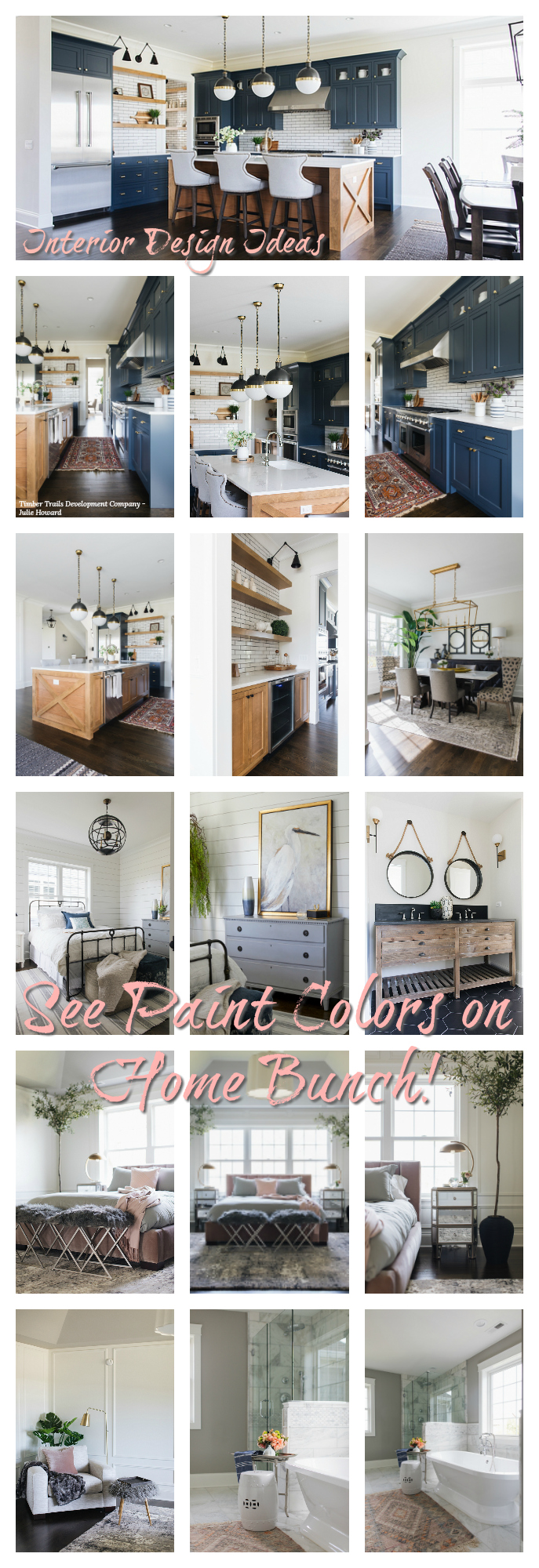 Newest Interior Design Ideas.
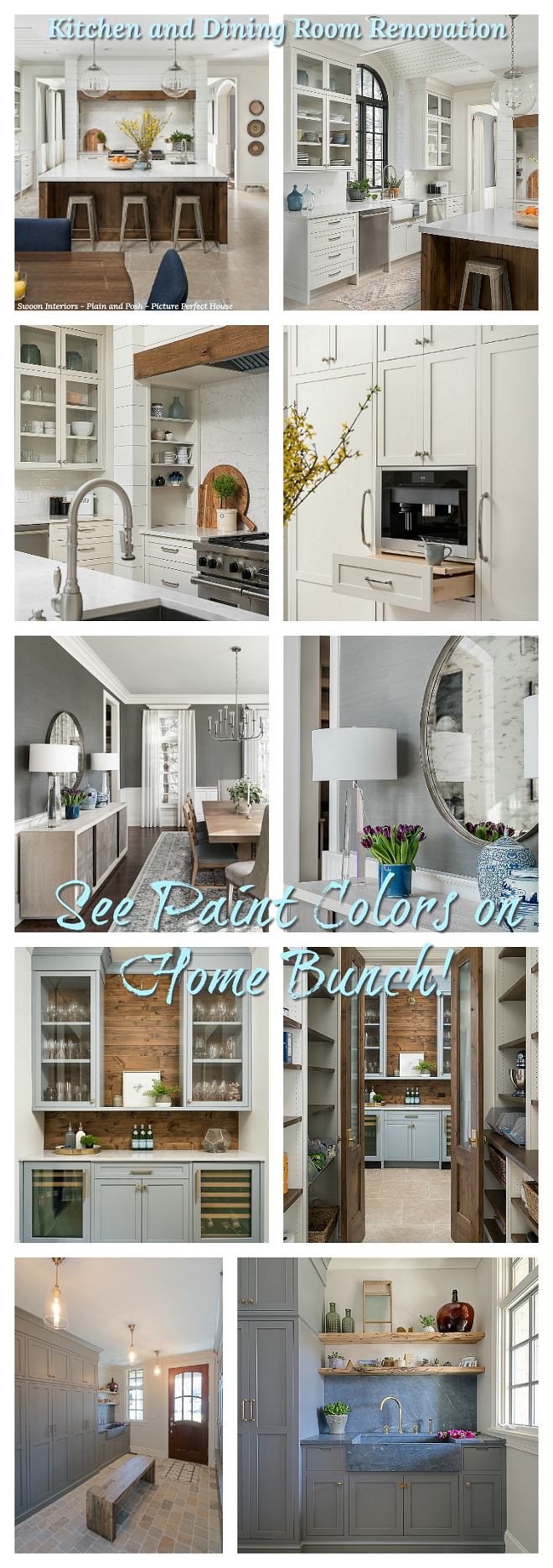 Kitchen and Dining Room Renovation.
 Interior Design Ideas.
“Dear God,
If I am wrong, right me. If I am lost, guide me. If I start to give-up, keep me going.
Lead me in Light and Love”.
Have a wonderful day, my friends and we’ll talk again tomorrow.”
with Love,
Luciane from HomeBunch.com
Interior Design Services within Your Budget ![]()
Get Home Bunch Posts Via Email ![]()
“For your shopping convenience, this post might contain links to retailers where you can purchase the products (or similar) featured. I make a small commission if you use these links to make your purchase so thank you for your support!”
Subscribe to get Home Bunch Posts Via Email
I love the style of the @lovehurtts home!! <3
How can we request a layout of the house plan that @lovehurtts used for her home?