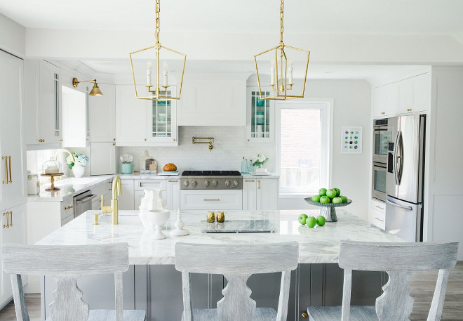
Debi Traub, an avid cook, founder of the blog Simply Beautiful Eating, and contributor for Martha Stewart, was in desperate need to update her tired Toronto kitchen. This is how she describes her old kitchen: “My old kitchen was a disaster zone. The cupboards were literally falling off the ceiling and the interior shelving was so warped, it was a miracle that they held pots and pans without caving in. I had virtually no counter space as the kitchen was small. We demolished the wall between the existing dining area and the kitchen to open up the space, installed a beautiful island with a small sink and ensured that there was plenty of counter and storage space in the new kitchen. I can use so many areas for food prep now. Being a food blogger, stylist and photographer, the island area is now my true dream kitchen prep spot. I wanted to keep the counters clean and uncluttered. I also have two wall ovens which is great for entertaining larger parties. It has improved our lives greatly by having enough space to work in and entertain family friends.”
Take a look and get inspired by this incredible “Before & After” kitchen reno!
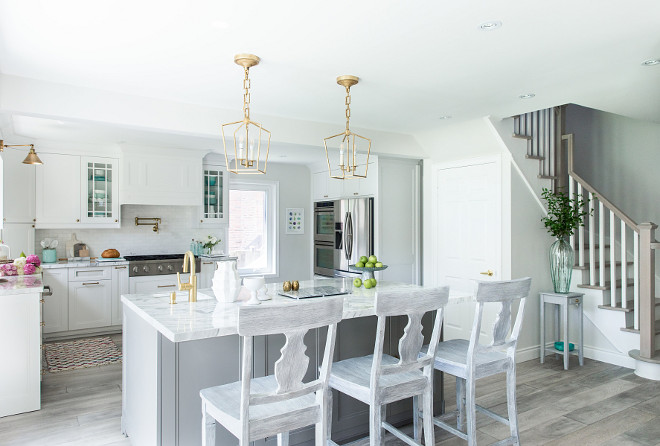
Is it different from before the renovation? YES! The cabinetry is light and airy looking, the drawers are all soft closing, the countertops are marble and very elegant and the hardware is absolutely a dream (all satin brass and a wonderful contrast to the color scheme in the kitchen).
How would I describe my kitchen style? Modern Farmhouse/Hamptons Chic.
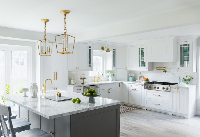
My inspiration for this renovation was found in various magazines and online: Martha Stewart, Better Homes and Gardens, Style at Home, House Beautiful, House and Home Magazine, Pinterest and Houzz.
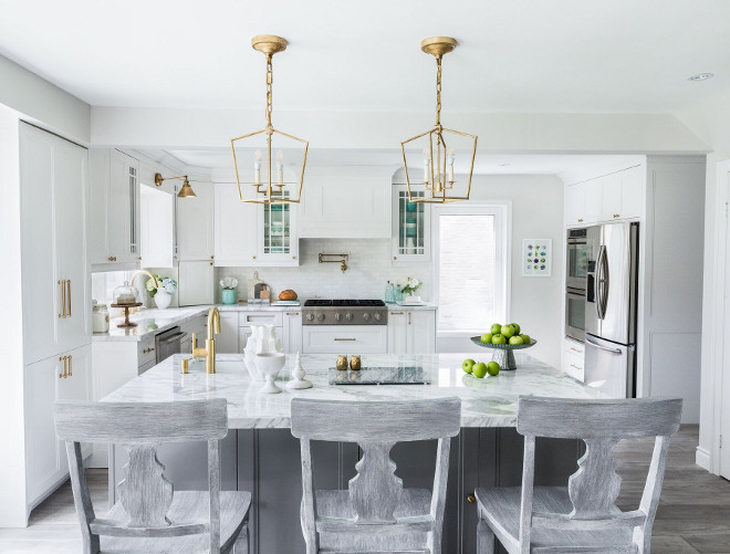
Although the layout and cabinetry was custom made, I wanted to add a unique look to the display cupboards so I drew out the glass design for the cabinet maker.
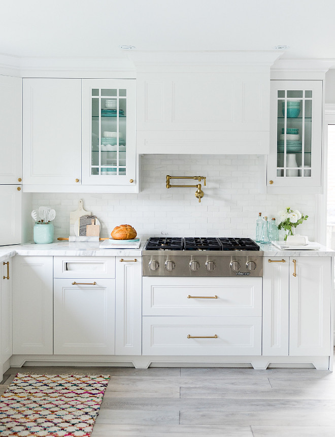
The cabinet paint color is “Benjamin Moore CC-20 Decorator’s White”.
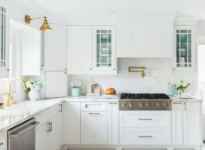
I have a pantry area for all my baking supplies, a corner lazy Susan for dry goods and cans, two slide out drawers on either side of the cooktop (one for all my spices and the the other for my oils and cooking sprays). The glass cupboards display all the beautiful tableware and glassware. This is something that was very important for me to have as I wanted it to be a visual focal point in the kitchen.
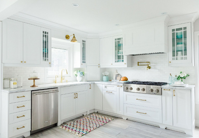
Decor is from HomeSense.
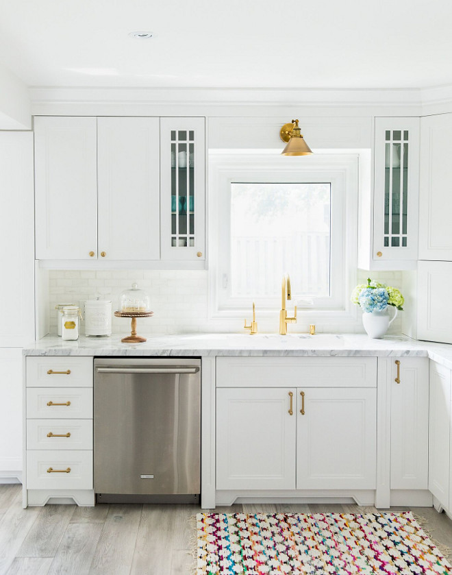
I am loving the layout of the cabinets flanking the sink. Everything is within reach and organized.
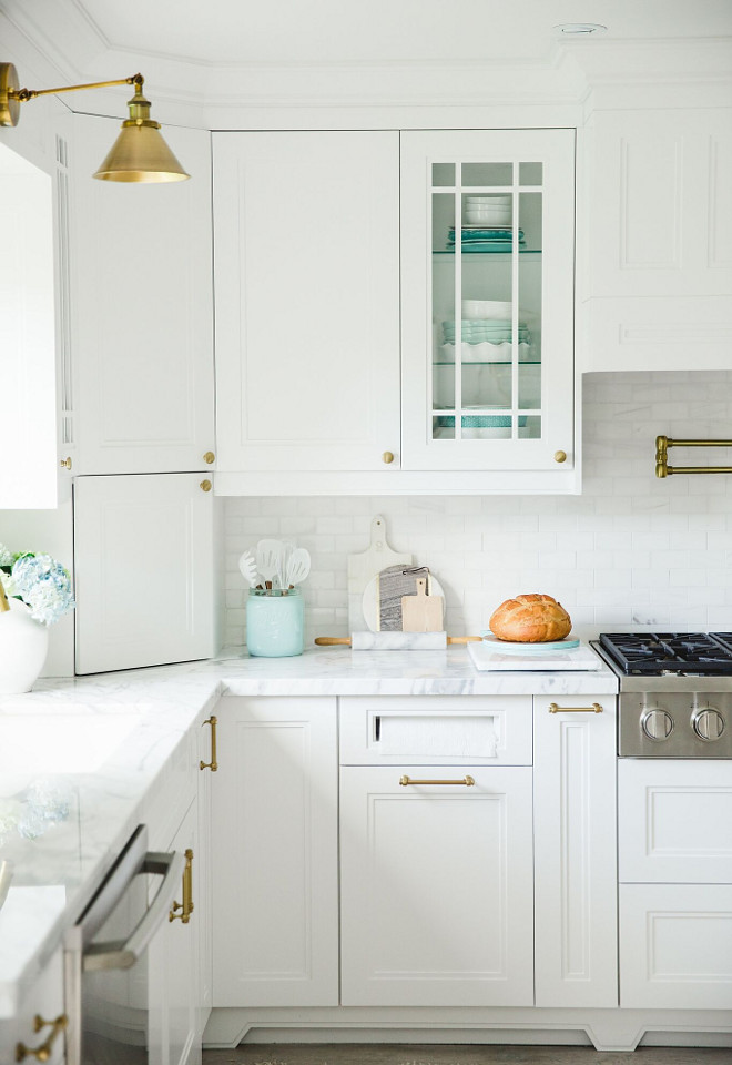
Pulls are from Restoration Hardware – Lugarno Pull in Aged Brass.
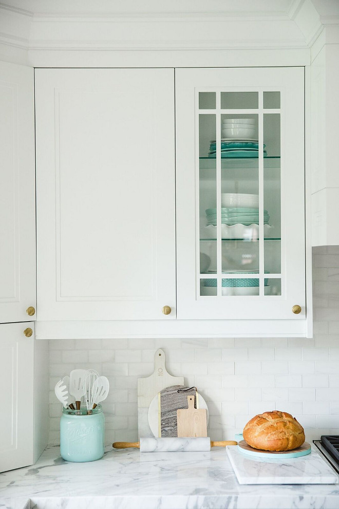
Knobs are Restoration Hardware – Aubrey Knob in Aged Brass.
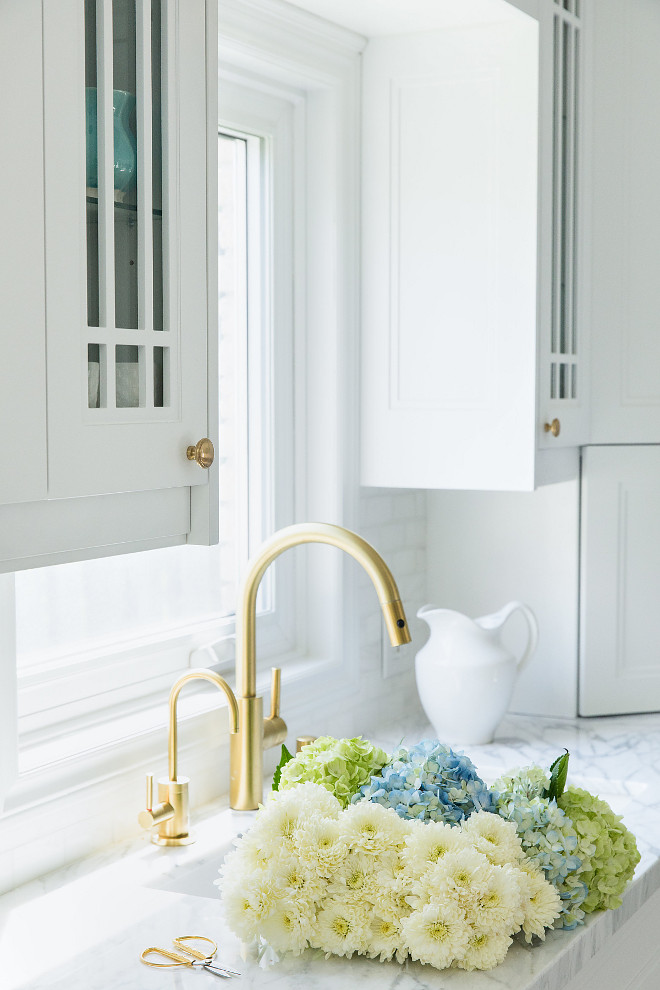
Sinks is Silgranit from Blanco.
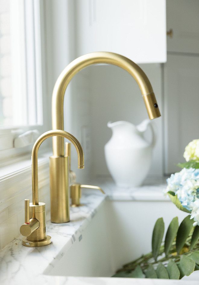
I went with Newport Brass for all the kitchen sinks, accessories and even the sink flange, because everyone needs a matching sink flange, right? I had no idea that there was even such a word as “flange”, until I asked if there was a such a thing as a brass sink thingy that goes around the drain. 🙂
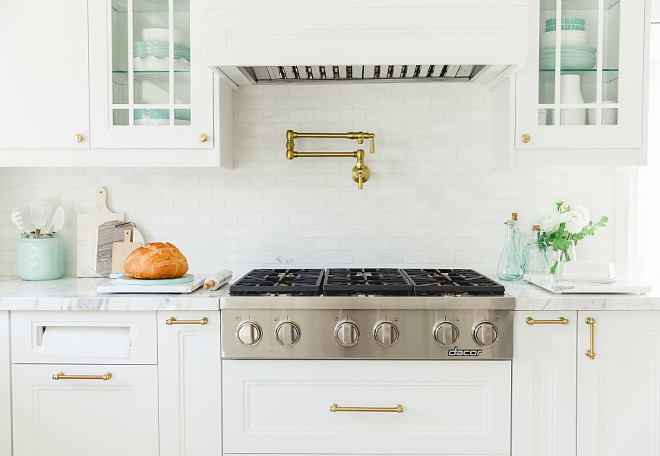
Backsplash: “I thought I was 100% firm on the one that I wanted until the day the counters were installed. I placed all the samples up against the wall and decided to go back to the drawing board. Since the marble was in a league of its own, I didn’t want anything competing with it. Keeping it simple and clean, I went with a white dolomite marble from Sarana Tile. Tip: Choose a backsplash after your counters are installed.”
The range cooktop is by Dacor.
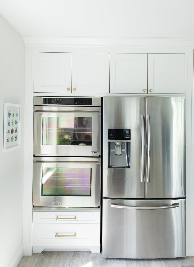
As far as items go, Debi biggest splurge would be the appliances.
Most of the appliances are Dacor.
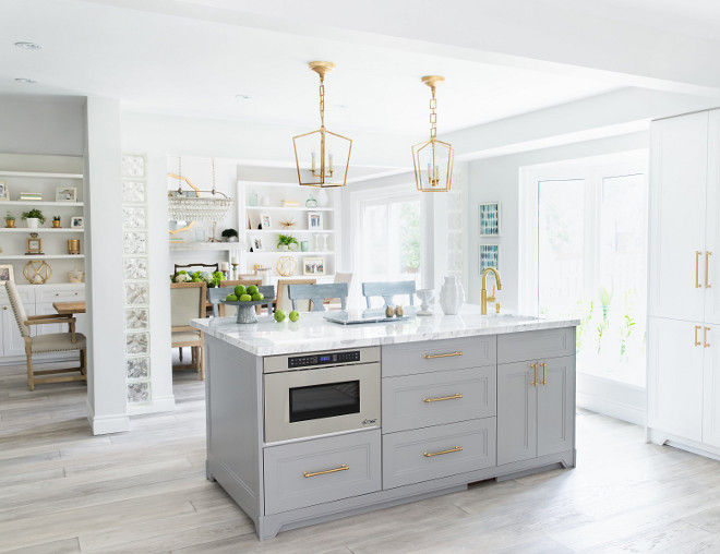
Dimensions: The entire space measures 21 x 17 now that they removed the wall between the existing kitchen and old dining area.
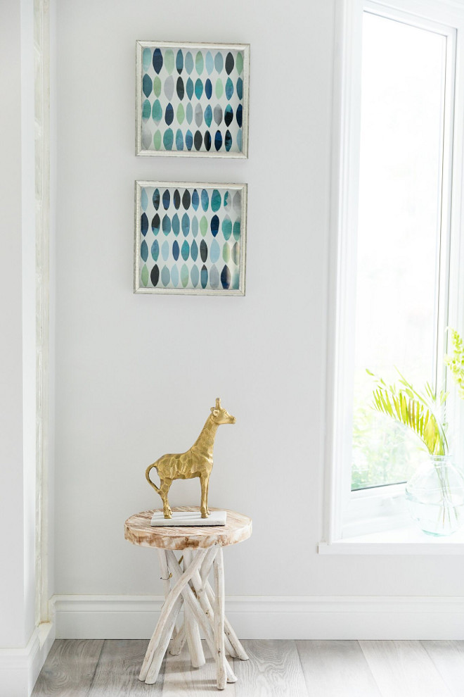
The paint. Oh yes, let’s talk about paint. I can only describe this experience by saying that I own more paint samples than you could imagine. It started out as a simple task. I wanted a pure gray for the walls. What does that mean? Well, a pure gray has no undertones at all. No blue. No green. No purple. No red. No brown. NO NOTHING. Just a pure and simple gray. Did I find it? Yes. I had already picked out a beautiful shade of Martha Stewart’s Lava Stone Gray for my kitchen island and wanted something to compliment it. I found the perfect one, Benjamin Moore’s Silver Chain 1472. I took the colour gradation down 75% because I wanted it very light. It is soft, with no hints of any weirdness, and it is gracing my walls throughout the entire main floor. Tip: Most specialty paint stores charge almost double for a sample. Best bet? Big box stores are 50% less.
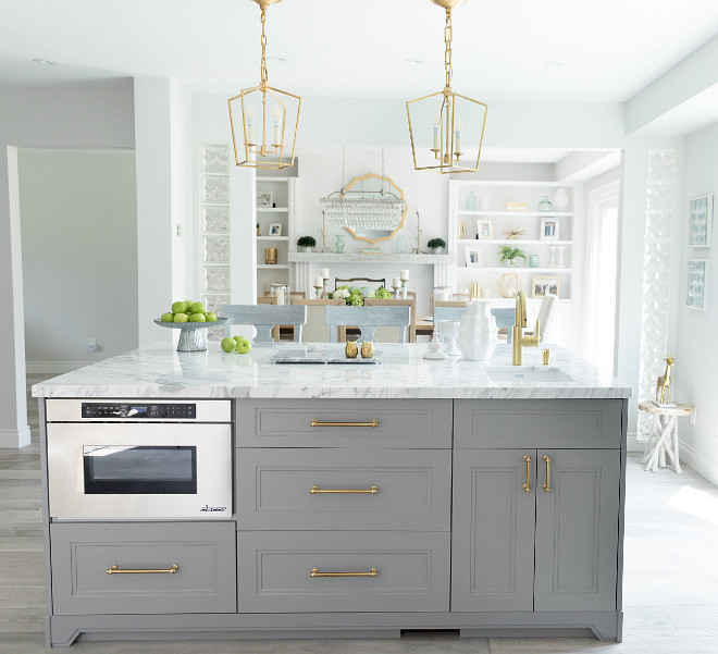
The grey island paint color is Martha Stewart’s Lava Stone Gray.
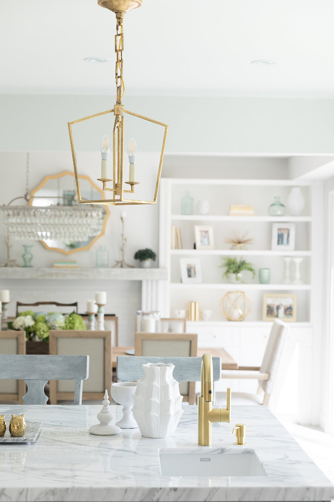
The countertops. This is another focal point in the kitchen, and one of the first things I chose. I saw a sample of quartz that I liked and thought that it would be the most practical choice, geared for food preparation, spills and the inevitable mess that is the standard state in a food blogger’s kitchen. And then, I fell head over heels in love with a slab of marble that I should not have installed in my kitchen. Marble is as temperamental as a two year old, but as beautiful as a private island in the Caribbean. Countertops are one of the biggest investments you are going to make during a kitchen makeover. Tip: If you do choose marble, please make sure you have it professionally sealed.
The prep sink is by Blanco.
Bar Faucet is Newport Brass.
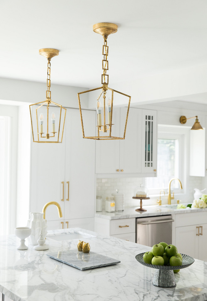
The kitchen fixture above the sink are from Joss & Main – currently on sale!
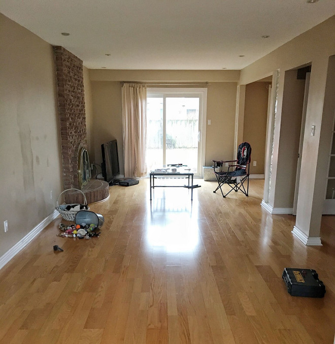
Debi’s dining room used to be dark and felt isolated from the kitchen area.
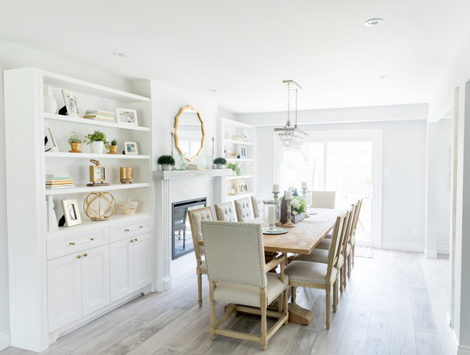
The room now feels open, airy and even bigger!
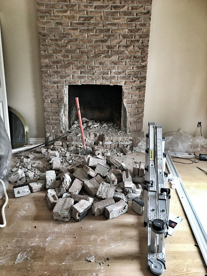
Debi and her husband worked really hard to transform this space.
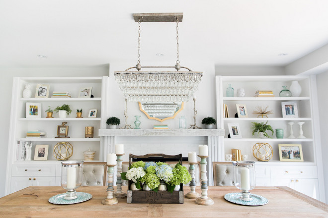
I wanted a very fresh look for this renovation and decided to incorporate a DIY project to save money. The fireplace mantlepiece was one focal point that my husband and I created together as a team.
My husband is extremely handy and can build and design just about anything so that’s a big plus. The two of us had a vision for this fireplace. We purchased an electric fireplace unit and it’s set into the wall. I’ve never had a mantlepiece so this was one thing I wanted my home as another focal point in the new dining area. We were walking through Home Depot looking at materials to use to build the sides of the fireplace. I chose each piece of wood and my husband built it from scratch. He even made the side panels by hand and created a riveted look with long strips of the material. I spotted barn wood in one area of the store and said, THAT’S MY FIREPLACE MANTLE!. It is a washed light gray and blends with my new hardwood floor. I wanted the top of the fireplace painted the same color as all the cabinetry and fell in love with a mirror I found at HomeSense so I knew it would be perfect above mantle. It was very easy to install the barn wood shelf and I was really excited to use an air gun to nail it together (supervised of course!)
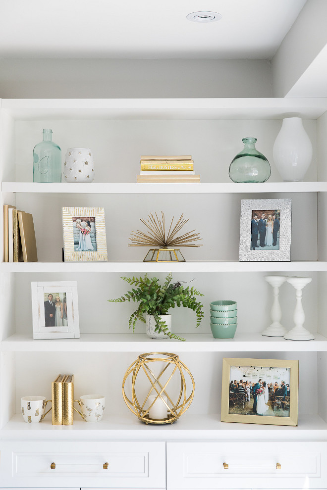
Isn’t this beautiful? I love the coastal hues and the brass against the crisp white cabinetry.
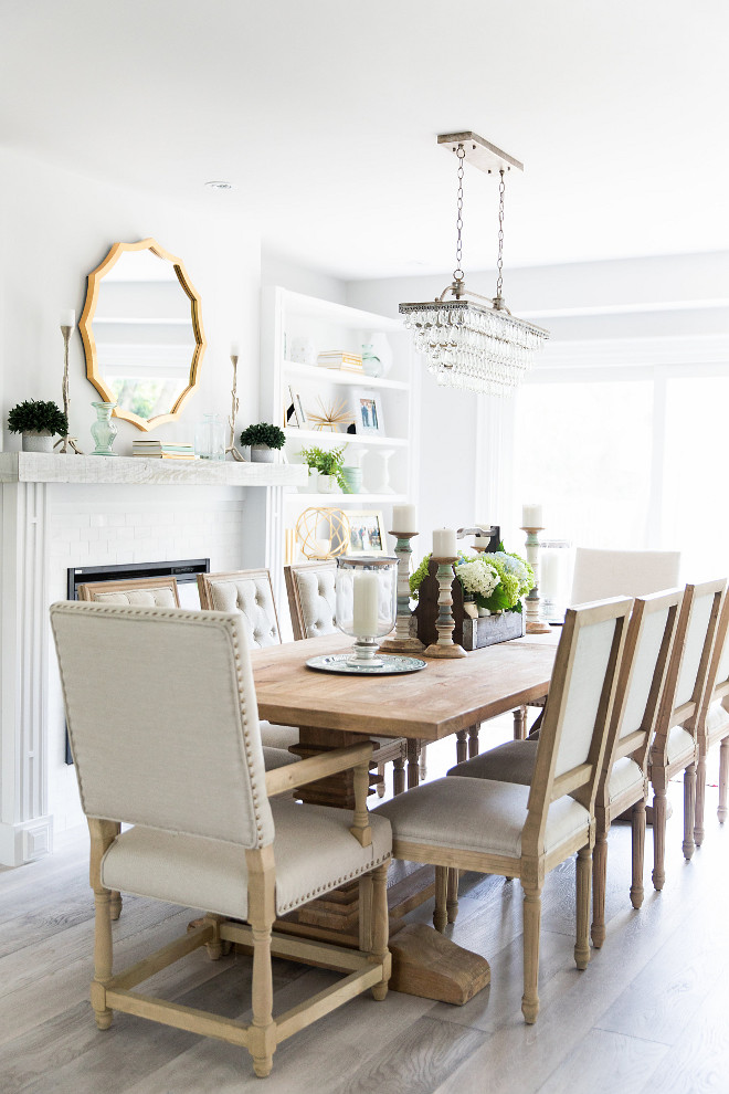
The flooring manufactured hardwood by Kentwood – Brushed Oak – Color is Angora. It’s really stunning!
The flooring. This was one of the hardest decisions ever. I leaned towards a vintage gray-wash hardwood floor throughout the entire main floor, with the exception of the laundry and powder room. My husband hated the idea of that particular wood flooring. We chose a hardwood sample that both of us weren’t crazy about and in the 11th hour, I changed my mind, and went back to the store with him to pick something else. We ended up with exactly what I had seen a million times on Pinterest. THE GRAY-WASH HARDWOOD. My husband’s reasoning for succumbing to the floor I wanted? He said that it looked different in person than in a picture. Tip: If you are installing hardwood in the kitchen, buy a waterproof rug for areas near the sink and dishwasher.
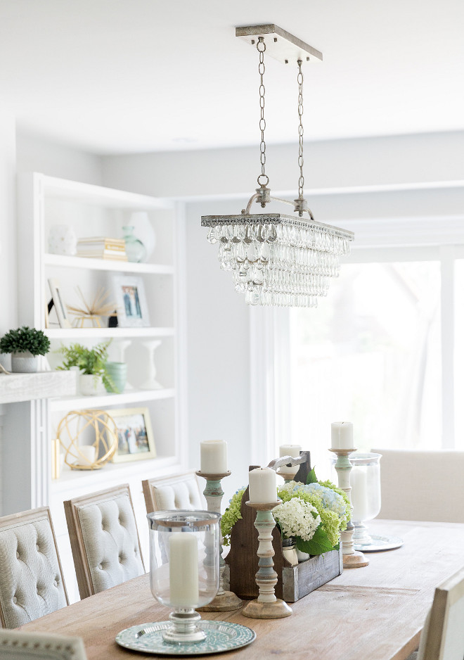
My new dining room table is made from reclaimed wood and I wanted to keep a natural flow with the rustic but chic look of the room.
Get the Look:
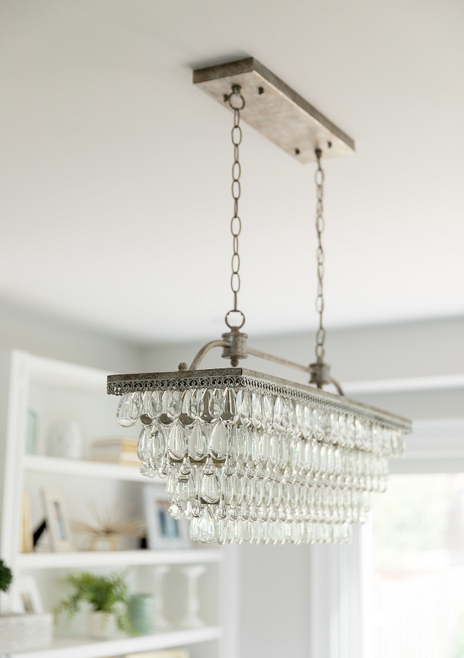
Crystal Drop Rectangular Chandelier: Overstock.
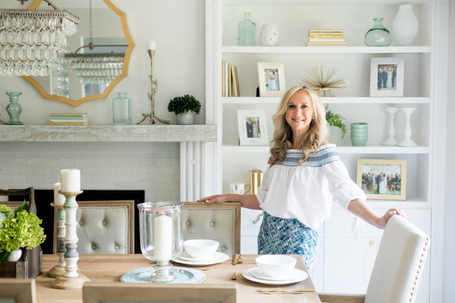
Debi is looking stunning and very happy at her newly renovated home! 🙂
Interior Design, Decor & Styling – Debi Traub – Simply Beautiful Eating.
Kitchen Cabinetry Consultant – Layout & Island Colour – Monaco Interiors
***Photos are a combined effort – Debi Traub @Simplybeautifuleating & Michelle Belsky @MagnoliaStudios
Thank you for shopping through Home Bunch. For your shopping convenience, this post may contain AFFILIATE LINKS to retailers where you can purchase the products (or similar) featured. I make a small commission if you use these links to make your purchase, at no extra cost to you, so thank you for your support. I would be happy to assist you if you have any questions or are looking for something in particular. Feel free to contact me and always make sure to check dimensions before ordering. Happy shopping!
Wayfair: Up to 75% OFF on Furniture and Decor!!!
Serena & Lily: Enjoy 20% OFF Everything with Code: GUESTPREP
Joss & Main: Up to 75% off Sale!
Pottery Barn: Bedroom Event Slale plus free shipping. Use code: FREESHIP.
One Kings Lane: Buy More Save More Sale.
West Elm: 20% Off your entire purchase + free shipping. Use code: FRIENDS
Anthropologie: 20% off on Everything + Free Shipping!
Nordstrom: Sale – Incredible Prices!!!

 Tom Brady and Gisele Bundchen’s Home – Full House Tour.
 Beautiful Homes of Instagram: Modern Farmhouse.
 2019 New Year Home Tour.
 Coastal Farmhouse Home Decor.
 Beautiful Homes of Instagram: Charlotte, NC.

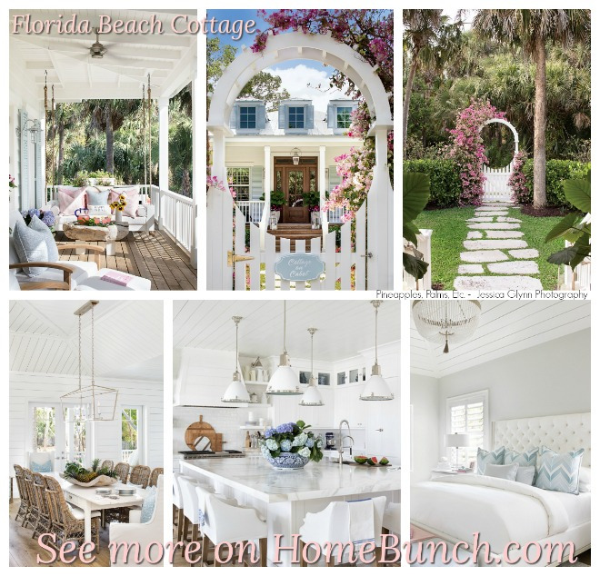 Florida Beach Cottage.
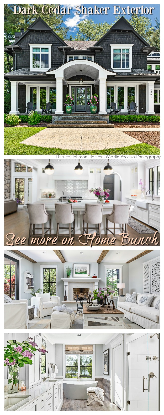 Dark Cedar Shaker Exterior.
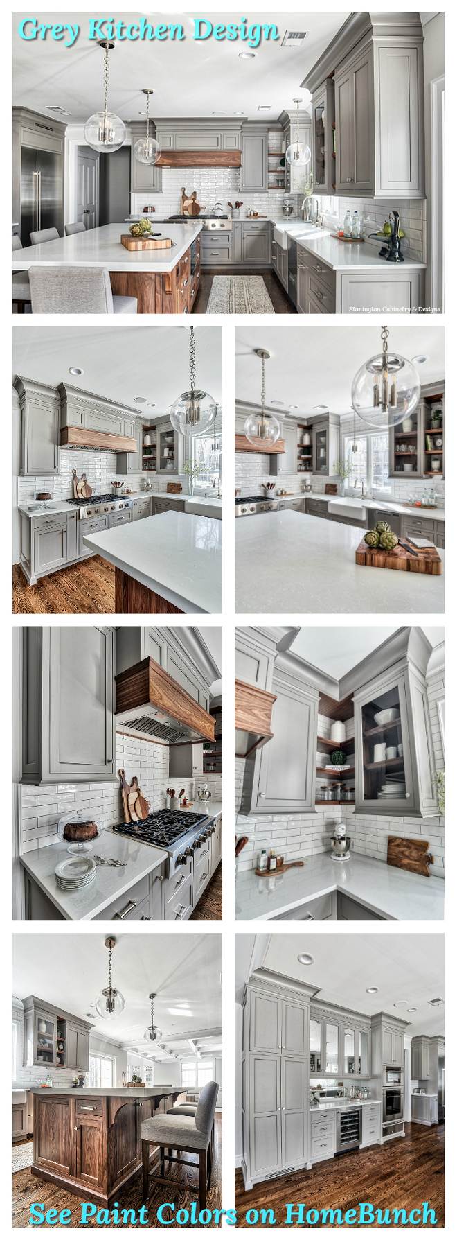 Grey Kitchen Paint Colors.
“Dear God,
If I am wrong, right me. If I am lost, guide me. If I start to give-up, keep me going.
Lead me in Light and Love”.
Have a wonderful day, my friends and we’ll talk again tomorrow.”
with Love,
Luciane from HomeBunch.com
Subscribe to get Home Bunch Posts Via Email
Hello, I came across a beautiful white kitchen with brass hardware and a marble countertop. Can you tell me the name marble countertop, I would like to find a quartz in a similar color for my white cabinets and light floor.
Thanks
Hi Keisha,
Feel free to contact the designer – she should be able to be more specific about this.
Thank you!
Luciane