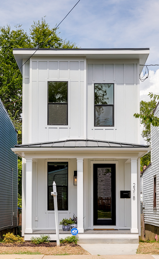
We often see TV shows transforming homes that are falling apart into dream homes, but that’s not so hard to do when you have a big team working against the time to show the beautiful results. Don’t get me wrong, I am a HUGE fan of some of these shows and some of them can certainly be trend setters, but today I want to showcase a builder and designer that could envision a new modern farmhouse on a really narrow lot in a real fixer-upper neighborhood. That’s the type of work I can really admire. Keep reading to know more:
“Hi everyone! My name is Amanda of @Nest_Builders_. I’m so excited to contribute to Home Bunch! My company Nest Builders Development & Design Co. builds and renovates homes in Richmond, Va.
With each home I build I try to incorporate current trends and timeless style while staying some what true to the style of other homes in the neighborhood. I call this project “The Urban Farmhouse.” This new construction home is located in the city along side Italianate homes. This home is only 15 ft. wide so keeping the floor plan open and the design as as light and bright as possible was very important. We kept the exterior style of the home similar to the other homes on this block but we added the board and batten siding, white exterior paint, and black windows to give it an updated and on trend look. We made the front porch low to the ground to also give the home some southern charm. The roof is a flat TPO roof similar to the other homes on this block.”
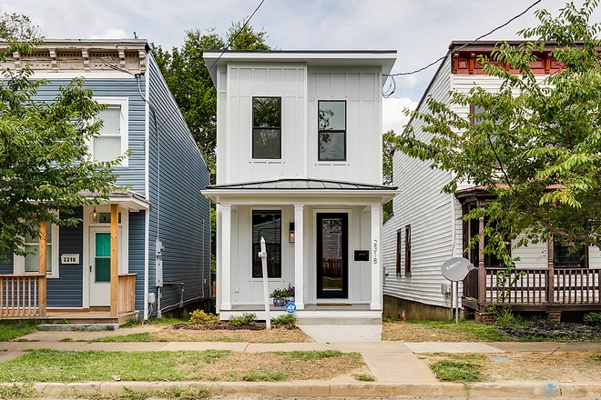
This newly-built white urban farmhouse features white siding black vinyl windows, black metal roof, black TPO roof a black front door.
Home Overall Details: 3 Bedrooms – 2.5 Baths
Roof: Black TPO roof with metal roof details in Black.
Siding and Trim: James Hardie Arctic White.
Windows: Jeld Wen Windows in Black.
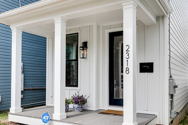
The front porch features grey Trex Deck.
Flower Pots by Williams Sonoma.
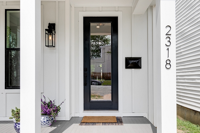
The front door is painted in “Soot by Benjamin Moore”.
Exterior Lighting: Vintage Suspended Pane Outdoor Sconce – small – similar here – Others: here, here & here.
Mailbox by Pottery Barn.
Address Numbers by Home Depot.
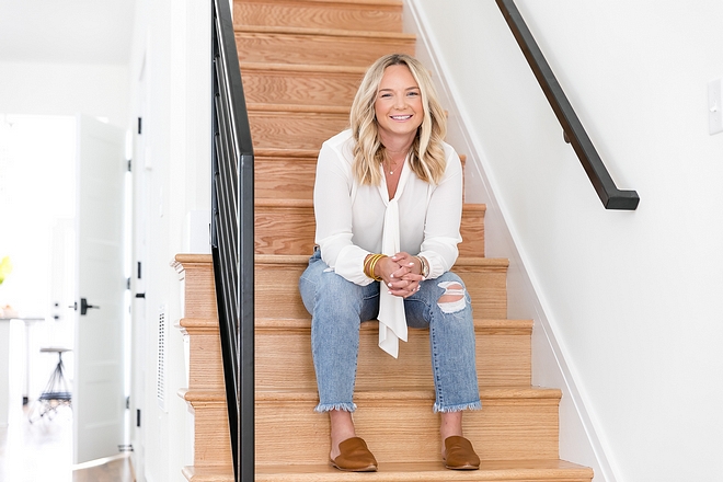
This is the talented and beautiful designer, Amanda Seibert.
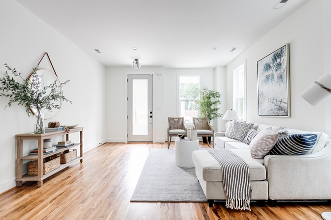
The interiors feel bright, open and very welcoming without being cluttered.
Door Paint Color: Repose Gray by Sherwin Williams.
Lighting by Shades of Light – similar here, here & here.
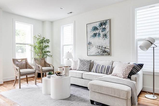
We live in a historic southern neighborhood so I wanted to keep the furniture traditional yet modern. I think the neutral colors, soft textures, and clean lines marry both styles well.
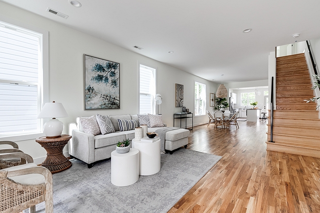
Paint Color: Simply White by Benjamin Moore.
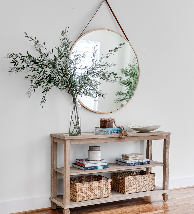
A wooden console table brings warmth and some storage space to this living room.
Beautiful Console Tables: here, here, here, here, here & here.
Mirror: West Elm – Others: here & here – similar.
Olive Stems: here.
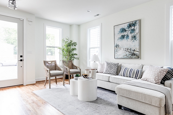
Furniture was provided by a stanging company that beautifully decorated this entire home.
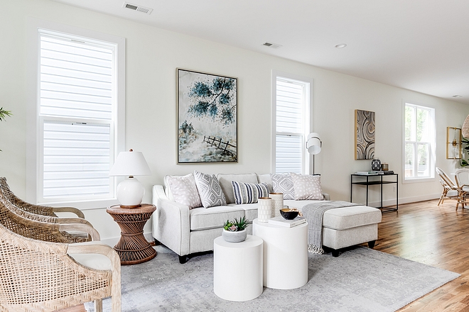
Coffee Table: Wayfair.
Peacock Rattan Side Table: here – similar.
Table Lamp: Home Goods – Similar: here, here & here.
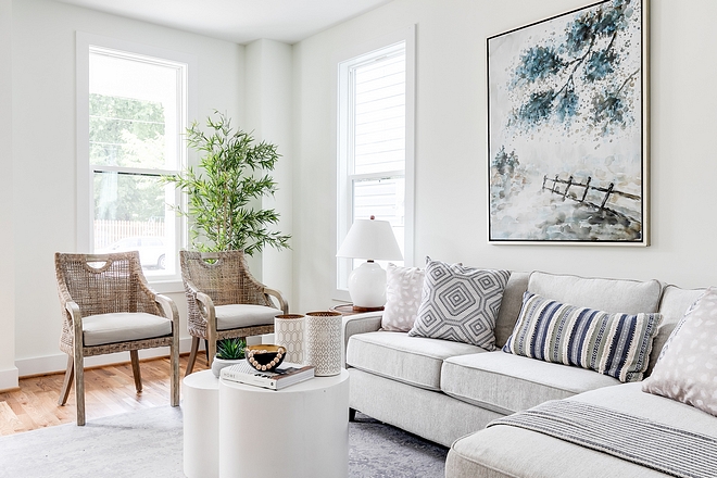
Art: Green Front Furniture – Others: here, here, here & here.
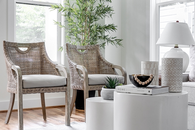
Rattan Arm Chairs: Green Front Furniture – Others: here, here, here, here, here & here.
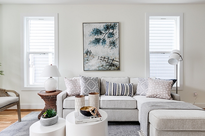
Sofa: Scott Living Reversible Sectional.
Floor Lamp: Home Goods – Similar: here.
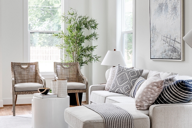
(Scroll to see more)
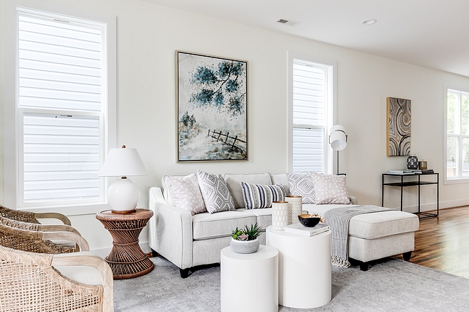
Rug: Home Goods – Shop Neutral Rugs: here, here, here, here & here.
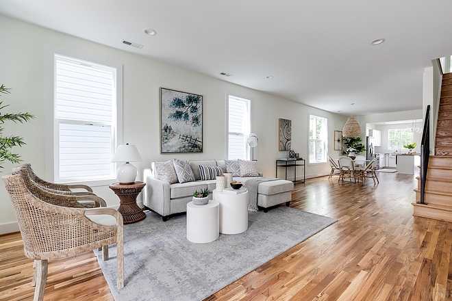
We kept the floors light. We used white oak with a clear finish throughout the home.
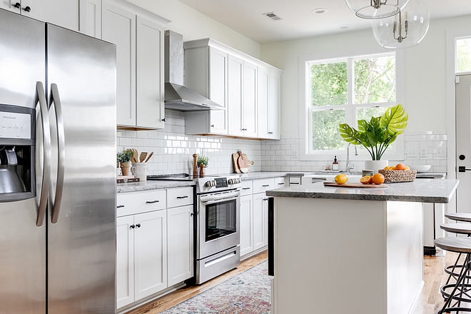
It was very important to me that we kept this house affordable but I wanted it to feel luxurious. I used a granite that mimics marble to get that same look and upgraded the lights and cabinet pulls. The polished nickel coloring of the lights balance the black of the pulls to make the kitchen feel fresh but warm and inviting.
Runner: Wayfair.
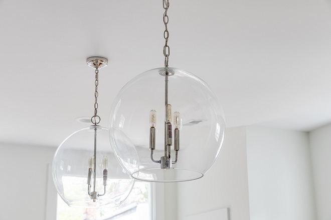
Lighting by Shades of Light – similar here – Other Affordable Pendants: here, here, here, here & here.
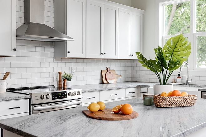
Countertop is white Granite.
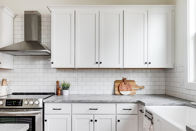
Cabinet Hardware: Metro – 3 3/4″ Centers Uptown Appeal Pull in Matte Black.
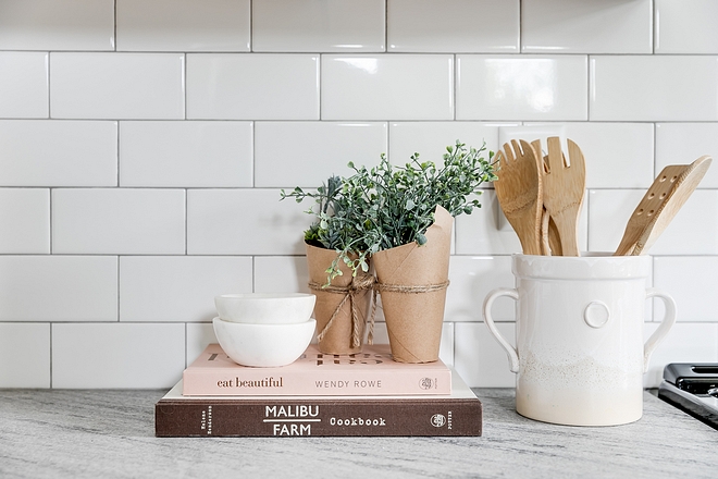
Glazed Ceramic Crock: here.
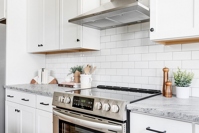
Range: Frigidaire 30″ Freestanding Range.
Ventilation Hood: Frigidaire.
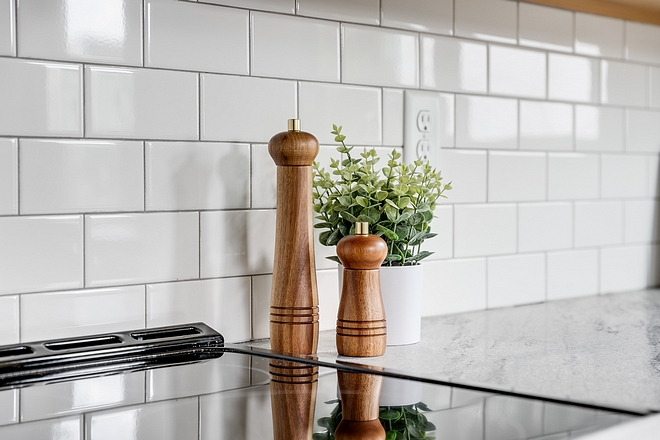
Backsplash tile by The Tile Shop, Imperial Bianco Gloss Ceramic Subway Tile – 3 x 6 – similar here (Great price!) Other Beautiful Tiles: here, here, here, here & here.
Grout: Silver by Mapei.
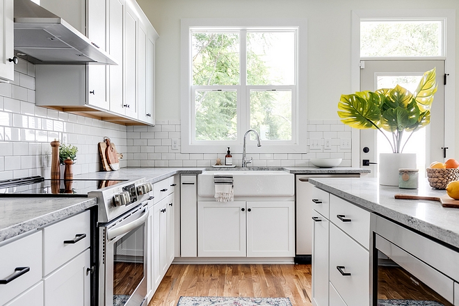
Cabinets Aristokraft Select Series with Winstead White Shaker Full Overlay installed by Midsouth.
Microwave: Frigidaire.
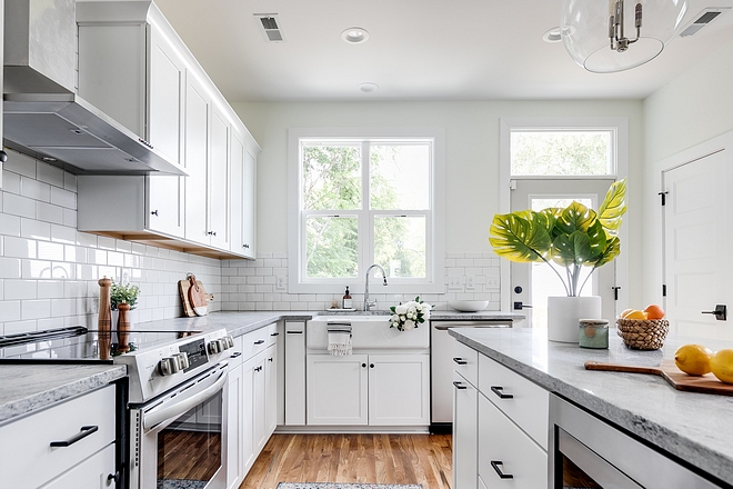
Kitchen cabinets are “Simply White by Benjamin Moore”.
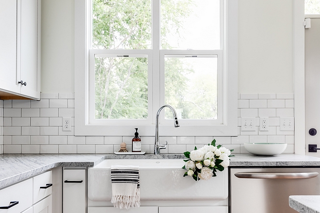
Kitchen Sink: 30” Kohler WhiteHaven Apron Sink.
Dishwasher: Frigidaire.
Bowl: Crate & Barrel.
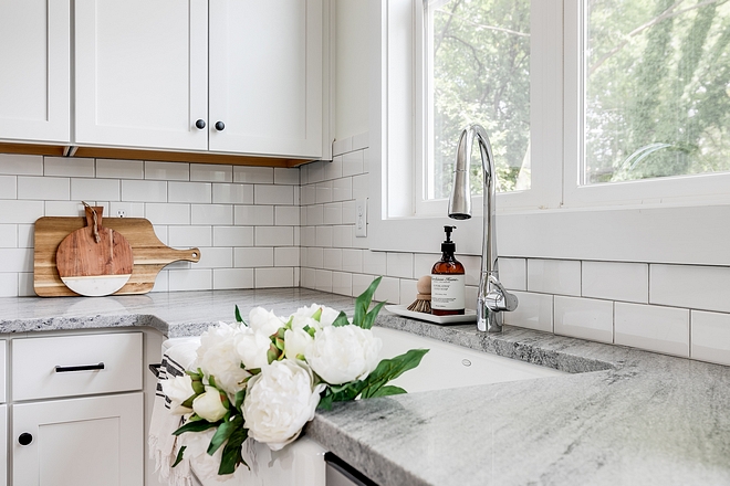
Faucet is Delta.
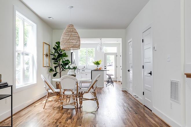
I love this light fixture! I knew from the moment I started designing this house that I would use this light fixture. It’s upscale, southern, and a little coastal. It blends all of my favorite styles to make this home feel custom and luxurious.
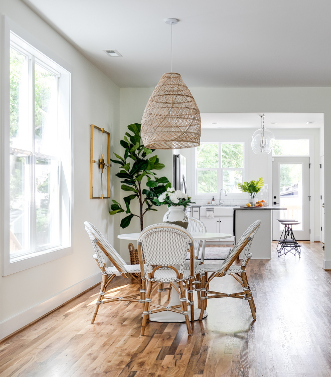
Lighting by Serena & Lily.
Fiddle Leaf Three: Pottery Barn (Basket is also Pottery Barn).
Wall Clock: Imax Esteri Acrylic Wall Clock.
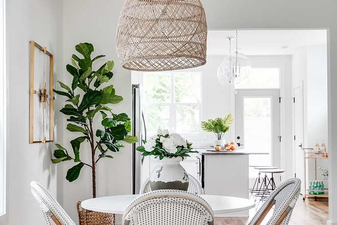
Vase by Pottery Barn. Flowers are also by Pottery Barn.
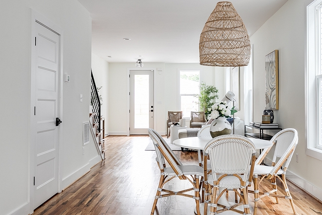
Dining chairs are by Serena & Lily.
Dining Table: Ikea, DOCKSTA.
Paint Color: Simply White by Benjamin Moore.
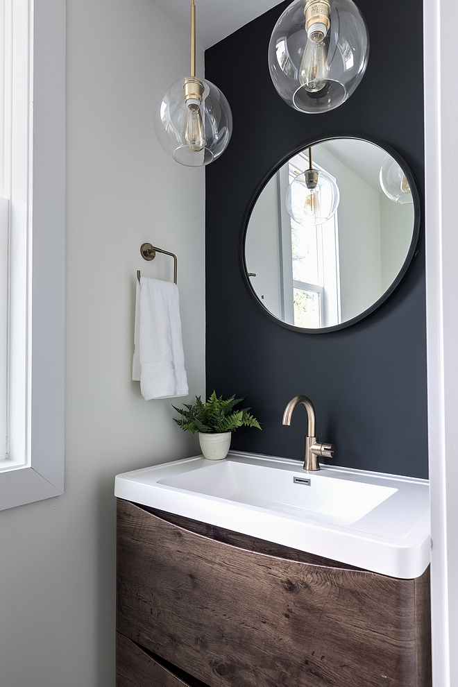
The floor tile was the inspiration for this room. The half bath is always one of my favorite places to create a show piece in the home. It’s a small space so you can uses really expensive materials without breaking the bank. We upgraded the tile to cement and used a fun vanity to give it more of a custom look.
Lighting by West Elm.
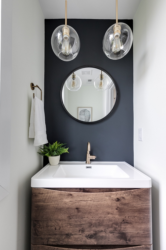
Accent Wall Color: “Soot by Benjamin Moore”.
Paint Color: “Simply White by Benjamin Moore”.
Vanity by Home Depot (also available here).
Mirror by Wayfair.
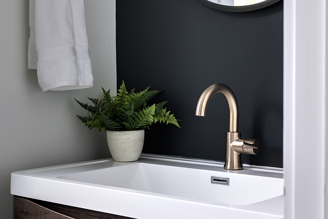
Plumbing by Delta.
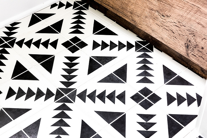
Tile by Cement Tile Shop, Tulum Tile – Also available here.
Grout: White, Mapei.
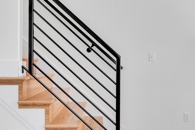
I am a beach girl at heart. I see these railing in a lot of coastal homes and I just thought it would be a cool feature that would go well with the front elevation of the home.
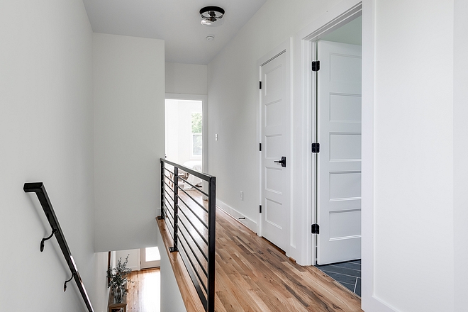
Railing is custom-made, powder coated metal.
Paint Color Simply White by Benjamin Moore.
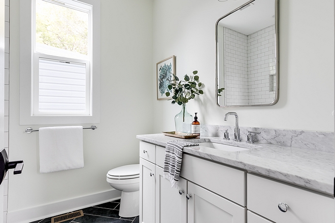
Again trying to blend trendy and modern with timeless and elegant, I opted for a white vanity and did a herringbone pattern with the black floor tile. I used a polished nickel mirror with rounded edges to soften to the space and incorporate some modern touches.
Cabinet: White Aristokraft.
Mirror by Rejuvenation.
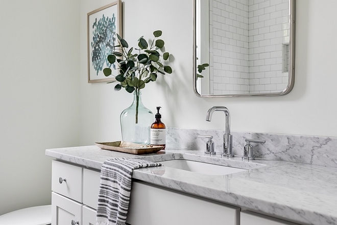
Countertop is Carrara Marble.
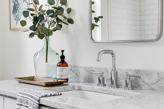
Bathroom faucet is Moen.
Vase: Joss & Main.
Eucalyptus Stems: Joss & Main.
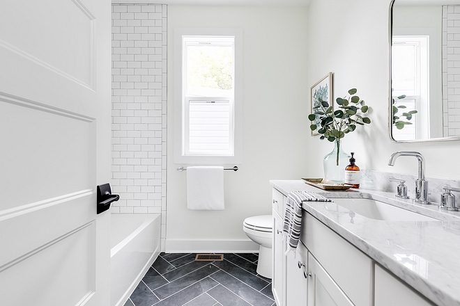
Bathroom is Simply White OC-117 by Benjamin Moore.
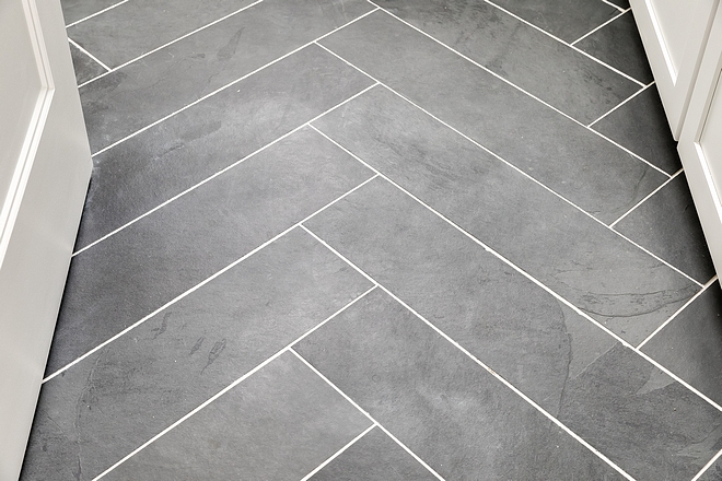
Tile by Home Depot 6 x 24.
Grout: White by Mapei.
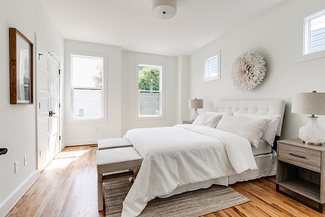
The master is typically in the back of the house in the city but we moved it to the front to capture as much natural light as we could.
Nightstands: Target.
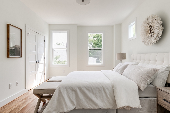
White Bedroom Paint Color: “Simply White by Benjamin Moore”.
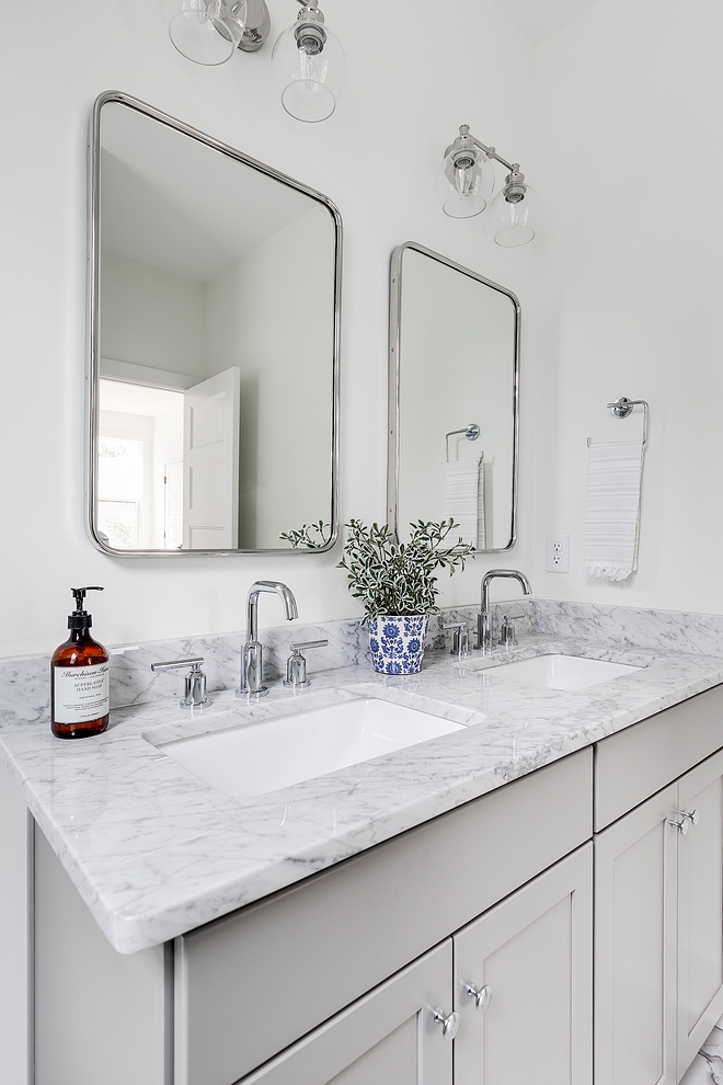
Bathroom countertop is Carrara Marble.
Mirrors are Rejuvenation – Other Great Mirrors: here, here, here & here.
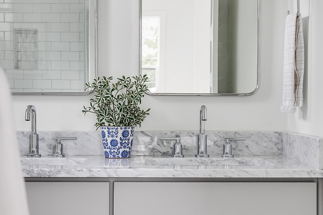
Faucets are Moen. I love these faucets!
Photography: Mike Anders Photography.
Home Staging: Vignettes Home Staging LLC.
Thank you for shopping through Home Bunch. I would be happy to assist you if you have any questions or are looking for something in particular. Feel free to contact me and always make sure to check dimensions before ordering. Happy shopping!
Serena & Lily: Enjoy 20% OFF Everything with Code: GUESTPREP
Wayfair: Up to 75% OFF on Furniture and Decor!!!
Joss & Main: Up to 75% off Sale!
Pottery Barn: Bedroom Event Slale plus free shipping. Use code: FREESHIP.
One Kings Lane: Buy More Save More Sale.
West Elm: 20% Off your entire purchase + free shipping. Use code: FRIENDS
Anthropologie: 20% off on Everything + Free Shipping!
Nordstrom: Sale – Incredible Prices!!!
 Black & White Modern Farmhouse.
 Beautiful Homes of Instagram: Modern Farmhouse.
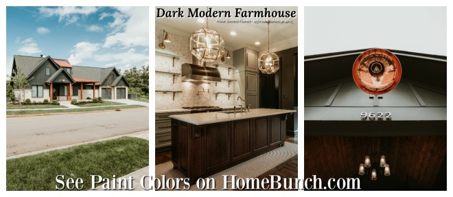 Dark Modern Farmhouse.
 2019 New Year Home Tour.
 Neutral Home.
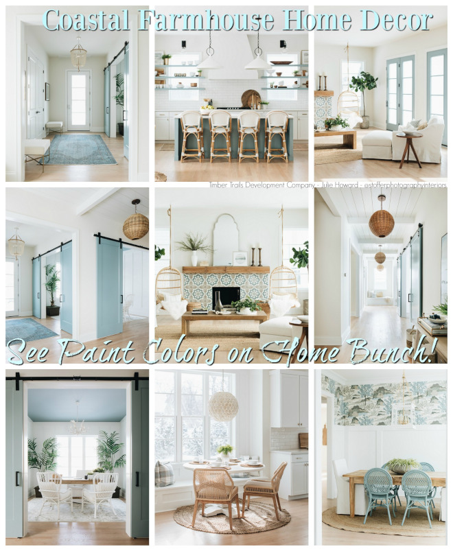 Coastal Farmhouse Home Decor.

 Beautiful Homes of Instagram: Charlotte, NC.

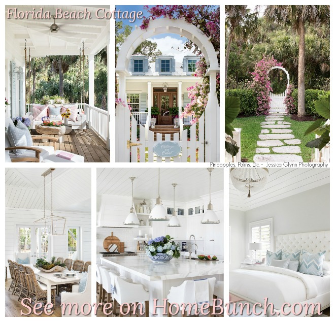 Florida Beach Cottage.
 Tom Brady and Gisele Bundchen’s Home – Full House Tour.
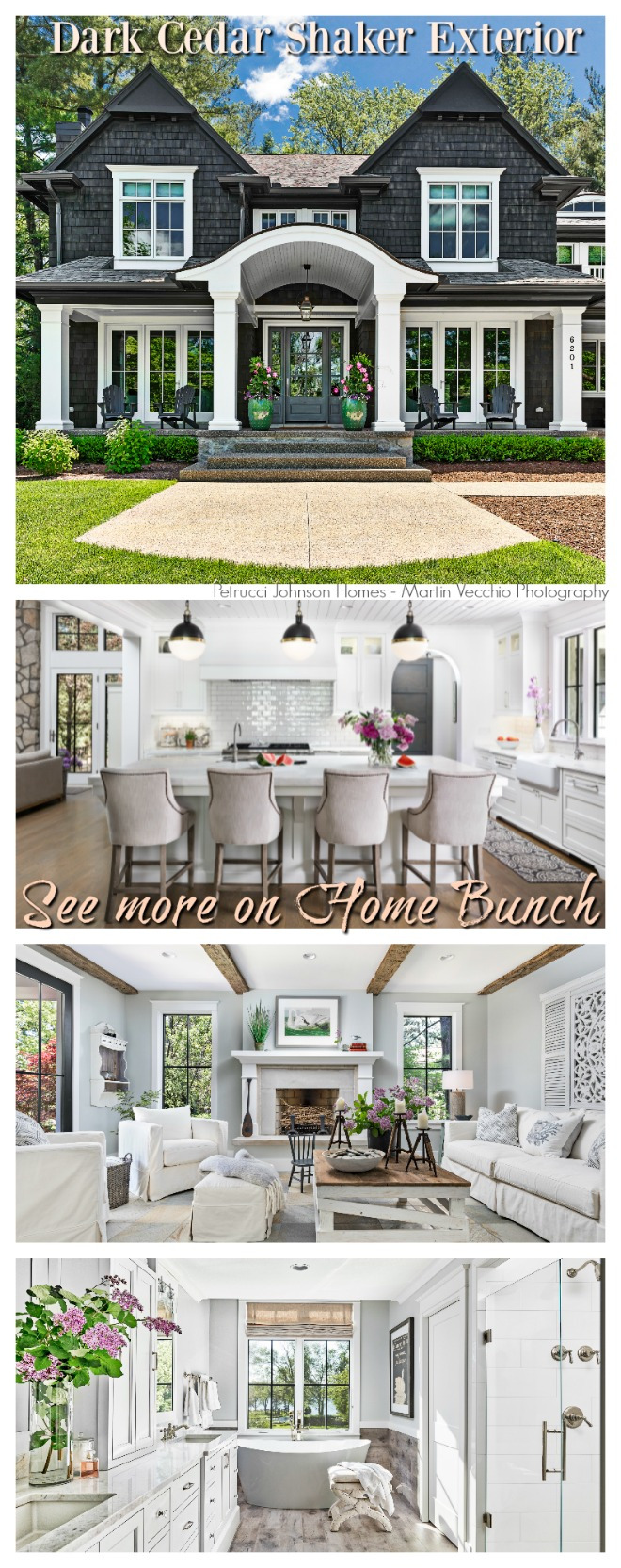 Dark Cedar Shaker Exterior.
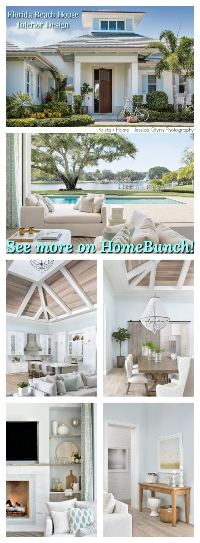 Florida Beach House Interior Design.
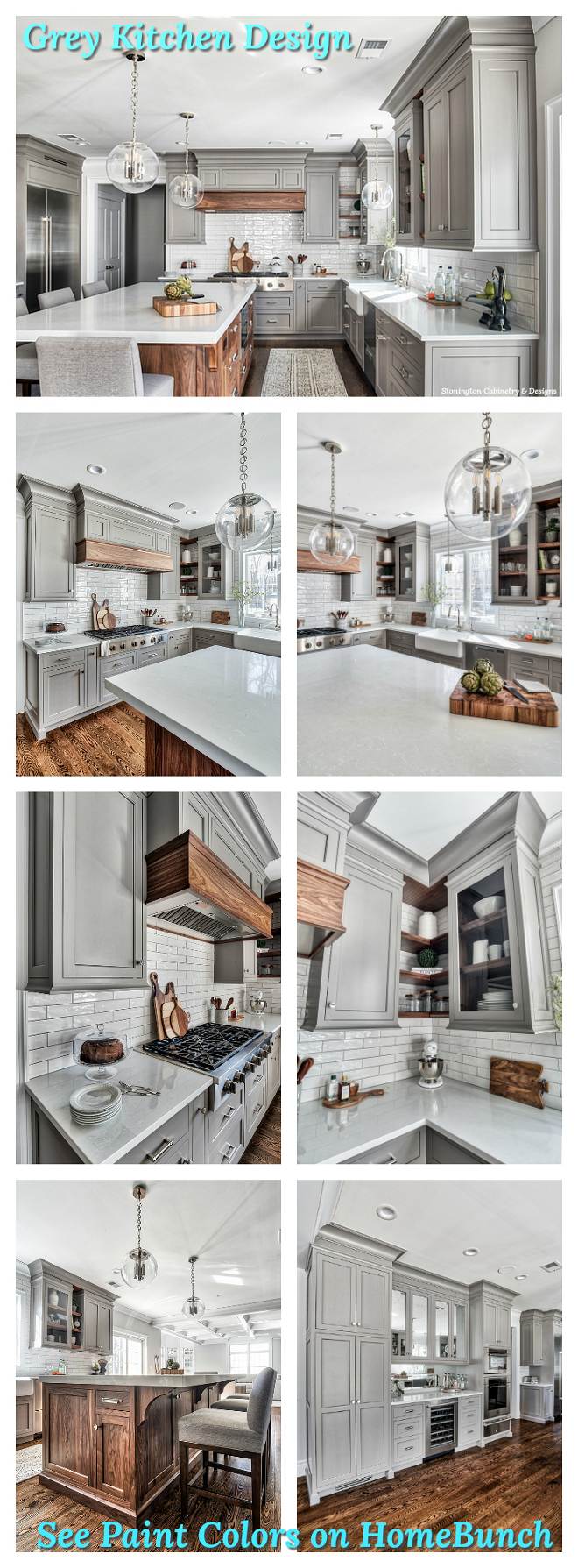 Grey Kitchen Paint Colors.
“Dear God,
If I am wrong, right me. If I am lost, guide me. If I start to give-up, keep me going.
Lead me in Light and Love”.
Have a wonderful day, my friends and we’ll talk again tomorrow.”
with Love,
Luciane from HomeBunch.com
“For your shopping convenience, this post might contain links to retailers where you can purchase the products (or similar) featured. I make a small commission if you use these links to make your purchase so thank you for your support!”
Subscribe to get Home Bunch Posts Via Email
Beautiful! But please from the staircase to the bedrooms no good details, how many rooms upstairs? And how are they partitioned?
House looks beautiful and so nice to see all the links added. I’m interested in seeing more than the cosmetics. Is there the floor plan and sq feet available. We are looking at building and I finally found something that’s really nice and not over the top as far as sizing.
Hi Tiffany,
Thank you for your kind words. I appreciate it.
Please, refer to the builder for more details on the floor plan. I hope they can help you with that.
Regards,
Luciane
@HomeBunch