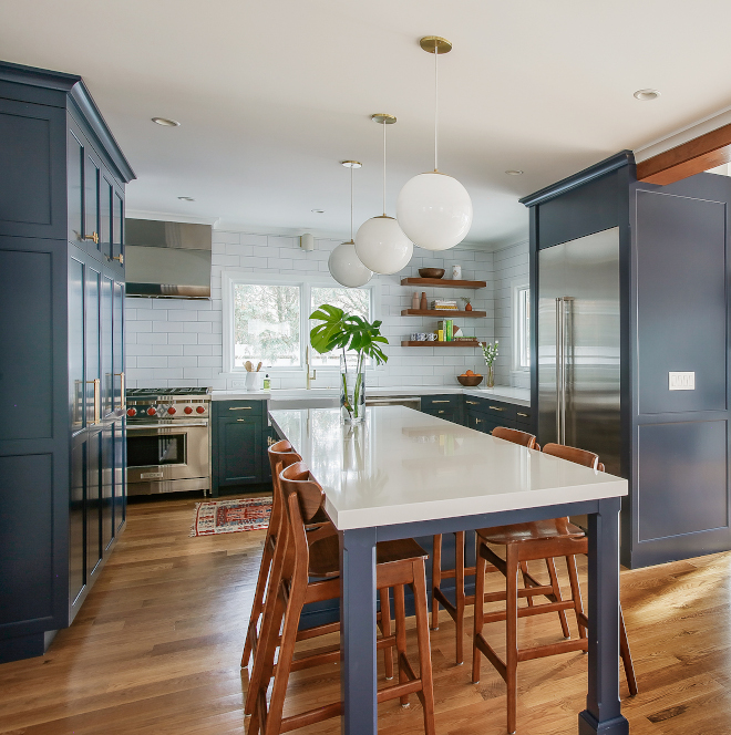
The reason I love my work so much is because I know the importance of creating a safe and welcoming place to live. I strongly believe our home is our own sanctuary and showcasing meaningful projects like the one we’re seeing today by Edward Deegan Architects and Interiors, makes what I do even more meaningful and I hope it brings hope to your heart and inspiration to your mind.
Here, the designers share more details about this beautiful project:
“This project presented a unique set of challenges for our team. The goal was to modernize and open up the kitchen and living spaces, add a first floor master suite, and make the entire first floor functional for our client who was diagnosed with ALS. All while meeting the client’s budget and personal style.
The completely open first floor allows generous room for circulation and the ability to see the entire space at once – which helps this client keep an eye on their young kids from anywhere in the space. With an addition to the back of the house, we were able to capture more square footage for the living & dining rooms. And not to mention add three wide glass doors, creating an almost seamless connection to the back yard and porch.
The client’s California-esque style worked well with the open first floor plan. The wood beams create some visual separation to each area, while also bringing some warmth to the overall aesthetic. The idea was to keep the spaces light and fresh with white walls, simple details and clean lines. But to bring in a little warmth and drama with the wood details and blue kitchen cabinets.
We worked closely with our client to create a master bathroom that would suit their future needs, which meant an ADA compliant vanity, sliding barn doors to a 5’ opening, automatic toilet and more. Though that didn’t mean we had to compromise aesthetic. The white tile, boarded walls and simple counter top create a subtle backdrop for a pop of color on the cabinets and warm wood tones in the mirrors and light fixtures – keeping the same feel as the rest of the first floor.”
This young and strong couple created I AM ALS – a patient-led, patient-centric community that was created to offer more resources to ALS patients and their families. I highly encourage you to read more about this couple here.
See other projects by Edward Deegan Architects on Home Bunch:

I love this navy blue color on cabinets and I think it pairs really well with the classic white subway tile. The navy blue paint color is “Sherwin Williams Naval SW6244”.
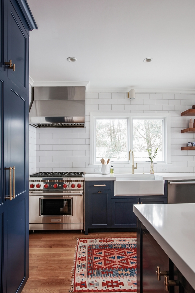
Featuring 4×12 white subway tiles, the backsplash gives this kitchen a classic and timeless feel.
Backsplash: 4×12 White Subway.
Range: Wolf.
Hardware: Classic Brass in Satin Brass – similar: Pulls & Knobs.
Faucet: California Faucets – Others: here, here & here.
Sink: 33” Barclay Sink.
Sconce: Schoolhouse.
Rug: Vintage – similar here – Others: here, here, here, here, here, here, here, here, here & here.
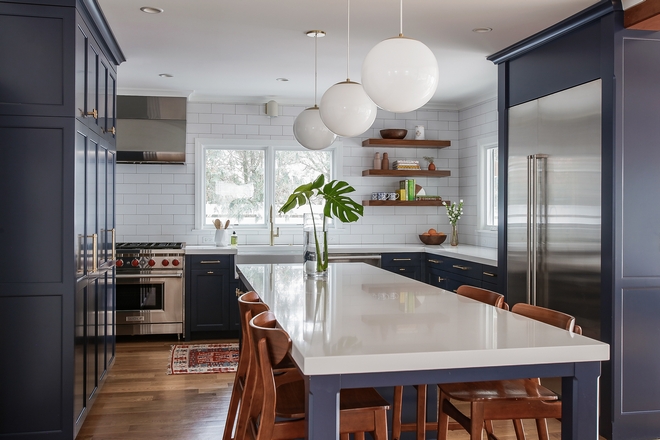
Counters are White Quartz with 2” Miter.
Kitchen Floating Shelves: Custom, Oak – similar here.
Lighting: Schoolhouse – Other Beautiful Pendants: here, here, here, here, here, here, here, here & here.
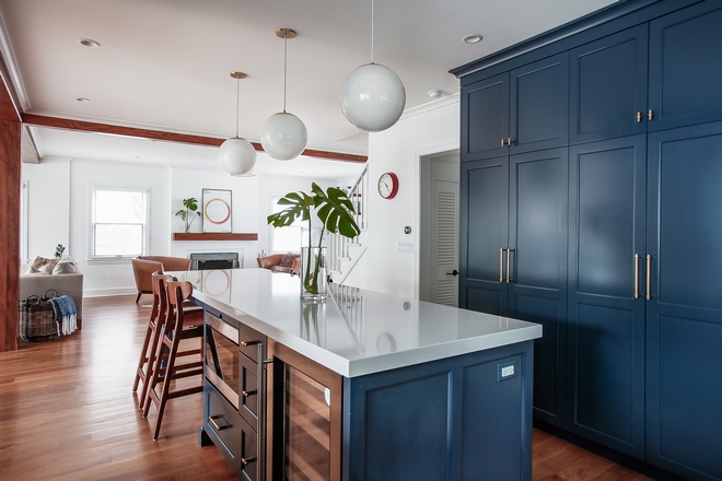
The kitchen island is 10ft long and it features an eating area and some great appliances.
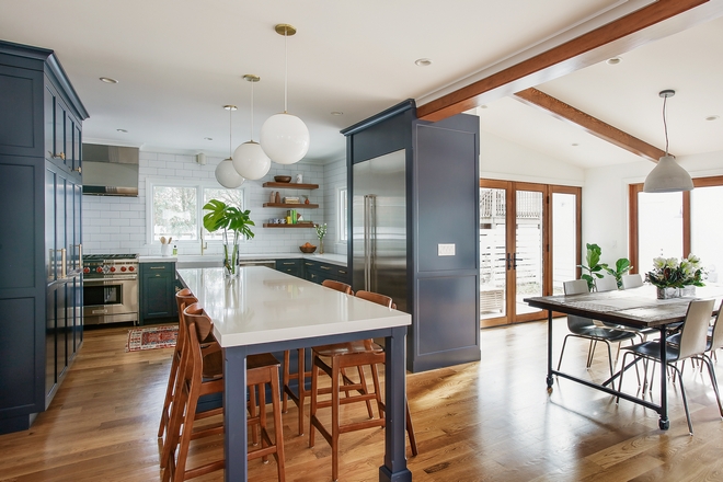
Counterstools are from West Elm – Others: here, here, here, here, here, here, here, here, here & here.
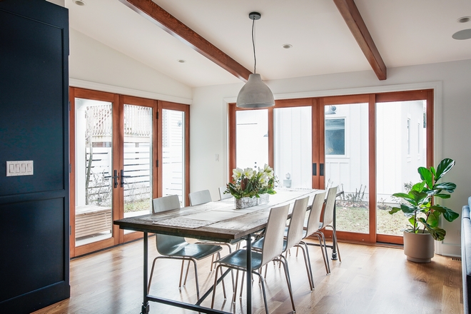
The kitchen opens into a large Dining Room and Family Room with wide sliding patio doors.
Chandelier: Concrete-look Pendant.
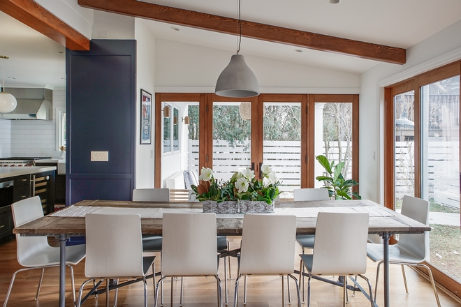
Dining Table: Client’s own – Others: here, here, here, here, here, here, here, here, here & here.
Dining Chairs: Client’s own – Other Favorites: here, here, here, here, here, here & here.
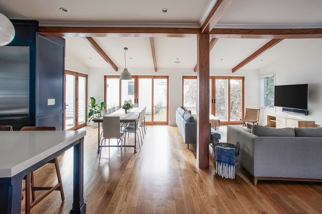
Wall Color: Benjamin Moore Chantilly Lace OC-65.
Flooring is 4” White Oak Rift Quarter with natural finish on it – Others: here, here, here & here.
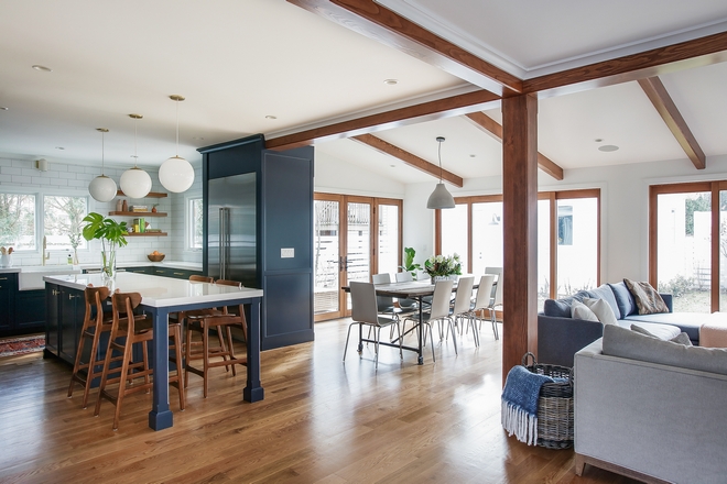
Beams are Fir with a custom finish.
(Scroll to see more)
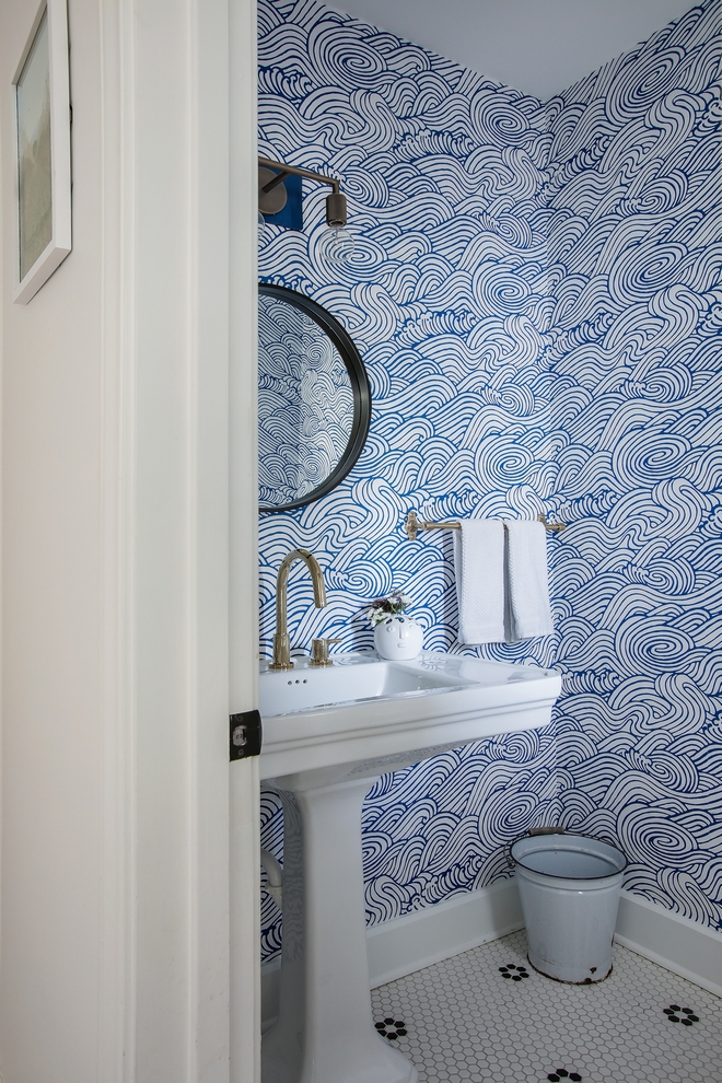
Isn’t this Powder Room perfect?! I am loving the wallpaper! This space has such a happy vibe. 🙂
Paint: Benjamin Moore Chantilly Lace OC-65.
Flooring: Existing – similar here.
Wallcovering: Wayfair.
Sconce: RH – Others: here, here, here, here, here & here.
Faucet: Signature Hardware.
Washstand: here.
Mirror: here.
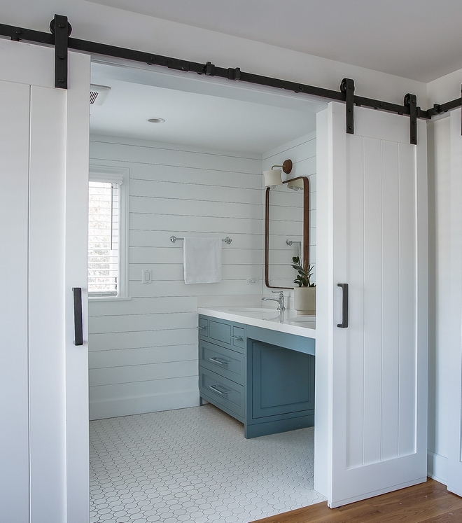
The Master Bathroom features double Barn Doors and plenty of space. Walls are 1×6 boarding in “Benjamin Moore Chantilly Lace”.
Tile: White tile from local store – similar here – Other Tiles: here, here, here, here, here, here, here & here.
Barn Door: Custom – Other Option: here.
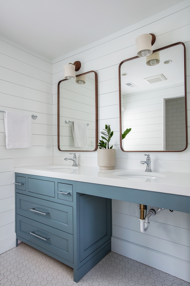
Cabinets are custom-designed by Edward Deegan Architects and Interiors, with custom color to match a tile client liked – a similar color would be “Benjamin Moore HC-145 Van Courtland Blue”.
Hardware: Top Knobs Aspen in Polished Chrome.
Countertop: White Quartz.
Faucets: Brizo.
Mirror: Rejuvenation.
Photography: @karenloffing.
Click on items to shop!
Thank you for shopping through Home Bunch. For your shopping convenience, this post may contain AFFILIATE LINKS to retailers where you can purchase the products (or similar) featured. I make a small commission if you use these links to make your purchase, at no extra cost to you, so thank you for your support. I would be happy to assist you if you have any questions or are looking for something in particular. Feel free to contact me and always make sure to check dimensions before ordering. Happy shopping!
Wayfair: Home Decor and Furniture Sale.
Serena & Lily: Summer Tent Furniture and Decor Sale.
Pottery Barn: Flash Sale Up to 70% off!
Joss & Main: Rugs & Furniture Sale.
 California Designer’s Home for Sale.
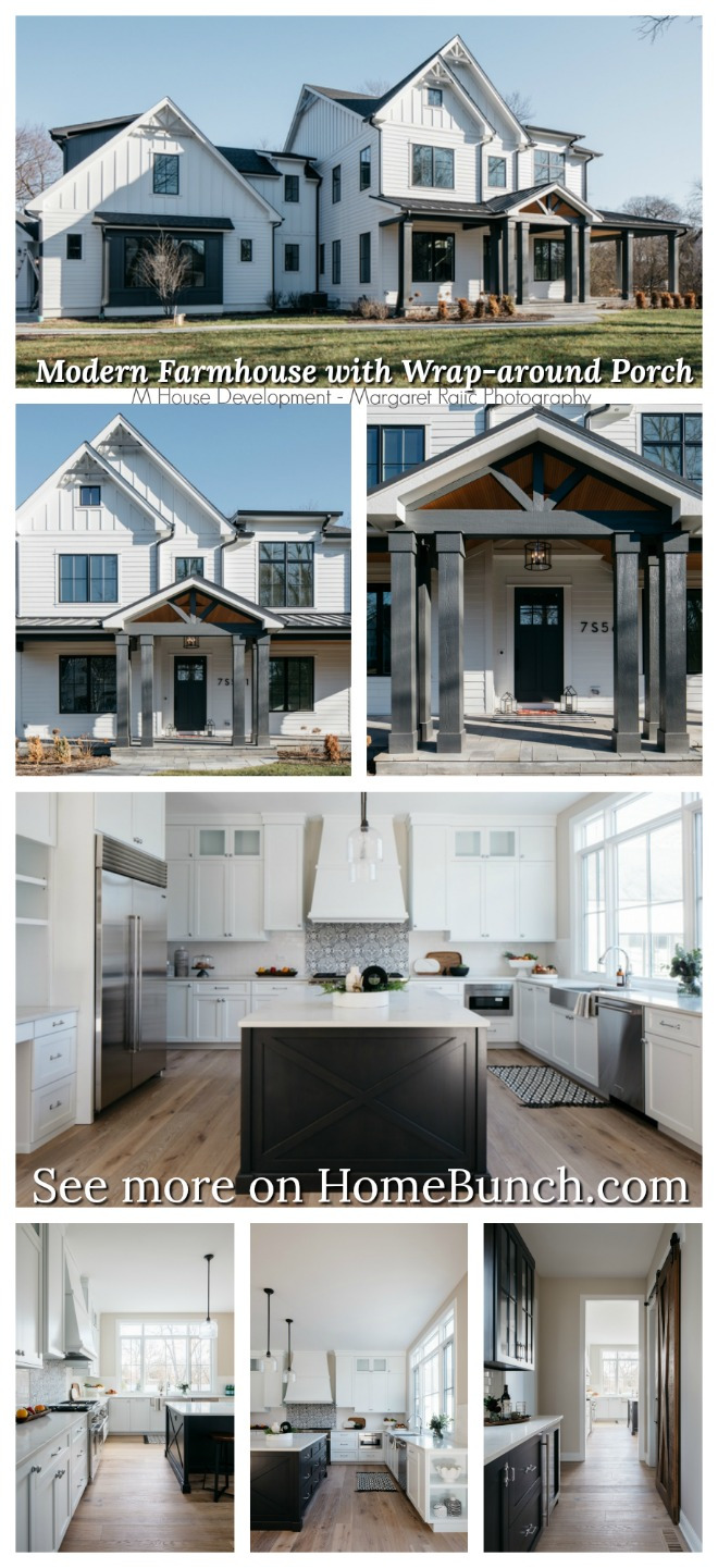 Modern Farmhouse with Wrap-around Porch.
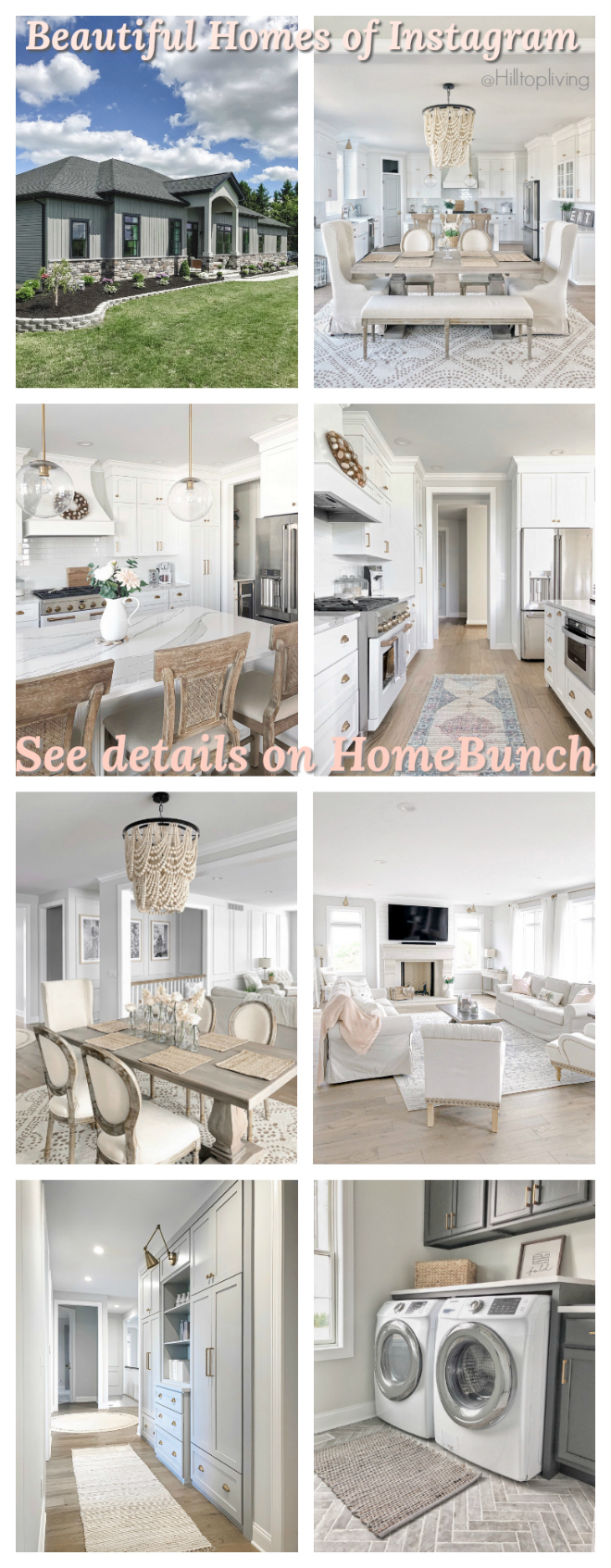 Beautiful Homes of Instagram.
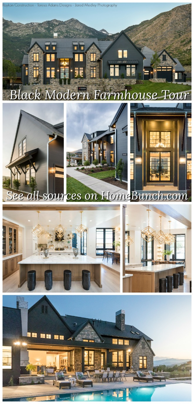 Black Modern Farmhouse Tour.
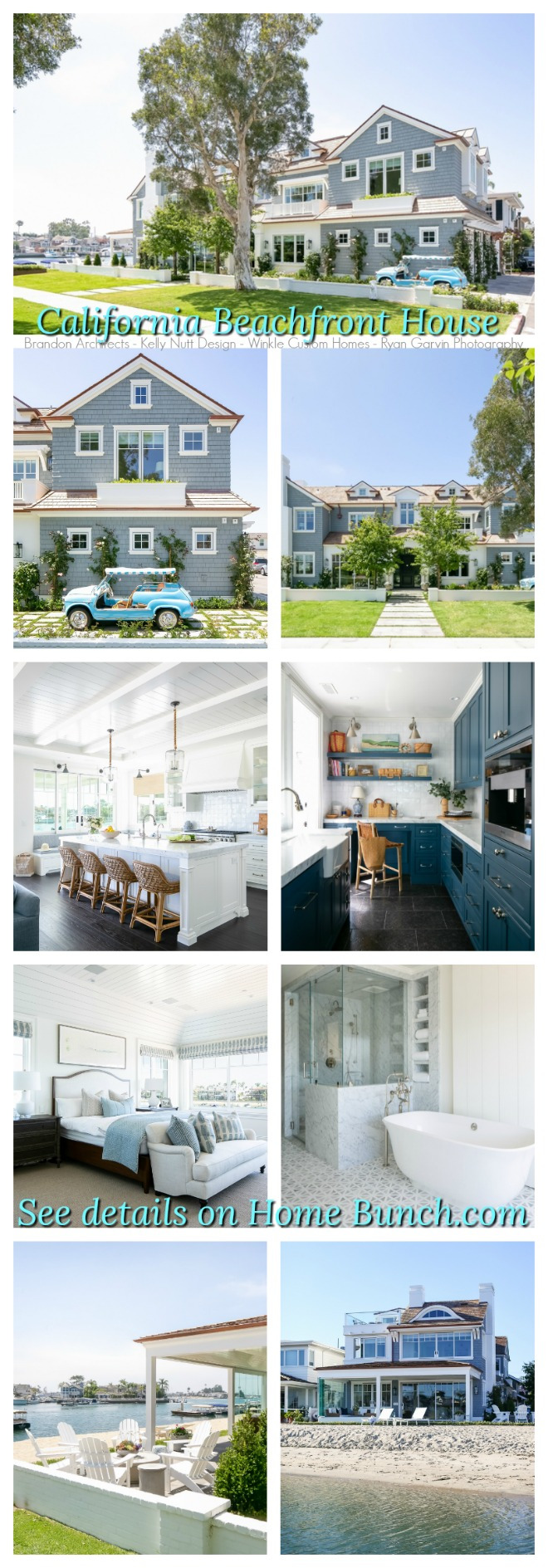 California Beachfront House.
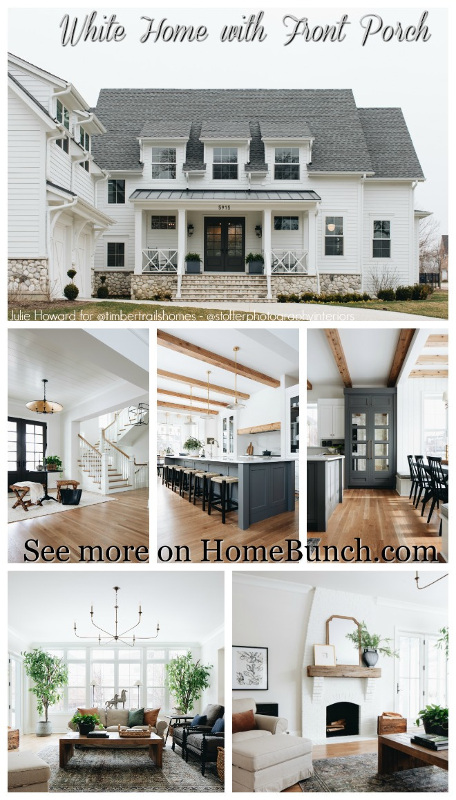 White Home with Front Porch.
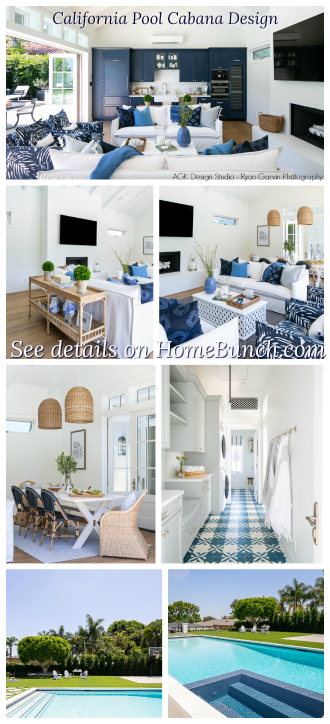 California Pool Cabana Design.
 Inspiring Charlotte Home Tour.
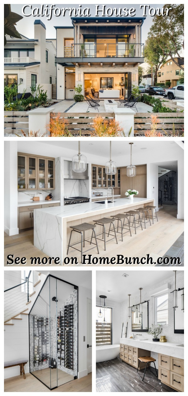 California House Tour.
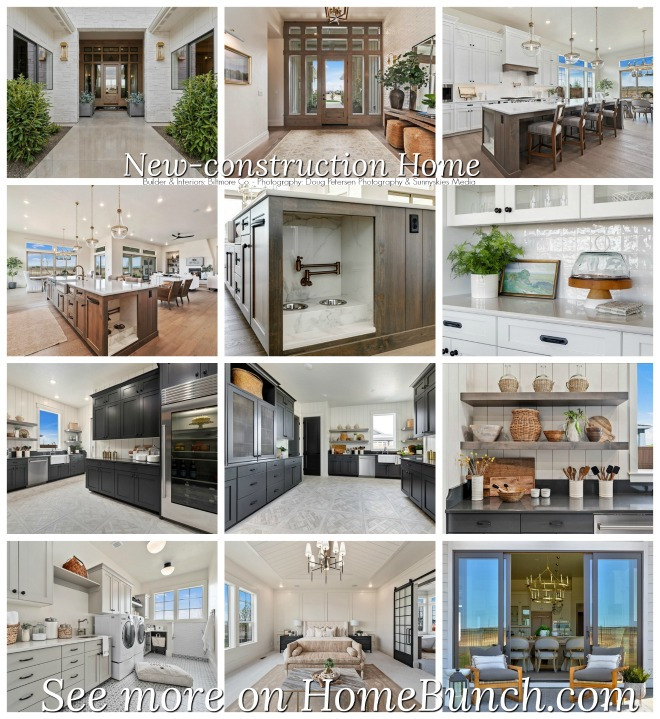 Beautiful Homes of Instagram: New-construction Home.
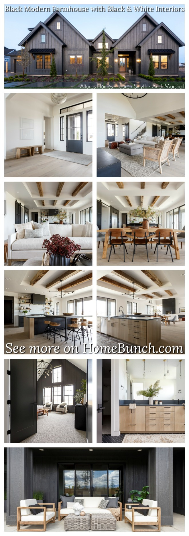 Black Modern Farmhouse with Black and White Interiors.
 New England style Shingle Home.
 California Fixer Upper.
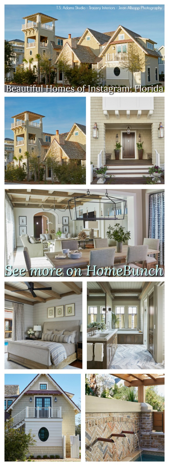 Beautiful Homes of Instagram: Florida.
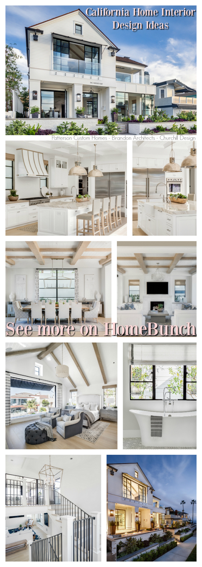 California Home Interior Design Ideas.
 Beautiful Homes of Instagram: Modern Farmhouse.
“Dear God,
If I am wrong, right me. If I am lost, guide me. If I start to give-up, keep me going.
Lead me in Light and Love”.
Have a wonderful day, my friends and we’ll talk again tomorrow.”
with Love,
Luciane from HomeBunch.com
No Comments! Be The First!