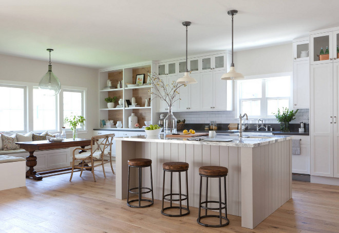
Sometimes when a renovation is not possible, the best you can do to create your dream is by building it from the ground up and this is exactly what happened in this home designed by the talented interior designer Kate Lester from Kate Lester Interiors. The homeowner purchased an existing home on the lot which was just too small and in need of some major TLC. After assessing all of the costs to remodel and add on square footage it was determined it would be a better investment to just demo the house and start from scratch.
The overall concept for the home is “Modern Farmhouse” and the designer’s goal was to capture the charm, texture, and classic feel of a traditional farmhouse and incorporate that into a more modern floor plan and design concept. In this modern farmhouse kitchen, the designer’s most favorite element is the wood paneled hood. It took a little convincing on her part to get the homeowner to see her vision, but I think we all can agree that it was well worth it.
Take a look and take notes on the designer’s insights and tips on how to design a neutral modern farmhouse kitchen and bathroom.

The wood accent on the range hood is incredibly eye catching and this was where the designer was really able to tie in the concept of the “Modern Farmhouse”. Here, the designer tell us more about the hood: “Our initial design direction was to use reclaimed barn wood to panel the hood and back of the hutch as an accent. However, when I visited the job site as the flooring was being installed, I realized I loved it so much I wanted to use that same cerused oak instead to tie it all together. Best of all, there was no additional cost because there we were able to use the leftover flooring material!” Isn’t it a brilliant idea?
Paint Color
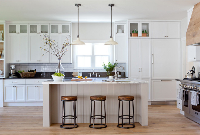
The shaker style cabinetry was made in walnut, and painted in Benjamin Moore’s “Decorators White”. This is one of the designer’s favorite whites because it reflects the natural light so beautifully and looks really fresh in a kitchen.
When asked about the advantage of having the cabinets reach the ceiling, the designer says this is something she does in pretty much every kitchen she designs: “When cabinets stop short of the ceiling there is always that dead space that people tend to fill with bad faux plants and tchotchkes. So we always design an extra cabinet to utilize that space for storage or display. In this case we used a seeded glass door to add interest and draw your eye up. Another excellent reason to take the cabinets all the way to the ceiling is to trick the eye to make the space feel larger, and ceilings appear higher than they really are”, she explains.
Kitchen Dimensions: Approx 350 sq ft.
Lighting: Restoration Hardware Vintage Barn Collection.
Kitchen Island
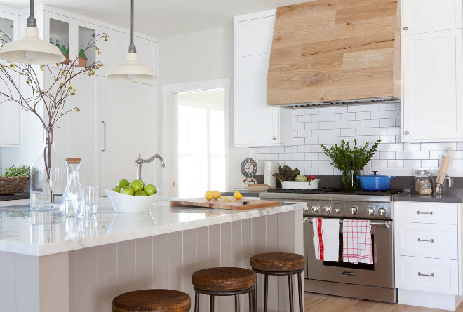
The island is painted in a beautiful Gray-ish Taupe color by Farrow and Ball called Old White. The designer wanted the island to be large enough to include a prep sink, additional storage cabinets, and a beverage fridge. She also designed it to accommodate seating for up to 4, so the kids could do homework, play games, or it could be used as a space for a buffet while entertaining. The wood paneling was a nod to a traditional farmhouse look while the gray paint gave it a slight pop of color and contrast.
Countertop: The designer wanted to introduce a bit of modern luxury to this farmhouse kitchen, so she went with a gorgeous Cararra Marble for the island countertop. To add contrast and durability to the surrounding countertops, she selected a charcoal colored Quartz. It is a great counterpoint to all of the white and really draws your eye to the black grouted backsplash.
Subway Tile: Daltile White Ceramic Subway Tile.
Range: Thermador Range.
To Eat & To Live

The main requests of the homeowner were that the kitchen be luxurious, bright and open. When it came to the layout, they wanted a space where they could not only entertain, but where their kids could also do homework, play games, and interact with the rest of the family. I think it was a tall order, but the designer truly captured all of that really well in the finished design.
Sinks: Blanco Cerana 33” Apron Front and Bar Prep sink.
Faucet: Brizo Tresa Bridge Faucet.
Breakfast Nook
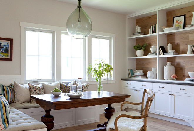
According to the designer, a breakfast nook is one of the most frequent requests from her clients. It’s the new “California casual dining room”.
Wall paint color is Paper White OC-55 by Benjamin Moore.
Floors
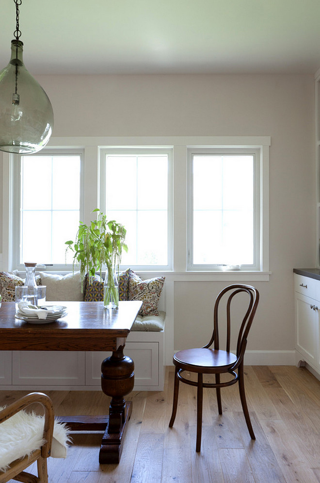
The flooring is a lightly cerused 6” plank oak and runs throughout the entire first floor. Keeping the flooring consistent is an intentional and important design element that provides a more cohesive feeling throughout the home and makes everything feel more open.
When asked about a basic tip on how someone can renovate a kitchen on a tight budget, the designer says to keep it simple, and not too trendy. “In this kitchen we didn’t overwhelm with any fancy moldings, edge details, patterns or colors. We let the overall design and quality of materials be the focal point. This way, our client can add pops of color with accessories and art, and change them as often as they like. But the bones of the kitchen are classic, luxurious and timeless”.
Foyer
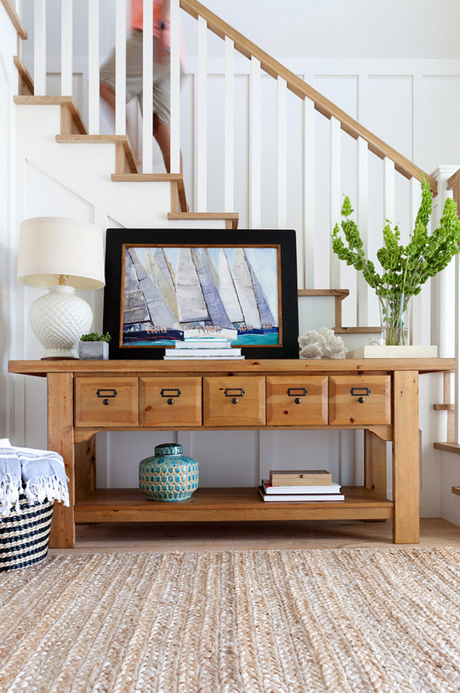
I love this neutral foyer! The console table is a vintage piece.
Simplicity
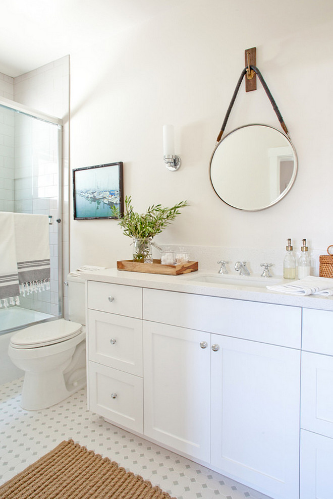
This small bathroom comes with a practical layout and a timeless look.
Master Bathroom
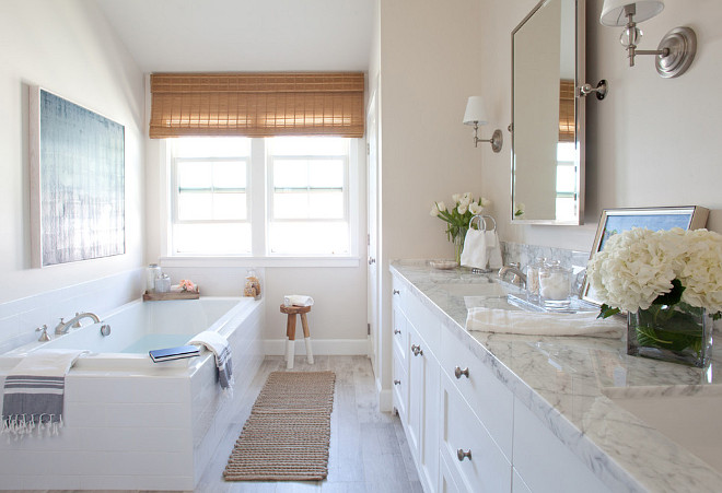
The master bathroom features a neutral color palette. Paint color is Benjamin Moore OC-55 Paper White.
This tub is made by JASON, model RC-553.
Decor
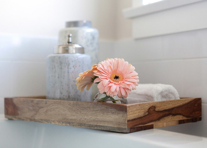
Beautiful and simple…
White Cabinetry
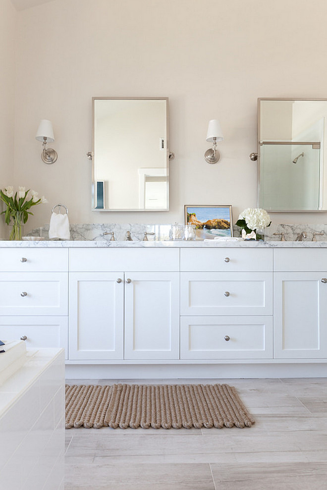
Cabinet Color: Decorators White by Benjamin Moore.
Soothing Decor
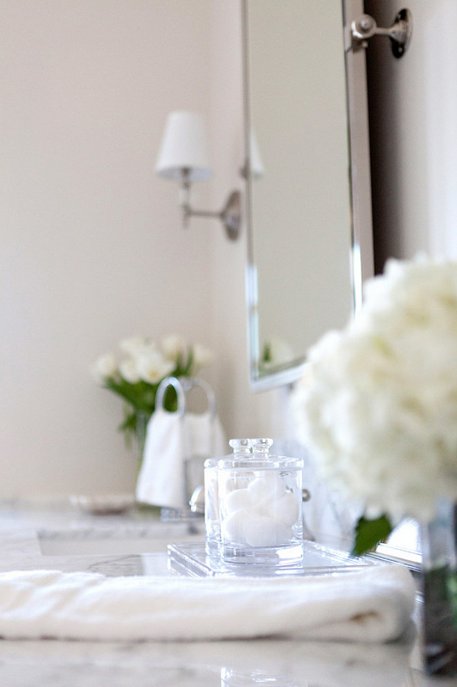
Always keep your counters organized and without any clutter.
Bathroom Flooring
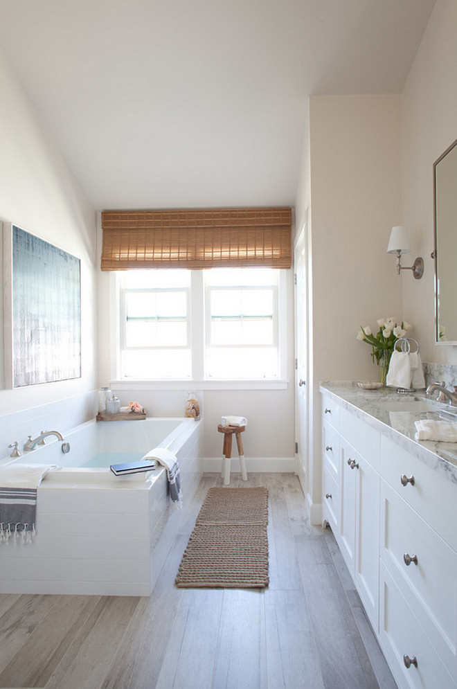
The bathroom floor is from Dal Tile. FP94 6″x36″ Planks.
Interiors by Kate Lester Interiors.
Photos by Amy Bartlam Photography.
Thank you for shopping through Home Bunch. For your shopping convenience, this post may contain AFFILIATE LINKS to retailers where you can purchase the products (or similar) featured. I make a small commission if you use these links to make your purchase, at no extra cost to you, so thank you for your support. I would be happy to assist you if you have any questions or are looking for something in particular. Feel free to contact me and always make sure to check dimensions before ordering. Happy shopping!
Wayfair: Up to 75% OFF on Furniture and Decor!!!
Serena & Lily: Enjoy 30 to 70% OFF on Sale Styles!
Joss & Main: End-of-Decade Dash Sale!
Pottery Barn: Buy More, Save More Sale + Free Shipping.
West Elm: End of Season Sale – Up to 75% Off.
Anthropologie: Extra 40% off Sale Items!
Nordstrom: Save Up to 50% Off!
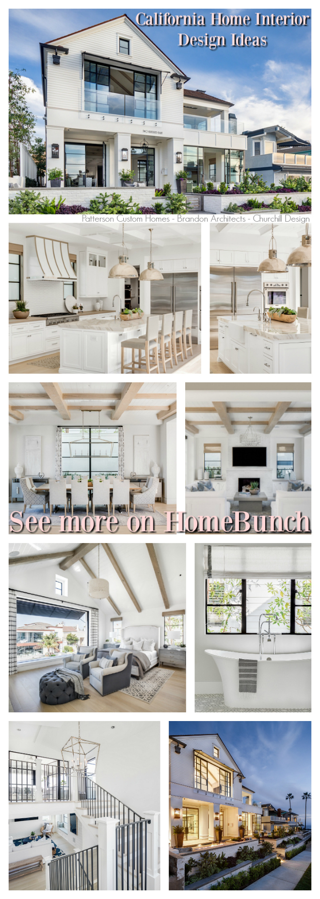 California Home Interior Design Ideas.

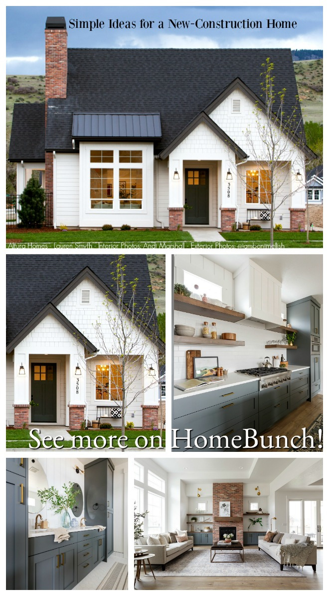 Simple Ideas for a New-Construction Home.
 Open and Airy Townhouse Design.
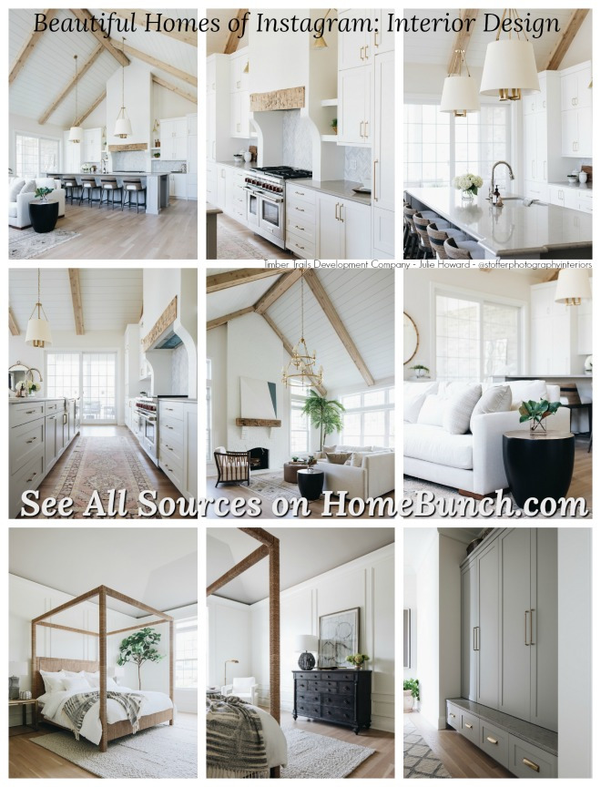
 Beautiful Homes of Instagram: Modern Farmhouse.
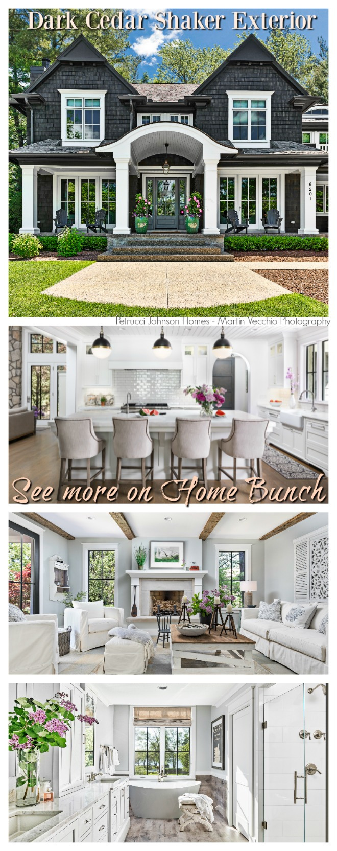 Dark Cedar Shaker Exterior.
“Dear God,
If I am wrong, right me. If I am lost, guide me. If I start to give-up, keep me going.
Lead me in Light and Love”.
Have a wonderful day, my friends and we’ll talk again tomorrow.”
with Love,
Luciane from HomeBunch.com
Subscribe to get Home Bunch Posts Via Email
I really enjoyed this post. Although I love looking at all of your posts, it was refreshing to see an average-sized home (at least, judging from the size of the master bath, I think it is). Thanks for sharing!
Would love to know where the barstool share from please.
Hi Lisa,
According to the designer, the stoos are vintage but you can find similar ones at World Market.
Thank you,
Luciane
Could you tell me the paint color of the wall in the bathroom with the tile/wood floor?