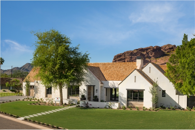
Happy new week, my dear friends! What a gift it is to start a new day with you here. It’s also a gift to start the week sharing this extraordinary new-construction home by one of my favorite designers; Jennifer Ferrandi of NoMad Design. Here, she explains all the details about the making of this inspiring project. Enjoy!
“This home was a collaboration by what I lovingly refer to as my dream team. Over the years, I have been lucky enough to work on countless custom and spec homes with Luke Wilson of Vista General Construction, and Matt Thomas of Matthew Thomas Architecture L.L.C.. The three of us have really build up a level of trust and respect over the years and I think it shows in all our projects.
I cannot stress enough how important a good team is to the home building process. Great design and creativity absolutely flourishes when you have the right team in place from the onset.
While I love helping my clients design their dream homes I also relish working on a beautiful spec home where I have free rein to execute my own design vision for the space. As soon I saw Matt’s plans for this home and his gorgeous exterior elevations I had a clear vision for the interiors. The home was to appeal to a buyer that had a love for a touch of modern while still appreciating the warmth and character of weathered wood with timeless touched of interior Limestone walls.
The home is located in a gorgeous area of Phoenix called Arcadia, which is situated in the shadow of Camelback Mountain with large sprawling lawns and mature trees offering the most gorgeous backdrop for this special home.” – Jennifer Ferrandi from NoMad Design.
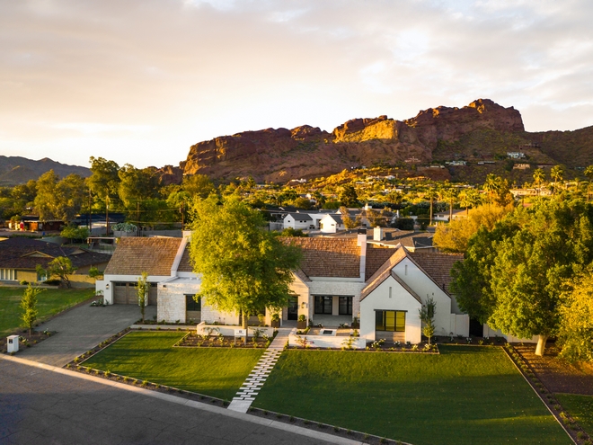
“The lot for this home was chosen because of the quiet street and exceptional views of Camelback Mountain. This enclave of Arcadia had a variety of different architectural influences. On the same street you could appreciate Santa Barbara homes and Modern homes.” – Jennifer Ferrandi from NoMad Design.
Photo by @erickrukphoto.
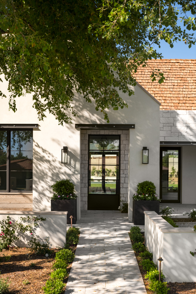
“Matt Thomas wanted to create a traditional house that sat comfortably within the context of the community, but with fresh touches. The home was designed in an Irish contemporary style with clean lines, shallow eaves and a bold use of mixed materials.” – Jennifer Ferrandi.
Front Door: Custom Steel and Glass Door by Vista General.
Pots & Landscape: Berghoff Design Group.
Wood Accents: Reclaimed wood by Vista General.
Photo by @erickrukphoto.
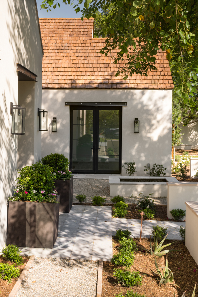
“The home appears traditional at first glance, but on a closer look, the home surprises with charm and confidence.” – Jennifer Ferrandi from NoMad Design.
Lighting: Quoizel Lighting Westover.
Photo by @erickrukphoto.
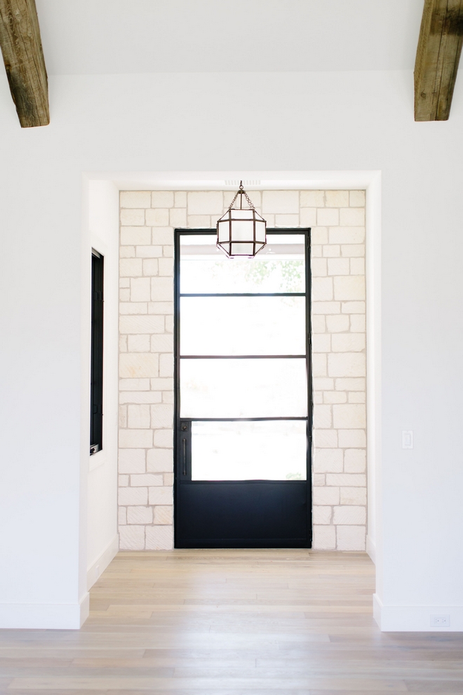
“The stone, steel and weathered wood that begin on the exterior continue effortlessly into the interior living spaces.”
Photo by @elizabethlawlorphotographt.
(Scroll to see more)
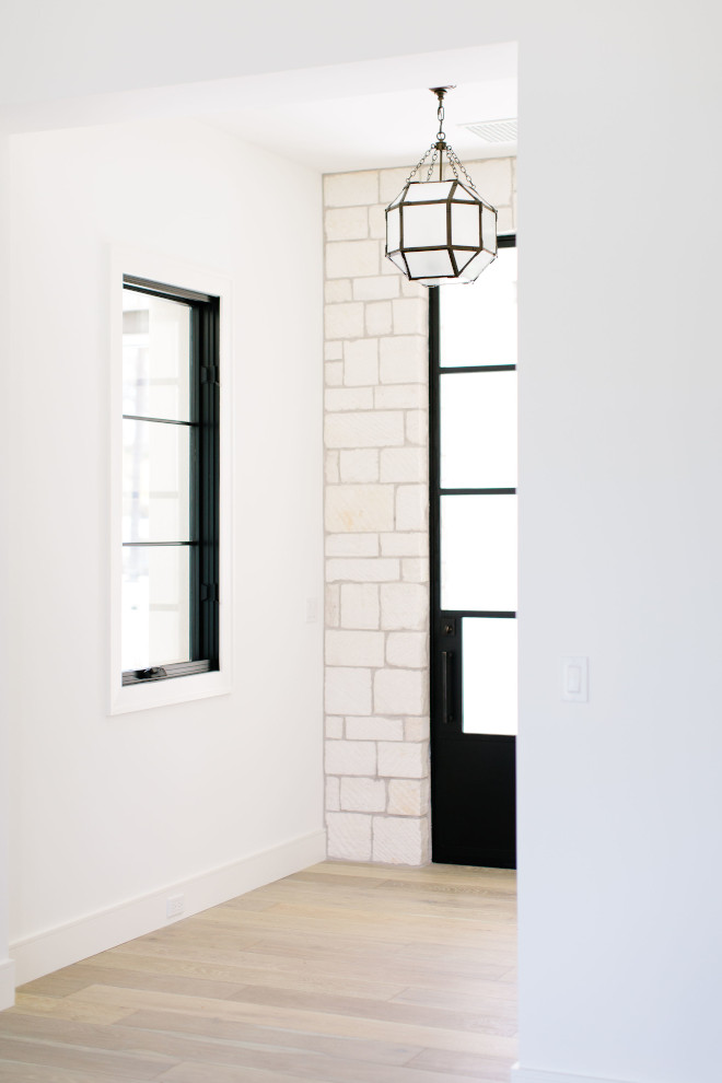
“We added the exterior Limestone to the entry to marry the exterior to interior.“
Paint Color: Sherwin Williams Alabaster.
Lighting: Visual Comfort – similar here.
Photo by @elizabethlawlorphotographt.
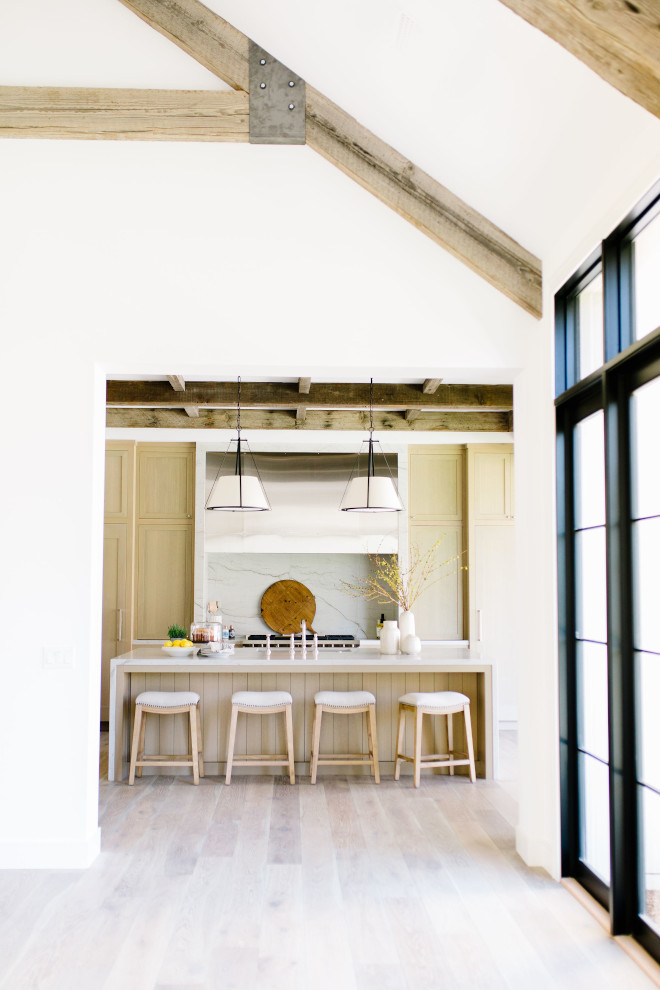
“For every modern element I used in Kitchen I tried to counterbalance with a touch of something rustic.” – Jennifer Ferrandi.
Photo by @elizabethlawlorphotographt.
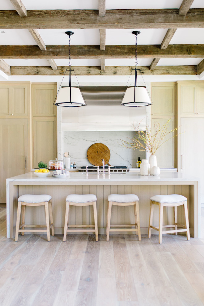
Flooring: Elegance European Oak in Frederick, part of Seneca Valley Collection – Other Best Sellers: here, here & here.
Photo by @elizabethlawlorphotographt.
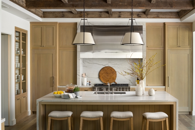
The reclaimed beams used for the ceiling treatment assured the hood design and waterfall slab at the island.
Photo by @erickrukphoto.
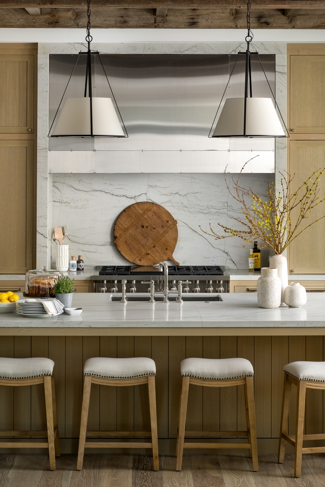
Kitchen Backsplash: Macaubas Quartzite Slab.
Beautiful Vases: here, here, here, here, here & here.
Faux Stems: here – similar.
Pizza Board: here – similar.
Photo by @erickrukphoto.
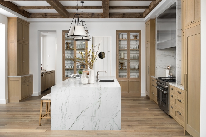
“I had originally planned on using marble for the countertops but as the kitchen came to life I knew this was not the right material. I remember standing in Stone Collection one afternoon blasting Luke’s phone with pictures of these gorgeous Quartzite slabs trying to win my case they were worth the extra cost. This kitchen has taken on a life of its own on Instagram and even won a SubZero kitchen contest! I get great joy every time I see a photo of it cross my feed and make sure to remind Luke I was right. LOL” – Jennifer Ferrandi
Photo by @erickrukphoto.
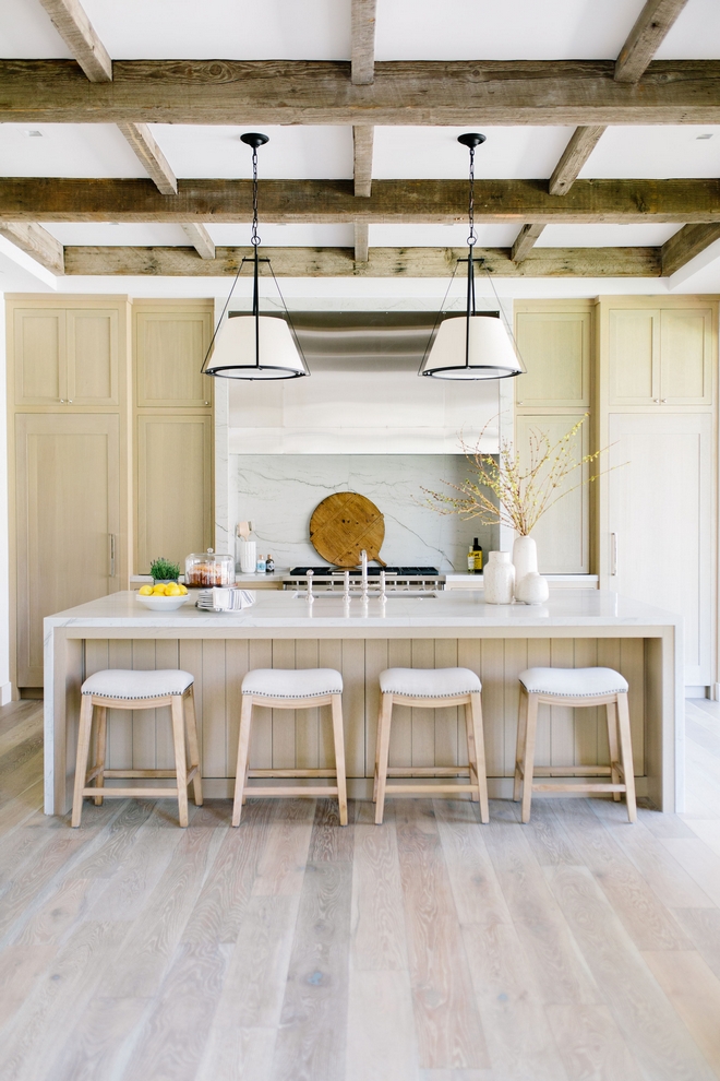
Millwork: Rift-Sawn White Oak.
Photo by @elizabethlawlorphotographt.
(Scroll to see more)
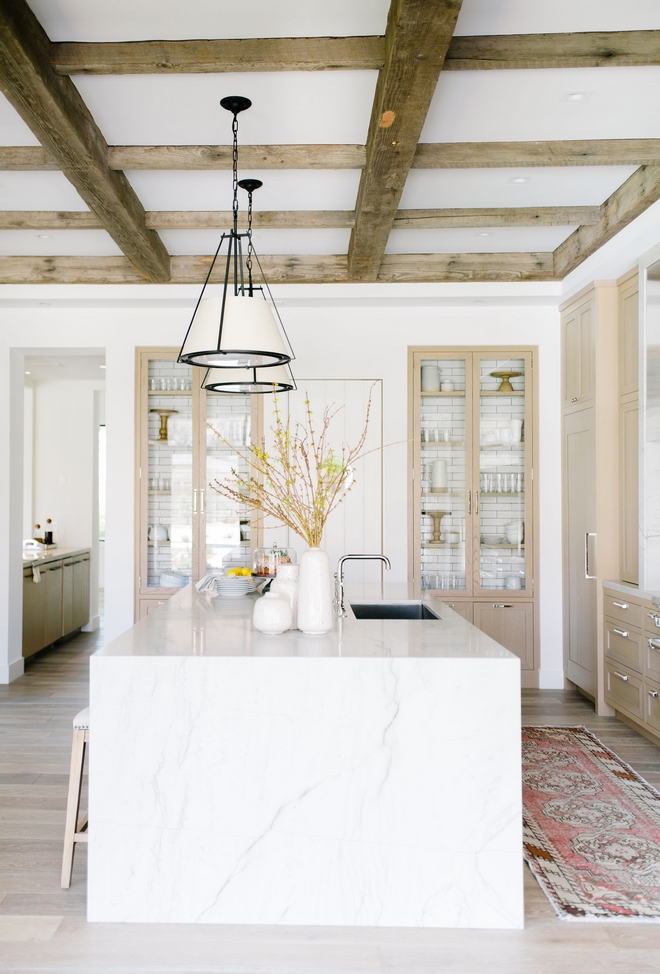
This gorgeous kitchen features a pair of built-in cabinets flanking a walk-in Pantry.
Tile in Back of Cabinets: Glazed Brick Tile (Discontinued) – similar here – Others: here, here & here.
Photo by @elizabethlawlorphotographt.
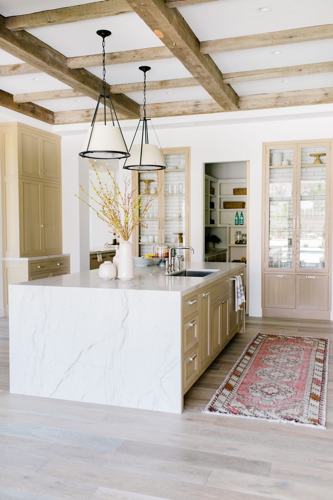
Countertop: Macabus White Quartzite from Stone Collection.
Photo by @elizabethlawlorphotographt.
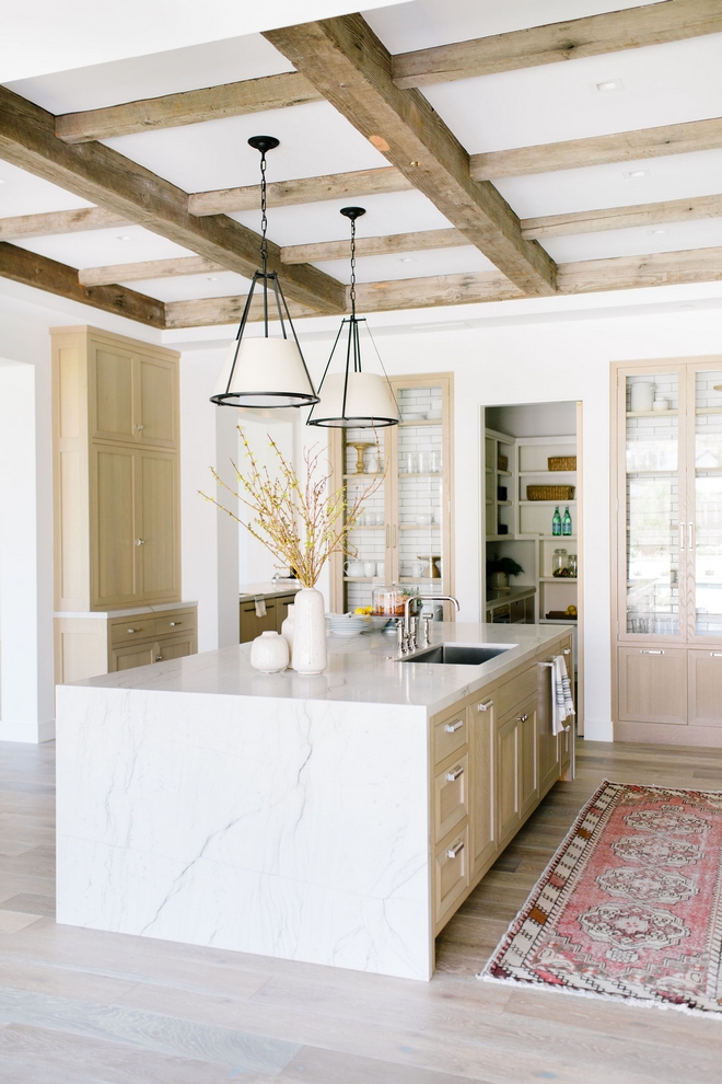
Kitchen Paint Color: Alabaster by Sherwin Williams.
Photo by @elizabethlawlorphotographt.
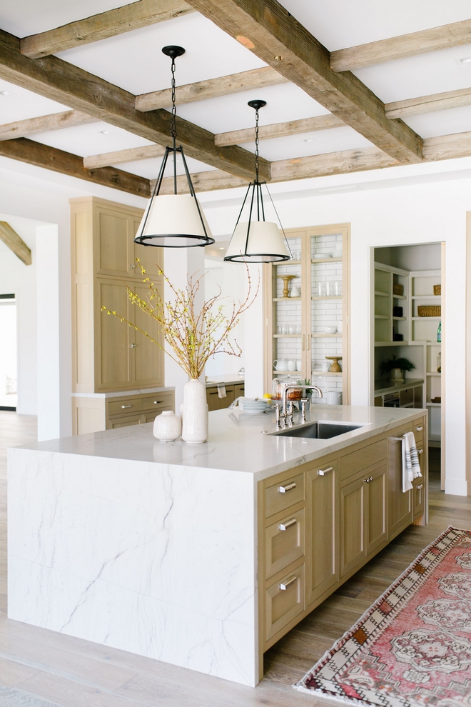
For cabinet hardware I used the “Barrington Collection” from Top Knobs. I love this collection for its modern take on the traditional bin pull.
Photo by @elizabethlawlorphotographt.
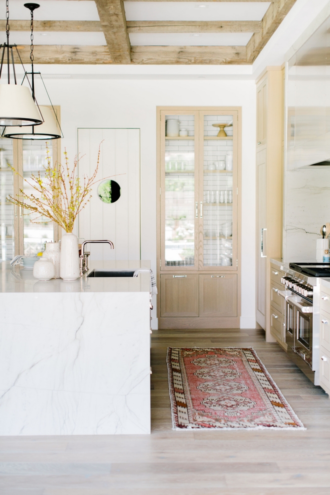
Runner: Antique, Nomad Design – Others: here, here, here, here, here, here & here.
Photo by @elizabethlawlorphotographt.
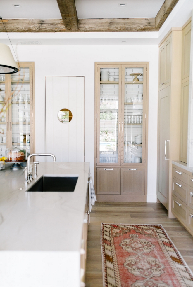
“To not take on too much of a contemporary feel, I added a glazed brick to the back of the glass front cabinets to add character and break all the slab that was used on range wall.” – Jennifer Ferrandi.
Photo by @elizabethlawlorphotographt.
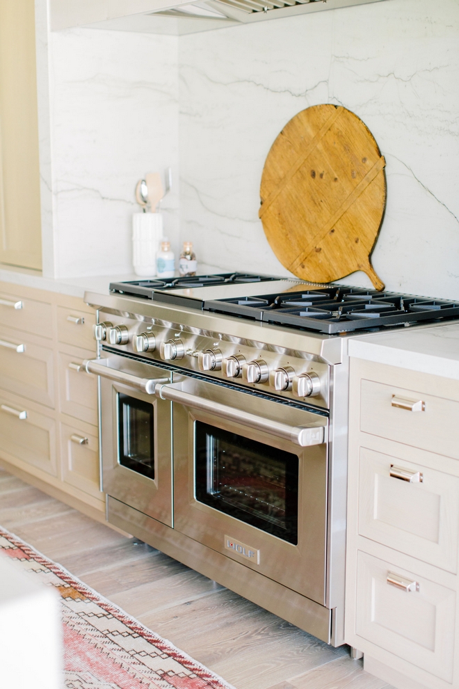
Range is a 48″ Wolf – Other: here.
Photo by @elizabethlawlorphotographt.
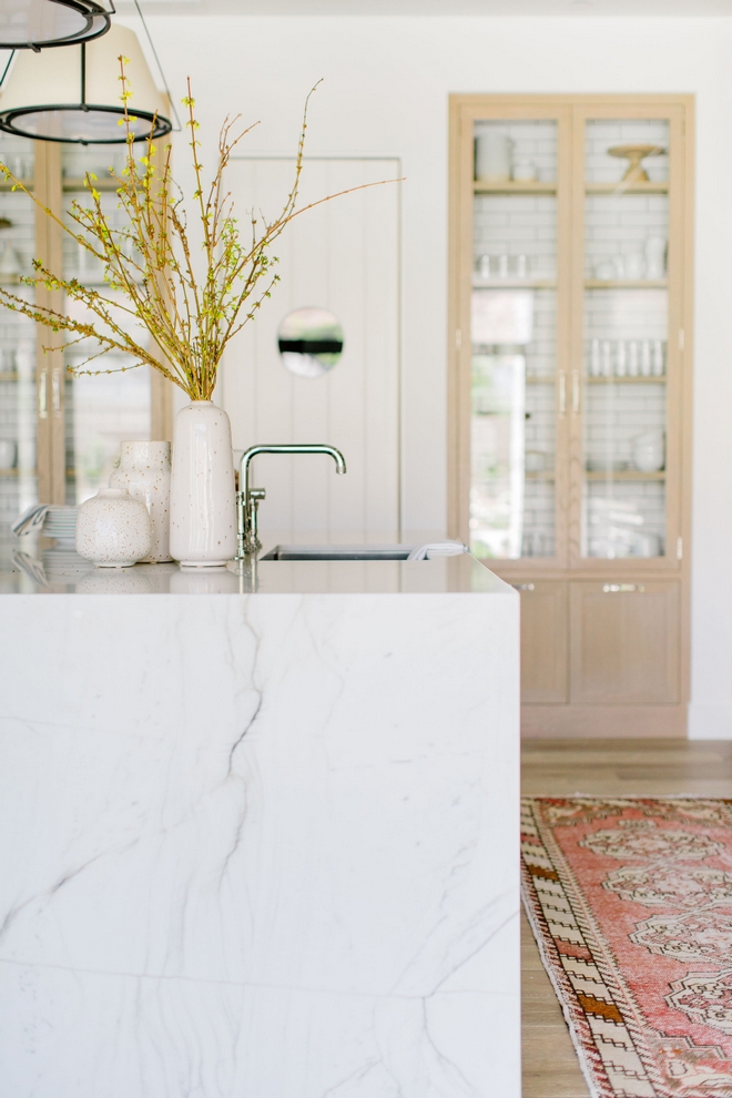
White Macaubas Quartzite is a great choice to be used as waterfall kitchen island edge countertop, as we see above, and as backsplash because it’s not too busy and it has a neutral feel.
Photo by @elizabethlawlorphotographt.
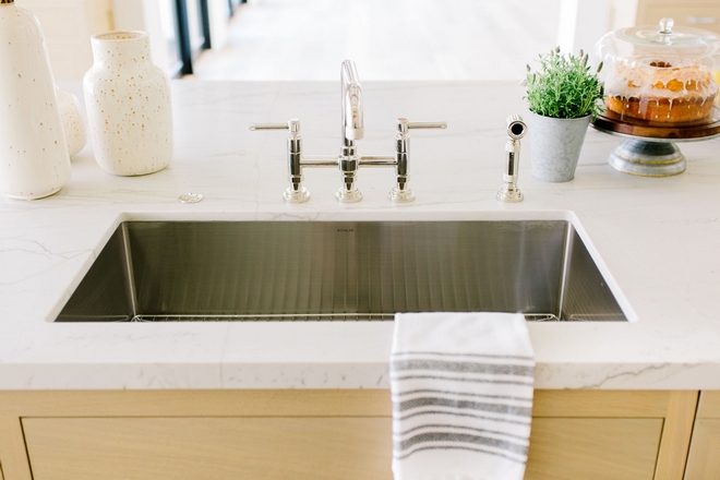
Kitchen Sink: Kohler Strive (great quality!).
Photo by @elizabethlawlorphotographt.
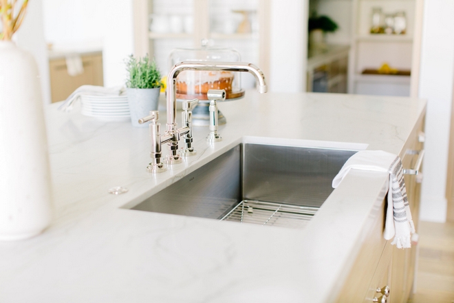
Kitchen Faucet: Rohl Italian Kitchen Campo Deck Mounted U-Spout – also available here.
Photo by @elizabethlawlorphotographt.
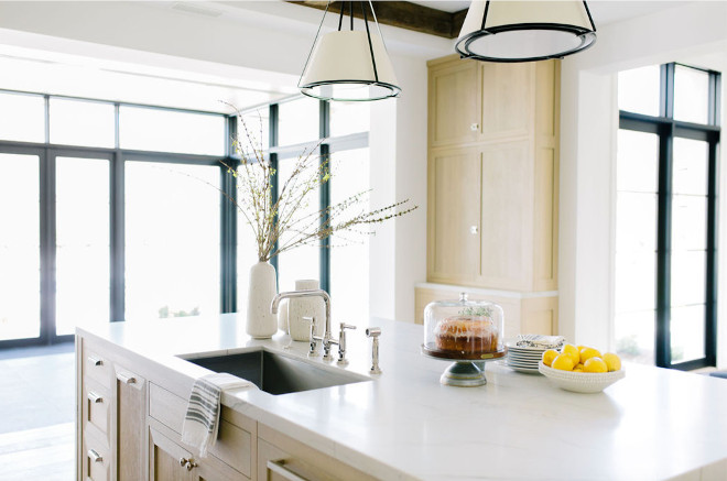
The kitchen is located between the Great Room (on right) and a large Breakfast Room (on left).
Photo by @elizabethlawlorphotographt.
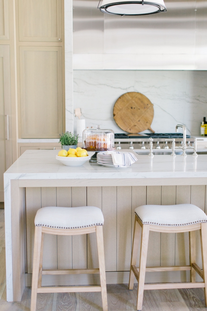
Counterstools: Nomad Design (Available through the designer) – Others: here, here, here, here & here.
Photo by @elizabethlawlorphotographt.
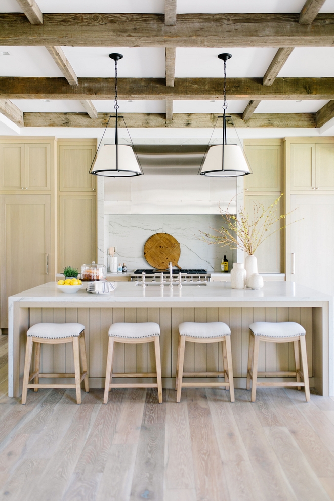
Kitchen Lighting: Visual Comfort – Others: here, here, here, here, here, here & here.
Photo by @elizabethlawlorphotographt.
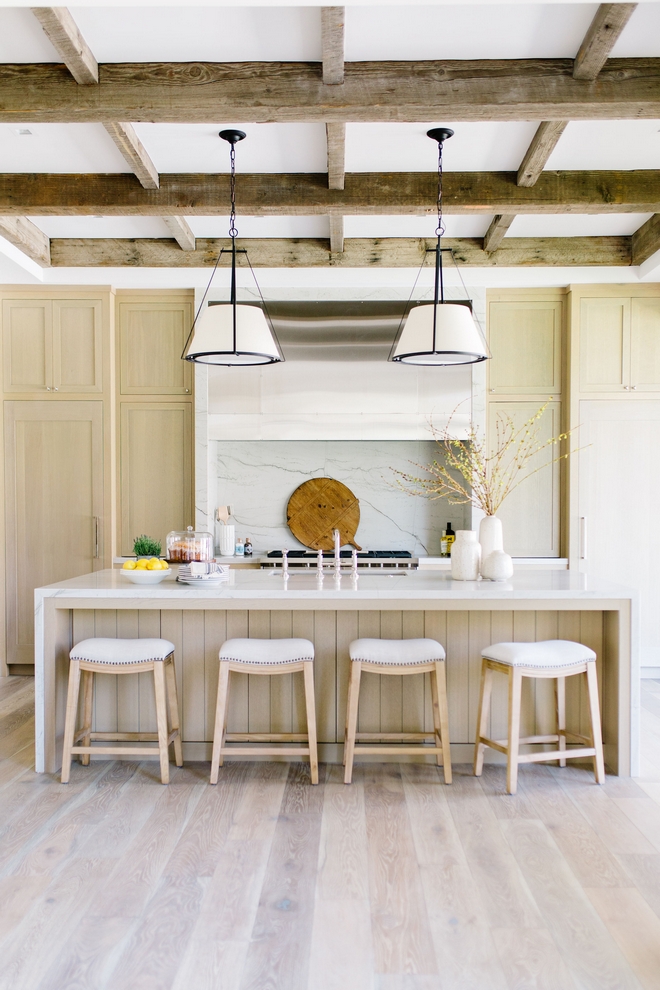
Ceiling Treatment: Reclaimed Beams by Vista General.
Photo by @elizabethlawlorphotographt.
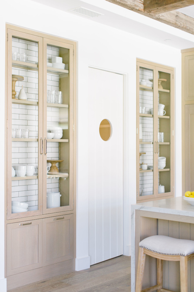
Pantry Door: Custom by Vista General.
Photo by @elizabethlawlorphotographt.
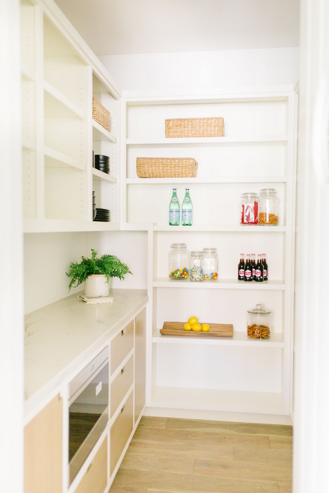
Pantry Cabinet: Sherwin Williams Alabaster with White Oak.
Photo by @elizabethlawlorphotographt.
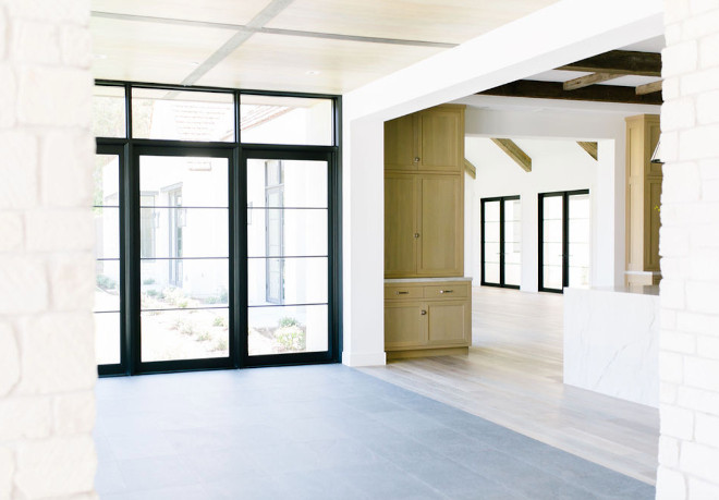
“I wanted to take advantage of the floor-to-ceiling windows and play the conservatory feel by using stone floor in lieu of the Oak.” – Jennifer Ferrandi
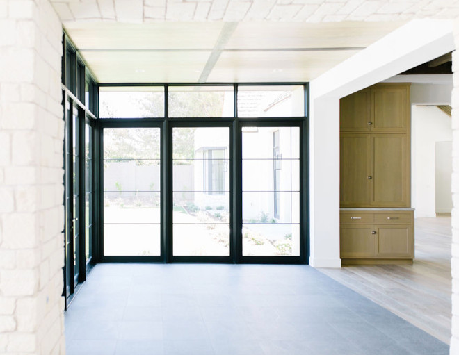
Ceiling: Planked Ceiling with Darker stained Accent Planks.
Floors: Belgium Limestone.
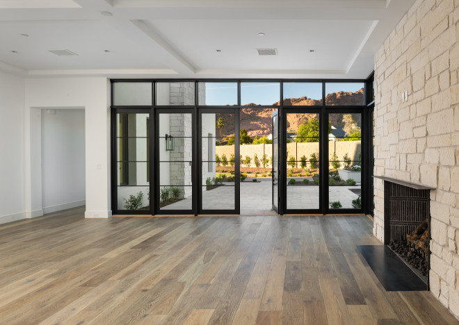
Located just off the Breakfast Room, this space is perfect to be used as a Playroom or Family Room.
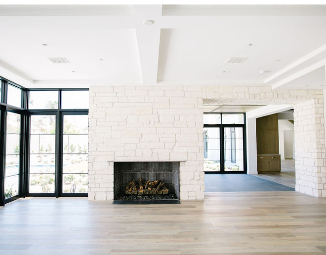
Fireplace and accent wall is clad in Limestone.
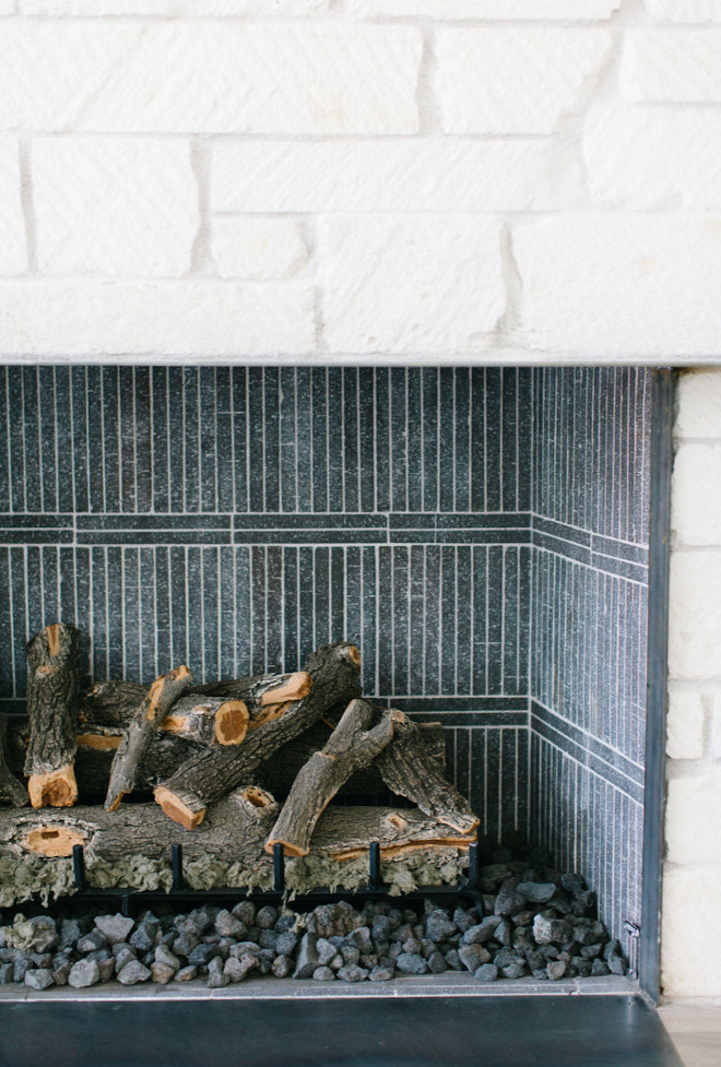
Fireplace: Limestone with black firebrick cut down (similar here in “Caviar”) and installed in vertically stacked with double row of horizontal between.
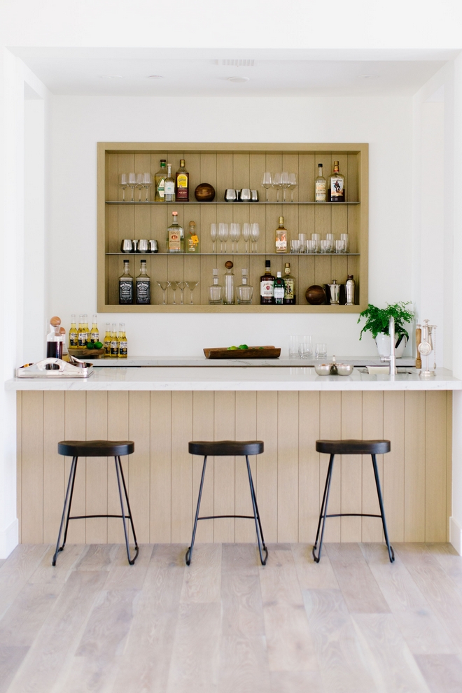
“Because you can see the Bar and Kitchen from the Great Room I wanted them to be compatible yet different.” – Jennifer Ferrandi
Counterstools: here – similar – Others: here & here.
Photo by @elizabethlawlorphotographt.
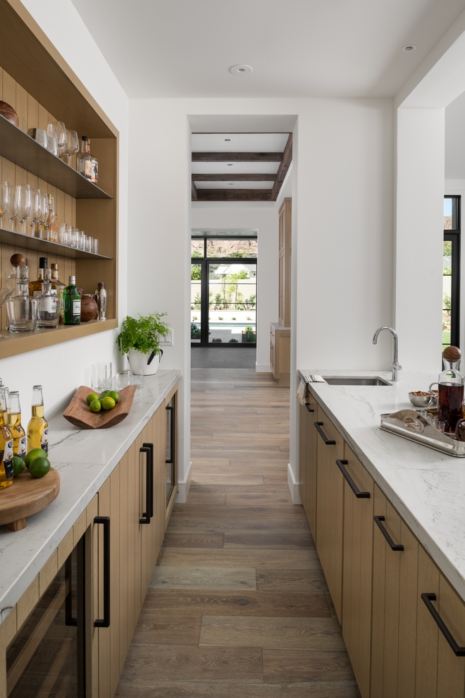
“I kept the millwork all White Oak but went with plank style slab door style. Instead of doing an entire wall of open shelving for beverages I opted for a built-in niche with metal shelving.”
Hardware: Top Knobs – similar here.
Photo by @erickrukphoto.
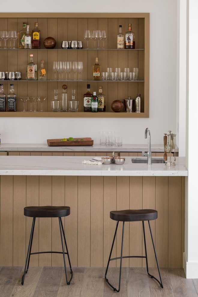
Countertop: White Macabus Quartzite.
Built-in Shelving: Custom Shelves by Vista General.
Photo by @erickrukphoto.
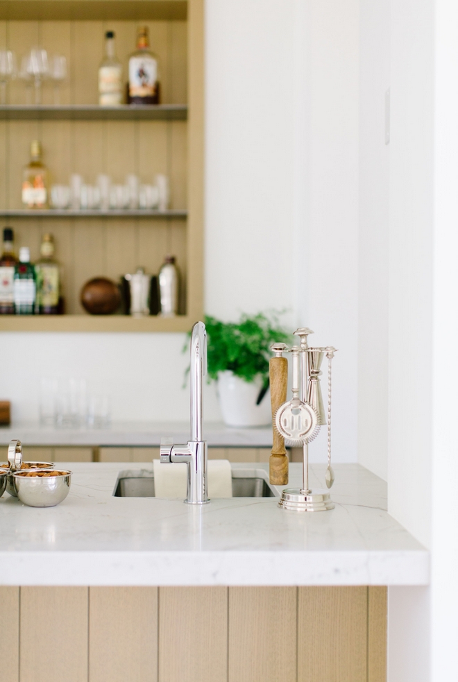
Bar Faucet: Franke Ambient Bar Faucet.
Photo by @elizabethlawlorphotographt.
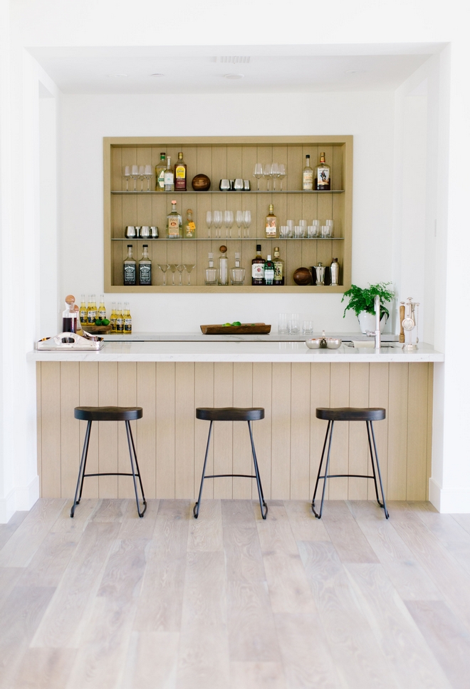
Since this home was being built to appeal a large audience, this space needed to have the ability to become a Butler’s Pantry or Coffee Bar if the new owners preferred.
Photo by @elizabethlawlorphotographt.
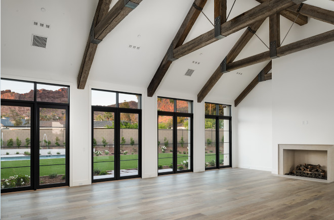
Black framed French doors with transoms allow the Great Room to have stunning views of the backyard and Camelback Mountain.
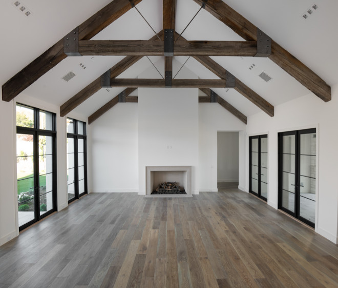
Flooring: Elegance European Oak in Frederick, part of Seneca Valley Collection – similar here & here.
(Scroll to see more)
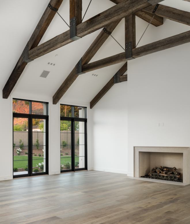
“The reclaimed beams were such show stoppers that I decided to let them shine and just go with a simple style and just go with a simple style Gobi Limestone surround for the fireplace. I had a neutral firebrick cut down into long strips and installed in stacked pattern.”
Fireplace: Gobi Limestone.
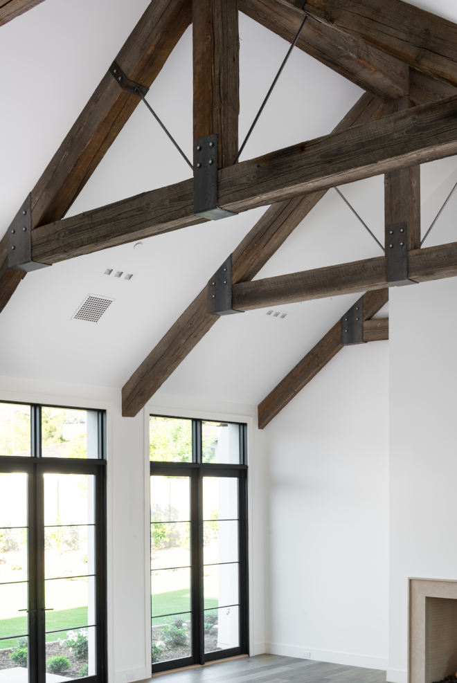
Beams are reclaimed wood and they beautifully contrast with the walls and ceiling in Sherwin Williams Alabaster.
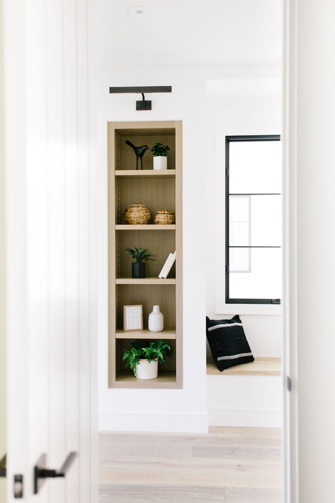
The main Hallway features a window-seat and built-in bookshelves in White Oak.
Lighting: Visual Comfort.
Accessories: NoMad Design.
Photo by @elizabethlawlorphotographt.
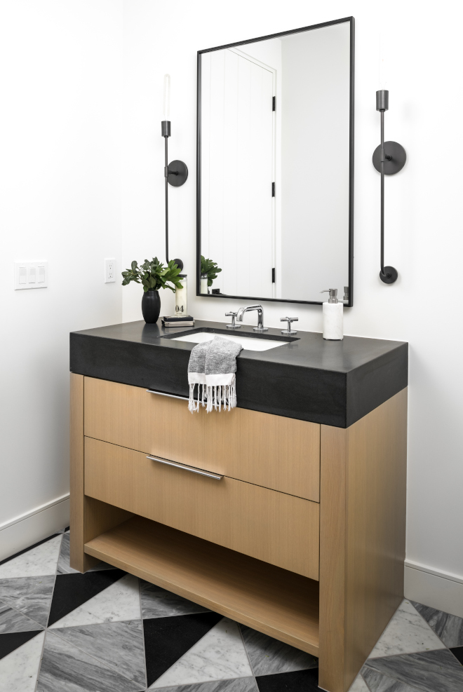
“This might be my favorite Bathroom of all time. For the floor I had Vista General cut down three different stone into triangles and install in a geometric pattern.”
Floor: AZ Tile 12×12 Carrara Marble, Bardiglio (similar here) & Indian Premium (similar here) cut into triangles – Others: here, here, here, here & here.
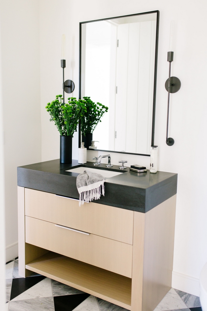
“I designed a freestanding vanity to be fabricated out of the White Oak with a 4″ Black Honed Granite Countertop.” – Jennifer Ferrandi
Cabinet Hardware: Top Knobs.
Photo by @elizabethlawlorphotographt.
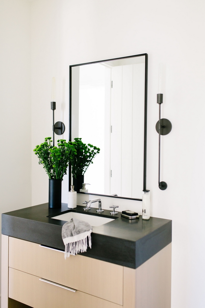
The Dylan Sconces from Mitzi added to the Modern fresh look.
Other Affordable Sconces: here, here, here, here, here, here, here & here.
Photo by @elizabethlawlorphotographt.
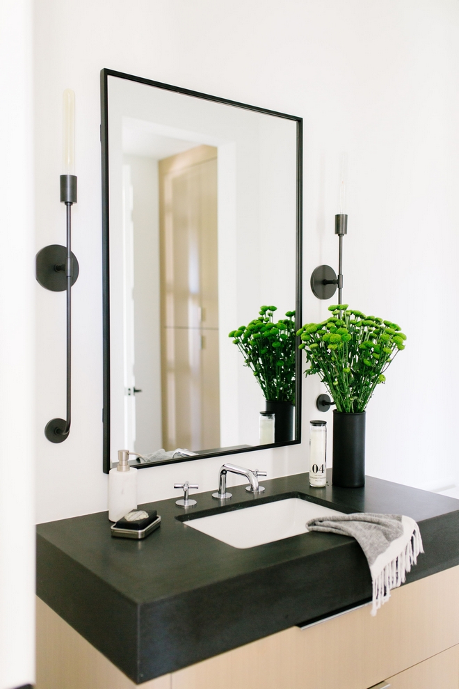
Countertop: Black Honed Indian Premium Granite.
Faucet: Waterworks Flyte Collection – similar here – Others: here, here, here, here, here, here & here.
Photo by @elizabethlawlorphotographt.
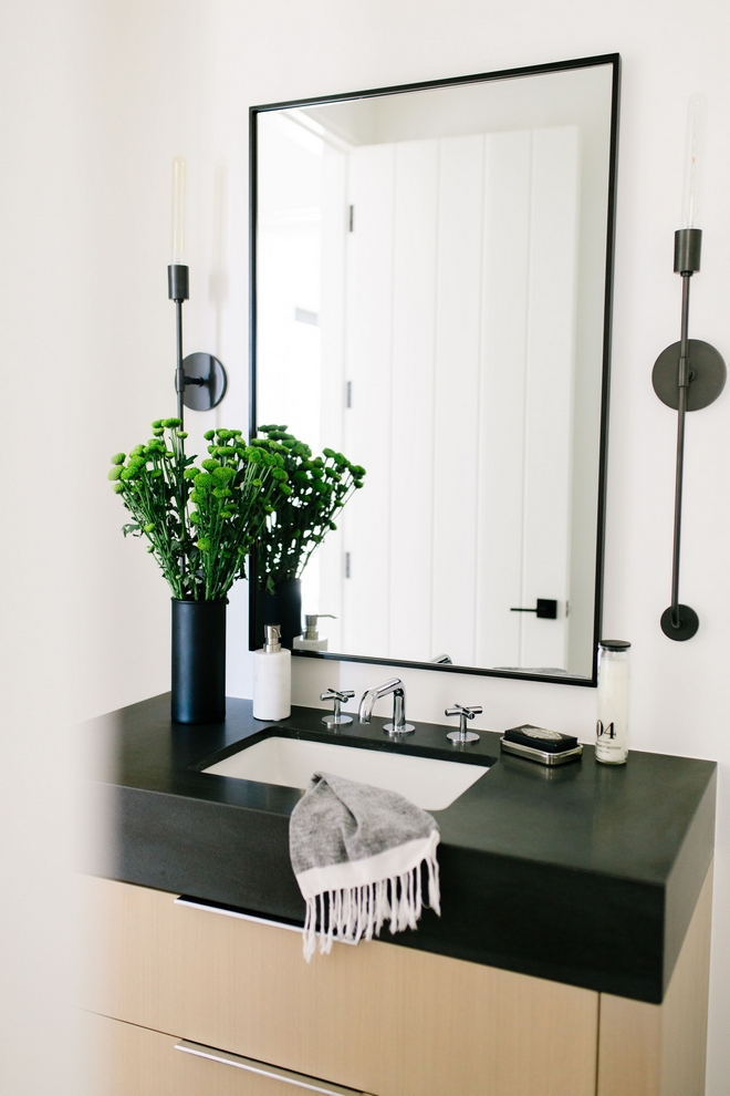
Mirror: Custom Iron Mirror by Vista General – similar here – Others: here, here, here, here, here & here.
Photo by @elizabethlawlorphotographt.
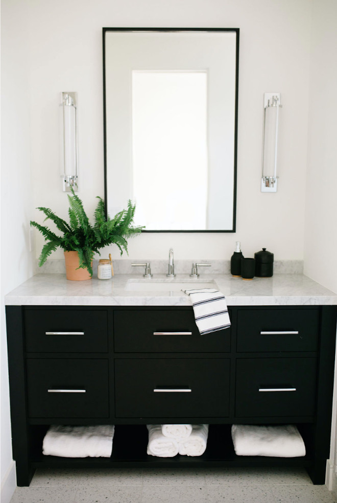
Bathroom Vanity: Custom in Benjamin Moore Soot.
Sconces: Visual Comfort – Others: here & here.
Mirror: Custom – similar here.
Hardware: Top Knobs.
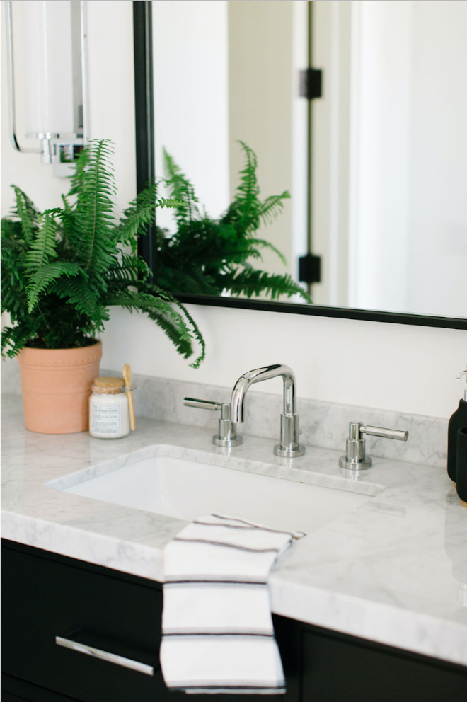
Countertop: Carrara Marble.
Faucet: Phylrich – similar here, here & here.
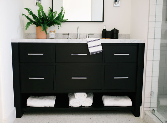
Floor Tile: Terrazzo Floor Tile.
Shower Tile: here – similar (great brand!).
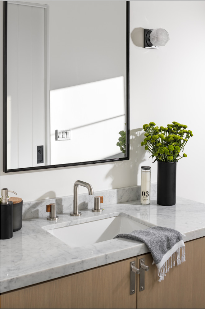
“This Bathroom is technically the pool bath so I thought we could have a little fun with the materials. For the floor I used three different colors of an oversized hexagon tile. Cabinet hardware is by Buster and Punch and for the lights I went for something different opting for small glass geometric fixtures from Hudson Valley.”
Vanity: White Oak – Others: here, here, here & here.
Mirror: Custom – similar here.
Countertop: Carrara Marble.
Lighting: Hudson Valley.
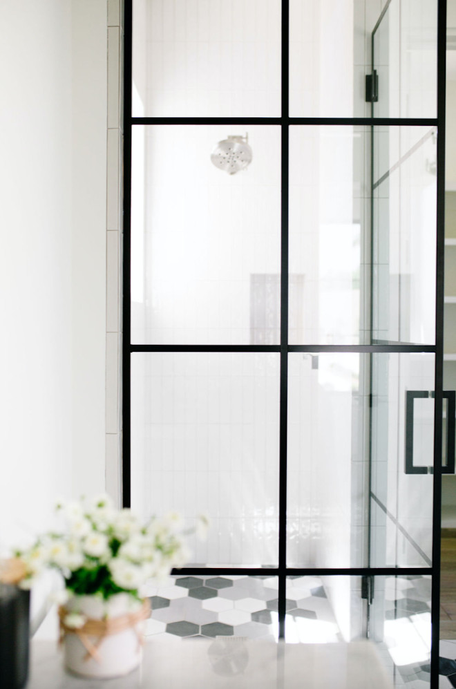
Black Frame Shower Enclosure – similar style: here, here & here.
Plubing: Brizo Litze.
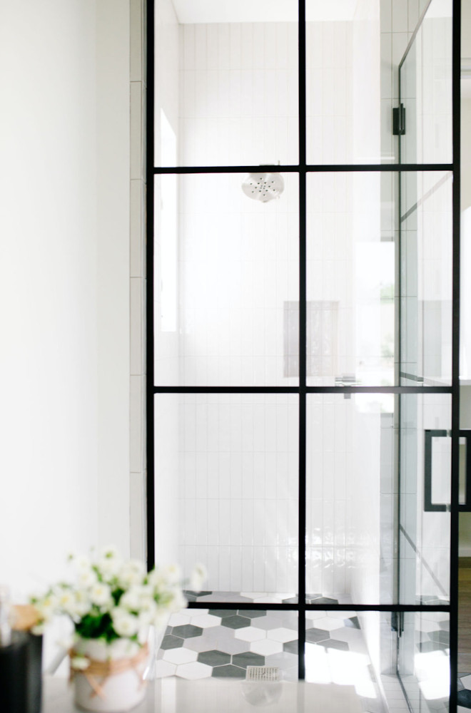
Shower Wall Tile: AZ Tile – similar: here.
Floor Tile: Facings of America 6th Ave Hexagon in White, Black & Grey – similar here.
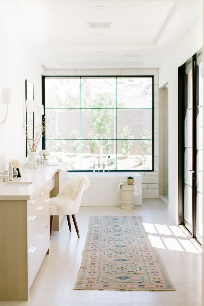
“This Master Bathroom is proof that warm and beauty can go hand in hand with simple modern aesthetics.” – Jennifer Ferrandi3
Photo by @elizabethlawlorphotographt.
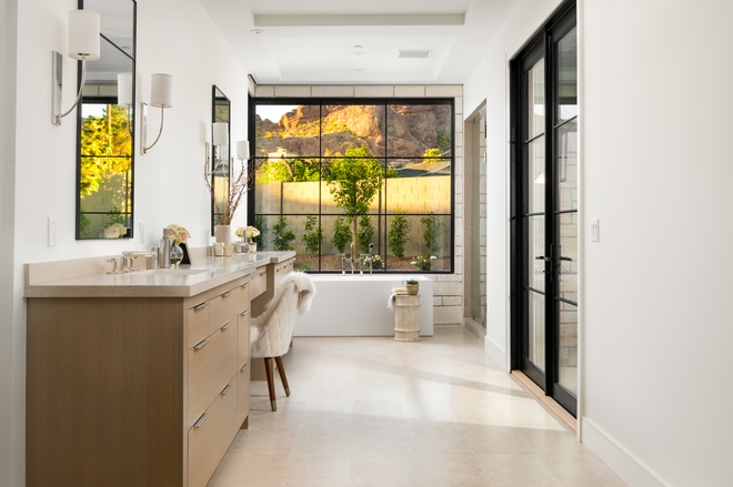
“I used Gobi Limestone for the floors, countertops and shower walls.” – Jennifer Ferrandi
Flooring: Gobi Limestone – Other Neutral Tiles: here, here, here, here & here.
Photo by @erickrukphoto.
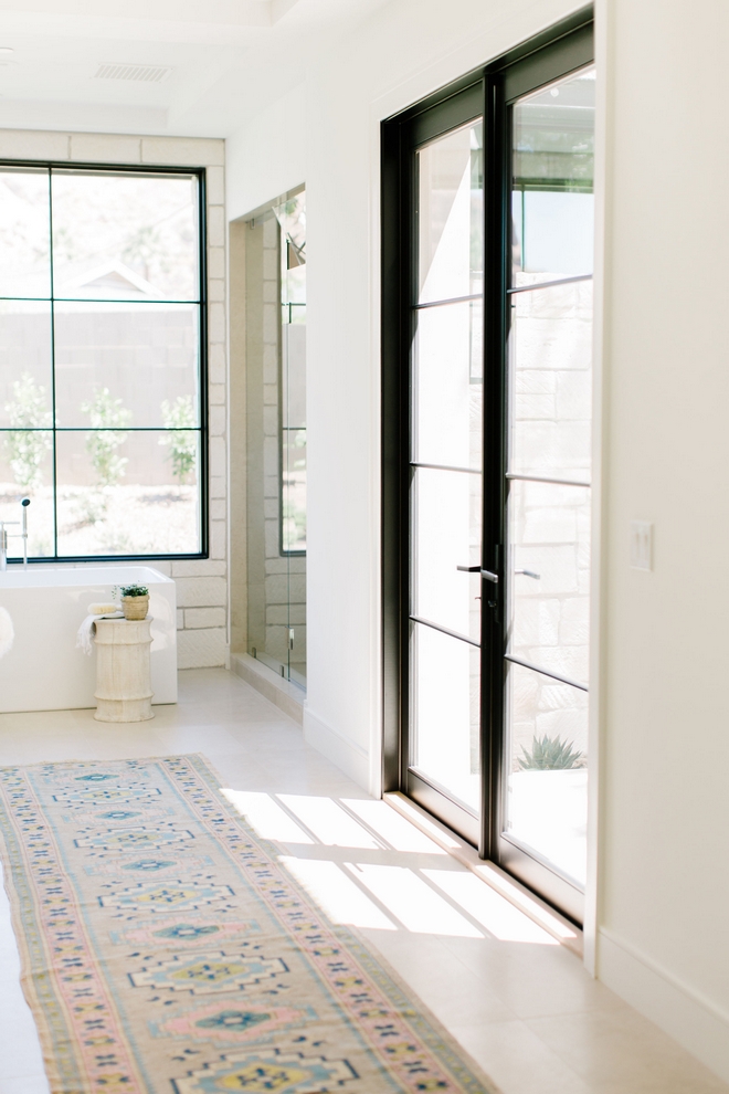
The bathroom walls are “Sherwin Williams Alabaster”.
Photo by @elizabethlawlorphotographt.
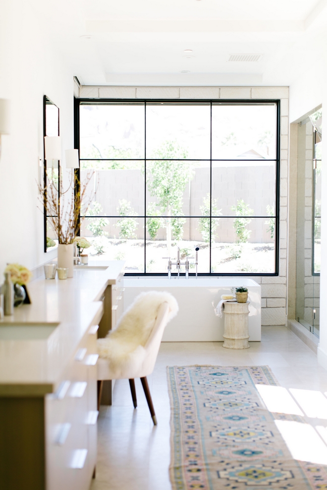
“We reintroduced the exterior Limestone at the tub wall to break up the Gobi and frame the beautiful view of Camelback Mountain.”
Photo by @elizabethlawlorphotographt.
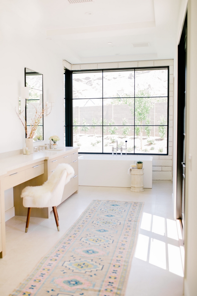
Runner: Antique from NoMad Designs – Others: here, here, here, here, here & here.
Beautiful Chairs: here, here, here, here & here.
Photo by @elizabethlawlorphotographt.
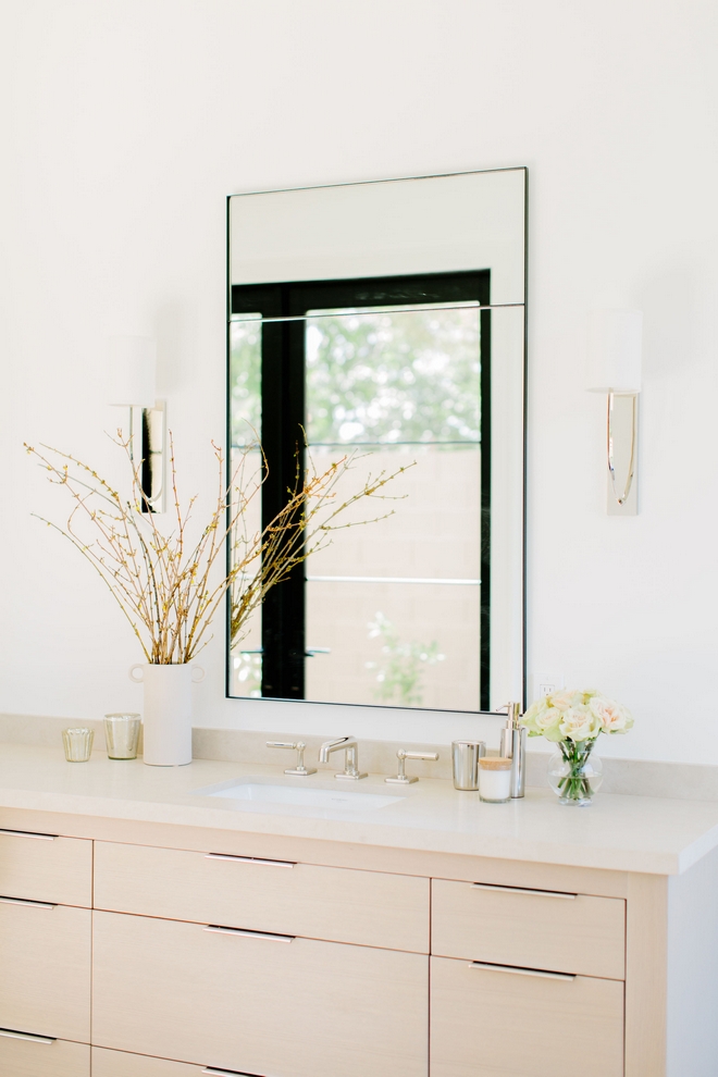
Vanity: Custom, White Oak.
Sconces: Hudson Valley Colton Sconce, Polished Nickel.
Photo by @elizabethlawlorphotographt.
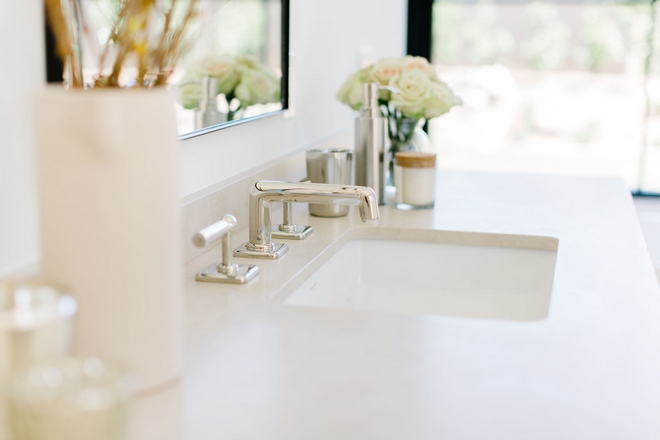
Bathroom Faucets: Waterworks Ludlow Collection – Others: here, here, here, here & here.
Photo by @elizabethlawlorphotographt.
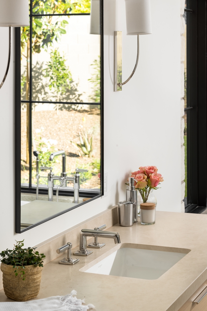
Countertop: Gobi Limestone.
Photo by @erickrukphoto.
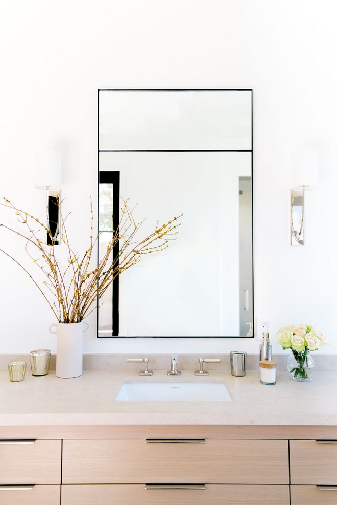
Mirrors: Custom Steel Mirrors by Vista General – similar style: here, here & here – Other Stunning Mirrors: here, here, here, here, here & here.
Photo by @elizabethlawlorphotographt.
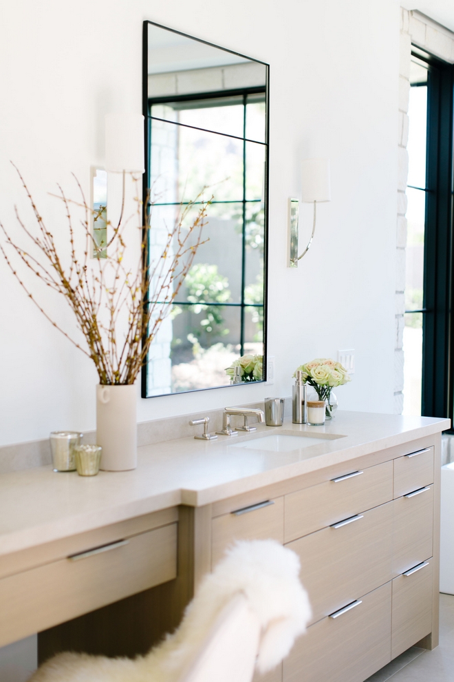
Hardware: Top Knobs.
Photo by @elizabethlawlorphotographt.
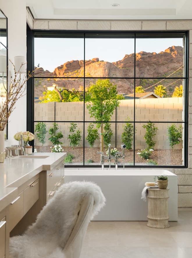
Lovely views can be admired from a sleek freestanding tub (similar here).
Photo by @erickrukphoto.
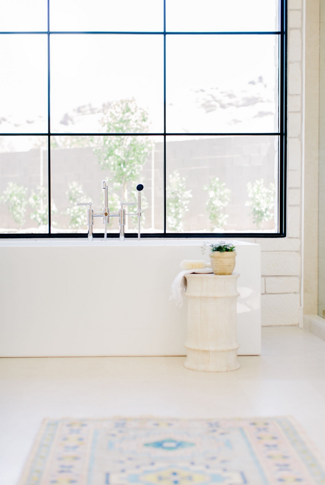
Tub Faucet: Waterworks Ludlow Collection.
Photo by @elizabethlawlorphotographt.
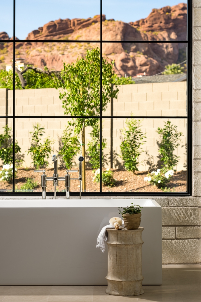
Side Table: NoMad Designs – Others: here, here, here, here & here.
Photo by @erickrukphoto.
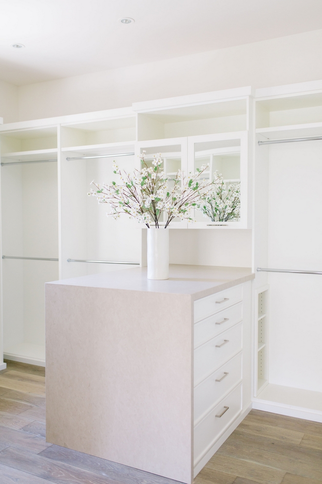
The layout of this closet with island/peninsula is really inspiring! Cabinets are in Sherwin Williams Alabaster.
Photo by @elizabethlawlorphotographt.
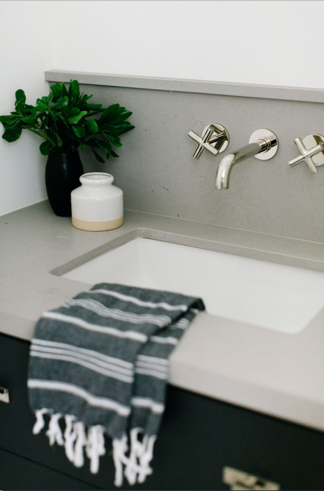
“This bath is right off the colorful Mudroom. A floating dark vanity is topped by a grey honed countertop topped by a wall mounted fixture by Waterworks.”
Vanity Paint Color: Benjamin Moore Soot.
Countertop: Caesastone Raw Concrete.
Faucet: Waterworks – similar here & here.
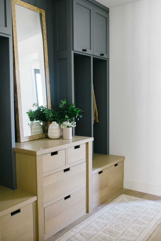
“I wanted to add a little color and fun to the Mudroom millwork. For the finish I chose to mix White Oak with a dark grey paint by Benjamin Moore; French Beret.” – Jennifer Ferrandi
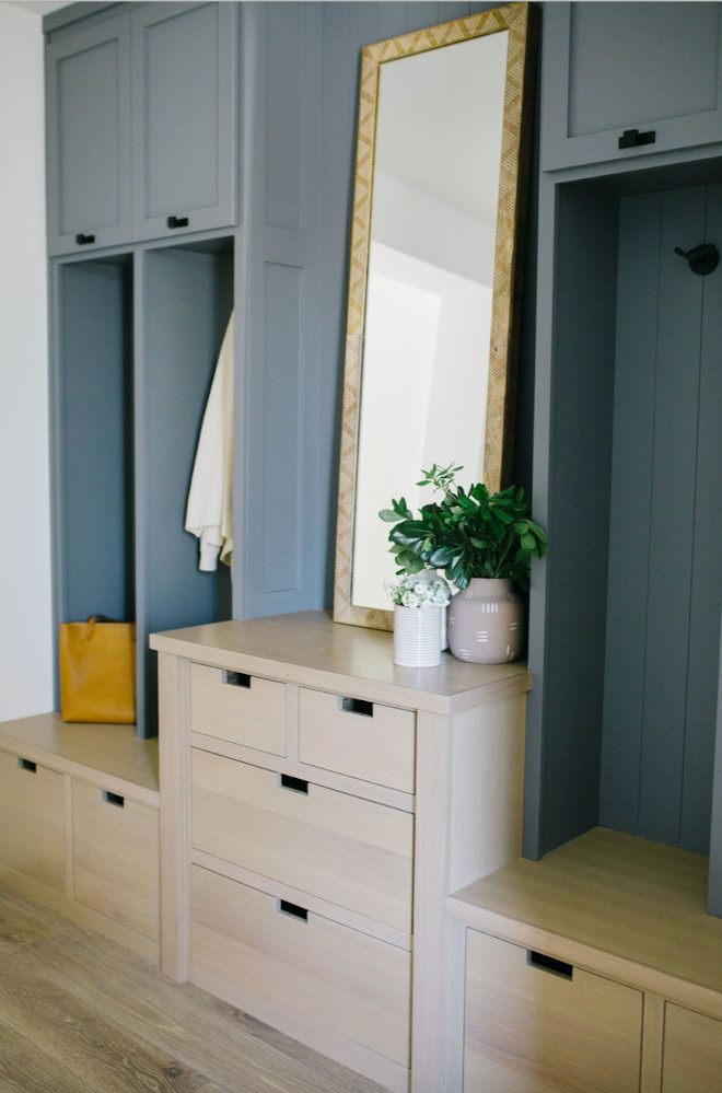
“Rectangle cut out cabinet pulls were added to the drawers, while square knobs with rectangle back plates were used for the cabinet doors.”
Hardware: Top Knobs Channing Knob and Backplate.
Hooks: Schoolhouse Electric.
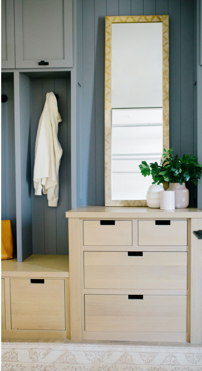
“I designed the middle section as a key drop zone to help organized all the necessary items a busy family require.” – Jennifer Ferrandi of NoMad Design.
Mirror: Target.
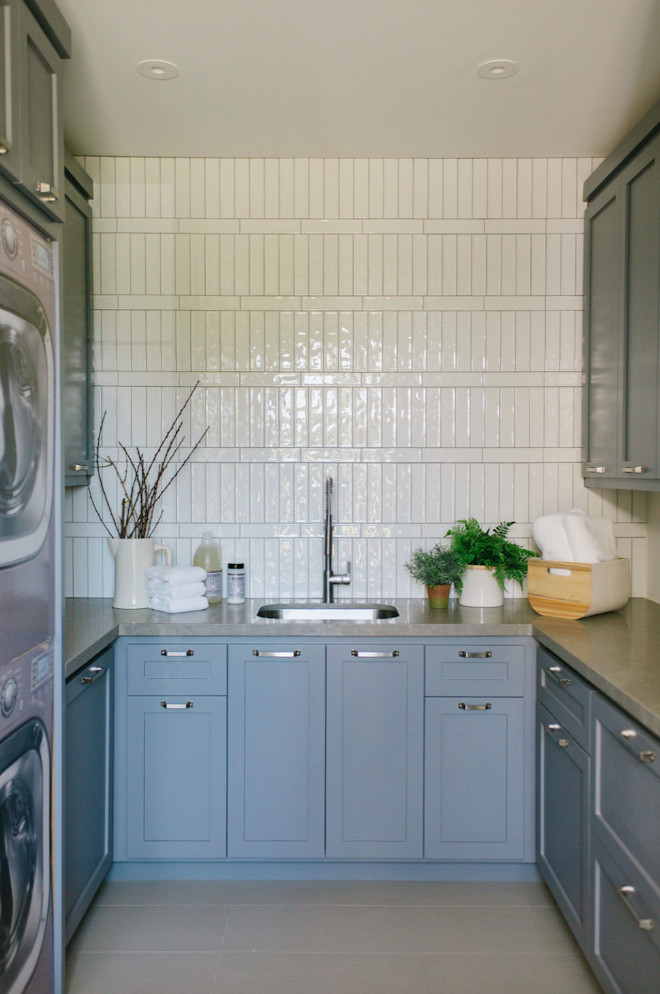
“For the Laundry Room I used the same Benjamin Moore French Beret as the Mudroom millwork.”
Hardware: Top Knobs Channing Pull.
Floors: AZ Tile Vega Grey 12×24 – similar style: here & here.
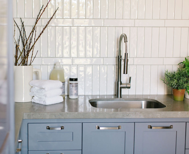
Countertop: Rocas Azul Limestone.
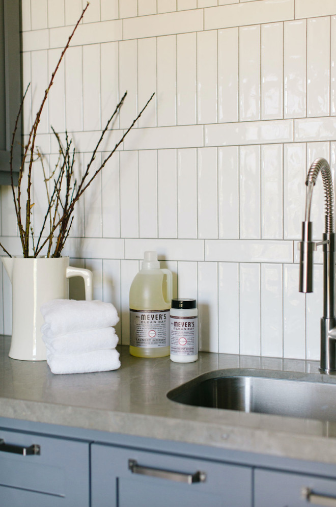
“To add a little visual interest, I tiled all the walls with long thin subway tile installed vertically with horizontal bands between rows.”
Backsplash: AZ Tile Concerto Glossy White – similar here & here – Other Best Sellers: here, here, here, here, here, here, here & here.
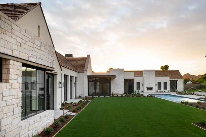
The back of the house is also accentuated with Limestone.
Photo by @erickrukphoto.
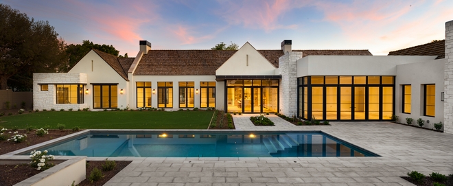
This home is truly stunning and full of inspiration, inside and out!
Photo by @erickrukphoto.
Photography: @elizabethlawlorphotographt & @erickrukphoto (including 1st image)
Click on items to shop:
Thank you for shopping through Home Bunch. For your shopping convenience, this post may contain AFFILIATE LINKS to retailers where you can purchase the products (or similar) featured. I make a small commission if you use these links to make your purchase, at no extra cost to you, so thank you for your support. I would be happy to assist you if you have any questions or are looking for something in particular. Feel free to contact me and always make sure to check dimensions before ordering. Happy shopping!
Pottery Barn: Up to 40% Off + Free Shipping on orders over $99 with code: COZY
Joss & Main: New Spring Arrivals
Burke Decor: 20% Off Site Wide. Use Code: Glass
West Elm: Up to 75% Off! + An Extra 50% off Clearance with code: SAVE50
 Dream Lake House Tour.
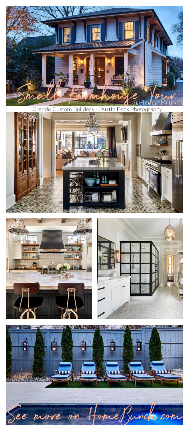 Small Farmhouse Home Tour.
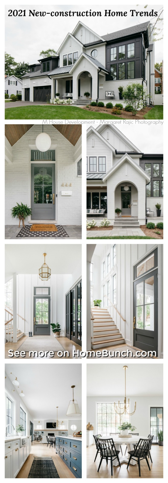 2021 New-construction Home Trends.
 California New-construction Home.
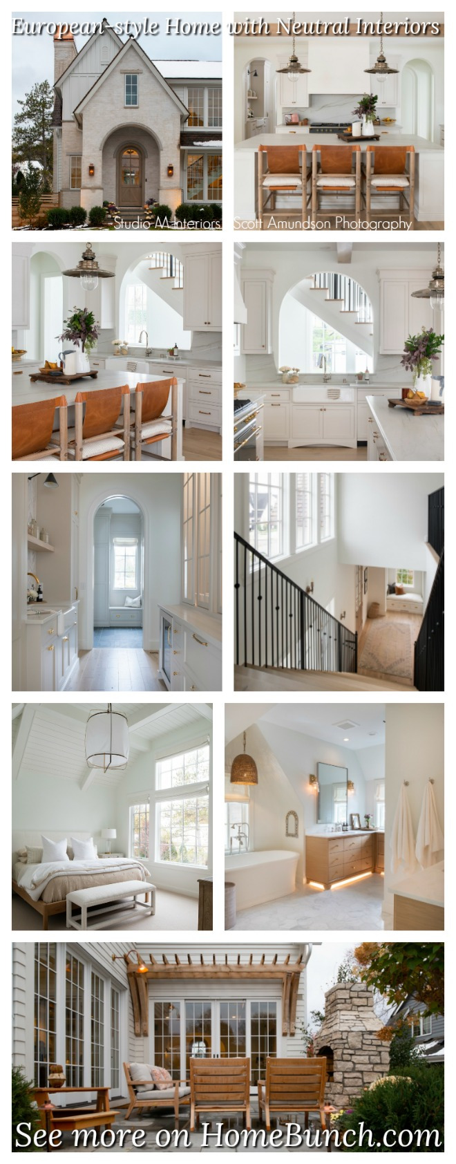 Classic European-style Home with Neutral Interiors.
 New-construction Modern Home Trends.
 California Farmhouse Design.
 2021 Beautiful Homes of Instagram.
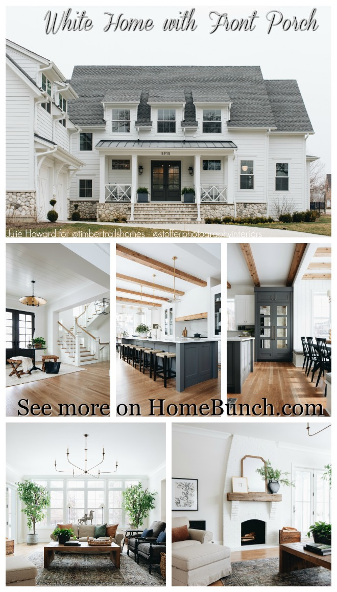 White Home with Front Porch.
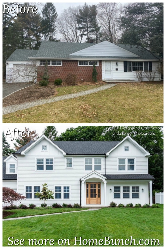
 Florida Home Renovation.
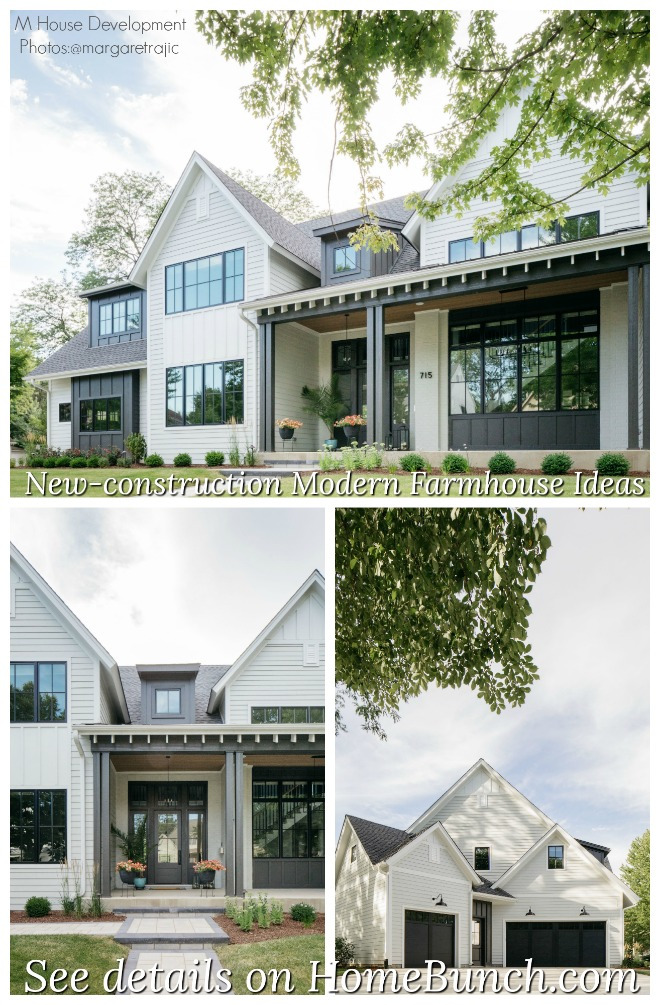 New-construction Modern Farmhouse Ideas.
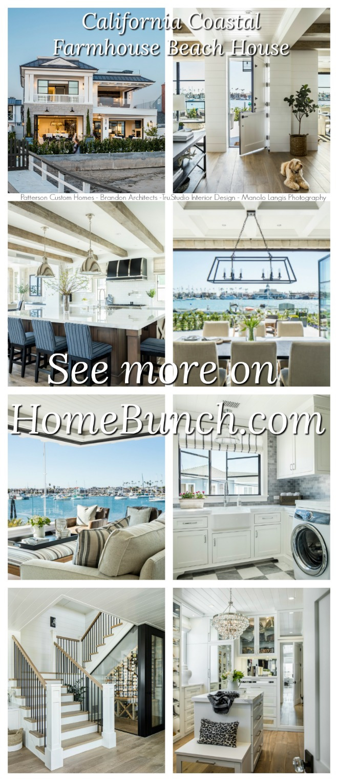 California Coastal Farmhouse Beach House.
“Dear God,
If I am wrong, right me. If I am lost, guide me. If I start to give-up, keep me going.
Lead me in Light and Love”.
Have a wonderful day, my friends and we’ll talk again tomorrow.”
with Love,
Luciane from HomeBunch.com
No Comments! Be The First!