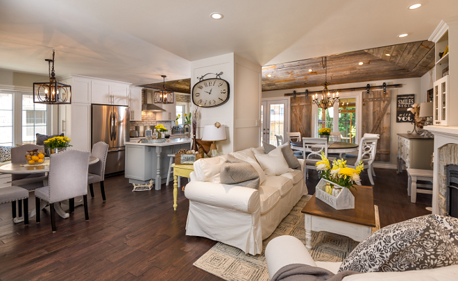
Spring won’t take too long to arrive (and I am counting down the days!) and with every new spring, the real estate market starts booming once again. Many homeowners get tired of living in their home and seek a new start. But others, like this couple who lives in a town just outside of Toronto, Canada, decide to make some changes while keeping the same address.
As an interior designer, I see a lot of homeowners wanting to live in their dream home, and although building your dream home is the ultimate way to have everything you want in a house, it’s important to consider other options such a renovation before putting your home for sale, especially if you love where you live, and that’s exactly what these homeowners did. After getting tired of living for more than 20 years with a “choppy” floor plan, they decided to hire Manny Neves from Hardcore Renos to open the entire space and bring a rustic farmhouse feel to their beloved home. Manny not only gave them the open floor plan they wished but also a fabulous shaker-style kitchen, plenty of barn wood shiplap and a, exposed whitewashed brick backplash.
I hope this renovation shows you that, with care and experienced professionals, any space in your home can be transformed into what you envision and, depending on the project, it can end up being much cheaper than moving.
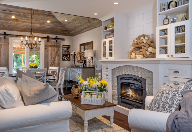
This entire space was completely renovated. In the living room, the contractor moved the gas-insert fireplace to make it fit into the layout in a pleasing way. He gave it a new stone veneer surround and crafted built-ins around it, which make it the focal point of the room. The homeowners asked him to fill the cabinet door frames with chicken wire to continue the rustic theme.
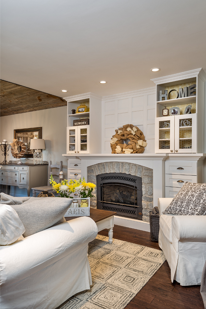
The cabinet paint color is “Benjamin Moore White Dove”.
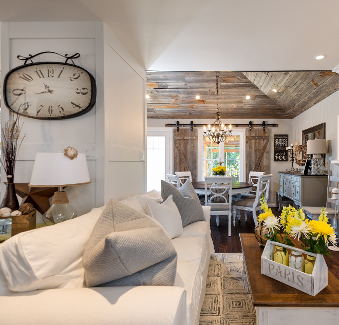
Sofa and chair (see picture above) are from Ikea and the clock is from HomeSense.
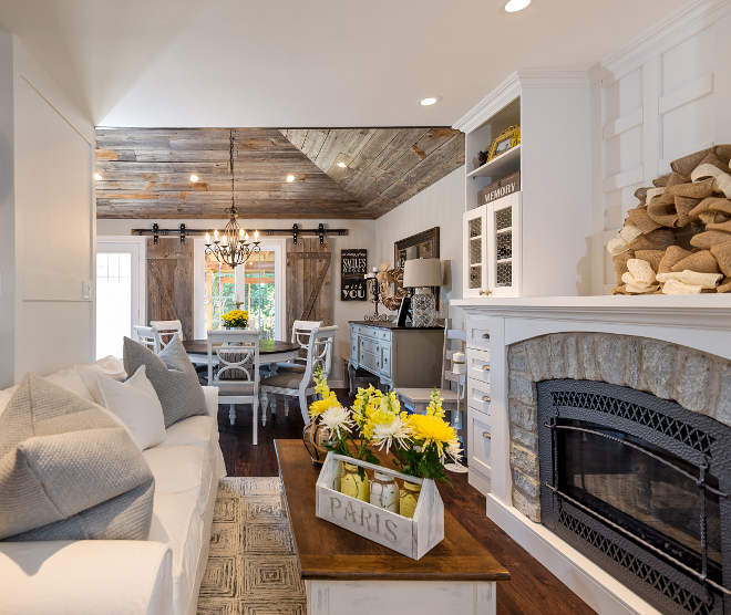
Fireplace insert is by Vermont Castings.
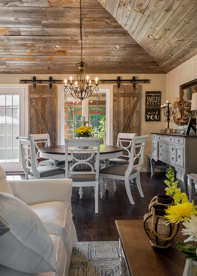
I love how the barn wood shiplap transformed this home! According to Manny, the barn board was purchased from a rep supplier up north and its as is. No planing or finishing, that’s how they came and got installed.
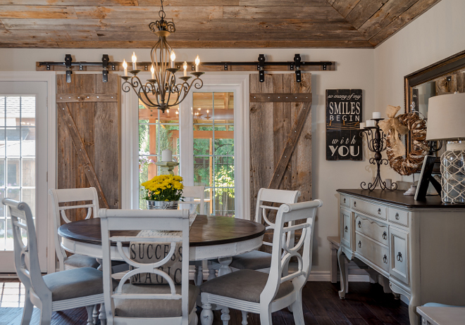
The homeowners purchased the table a long time ago and recently refinished it themselves as part of the project.
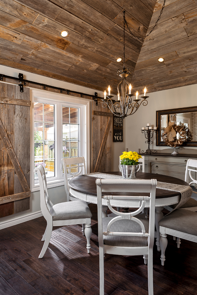
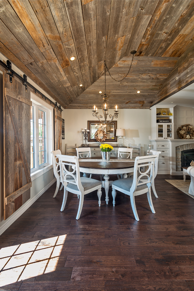
The vaulted portions of the ceiling were covered with reclaimed wood shiplap to bring warmth to this entire space. Here’s what the contractor has to say about the feature: “The ceiling was so boring, and because the homeowners already knew they wanted an exposed brick look in here, they really liked the idea of going rustic,” Neves says. Because they opened up the floor plan to let in more light and used lots of white, the ceiling doesn’t darken the space too much.
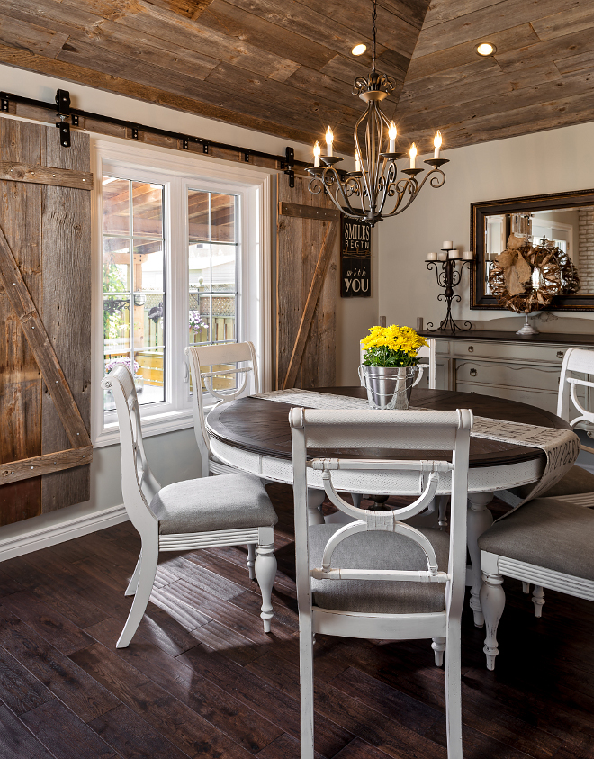
Similar wall paint color: “Benjamin Moore Collingwood Gray”.
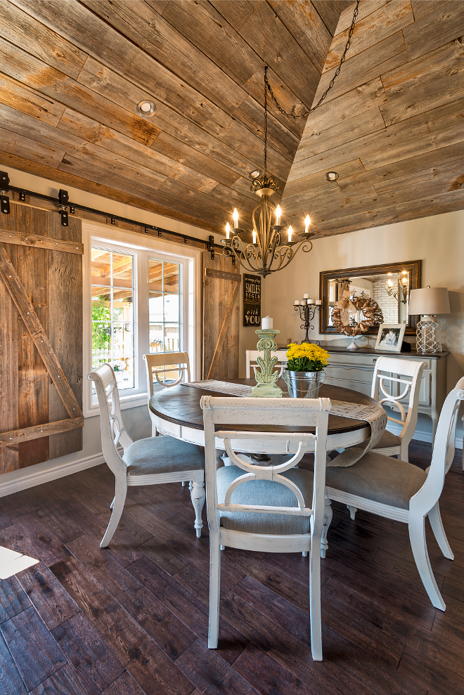
Barn door track hardware: Richards-Wilcox.
The flooring is 5-inch hand-scraped oak.
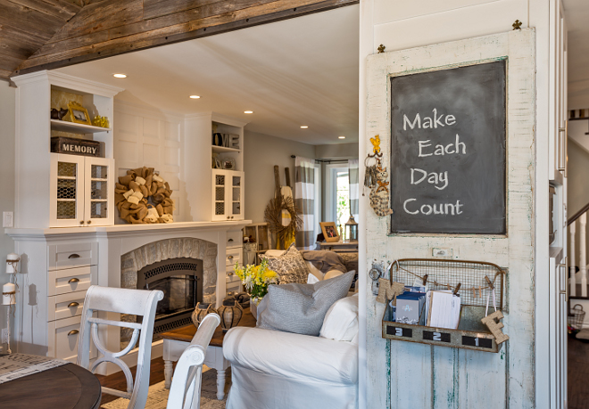
Because the box was smack-dab in the middle of everything, the homeowners and the contractor used it to help determine where the different rooms would go. Smart!
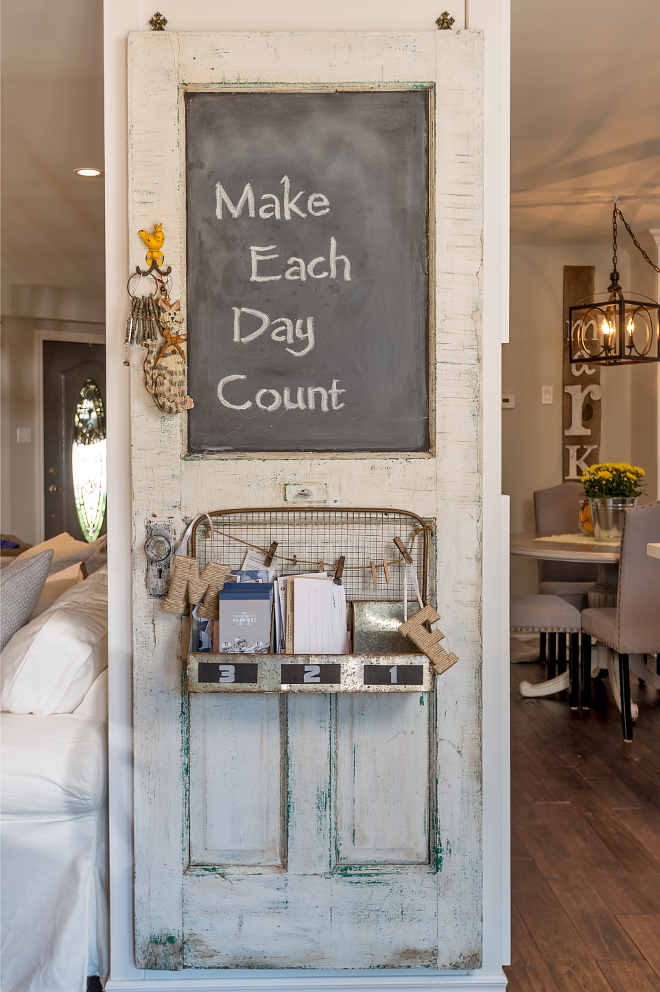
Found by the homeowner, this reclaimed door was hung and partly painted with chalk paint to create a message board. How creative is that?!
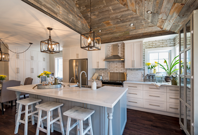
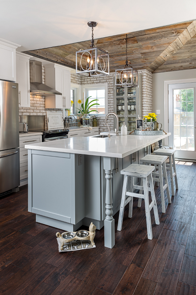
The new farmhouse kitchen features reclaimed barn wood ceilings, shaker-style cabinetry and exposed brick backsplash.
The perimeter cabinets are painted in Benjamin Moore White Dove.
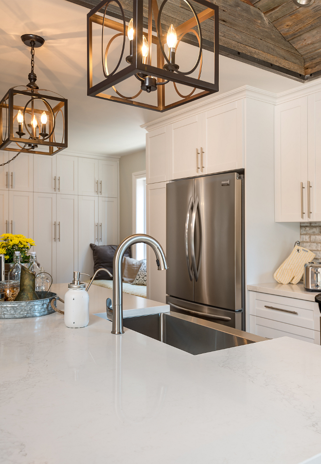
Another detail worth noting is the touchless faucet. Because it’s motion-activated, there’s no worry about spreading contaminants when turning it on and off.The touchless faucet is “Sensate” by Kohler.
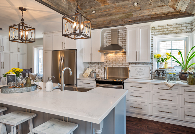
On the left, you can find a wall with floor-to-ceiling cabinets. These provide pantry space and room for cleaning supplies.
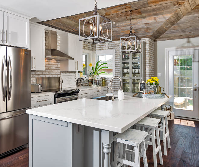
The island is 42 inches wide by almost 10 feet long. There is a 42″ space between the island and the wall base cabinets.
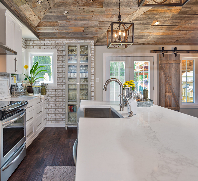
The countertop is a marble-like quartz with a beautiful diagonal vein through it. “The large size of the island allowed us to place the sink in a way that wouldn’t interrupt that beautiful vein in the quartz,” Neves says.
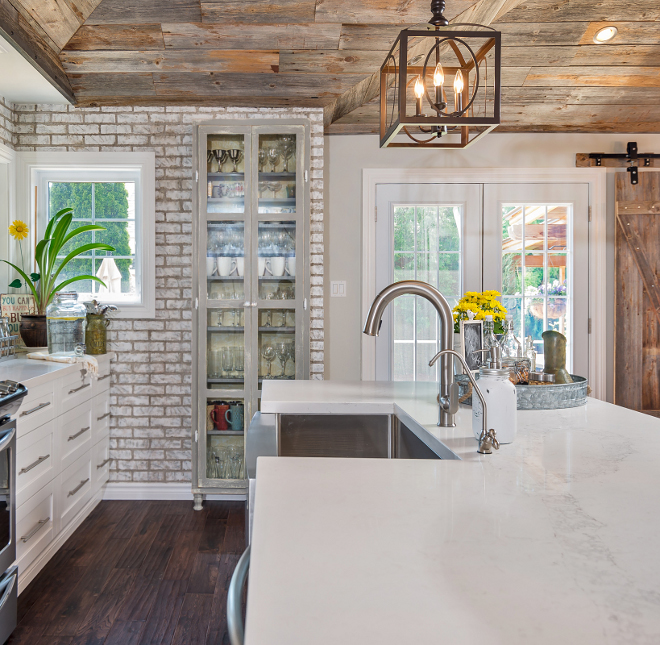
Counters: Statuario Nuvo, Caesarstone –– it’s such a beautiful slab with a striking vein across it.
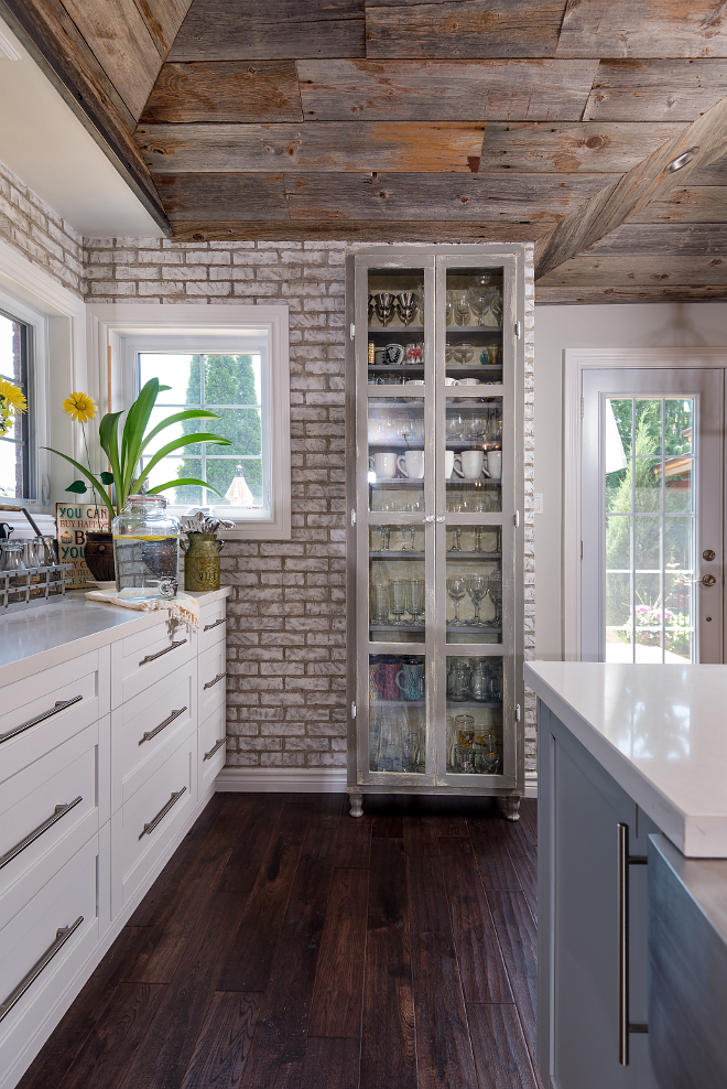
The homeowner saved some serious money by distressing this inexpensive Ikea cabinet, giving it an antique patina. The contractor bolted it to the wall to make it look embedded in the brick. This is what the contractor has to say about the piece: “They didn’t want guests having to guess at where to find a glass or a coffee mug so they opted for this glass-front cabinet,” he says. “Everyone can see everything they need and grab it without a cabinet search.”
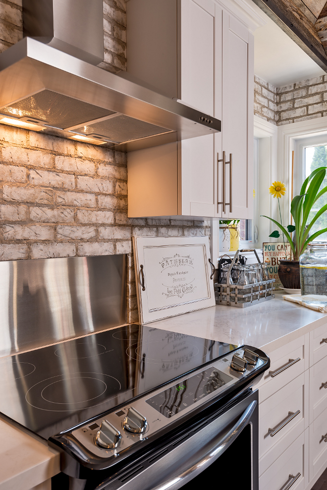
Whitewashed bricks are in huge demand right now and not wanting to wait on the three-month backorder for a whitewashed brick, the homeowners ordered regular-colored bricks and, over the course of two weekends, they painted the 700-plus facades to give them a whitewashed look. How amazing is that?!
The whitewashed brick on the walls looks like real exposed brick, but it’s a veneer. The key to making it look real was Neves’ suggestion to wrap the wall to the right of the tall cabinet. “By wrapping this wall, you see what looks like the thickness of full bricks, rather than revealing that they are a thin veneer,” he says. Neves says that sealed everything afterwards to make it easier to clean up.
To keep the brick even cleaner, a stainless plate was added behind the stove. The stainless plate wasn’t part of the stove, it was ordered through a local metal fabricator. The piece actually runs down the whole back for ease of cleaning, including a cut out for the range plug for a nice finish.
Brick Veneer (painted by homeowner): Brampton Brick.
Color: The homeowner painted over in a few steps with white and 2 shades of grey to get this final result.
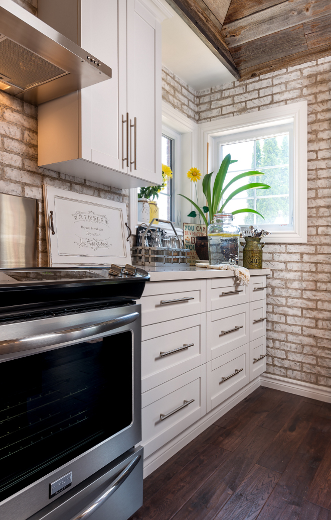
The oversized kitchen pulls are from Richelieu.
The refrigerator and range are Frigidaire and the hood fan is an after market similar to a vent a hood model.
Hood Installation Details: “We did an outline of the hood and then set the bricks a few inches inside of that line. Used a piece of plywood to bring the inside part with no brick to the front edge of the brick. Its always a nicer and cleaner finish doing it that way instead of cutting around the appliance.” Neves explains.
Kitchen Flooring: It’s 3/4″ T&G 5″ wide Oak from Bruce.
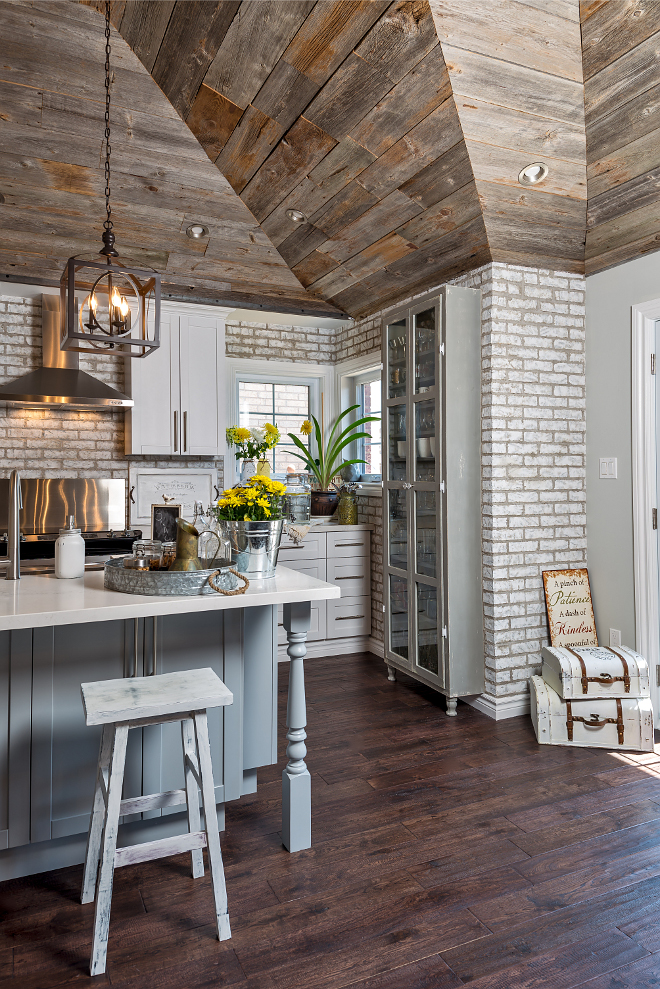
“Once the reclaimed barn wood was installed, it didn’t look quite right where the wood met the drywall,” Neves says. “Transitions are important.” He came up with the idea of adding a strip of riveted cold-rolled steel between the wood and the drywall. In addition to giving the space a finished look, it adds another interesting texture and patina.
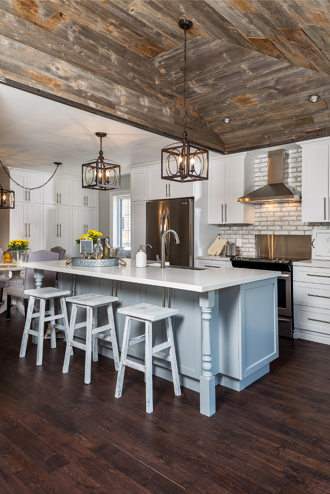
The kitchen island cabinet paint color is Benjamin Moore Coventry Grey.
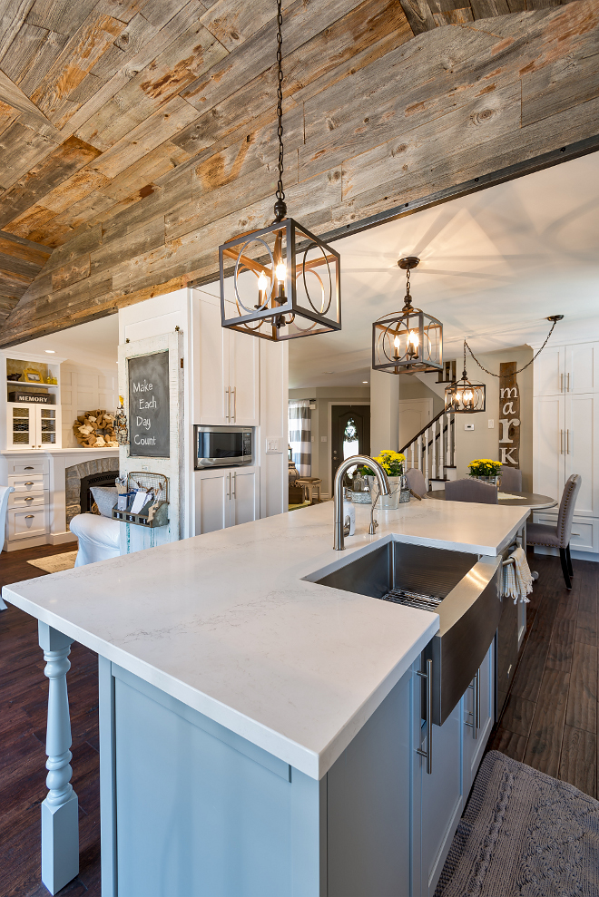
The kitchen pendants are Caledon Lighting Sterling Industries #198096 Ailisa 3 Light Lantern in Aged Bronze. They’re really perfect for this rustic farmhouse kitchen.
Contractor: Hardcore Renos
(Instagram – Facebook – Houzz – Youtube)
Photos by Adrian Ozimek.
Click on items to shop!
Thank you for shopping through Home Bunch. I would be happy to assist you if you have any questions or are looking for something in particular. Feel free to contact me and always make sure to check dimensions before ordering. Happy shopping!
Serena & Lily: Pillow & Throw Sale!
Wayfair: Up to 75% OFF on Furniture and Decor!!!
Joss & Main: Up to 70% off Sale!
Pottery Barn: Bedroom Event Slale plus free shipping. Use code: FREESHIP.
One Kings Lane: Buy More Save More Sale.
West Elm: 20% Off your entire purchase + free shipping. Use code: FRIENDS
Anthropologie: 20% off on Everything + Free Shipping!
Nordstrom: Sale – Incredible Prices!!!


 Beautiful Homes of Instagram: Modern Farmhouse.
 2019 New Year Home Tour.
 New-Construction Home Ideas.
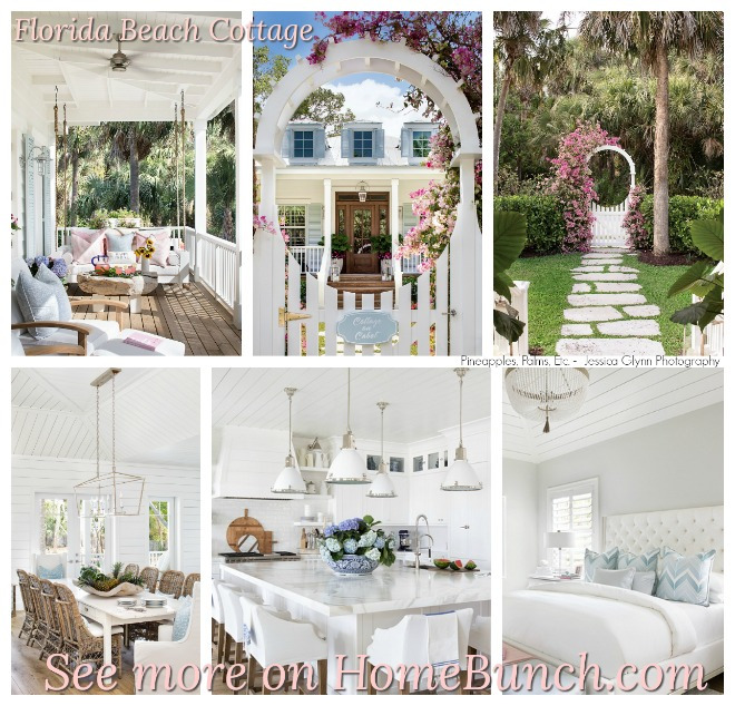 Florida Beach Cottage.
 Tom Brady and Gisele Bundchen’s Home – Full House Tour.
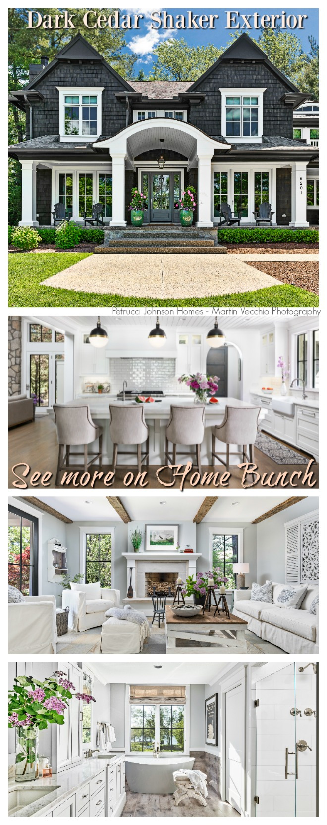 Dark Cedar Shaker Exterior.
 Neutral Home.
 Coastal Farmhouse Home Decor.
 Modern Farmhouse with Front Porch.
 Lake House Interior Design Ideas.
 New England Home.
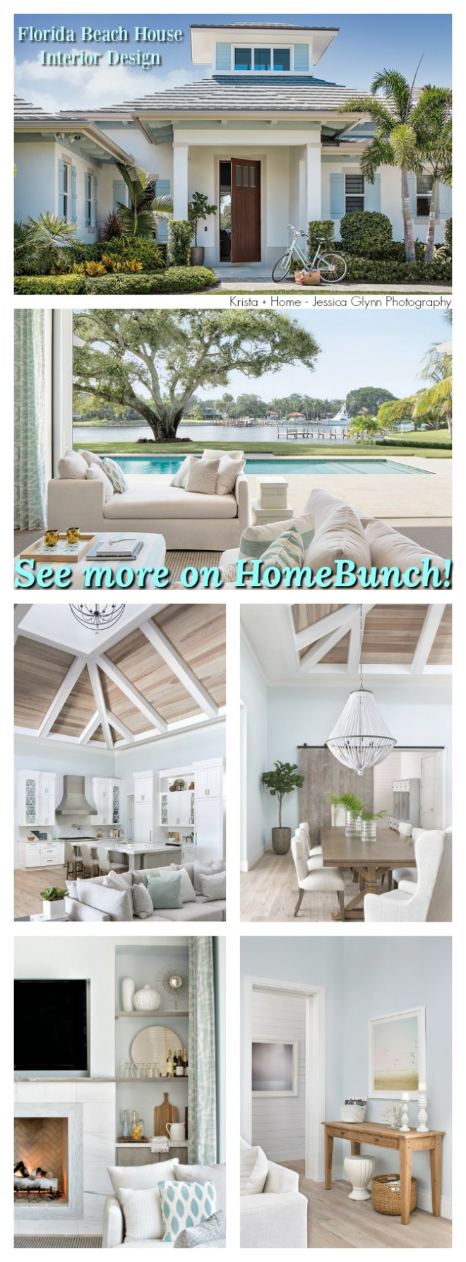 Florida Beach House Interior Design.
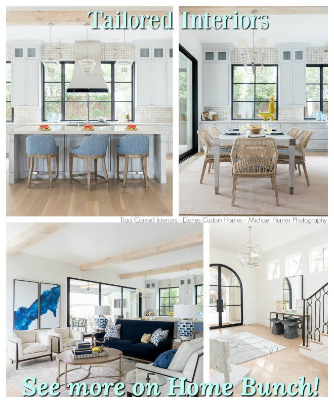 Tailored Interiors.
 Grey Kitchen Paint Colors.
“Dear God,
If I am wrong, right me. If I am lost, guide me. If I start to give-up, keep me going.
Lead me in Light and Love”.
Have a wonderful day, my friends and we’ll talk again tomorrow.”
with Love,
Luciane from HomeBunch.com
Get Home Bunch Posts Via Email ![]()
“For your shopping convenience, this post might contain links to retailers where you can purchase the products (or similar) featured. I make a small commission if you use these links to make your purchase so thank you for your support!”
No Comments! Be The First!